


css的box模型
The following is an extract from our book, CSS Master, written by Tiffany Brown. Copies are sold in stores worldwide, or you can buy it in ebook form here.
以下是蒂芙尼·布朗(Tiffany Brown)所著《 CSS Master》一书的摘录。 副本在世界各地的商店中都有出售,您也可以在这里以电子书的形式购买。
Perhaps the most important point to understand about CSS is this: Everything is a box. More specifically, every element in a document generates a box. This box may be a block-level box, or it may be an inline-level box. The box type determines how the element affects page layout.
理解CSS的最重要一点可能是: 一切都是一个盒子 。 更具体地说,文档中的每个元素都会生成一个框。 此框可以是块级框,也可以是内联级框。 框类型确定元素如何影响页面布局。
Whether or not an element creates a box and which type of box it creates will depend on the markup language. CSS developed as a way to style HTML documents so, as a result, much of the CSS visual rendering model is rooted in HTML’s distinction between block-level and inline elements. By default, elements such as p and section create block-level boxes but a, span, and em create inline boxes. SVG, on the other hand, does not use the box model, so most layout-related CSS properties fail to work with SVG.
一个元素是否创建一个盒子以及它创建哪种盒子取决于标记语言。 CSS作为一种样式化HTML文档的方式而开发,因此,许多CSS视觉呈现模型都植根于HTML在块级元素和内联元素之间的区别。 默认情况下,元件,例如p和section创建块级框,但a , span ,和em创建行内框。 另一方面,SVG不使用盒模型,因此大多数与布局相关CSS属性都无法与SVG一起使用。
Block-level boxes create new blocks of content as can be seen in Figure 4.1. Block-level boxes are rendered vertically according to their source order and (except for tables) expand to fill the available width of their containing element. This is known as normal flowdisplay value of block, list-item, table, or any of the table-* values (for example, table-cell).
块级框创建新的内容块,如图4.1所示。 块级框根据其源顺序垂直呈现,并且(表除外)扩展以填充其包含元素的可用宽度。 这称为block , list-item , table或任何table-*值的正常流显示值(例如table-cell )。

Figure 4.1. Block-level boxes featuring h1, p, ul, and table elements within a containing element (gray area)
图4.1。 具有包含元素(灰色区域)中的h1,p,ul和table元素的块级框
Inline-level boxes, by contrast, do not form new blocks of content. Instead, these boxes make up the lines inside a block box. They’re displayed horizontally and fill the width of the containing box, wrapping across lines if necessary, as shown in Figure 4.2. Inline-level boxes have a display value of inline, inline-block, inline-table, or ruby.
相比之下, 内联级别的框不会形成新的内容块。 而是,这些框组成了块框内的行。 它们将水平显示并填充包含框的宽度,并在必要时跨行环绕,如图4.2所示。 内联级别的框的display值为inline , inline-block , inline-table或ruby 。

Figure 4.2. An example of an inline box with margin: 1em and padding: 5px applied
图4.2。 内联框的示例,其边距为:1em,填充为:5px
But how are the dimensions of the box calculated? Here is where it becomes more complicated. As seen in Figure 4.3, box dimensions are the sum of the box’s content area, plus its padding width, and border width as defined in CSS2. The margin width creates a margin box for the element, and affects other elements in the document; however, the margin width has no effect on the dimensions of the box itself.
但是盒子的尺寸如何计算? 这是变得更加复杂的地方。 如图4.3所示,框的尺寸是框的内容区域之和,加上其填充宽度和CSS2中定义的边框宽度之和。 边距宽度为元素创建一个边距框,并影响文档中的其他元素; 但是,边距宽度对盒子本身的尺寸没有影响。

Figure 4.3. The CSS 2.1 box model
图4.3。 CSS 2.1盒子模型
For instance, a p element with width: 300px, padding: 20px, and border: 10px has a calculated width of 360 pixels. That’s the sum of its width, left and right padding, and left and right border-width properties. To create an element that is 300 pixels wide with 20 pixels of padding and a 10 pixel border, the width needs to be 240px. Most leading browsers calculated the width in just this way. Internet Explorer 5.5, however, did not.
例如, width: 300px , padding: 20px , border: 10px的p元素的计算宽度为360像素。 这是它的宽度,左右填充以及左右border-width属性的总和。 要创建一个宽度为300像素,填充为20像素,边框为10像素的元素,其width必须为240px 。 大多数领先的浏览器都是通过这种方式计算宽度的。 但是,Internet Explorer 5.5没有。
Instead, IE5.5 used the width property as the final arbiter of box dimensions, with padding and border drawn inside the box as seen in Figure 4.4. Both values were, in effect, subtracted from width, decreasing the size of the content area. Though it’s the exact opposite of the behavior defined in the specification, many web developers thought it was the more sensible approach.[10]
而是,IE5.5使用width属性作为框尺寸的最终仲裁者,在框内绘制填充和边框,如图4.4所示。 实际上,两个值都从width减去,从而减小了内容区域的大小。 尽管这与规范中定义的行为完全相反,但是许多Web开发人员认为这是更明智的方法。 [10]
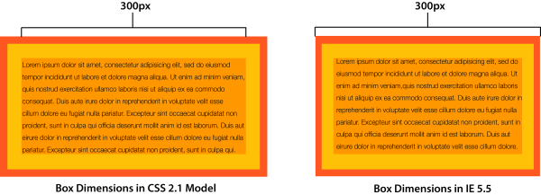
Figure 4.4. The CSS 2.1 box model versus the old Internet 5.5 “quirks mode” box model
图4.4。 CSS 2.1框模型与旧版Internet 5.5“怪癖模式”框模型
Partly as a way to resolve these competing models, the CSS working group introduced the box–sizing property. It lets us choose the box model implementation that we prefer, and greatly simplifies calculations when working with responsive designs.
作为解决这些竞争模型的一种方法,CSS工作组介绍了box–sizing属性。 它使我们能够选择自己喜欢的盒模型实现,并在使用响应式设计时大大简化了计算。
选择具有box-sizing的盒子模型 (Choosing a Box Model with box-sizing)
The box-sizing property is defined in the CSS Basic User Interface Module Level 3 specification. It has two possible values: content-box and border-box.
box-sizing属性在CSS Basic User Interface Module Level 3规范中定义。 它有两个可能的值: content-box和border-box 。
Initially, the value of box-sizing is content-box. With this value, setting the width and height properties of an element affect the size of its content area. This matches the behavior defined by the CSS 2.1 specification, and it’s the default behavior in modern browsers (as presented in Figure 4.4).
最初, box-sizing的值是content-box 。 使用此值,设置元素的width和height属性会影响其内容区域的大小。 这符合CSS 2.1规范定义的行为,并且是现代浏览器中的默认行为(如图4.4所示)。
Setting the value of box-sizing to border-box creates a little bit of magic. Now, the values of width and height will be applied to the outer border edge instead of the content area. Borders and padding are drawn inside the element box, matching the old Internet Explorer 5.5 behavior. Let’s look at an example that mixes percentage widths and px units for padding and borders:
将box-sizing的值设置为border-box会产生一点魔力。 现在, width和height的值将应用于外边界边缘,而不是内容区域。 在元素框中绘制边框和填充,与旧的Internet Explorer 5.5行为匹配。 让我们看一个示例,该示例将百分比宽度和px单位混合用于填充和边框:
<div class="wrapper">
    <article>
    <h2>This is a headline</h2>
    <p>Lorem ipsum dolor sit amet, consectetur adipisicing ... </p>
    </article>
    <aside>
    <h2>This is a secondary headline</h2>
    <p>Lorem ipsum dolor sit amet, consectetur adipisicing ... </p>
    </aside>
</div>
Both our article and aside elements have the following CSS applied, which gives us the layout shown in Figure 4.5 where the first element has a width of 60% while the second has a width of 40%:
我们的article和aside元素都应用了以下CSS,从而为我们提供了图4.5所示的布局,其中第一个元素的宽度为60%,第二个元素的宽度为40%:
article, aside {
    background: #FFEB3B;
    border: 10px solid #9C27B0;
    float: left;
    padding: 10px;
}
article {
    width: 60%;
}
aside {
    width: 40%;
}
Figure 4.5. Elements with box-sizing: content-box
图4.5。 具有框大小的元素:内容框
By default, both aside and article have a box-sizing value of content-box. The border-width and padding values add 40 pixels to the width of each element, which throws off the 60%/40% split considerably. Now let’s add box-sizing: border-box to the article and aside elements:
默认情况下, aside和article的box-sizing值都是content-box 。 border-width和padding值为每个元素的宽度增加了40个像素,这大大降低了60%/ 40%的分割率。 现在让我们在article box-sizing: border-box添加box-sizing: border-box并aside元素:
article, aside {
    box-sizing: border-box;
}
You can see the change in Figure 4.6: the elements have the same width, but the box-sizing: border-box means that the width includes the border and padding. Because the width property applies to the border edge instead of the content area, our elements now fit side by side.
您可以在图4.6中看到更改:元素具有相同的宽度,但是box-sizing: border-box表示宽度包括边框和填充。 由于width属性应用于边框边缘而不是内容区域,因此我们的元素现在可以并排放置。

Figure 4.6. Elements with box-sizing: border-box.
图4.6。 具有框大小的元素:边框。
I’d suggest that you use box-sizing: border-box in your projects. It makes life easier, as there’s no need to calculate the width value to account for the values of padding and border, and boxes behave more predictably.
我建议您在项目box-sizing: border-box使用box-sizing: border-box 。 由于不需要计算width值来考虑padding和border的值,因此它使生活更轻松,并且框的行为更加可预测。
The best way to apply box-sizing: border-box is with reset rules. The following example is from Chris Coyier’s CSS-Tricks post, “Inheriting box-sizing Probably Slightly Better Best-Practice:
最好应用box-sizing: border-box具有重置规则。 以下示例来自克里斯·科耶尔(Chris Coyier)CSS-Tricks帖子,“ 继承box-sizing可能略微更好的最佳实践” :
html {
    box-sizing: border-box;
}

*, *:before, *:after {
    box-sizing: inherit;
}
This applies border-box sizing to every element by default, without affecting the box-sizing behavior of existing parts of your project. If you know that there will be no third-party or legacy components that rely on content-box behavior, you can simplify these rules:
默认情况下,这会将border-box大小应用于每个元素,而不会影响项目现有部分的框大小行为。 如果您知道不存在任何依赖于content-box行为的第三方或旧组件,则可以简化以下规则:
*,
*:before,
*:after {
    box-sizing: border-box;
}
Table 4.1 shows curent bowser support for box-size: border-box
表4.1显示了当前boxser对box-size: border-box
| Internet Explorer | Firefox | Safari | Chrome | Opera | Android |
|---|---|---|---|---|---|
| 8+ | 2+ (versions < 29 require -moz- prefix) | 3.1+ (versions < 5.1 require -webkit- prefix) | 4+ (versions < 9 require -webkit- prefix) | 10.1+ | 2.1+ (versions < 4 require -webkit- prefix) |
| IE浏览器 | 火狐浏览器 | 苹果浏览器 | Chrome | 歌剧 | 安卓系统 |
|---|---|---|---|---|---|
| 8+ | 2+(低于29的版本需要-moz-前缀) | 3.1+(低于5.1的版本需要-webkit-前缀) | 4+(版本<9需要-webkit-前缀) | 10.1+ | 2.1+(版本<4需要-webkit-前缀) |
Managing the box model is just one ingredient in understanding how to create complex layouts. Let’s dig into layering elements in the next section.
管理盒子模型只是了解如何创建复杂布局的一种要素。 让我们在下一部分中深入研究分层元素。
css的box模型


 扫一扫
扫一扫
 338
338

 被折叠的 条评论
为什么被折叠?
被折叠的 条评论
为什么被折叠?
 到【灌水乐园】发言


