


vux flexbox使用
There is no doubt that flexbox is an effective solution for laying out web pages. However, past struggles with browser support have resulted in many developers having little knowledge of the flex layout and the sheer power that it holds. By referencing caniuse.com however, you can see that flexbox is now supported by pretty much all major browsers, thus making knowledge of the layout imperative to those who wish to stay current in web development.
毫无疑问,flexbox是用于布局网页的有效解决方案。 但是,过去与浏览器支持的斗争导致许多开发人员对flex布局及其拥有的强大功能几乎一无所知。 但是, 通过引用caniuse.com ,您可以看到几乎所有主流浏览器都支持flexbox,因此对于那些希望始终关注Web开发的人来说,必不可少的布局知识。
Therefore, I have created this guide to help you become more familiar with flexbox by integrating the Compass CSS framework. I’ll use Compass to guide you through different flex-containers to show you how flexbox lays out child items, or flex-items, across different axes. Additionally, I will be to show you how easy it makes this process as it eliminates the need to include those pesky vendor prefixes that are still required for the deepest possible browser support.
因此,我创建了本指南,以帮助您通过集成Compass CSS框架来熟悉Flexbox。 我将使用Compass引导您通过不同的flex容器,向您展示flexbox如何在不同的轴上布置子项或flex-items。 此外,我将向您展示简化此过程的过程,因为它消除了包含那些对尽可能深的浏览器支持仍然需要的讨厌的供应商前缀的需求。
Before we begin however, I’ll provide a brief overview of flexbox, so we fully understand the different mixins we will be using, and the effect they are having on our code.
但是,在开始之前,我将简要介绍一下flexbox,以便我们充分了解我们将要使用的各种mixin以及它们对代码的影响。
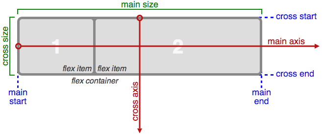
As you can see, flexbox consists of 2 axes — a main axis, and a cross axis. By default, flexbox will display items in rows that run from left to right along the main axis. On the other hand, the flex layout can display items in columns that stack on top of one another. For the sake of this article, I will only be dealing with the flex-containers, and how they can be manipulated. Throughout the tutorial, feel free to reference Compass’ documentation on flexbox, which provides information on the mixins I’ll be covering.
如您所见,flexbox由2个轴组成-主轴和交叉轴。 默认情况下,flexbox将在沿主轴从左到右的行中显示项目。 另一方面,flex布局可以显示堆叠在一起的列中的项目。 为了本文的目的,我将只讨论flex容器以及如何对其进行操作。 在整个教程中,随时可以在flexbox上参考Compass的文档 ,该文档提供了我将介绍的mixins的信息。
display-flex() (The display-flex() Mixin)
First, let’s take a look at my initial example, which shows a basic flex-container with four flex-items. Flexbox is a new feature in CSS, so we need to import the compass/css3 library in order to utilize Compass’s flexbox mixins. Once I’ve imported the library, all I have to do is include the display-flex() mixin to define a flex container. As a result, I’ll now have a flex-container with items that run from left to right, and shrink as the viewport decreases.
首先,让我们看一下我的第一个示例,该示例显示了具有四个flex-items的基本flex-container。 Flexbox是CSS中的新功能,因此我们需要导入compass/css3库以利用Compass的flexbox mixins。 导入库后,我要做的就是包括display-flex() mixin来定义一个flex容器。 结果,我现在将拥有一个伸缩容器,其中的项目从左到右运行,并随着视口的缩小而缩小。
See the Pen Flexbox with Compass: display-flex() by SitePoint (@SitePoint) on CodePen.
看到笔Flexbox的指南针:显示-FLEX()由SitePoint( @SitePoint上) CodePen 。
.flex-container  {
  @include display-flex();
  // flex is the default value
}
flex-wrap() (The flex-wrap() Mixin)
If you narrow the viewport in the demo above, the flex-container will run out of space and a scrollbar will appear at the bottom. I can use a number of techniques in order to combat this. In the next example, I’m going to use the flex-wrap mixin to make the items in this flex-container wrap (i.e. drop to the next line) when the size of the viewport decreases.
如果您在上面的演示中缩小了视口,则Flex容器的空间将用完,并且滚动条将出现在底部。 为了解决这个问题,我可以使用多种技术。 在下一个示例中,当视口尺寸减小时,我将使用flex-wrap mixin使该项目在该flex-container包装中(即,移至下一行)。
See the Pen Flexbox with Compass: flex-wrap() by SitePoint (@SitePoint) on CodePen.
见笔Flexbox的指南针:柔性包装()由SitePoint( @SitePoint上) CodePen 。
.flex-container  {
  @include display-flex();
  @include flex-wrap(wrap);
}
As you can see, the .flex-container rule set now includes Compass’s flex-wrap() mixin, which causes flex-items to stack on top of one another as they run out of space inside the viewport. Additionally, this mixin can take the values of nowrap and wrap-reverse. nowrap is the default value for flex-containers, and wrap-reverse will reverse the order in which the items are stacked.
如您所见, .flex-container规则集现在包含Compass的flex-wrap() mixin,这会导致flex-item在视口空间不足时彼此堆叠。 另外,此mixin可以采用nowrap和wrap-reverse的值。 nowrap是flex-container的默认值,而wrap-reverse将颠倒项目的堆叠顺序。
By checking out the example below, you can see wrap-reverse in use:
通过查看下面的示例,您可以看到正在使用wrap-reverse :
See the Pen Flexbox with Compass: wrap-reverse by SitePoint (@SitePoint) on CodePen.
请参阅CodePen上的SitePoint( @SitePoint )的带有指南针的Pen Flexbox:自动换 行 。
.flex-container  {
  @include display-flex();
  @include flex-wrap(wrap-reverse);
}
flex-direction() (The flex-direction() Mixin)
By default, flexbox will automatically render flex-containers as rows. Therefore, I did not have to define the flex-direction property in the first two. If instead we wanted to display flex-items stacked on top of one another, I simply need to pass in a value of column into Compass’s flex-direction() mixin.
默认情况下,flexbox将自动将flex-container渲染为行。 因此,我不必在前两个中定义flex-direction属性。 相反,如果我们想显示堆叠在一起的弹性项目,我只需要将一column的值传递到Compass的flex-direction() mixin中。
See the Pen Flexbox with Compass: flex-direction() by SitePoint (@SitePoint) on CodePen.
看到笔Flexbox的指南针:挠曲方向()由SitePoint( @SitePoint上) CodePen 。
.flex-container  {
  @include display-flex();
}

.flex-container:nth-of-type(2n) {
  @include display-flex();
  @include flex-direction(column);
}
flex-flow() (The flex-flow() Mixin)
The next example I’m going to discuss will demonstrate how to create flex-containers using the shorthand method. Moreover, I can combine the flex-direction and flex-wrap properties, and pass these values into the flex-flow mixin. Below, you can see this mixin being used to create a flexible row, which will run from right to left. As a result, the items will stack from the top down because a value of wrap-reverse is passed into the mixin.
我将要讨论的下一个示例将演示如何使用速记方法创建flex容器。 而且,我可以组合flex-direction和flex-wrap属性,并将这些值传递给flex-flow mixin。 在下面,您可以看到此mixin用于创建灵活的行,该行将从右到左运行。 结果,由于将wrap-reverse值传递到mixin中,因此这些项将从上向下堆叠。
See the Pen Flexbox with Compass: flex-flow() by SitePoint (@SitePoint) on CodePen.
见笔Flexbox的指南针:弹性流量()由SitePoint( @SitePoint上) CodePen 。
.flex-container  {
  @include display-flex();
  @include flex-flow(row wrap-reverse);
  @include align-items(space-between);
} 使用flex-direction()操纵主轴和十字轴 (Using flex-direction() to Manipulate the Main and Cross Axes)
As I said earlier, the main and cross axes are so integral in understanding how flex-container works. To better delineate this, I am going to pass in values of row-reverse and column-reverse to the flex-direction() mixin.
正如我之前所说,主轴和交叉轴对于理解flex容器的工作原理至关重要。 为了更好地描述这一点,我将把row-reverse和column-reverse值传递给flex-direction() mixin。
See the Pen Flexbox with Compass: row-reverse/column-reverse by SitePoint (@SitePoint) on CodePen.
看到笔Flexbox的指南针:行反向/列反转由SitePoint( @SitePoint上) CodePen 。
.flex-container  {
  @include display-flex();
  @include flex-direction(row-reverse);
  @include flex-wrap(wrap);
}

.flex-container:nth-of-type(2n) {
  @include display-flex();
  @include flex-direction(column-reverse);
}
With this, my flex-container displays items in reverse order. You’ve already seen that the main axis displays items from left to right; however, we have modified this behavior to create a flex-container that runs from right to left. Additionally, the flex-items in this row will wrap to the right side of the page. This is a result of our main axis beginning on the right side of the page.
这样,我的伸缩容器以相反的顺序显示项目。 您已经看到主轴从左到右显示项目; 但是,我们已经修改了此行为,以创建从右到左运行的flex容器。 此外,该行中的弹性项目将换行到页面的右侧。 这是因为主轴从页面右侧开始。
Additionally, you see the same thing happen to the cross axis in the column layout. As you already know, the column value will lay out items from top to bottom, however the column-reverse value flips this axis, and gives us the result seen above. As you continue learning about flexbox, you will see that knowledge of how these axes work is extremely beneficial in order to have complete control over the items in a flex-container.
此外,您会在列布局中看到交叉轴发生相同的情况。 如您所知, column值将按从上到下column-reverse排列项目,但是column-reverse值使该轴翻转,并提供上面所示的结果。 在继续学习flexbox时,您会发现,对于这些轴如何工作非常了解,从而可以完全控制flex容器中的项目。
justify-content() (The justify-content() Mixin)
In our next example, I’m going to check out Compass’s justify-content() mixin, which is used to align items along the main axis. The demo below shows another example of how we can modify the start and end points of axes in flexbox.
在我们的下一个示例中,我将检查Compass的justify-content() mixin,该对象用于沿主轴对齐项目。 下面的演示显示了另一个示例,说明了如何在flexbox中修改轴的起点和终点。
See the Pen Flexbox with Compass: justify-content() by SitePoint (@SitePoint) on CodePen.
见笔Flexbox的指南针:证明内容()由SitePoint( @SitePoint上) CodePen 。
.flex-container  {
  @include display-flex();
  @include flex-flow(row-reverse wrap);
  @include justify-content(flex-end);
}

.flex-container-2 {
  @include display-flex();
  @include flex-flow(row wrap);
  @include justify-content(flex-end);
}
By taking a look at the first flex-container, we see that I passed in the value of row-reverse to the flex-flow() mixin. As a result, it will run from left to right, thus effecting on the flex-end value. Moreover, it tells all of the items in this flex-container that the main axis ends on the left side of the page, which, as we know, does not follow the default flexbox layout.
通过查看第一个flex容器,我们看到我将row-reverse的值传递给了flex-flow() mixin。 结果,它将从左到右运行,从而影响flex-end值。 而且,它告诉此flex容器中的所有项目,主轴在页面的左侧结束,众所周知,它不遵循默认的flexbox布局。
In the second example, we see a typical flex-container, similar to the one in our first example. The value of flex-end has been passed into the justify-content() mixin for both flex-containers, however our second box shows how this flex-end value is supposed to work. As a result, all of the flex-items in this example are pushed as far to the right as possible. After all, the end of the main axis is the right-most side of the page, so this should make sense to us.
在第二个示例中,我们看到一个典型的flex-container,与第一个示例中的相似。 flex-end的值已传递到两个flex容器的justify-content() mixin中,但是我们的第二个框显示了应该如何使用flex-end值。 结果,此示例中的所有弹性项目都被尽可能向右推。 毕竟,主轴的末端在页面的最右侧,所以这对我们来说应该是有意义的。
As we continue on, let’s take a quick look at some of the other values that can be passed into this mixin. In the previous demo, I have removed one of the flex-items to better show how these values differ from one another.
在继续的过程中,让我们快速看一下可以传入此mixin的其他一些值。 在上一个演示中,我删除了一个弹性项目,以更好地说明这些值之间的差异。
The first of the bunch will take a value of center, which, as you may have guessed, will center flex items along the main axis. Next, we see both the space-between, and space-around values being used to define our remaining flex-containers. In the second flex-container, we see that the space-between value pins the first flex-item to the beginning of the axis, and it will also pin the last flex-item to the end of this axis. Any of the remaining space will then be allocated in between the remaining flex-items. In this case, our second flex-item is the lone wolf, therefore it receives a lot of breathing room as it does not have to share this space with any other items.
束中的第一个将采用center的值,正如您可能已经猜到的那样,它将使弹性项沿主轴居中。 接下来,我们看到space-between和space-around值都用于定义剩余的flex容器。 在第二个flex容器中,我们看到值space-between的space-between将第一个flex-item固定到轴的起点,并且还将最后一个flex-item固定到该轴的末端。 然后,将在剩余的弹性项目之间分配剩余的空间。 在这种情况下,我们的第二个弹性项目是孤独的狼,因此它有很多呼吸空间,因为它不必与任何其他项目共享此空间。
The last flex-container makes use of the space-between value. When implemented, this value will evenly distribute any extra space in a flex-container between two adjacent flex-items. It is important to note that the first and last flex-items will only receive half of this space on the side closest to the container.
最后一个flex容器使用了space-between的space-between值。 实施后,此值将在两个相邻的弹性项目之间的弹性容器中均匀分配所有多余空间。 重要的是要注意,第一个和最后一个弹性项目将只在最靠近容器的一侧接收此空间的一半。
align-items() (The align-items() Mixin)
The last mixin we are going to look at is Compass’s align-items(). Whereas the align-content() mixin aligns flex-items along the main axis, the align-items mixin aligns flex-items with respect to the cross-axis. In turn, our flex items will shift upwards or downward, as opposed to right or left. We should note that this flex-container has a max-width of 1000 pixels, therefore we can see this in action as we we resize the viewport.
我们要看的最后一个mixin是Compass的align-items() 。 align-content() mixin沿主轴对齐弹性项目,而align-items mixin相对于横轴对齐flex-items。 反过来,我们的弹性项目将向上或向下移动,而不是向右或向左移动。 我们应该注意,该flex容器的最大宽度为1000像素,因此我们在调整视口大小时可以看到这一点。
See the Pen Flexbox with Compass: align-items() by SitePoint (@SitePoint) on CodePen.
见笔Flexbox的指南针:对齐项目()由SitePoint( @SitePoint上) CodePen 。
$flex-container-width: 1000px;

.flex-container  {
  max-width: $flex-container-width;
  @include display-flex();
  @include flex-flow(row nowrap);
  @include align-items(flex-start);
}

.flex-container-2  {
  max-width: $flex-container-width;
  @include display-flex();
  @include flex-flow(row nowrap);
  @include align-items(flex-end);
}
In the first example, we see two flex-containers. All of the items in the first container are aligned using the flex-start value. As a result of this, all of the flex-items are pulled to the beginning of this cross axis, which we know starts at the top of the container. Additionally, we can see that the flex-end value is having an adverse effect on our flex-container, and is pulling all of the flex-items to the bottom of the cross axis.
在第一个示例中,我们看到了两个flex容器。 第一个容器中的所有项目都使用flex-start值对齐。 结果,所有的弹性项目都被拉到此横轴的起点,我们知道该起点始于容器的顶部。 此外,我们可以看到flex-end值对我们的flex-container有不利影响,并且将所有flex-item拖到了横轴的底部。
See the Pen Flexbox with Compass: align-items() (ver. 2) by SitePoint (@SitePoint) on CodePen.
见笔Flexbox的指南针:对齐项目()(第二版)由SitePoint( @SitePoint上) CodePen 。
$flex-container-width: 1000px;

.flex-container  {
  max-width: $flex-container-width;
  @include display-flex();
  @include flex-flow(row nowrap);
  @include align-items(center);
}

.flex-container-2  {
  max-width: $flex-container-width;
  @include display-flex();
  @include flex-flow(row nowrap);
  @include align-items(baseline);
}

.flex-container-3 {
  max-width: $flex-container-width;
  @include display-flex();
  @include flex-flow(row nowrap);
  @include align-items(stretch);
}
Above, we see the remaining values of center, baseline, and stretch passed into different flex-containers. We know that the align-items() mixin aligns items along the cross axis, so it should be easy to understand why we are seeing such results above. At the top of our example, all of the flex-items are centered on the cross axis, hence the name of the value. Next up, we see a flex-container laying out items according the baseline of each flex-item. Our mixin takes the stretch value, and thus stretches each flex-item so that no flex-item is bigger than another in this container.
在上方,我们看到了center , baseline和stretch的其余值传递到了不同的flex容器中。 我们知道align-items() mixin沿十字轴对齐项目,因此应该很容易理解为什么我们在上面看到这样的结果。 在我们的示例的顶部,所有的弹性项目都以交叉轴为中心,因此是值的名称。 接下来,我们看到一个弹性容器,它根据每个弹性项目的基准来布置项目。 我们的mixin会获取stretch值,从而拉伸每个flex-item,以便该容器中的flex-item不大于另一个。
最后的想法 (Final Thoughts)
And thus concludes my article on creating flex-containers with the Compass CSS framework. By now, I hope you have an understanding of many of the mixins Compass provides for defining flex layouts. I encourage you to make use of these examples above, and modify them as you please, as you it will definitely help you further your grasp on using flexbox.
从而结束了我关于使用Compass CSS框架创建伸缩容器的文章。 到现在为止,我希望您对Compass提供的许多用于定义弹性布局的mixins有所了解。 我鼓励您使用上面的这些示例,并根据需要进行修改,因为它肯定会帮助您进一步掌握使用flexbox的方法。
翻译自: https://www.sitepoint.com/a-primer-on-using-flexbox-with-compass/
vux flexbox使用


 484
484

 被折叠的 条评论
为什么被折叠?
被折叠的 条评论
为什么被折叠?
 到【灌水乐园】发言


