
photo: fishbulb1022
照片:fishbulb1022
In my previous article on newsletter authoring we’ve seen how a handful of tricks can make a huge difference in how your email displays in different clients.
在我以前的新闻通讯撰写文章中 ,我们已经看到了一些技巧可以极大地改变您的电子邮件在不同客户端中的显示方式。
Moreover, we have to take account of mobile devices, whose use in email consumption grows daily. This brings us to the question of building responsive layouts for email.
此外,我们必须考虑移动设备,其每天在电子邮件消费中的使用量每天都在增长 。 这使我们想到了为电子邮件构建响应式布局的问题。
Since we know email templates are built with HTML tables, and have the inline CSS, our work is a bit more complicated than usual:
由于我们知道电子邮件模板是使用HTML表构建的,并且具有内联CSS,因此我们的工作比平时更加复杂:
Inlined CSS rules have high specificity values (they always win an arm wrestle).
内联CSS规则具有很高的专一性值(它们总是能赢得角力)。
- Tables are not designed for layout composition so we must take care to compose our emails keeping in mind the need that cells – which have a naturally horizontal positioning – should be arranged vertically in mobile devices. 表格不是为布局设计而设计的,因此我们必须注意撰写电子邮件,同时牢记必须将具有自然水平位置的单元格垂直放置在移动设备中。
- Of course, we can’t use JavaScript. 当然,我们不能使用JavaScript。
Luckily, most mobile devices have a high compatibility with modern CSS rules, so we are able to tackle all these problems easily using media queries, making a large use of the !important declaration (to over-rule inline styles), and paying careful attention to the way your content is arranged.
幸运的是,大多数移动设备与现代CSS规则都具有高度兼容性,因此我们能够使用媒体查询轻松地解决所有这些问题,大量使用!important声明(以过度统治内联样式),并格外注意内容安排的方式。
A mobile first approach to this kind of projects is very important and allow to avoid layout that can’t be properly arranged in small devices.
此类项目的移动优先方法非常重要,可以避免无法在小型设备中正确布置的布局。
Consider that even if, in this article, we will only address responsiveness issues, responsive mobile emails are not automatically good ones. Effective mobile email design involves many elements including font sizing, layout composition and so on: these are very important tasks and we’ll cover them in an another article.
考虑一下,即使在本文中我们仅解决响应性问题,响应式移动电子邮件也不会自动成为好电子邮件。 有效的移动电子邮件设计涉及许多元素,包括字体大小,布局组成等:这些都是非常重要的任务,我们将在另一篇文章中介绍。
电子邮件布局模式 (Email layouts patterns)
Regarding responsiveness, we can identify two types of email: single column and multicolumn ones.
关于响应性,我们可以识别两种类型的电子邮件: 单列电子邮件和多 列电子邮件。
单列布局 (Single column layout)
Single column layouts (often with a single header image) don’t have particular needs. Since they don’t need to rearrange elements, we have only to take care that all widths degrades gracefully to match device sizes. Rather than Responsive design, this is a classic example of Scalable design (see Scalable, Fluid or Responsive: Understanding Mobile Email Approaches).
单列布局(通常带有单个标题图像)没有特殊需要。 由于它们不需要重新排列元素,因此我们只需要注意所有宽度都会适当减小以匹配设备尺寸。 这不是可伸缩 设计 ,而是可伸缩设计的经典示例(请参阅可伸缩,流畅或响应式:了解移动电子邮件方法 )。
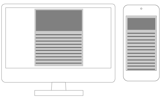
A single column layout
单列布局
To ensure your email resizes correctly, you have only to adjust table width:
为确保正确调整电子邮件大小,您只需要调整表格宽度即可:
<table cellspacing="0" cellpadding="0" border="0" width="600">
	<!-- email content -->
</table>
@media screen and (max-width:480px) {
table {
width: 100%!important;
}
}You will need to resize images too (see the About images paragraph at the end of this article) and to adjust your font-size also, but there aren’t any other particular needs.
您还需要调整图像的大小(请参阅本文结尾处的“ 关于图像”段落),并调整font-size ,但是没有其他特殊需要。
多列布局 (Multicolumn layout)
Multicolumn layouts require your columns to be rearranged as device width decreases. It makes no difference whether you’re working with two columns, three or more: you will need to display them vertically instead than horizontally.
多列布局要求您的列随着设备宽度的减小而重新排列。 无论您使用的是两列,三列还是更多列,都没有什么区别: 您将需要垂直显示它们而不是水平显示它们 。
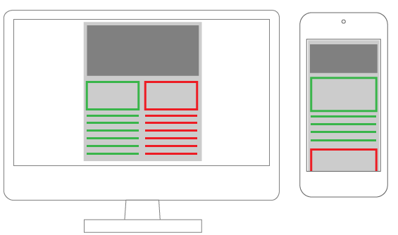
There are two easy ways to accomplish this:
有两种简单的方法可以完成此操作:
- Using nested tables 使用嵌套表
Changing table cells
displayproperty.更改表格单元格的
display属性。
嵌套表格布局 (Nested tables layout)
Email composition often requires you to use nested tables. This has always been considered the best way to ensure client compatibility, but on the other hand the resulting code is very dirty and practically illegible.
电子邮件撰写通常需要您使用嵌套表。 一直以来,这一直被认为是确保客户端兼容性的最佳方法,但是另一方面,生成的代码非常脏,几乎难以辨认。
The trick is the use of the table align="left" attribute that causes tables to align horizontally.
诀窍是使用表align="left"属性,该属性使表水平对齐。
Every element must have a specific width and their total must have the same value as their container.
每个元素必须具有特定的宽度,其总和必须与容器的值相同。
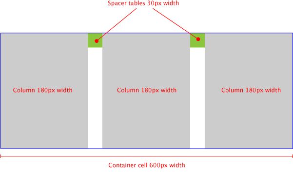
When the device width decreases, we have to resize the container and force all the tables-columns to 100% width.
当设备宽度减小时,我们必须调整容器的大小,并将所有表列强制设置为100%宽度。
table[class="body_table"] {
	width: 600px;
}

table[class="column_table"] {
	width: 180px;
}

table[class="spacer_table"] {
	width: 30px;
	height:30px;
}

@media only screen and (max-width: 480px) {
	table[class="body_table"] {
		width: 420px!important;
	}
	table[class="column_table"] {
		width: 100%!important;
	}
}
This technique ensures compatibility with the majority of clients: I’ve tested the demo file in Litmus and I had good results for all clients, allowing the following caveat:
这项技术可确保与大多数客户端的兼容性:我已经在Litmus中测试了演示文件,并且对所有客户端都取得了不错的效果,请注意以下几点:
Outlook 2007, 2010 and 2013 (these versions of Outlook use Microsoft Word as rendering engine: see A Guide to Rendering Differences in Microsoft Outlook Clients on Litmus blog);
Outlook 2007、2010和2013(这些版本的Outlook使用Microsoft Word作为渲染引擎:请参阅Litmus博客上的Microsoft Outlook Client中的渲染差异指南 );
Oldest versions of Lotus Notes;
Lotus Notes的最旧版本;
Gmail Android App.
Gmail Android应用程序 。
This is a good start point (see below for a partial result of the test), and we must also consider that this test has been built with empty tables: adding content (and more nested tables!!) you should be able to fix all bugs and make this technique working properly with all clients.
这是一个很好的起点(有关测试的部分结果,请参见下文), 我们还必须考虑到此测试是使用空表构建的 :添加内容(以及更多嵌套表!),您应该可以修复所有问题。错误,并使该技术适用于所有客户端。
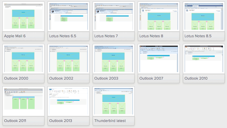
Part of the compatibility test made with Litmus
用石蕊进行的兼容性测试的一部分
I’ve made a codepen with the code I used (note that the CSS is not inlined in this pen, so you’ll need run a CSS inliner before using it for production email).
我做了一个codepen与我使用的代码(注意,CSS未在此笔内联,所以你需要用它来制作电子邮件之前运行CSS衬里)。
有关代码编辑器的说明: (A note about the code editors:)
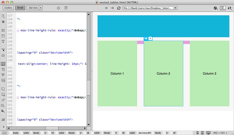
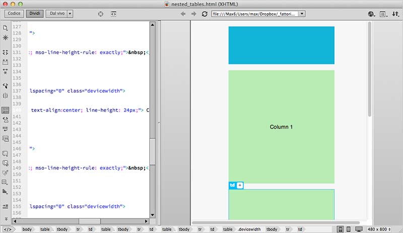
Although I currently use Coda or Brackets for coding, in these cases I really appreciate visual editors, such as Dreamweaver. It makes it very easy to navigate within nested tables and edit HTML and CSS.
尽管我目前使用Coda或Brackets进行编码,但是在这些情况下,我还是非常喜欢可视化编辑器,例如Dreamweaver 。 它使在嵌套表中导航以及编辑HTML和CSS变得非常容易。
In the screenshots below you can see the email layout in Dreamweaver in desktop and phone views.
在下面的屏幕截图中,您可以在桌面视图和电话视图中查看Dreamweaver中的电子邮件布局。
更改表格单元格的display属性 (Changing table cells display property)
The second way to built multi-columns email, is more elegant and uses native CSS rules.
构建多列电子邮件的第二种方法更优雅,并使用本机CSS规则。
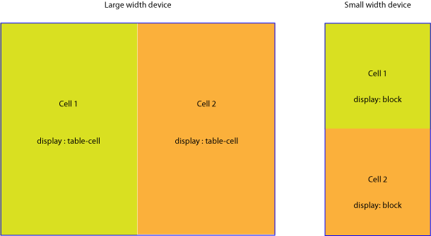
This technique consists in changing the default table cells display property when device width decreases (you can find many examples at responsiveemailpatterns.com). This causes the cells to re-stack vertically:
该技术包括在设备宽度减小时更改默认的表格单元格display属性(您可以在响应 emailpatterns.com上找到许多示例)。 这导致细胞垂直重新堆叠:
Changing display scheme
更改显示方案
table[class="body_table"] {
	width: 600px;
}
table td[class="column"] {
    height:100px;
    width:200px;
}

@media only screen and (max-width: 480px) {
	table[class="body_table"] {
		width: 440px!important;
	}

	table td[class="column"] {
        width:100%!important;
        display: block!important;
    }
}
The results of this test are excellent: all clients rendered properly test email (sometimes with minor bugs), anyway remember that we have tried an empty mail, and the results may be different adding content.
该测试的结果非常好:所有客户端都正确渲染了电子邮件(有时有一些小错误),无论如何,请记住我们尝试了一封空邮件,添加内容的结果可能有所不同。
Here is the codepen for you to pick through.
这是供您阅读的Codepen 。
关于图像 (About images)
In responsive emails, images don’t requires anything more than the classic responsive technique (img {max-width: 100%;}) we currently use in the web.
在响应式电子邮件中,图像只需要我们当前在网络上使用的经典响应式技术( img {max-width: 100%;} )即可。
Anyway, as suggested in Campaign Monitor Responsive Email Design Guide, using media queries, you can hide an image and show another one as a background image instead.
无论如何,如《 Campaign Monitor响应式电子邮件设计指南》中所建议的那样,使用媒体查询,您可以隐藏图像并显示另一幅图像作为背景图像。
@media only screen and (max-device-width: 480px) {
    img.original_img {
        display: none;
    }
    .substitute_image {
        background-image: url(background_image.png);
        width: 440px !important;
        height: 240px !important
    }
}
Keep in mind that even images hidden via CSS are loaded into the client, so be careful about this.
请记住,即使通过CSS隐藏的图像也已加载到客户端,因此请注意这一点。
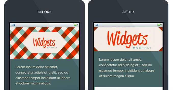
A good option can be to use the same image both for the img tag and the background-image source. You have to prepare a multipurpose image that can be used for all that scopes, just like the example below:
一个不错的选择是为img标签和background-image源使用相同的图像。 您必须准备一个可用于所有范围的多用途图像,如以下示例所示:
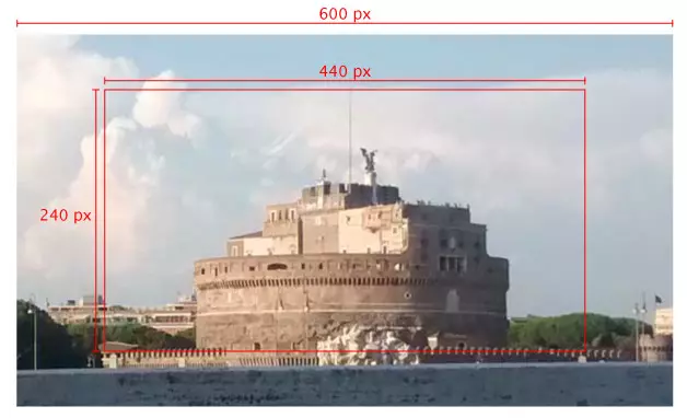
Choosing the right image, you can use it for many media queries breakpoints. After have prepared it, you have only to add a handful of CSS rules:
选择正确的图像,可以将其用于许多媒体查询断点。 准备好之后,您只需添加一些CSS规则:
@media only screen and (max-device-width: 480px) {
    img.original_img {
        display: none;
    }
    .substitute_image {
        background-image: url(original_image_source.jpg);
        background-position: center center;
        background-repeat: no-repeat;
      width: 440px !important;
      height: 120px !important
    }
}
You can also add a background-size property to adjust each breakpoint view (paying attention to clients support for this rule).
您还可以添加一个background-size属性来调整每个断点视图(注意客户端对此规则的支持 )。
Unfortunately, this is unlikely to solve all your needs for high density devices – however it can reduce the number of files loaded for all other cases.
不幸的是,这不可能满足您对高密度设备的所有需求-但是,它可以减少在所有其他情况下加载的文件数量。
结论 (Conclusions)
So, is there a single, all-conquering, best-ever technique for responsive email authoring?
因此,是否有一种单一的,无所不能的,有史以来最佳的响应式电子邮件创作技术?
As is usually the case, there isn’t. Every project needs a different approach and has a different best solution. The real answer is to have a useful selection of techniques to choose from at your fingertips, and always experiment with new ways.
通常情况下,没有。 每个项目都需要不同的方法并具有不同的最佳解决方案 。 真正的答案是,有多种有用的技术可供选择,并随时尝试新方法。
资源资源 (Resources)
https://litmus.com/blog/the-how-to-guide-to-responsive-email-design-infographic
https://litmus.com/blog/the-how-to-guide-to-sensitive-email-design-infographic
https://litmus.com/blog/responsive-scalable-email-design-whats-the-difference
https://litmus.com/blog/sensitive-scalable-email-design-whats-the-difference
翻译自: https://www.sitepoint.com/tricks-building-responsive-email/


 263
263


 被折叠的 条评论
为什么被折叠?


