


手机网页合适尺寸
With responsive practically becoming the standard, it’s harder than ever to define the best size for a website. Before responsive became mainstream, we used to base our design width on which screen sizes were popular at the moment.
随着响应式服务实际上已成为标准,为网站定义最佳尺寸变得前所未有的困难。 在响应成为主流之前,我们曾经根据当前屏幕尺寸流行的设计宽度为基础。
This way you knew that at least way a large portion of your sites’ visitors would see the site as you intended. But as screens became bigger, so did our websites. Only to be followed by smaller screen sizes, due to smaller laptops becoming popular.
这样,您就知道至少大部分站点的访问者会以您期望的方式看到该站点。 但是随着屏幕变大,我们的网站也越来越大。 由于较小的笔记本电脑开始流行,因此只能使用较小的屏幕尺寸。
Luckily responsive sites solve a lot of this bouncing up and down so you can make you website look good on most screens. But it still doesn’t answer the question of what is the best size for a website. Time to do some research.
幸运的是,响应Swift的网站可以解决很多这种上下反弹的问题,因此您可以使您的网站在大多数屏幕上看起来都不错。 但是,它仍然无法回答关于什么是网站的最佳尺寸的问题。 该做些研究了。
屏幕尺寸历史记录 (A little bit of screen size history)
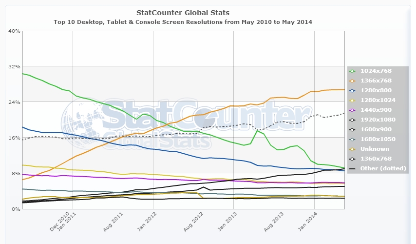
Let’s first look at some of the most popular screen sizes over the years. According to the data Statcounter (a popular free visitor counter) provides, 1024×768 was the most popular size up until March 2012. That month it was surpassed by 1366×768, which is still the most popular today.
首先让我们看一下这些年来最流行的屏幕尺寸。 根据Statcounter(一个受欢迎的免费访客计数器)提供的数据,截至2012年3月,1024×768是最受欢迎的尺寸。当月它超过了1366×768,今天仍然是最受欢迎的尺寸。
The difference between these two sizes? 1366×768 is widescreen with a 16:9 ratio, where 1024×768 has the more traditional 4:3 ratio. This shift marks the change from regular desktop monitors to the still very popular widescreen laptops.
这两种尺寸之间的区别? 1366×768的宽屏比例为16:9,其中1024×768的传统比例为4:3。 这一转变标志着从常规台式机显示器到仍然非常流行的宽屏笔记本电脑的转变。
The 1366×768 size is just for display screens ranging from 10.1 to 16 inch, but you can imagine it won’t look that pretty on the latter.
1366×768的尺寸仅适用于从10.1到16英寸的显示屏,但是您可以想象在后者上看起来并不那么漂亮。
So it’s safe to say that if you decide to use a static size, 1366×768 is your safest bet. That is if you cater a general audience.
因此可以肯定地说,如果您决定使用静态尺寸,则最安全的选择是1366×768。 那是如果您迎合一般观众。
1920×1080 (Full HD screens) is on the rise too, especially with a tech oriented audience. This means these people will see your 1366×768 site with large empty spaces left and right.
1920×1080(全高清屏幕)也在不断增长,尤其是面向技术的观众。 这意味着这些人将看到您的1366×768站点,左右两侧都有较大的空白空间。
And did you see the large “Other” line in the StatCounter screenshot? There’s just a whole range of different screen sizes to design for which don’t fall in the listed size categories. That’s where responsive comes into play.
您是否在StatCounter屏幕截图中看到大的“其他”行? 只能设计各种不同的屏幕尺寸,而这些尺寸不属于所列的尺寸类别。 这就是响应式发挥作用的地方。
响应如何? (How about responsive?)
Making a site responsive is more popular than ever. It allows for one design which is displayed full width on any screen size. Adapting a websites’ view size is regulated with CSS and is based on the viewport of the device a visitor is using. The viewport is the visible part of your website, without scroll bars.
使网站具有响应能力比以往任何时候都更受欢迎。 它允许一种设计,可以在任何屏幕尺寸上全屏显示。 网站的视图大小调整是通过CSS进行的,并且基于访问者正在使用的设备的视口。 视口是网站的可见部分,没有滚动条。
Annarita wrote an excellent article about the concepts of responsive design here on SitePoint.com. You can read it here.
Annarita在SitePoint.com上撰写了一篇有关响应式设计概念的出色文章。 您可以在这里阅读。
A general assumption is that you can use a responsive design to make a website look good on any type of device. That is not entirely true. A responsive design makes sure that the maximum view space of each device is used when viewing your site. It basically means no horizontal scroll bars. But that doesn’t mean it will actually look good.
通常的假设是,您可以使用自适应设计来使网站在任何类型的设备上看起来都不错。 这不是完全正确的。 快速响应的设计可确保在查看站点时使用每个设备的最大查看空间。 它基本上意味着没有水平滚动条。 但这并不意味着它实际上看起来会很好。
To see a live example, please have a look at one of my sites which uses responsive design. It uses a full page background image which I believe looks great on a Full HD monitor (which I’m using myself). The sidebars are still on default settings.
要查看实时示例,请查看我的其中一个使用响应式设计的网站 。 它使用了整页的背景图像,我相信在全高清显示器(我正在使用自己的显示器)上看起来很棒。 侧栏仍处于默认设置。
The WordPress theme I use is optimized for responsive, which means, for example, even the call-to-action “Apply” boxes scale down.
我使用的WordPress主题已针对响应进行了优化,这意味着,例如,号召性用语“应用”框也会缩小。
Now re-size your browser, and see what happens. The sidebars are moved below the main content, therefore losing their use as sidebars. They become just a bunch of boxes for which no one will take the effort to scroll down to see them. Imagine if you HAD ads put in there: this will severely reduce your earnings. It looks even worse on mobile, toO crammed up which makes your small mobile screen feel even smaller.
现在调整浏览器的大小,然后看看会发生什么。 侧栏被移动到主要内容的下方,因此失去了它们作为侧栏的使用。 它们只是一堆盒子,没有人会费力向下滚动才能看到它们。 想象一下,如果您在这里投放了HAD广告:这将严重降低您的收入。 在手机上看起来甚至更糟,而且太挤塞了,这使您的小手机屏幕显得更小。
While I don’t like the sidebars below the content, I wouldn’t want them placed in between content either. I may be a bit biased since I really don’t like responsive (I decide to buy a larger phone and use desktop sizes instead), but you have to be really creative if you want to make proper use of sidebars.
尽管我不喜欢内容下方的侧边栏,但我也不希望它们放在内容之间。 我可能确实有点偏见,因为我真的不喜欢响应式(我决定购买更大的手机,改用台式机尺寸),但是如果要适当使用侧边栏,则必须很有创造力。
You basically have to accept the fact that you need to include your most important links and ads in-content or they probably won’t get seen. But you need to be very sure this design still looks good on desktop or tablets (for which you should disable responsive), since it’s bound to mess up your layout if you don’t keep an eye on it.
您基本上必须接受一个事实,即您需要在内容中包含最重要的链接和广告,否则它们可能不会被看到。 但是,您需要确保此设计在台式机或平板电脑上仍然看起来不错(应该禁用其响应),因为如果您不注意它,势必会弄乱您的布局。
Responsive design works better for layouts which don’t include sidebars in the first place. But there’s only so much room on smaller screens, so even with an optimized mobile layout you need to decide which content you want to show the most.
响应式设计对于不首先包含侧边栏的布局效果更好。 但是,在较小的屏幕上只有这么大的空间,因此,即使采用了优化的移动版式,您也需要决定要展示的内容最多。
So is responsive the best “size” for a website? Probably yes, but life was much easier when we were all just using the same screens.
那么响应式网站的最佳“大小”是否合适? 可能是的,但是当我们都使用相同的屏幕时,生活要容易得多。
Let me know in the comments what you think is the best size for a website, or what your thoughts are on responsive design in general.
在评论中让我知道您认为最适合网站的大小,或者您对响应式设计的总体想法是什么。
手机网页合适尺寸


 7063
7063

 被折叠的 条评论
为什么被折叠?
被折叠的 条评论
为什么被折叠?
 到【灌水乐园】发言


