


If you’d like to learn more about custom theme development, check out the SitePoint Premium course WordPress Theme Development!
如果您想了解有关自定义主题开发的更多信息,请查看SitePoint Premium课程WordPress主题开发 !
As you may have noticed, SitePoint now offers our own range of premium WordPress Themes. Our newest and – we think – most attractive theme is called ‘Portfolio’. We worked closely with a very talented designer – Shahadat from DroitLab – to try to create the ideal platform for designers, writers, artists, and even front-end coders to showcase their talents. The brief was ‘crisp, open and minimalist’.
您可能已经注意到,SitePoint现在提供了我们自己的一系列高级WordPress主题。 我们最新(也是我们认为 )最有吸引力的主题称为“ 投资组合 ”。 我们与非常有才华的设计师DroitLab的 Shahadat紧密合作,试图为设计师,作家,艺术家,甚至前端编码人员创建理想的平台来展示自己的才华。 简报是“酥脆,开放和简约”。
I thought it might be useful to break down the key design decisions that drove it.
我认为分解推动它的关键设计决策可能很有用。
1)。 选择字体:Raleway和Open Sans Regular (1). Choosing the Typography: Raleway and Open Sans Regular)
Typography choices are always loaded. Arguably no other design decision will be so totally pervasive to the feel of a design, yet also strangely invisible to the user. The may read thousands of words a day on Facebook, yet ask the average user to describe the font used, and they’ll most likely blink and shrug.
版式选项始终会加载。 可以说,没有其他设计决策会完全渗透到设计的感觉中,但是对于用户来说却是奇怪的。 他们可能每天在Facebook上读成千上万个单词,但要求普通用户描述所使用的字体,他们很可能眨眼而耸耸肩。
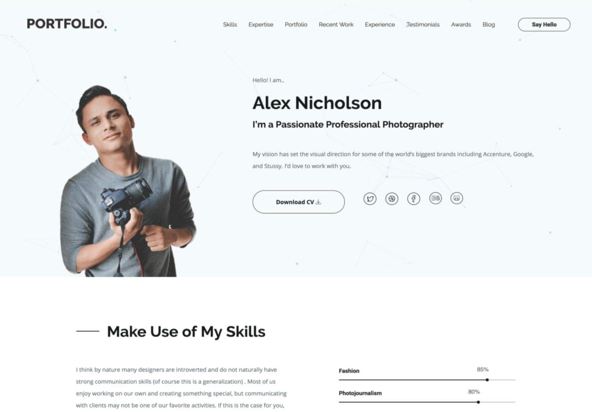
SitePoint WordPress Portfolio Theme screenshot
SitePoint WordPress投资组合主题屏幕截图
For the headings in Portfolio, we picked perhaps my favorite sans-serif font available in the Google catalog – Raleway, Matt McInerney’s profoundly elegant creation.
对于Portfolio中的标题,我们可能选择了我最喜欢的sans-serif字体,该字体可在Google目录中找到-Raleway,这是Matt McInerney极为优雅的创作 。
Why do I like it so much? Check out that ‘W’!
我为什么这么喜欢它? 看看“ W”!
Raleway has the look of flexed and machined steel – the kind of lettering you see on 1930-40’s era post offices, schools, and public buildings. It’s always razor sharp but not aggressive.
Raleway具有柔韧性和机械加工的钢材外观-在1930-40年代的邮局,学校和公共建筑中都可以看到这种字体。 它总是非常锋利,但没有侵略性。
Open Sans Regular was a nice match for the body type. It’s more versatile than Raleway but shares a lot of neo-grotesque qualities – minus some of the distinctive mid-century flourishes (like the ‘w’). They share space on the same page together easily.
Open Sans Regular适合身体类型。 它比Raleway更具通用性,但是具有许多新奇特的特质-减去了本世纪中叶的一些独特特色(例如“ w”)。 他们可以轻松地在同一页面上共享空间。
2)。 选择影像 (2). Selecting Imagery)
Our typography pointed the direction towards the iconography we selected. Both Raleway and Open Sans Regular use a light, single weight line – almost like they’re crafted from fencing wire.
我们的字体设计为我们选择的肖像画指明了方向。 Raleway和Open Sans Regular均使用轻质单重线-几乎就像它们是由围栏线制成的。
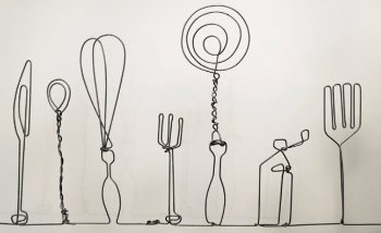
Handmade wireframe imagery – Madebyjoel.com
手工线框图像– Madebyjoel.com
I’ve seen real-world fencing wire sculptures – this raw piece from MadeByJoel.com is brilliant – so we wanted to continue the ‘wirework look’ for the icons, assembling a combination of linear icons – about 50 all up. As no single icon set had what we wanted, we curated a new icon library from a number of sources including:
我看过现实世界中的击剑线雕塑– MadeByJoel.com的原始作品非常出色–因此,我们希望继续对图标进行“有线外观”,将线性图标组合在一起-总共约50个。 由于没有一个单一的图标集可以满足我们的需求,因此我们从多个来源策划了一个新的图标库,其中包括:
- Custom hand-drawn icons 自定义手绘图标
They’re all in crisp SVG, so they work fine at almost any scale from icon to feature illustration.
它们全部使用清晰的SVG,因此从图标到功能图,几乎可以在任何比例下正常工作。
3)。 画廊视图 (3). The Gallery View)
Showing off your work to its best effect is always going to be super important in a portfolio site. We focused the gallery on showcasing collections of visuals in a square-tiled gallery layout before opening each unit into a magazine-like modal. You can filter your images by category or browse them all as an open collection.
在作品集网站中,始终以最佳的效果来展示您的作品总是非常重要的。 在将每个单元打开为类似杂志的模版之前,我们将画廊集中在以正方形平铺的画廊布局展示视觉效果集合上。 您可以按类别过滤图像,也可以将所有图像作为打开的集合进行浏览。

4)。 粒子几何效果 (4). Particle Geometry Effects)
While we wanted the hero area to remain open and uncluttered, we thought a subtle touch of the unexpected wouldn’t be out of place in such an important panel. The particle effect we implemented here fits the bill nicely. It’s calming yet charming.
虽然我们希望英雄区域保持开放和整洁,但我们认为在如此重要的面板中,对意外内容的微妙触感不会错位。 我们在此处实现的粒子效果非常合适。 平静而迷人。
The floating nodes and linking vectors hint at the theme of idea generation and connections – a relevant skill for designers, writers, and coders. It adds texture and depth to design but doesn’t demand your attention over more important page elements – in this case, you. And that’s a good thing.
浮动节点和链接向量暗示了思想产生和联系的主题–这是设计师,作家和编码人员的一项相关技能。 它增加了质感和深度的设计,但不要求你注意在更重要的页面元素-在这种情况下,你。 那是一件好事。
The particle effect is rendered in lightweight JavaScript and canvas making it fast to load and run, and scalable to any space. We’re looking at methods that will allow you to craft your own signature particle effect.
粒子效果在轻量级JavaScript和canvas中呈现,使其可以快速加载和运行,并可以扩展到任何空间。 我们正在寻找可让您制作自己的签名粒子效果的方法。
总结 (The Wrap Up)
So, that’s a snapshot of the design thinking behind this project. I think Portfolio is our best work so far, and I’m looking forward to working with Shahadat again soon.
因此,这是该项目背后的设计思想的快照。 我认为到目前为止, Portfolio是我们迄今为止最好的工作,我期待很快与Shahadat再次合作。
Check it out and let us know what you think.
检查一下,让我们知道您的想法。
翻译自: https://www.sitepoint.com/introducing-portfolio-wordpress-theme-and-the-design-decisions-behind-it/


 1万+
1万+

 被折叠的 条评论
为什么被折叠?
被折叠的 条评论
为什么被折叠?
 到【灌水乐园】发言


