


tumblr
In this tutorial we’re going to retrofit a grid-based design to a layout inspired by the What’re you into? Tumblr page, where the user was able to select a set of topics to tailor their recommended content.
在本教程中,我们将基于您所从事的工作的启发,将基于网格的设计改型为布局。 Tumblr页面,用户可以在其中选择一组主题以定制其推荐内容。
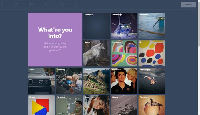
Only the visual design of the grid is executed, not the selection functionality, as shown in the Pen we’ll be building:
仅执行网格的视觉设计,而不执行选择功能,如我们将要构建的笔所示:
See the Pen MBdNav by SitePoint (@SitePoint) on CodePen.
见笔MBdNav由SitePoint( @SitePoint上) CodePen 。
The main goal is to implement the design with CSS Grid, but a fallback layout with floats is outlined in the Support section below.
主要目标是使用CSS Grid实现设计,但是下面的“ 支持”部分概述了带有浮点的后备布局。
标记 (Markup)
Essentially, the page content consists of a list of cards:
本质上,页面内容包含卡片列表:
<ul class="grid">
  <li class="card header">
    <h1>Which foods do you like?</h1>
    <p>Tell us what you crave for and we'll get you the tasty bits</p>
  </li>
  <li class="card">
    <a href="...">
      <h2>Pizza</h2>
      <img src="..." alt="A salami pizza">
    </a>
  </li>
  <!-- ... -->
</ul>
A card that represents a topic proposed to the user (food in our example) has a title and an illustrative image, both wrapped in a link element. Others could be adopted; see for instance the excellent article on the card component on Inclusive Components, where the pros and cons of such alternatives are analyzed.
代表向用户提出的主题的卡片(在我们的示例中为食物)具有标题和说明性图像,两者都包装在link元素中。 其他可以被采纳; 例如,请参阅“ 包容性组件 ”中有关卡组件的出色文章 ,其中将分析此类替代方案的优缺点。
结构布局 (Structural Layout)
In this section, the foundations of the grid design will be implemented. The next section will style the cards. This Pen shows the bare-bones layout using placeholders for grid items. Run it on a browser that supports CSS Grid.
在本节中,将实现网格设计的基础。 下一节将对卡片进行样式设置。 该笔显示使用网格项目占位符的准系统布局。 在支持CSS Grid的浏览器上运行它。
See the Pen JBqgGm by SitePoint (@SitePoint) on CodePen.
请参阅CodePen上的SitePoint( @SitePoint )的Pen JBqgGm 。
Before going ahead with the code, it’s important to specify the features and the responsive behavior of the grid. Let’s try to write down some properties it must satisfy.
在继续编写代码之前,重要的是指定网格的功能和响应行为。 让我们尝试写下一些必须满足的属性。
设计规格 (Design Specs)
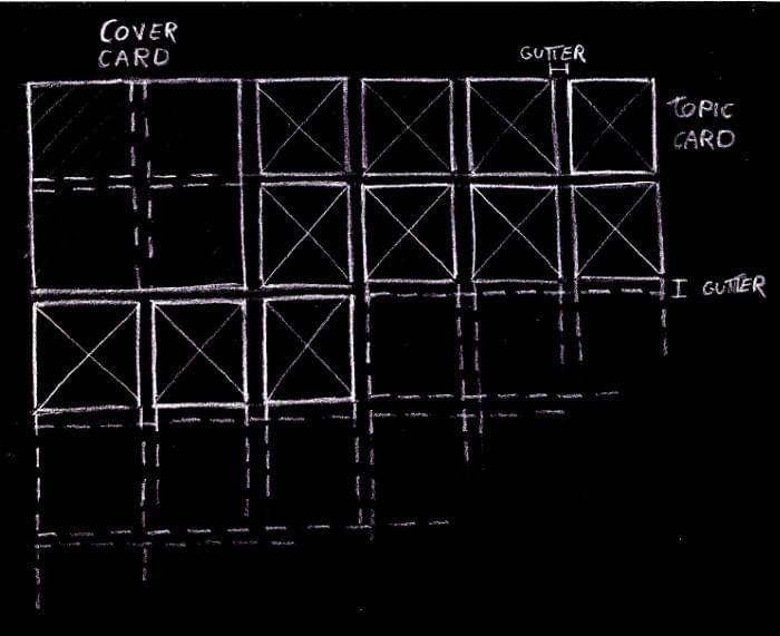
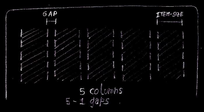
Two kinds of cards are featured in the design: a series of topic cards, and an introductory cover card. We arrange them on an underlying grid composed of square cells of fixed size. Each topic card occupies just one of these cells, while the cover spans a larger area of adjacent cells, whose extent depends on the viewport width. Furthermore, rows and columns are separated by the same fixed-size gutter.
设计中有两种卡片:一系列主题卡片和介绍性封面卡片。 我们将它们排列在由固定大小的方形单元格组成的基础网格上。 每个主题卡仅占据这些单元格之一,而封面则覆盖相邻单元格的较大区域,其范围取决于视口宽度。 此外,行和列由相同的固定大小的装订线分隔。
The grid has as many (fixed-sized) columns as they fit into the viewport:
网格具有适合视口的尽可能多(固定大小)的列:
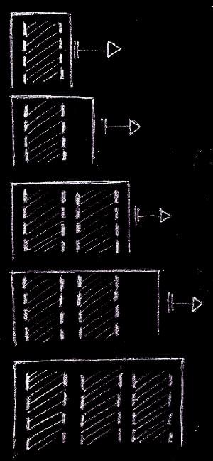
But we don’t want a zillion columns on large screens, so let’s limit the maximum number of columns:
但是我们不希望大屏幕上有不计其数的列,因此让我们限制最大列数:
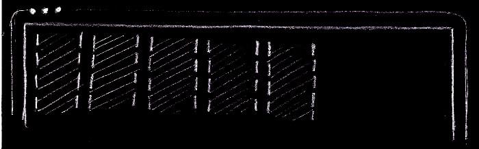
The columns are always horizontally centered in the viewport:
列始终在视口中水平居中:
Only the columns are centered, not the grid items. This means that the cards on an incomplete row are aligned to the left of the grid, not at the center of the viewport:
只有列居中,而不是网格项居中。 这意味着未完成的行上的卡片对齐到网格的左侧,而不是视口的中心:
Check out these requirements in the above Pen. Also, it’s useful to inspect the layout with the CSS Grid tools provided by some browsers, such as the Firefox’s Grid Inspector.
在上述Pen中检查这些要求。 此外,使用某些浏览器(例如Firefox的Grid Inspector)提供CSS Grid工具检查布局也很有用。
Keeping in mind this checklist, we can fire up our favorite development environment and start coding.
牢记此清单,我们可以启动我们喜欢的开发环境并开始编码。
实作 (Implementation)
Let’s introduce a couple of Sass global variables to represent the layout parameters defined in the specs, namely:
让我们介绍几个Sass全局变量来表示规范中定义的布局参数,即:
$item-sizefor the size of the side of the grid cells$item-size表示网格单元侧面的大小$col-gutterfor the gutter between the tracks of the grid$col-gutter用于网格轨道之间的排水沟$vp-gutterfor a safety space to leave between the grid items and the viewport edges$vp-gutter用于在网格项和视口边缘之间保留安全空间$max-colsfor the maximum number of columns the grid can have$max-cols表示网格可以具有的最大列数
We could use CSS custom properties for these variables, avoiding the need of a preprocessor and allowing us to edit them with the in-browser development tools and watch the changes happen instantly. But we’re going to use these values even for a fallback layout suitable for older browsers, where CSS variables aren’t supported. Moreover, we use expressions with these values even in media query selectors, where custom properties and the calc() function aren’t fully available even on recent browsers:
我们可以对这些变量使用CSS自定义属性,从而避免了预处理器的需要,并允许我们使用浏览器内开发工具对其进行编辑并观察更改的即时发生。 但是,即使对于不支持CSS变量的旧版浏览器,我们也将使用这些值作为后备布局。 而且,即使在媒体查询选择器中,我们也使用具有这些值的表达式,其中自定义属性和calc()函数甚至在最近的浏览器中也不完全可用:
$item-size: 210px;
$col-gutter: 10px;
$vp-gutter: $col-gutter;
$max-cols: 5;
We must establish a grid formatting context on the grid element:
我们必须在grid元素上建立一个网格格式化上下文:
.grid {
  display: grid;
}
The grid-gap property separates the grid tracks by the specified amount of space. But these gutters are only inserted between the tracks and not before the first track and after the last one. A horizontal padding on the grid container prevents the columns from touching the viewport edges:
grid-gap属性将网格轨迹分隔为指定的空间量。 但是这些装订线仅插入轨道之间,而不插入第一个轨道之前和最后一个轨道之后。 网格容器上的水平填充可防止列接触视口边缘:
.grid {
  grid-gap: $col-gutter;
  padding: 0 $vp-gutter;
}
The columns of the grid can be defined with the grid-template-columns property and the repeat function with the auto-fill value as the repetition number and the $item-size variable for the track list argument:
可以使用grid-template-columns属性定义grid-template-columns并使用auto-fill值作为重复数和track list参数的$item-size变量定义repeat函数:
.grid {
  grid-template-columns: repeat(auto-fill, $item-size);
}
This tells the browser to fill the grid container (the .grid element) width with as many fixed-size columns as possible, keeping account of the vertical gutters.
这告诉浏览器使用尽可能多的固定大小的列填充网格容器( .grid元素)的宽度,同时要考虑到垂直装订线。
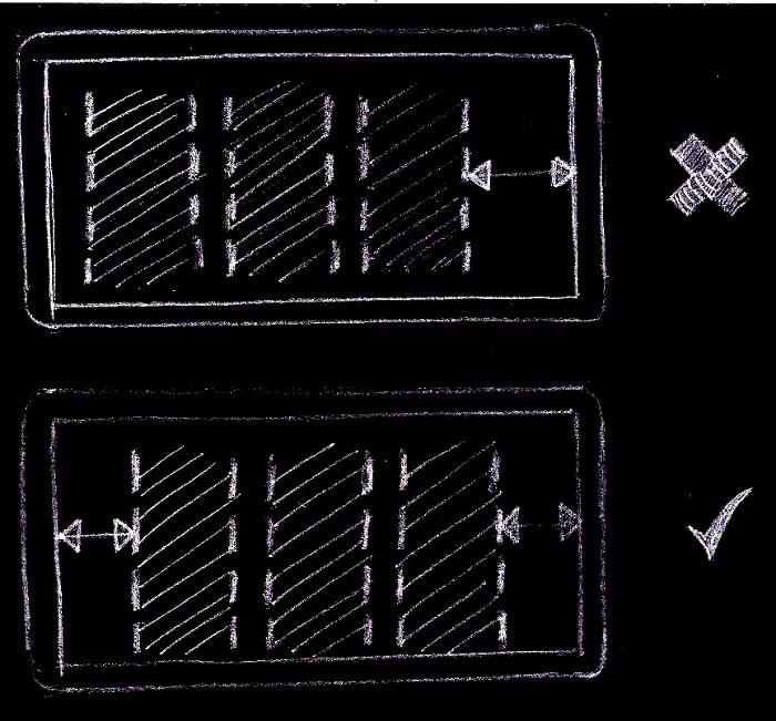
It’s worth pointing out that we could have used the auto-fit mode, and in many combinations of viewport sizes and number of grid items we could not tell the difference with auto-fill. But when there are only a few items in the grid, with just an incomplete row, with auto-fit the items would be centered, instead of starting from the left of the grid, as detailed in the design specs. This happens because, while with auto-fill the grid has always as many columns as possible, with auto-fit empty columns are removed, and the centering of the remaining columns places the items at the center of the viewport:
值得指出的是,我们可以使用auto-fit模式,并且在视口大小和网格项数量的许多组合中,我们无法分辨auto-fill的区别。 但是,当网格中只有很少的项目时,只有不完整的行,并且具有auto-fit这些项目将居中放置,而不是从网格的左侧开始,如设计规范中所述。 发生这种情况的原因是,在使用auto-fill ,网格始终具有尽可能多的列,而在使用auto-fit空列将被删除,而其余列的居中会将项目放置在视口的中心:
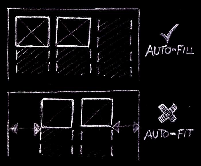
If the first row of the grid is complete, no columns are removed and there’s no difference between the two modes:
如果网格的第一行完成,则不会删除任何列,并且两种模式之间没有区别:
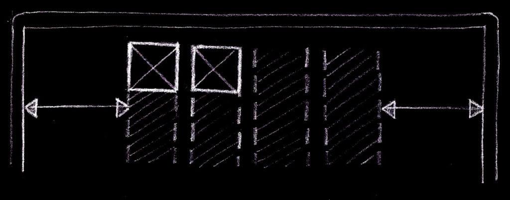
Back to the grid columns. Up to this point, the number of columns had no limit. It can arbitrarily grow as the viewport width increases. But according to the spec, the grid must have a maximum number of columns. It’s possible to fix this with the max-width property:
回到网格列。 到目前为止,列数没有限制。 它可以随视口宽度的增加而任意增加。 但是根据规范,网格必须具有最大的列数。 可以使用max-width属性修复此问题:
.grid {
  max-width: grid-width($max-cols);
}
grid-width is a custom Sass function that returns the width of a grid with n columns:
grid-width是一个自定义的Sass函数,它返回n列的网格的宽度:
@function grid-width($num-cols) {
  @return $num-cols * $item-size + ($num-cols - 1) * $col-gutter;
}
The first multiplication accounts for the size required by the columns, while the second one represents the space required by the gutters.
第一个乘法说明列所需的大小,而第二个乘法则表示装订线所需的空间。
According to the specs, the grid must be always horizontally centered. We can combine the old auto margins trick with justify-content to accomplish this task:
根据规格,网格必须始终水平居中。 我们可以结合使用旧的自动页边距技巧和justify-content来完成此任务:
.grid {
  justify-content: center;
  margin: 40px auto;
}
justify-content centers the columns when there’s available space left inside the grid container. This happens when the container bleeds from one viewport edge to the other. The lateral auto margins center the .grid container itself when it has reached its maximum width.
当网格容器内有可用空间时, justify-content将使列居中。 当容器从一个视口边缘流到另一视口边缘时,就会发生这种情况。 当.grid容器达到其最大宽度时,横向自动边距.grid其.grid 。
Now for the rows. They’re not explicitly specified, as done with the columns. Rather, they’re implicitly added by the browser as needed, and we just tell it their size with the grid-auto-rows property. Reusing the $item-size variable, each grid cell is shaped like a square, as per the specs:
现在为行。 没有像列那样明确指定它们。 相反,它们是根据需要由浏览器隐式添加的,我们只是通过grid-auto-rows属性告知它们的大小。 根据$item-size ,重新使用$item-size变量,每个网格单元的形状都像正方形:
.grid {
  grid-auto-rows: $item-size;
}
Let’s move on by sizing the cards. On small viewports, when the grid configures itself on a single column, the cover card spans only a grid cell, while when there are two or more columns, it must span a 4×4 grid area:
让我们继续调整卡片的大小。 在小型视口上,当网格在单列上进行配置时,封面卡仅跨越一个网格单元,而在有两列或更多列时,其覆盖范围必须为4×4网格区域:
@include when-n-cols(2) {
  .grid .header {
    grid-row: span 2;
    grid-column: span 2;
  }
}
when-n-cols() is a Sass mixin to express a media query suitable for a grid with the given number of columns:
when-n-cols()是Sass mixin,用于表示适用于具有给定列数的网格的媒体查询:
@mixin when-n-cols($n) {
  @media screen and (min-width: #{grid-width($n) + 2 * $vp-gutter + $scrollbar-size}) {
    @content;
  }
}
The CSS rules represented by @content are active whenever the viewport width is equal or greater than the width of a grid with $n columns plus the two safety spaces to separate the grid items from the viewport edges. $scrollbar-size is just an upper bound on the size of a vertical scrollbar, to account for the fact that the width reported in the media query is the entire viewport width, including an eventual vertical scrollbar.
每当视口宽度等于或大于具有$n列的网格的宽度加上两个用于将网格项与视口边缘分开的安全空间时,由@content表示CSS规则将处于活动状态。 $scrollbar-size只是垂直滚动条大小的上限,以说明以下事实:媒体查询中报告的宽度是整个视口宽度,包括最终的垂直滚动条。
Regarding the topic cards, there’s nothing to do, because the default Grid behavior makes them the same size as their assigned grid cells.
关于主题卡,无需执行任何操作,因为默认的“网格”行为使它们的大小与其分配的网格单元相同。
Okay, we got it! Refer to the structural Pen at the beginning of this section to see all these code snippets put together in the complete code.
好,知道了! 请参阅本节开头的结构笔,以查看完整的代码中所有这些代码片段。
卡 (The Cards)
Here we build the cards — or their inner content, to be more precise.
在这里,我们将制作卡片-或更准确地说,是卡片的内部内容。
Let’s address the topic cards first. To make them clickable, the link element is expanded to fill the entire card area:
让我们首先讨论主题卡片。 为了使它们可单击,将扩展链接元素以填充整个卡区域:
.grid .card a {
  display: block;
  width: 100%;
  height: 100%;

  position: relative;
}
Then we make sure the card image covers all the card surface:
然后,我们确保卡片图像覆盖了卡片的所有表面:
.grid .card img {
  display: block;
  width: 100%;
  height: 100%;
  object-fit: cover;
}
In the example, the thumbnails have a square aspect ratio, and therefore they scale nicely inside their grid items. To handle arbitrary image sizes, object-fit: cover scales (preserving the aspect ratio) and eventually clips the image to fit inside the container.
在此示例中,缩略图的纵横比为正方形,因此缩略图在其网格项内可以很好地缩放。 要处理任意图像尺寸,请使用object-fit: cover比例(保留宽高比),并最终裁剪图像以适合容器内部。
It’s the turn of the card title:
轮到卡片标题了:
.grid .card h2 {
  margin: 0;

  position: absolute;
  top: 0;
  left: 0;
  right: 0;
  bottom: 0;

  padding: 10px;

  text-decoration: none;
  font-family: Raleway, sans-serif;
  font-size: 1em;
  letter-spacing: 1px;

  color: #fff;
}
With the absolute positioning, the heading element is removed from the flow and positioned above the image, at the top left corner of the card.
通过绝对定位,可以将标题元素从流中移出并定位在图像的上方,位于卡的左上角。
In order to improve the contrast between the label and an arbitrary underlying card image, a partially transparent layer is sandwiched between these two graphic elements.
为了改善标签和任意基础卡片图像之间的对比度,在这两个图形元素之间夹有部分透明的层。
Here I’m using the same exact technique employed on the original Tumblr page, where this overlay consists in a radial gradient which starts completely transparent at the center of the card and ends with a partially opaque black towards the borders, in a circular fashion, giving the image a sort of subtle spotlight effect. Let’s render this layer as a background image of the card link, which it has just been extended to cover all the card surface:
在这里,我使用的是与原始Tumblr页面上使用的完全相同的技术,其中该叠加层包含一个径向渐变,该渐变从卡片的中心开始完全透明,并以圆形的方式向边界的边界部分变为不透明的黑色,使图像具有微妙的聚光效果。 让我们将此层渲染为卡片链接的背景图像,刚刚将其扩展为覆盖所有卡片表面:
.grid .card h2 {
  background-image: radial-gradient(ellipse at center, transparent 0, rgba(0,0,0, .36) 100%);
}
As for the cover card, plenty of techniques could be used here, but let’s keep it simple. The card features two centered blocks of text. With a side padding their horizontal extent is limited, and with text-align their content is centered. After that, the blocks are vertically centered just by pushing them down with a bit of top padding applied to the card container:
至于封面卡,这里可以使用很多技术,但让我们保持简单。 该卡具有两个居中的文本块。 使用侧面填充时,其水平范围受到限制,而使用text-align其内容将居中。 之后,只需将其向下推,并在卡容器上施加一些顶部填充,即可将这些块垂直居中:
.grid .header {
  box-sizing: border-box;

  text-align: center;
  padding-top: 23px;

  font-size: 1.6875em;
  line-height: 1.3;

  background: radial-gradient(ellipse at center, transparent 0, rgba(0,0,0, 0.48) 100%) hsla(0, 0%, 27%, 1);
}

.grid .header h1 {
  margin-top: 0;
  margin-bottom: 0.67em;

  font-family: 'Cherry Swash', cursive;
  text-transform: capitalize;
  font-size: 1em;
  font-weight: normal;

  padding-left: 28px;
  padding-right: 28px;
}

.grid .header p {
  margin: 0;

  font-family: 'Raleway', sans-serif;
  font-size: 0.52em;

  padding-left: 34px;
  padding-right: 34px;
}
With a media query, the font size is increased and the padding adjusted when the grid displays two or more columns:
使用媒体查询时,当网格显示两列或更多列时,将增加字体大小并调整填充:
@include when-n-cols(2) {
  .grid .header {
    font-size: 2.5em;

    padding-top: 100px;
  }

  .grid .header h1 {
    padding-left: 80px;
    padding-right: 80px;
  }

  .grid .header p {
    padding-left: 120px;
    padding-right: 120px;
  }
}
It’s time to add some interactivity to the topic cards. They must reduce the size on hover:
现在是时候为主题卡片添加一些交互性了。 它们必须减小悬停时的大小:
.grid .card:hover {
  transform: scale(0.95);
}

.grid .header:hover {
  transform: none;
}
With a CSS transition, this change of visual state is smoothed out:
通过CSS过渡,这种视觉状态的变化得以消除:
.grid .card {
  transition-property: transform;
  transition-duration: 0.3s;
}
The cards can be navigated with a keyboard, so why not customize their focus style to match the same look and feel of the mouse over? We must scale a .card container when the anchor link inside it receives the focus. Hmmm … we need to style an element only when one of its children gets the focus — and we have the :focus-within pseudo-class for doing just that:
这些卡可以使用键盘进行导航,那么为什么不自定义其焦点样式以匹配鼠标上方的相同外观呢? 当其中的锚点链接获得焦点时,我们必须缩放.card容器。 嗯……我们只需要在元素的一个子元素获得焦点时才对元素进行样式设置,并且我们就有:focus-within伪类来实现这一目的:
.grid .card a:focus {
  outline: none;
}
.grid .card:focus-within {
  transform: scale(0.95);
}
First the default link focus style is reset, and then the same transform as before is used when the card (its link) gets the focus.
首先重置默认的链接焦点样式,然后在卡(其链接)获得焦点时使用与以前相同的变换。
支持 (Support)
CSS网格 (CSS Grid)
Nowadays, CSS Grid has wide support, but what can we do with the other browsers? In the demo pen, there’s a fallback layout, implemented with floats, that behaves exactly as the Grid layout. Let’s have a quick look at how it works and interacts with the Grid implementation.
如今,CSS Grid具有广泛的支持 ,但是我们可以用其他浏览器做什么? 在演示笔中,有一个使用浮点数实现的后备布局,其行为与Grid布局完全相同。 让我们快速看一下它如何工作以及如何与Grid实现交互。
The cards are sized, floated to the left and have a bottom margin for the horizontal grid gutter:
卡的大小,向左浮动并为水平网格装订线的底部留有边距:
.card {
  float: left;
  width: $item-size;
  height: $item-size;
  margin: 0;
  margin-bottom: $col-gutter;
}
At this point, we could just set a max-width on the .grid container to limit the number of columns on a large screen, use auto margins to center the grid, and the layout would be almost the same as the Grid one, but with the important difference that, when the container doesn’t reach its maximum width, the cards are aligned to the left of the viewport. This is a fallback layout for browsers not supporting CSS Grid, so we could be happy with this. Otherwise, we could go on and add some more code to fix this difference. Let’s have a try.
此时,我们可以在.grid容器上设置max-width以限制大屏幕上的列数,使用自动边距将网格居中,并且布局将与Grid几乎相同,但是重要的区别在于,当容器未达到最大宽度时,卡片将对齐到视口的左侧。 这是不支持CSS Grid的浏览器的后备布局,因此我们对此感到满意。 否则,我们可以继续并添加更多代码来解决此问题。 让我们尝试一下。
We set the width of the .grid container when there’s only one column, center it into the viewport, and separate it from the screen edges:
当只有一列时,我们设置.grid容器的宽度,将其.grid放置在视口中,并将其与屏幕边缘分开:
.grid {
  width: grid-width(1);
  margin: 40px auto;
  padding-left: $vp-gutter;
  padding-right: $vp-gutter;
}
Note how we reused the grid-width Sass function introduced above.
请注意我们如何重用上面介绍的grid-width Sass函数。
Now, reusing the media query mixin, we define the width of the .grid container when there are two columns:
现在,重新使用媒体查询混合,当有两列时,我们定义.grid容器的宽度:
@include when-n-cols(2) {
  width: grid-width(2);
  .card:nth-child(2n) {
    margin-right: $col-gutter;
  }
  .header {
    $header-size: grid-width(2);
    width: $header-size;
    height: $header-size;
  }
}
We also doubled the size of the header card and assigned the right margin for the grid’s horizontal gutter.
我们还将标头卡的大小加倍,并为网格的水平装订线分配了右边距。
This pattern is repeated for a grid of two, three, … $max-cols columns, taking care of resetting and assigning the margin-rights of the proper cards. For instance, when the grid has three columns:
对两个,三个,… $max-cols列的网格重复此模式,注意重置并分配适当卡的margin-right s。 例如,当网格具有三列时:
@include when-n-cols(3) {
  width: grid-width(3);
  .card {
    margin-right: $col-gutter;
  }
  .card:nth-child(2),
  .card:nth-child(3),
  .card:nth-child(3n + 6) {
    margin-right: 0;
  }
}
Please refer to the pen for the rest of code.
请参阅笔以获取其余代码。
Now that we have two blocks of CSS that implement the same layout on the same page, we must be sure that they don’t conflict with each other. In particular, on a browsers that supports Grid, the float layout must not disturb the Grid layout. Thanks to CSS Grid’s inherent overriding capabilities, it’s sufficient to reset the grid container width, to set its max-width, and to reset the margins of the cards (grid-gap takes care of the grid gutters now):
现在,我们有两个CSS块在同一页面上实现相同的布局,我们必须确保它们不会相互冲突。 特别是,在支持Grid的浏览器上,浮动布局不得干扰Grid布局。 得益于CSS Grid固有的覆盖功能 ,足以重置网格容器的宽度,设置其max-width并重置卡的边距( grid-gap现在可以处理网格装订线):
@supports (display: grid) {
  .grid {
    width: auto;
    max-width: grid-width($max-cols);
    .card {
      margin: 0 !important;
    }
  }
}
These overrides have to occur only when CSS Grid is supported, as they would otherwise break the float layout. This conditional overriding is performed with the @supports rule.
仅当支持CSS Grid时才必须执行这些替代,否则它们将破坏float布局。 此条件覆盖是通过@supports规则执行的。
The code in the pen is organized so that these two blocks of code for the layout are independent. That is, one of them can be removed without affecting the other. To achieve this, the CSS rules common to both layout implementations were grouped together:
笔中的代码是经过组织的,因此用于布局的这两个代码块是独立的。 也就是说,可以删除其中一个而不影响另一个。 为了实现这一点,将两种布局实现通用CSS规则组合在一起:
.grid {
  margin: 0;
  padding: 0;
  list-style: none;

  margin: 40px auto;
  padding-left: $vp-gutter;
  padding-right: $vp-gutter;
}
So, if some day we want to get rid of the float layout, it’s easy to do so.
因此,如果有一天我们想摆脱浮动布局,这很容易做到。
To end this discussion on the fallback layout, note how its code looks more complicated and not as intuitive as the CSS Grid. This highlights the power of a CSS technique specifically developed for layout, as opposed to an older CSS feature (floats) whose original intent was (ab)used for many years for the lack of more specific methods.
为了结束对后备布局的讨论,请注意其代码看起来更复杂,而不像CSS Grid那样直观。 这凸显了专门为布局开发CSS技术的强大功能,与之相反,较早CSS功能(浮动元素)由于缺乏更具体的方法而被(滥用)了多年的原始意图。
其他特性 (Other Features)
Regarding :focus-within, it’s not supported on Microsoft browsers. With the CSS defined above, on these user agents the user misses the visual feedback when a grid item link receives the focus. Here’s a way to fix this:
关于:focus-within , Microsoft浏览器不支持。 使用上面定义CSS,在这些用户代理上,当网格项链接获得焦点时,用户会错过视觉反馈。 这是解决此问题的方法:
.grid .card a:focus {
  outline: 2px solid #d11ee9;
}
.grid .card:focus-within {
  transform: scale(0.95);
}
.grid .card:focus-within a:focus {
  outline: none;
}
A non-supporting browser uses only the first rule, which customizes the look of the default focus outline. Even a supporting browser uses this rule, but the outline is reset again in the third line.
不支持的浏览器仅使用第一条规则,该规则将自定义默认焦点轮廓的外观。 即使是支持的浏览器也使用此规则,但是在第三行中再次重置了轮廓。
Another alternative is to use the :hover and :focus pseudo classes on the link element, not on the card root element. In fact, for more generality, I preferred to scale the entire card, but in this particular case, where the link stretches to cover the full extent of the card, we could just do this:
另一种选择是在链接元素上而不是在卡片根元素上使用:hover和:focus伪类。 实际上,为了更笼统,我更喜欢缩放整个卡,但是在这种特殊情况下,链接会延伸到覆盖卡的整个范围,我们可以这样做:
.grid .card a:hover {
  transform: scale(0.95);
}
.grid .card a:focus {
  outline: none;
  transform: scale(0.95);
}
This way, there’s no need for focus-within, and the card on focus behaves the same way as when it’s hovered, even in older browsers.
这样,就不需要在focus-within ,并且即使在较旧的浏览器中,聚焦卡的行为也与悬浮时的行为相同。
object-fit has some troubles on Microsoft browsers too, so if the images don’t have the same aspect ratio as the cards, they may appear stretched.
对象适配在Microsoft浏览器上也有一些麻烦,因此,如果图像的长宽比与卡的纵横比不同,则它们可能会显得拉长。
Finally, on IE9 and below the CSS gradients aren’t implemented. As a consequence, the transparent layer which improves the contrast between the card title and the underlying image isn’t visible. On IE9 this can be fixed by adding a background color specified with the rgba() color function:
最后,在IE9及以下版本中, 未实现 CSS渐变。 因此,提高卡标题和基础图像之间对比度的透明层是不可见的。 在IE9上,可以通过添加使用rgba()颜色函数指定的背景颜色来解决此问题:
.grid .card h2 {
  background: rgba(0,0,0, 0.2);
  background: radial-gradient(ellipse at center, transparent 0, rgba(0,0,0, .36) 100%);
}
最后的话 (Final Words)
We have already pointed out the power of CSS Grid in the previous section. Furthermore, we may also note how the responsive behavior of the grid outlined in the design specs was achieved without media queries. In fact, the only two queries utilized in the previous snippets were both for the cover card — one to assign the card to its grid area, and the other for its content.
我们已经在上一节中指出了CSS Grid的强大功能。 此外,我们可能还会注意到在没有媒体查询的情况下如何实现设计规范中概述的网格的响应行为。 实际上,在先前的代码片段中使用的仅有两个查询都是针对封面卡-一个是将名片分配到其网格区域,另一个是其内容。
So, after some coding, and lots of pizzas and cakes, we’ve come to the end. But an end is just a beginning of something else, and we could go ahead with further work, such as adding some entrance animations to the cards, performing an accessibility review, and trying to carry out a selection functionality similar to the original Tumblr page.
因此,经过一些编码以及大量的比萨饼和蛋糕,我们已经结束了。 但是结局只是其他事情的开始,我们可以继续做进一步的工作,例如在卡片上添加一些入口动画,执行可访问性检查以及尝试执行类似于原始Tumblr页面的选择功能。
Thanks to Freepik for the tasty pictures. Follow the card links to view the original images.
感谢Freepik提供的美味图片。 按照卡上的链接查看原始图像。
tumblr


 653
653

 被折叠的 条评论
为什么被折叠?
被折叠的 条评论
为什么被折叠?
 到【灌水乐园】发言


