


-ms-flexbox
Flexbox is well-known for solving common layout problems such as sticky footers and equal-height columns. Beyond those capabilities, it also provides a few other useful features that aren’t so popular. Let’s explore two of them!
Flexbox以解决常见的布局问题(如粘页脚和等高列)而闻名。 除了这些功能之外,它还提供了其他一些不太流行的有用功能。 让我们探索其中的两个!
Flexbox和z-index (Flexbox and z-index)
As you probably already know, the z-index property works only on positioned elements. By default, all elements have position: static and aren’t positioned. An element is “positioned” when its position property is set to relative, absolute, fixed, or sticky.
您可能已经知道, z-index属性仅适用于定位的元素。 默认情况下,所有元素都具有position: static且未定位。 当元素的position属性设置为relative , absolute , fixed或sticky时,该元素将被“定位”。
However, an “unpositioned” element, such as a flex item can also receive the z-index property. The CSS Flexible Box Layout spec says:
但是,“未定位”元素(例如弹性项目)也可以接收z-index属性。 CSS Flexible Box Layout规范说:
Flex items paint exactly the same as inline blocks [CSS21], except that order-modified document order is used in place of raw document order, and z-index values other than auto create a stacking context even if position is static.
Flex项的绘制与内联代码块[CSS21]完全相同,不同之处在于,使用顺序修改后的文档顺序代替原始文档顺序,并且即使位置是静态的,z-index值也会自动创建堆叠上下文,而不是自动创建堆栈上下文。
To understand this behavior, consider the following example:
要了解此行为,请考虑以下示例:
See the Pen Flexbox and z-index by SitePoint (@SitePoint) on CodePen.
见笔Flexbox的和z指数由SitePoint( @SitePoint上) CodePen 。
Here we define two elements: the .front element and the .back element. The .front element has one child, a box with a number “1”. The .front element itself is absolutely positioned. Specifically, it has position: fixed and covers the entire viewport.
在这里,我们定义两个元素: .front元素和.back元素。 .front元素有一个孩子,一个带有数字“ 1”的盒子。 .front元素本身是绝对定位的。 具体来说,它具有以下position: fixed并覆盖整个视口。
Our .back element is a flex container. It contains two child elements — boxes with numbers “2” and “3”. Based on what we’ve discussed above, we can set the z-index property of its flex items, even if they aren’t positioned elements (i.e. they have position: static).
我们的.back元素是一个flex容器。 它包含两个子元素-带有数字“ 2”和“ 3”的框。 基于上面的讨论,我们可以设置其flex项目的z-index属性,即使它们不是定位元素(即它们具有position: static )。
Notice that when we add z-index: 2 to the flex items by clicking the button in the demo above, they are positioned on top of the .front element.
请注意,当我们通过单击上面演示中的按钮将z-index: 2添加到flex项目时,它们位于.front元素的顶部。
Flexbox和自动保证金 (Flexbox and Auto Margins)
By applying auto margins to flex items, we’re able to solve common UI patterns. To begin with, let’s assume that we want to build this typical header layout:
通过将自动页边距应用于弹性项目,我们能够解决常见的UI模式。 首先,假设我们要构建这种典型的标题布局:

To build it, we’ll use flexbox. No floats, fixed widths, or anything like that.
要构建它,我们将使用flexbox。 没有浮动,固定宽度或类似内容。
Here’s our markup:
这是我们的标记:
<header>
  <nav>
    <h1 class="logo">LOGO</h1>

    <ul class="menu">
      <li>
        <a href="">About</a>
       </li>
      <li>
        <a href="">Projects</a>
      </li>
      <li>
        <a href="">Contact</a>
      </li>
    </ul>

    <ul class="social">
      <li>
        <a href="">Facebook</a>
      </li>
      <li>
        <a href="">Twitter</a>
      </li>
    </ul>
  </nav>
</header>
Our CSS looks like this:
我们CSS看起来像这样:
header {
  background: #333;
}

nav {
  display: flex;
  align-items: center;
  width: 90%;
  max-width: 1200px;
  margin: 0 auto;
}

.menu {
  margin-left: 60px;
  margin-right: auto;
}
In this example, our nav element is the flex container and the logo, main menu, and social menu the flex items. As you can see from the previous visualization, the first two flex items are aligned to the left side of the flex container along the main axis. On the contrary, the social menu is aligned to the right edge of its parent along the main axis.
在此示例中,我们的nav元素是flex容器,而徽标,主菜单和社会菜单是flex项。 从上一个可视化文件中可以看到,前两个flex项目沿主轴与flex容器的左侧对齐。 相反,社交菜单沿主轴与父菜单的右边缘对齐。
One way of achieving this custom alignment is to add margin-right: auto to the main menu. With just one line of code, we’re able to override the default alignment for the social menu and push it all the way to the right of its container. Similarly, we use the align-self property to override the default alignment for a flex item along the cross-axis.
实现此自定义对齐方式的一种方法是在主菜单中添加margin-right: auto 。 仅需一行代码,我们就可以覆盖社交菜单的默认对齐方式,并将其一直推到其容器的右侧。 类似地,我们使用align-self属性覆盖弹性项目沿横轴的默认对齐方式。
Beyond auto margins, there’s a second method we can use to build the desired layout. First, we remove the margin-right property from the main menu and then, we add flex-grow: 1 to it.
除了自动边距之外,还有第二种方法可以用来构建所需的布局。 首先,我们从主菜单中删除margin-right属性,然后在其中添加flex-grow: 1 。
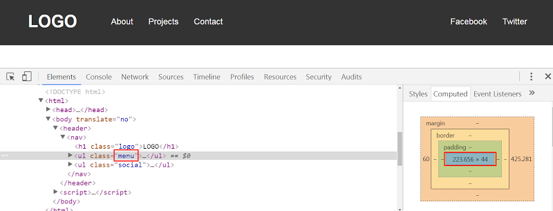
Even though the result in both cases seems the same, there’s one big difference. With the first solution, our menu has its initial calculated width. So for example, when the viewport width is 1100px the menu width would look something like this:
即使两种情况下的结果看起来相同,也存在很大差异。 对于第一种解决方案,我们的菜单具有其初始计算宽度。 因此,例如,当视口宽度为1100px时,菜单宽度将如下所示:
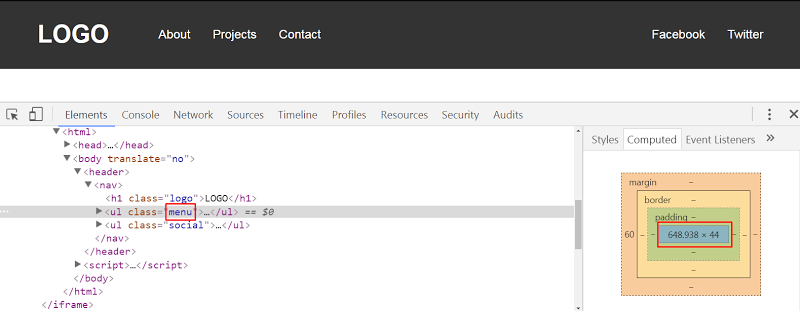
On the other hand, with the second solution, the menu width gets bigger because we specify flex-grow: 1. Here’s its corresponding width when the viewport width is 1100px:
另一方面,在第二种解决方案中,菜单宽度变大,因为我们指定了flex-grow: 1 。 这是视口宽度为1100px时的相应宽度:
The Codepen demo:
Codepen演示:
See the Pen Custom Flexbox Alignment With Auto Margins by SitePoint (@SitePoint) on CodePen.
请参阅CodePen上的SitePoint( @SitePoint ) 带有自动页边距的笔自定义Flexbox对齐 方式 。
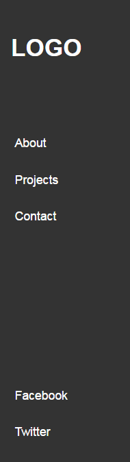
Let’s now assume that we want to modify the header layout. Here’s the new desired one:
现在假设我们要修改标题布局。 这是新的期望的:
The markup remains the same. We just make a few changes in the CSS:
标记保持不变。 我们只是在CSS中进行了一些更改:
nav {
  background: #333;
  display: flex;
  flex-direction: column;
  height: 100vh;
  width: 180px;
  padding: 20px;
  box-sizing: border-box;
}

.menu {
  margin-top: 60px;
  margin-bottom: auto;
}
In this example, notice that the social menu is aligned to the bottom edge of its parent. Again, this is done it by adding margin-bottom: auto to the main menu. Of course, we can also use flex-grow: 1, yet this solution will increase the menu height.
在此示例中,请注意社交菜单与其父菜单的底部边缘对齐。 同样,通过在主菜单中添加margin-bottom: auto来完成此操作。 当然,我们也可以使用flex-grow: 1 ,但是此解决方案将增加菜单高度。
See the Codepen demo below:
请参见下面的Codepen演示:
See the Pen Custom Flexbox Alignment With flex-grow:1 by SitePoint (@SitePoint) on CodePen.
请参阅CodePen上SitePoint ( @SitePoint ) 编写的 使用flex-grow:1的笔自定义Flexbox对齐 方式 。
Another thing to keep in mind is that if we define the justify-content property in any of our examples, we won’t see any visual difference. That happens because we use auto margins to align the flex items. Only when we remove the auto margins will the justify-content property take effect. According to the spec:
要记住的另一件事是,如果我们在任何示例中定义了justify-content属性,我们将看不到任何视觉差异。 发生这种情况是因为我们使用自动边距来对齐弹性项目。 只有当我们删除自动边距时, justify-content属性才会生效。 根据规格 :
If free space is distributed to auto margins, the alignment properties will have no effect in that dimension because the margins will have stolen all the free space left over after flexing.
如果将可用空间分配给自动页边距,则对齐属性在该尺寸上将不起作用,因为页边距将在弯曲后偷走所有剩余的可用空间。
Next, let’s create a new variation of our header:
接下来,让我们创建标题的新变体:

Undoubtedly, this can be easily achieved by setting justify-content: space-between to the flex container. But once again, we’re able to produce the same layout with auto margins. All we have to do is to apply margin: 0 auto to the main menu.
无疑,这可以通过设置justify-content: space-between flex容器justify-content: space-between来轻松实现。 但是再次,我们能够使用自动边距生成相同的布局。 我们要做的就是将margin: 0 auto应用于主菜单。
The Codepen demo:
Codepen演示:
See the Pen Custom Flexbox Alignment With Auto Margins by SitePoint (@SitePoint) on CodePen.
请参阅CodePen上的SitePoint( @SitePoint ) 带有自动页边距的笔自定义Flexbox对齐 方式 。
结论 (Conclusion)
In this article, we covered two little-known flexbox tips. Before closing, let’s recap:
在本文中,我们介绍了两个鲜为人知的flexbox技巧。 在关闭之前,让我们回顾一下:
We can apply the
z-indexproperty to flex items, even if they haveposition: static.我们可以将
z-index属性应用于flex项目,即使它们的position: static。- We can use auto margins to achieve custom alignment for our flex items across the main axis. 我们可以使用自动页边距来实现我们的弹性项目在主轴上的自定义对齐。
If you’ve used any of those tips in your projects, let us know in the comments below.
如果您在项目中使用了任何这些技巧,请在下面的评论中告诉我们。
翻译自: https://www.sitepoint.com/quick-tip-how-z-index-and-auto-margins-work-in-flexbox/
-ms-flexbox


 239
239


 被折叠的 条评论
为什么被折叠?
被折叠的 条评论
为什么被折叠?
 到【灌水乐园】发言


