


svg 图标 小程序
It has been commonly admitted that using fonts for icons is a bad practice. It’s bad for rendering (sizing, positioning, etc.), it has weird failures (proxy browsers, CORS, etc.), it conveys poor semantics, can hurt accessibility, and the list goes on. CSS-Tricks has an insightful piece on the matter.
人们普遍承认,使用字体作为图标是一种不好的做法。 它不利于呈现(调整大小,定位等),它具有怪异的错误(代理浏览器,CORS等),传达了较差的语义,可能会损害可访问性,并且列表还会继续。 CSS-Tricks 在这件事上有深刻见解 。
That being said, I always find it a bit complex to deal with SVG. Let’s be honest, I’m no Sara Soueidan. SVG is not really my thing. All these paths, weird tags, and attributes, ugh. I don’t really know how to use them. Still, I have to. And still, I like to do things properly.
话虽如此,我总是觉得处理SVG有点复杂。 老实说,我不是Sara Soueidan 。 SVG并不是我真正的事情。 所有这些路径,奇怪的标记和属性,等等。 我真的不知道如何使用它们。 不过,我必须。 而且,我喜欢正确地做事。
So I came up with an SVG workflow for icons that is both simple and automated. Hopefully, it will be useful to some of you.
因此,我想出了简单且自动化的SVG图标工作流程。 希望对您中的某些人有用。
要点是什么? (What’s the Gist?)
CSS-Tricks has a very nice article by Chris Coyier about how to build an icon system with SVG sprites. Given that this article is a direct application of Chris’s article, I suggest you read it if you haven’t already.
Chris Coyier在CSS-Tricks上有一篇非常不错的文章 ,内容涉及如何使用SVG精灵构建图标系统。 鉴于本文是Chris文章的直接应用,因此建议您阅读尚未读过的文章。
Here is roughly how it works.
这大致是这样的。
- Source icons are gathered in individual SVG files in a dedicated folder. 源图标收集在专用文件夹中的单个SVG文件中。
A sprite is generated with spritesh.
用spritesh生成一个精灵。
- The sprite is included in the main layout for future reference. 该子画面包含在主布局中,以备将来参考。
- Icons are displayed through a small component. 图标通过一个小组件显示。
- ??? ???
- Profit. 利润。
The setup depends a bit on the type of project you are working on (Jekyll, React, Rails…) but the gist of it stays the same. In this article, I’ll walk you through the steps so you can start using it today.
设置取决于您正在处理的项目的类型(Jekyll,React,Rails ...),但要点保持不变。 在本文中,我将引导您完成所有步骤,以便立即开始使用。
收集图标文件 (Gathering Icon Files)
If you ask me, this is somewhat of a hard part, because having correct SVG files is not an easy topic. Depending on which tool is used to export the icon, the markup looks different, can be bloated, and so on. And don’t get me started on viewBox issues…
如果您问我,这有点困难,因为拥有正确的SVG文件并非易事。 根据使用哪种工具导出图标,标记看起来会有所不同,可能会,肿,依此类推。 而且不要让我开始了解viewBox问题...
If you can avoid designing your own icons, I’d recommend you do that. Icomoon has a very decent collection of lovely icons that are free to use and exportable as SVG. You could not wish for more. Which is why we will go this way in this article.
如果可以避免设计自己的图标,建议您这样做。 Icomoon收集了非常不错的可爱图标,可以免费使用和导出为SVG。 您不希望更多。 这就是为什么我们在本文中将采用这种方式。
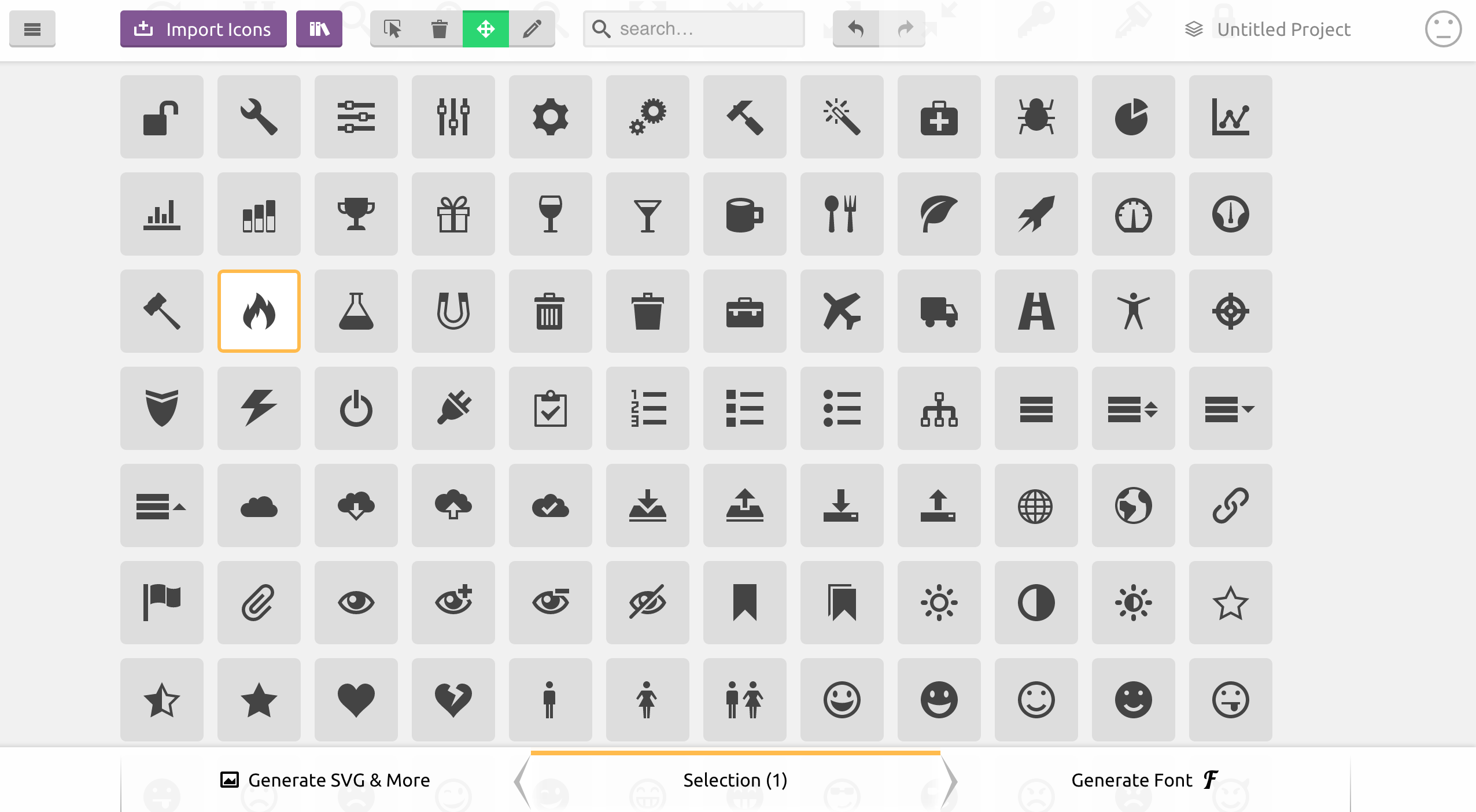
First, select the icons you need. Once you are done, click on “Generate SVG & More”. You should see listed all the icons you chose. Now you can download the bundle from Icomoon. The generated zip contains everything you need for the icons you picked (PNG files, SVG files, CSS, JavaScript, demo…). I recommend you copy the content of the SVG sub-folder (containing individual icon files), and paste it into your icon folder.
首先,选择所需的图标。 完成后,点击“ Generate SVG&More”。 您应该看到列出了所有选择的图标。 现在,您可以从Icomoon下载该软件包。 生成的zip包含您选择的图标所需的所有内容(PNG文件,SVG文件,CSS,JavaScript,演示…)。 我建议您复制SVG子文件夹的内容(包含单个图标文件),并将其粘贴到图标文件夹中。
Before moving on, you will have to clean up the SVG files a bit. It is not entirely necessary per se, but I’d recommend you do that nevertheless to avoid bloating your SVG sprite with a lot of junk. Here is what the fire icon from Icomoon looks like when downloaded:
在继续之前,您将需要稍微清理SVG文件。 本身并不是完全必要的,但是我还是建议您这样做,以免因大量垃圾而使SVG精灵膨胀。 这是下载Icomoon的火图标时的样子:
<?xml version="1.0" encoding="utf-8"?>
<!-- Generated by IcoMoon.io -->
<!DOCTYPE svg PUBLIC "-//W3C//DTD SVG 1.1//EN"
          "https://www.w3.org/Graphics/SVG/1.1/DTD/svg11.dtd">
<svg version="1.1" xmlns="https://www.w3.org/2000/svg"
     xmlns:xlink="https://www.w3.org/1999/xlink"
width="16" height="16" viewBox="0 0 16 16">
<path d="M5.016 16c-1.066-2.219-0.498-3.49 0.321-4.688 0.897-1.312 1.129-2.61
1.129-2.61s0.706 0.917 0.423 2.352c1.246-1.387 1.482-3.598 1.293-4.445 2.817 1.969
4.021 6.232 2.399 9.392 8.631-4.883 2.147-12.19 1.018-13.013 0.376 0.823 0.448
2.216-0.313 2.893-1.287-4.879-4.468-5.879-4.468-5.879 0.376 2.516-1.364 5.268-3.042
7.324-0.059-1.003-0.122-1.696-0.649-2.656-0.118 1.823-1.511 3.309-1.889 5.135-0.511
2.473 0.383 4.284 3.777 6.197z"></path>
</svg>
So much for a <path>! I recommend you remove the XML definition, the initial comment, the doctype, and the SVG wrapper (because we will inline SVG by referencing the sprite), so only the actual drawn content remains:
<path>这么多! 我建议您删除XML定义,初始注释,doctype和SVG包装器(因为我们将通过引用sprite内联SVG),因此仅保留实际绘制的内容:
<path d="M5.016 16c-1.066-2.219-0.498-3.49 0.321-4.688 0.897-1.312 1.129-2.61
1.129-2.61s0.706 0.917 0.423 2.352c1.246-1.387 1.482-3.598 1.293-4.445 2.817 1.969
4.021 6.232 2.399 9.392 8.631-4.883 2.147-12.19 1.018-13.013 0.376 0.823 0.448
2.216-0.313 2.893-1.287-4.879-4.468-5.879-4.468-5.879 0.376 2.516-1.364 5.268-3.042
7.324-0.059-1.003-0.122-1.696-0.649-2.656-0.118 1.823-1.511 3.309-1.889 5.135-0.511
2.473 0.383 4.284 3.777 6.197z"></path>
生成精灵 (Generating the Sprite)
You might be asking yourself why we don’t use the sprite generated by Icomoon directly (symbol-defs.svg)? Actually, we could. You’ll see that what we are about to do is basically doing the same thing. The reasons I don’t like using the sprite are:
您可能会问自己,为什么我们不直接使用Icomoon生成的sprite( symbol-defs.svg )? 实际上,我们可以。 您将看到我们将要做的基本上是做相同的事情。 我不喜欢使用Sprite的原因是:
Icomoon adds a few things that are not necessary (mostly attributes) and are not always relevant (e.g.
<title>filled after file name).Icomoon添加了一些不必要的东西(大多数是属性),并且并不总是相关的(例如,在文件名后填充
<title>)。- I don’t want to go back to Icomoon to download the sprite again every time I want to add an icon to the sprite. It’s nice to have a system inside the project. 我不想每次想向精灵添加图标时都回到Icomoon重新下载精灵。 在项目内部有一个系统真是太好了。
There are several ways to generate a sprite from a folder of icon files, but most of them rely on some kind of asset pipeline like Grunt or Gulp. This is why I created spritesh, a Bash script that does Just That™.
有几种方法可以从图标文件的文件夹中生成精灵,但是大多数方法都依赖于某种资产管道,例如Grunt或Gulp。 这就是为什么我创建了spritesh的原因 ,它是执行Just That™的Bash脚本。
Note: If you have a sprite generator that you like, please by all mean stick to it. spritesh is only a small helper for when you can’t/don’t want to load Gulp/Grunt and all the dependencies just for bundling icons.
注意:如果您有喜欢的精灵生成器,请务必坚持使用它。 当您不想/不想加载Gulp / Grunt以及仅用于捆绑图标的所有依赖项时,spritesh只是一个小帮手。
You can install spritesh through npm or as a gem (both being thin wrappers around the Bash script anyway):
您可以通过npm或作为gem来安装spritesh(无论如何都是Bash脚本周围的薄包装):
npm install spritesh -gThen, run spritesh on the folder of icons. Assuming you stored the icon files in assets/images/icons and want to generate the sprite in the _includes folder, here is how it would look:
然后,在图标文件夹上运行spritesh。 假设您将图标文件存储在assets/images/icons并想在_includes文件夹中生成精灵,则其外观如下:
spritesh --input assets/images/icons --output _includes/sprite.svg --viewbox "0 0 16 16" --prefix icon-Note: You might want to put this command in an npm script to avoid retyping it every time you want to regenerate the sprite.
注意:您可能希望将此命令放在npm脚本中,以避免每次想要重新生成精灵时都重新键入该命令。
Since we stripped out the <svg> element (and its viewBox attribute) from our source files, the viewbox argument is necessary. Here we use 0 0 16 16 because this is what Icomoon uses in the first place.
由于我们从源文件中删除了<svg>元素(及其viewBox属性),因此viewbox参数是必需的。 这里我们使用0 0 16 16因为这是Icomoon首先使用的。
The prefix argument is not mandatory either. It just prevents any conflict with already-existing id attributes in the DOM when including the sprite. Should not be necessary, but I’d argue it’s a good practice to namespace the id attribute of the icons.
prefix参数也不是必需的。 当包含精灵时,它只是防止与DOM中已经存在的id属性发生任何冲突。 应该没有必要,但是我认为对图标的id属性进行命名空间是一种好习惯。
Note: If working on Windows, you will have to run spritesh in git bash or Cygwin.
注意:如果在Windows上运行 ,则必须在git bash或Cygwin中运行spritesh 。
You should now have a sprite looking like this:
现在,您应该具有如下所示的sprite:
<svg xmlns="https://www.w3.org/2000/svg" style="display:none">
<symbol id='icon-fire' viewBox='0 0 16 16'><path d="M5.016
16c-1.066-2.219-0.498-3.49 0.321-4.688 0.897-1.312 1.129-2.61
1.129-2.61s0.706 0.917 0.423 2.352c1.246-1.387 1.482-3.598
1.293-4.445 2.817 1.969 4.021 6.232 2.399 9.392 8.631-4.883
2.147-12.19 1.018-13.013 0.376 0.823 0.448 2.216-0.313
2.893-1.287-4.879-4.468-5.879-4.468-5.879 0.376 2.516-1.364
5.268-3.042 7.324-0.059-1.003-0.122-1.696-0.649-2.656-0.118
1.823-1.511 3.309-1.889 5.135-0.511 2.473 0.383
4.284 3.777 6.197z"></path></symbol>
<!-- Other <symbol>s… -->
</svg>
The only thing left to do is include the sprite in the main layout. If working on a Jekyll website for instance, it could be as simple as generating the sprite in the _includes/ folder and adding this to the layout file:
剩下要做的就是在主布局中包含精灵。 例如,如果在Jekyll网站上工作,可能就像在_includes/文件夹中生成精灵并将其添加到布局文件中一样简单:
{% include sprite.svg %}创建图标组件 (Creating an Icon Component)
So far we’ve gathered icons and made a sprite. That’s nice, however, we still have to set up a convenient way to use these sprited icons. We will use a <use> tag inside an <svg> tag to reference the relevant symbol from our sprite (more on that technique in this article on CSS-Tricks), like this:
到目前为止,我们已经收集了图标并制作了一个精灵。 很好,但是,我们仍然必须设置一种方便的方式来使用这些带有图标的图标。 我们将在<svg> <use>标记内使用<use>标记来引用子画面中的相关符号(有关CSS-Tricks的本文中有关该技术的更多信息),如下所示:
<svg viewBox="0 0 16 16" class="icon icon-fire">
  <use xlink:href="#icon-fire"></use>
</svg>
It works, but it’s not very friendly and ends up being quite annoying to deal with in the long run. Also, if we need to change the class, or the viewBox attribute, we’ll have to go over all the occurrences of this in the project. Not ideal at all.
它可以工作,但是不是很友好,从长远来看最终会很烦人。 另外,如果需要更改类或viewBox属性,则必须遍历项目中所有此类情况。 一点都不理想。
What we want is to abstract this bit of repetitive markup in a partial. In Jekyll, it could look like this:
我们想要的是将部分重复标记抽象出来。 在Jekyll中,它可能看起来像这样:
<svg viewBox="0 0 16 16" class="icon icon-{{ include.icon }}">
  <use xlink:href="#icon-{{ include.icon }}"></use>
</svg>
To use it, you include the partial and pass it an icon parameter:
要使用它,您需要包括partial并向其传递一个icon参数:
{% include icon.html icon="fire" %}Feel free to improve the partial to make it accept other parameters such as an extra class.
随时改进局部变量以使其接受其他参数,例如额外的类。
In React, it could look like this:
在React中,它看起来可能像这样:
const Icon = (props) => (
  <svg viewBox='0 0 16 16' className={`icon icon-${props.icon}`}>
    <use xlinkHref={`#icon-${props.icon}`} />
  </svg>
);

export default Icon;
Note: the xlinkHref is only available as per React 0.14. In React 0.13, you’ll have to use dangerouslySetInnerHTML. More on that in this answer on Stack Overflow.
注意: xlinkHref仅在React 0.14中可用。 在React 0.13中,您必须使用dangerouslySetInnerHTML 。 关于堆栈溢出的更多信息 。
And then:
然后:
<Icon icon='fire' />关于可访问性 (A Word on Accessibility)
In this article from Léonie Watson, it is recommended to add a title and a description with <title> and <desc> respectively to the <symbol> definitions in the sprite, to improve accessibility.
在LéonieWatson的这篇文章中 ,建议在sprite中的<symbol>定义中分别添加标题和带有<title>和<desc> ,以提高可访问性。
I fully support this, however, I tend to think that title and description are heavily dependent on context. Therefore, they are better defined at use time (in our component) rather than at definition time (in the sprite) in my opinion.
我完全支持这一点,但是,我倾向于认为标题和描述在很大程度上取决于上下文。 因此,在我看来,最好在使用时(在我们的组件中)定义它们,而不是在定义时(在Sprite中)定义它们。
For instance, if you use an icon alongside text, you don’t want a title to be read out loud, because text is already there for this. On the other hand, if you use an icon as only content for a button, you want a title and description to be read, so the user knows the purpose of the button.
例如,如果在文本旁边使用图标,则不希望大声读出标题,因为文本已经存在。 另一方面,如果仅将图标用作按钮的内容,则希望阅读标题和说明,以便用户知道按钮的用途。
Here is how I would update our component to make it possible to pass a title and a description, making it highly accessible.
这是我更新组件的方式,以使其可以传递标题和描述,从而使其易于访问。
{% capture id %}{% increment uniqueid %}{% endcapture %}
<svg viewBox="0 0 16 16" role="img" class="icon icon-{{ include.icon }}"
     aria-labelledby="{% if include.title %}title-{{ id }}{% endif %}{% if include.desc %} desc-{{ id }}{% endif %}">
  {% if include.title %}
  <title id="title-{{ id }}">{{ include.title }}</title>
  {% endif %}
  {% if include.desc %}
  <desc id="title-{{ id }}">{{ include.desc }}</desc>
  {% endif %}
  <use xlink:href="#icon-{{ include.icon }}"></use>
</svg>
The {% increment %} Liquid tag initialises a variable and then bumps it by one every time it is being called. In our scenario, it is called every time we include the icon partial, so for every icon.
{% increment %} Liquid标签会初始化变量,然后在每次调用时将其加1。 在我们的场景中,每次我们将局部图标包含时都会调用它,因此每个图标都将被调用。
The React version would work the same, using Lodash to get a unique id (feel free to use the implementation of your choice):
React版本可以使用Lodash获得唯一的ID(可以随意使用您选择的实现),其工作原理相同:
import { uniqueId } from 'lodash';

const Icon = (props) => {
  const id = uniqueId();
  return (
    <svg viewBox='0 0 16 16' role='img'
    className={`icon icon-${props.icon}`}
    aria-labelledby={
      (props.title ? `title-${id}` : '') +
      (props.desc ? ` desc-${id}` : '')
    }>
      {props.title && <title id={`title-${id}`}>{props.title}</title>}
      {props.desc && <desc id={`desc-${id}`}>{props.desc}</desc>}
      <use xlinkHref={`#icon-${props.icon}`} />
    </svg>
  );
}

export default Icon;
I will concede that it is extensively more verbose, but that’s not really a problem given that:
我将承认,它过于冗长,但是鉴于以下情况,这并不是真正的问题:
- The role of a component is to abstract complexity and avoid repetition. 组件的作用是抽象复杂性并避免重复。
- Accessibility is extremely important and should be a priority. 无障碍获取极为重要,应作为优先事项。
包装东西 (Wrapping Things Up)
Hey, this wasn’t so bad now, was it? If we sum up, our system makes it easy to:
嘿,现在还不错吧? 综上所述,我们的系统使以下操作变得容易:
- Generate a sprite from the command line (which makes it easily pluggable in any build script) with custom options; 使用自定义选项从命令行生成精灵(使其易于插入任何构建脚本中);
- Use the sprite and customise the output with a partial / component; 使用sprite并使用局部/组件来自定义输出;
- Add new icons. 添加新图标。
That sounds like a good system if you ask me! If we want to push things further, we could pipe in SVGO to optimise the SVG files. Install it via npm:
如果您问我,这听起来像是一个不错的系统! 如果我们想进一步推进,我们可以通过管道输入SVGO来优化SVG文件。 通过npm安装:
npm install svgo spritesh --save-devThen, make good use of npm scripts in your package.json:
然后,充分利用package.json的npm脚本:
{
  "scripts": {
    "sprite": "spritesh --input assets/images/icons --output _includes/sprite.svg --viewbox '0 0 16 16' --prefix icon-",
    "presprite": "svgo assets/images/icons"
  },
  "devDependencies": {
    "spritesh": "^1.0.8",
    "svgo": "^0.6.1"
  }
}
Now, everytime we run the sprite task npm will first run svgo on the icon folder (which is only useful once, but might be good to keep in case we add new icons).
现在,每次我们运行sprite任务npm时,都会首先在icon文件夹上运行svgo (这只有用一次,但是如果我们添加新的图标,可能会很好保留)。
There is probably room for further improvement so if you think of anything to make this SVG workflow better, please be sure to share!
可能还有进一步改进的空间,因此,如果您想使SVG工作流程更好,请务必分享!
Huge thanks to Sara Soueidan for her technical review on the SVG side, and to Heydon Pickering for his insightful opinion regarding accessibility.
非常感谢Sara Soueidan对SVG方面的技术审查,并感谢Heydon Pickering对可访问性的深刻见解。
翻译自: https://www.sitepoint.com/a-working-svg-workflow-for-accessible-icons/
svg 图标 小程序


 2543
2543

 被折叠的 条评论
为什么被折叠?
被折叠的 条评论
为什么被折叠?
 到【灌水乐园】发言


