


vux flexbox使用
There are plenty of valuable resources (articles, tutorials, and online tools) discussing the flexbox layout module. Flexbox has gained so much traction that more and more grids and frameworks are supporting this powerful layout feature.
有大量宝贵的资源(文章,教程和在线工具)讨论flexbox布局模块 。 Flexbox获得了极大的吸引力,以至于越来越多的网格和框架正在支持这种强大的布局功能。
In this article, we’ll examine how 3 tools are incorporating flexbox-based grids and I’ll show you some demos that will illustrate the features.
在本文中,我们将研究3种工具如何结合基于Flexbox的网格,并向您展示一些演示这些功能的演示。
Note: This article expects that you have some knowledge of flexbox.
注意:本文希望您对flexbox有一定的了解。
Flexbox网格 (Flexbox Grid)
Flexbox Grid is a grid system built on top of flexbox. If you’re familiar with Bootstrap, this grid uses the same predefined grid classes and media query breakpoints. The following table summarizes how the grid works:
Flexbox Grid是建立在flexbox之上的网格系统。 如果您熟悉Bootstrap ,那么此网格将使用相同的预定义网格类和媒体查询断点。 下表总结了网格的工作方式:
| Screens | Viewport Size | Container Width | Class Prefix |
|---|---|---|---|
| Extra small screens | <30em (768px) | auto | .col-xs-* |
| Small screens | ≥48em (768px) | 46rem (736px) | .col-sm-* |
| Medium screens | ≥62em (992px) | 61rem (976px) | .col-md-* |
| Large screens | ≥75em (1200px) | 71rem (1136px) | .col-lg-* |
| 屏风 | 视口大小 | 容器宽度 | 类前缀 |
|---|---|---|---|
| 超小屏幕 | <30em(768px) | 汽车 | .col-xs-* |
| 小屏幕 | ≥48em(768px) | 46rem(736px) | .col-sm-* |
| 中型屏幕 | ≥62em(992px) | 61rem(976px) | .col-md-* |
| 大屏幕 | ≥75em(1200px) | 71rem(1136px) | .col-lg-* |
To get started with Flexbox Grid, you have to install and include the required CSS file (i.e. flexboxgrid.css) in your projects. More information about this process is available on the project’s GitHub page.
要开始使用Flexbox Grid,您必须在项目中安装所需CSS文件(即flexboxgrid.css )并将其包括在内。 有关此过程的更多信息,请参见项目的GitHub页面 。
Let’s now create a responsive navigation menu based on this grid. Here’s what we’re going to build:
现在,基于此网格创建一个响应式导航菜单。 这是我们要构建的:

First, we define the ul element as a flex container by assigning the row class to it. Then we use the col-xs-2 class to specify the width of the flex items. This class ensures that the list items will have a maximum width equal to 16.667% for all devices. Finally, we horizontally and vertically center our items by adding the center-xs and middle-xs classes to the flex wrapper.
首先,通过向其分配row类,将ul元素定义为flex容器。 然后,我们使用col-xs-2类指定flex项目的宽度。 此类确保所有设备的列表项的最大宽度等于16.667% 。 最后,我们通过将center-xs和middle-xs类添加到flex包装器中来水平和垂直居中放置项目。
Below is the required HTML:
以下是必需HTML:
<nav>
  <ul class="row center-xs middle-xs">
    <li class="col-xs-2">
      <a href="#">Home</a>
    </li>
    <li class="col-xs-2">
      <a href="#">About</a>
    </li>
    <!-- more list items here... -->
  </ul>
</nav>
And here are some CSS styles to enhance the appearance of our menu:
以下是一些CSS样式,可增强菜单的外观:
.row {
  height: 80px;
}

ul a:before  {
  font-family: FontAwesome;
  font-size: 22px;
}

ul li:nth-child(1) a:before {
  content: '\f015';
}

@media screen and (max-width: 800px) {
  ul a {
    font-size: 0;
  }

  ul a:before {
    font-size: 32px;
  }
}
Note: To keep things simple, I’ve only included some of the rules from the corresponding CSS file.
注意:为简单起见,我仅包含了相应CSS文件中的一些规则。
See the Pen A flexible menu based on the Flexbox Grid framework. by SitePoint (@SitePoint) on CodePen.
请参阅基于Flexbox网格框架的Pen A灵活菜单。 通过SitePoint( @SitePoint上) CodePen 。
At this point we have a new requirement. We have to add our logo to the main menu. The following screenshot shows what we want to create:
在这一点上,我们有一个新的要求。 我们必须将徽标添加到主菜单。 以下屏幕截图显示了我们要创建的内容:

To make that work, we’ll add a bit of extra markup.
为了使它起作用,我们将添加一些额外的标记。
Here’s the new version of our HTML:
这是HTML的新版本:
<div class="row center-xs middle-xs">
  <div class="col-sm-2 col-xs-4">
    <h1>
      <a href="#">My Logo</a>
    </h1>
  </div>
  <div class="col-sm-8 col-sm-offset-2 col-xs-12">
    <nav>
      <ul>
        <li class="col-xs">
          <a href="#">Home</a>
        </li>
        <!-- more list items here... -->
      </ul>
    </nav>
  </div>
</div><!-- end of .row ... -->
Let’s explain the code above:
让我们解释一下上面的代码:
We define a
divelement as the outer flex wrapper of our logo and menu. We assign different grid classes to the flex items depending on the viewport size. For example, on small devices and up (≥768px) the logo will have a maximum width equal to16.667%, while the menu will occupy66.667%of the parent’s width.我们将
div元素定义为徽标和菜单的外部flex包装。 我们根据视口大小为弹性项目分配不同的网格类别。 例如,在小型设备上(≥768px),徽标的最大宽度等于16.667%,而菜单将占据父级宽度的66.667%。We choose to move our menu
16.667%to the right by giving it a class ofcol-sm-offset-2.我们选择通过给它一类
col-sm-offset-2来向右移动16.667%菜单。Finally, notice the
col-xsclass we set on our list items. If you remember the previous example, we had used thecol-xs-2class. In this case though, we apply thecol-xsclass because we give items the option to grow and cover the entire parent’s width.最后,请注意我们在列表项上设置的
col-xs类。 如果您还记得前面的示例,我们使用了col-xs-2类。 但是,在这种情况下,我们应用col-xs类是因为我们为项目提供了增大和覆盖整个父对象宽度的选项。
See the Pen A flexible menu, with logo, based on the Flexbox Grid framework. by SitePoint (@SitePoint) on CodePen.
请参阅基于Flexbox网格框架的带有徽标的Pen A灵活菜单。 通过SitePoint( @SitePoint上) CodePen 。
UIkit框架 (UIkit Framework)
UIkit is a modern front-end framework similar to Bootstrap and Foundation. It comes with a number of different components, which you might find useful depending on your needs. For the purposes of this article, we’ll combine the Flex, Slideshow, and Dotnav components, so as to build a responsive slideshow.
UIkit是类似于Bootstrap和Foundation的现代前端框架。 它带有许多不同的组件,根据您的需求,它们可能会有用。 出于本文的目的,我们将结合Flex , Slideshow和Dotnav组件,以构建响应式幻灯片。
As usual, to use this plugin in your projects, make sure to download and install the required files. Also keep in mind that the additional components aren’t included in the core framework, so if you want to use any of those components, you have to add them to your projects as well.
与往常一样,要在您的项目中使用此插件,请确保下载并安装所需的文件 。 还请记住,核心框架中未包含其他组件 ,因此,如果要使用这些组件中的任何一个,也必须将它们添加到项目中。
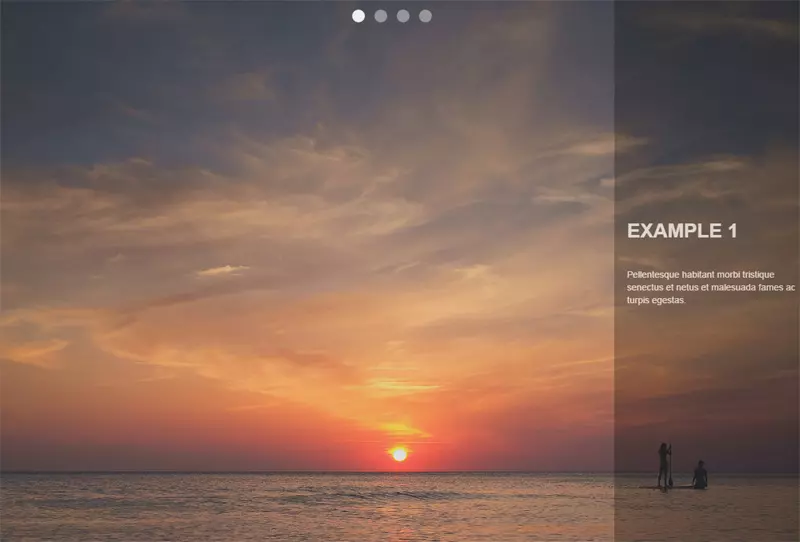
The image below shows what our slideshow will look like:
下图显示了我们的幻灯片显示:
To build it, we’ll take advantage of the basic code for the Slideshow component that UIkit provides us:
要构建它,我们将利用UIkit提供给我们的Slideshow组件的基本代码:
<div data-uk-slideshow>
  <ul class="uk-slideshow uk-slideshow-fullscreen">
    <li>
      <img src="https://download.unsplash.com/photo-1414446483597-8d8f792bfe39">
      <div class="uk-overlay-panel uk-overlay-background uk-overlay-fade">
        <div class="caption">
          <h3>Example 1</h3>
          <!-- more content here -->
        </div>
      </div>
    </li>
    <!-- more list items here --->
  </ul><!-- end of slideshows list --->
  <ul class="uk-dotnav uk-dotnav-contrast uk-position-top uk-flex-center">
    <li data-uk-slideshow-item="0">
      <a href="#"></a>
    </li>
    <li data-uk-slideshow-item="1">
      <a href="#"></a>
    </li>
    <li data-uk-slideshow-item="2">
      <a href="#"></a>
    </li>
    <li data-uk-slideshow-item="3">
      <a href="#"></a>
    </li>
  </ul><!-- end of dotnavs list --->
</div>
Notice the uk-flex-center class that we applied to the second ul element. This horizontally centers the slideshow navigation. In addition, we can modify the flex behavior by removing this class and adding another one (e.g. the uk-flex-column class).
注意我们应用于第二个ul元素的uk-flex-center类。 这将幻灯片导航水平居中。 另外,我们可以通过删除此类并添加另一个类(例如uk-flex-column类)来修改flex行为。
See the Pen UIkit slideshow with flexbox by SitePoint (@SitePoint) on CodePen.
见笔与Flexbox的UIKit的幻灯片由SitePoint( @SitePoint上) CodePen 。
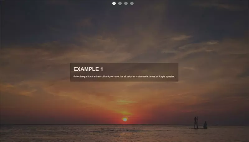
At this point, we’ll use the power of flexbox to modify the previous version of our slideshow. In fact, we’ll change the position of the div.caption element. As you can see in the screenshot below, the goal is to horizontally and vertically center it:
此时,我们将使用flexbox的功能来修改幻灯片的先前版本。 实际上,我们将更改div.caption元素的位置。 如下面的屏幕快照所示,目标是使其水平和垂直居中:
To achieve this, all we have to do is assign some additional helper classes to the immediate parent (flex wrapper) of the div.caption element (flex item). Here’s the HTML that we have to update:
为此,我们要做的就是为div.caption元素(flex项目)的直接父级(flex包装器)分配一些附加的帮助器类。 这是我们必须更新HTML:
<div class="uk-overlay-panel uk-overlay-background uk-overlay-fade
            uk-flex uk-flex-center uk-flex-middle">
  <div class="caption">
    <h3>UIkit Framework</h3>
    <!-- more content here -->
  </div>
</div>
See the Pen UIkit slideshow with flexbox and alternate caption layout. by SitePoint (@SitePoint) on CodePen.
请参阅带有Flexbox和备用字幕布局的Pen UIkit幻灯片。 通过SitePoint( @SitePoint上) CodePen 。
混蛋 (sass-flex-mixin)
Brian Franco has developed a set of useful Sass mixins that we can use to build flexible layouts. In order to work with them, you have to grab a copy of the required SCSS file (the flexbox.scss partial) from the GitHub repo then incorporate it in your SCSS project.
Brian Franco开发了一组有用的Sass mixins,可用于构建灵活的布局。 为了与他们合作,您必须从GitHub存储库中获取所需SCSS文件的副本( flexbox.scss部分),然后将其合并到您的SCSS项目中。
At this point, let’s see those mixins in action by trying to replicate the layout of the following screenshot:
在这一点上,让我们通过尝试复制以下屏幕截图的布局来查看那些混合操作:
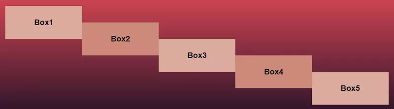
To do this, we start by setting the section element as our flex container and we lay out the flex items vertically (as columns). Next, each of the columns receives a different value for the justify-content property. The last step is to take advantage of CSS pseudo-elements in order to create some extra “flex items”.
为此,我们首先将section元素设置为flex容器,然后垂直放置flex项目(作为列)。 接下来,每个justify-content属性接收一个不同的值。 最后一步是利用CSS伪元素来创建一些额外的“弹性项目”。
Here’s our HTML:
这是我们HTML:
<section>
  <div class="box box1" data-content="Box2">
    <h3>Box1</h3>
  </div>
  <div class="box box2" data-content="Box4">
    <h3>Box3</h3>
  </div>
  <div class="box box3">
    <h3>Box5</h3>
  </div>
</section>
And the SCSS styles:
和SCSS样式:
section {
  @include flexbox;
  @include flex-direction(column);

  .box {
    width: 20%;
    height: 100px;
    position: relative;

    &:after {
      display: block;
      position: absolute;
      top: 50%;
      right: -100%;
      width: 100%;
      height: 100%;
    }
  }

  .box1 {
    @include align-self(flex-start);

    &:after {
      content: attr(data-content);
    }
  }

  .box2 {
    @include align-self(center);

    &:after {
      content: attr(data-content);
    }
  }

  .box3 {
    @include align-self(flex-end);
  }

  @media screen and (max-width: 500px) {
    .box {
      width: 100%;
    }

    &:after {
      top: 100%;
      right: 0;
    }
  }

}
Note: To keep things simple, I’ve only included some of the rules from the corresponding SCSS file and I’ve omitted the compiled CSS.
注意:为简单起见,我只包括了相应SCSS文件中的一些规则,而省略了已编译CSS。
See the Pen A flexbox layout with Brian Franco’s sass-flex-mixin by SitePoint (@SitePoint) on CodePen.
见笔与布赖恩·佛朗哥的青菜-FLEX-混入一个Flexbox的布局由SitePoint( @SitePoint )上CodePen 。
更灵活的网格 (More Flexy Grids)
Beyond the three tools that we analyzed above, there are other flexbox-based grids and frameworks, some of which are shown below:
除了我们上面分析的三个工具之外,还有其他基于flexbox的网格和框架,其中一些如下所示:
结论 (Conclusion)
I hope this summary has helped you see how some modern tools are using flexbox. As a next step, I recommend experimenting with the following exercises:
希望本摘要有助于您了解一些现代工具如何使用flexbox。 下一步,我建议尝试以下练习:
- Incorporate a flexbox grid into your favorite framework, if it doesn’t support the flexbox layout method. 如果不支持flexbox布局方法,则将flexbox网格合并到您喜欢的框架中。
- Make the examples presented above more fancy by adding CSS transitions, CSS animations or by modifying the flex behavior. 通过添加CSS过渡,CSS动画或修改flex行为,使上面提供的示例更加精美。
If you’ve used any modern frameworks that incorporate flexbox, let us know in the comments.
如果您使用了任何包含flexbox的现代框架,请在评论中告知我们。
翻译自: https://www.sitepoint.com/3-modern-tools-using-flexbox-grids/
vux flexbox使用


 扫一扫
扫一扫
 1180
1180

 被折叠的 条评论
为什么被折叠?
被折叠的 条评论
为什么被折叠?
 到【灌水乐园】发言


