


When designing an email — be it an e-newsletter, promotion, transactional email or announcement — there are a few standard rules to follow. Although a graphic email message may look and feel just like a standard web page, where and how it will be viewed is anything but standardized.
在设计电子邮件时(无论是电子新闻,促销,交易电子邮件还是公告),都需要遵循一些标准规则。 尽管图形电子邮件的外观和感觉就像是标准网页,但是在何处以及如何查看它只是标准化的。
Aside from having to contend with the suite of standard web browsers (Chrome, Firefox, Safari, IE) and their idiosyncrasies, you also have to satisfy the requirements imposed by a slew of email clients and mobile apps, which don’t always render your messages the way your design intended them to.
除了必须与标准的Web浏览器套件(Chrome,Firefox,Safari,IE)和它们的特性抗衡之外,您还必须满足大量电子邮件客户端和移动应用所施加的要求,这些要求并不总是呈现您的传达您的设计意图的方式。
Although constraints are a challenge, when trying to design something compelling, sticking to these best practices will ensure that your emails render beautifully across all clients and on mobile devices.
尽管限制是一个挑战,但是在尝试设计引人注目的东西时,坚持这些最佳实践将确保您的电子邮件在所有客户端和移动设备上呈现精美的外观。
规则1。 在600像素的宽度上设计 (Rule #1. Design on a Width of 600 pixels)
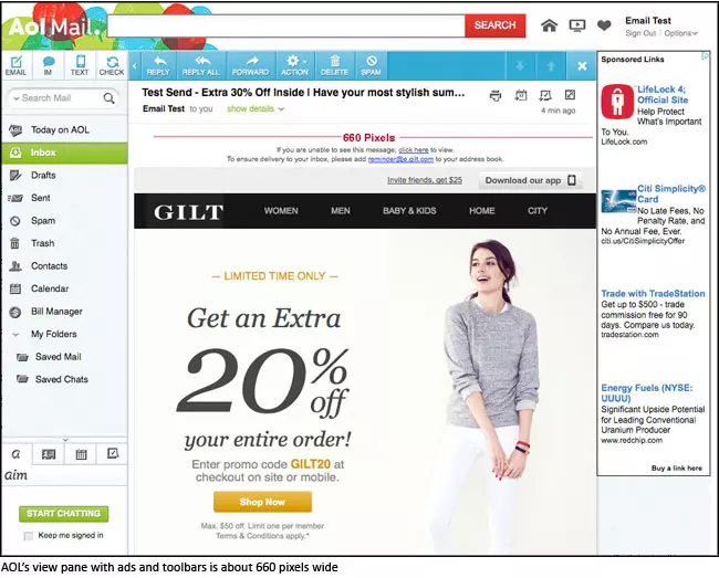
Emails are viewed in a variety of clients, and many different factors — advertisements, menus, and toolbars, just to name a few—can impact upon and minimize the view pane of the message.
电子邮件可以在各种客户端中查看,并且许多不同的因素(例如广告,菜单和工具栏,仅举几例)可以影响并最小化消息的查看窗格。
The standard width for most emails is around 550-600 pixels, although the trend toward wider emails is increasing—and scalability, even on mobile devices, has improved with time. In short, if your design has to be wider than the 600 pixels, keep it under 700 pixels to be on the safe side.
大多数电子邮件的标准宽度大约为550-600像素,尽管向更宽范围的电子邮件发展的趋势正在增加-甚至在移动设备上,可伸缩性也随着时间而提高。 简而言之,如果您的设计必须大于600像素,则为了安全起见,请将其保持在700像素以下。
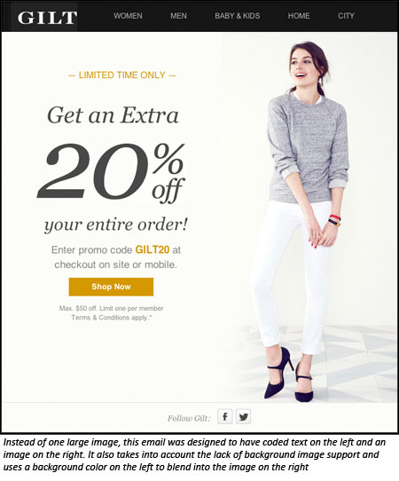
规则2。 少用背景图像 (Rule #2. Use Background Images Sparingly)
Since version 2007, Outlook has provided zero background image support. When using layered images in your design, be sure they can degrade gracefully. Always use a solid background color as a fallback for Outlook and make sure no crucial information or imagery exists solely in a background image.
从2007版开始,Outlook提供了零背景图像支持。 在设计中使用分层图像时,请确保它们可以正常降级。 始终使用纯背景色作为Outlook的后备,并确保仅在背景图像中不存在任何关键信息或图像。

Background image with fallback for Outlook
Outlook的后备背景图片
规则3。 坚持使用系统字体 (Rule #3. Stick with System Fonts)
Web fonts are not widely supported in email, so in most cases you’ll need a fallback. To circumvent the general lack of support available for handling these issues, stick with web-safe fonts like Arial, Helvetica, Tahoma, Times Roman, and Georgia.
电子邮件不广泛支持Web字体,因此在大多数情况下,您需要使用备用字体。 为了避免普遍缺乏处理这些问题的支持,请坚持使用Web安全字体,例如Arial,Helvetica,Tahoma,Times Roman和Georgia。
规则#4。 力求文本与图像比率的良好平衡 (Rule #4. Strive for a Good Balance of Text-to-Image Ratio)
At first, it might seem that the best way to preserve the design of an email is to throw it all in an image tag or slice it up into lots of images. Then there’s no need to worry about being limited to ugly system fonts or stripping of the background images, right?
起初,似乎保留电子邮件设计的最佳方法是将其全部放入图像标签或将其切成许多图像。 然后,不必担心限于丑陋的系统字体或背景图像的剥离,对吗?
Not quite. An image-heavy email will increase the chances of your email client flagging it as spam, resulting in damage to your sender reputation.
不完全的。 图像过多的电子邮件会增加电子邮件客户端将其标记为垃圾邮件的机会,从而损害发件人的声誉。
As a general rule, the best way to avoid ending up in the dreaded Spam folder is to make sure that your emails reflect a balanced image to text ratio.
通常,避免最终显示在“垃圾邮件”文件夹中的最佳方法是确保您的电子邮件反映平衡的图像与文本比率。
Most email clients block images by default. With this in mind, incorporate text that summarizes the main point of your message: the offer, the announcement, the transaction taking place, the action for the consumer to take, etc. Some text — especially the main call to action — should be viewable upon opening the email, even if the images are shut off.
默认情况下,大多数电子邮件客户端都会阻止图像。 考虑到这一点,请结合总结您的消息要点的文本:要约,公告,交易正在进行,消费者采取的行动等。一些文本(尤其是主要的号召性用语)应该可见打开电子邮件后,即使图像已关闭。
规则5。 考虑移动优先设计 (Rule #5. Consider a Mobile-First Design)
It’s true, CSS support in email has come a long way, and we can now incorporate some media queries to allow for responsive layouts — but by no means can we expect all clients and devices to support this yet.
的确,电子邮件对CSS的支持已经走了很长一段路,现在我们可以合并一些媒体查询以允许响应式布局-但是我们绝对不能期望所有的客户端和设备都支持这一点。
It’s still wise to begin with a mobile-first design for optimal viewing across all platforms. Use single-column layouts, larger fonts, and clear and concise messaging and calls-to-action as much as possible.
从移动优先的设计入手,以在所有平台上实现最佳观看仍然是明智的。 使用单列布局,更大的字体,并尽可能简洁明了的消息传递和号召性用语。
Multi-column layouts don’t have to be off-limits for mobile, but keep them to a minimum as needed—and try to avoid going above a three-column layout.
对于移动设备,多列布局不一定非得超出限制,但可以根据需要将其保持在最低限度,并尽量避免超过三列布局。
After considering all the factors listed here, and updating your design to fit within these constraints, always remember to test your emails thoroughly on all devices and clients. Rendering tools like Campaign Monitor, Litmus and Returnpath offer a full display of the rendered image in different clients and platforms, and can really save you time and anguish.
在考虑了此处列出的所有因素并更新设计以使其符合这些限制之后,请始终记住要在所有设备和客户端上全面测试电子邮件。 诸如Campaign Monitor , Litmus和Returnpath之类的渲染工具可以在不同的客户端和平台上完整显示渲染的图像,并可以真正节省您的时间和痛苦。


 扫一扫
扫一扫
 1877
1877

 被折叠的 条评论
为什么被折叠?
被折叠的 条评论
为什么被折叠?
 到【灌水乐园】发言


