


Recently, I had to work on a website heavily using tilted angles as part of its design guidelines. By “tilted angles”, I mean these sections whose top or bottom edge is not completely horizontal and rather a bit inclined.
最近,我不得不在一个网站上大量使用倾斜角度作为其设计准则的一部分。 所谓“倾斜角”,是指其顶部或底部边缘不完全水平而是稍微倾斜的这些部分。
There are quite a few ways to implement this. You could have base 64 encoded images applied as a background, but it makes it hard to customise (color, angle, etc.).
有很多方法可以实现此目的。 您可以将以64为底的编码图像用作背景,但是很难自定义(颜色,角度等)。
Another way would be to skew and/or rotate an absolutely positioned pseudo-element, but if there is one thing I don’t want to deal with, it’s the skew transform. God, no.
另一种方法是倾斜和/或旋转绝对定位的伪元素,但是如果有一件我不想处理的事情,那就是倾斜变换。 天哪
When using Sass, you could use the Angled Edges library that encodes dynamically generated SVG. It works super well, however it requires a fixed width and height expressed in pixels, which kind of bothered me.
使用Sass时,可以使用Angled Edges库对动态生成的SVG进行编码。 它工作得非常好,但是它需要以像素表示的固定宽度和高度,这让我感到困扰。
I also really wanted to see if and how I could be able to implement this. I ended up with a solution that I am really proud of, even if it might be a bit over-engineered for simple scenarios.
我也真的很想看看是否以及如何能够实现这一目标。 最后,我提出了一个令我引以为傲的解决方案,即使对于简单的方案而言,它可能有些过度设计。
有什么想法? (What’s the Idea?)
My idea was to apply a half transparent, half solid gradient to an absolutely-positioned pseudo-element. The angle of the gradient defines the tilt angle.
我的想法是将半透明,半实心渐变应用于绝对定位的伪元素。 倾斜角度定义倾斜角度。
background-image: linear-gradient($angle, $color 50%, transparent 50%);This is packaged in a mixin that applies the background color to the container, and generates a pseudo-element with the correct gradient based on the given angle. Simple enough. You’d use it like this:
将其包装在mixin中,该mixin将背景色应用于容器,并根据给定的角度生成具有正确渐变的伪元素。 很简单。 您可以这样使用它:
.container {
  @include tilted($angle: 3deg, $color: rgb(255, 255, 255));
}
The main problem I faced with this was to figure which height the pseudo-element should have. At first, I made it an argument of the mixin, but I ended up going trial-and-error at every new angle to figure out what would be the best height for the pseudo. Not ideal.
我面临的主要问题是确定伪元素应具有的高度。 最初,我将其作为mixin的一个论据,但最终我在每个新角度进行了反复试验,弄清楚什么是拟人的最佳身高。 不理想。
And just when I was about to table flip the whole thing, I decided to leave the laptop away, took a pen and paper and started doodling to figure out the formula behind it. It took me a while (and a few Google searches) to remember trigonometry I learnt in high-school, but eventually I made it.
就在我要摆桌子的时候,我决定离开笔记本电脑,拿起笔和纸,开始涂鸦以弄清楚背后的公式。 我花了一段时间(和一些Google搜索)来记住我在高中学习的三角学,但最终我做到了。
To avoid having to guess or come up with good approximations, the height of the pseudo-element is computed from the given angle. This is, of course, all done with a bit of Sass and a lot of geometry. Let’s go.
为了避免猜测或得出良好的近似值,应从给定角度计算伪元素的高度。 当然,这都是用少量的Sass和大量的几何图形完成的。 我们走吧。
计算伪元素的高度 (Computing the Pseudo-element’s Height)
Trust me when I’m telling you it won’t be too hard. The first thing we know is that we have a full-width pseudo-element. The gradient line will literally be the pseudo’s diagonal, so we end up with a rectangle triangle.
当我告诉您时,请相信我,这不会太难。 我们知道的第一件事是我们有一个全角的伪元素。 渐变线从字面上是伪物体的对角线,因此我们最终得到一个矩形三角形。
Let’s name it ABC, where C is the right angle, B is the known angle ($angle argument) and A is therefore C - B. As shown on this diagram, we try to figure out what b is.
让我们将其命名为ABC,其中C是直角, B是已知角度( $angle参数),因此A是C - B 。 如该图所示,我们尝试找出b是什么。
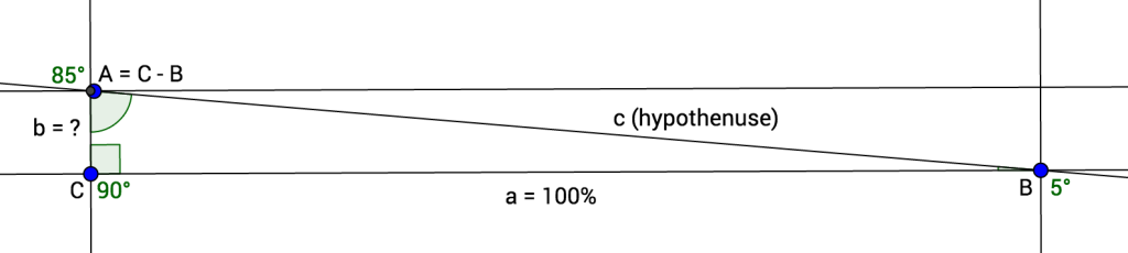
To do that, we need to find the value of c (the gradient line, aka the hypothenuse), which is the length of a (the bottom side, 100%) divided by sine of the A angle (with B = 5°, A would be 85° for instance).
为此,我们需要找到c的值(坡度线,又称假设),即a的长度(底边,100%)除以A角的正弦值( B = 5° , A为85°)。
c = a / sin(C - B)From there, we have to use Pythagoras theorem:
从那里开始,我们必须使用毕达哥拉斯定理:
The square of the hypotenuse (the side opposite the right angle) is equal to the sum of the squares of the other two sides.
斜边的平方(与直角相对的一侧)等于其他两侧的平方之和。
Therefore, the square of one of the other side equals the square of the hypothenuse minus the square of the third side. So the square of b equals the square of c minus the square of a.
因此,另一侧的平方等于假设的平方减去第三侧的平方。 所以平方b等于平方c减去的平方a 。
b² = c² - a²Finally, the length of b equals the squared root of the square of c minus the square of a.
最后,的长度b等于的平方的平方根c减去的平方a 。
b = √(c² - a²)That’s it. We can now build a small Sass function computing the height of the pseudo-element based on a given angle.
而已。 现在,我们可以构建一个小的Sass函数,根据给定的角度计算伪元素的高度。
@function get-tilted-height($angle) {
  $a: (100% / 1%);
  $A: (90deg - $angle);
  $c: ($a / sin($A));
  $b: sqrt(pow($c, 2) - pow($a, 2));

  @return (abs($b) * 1%);
}
Note: the pow(), sqrt() and sin() functions can either come from Sassy-Math, Compass or custom sources.
注意: pow() , sqrt()和sin()函数可以来自Sassy-Math , Compass或自定义 来源 。
建立倾斜的Mixin (Building the Tilted Mixin)
We’ve done the hardest part, trust me! The last thing to do is build the actual tilted() mixin. It accepts an angle and a color as argument and generates a pseudo-element.
我们已经完成了最难的部分,请相信我! 最后要做的是构建实际的tilted() mixin。 它接受一个角度和一个颜色作为参数,并生成一个伪元素。
@mixin tilted($angle, $color) {
  $height: get-tilted-height($angle);

  position: relative;
  background-color: $color;

  &::before {
    content: '';
    padding-top: $height;
    position: absolute;
    left: 0;
    right: 0;
    bottom: 100%;
    background-image: linear-gradient($angle, $color 50%, transparent 50%);
  }
}
A few things to note here: the mixin applies position: relative to the container to define a position context for the pseudo-element. When using this mixin on absolute or fixed elements, it might be worth considering removing this declaration from the mixin.
这里需要注意的几件事:mixin应用position: relative对于容器来定义伪元素的位置上下文。 在绝对或固定元素上使用此mixin时,可能值得考虑从mixin中删除此声明。
The mixin applies the background color to the container itself as well as pseudo’s gradient, as they have to be synced anyway.
mixin将背景色应用于容器本身以及伪渐变,因为它们无论如何都必须同步。
Finally, the pseudo-element’s height has to be conveyed through padding-top (or padding-bottom for that matter) instead of height. Since the height is expressed in percentages based on the parent’s width, we cannot rely on height (as it computes from the parent’s height).
最后,伪元素的高度必须通过padding-top (或在此情况padding-bottom为padding-bottom )传递,而不是通过height传递。 由于身高是根据父母的宽度以百分比表示的,因此我们不能依赖height (因为它是根据父母的身高计算得出的)。
最终想法和进一步发展 (Final Thoughts and Going Further)
For this article, I’ve chosen to go with a simple version of the mixin, which might lack flexibility and could, in theory, present the following problems:
在本文中,我选择使用简单版本的mixin,该版本可能缺乏灵活性,并且从理论上讲可能会出现以下问题:
It is not possible to use it on an element already making use of its
::beforepseudo-element. This could be solved by adding an optional parameter to specify the pseudo-element, defaulting tobefore.无法在已经使用其
::before伪元素的元素上使用它。 这可以通过添加可选参数来指定伪元素(默认为before。It is not possible to display a tilted edge at the bottom of the container as
bottom: 0is currently hard-coded in the mixin core. This could be solved by making it possible to pass an extra position to the mixin.不可能在容器的底部显示倾斜的边缘作为
bottom: 0当前在mixin核心中硬编码为bottom: 0。 这可以通过将额外的位置传递给mixin来解决。
Also, my existing version uses Sass-based math functions as it was in a Jekyll project, not allowing me to extend the Sass layer. If using node-sass, you could easily pass these functions from JavaScript to Sass through Eyeglass or Sassport, which would be definitely much better.
另外,我现有的版本像在Jekyll项目中一样使用基于Sass的数学函数,不允许我扩展Sass层。 如果使用node-sass,则可以通过Eyeglass或Sassport轻松地将这些函数从JavaScript传递到Sass,这肯定会更好。
I hope you liked it! If you can think of anything to improve it, please feel free to share in the comments. :)
我希望你喜欢它! 如果您有任何改进的想法,请随时在评论中分享。 :)
See the Pen Tilted Angles in CSS by SitePoint (@SitePoint) on CodePen.
请参阅CodePen上SitePoint ( @SitePoint ) 在CSS中的笔倾斜角度 。


 扫一扫
扫一扫
 3万+
3万+

 被折叠的 条评论
为什么被折叠?
被折叠的 条评论
为什么被折叠?
 到【灌水乐园】发言


