


You’ve seen it before: you designed a beautiful layout and someone walks into your office with a print off and you cringe at the site of your hard work horrifically misrepresented by the printer.
您之前已经看过:您设计了漂亮的版面,有人走进您的办公室打印了一张照片,然后畏缩在您的辛勤工作现场,而打印机却严重地误导了这一点。
Printed versions of a web design are rarely what you’d expect. They take some additional tweaking and some staging. But, an understanding of how to set up a print view so that content comes out as expected is not too tough once you get the hang of it.
网页设计的印刷版很少达到您的期望。 他们需要进行一些其他的调整和暂存。 但是,了解如何设置打印视图以使内容按预期显示并不是一件容易的事。
In this article, I’ll show you how to set up a stylesheet just for printing off your content on a website. I’ll be using a WordPress site as a starting point, because it’s such a popular framework, but this will work for any site so long as you apply the same principles.
在本文中,我将向您展示如何设置样式表以仅打印网站上的内容。 我将以WordPress网站为起点,因为它是一个非常流行的框架,但是只要您应用相同的原理,该方法就适用于任何网站。
Quick note: there’s no easy way to make web to print perfect. You have to jump in there and work through each element you want to tailor. I start by going to a page and printing it to see what I’m starting with. Then, I break each element or structural section down by what I need and what needs to change. It takes time, but it’s worth it.
快速说明:没有简单的方法可以使Web完美打印。 您必须跳到那里并仔细研究要定制的每个元素。 我先进入页面并打印以查看我的入门内容。 然后,我根据需要和需要更改的内容细分每个元素或结构部分。 这需要时间,但值得。
您需要印刷版吗? (Do You Need a Print Version?)
The first thing I ask myself before building out a printed version of a site is whether or not I even need one. The meticulous designer in me tends to kick in and I lean towards “yes” in most cases. But, often there’s just not a need for a print stylesheet, depending on the nature and purpose of your website.
在构建网站的印刷版本之前,我首先要问自己的一点是,我是否还需要一个。 我内心细心的设计师倾向于介入,在大多数情况下,我倾向于“是”。 但是,通常不需要打印样式表,这取决于您网站的性质和目的。
Also, when people print a page off your site, what is their goal? Often, they just want your content in hand and that’s all — they don’t want all the graphics, pretty layouts, headers, sidebars, and the like. (And, they may not want to use their expensive ink on nonessential elements.) So, consider what is actually needed.
另外,当人们在您的网站上打印页面时,他们的目标是什么? 通常,他们只想要您的内容,仅此而已-他们不想要所有的图形,漂亮的布局,标题,侧边栏等。 (而且,他们可能不想在不必要的元素上使用昂贵的墨水。)因此,请考虑实际需要什么。
打印注意事项 (Print Considerations)
I always convert my text to black so that the printer understands that no shading is necessary (which is a big ink saver). I also change over from font sizes in pixels to points. If you’re trying to match font sizes, this can be a bit of a challenge, but here’s a slick chart to help you convert quickly from px to pt assuming you have a base font size of 16px:
我总是将文本转换为黑色,以便打印机理解不需要阴影(这可以节省大量墨水)。 我还将字体大小从像素切换为磅。 如果您要匹配字体大小,这可能会有些困难,但这是一个圆滑的图表,可帮助您在假定基本字体大小为16px的情况下从pxSwift转换为pt :
- Pixels => Points 像素=>点
- 6px => 5pt 6px => 5pt
- 7px => 5pt 7px => 5pt
- 8px => 6pt 8px => 6pt
- 9px => 7pt 9px => 7pt
- 10px => 8pt 10px => 8pt
- 11px => 8pt 11px => 8pt
- 12px => 9pt 12px => 9pt
- 13px => 10pt 13px => 10pt
- 14px => 11pt 14px => 11pt
- 15px => 11pt 15px => 11pt
- 16px => 12pt 16px => 12pt
- 17px => 13pt 17px => 13pt
- 18px => 14pt 18px => 14pt
- 19px => 14pt 19px => 14pt
- 20px => 15pt 20px => 15pt
- 21px => 16pt 21px => 16pt
- 22px => 17pt 22px => 17pt
- 23px => 17pt 23px => 17pt
- 24px => 18pt 24px => 18pt
定位您的内容 (Targeting Your Content)
WordPress typically has a built-in structure that looks like this:
WordPress通常具有如下所示的内置结构:
- header 标头
- content 内容
- comments 注释
- sidebar 侧边栏
- footer 页脚
Every page has these structural elements that you can easily target with CSS. Even if your site doesn’t have this exact structure, the key is to simply customize your print stylesheet for your purposes.
每个页面都有这些结构元素,您可以轻松地使用CSS作为目标。 即使您的网站没有这种确切的结构,关键还是只是根据您的目的自定义打印样式表。
Target each structure in CSS using #header for those sections with an ID or .header if it’s a class.
使用#header定位具有ID或.header(如果是类)的那些部分CSS中的每个结构。
Lastly, and possibly most importantly, we’re going to be using the @media print CSS to define when certain CSS styles are applied properly.
最后,也是最重要的一点,我们将使用@media print CSS定义何时正确应用某些CSS样式。
For example, to remove all content from your print styles, you would do something as simple as this in your style.css:
例如,要从打印样式中删除所有内容,您可以在style.css中执行以下操作:
[sourcecode language=”css”]
[源代码语言=“ css”]
@media print {
@media print {
#header {display:none;} #content {display:none;} #comments {display:none;} #sidebar {display:none;} #footer {display:none;}
#header {display:none;} #content {display:none;} #comments {display:none;} #sidebar {display:none;} #footer {display:none;}
.site-description {display:none;} .site-title {display:none;}
.site-description {display:none;} .site-title {display:none;}
}
}
[/sourcecode]
[/源代码]
This worked for the Twenty Twelve theme for WordPress and gives me a nice, clean blank slate to start with.
这适用于WordPress的“十二十二”主题,并为我提供了一个漂亮,干净的空白。
If you’re struggling to remove a straggler element, the easiest thing to do is right-click the element in your browser and find it in your source document. Chrome has the “Inspect Element” feature which jumps right to the code for that element, making it very easy to find the offending element. Look for either the id or class definition and then target it accordingly.
如果您正在努力删除散乱的元素,那么最简单的方法是右键单击浏览器中的元素,然后在源文档中找到它。 Chrome具有“检查元素”功能,可直接跳转到该元素的代码,从而非常容易找到有问题的元素。 查找id或类定义,然后相应地定位它。
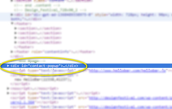
In this example, we may have had this straggler popping up in our prints. Here you can see the ID:
在此示例中,我们的打印物中可能弹出了这种散乱的信息。 在这里您可以看到ID:
We can now target this element with the following CSS:
现在,我们可以使用以下CSS定位此元素:
[sourcecode language=”css”]
[源代码语言=“ css”]
#contact-popup {display:none;}
#contact-popup {display:none;}
[/sourcecode]
[/源代码]
分页符 (Page Breaks)
Printers break your content up into pages, assuming you have more than one page to print. You can tell the browser to avoid page breaks at certain points. You can read all about page breaks in CSS at the W3.org page. In short, your options are as follows:
假设您要打印一页以上,则打印机会将您的内容分成几页。 您可以告诉浏览器避免在某些时候分页。 您可以在W3.org页面上阅读有关CSS分页符的所有信息。 简而言之,您的选择如下:
- page-break-before: always | avoid — always/avoid page breaks before the item page-break-before:始终| 避免—始终/避免在项目前分页
- page-break-after: always | avoid — always/avoid page breaks after the item 分页后:始终| 避免—始终/避免在项目后分页
- page-break-inside: always | avoid — always/avoid page breaks in the middle of the item page-break-inside:始终| 避免—始终/避免在项目中间出现分页符
Bear in mind that page breaks only apply to block content. A common example is a list — you may want to make lists blocks and then prevent page breaks happening in the middle of a list. The exception is text, which you can define as a block and then use the page breaks to change how it will print, but typically text should flow and you can allow the browser to figure out where to place it.
请记住,分页符仅适用于阻止内容。 一个常见的示例是列表-您可能希望使列表成为块,然后防止在页面中间发生分页符。 文本是一个例外,您可以将其定义为块,然后使用分页符更改其打印方式,但是通常情况下,文本应该可以流动,并且您可以允许浏览器确定将其放置在何处。
样品盒 (Sample Case)
Now that we have a blank slate, let’s start adding the structural pieces that we actually want to display when printed. The content section is an obvious candidate, so let’s add it back in and convert the paragraph font size to points:
现在我们有了一块空白板,让我们开始添加在打印时实际要显示的结构件。 内容部分是很明显的候选对象,因此让我们重新添加它,并将段落字体大小转换为磅数:
[sourcecode language=”css”]
[源代码语言=“ css”]
@media print { #content p { font-size:11pt; color: black; }
@media print {#content p {font-size:11pt; 颜色:黑色; }
#content img { display:block; page-break-after: avoid; page-break-inside: avoid; }
#content img {display:block; 分页后:避免; page-break-inside:避免; }
#content ul, li { display:block; page-break-inside:avoid; }
#content ul,li {display:block; page-break-inside:avoid; }
#header {display:none;} #comments {display:none;} #sidebar {display:none;} #footer {display:none;}
#header {display:none;} #comments {display:none;} #sidebar {display:none;} #footer {display:none;}
.site-description {display:none;} .site-title {display:none;}
.site-description {display:none;} .site-title {display:none;}
}
}
[/sourcecode]
[/源代码]
I removed the display:none; content CSS and converted our paragraph text from 14px to 11pt. You can go through each element of your page and customize each just for printing with this methodology.
我删除了显示:无; 内容CSS,并将我们的段落文本从14px转换为11pt。 您可以遍历页面的每个元素,并使用此方法自定义每个元素以进行打印。
结语 (Wrap Up)
Going from web to print can be frustrating, but the @media print media query allows us to get very targeted with how what elements get printed and how they get printed.
从网络转到打印可能会令人沮丧,但是@media打印媒体查询使我们可以非常有针对性地确定如何打印哪些元素以及如何打印它们。
There’s no real shortcut. If you need your site to look good in print, you’re likely going to have to create a separate CSS definition on a per element level until it’s perfect.
没有真正的捷径。 如果您希望网站的外观印刷精美,则可能需要在每个元素级别上创建一个单独CSS定义,直到完美为止。
Are print stylesheets part of your standard design process, or do you consider them an extra, nice-to-have addition to a thoroughly-designed website?
打印样式表是您标准设计过程的一部分,还是您认为它们是对经过彻底设计的网站的补充而又不错的补充?
翻译自: https://www.sitepoint.com/create-a-customized-print-stylesheet-in-minutes/


 扫一扫
扫一扫
 2779
2779

 被折叠的 条评论
为什么被折叠?
被折叠的 条评论
为什么被折叠?
 到【灌水乐园】发言


