


响应式web设计
The following is an exclusive extract from my new book, Jump Start Responsive Web Design, 2nd Edition. Copies are sold in stores worldwide, or you can buy it in ebook form here.
以下是我的新书《快速入门响应式Web设计第二版》的独家摘录。 副本在世界各地的商店中都有出售,或者您可以在此处以电子书形式购买 。
There are two main building blocks at the heart of responsive web design: media queries and viewports. In this post, we’ll take a look at media queries when building responsive sites.
响应式Web设计的核心有两个主要构建块:媒体查询和视口。 在本文中,我们将介绍构建响应式网站时的媒体查询。
Media queries represent the glue that joins a lot of other responsive concepts and tools together. They’re a simple but powerful concept, allowing you to detect device properties, define rules, and load different CSS properties based on them. For example, you can optimize a navigation menu for different devices, converting a full horizontal menu on desktop browsers to the “hamburger” menu often encountered on mobile devices.
媒体查询代表了将许多其他响应式概念和工具结合在一起的粘合剂。 它们是一个简单但功能强大的概念,可让您检测设备属性,定义规则并基于它们加载不同CSS属性。 例如,您可以优化不同设备的导航菜单,将桌面浏览器上的完整水平菜单转换为移动设备上经常遇到的“汉堡”菜单。
创建查询 (Creating a Query)
Let’s try a more substantial example. The aside to the main content in RWDflix is designed to show announcements and news. Mobile and tablet visitors probably want to focus on watching shows and nothing else, so let’s hide this element for users of smaller screened devices.
让我们尝试一个更实质的例子。 aside RWDflix的主要内容外,它还用于显示公告和新闻。 移动和平板电脑的访问者可能只想关注观看节目,而没有别的,所以让我们为屏幕较小的设备的用户隐藏此元素。
For the remainder of this chapter, I’ll use the @media method shown previously for media queries. It’s a personal preference, and as an experiment, you might like to try re-writing the examples using other methods.
在本章的其余部分,我将使用前面显示的@media方法进行媒体查询。 这是个人喜好,作为实验,您可能想尝试使用其他方法重写示例。
Remove the current aside CSS class and replace it with the following media queries:
删除当前aside CSS类并用以下媒体查询替换它:
@media screen and (min-width: 680px) {
    aside {
        width: 33%;
    }
}

@media screen and (max-width: 680px) {
    aside {
        display: none;
    }
}
This pair of media queries sets the aside element to a width of 33% if the screen is wider than 680px (by asking if the screen is at least 680px wide with min-width), and hides it if the screen is narrower than 680px (asking if the screen is at most 680px wide with max-width).
如果屏幕宽度大于680px(通过询问屏幕min-width是否至少为 680px且宽度为min-width ),这对媒体查询会将aside元素的宽度设置为33%,如果屏幕宽度小于680px(将其隐藏,则将其隐藏)(询问屏幕max-width是否为 680px( max-width )。
Next, make the TV listings fill the screen width when the aside isn’t showing:
接下来,在未显示aside情况下,让电视列表填充屏幕宽度:
section.showslisting {
    margin-bottom: 25px;
}

@media screen and (min-width: 680px) {
    section.showslisting {
        width: 66%;
    }
}

@media screen and (max-width: 680px) {
    section.showslisting {
        width: 100%;
    }
}
If you resize the page in your desktop browser, you’ll see the aside appearing and disappearing as you widen and narrow the browser window, the main content adjusting appropriately.
如果在桌面浏览器中调整页面的大小,则在扩大和缩小浏览器窗口时, aside出现aside出现和消失的情况,主要内容会适当调整。
You can use basic logic in your media queries. This allows you to combine multiple conditions. For example, you can use a logical AND:
您可以在媒体查询中使用基本逻辑。 这使您可以组合多个条件。 例如,您可以使用逻辑AND:
@media only screen and (min-width: 640px) and (max-width: 1136px) {
    …
}
The code above will invoke the CSS styles within the query if a device’s screen width is between 640px and 1136px. The min-width property is the minimum width of the screen, and max-width the maximum.
如果设备的屏幕宽度在640px 至 1136px之间,则上面的代码将在查询中调用CSS样式。 min-width属性是屏幕的最小宽度, max-width是最大max-width 。
For this media query to match, both conditions need to be true. It’s also possible to match queries if only one condition is true with a logical OR, which (confusingly) is represented with a comma. The query below will apply on screen or print devices:
为了使该媒体查询匹配,两个条件都必须为真。 如果只有一个条件与逻辑“或”相符(以逗号表示)(混淆),也可以匹配查询。 以下查询将应用于screen或print设备:
@media only screen, print {
    …
}
You can also combine ANDs with ORs to make more complex queries. Here’s the current page rendered on a larger sized phone, but in landscape mode:
您还可以将AND与OR结合使用,以进行更复杂的查询。 这是在较大尺寸的手机上呈现的当前页面,但处于横向模式:
In the screenshot above, the screen is 732px wide, which is above the 640px set above. Still, the aside doesn’t quite fit into the window, so let’s hide it if the screen size is below 640px, or if the device is in landscape mode:
在上面的屏幕截图中,屏幕宽732px,高于上面设置的640px。 尽管如此, aside仍不太适合窗口,因此,如果屏幕尺寸小于640像素,或者设备处于横向模式,请将其隐藏起来:
@media screen and (max-width: 680px), screen and (orientation: landscape) and (max-width: 750px) {
    aside {
        display: none;
    }
}
And the corresponding media query for the listings section:
并针对清单部分进行相应的媒体查询:
@media screen and (max-width: 680px), screen and (orientation: landscape) and (max-width: 750px) {
    section.showslisting {
        width: 100%;
    }
}
You’ll see that I added a max-width check, to show the aside on tablets in landscape mode, but also to show how you can combine logical checks together.
您会看到我添加了一个max-width检查,以横向模式在平板电脑上显示aside ,同时也显示了如何将逻辑检查结合在一起。
逻辑查询,仅包含和不包含 (Logical Queries with Only and Not)
You can also make precise media queries using only and not. For example, this media query will match devices that are at least 640px wide and exclude the print media type:
您还可以only使用和not使用进行精确的媒体查询。 例如,此媒体查询将匹配宽度至少为640px设备,并排除打印媒体类型:
@media not print and (min-width: 640px) {
    …
}
In contrast, this query will only apply to screen devices that are at least 640px wide:
相反,此查询将仅适用于宽度至少为640px屏幕设备:
@media only screen and (min-width: 640px) {
    …
}
查询功能 (Query Features)
The width and height queries we’ve looked at so far are some of the most widely used, but there are several other media features that are also useful for checking against device features. These include color capabilities, aspect ratio, orientation, resolution, and vendor-specific features for Mozilla- and WebKit-based browsers. Most of these accept min- and max- prefixes that work in a similar way to the dimension queries above.
到目前为止,我们研究过的width和height查询是使用最广泛的一些查询,但是还有其他一些媒体功能对于检查设备功能也很有用。 这些包括针对基于Mozilla和WebKit的浏览器的颜色功能,长宽比,方向,分辨率和特定于供应商的功能。 其中大多数接受min-和max-前缀,其工作方式与上述维度查询类似。
aspect-ratio (aspect-ratio)
The aspect-ratio feature allows you to check the ratio of horizontal pixels to vertical pixels, separated by a slash. For example:
高aspect-ratio功能使您可以检查水平像素与垂直像素的比率,并用斜杠分隔。 例如:
@media screen and (min-aspect-ratio: 1/1) {
    …
}
The above rule will match a device where the screen’s width to height ratio is 1:1 or more, so square or landscape.
上面的规则将匹配屏幕的宽高比为1:1或更大(即正方形或横向)的设备。
A common use for this would be to detect wider screens, useful when you’re displaying videos:
这样做的常见用途是检测更宽的屏幕,这在显示视频时很有用:
@media screen and (min-aspect-ratio: 16/9) {
    …
}
orientation (orientation)
As shown earlier, this feature checks if the device is in landscape or portrait mode. For example:
如前所述,此功能检查设备是处于横向还是纵向模式。 例如:
@media all and (orientation: landscape) {
    …
}
And:
和:
@media all and (orientation: portrait) {
    …
}
color (color)
This feature checks if a device can support a certain bit-level of color. For example, this is how to check that a device supports at least 8-bits of color (that is, 256 colors):
此功能检查设备是否可以支持特定级别的颜色。 例如,这是检查设备是否支持至少8位颜色(即256种颜色)的方法:
@media all and (min-color: 8) {
    …
}
color-index (color-index)
This plays a role similar to color, but lets you check for the number of colors instead of the bit-level:
它起着类似于color的作用,但是让您检查颜色的数量而不是位级别:
@media all and (min-color-index: 256) {
    …
}
monochrome (monochrome)
Again, similar to color, monochrome lets you check for the levels of gray in a device:
再次,类似于color , monochrome使您可以检查设备中的灰度等级:
@media all and (min-monochrome: 8) {
    …
}
resolution (resolution)
This feature targets devices that have high-resolution screens:
此功能针对具有高分辨率屏幕的设备:
@media all and (min-resolution: 120dpi) {
    …
}
scan (scan)
The scan media feature lets you check the scanning process of TVs, the options being interlace or progressive:
scan媒体功能可让您检查电视的扫描过程,选项是interlace还是progressive interlace :
@media all and (scan: progressive) {
    …
}
grid (grid)
grid is used for checking if a device is a terminal-like device. This also includes older phones (that is, non-smartphones), accessible phones (for those with poor vision), and braille devices. It returns a boolean value if true:
grid用于检查设备是否是类似终端的设备。 这也包括较旧的电话(即非智能电话),无障碍电话(针对视力不佳的人)和盲文设备。 如果为true,则返回布尔值:
@media grid {
    …
}
As you can see, through combinations of dimension- and feature-based queries, you can construct complex stylesheets to target a multitude of devices effectively with styles that work most efficiently for them. This is the main point of media queries: they allow you to selectively load CSS styles for particular device configurations.
如您所见,通过组合基于维度和基于特征的查询,您可以构造复杂的样式表,以有效地定位最适合其使用的样式的多种设备。 这是媒体查询的重点:它们允许您有选择地加载特定设备配置CSS样式。
简化示例应用 (Streamlining the Example App)
Now that you have a basic understanding, let’s continue to build upon the media queries added earlier to make the example site tidier.
现在您已经有了基本的了解,让我们继续建立在前面添加的媒体查询的基础上,以使示例网站更加简洁。
First, you can consolidate the queries already written, moving the classes into two groups of media queries:
首先,您可以合并已经编写的查询,将这些类移动到两组媒体查询中:
/* Media Queries */
/* For example, desktop devices */
@media screen and (min-width: 680px) {
    aside {
        width: 33%;
    }

    section.showslisting {
        width: 66%;
    }
}

/* For example, medium-width screens or smaller screens in landscape */
@media screen and (max-width: 680px), screen and (orientation: landscape) and (max-width: 750px) {
    aside {
        display: none;
    }

    section.showslisting {
        width: 100%;
    }
}
Much tidier! You can keep adding new styles for each query into these sections.
更整洁! 您可以继续在这些部分中为每个查询添加新样式。
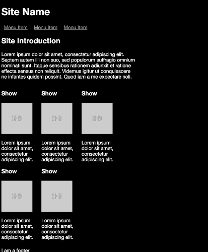
Let’s look back to our demo site specification outlined in Chapter 1 for what else needs to be optimized for each screen size. The next step will be hiding the TV show description on small screens, and shorten it on medium-sized screens.
让我们回顾一下第1章中概述的演示站点规范,以了解针对每种屏幕尺寸还需要优化的内容。 下一步将在小屏幕上隐藏电视节目说明,而在中型屏幕上将其缩短。
It would be a lot easier to do this if the description text had a class, so add one to each instance of the p tag that contains the show description:
如果描述文本中有一个类,这样做会容易得多,因此请在包含显示描述的p标记的每个实例中添加一个:
<section class="tvshow">
    <h3>Show</h3>
    <img src="http://placehold.it/350x150"
    class="thumbnail">
    <p class="showdescription">Lorem ipsum dolor sit amet,
    consectetur adipiscing elit.</p>
</section>
Let’s add new media queries to accommodate the various sizes we aim to support, and, in doing so, tidy up the existing ones.
让我们添加新的媒体查询以适应我们旨在支持的各种规模,并在此过程中整理现有的查询。
The specific widths at which we want our design to reflow are known as breakpoints. The breakpoints we’ll add are not exhaustive: there’s a huge range of device sizes, and more are appearing all the time, so it’s futile to try to target each device with separate queries. A better approach is to assess the points at which your design needs to reflow, and then create media queries for those breakpoints. This is the beauty of responsive web design: you can ensure that each device will get an appropriate layout without having to design separately for each device.
我们希望设计回流的特定宽度称为断点 。 我们将添加的断点并不详尽:设备大小范围很大,并且一直在出现更多的断点,因此尝试使用单独的查询来定位每个设备是徒劳的。 更好的方法是评估设计需要重排的点,然后为这些断点创建媒体查询。 这就是响应式Web设计的优点:您可以确保每个设备都将获得适当的布局,而不必为每个设备分别设计。
Add the following breakpoints and refactor our existing styles into them:
添加以下断点并在其中重构我们现有的样式:
/* Media Queries */

/* For example, older phones */
@media only screen and (min-width: 320px) {
    aside {
        display: none;
    }

    section.showslisting {
        width: 100%;
    }

    .showdescription {
        display: none;
    }
}

/* For example, newer phones */
@media only screen and (min-width: 480px) {
}

/* For example, small computer screens and larger tablets */
@media only screen and (min-width: 768px) {
    .showdescription {
        text-overflow: ellipsis;
        display: block;
        white-space: nowrap;
        width: 100px;
        overflow: hidden;
    }
}

/* For example, typical desktop monitors or larger tablet devices */
@media only screen and (min-width: 992px) {
    aside {
        width: 33%;
        display: block;
    }

    section.showslisting {
        width: 66%;
    }

    .showdescription {
        white-space: normal;
        width: 125px;
    }
}

/* Large Devices, for example large monitors and TVs */
@media only screen and (min-width: 1200px) {
}
The media queries should now be self-explanatory. They define queries for a selection of devices, defined using screen sizes. As the C in CSS implies, the media queries cascade: you can build upon styles defined in a breakpoint for a smaller device size and change the properties that are different.
媒体查询现在应该是不言自明的。 它们使用屏幕尺寸定义对设备选择的查询。 正如CSS中的C所暗示的那样,媒体查询是级联的 :您可以在断点中定义的样式上建立较小的设备尺寸,并更改不同的属性。
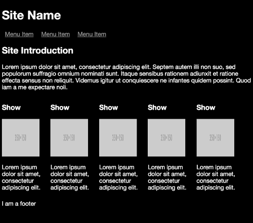
Notice that between the @media only screen and (min-width: 320px) breakpoint for smaller devices and the @media only screen and (min-width: 768px) breakpoint for medium-sized devices, all that changes is the showdescription class, showing text, but truncating it. Then in the @media only screen and (min-width: 992px) breakpoint for larger screens, all elements are revealed.
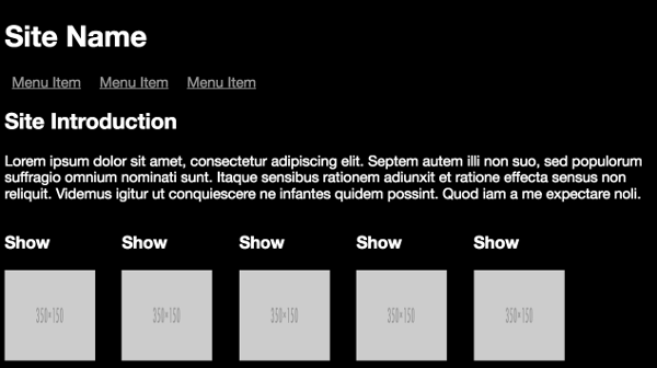
请注意,在较小设备的@media only screen and (min-width: 320px)断点与中型设备的@media only screen and (min-width: 768px)断点之间,所有更改都是showdescription类,显示文字,但将其截断。 然后在@media only screen and (min-width: 992px)较大屏幕的@media only screen and (min-width: 992px)断点处,将显示所有元素。
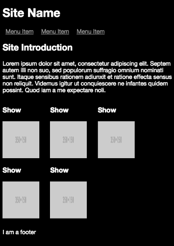
The layout generated by the small-screen breakpoint:
小屏幕断点生成的布局:
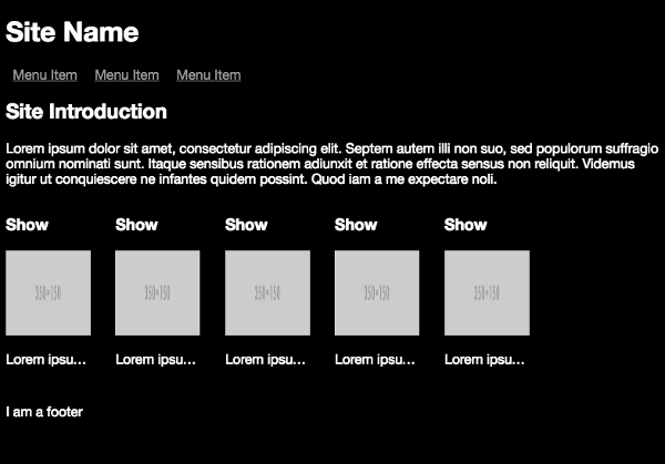
The layout generated by the medium breakpoint:
中等断点生成的布局:
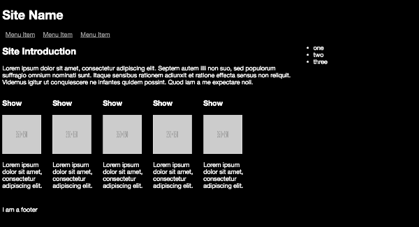
The layout generated by the medium to large breakpoint:
中型到大型断点生成的布局:
My recently released book Jump Start Responsive Web Design, is available now on SitePoint. It aims to get you started understanding, and using, the suite of CSS and HTML tools available for responding to this new world of devices. It’s highly practical, with plenty of examples throughout, covering:
我最近发行的书《快速启动响应式Web设计》现已在SitePoint上可用。 它旨在使您开始理解和使用可用于响应这一新设备世界CSS和HTML工具套件。 这是高度实用的,在整个过程中都有很多示例,包括:
The Meaning and Purpose of Responsive Web Design
响应式网页设计的意义和目的
The Building Blocks of Responsive Design
响应式设计的基础
Better Responsive Structures with Grid Systems
网格系统具有更好的响应结构
Responsive Text
回应文字
Responsive Images and Video
响应式图像和视频
Responding to User Context
响应用户上下文
My book is suitable for for beginner-level designers and developers with understanding of HTML and CSS. Some JavaScript experience is useful for the later chapters.
我的书适合具有HTML和CSS知识的初学者设计人员和开发人员。 一些JavaScript经验对于后面的章节很有用。
翻译自: https://www.sitepoint.com/creating-media-queries-for-responsive-web-designs/
响应式web设计


 576
576


 被折叠的 条评论
为什么被折叠?
被折叠的 条评论
为什么被折叠?
 到【灌水乐园】发言


