


polymer ajax
我们在建什么? ( What are we building? )
We will build a simple Battery Web Component using Polymer and our final goal looks like this:
我们将使用Polymer构建一个简单的Battery Web Component,我们的最终目标如下所示:
Source code of this battery component can be found at https://github.com/nemanja-popovic/simple-battery-component.
该电池组件的源代码可以在https://github.com/nemanja-popovic/simple-battery-component处找到。
聚合物 ( Polymer )
Polymer is an open source library built by Google to make using of Web components easier. Web components are a collection of specifications that give possibility to developers to build their web applications as a set of reusable components.
Polymer是Google建立的开放源代码库,可简化Web组件的使用。 Web组件是规范的集合,这些规范使开发人员有可能将其Web应用程序构建为一组可重用的组件。
More about Web Components can be found here, and more about Polymer project can be found here.
关于Web组件的更多信息可以在这里找到,有关Polymer项目的更多信息可以在这里找到。
电池API ( Battery API )
Battery API is one of great features that is providing us information about battery's current status. It also has events that are fired when changes of the battery level or status take place.
Battery API是一项出色的功能,可为我们提供有关电池当前状态的信息。 当电池电量或状态发生变化时,也会触发这些事件。
Properties that battery object has are:
电池对象具有的属性是:
level: Represents the current battery level scaled from 0 to 1.0. The attribute must be set to 0 if the system's battery is empty, and to 1.0 if the battery is full.level:表示当前电池电量,范围从0到1.0。 如果系统电池为空,则属性必须设置为0,如果电池已满,则属性应设置为1.0。charging: Represents if the system's battery is charging or not. Value is false when battery is discharging and true in all other cases (full, charging, no battery, etc.).charging:表示系统电池是否正在充电。 当电池正在放电时,该值为false;在所有其他情况下(充满,充电,无电池等),该值为true。chargingTime: Represents the time remaining in seconds until the system's battery is fully charged.chargingTime:表示系统电池充满电之前剩余的时间(以秒为单位)。dischargingTime: Represents the time remaining in seconds until the system's battery is completely discharged.dischargingTime:表示系统电池完全放电之前剩余的时间(以秒为单位)。
And battery events are including ondischargingtimechange, onlevelchange, onchargingchange and onchargingtimechange.
电池事件包括ondischargingtimechange , onlevelchange , onchargingchange和onchargingtimechange 。
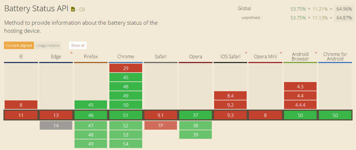
浏览器支持 (Browser support)
At the moment Battery API is supported by Firefox, Chrome and Opera. More details about supported browsers and their versions can be found at http://caniuse.com/#feat=battery-status.
目前,Firefox,Chrome和Opera支持Battery API。 有关受支持的浏览器及其版本的更多详细信息,请访问http://caniuse.com/#feat=battery-status 。
如何使用电池API (How to use Battery API)
In order to get battery status we need to call window.navigator.getBattery() method that is returning promise. Here is a small example showing how to get details about battery:
为了获取电池状态,我们需要调用返回promise的window.navigator.getBattery()方法。 这是一个小示例,展示了如何获取有关电池的详细信息:
window . navigator . getBattery ( ) . then ( function ( battery ) {

    // A few useful battery properties
    console . info ( 'Battery charging: ' , battery . charging ) ; // false
    console . info ( 'Battery level: ' , ( battery . level * 100 ) + '%' ) ; // 65%
    console . info ( 'Battery discharging time: ' , battery . dischargingTime ) ;

    // Few event listeners
    battery . addEventListener ( 'chargingchange' , function ( e ) {
        console . info ( 'Battery charge change: ' , battery . charging ) ;
    } , false ) ;
    battery . addEventListener ( 'chargingtimechange' , function ( e ) {
        console . info ( 'Battery charge time change: ' , battery . chargingTime ) ;
    } , false ) ;
    battery . addEventListener ( 'dischargingtimechange' , function ( e ) {
        console . info ( 'Battery discharging time change: ' , battery . dischargingTime ) ;
    } , false ) ;
    battery . addEventListener ( 'levelchange' , function ( e ) {
        console . info ( 'Battery level change: ' , battery . level ) ;
    } , false ) ;
} ) ;
For more details about Battery API please visit https://www.w3.org/TR/battery-status/.
有关Battery API的更多详细信息,请访问https://www.w3.org/TR/battery-status/ 。
配置 ( Setting up )
In this tutorial we will be using polymer seed element. Note: You can also start without seed element repository and in that case not all the steps will be the same. Polymer seed element can be found at https://github.com/PolymerElements/seed-element.
在本教程中,我们将使用聚合物种子元素。 注意:您也可以在没有种子元素存储库的情况下开始,在这种情况下,并非所有步骤都是相同的。 聚合物种子元素可以在https://github.com/PolymerElements/seed-element中找到。
First we should clone this repository. Create a new folder called simple-battery-status and navigate to it. When navigated to it clone the repository using the following command:
首先,我们应该克隆该存储库。 创建一个名为simple-battery-status的新文件夹,然后浏览至该文件夹。 导航到它时,使用以下命令克隆存储库:
$ git clone https://github.com/PolymerElements/seed-element.git .When repository is cloned install all bower dependencies. If you don't have Bower installed do that using the following command:
克隆存储库后,安装所有Bower依赖项。 如果您没有安装Bower ,请使用以下命令进行安装:
$ npm install -g bowerThen, go ahead and install the element's dependencies:
然后,继续安装元素的依赖项:
$ bower installAfter all this our element files are created. Let's change all occurrences of seed-element to our simple-battery-status element. Make sure that you changed it in all places and also that you renamed all seed-element files.
完成所有这些之后,我们的元素文件就创建了。 让我们将所有出现的种子元素更改为简单电池状态元素。 确保在所有位置都进行了更改,并且还重命名了所有seed-element文件。
In order to take a look at current state of the element we should use polyserve. Polyserve is a simple web server used to run components locally. To use polyserve we first need to install it via:
为了查看元素的当前状态,我们应该使用polyserve 。 Polyserve是用于在本地运行组件的简单Web服务器。 要使用polyserve,我们首先需要通过以下方式安装它:
$ npm install -g polyserveAfter polyserve is installed we can run:
安装Polyserve之后,我们可以运行:
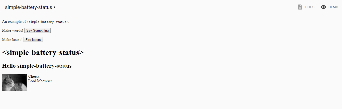
$ polyserve -oThis command will open our default browser and show us documentation page of seed element (if the command didn't open browser then you can do that manually as our element should be at http://localhost:8080/components/simple-battery-status/). In the top right corner of the opened page DOCS and DEMO buttons are shown. Current seed element is at demo page and we can navigate there clicking on DEMO button. We can see example component provided by Polymer team. Soon here we will see our battery element.
该命令将打开默认浏览器,并向我们显示种子元素的文档页面(如果该命令未打开浏览器,则您可以手动执行此操作,因为我们的元素应位于http:// localhost:8080 / components / simple-battery-状态/ )。 在打开的页面的右上角显示了DOCS和DEMO按钮。 当前的种子元素在演示页面上,我们可以在此处单击DEMO按钮进行导航。 我们可以看到Polymer团队提供的示例组件。 很快,我们将在这里看到电池元件。
So let's add few simple batteries to our DEMO page. If you open index.html file under demo folder you will see this demo elements under body tag. So replace all this code under body element and add this:
因此,让我们在DEMO页面中添加一些简单的电池。 如果打开demo folder下的index.html文件,您将在body标签下看到此demo元素。 因此,将所有这些代码替换为body元素并添加以下内容:
< h1 > Simple battery status demo </ h1 >

  < style >
    .example{
      width: 100px;
      margin: 0 auto;
      padding: 10px;
    }
  </ style >

  < div class = " example " >
    < simple-battery-status level = " 85 " > </ simple-battery-status >
  </ div >

  < div class = " example " >
    < simple-battery-status detect > </ simple-battery-status >
  </ div >
This way, when we start implementing our component DEMO part will show two batteries, one showing 85% and the other one showing current battery level of your device.
这样,当我们开始实施我们的组件DEMO部分时,将显示两节电池,一块显示85%的电量,另一块显示您设备的当前电池电量。
简单的电池状态Web组件 ( Simple battery status Web Component )
Let's open simple-battery-status.html file. Here you will see initial seed implementation of Polymer web component with some demo properties and methods. First we will get rid of code that is not needed anymore. After doing so our simple-battery-status.html will look like this:
让我们打开simple-battery-status.html文件。 在这里,您将看到Polymer Web组件的初始种子实现,其中包含一些演示属性和方法。 首先,我们将摆脱不再需要的代码。 这样做之后,我们的simple-battery-status.html将如下所示:
< link rel = " import " href = " ../polymer/polymer.html " >
<!--
Element used to show battery status using Battery API.
Example:
<simple-battery-status></simple-battery-status>
@demo demo/index.html
-->
< dom-module id = " simple-battery-status " >
< template >
< style > </ style >
</ template >
< script >
Polymer({
is: 'simple-battery-status',
properties: { },
// Element Lifecycle
attached: function() {
// `attached` fires once the element and its parents have been inserted
// into a document.
//
// This is a good place to perform any work related to your element's
// visual state or active behavior (measuring sizes, beginning animations,
// loading resources, etc).
},
// Element Behavior
});
</ script >
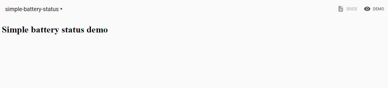
</ dom-module >If we now refresh http://localhost:8080/components/simple-battery-status/ and go to demo page we will see only title.
如果现在刷新http:// localhost:8080 / components / simple-battery-status /并转到演示页面,我们将仅看到标题。
So let's start adding features to our element. First let's make simple battery looking shape. We can do that by adding simple html and css to our element. These are added to template tag inside our element definition and after adding them our template will look like:
因此,让我们开始向要素添加功能。 首先,让我们制作简单的电池外观形状。 我们可以通过向元素添加简单的html和css来做到这一点。 它们被添加到元素定义内的template标签中,添加后,我们的template将如下所示:
< template >
< style >
.container {
font-family: Roboto, Noto, 'Trebuchet MS', sans-serif;
}
#batteryEnd {
width: 15px;
}
#batteryEnd div {
width: 35px;
height: 15px;
margin-left: 30px;
background-color: #CCC;
}
#batteryBody {
width: 75px;
height: 200px;
border: 10px #CCC solid;
}
</ style >
< div class = " container " >
< div id = " batteryEnd " >
< div > </ div >
</ div >
< div id = " batteryBody " >
</ div >
</ div >
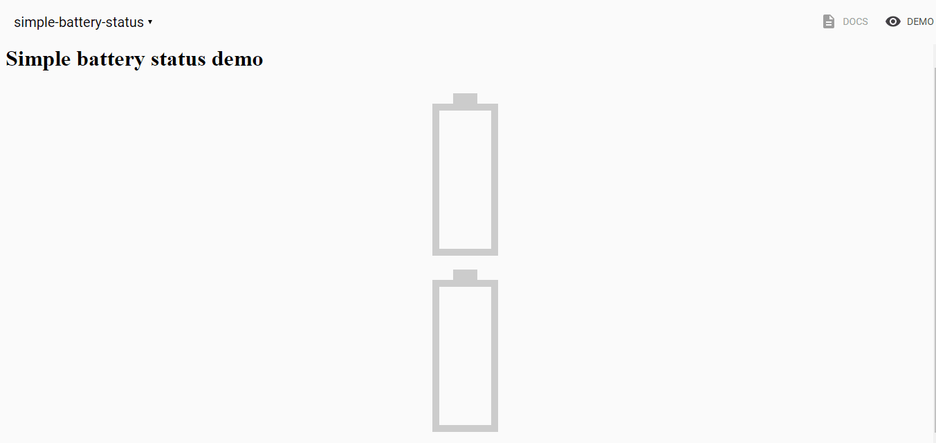
</ template >If we now take a look in our component we will see two "empty" batteries.
如果现在看一下组件,我们将看到两个“空”电池。
So let's add indicator element to our template:
因此,让我们将指标元素添加到我们的模板中:
< div id = " batteryBody " >
    < div id = " indicator " > </ div >
</ div >
Also let's add simple css for that indicator.
另外,让我们为该指标添加简单CSS。
#indicator  {
    width : 100% ;
    background-color : var ( --battery-status-indicator-background, #FFF ) ;
}
Note that background color is defined as custom css property. This way we allow theming of our element as now this property can be defined from outside of our component. More details about this can be found here.
请注意,背景色定义为自定义css属性。 这样,我们就可以对元素进行主题化,因为现在可以从组件外部定义此属性。 有关此的更多详细信息,请参见此处 。
It is time to start using Battery API. First we will just show current level of battery. Let's first define level property to our element, so now properties object of our element will look like this:
现在该开始使用Battery API了。 首先,我们将仅显示电池的当前电量。 首先,为元素定义级别属性,现在,元素的properties对象将如下所示:
properties : {
    level : {
        type : Number ,
        value : 50
    }
} ,
We defined level property that is type of Number and we are setting its default value to 50.
我们定义了级别类型为Number的属性,并将其默认值设置为50。
Also, we would like to have different colors for different levels of battery and because of that we will now add five different classes. This colors are also going to be custom css properties so we can enable theming of our element and enable changing of this colors from outside of our element.
另外,我们希望为不同级别的电池使用不同的颜色,因此,我们现在将添加五个不同的类别。 该颜色还将成为自定义CSS属性,因此我们可以启用元素的主题设置,并可以从元素外部更改此颜色。
.full  {
    background-color : var ( --battery-status-full-color, #BFFF00 ) ;
}

.good  {
    background-color : var ( --battery-status-good-color, #BDE24D ) ;
}

.medium  {
    background-color : var ( --battery-status-medium-color, #FFFF00 ) ;
}

.low  {
    background-color : var ( --battery-status-low-color, #FFC800 ) ;
}

.empty  {
    background-color : var ( --battery-status-empty-color, #FF5200 ) ;
}
In order to show correct color for correct value, we will call calculateLevelStyle method every time level is changed. This method will return class name that is showing current state of our battery level and we will show code for this method a bit later.
为了显示正确的颜色和正确的值,每次更改级别时,我们都会调用calculateLevelStyle方法。 该方法将返回显示电池电量当前状态的类名,稍后将显示该方法的代码。
< div id = " batteryBody " class$ = " [[_calculateLevelStyle(level)]] " >
    < div id = " indicator " > </ div >
</ div >
The last thing we need to do is update look of our simple battery every time level is changed. For that we can start observing level value, and when this value is changed we can call method that will check new level value and based on that set different state. So let's update our level property definition:
我们需要做的最后一件事是每次更改级别时都要更新简单电池的外观。 为此,我们可以开始观察级别值,并且当更改此值时,我们可以调用将检查新级别值并基于该设置的不同状态的方法。 因此,让我们更新关卡属性定义:
properties : {
    /**
     * `level` indicates level of battery
     */
    level : {
        type : Number ,
        value : 50 ,
        observer : '_levelChanged'
    }
}
And let's define function __levelChanged under // Element Behavior part of our file:
然后在文件的// Element Behavior部分下定义函数__levelChanged :
_levelChanged : function ( ) {
    var self = this ;

    //Make sure that it is not lower than 0
    if ( self . level < 0 ) {
        self . level = 0 ;
    }

    self . $ . indicator . style . height = ( 100 - self . level ) + '%' ;
    self . _calculateLevelStyle ( ) ;
} ,

_calculateLevelStyle : function ( level ) {
    if ( level <= 10 ) {
        return 'empty' ;
    }
    else if ( level <= 20 ) {
        return 'low' ;
    }
    else if ( level <= 50 ) {
        return 'medium' ;
    }
    else if ( level <= 80 ) {
        return 'good' ;
    }

    return 'full' ;
}
NOTE: Make sure that after attached function , is added.
NOTE: Make sure that after attached function , is added.
If we now refresh our components demo page we should see something like this:
如果现在刷新组件演示页面,我们应该看到类似以下内容:
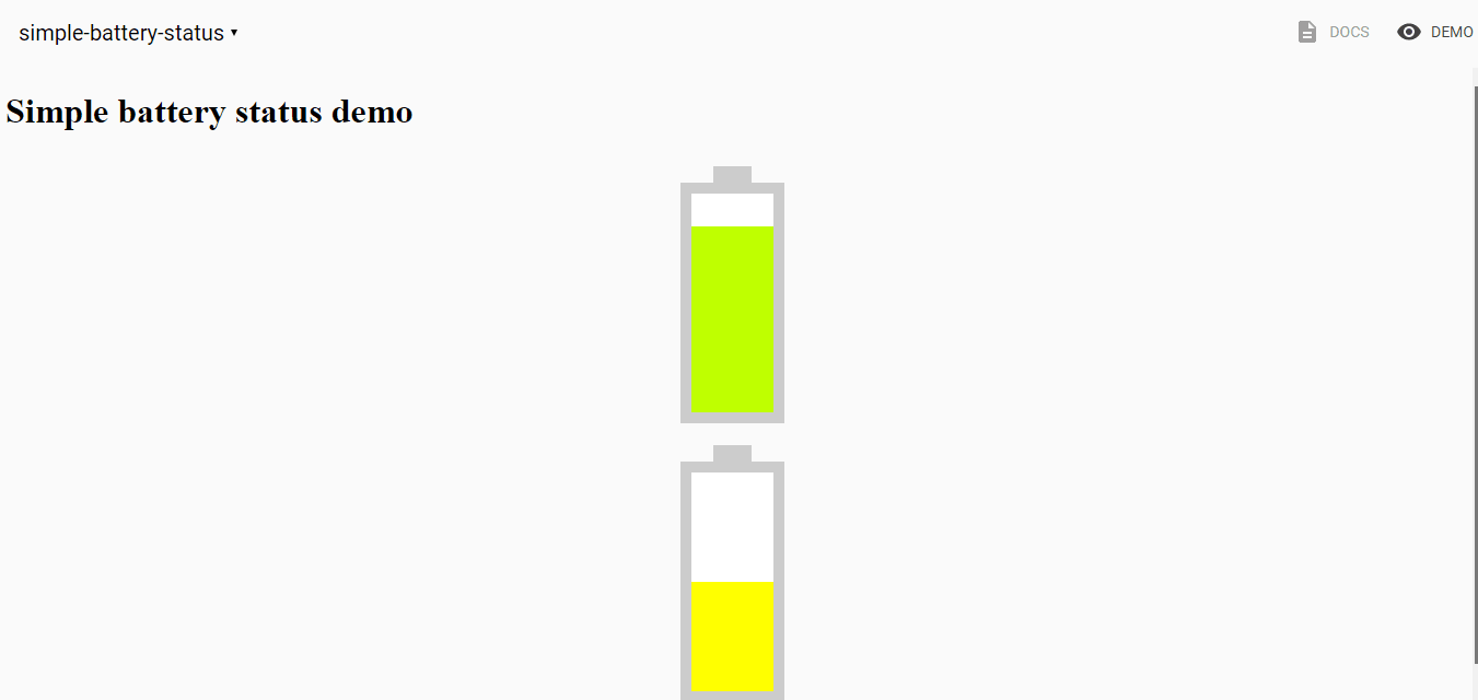
As you can see we do see that battery level is different, but we don't know exact level. Our battery component would be much nicer if we have level shown. So the last thing we will do in order to improve look and feel of our component is showing percentage of current level. For that we need to add additional element and styling for it. We will add element with id status under indicator element:
如您所见,我们确实看到电池电量有所不同,但我们不知道确切的电量。 如果显示水平,我们的电池组件会更好。 因此,为了改善组件外观,我们要做的最后一件事就是显示当前级别的百分比。 为此,我们需要为其添加其他元素和样式。 我们将在指标元素下添加具有id状态的元素:
< div id = " batteryBody " class$ = " [[_calculateLevelStyle(level)]] " >
    < div id = " indicator " >
        < span id = " status " > [[level]]% </ span >
    </ div >
</ div >
And style for this element will be:
这个元素的样式将是:
#status {
top : 90 px ;
position : relative ;
text-align : center ;
width : 100% ;
font-size : 20 px ;
font-weight : 700 ;
display : block ;
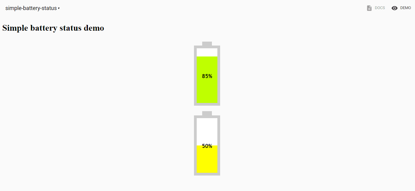
}If we take a look now at current progress we should see initial implementation of our battery component.
如果我们现在看看当前的进展,我们应该看到电池组件的最初实施。
实际电池状态 ( Real battery status )
So far the battery value was not the real value of our device battery level. In order to get real battery level we should add code that will get battery status in attached event of element and then get current level. We want to make this as an option for users. Because of that we will first add detect property and then start using Battery API is this property is provided as attribute when element is created. Property definition will be:
到目前为止,电池价值还不是我们设备电池电量的真实价值。 为了获得实际的电池电量,我们应该添加代码,该代码将在元素的附加事件中获取电池状态,然后获取当前电量。 我们希望将此作为用户的选项。 因此,我们将首先添加detect属性,然后开始使用Battery API,因为在创建元素时此属性作为属性提供。 属性定义为:
properties : {
    /**
     * `level` indicates level of battery
     */
    level : {
        type : Number ,
        value : 50 ,
        observer : '_levelChanged'
    } ,
    /**
    * `detect` indicates if the component will use Battery API to get
    * current _state or just show provided value. When detect attribute
    * provided component will use Battery API
    */
    detect : {
        type : Boolean ,
        value : false
    }
} ,
and this is how the code in attached function will look like:
这是附加函数中的代码的样子:
attached : function ( ) {
    // `attached` fires once the element and its parents have been inserted
    // into a document.
    //
    // This is a good place to perform any work related to your element's
    // visual state or active behavior (measuring sizes, beginning animations,
    // loading resources, etc).
    var self = this ;

    //Show initial level of battery
    self . $ . indicator . style . height = self . level + '%' ;

    if ( ! self . detect ) {
        return ;
    }

    navigator . getBattery ( )
        . then ( function ( battery ) {
            //Assign level property
            self . level = battery . level * 100 ;
        } ) ;
}
When we get battery we are setting level property that we defined earlier to battery.level * 100. We are doing this because battery.level has values between 0 and 1.
当获得电池时,我们将先前定义的level属性设置为battery.level *100。我们这样做是因为battery.level值在0到1之间。
Now if we take a look in our demo elements we will see our battery level. But level is not changing as our battery level changes. We should add that also. So in the attached method, we should also add event listener to levelchange event that will update our element. This part of code looks like:
现在,如果我们看一下演示元素,我们将看到电池电量。 但是,随着我们的电池电量变化,电量水平也没有变化。 我们也应该添加。 因此,在附加的方法中,我们还应该将事件侦听器添加到levelchange事件中,这将更新我们的元素。 这部分代码如下所示:
navigator . getBattery ( )
    . then ( function ( battery ) {
        //Assign level property
        self . level = battery . level * 100 ;

        //Listen for level change event
        battery . addEventListener ( 'levelchange' , function ( e ) {
            self . level = battery . level * 100 ;
        } , false ) ;
    } ) ;
结果 ( Result )
After all this code implemented we should go and take a look in our battery demo page. If we now again run polyserve -o command, and open DEMO part of our component we will see two battery elements. As our battery level changes level in second battery element will change also. Great job!
在完成所有这些代码之后,我们应该去看看电池演示页面。 如果现在再次运行polyserve -o命令,并打开组件的DEMO部分,我们将看到两个电池单元。 随着电池电量的变化,第二个电池元件的电量也会变化。 很好!
So now our Polymer Web component element is finished and we can share it easily with everyone!
至此,我们的Polymer Web组件元素已经完成,我们可以轻松地与所有人共享它!
Now you saw how easy is to build custom elements and hopefully you will start building many cool Web components with Polymer and help in making the world a better place for web developers one component at a time.
现在,您已经知道构建自定义元素有多么容易,并且希望您将开始使用Polymer构建许多很酷的Web组件,并帮助使Web开发人员一次成为一个更好的世界。
翻译自: https://scotch.io/tutorials/build-a-real-battery-status-web-component-with-polymer
polymer ajax


 245
245

 被折叠的 条评论
为什么被折叠?
被折叠的 条评论
为什么被折叠?
 到【灌水乐园】发言


