


power bi 背景图
Power BI Desktop amplifies the value of data. We can connect to multiple data sources and visualize the data interactively. One of the best parts of Power BI Desktop is the custom visual feature. It allows developers to create custom visuals and users can then download these visuals from the marketplace and use it as per the data set requirements. We can prepare reports using Power BI Desktop and share the reports using the Power BI service.
Power BI Desktop会放大数据的价值。 我们可以连接到多个数据源并以交互方式可视化数据。 自定义视觉功能是Power BI Desktop最好的部分之一。 它允许开发人员创建自定义视觉效果,然后用户可以从市场上下载这些视觉效果,并根据数据集要求使用它。 我们可以使用Power BI Desktop准备报告,并使用Power BI服务共享报告。
In this article, we will explore the Power BI Desktop custom visual ‘Pie Tree Chart’. We can represent hierarchical data in tree mode with the values in a pie chart for each node. It provides a different way to represent the data in the chart.
在本文中,我们将探讨Power BI Desktop自定义可视化“饼图”。 我们可以用树形模式表示分层数据,并用饼图中的每个节点的值表示。 它提供了另一种表示图表中数据的方式。
使用Excel数据源将数据导入Power BI Desktop (Importing Data into Power BI Desktop using Excel data source)
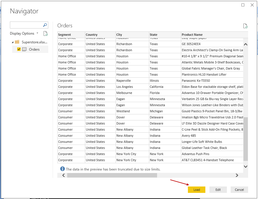
We will first import the data using Excel sheet into Power BI Desktop.
我们将首先使用Excel工作表将数据导入Power BI Desktop。
In Power BI Desktop, Click on the ‘Get Data -> Excel.’
在Power BI Desktop中,单击“获取数据-> Excel”。
Provide the source Excel file path and click ‘Open.’
提供源Excel文件路径,然后单击“打开”。
If you want to make any change in the data, you can click on ‘Edit’. We do not want to make any change in the data therefore, click ‘Load’.
如果要更改数据,可以单击“编辑”。 我们不想对数据进行任何更改,因此,请单击“加载”。
You can view the imported data set in the FIELDS area.
您可以在FIELDS区域中查看导入的数据集。
从市场将饼图树视觉效果导入Power BI Desktop (Importing Pie Chart Tree visuals from Marketplace into Power BI Desktop)
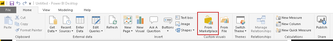
In the Menu bar, we can go to the Custom Visual Section. In this section, click on the ‘From Marketplace’
在菜单栏中,我们可以转到“自定义视觉”部分。 在此部分中,单击“来自市场”
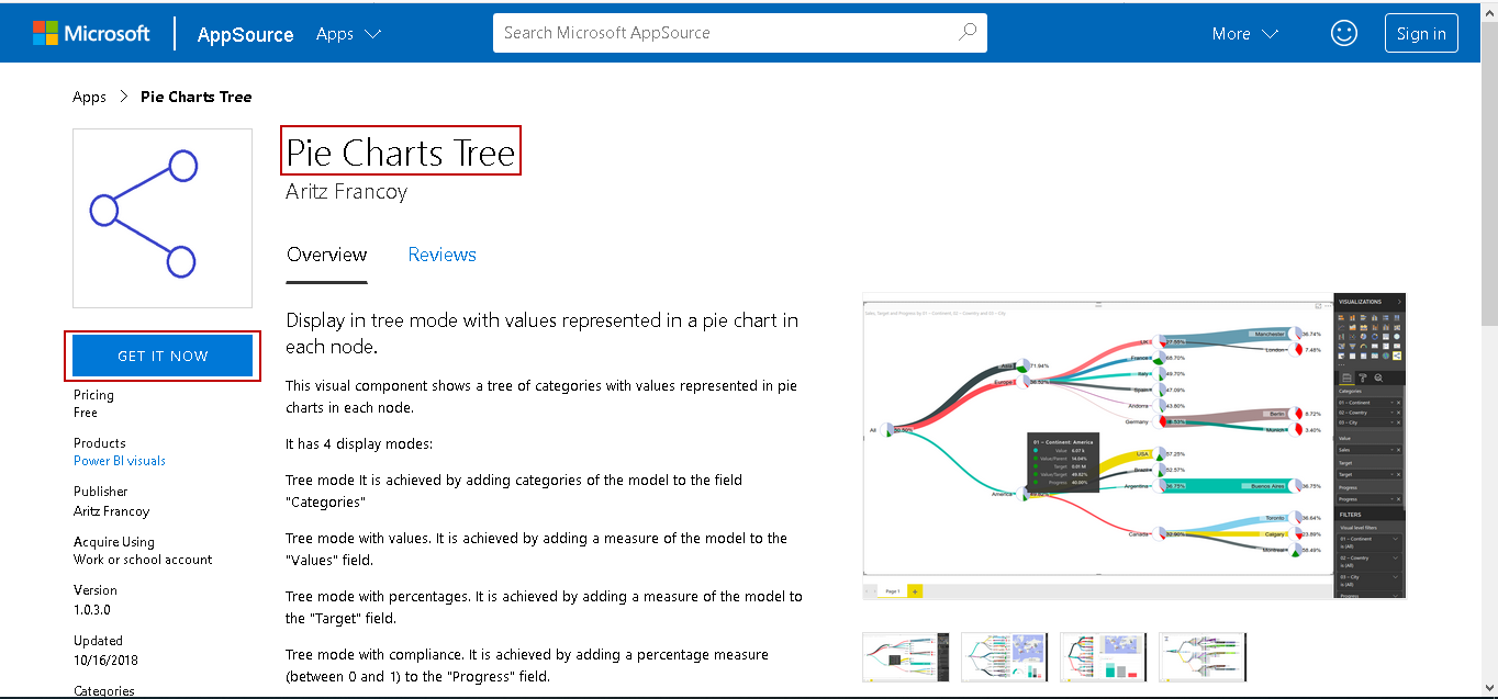
In the Power BI Visuals Marketplace, search for the Pie Chart Tree and add it.
在Power BI Visuals Marketplace中,搜索饼图树并将其添加。
It downloads and installs the custom visual Pie Tree Chart.
它下载并安装自定义可视饼图。
You can also download the Pie Tree Chart from the Microsoft AppSource.
您也可以从Microsoft AppSource下载饼图。
准备饼图 (Preparing the Pie Tree Chart)
( )
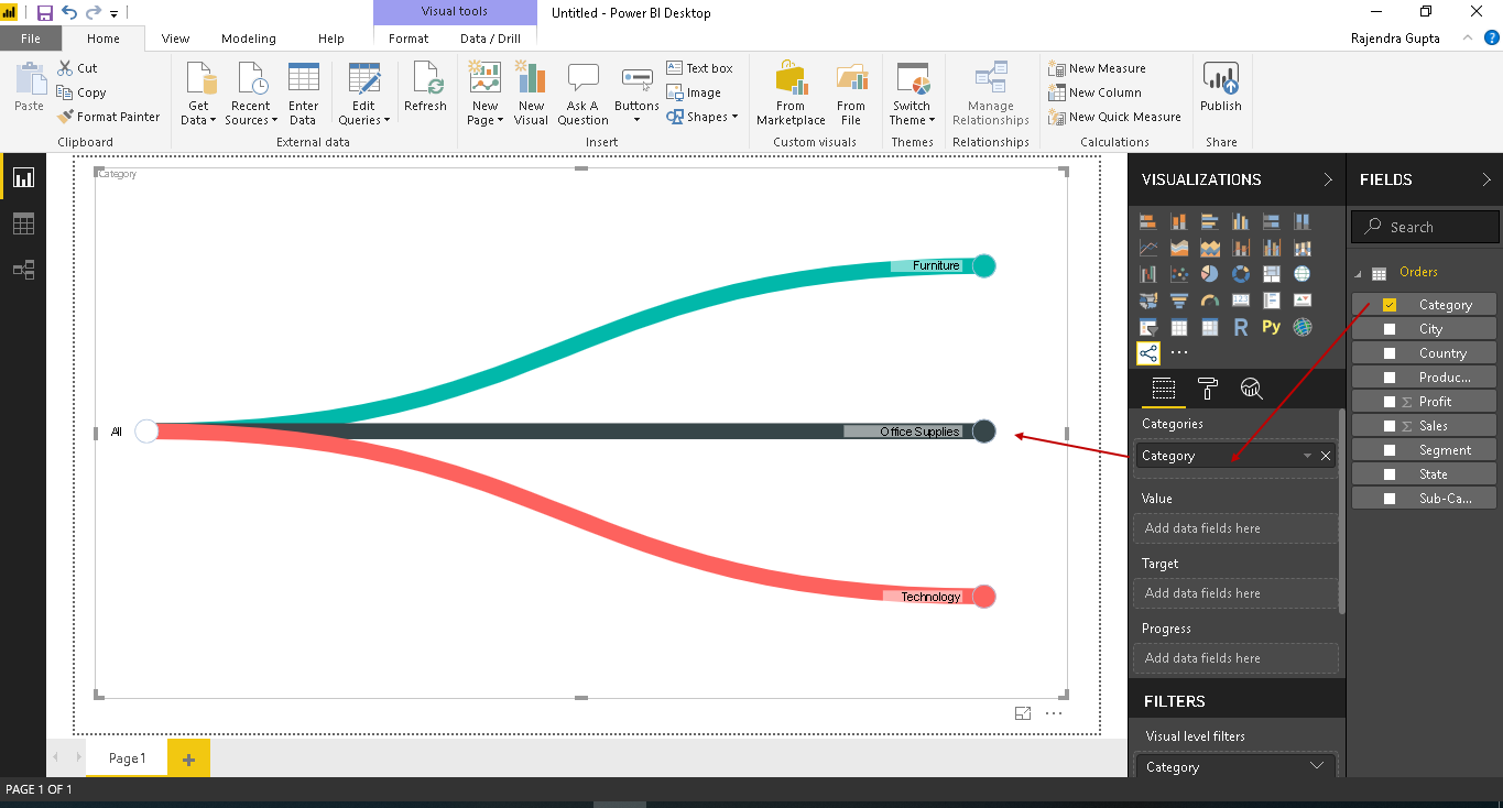
We have sample data in Power BI Desktop along with the Pie Tree Chart. Click on the Pie Tree chart icon in the visualization section. It populates a chart image in the chart area of Power BI Desktop.
我们在Power BI Desktop中具有示例数据以及饼图。 单击可视化部分中的饼图图表图标。 它将在Power BI Desktop的图表区域中填充图表图像。
Drag the ‘Category’ field from the FIELDS section to the ‘Categories’ area. We get the first level of hierarchy using this.
将“类别”字段从“字段”部分拖到“类别”区域。 我们使用此方法获得第一级层次结构。
In the following screenshot, you can see the product category in different lines. We have three categories in our sample data, i.e. Furniture, office Suppliers and Technologies. We can see the different colors for each category in the Pie chart Tree.
在以下屏幕截图中,您可以在不同的行中看到产品类别。 我们在样本数据中分为三类,即家具,办公室供应商和技术。 我们可以在饼图树中看到每个类别的不同颜色。
We can hover t
 最低0.47元/天 解锁文章


 2196
2196


 被折叠的 条评论
为什么被折叠?
被折叠的 条评论
为什么被折叠?
 到【灌水乐园】发言


