Power BI Desktop和Python; 像花生酱和巧克力

Power BI Desktop helps to visualize complex data with the help of inbuilt and custom visualizations. It allows integrating data from the various data sources and preparing visualization from it.

Power BI Desktop借助内置和自定义的可视化帮助可视化复杂的数据。 它允许集成来自各种数据源的数据并从中准备可视化。

Microsoft recently integrated the Python programming language in the Power BI. Python is a powerful object-oriented language and is used by the data analyst and scientist to analyze complex datasets. We can now use the Python as a preview feature in the Power BI August 2018 release onwards. We can now use Python scripts to generate custom visualization. The combination of these technologies is akin to 1 + 1 = 3 or like the famous ad for Reese’s Peanut butter cups, when chocolate was introduced to Peanut Butter 😉

微软最近在Power BI中集成了Python编程语言。 Python是一种功能强大的面向对象语言,数据分析师和科学家使用它来分析复杂的数据集。 现在,我们可以在Power BI August 2018版本及更高版本中将Python用作预览功能。 现在,我们可以使用Python脚本生成自定义可视化。 这些技术的组合类似于1 +1 = 3或类似当里斯(Reese)的花生酱杯广告中著名的广告,当时在花生酱中引入了巧克力😉

入门 (Getting started)

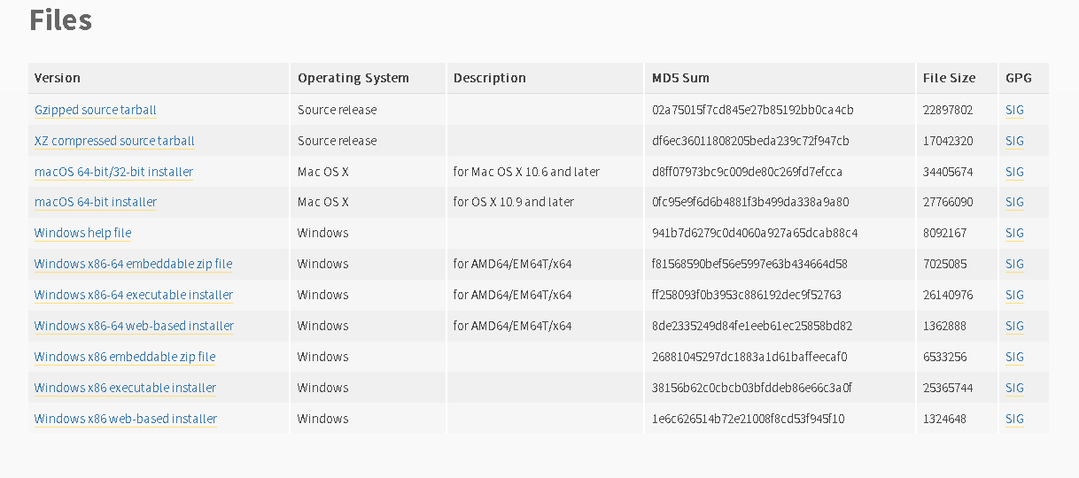
We should install the Python in the system before we can use the Python scripts in Power BI. Go to the Python Download page and download the installer based on the OS version.

我们应该先在系统中安装Python,然后才能在Power BI中使用Python脚本。 转到“ Python下载”页面,然后根据操作系统版本下载安装程序。

Once the appropriate Python download is completed, click on the installer file to launch it.

适当的Python下载完成后,单击安装程序文件以启动它。

You can choose the highlighted options to install Python for all users. You can enable the option ‘Add Python 3.7 to PATH’ to add this into the environment variable. We will do it manually at a later stage, therefore leave this option unchecked.

您可以选择突出显示的选项来为所有用户安装Python。 您可以启用选项“将Python 3.7添加到PATH”以将其添加到环境变量中。 我们将在以后的阶段手动进行操作,因此请不要选中此选项。

Once the set up is completed, you get the following message ‘Setup was successful’.

设置完成后,您将收到以下消息“设置成功”。

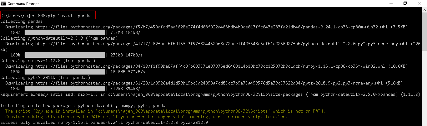
We need to install two Python packages, i.e. Pandas and Matplotlib using the command prompt. Open the command prompt and execute the command. Pandas is an open-source data analysis tool for Python.

我们需要使用命令提示符安装两个Python软件包,即Pandas和Matplotlib。 打开命令提示符并执行命令。 Pandas是用于Python的开源数据分析工具。

Pandas is an open-source, BSD-licensed Python library providing high-performance, and easy-to-use data structures and data analysis tools for the Python programming language

Pandas是经过BSD许可的开源Python库,为Python编程语言提供了高性能且易于使用的数据结构和数据分析工具。

pip install pandas

It downloads the required packages along with its dependencies.

它将下载所需的软件包及其依赖项。

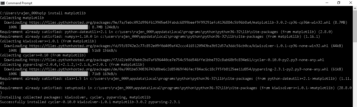
Similarly, we need to install the Matplotlib plotting library for the Python programming language with the below command

同样,我们需要使用以下命令为Python编程语言安装Matplotlib绘图库

pip install matplotlib

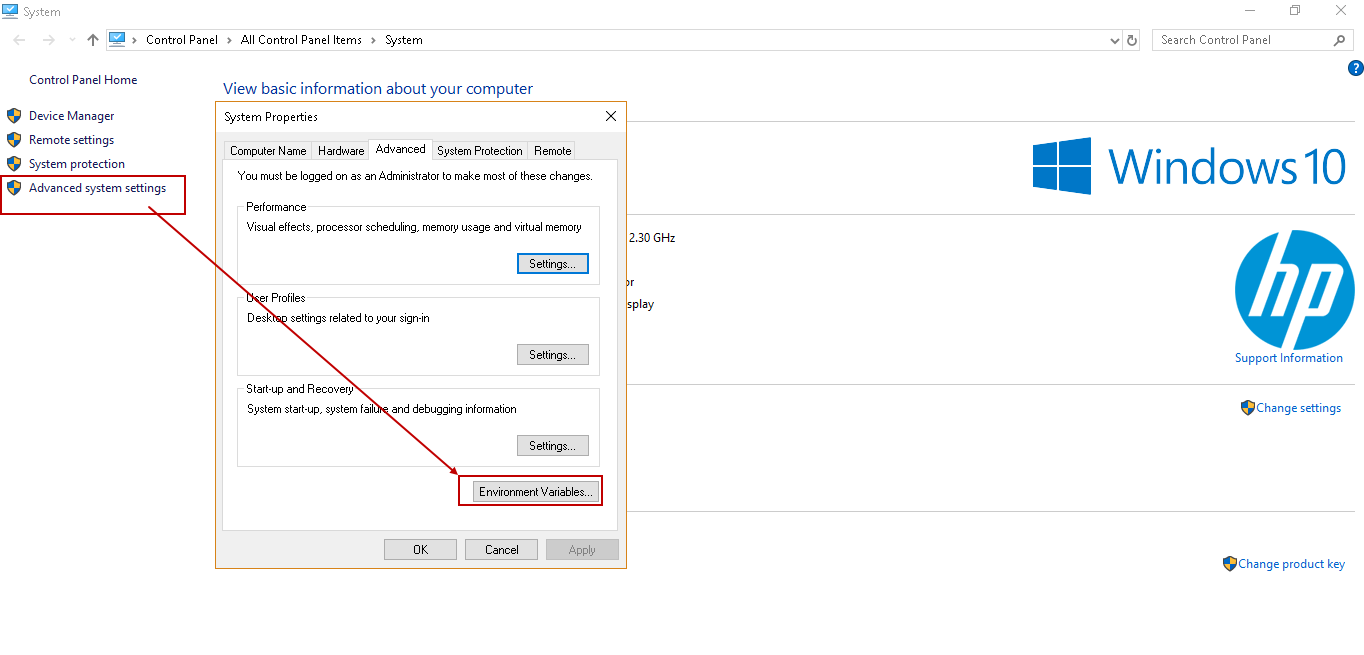
In the next step, we need to add the Python folder path in the environment variable. Right click on the computer and view properties. In Properties, go to the advanced system settings, click on the ‘Environment Variables’

下一步,我们需要在环境变量中添加Python文件夹路径。 右键单击计算机,然后查看属性。 在“属性”中,转到高级系统设置,然后单击“环境变量”

In the Environment Variables, click ‘New’, and it opens a pop-up box.

在环境变量中,单击“新建”,它会打开一个弹出框。

Enter the below details in the edit user variable page.

在编辑用户变量页面中输入以下详细信息。

  • Variable Name: PythonPath

    变量名称:PythonPath
  • Variable Value: C:\Users\rajen_000\AppData\Local\Programs\Python\Python37

    变量值:C:\ Users \ rajen_000 \ AppData \ Local \ Programs \ Python \ Python37

We have set up the environment until now to use Python. Now we are going to look at using the Python in the Power BI.

到目前为止,我们已经设置了使用Python的环境。 现在,我们将研究在Power BI中使用Python。

As stated earlier, Python is a preview feature in the Power BI. We need to enable it explicitly to use this feature. Launch the Power BI and go to ‘Options and Settings -> Options’

如前所述,Python是Power BI中的预览功能。 我们需要显式启用它才能使用此功能。 启动Power BI并转到“选项和设置->选项”

In the ‘Options’ page, go to ‘Preview Features’. Here, we need to enable the option ‘Python Support’. You can click on the hyperlink ‘Learn more’ to get more details about this.

在“选项”页面中,转到“预览功能”。 在这里,我们需要启用选项“ Python Support”。 您可以单击超链接“了解更多”以获得有关此的更多详细信息。

Click ‘OK’, and we get the following message. We need to restart the Power BI to enable the preview feature ‘Python Support’.

点击“确定”,我们得到以下消息。 我们需要重新启动Power BI才能启用预览功能“ Python支持”。

Once we again launch the Power BI, in the following image, you can see the Python visual in the ‘Visualization’ section.

再次启动Power BI后,在下图中,您可以在“ Visualization”部分中看到Python视觉效果。

Once we have enabled the Python in power BI and restarted it, we can verify it from the Options page again. Here, you get the new option ‘Python scripting’. In this ‘Python Scripting’, we can change the python home directories, temporary locations and Python IDE locations, however; we are going to leave the default configurations.

在Power BI中启用Python并重新启动它后,我们可以再次从“选项”页面中对其进行验证。 在这里,您将获得新的选项“ Python脚本”。 但是,在此“ Python脚本”中,我们可以更改python主目录,临时位置和Python IDE位置。 我们将保留默认配置。

Note: If you are having multiple Python versions installed on the system, verify that the Python home directories should match with the environment variable ‘Path’.

注意:如果您在系统上安装了多个Python版本,请确认Python主目录应与环境变量“ Path”匹配。

In this page, as well you can view the essential hyperlinks. You can go through them to get more knowledge about Python.

在此页面上,您也可以查看基本的超链接。 您可以遍历它们以获取有关Python的更多知识。

Sometimes, we might require an additional Python package to install using the Power BI. It uses the temporary storage location to download the installer files. It should have sufficient free space to hold these files. If we want to change the location, click on the hyperlink ‘Change temporary storage locations’ and browse to the required folder.

有时,我们可能需要附加的Python软件包才能使用Power BI安装。 它使用临时存储位置下载安装程序文件。 它应该有足够的可用空间来容纳这些文件。 如果要更改位置,请单击“更改临时存储位置”超链接,然后浏览到所需的文件夹。

在Power BI Desktop中使用Python创建可视化 (Creating Visualization with Python in Power BI Desktop)

We can prepare the visualization in Power BI now with the Python. We required sample data to prepare the visualization, therefore, let us import the sample data from the CSV files. In the menu bar, click on ‘Get Data -> Text/CSV’

我们现在可以使用Python在Power BI中准备可视化。 我们需要样本数据来准备可视化,因此,让我们从CSV文件导入样本数据。 在菜单栏中,单击“获取数据->文本/ CSV”

Provide the location of the CSV file and ‘Load’ data.

提供CSV文件和“加载”数据的位置。

In the following image, you can see the data set is loaded in the Power BI.

在下图中,您可以看到数据集已加载到Power BI中。

At this point initial configuration is completed, we need to add the report layout and query using the Python language. Click on the ‘Python Visuals’, and we get the warning to accept the script visuals to run the Python Scripts.

至此,初始配置完成,我们需要使用Python语言添加报表布局和查询。 单击“ Python视觉效果”,我们得到警告,要求接受脚本视觉效果来运行Python脚本。

Click on the ‘Enable’, and we get the following report layout in the Power BI Desktop. It shows the Python icon in the top report section and the bottom window, and you get the Python script editor.

单击“启用”,我们将在Power BI Desktop中获得以下报告布局。 它在顶部报告部分和底部窗口中显示Python图标,您将获得Python脚本编辑器。

In the Python Script editor, you get a message to drag the fields into the values area in the Visualization pane to start scripting. Once you drag the fields to the Values area, you can see the scripts in the Python script editor. You also get a message that it will remove the duplicate rows from the data.

在Python脚本编辑器中,您将收到一条消息,将字段拖到“可视化”窗格的“值”区域中以开始编写脚本。 将字段拖到“值”区域后,即可在Python脚本编辑器中查看脚本。 您还会收到一条消息,它将删除数据中的重复行。

In the ‘Date’, by default, it shows the date hierarchy. We want date field here, therefore, modify this value to ‘Date’ instead of ‘Date hierarchy’.

默认情况下,在“日期”中,它显示日期层次。 我们希望在此处输入日期字段,因此,请将此值修改为“日期”,而不是“日期层次”。

It now shows the Date column instead of the date hierarchy. You can see a change in the data frame query mentioned in the Python Script Editor.

现在,它显示日期列而不是日期层次结构。 您可以在Python脚本编辑器中看到数据框查询中的更改。

In the Python script editor, it automatically creates the data set using the ‘Pandas’ data frame with the required column from the data fields.

在Python脚本编辑器中,它将使用“ Pandas”数据框自动创建数据集,并在数据字段中添加所需的列。

We can write the code in the section ‘Paste or type your script code here’. Copy the Python code below to plot the data set.

我们可以在“粘贴或在此处键入脚本代码”部分中编写代码。 复制下面的Python代码以绘制数据集。

import pip
import matplotlib.pyplot as plt
dataset.plot()
plt.show()

In this query, we imported the matplotlib in the Power BI. It further created the visual using the plot() function.

在此查询中,我们将matplotlib导入了Power BI。 它还使用plot()函数创建了视觉效果。

We need to run the Python code to visualize the data set. The script will connect to the Python from the environment variable path. Click on the ‘Play’ icon in the right side o the Python script editor.

我们需要运行Python代码以可视化数据集。 该脚本将从环境变量路径连接到Python。 点击Python脚本编辑器右侧的“播放”图标。

In the following image, you can see the visualization using the Python code in the Power BI.

在下图中,您可以使用Power BI中的Python代码查看可视化效果。

Let us consider to prepare the visual using from the ‘Date’, ‘Price’ and ‘Units’ fields from the Values section. We do not need much programming knowledge to prepare the visualization. Select the required fields. It automatically makes the changes in the Python script editor. You can execute the Python code and view the plot accordingly.

让我们考虑使用“值”部分的“日期”,“价格”和“单位”字段来准备视觉效果。 我们不需要太多的编程知识即可准备可视化。 选择必填字段。 它会自动在Python脚本编辑器中进行更改。 您可以执行Python代码并相应地查看图。

Similarly, in the following image, you can see visual with fields ‘Price’ and ‘Revenue.’

同样,在下图中,您可以看到带有“价格”和“收入”字段的视觉效果。

We might need to define the labels on both the axis. We can define the labels using the below command. For the demonstration purpose only, I defined labels on both x and y-axis as ‘SQLShack Demo’.

我们可能需要在两个轴上都定义标签。 我们可以使用以下命令定义标签。 仅出于演示目的,我在x和y轴上都将标签定义为“ SQLShack演示”。

plt.ylabel('SQLShack Demo')
plt.xlabel('SQLShack Demo')

自定义图表标题 (Customizing the chart title)

In the following image, you can notice that the chart title is not visible properly. We can make changes to it using the ‘Title’ in the format area.

在下图中,您会注意到图表标题不正确可见。 我们可以使用格式区域中的“标题”对其进行更改。

Expand the ‘Title’ and change the title properties from the below options.

展开“标题”,然后从以下选项更改标题属性。

  • Title Text

    标题文字
  • Title font colour

    标题字体颜色
  • Title background

    标题背景
  • Title alignment (left, right or centre)

    标题对齐(左,右或居中)
  • Title text

    标题文字
  • Title size and font

    标题大小和字体

Once we have modified the chart format settings, we can see the updated chart title looks.

修改图表格式设置后,我们可以看到更新的图表标题外观。

Power BI中运行Python脚本的限制 (Limitation of running Python scripts in Power BI)

  • We can use the Python plot for maximum 150,000 rows in the data set

    我们可以使用Python图在数据集中最多150,000行
  • We cannot prepare an interactive image with it

    我们无法使用它准备交互式图像
  • Python script will give a time out error after 5 minutes of execution

    执行5分钟后,Python脚本将给出超时错误
  • Python plot cannot be used for cross filtering

    Python图不能用于交叉过滤

结论 (Conclusion)

In this article, we explored the integration of the Power BI Desktop and programming language Python. We can use Python to create visualization for the complex data sets with Power BI. I encourage you to explore this powerful combinations of technologies in your environment.

在本文中,我们探讨了Power BI Desktop和编程语言Python的集成。 我们可以使用Python通过Power BI创建复杂数据集的可视化。 我鼓励您探索环境中这种强大的技术组合。

目录 (Table of contents)

Power BI Desktop Interactive chord diagrams
Power BI Desktop Pulse Charts
How to create a Word Cloud generator in Power BI Desktop
Power BI desktop Mekko Charts
Hexbin Scatterplot in Power BI Desktop
Candlestick chart for stock data analysis in Power BI Desktop
Enlighten World Flag Slicer in Power BI Desktop
Flow Map Chart in Power BI Desktop
Ask a Question feature in Power BI Desktop
Power BI Desktop Q&A data interaction examples
Power BI Desktop and Python; like Peanut Butter and Chocolate
Power BI Desktop Pie Chart Tree
Importing data from a PDF file in Power BI Desktop
Power BI Desktop交互式和弦图
Power BI桌面脉冲图
如何在Power BI Desktop中创建词云生成器
Power BI桌面Mekko图表
Power BI Desktop中的Hexbin散点图
用于Power BI Desktop中的库存数据分析的烛台图
在Power BI桌面中启发世界国旗切片器
Power BI Desktop中的流程图
Power BI Desktop中的“提问”功能
Power BI桌面问答数据交互示例
Power BI Desktop和Python; 像花生酱和巧克力
Power BI桌面饼图树
从Power BI Desktop中的PDF文件导入数据

翻译自: https://www.sqlshack.com/power-bi-desktop-and-python-like-peanut-butter-and-chocolate/

  • 1
    点赞
  • 1
    收藏
    觉得还不错? 一键收藏
  • 0
    评论

“相关推荐”对你有帮助么?

  • 非常没帮助
  • 没帮助
  • 一般
  • 有帮助
  • 非常有帮助
提交
评论
添加红包

请填写红包祝福语或标题

红包个数最小为10个

红包金额最低5元

当前余额3.43前往充值 >
需支付:10.00
成就一亿技术人!
领取后你会自动成为博主和红包主的粉丝 规则
hope_wisdom
发出的红包
实付
使用余额支付
点击重新获取
扫码支付
钱包余额 0

抵扣说明:

1.余额是钱包充值的虚拟货币,按照1:1的比例进行支付金额的抵扣。
2.余额无法直接购买下载,可以购买VIP、付费专栏及课程。

余额充值