


亚马逊技能开发入门
In this article, I am going to introduce Amazon QuickSight and how to visualize data using it. Amazon QuickSight is a data visualization tool offered by Amazon hosted on AWS and is available across multiple locations. As per the statement provided on the official website it says: “Amazon QuickSight is a fast, cloud-powered business intelligence service that makes it easy to deliver insights to everyone in your organization.” Using QuickSight, users can create different analyses and then integrate those in a dashboard and share them with people within the organization.
在本文中,我将介绍Amazon QuickSight以及如何使用它可视化数据。 Amazon QuickSight是Amazon托管在AWS上的数据可视化工具,可在多个位置使用。 根据官方网站上的声明,它说: “ Amazon QuickSight是一种快速的,基于云的商业智能服务,可以轻松地向组织中的每个人提供见解。” 使用QuickSight,用户可以创建不同的分析,然后将其集成到仪表板中并与组织内的人员共享。
These dashboards can be consumed by many users and across multiple platforms like web or mobile apps. Users can also integrate these dashboards on web applications, websites, or various other portals as required. The dashboards are scalable and have an ability to interactively enable actions within the dashboards.
这些仪表板可由许多用户使用,并且可以跨多个平台(如Web或移动应用程序)使用。 用户还可以根据需要在Web应用程序,网站或其他各种门户上集成这些仪表板。 仪表板是可伸缩的,并且具有在仪表板内交互地启用操作的能力。
注册Amazon QuickSight (Signing up for Amazon QuickSight)
In order to use QuickSight, you need to have a valid AWS account. If you do not have an AWS account, please go to http://console.aws.amazon.com/ and create an account first. Creating the AWS account is beyond the scope of this article, so I am not going to explain that in detail. Once you are logged into the AWS console, search for QuickSight and click the link as follows.
为了使用QuickSight,您需要拥有一个有效的AWS账户。 如果您没有AWS账户,请访问http://console.aws.amazon.com/并首先创建一个账户。 创建AWS账户不在本文讨论范围之内,因此我将不对其进行详细说明。 登录到AWS控制台后,搜索QuickSight并单击链接,如下所示。
Figure 1 – Search for QuickSight
图1 –搜索QuickSight
You will be navigated to the portal for Amazon QuickSight, where you will be asked to sign up for the service, specifically. Click on Sign up for QuickSight and proceed forward. On the next page, you will have an option to select the edition. For the sake of this tutorial, I am going to select the Standard Edition and click on Continue.
您将被导航到Amazon QuickSight的门户,将特别要求您在其中注册该服务。 单击“ 注册QuickSight”,然后继续进行。 在下一页上,您可以选择版本。 为了本教程的缘故,我将选择标准版 ,然后单击继续 。
Figure 2 – Select QuickSight Edition
图2 –选择QuickSight版本
On the next page, you will need to provide an account name for your QuickSight service and an email address on which you can receive notifications. Click on Finish once you are done.
在下一页上,您将需要提供QuickSight服务的帐户名和一个可以接收通知的电子邮件地址 。 完成后,单击完成。
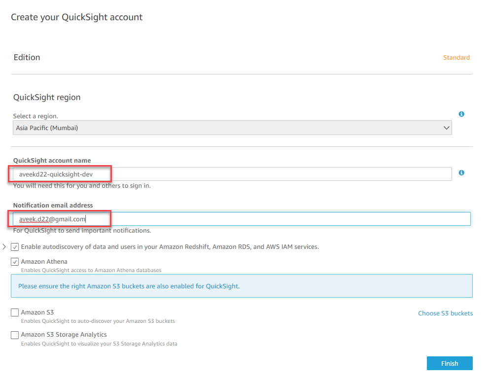
Figure 3 – Setting Up QuickSight Account
图3 –设置QuickSight帐户
The process may take up to a few minutes and once it is completed, you will receive a message which says signup for Amazon QuickSight is successful.
该过程可能需要花费几分钟,一旦完成,您将收到一条消息,提示成功注册Amazon QuickSight。
Figure 4 – QuickSight Account signup successful
图4 – QuickSight帐户注册成功
Click on Go to Amazon QuickSight to start the service. You will be navigated to a different service in which you can see QuickSight being loaded with a few sample analyses already prepared.
单击转到Amazon QuickSight以启动服务。 您将被导航到其他服务,在其中您可以看到QuickSight正在加载一些已经准备好的示例分析。
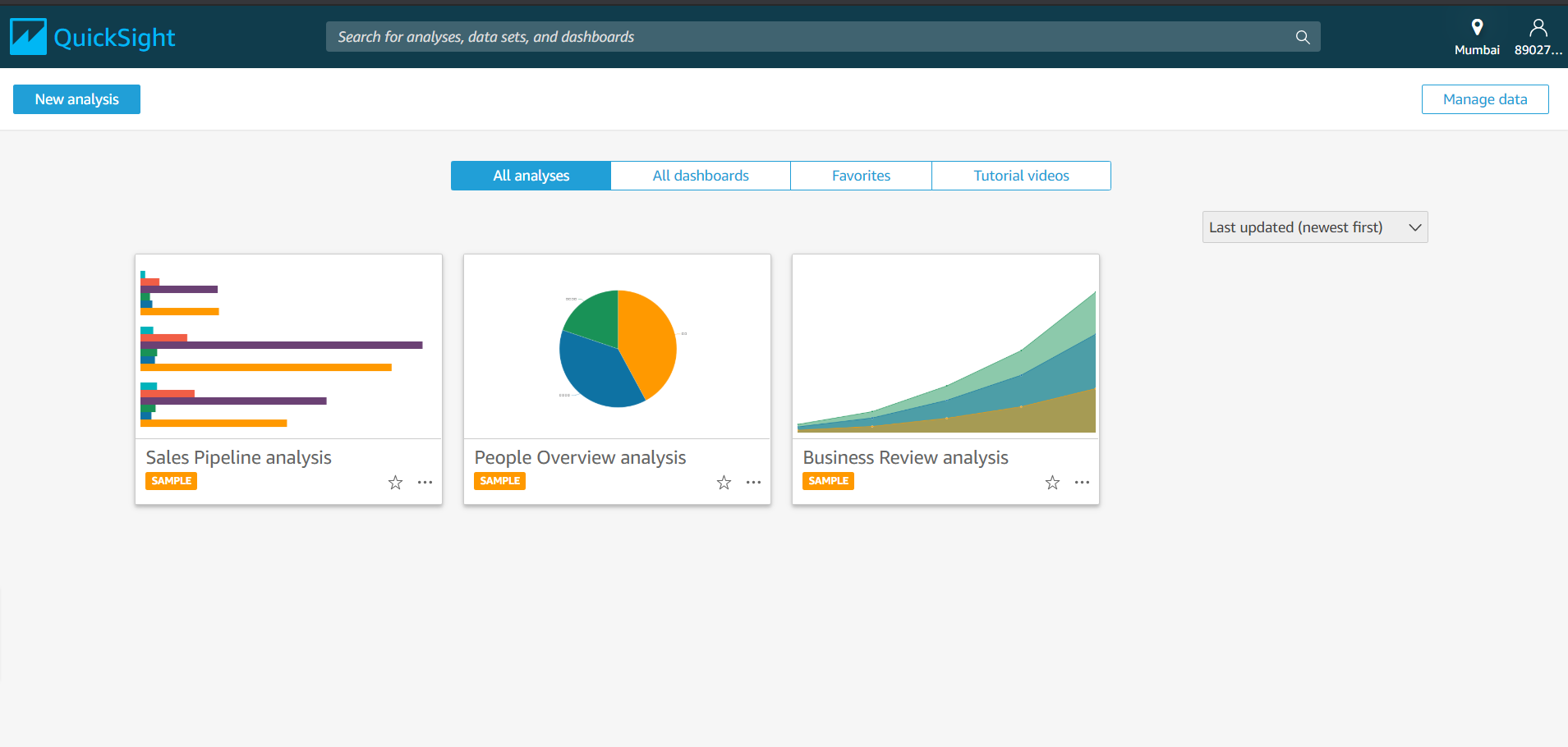
Figure 5 – QuickSight Sample Analyses
图5 – QuickSight样本分析
Just to get an idea about the sample analyses, let’s go ahead and open the Sales Pipeline analysis that is available on the list. As you can see, a new analysis that will start up and you will be able to view the report as follows.
只是为了对样本分析有所了解,让我们继续打开列表中可用的Sales Pipeline分析 。 如您所见,将启动一个新的分析,您将能够按照以下方式查看报告。
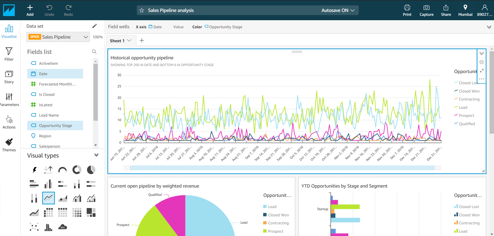
Figure 6 – Sample Analysis – Sales Pipeline
图6 –样本分析–销售渠道
As you can see in the above figure, this is the layout of an Amazon QuickSight analysis. On the left-hand pane, there are many icons that we can use to visualize the report which is active by default, apply filters to the existing report, create a story from an analysis, define parameters and use them as external filters, set actions to control how other visuals changed based on a fixed visual. You also have the option to define custom themes and color schemes so that the reports can be blended into the same theme as your web application or to give as a branded look of your organization.
如上图所示,这是Amazon QuickSight分析的布局。 在左侧窗格中,有许多图标可用于可视化默认情况下处于活动状态的报告,将过滤器应用于现有报告,根据分析创建故事,定义参数并将其用作外部过滤器,设置操作控制基于固定视觉的其他视觉变化。 您还可以选择定义自定义主题和配色方案,以便可以将报告与Web应用程序混合到同一主题中,或以组织的品牌外观呈现。
In the second pane on the left, we have the Dataset pane, which displays a list of all the available fields that the selected data source has. The fields are categorized according to the data types, for example; string, numerical, etc. You can use these fields to create the various analyses as and when required. On the bottom, there is the Visual Types pane which enables us to select what type of visual we want to display on the reports. There are several visual types from which we can select a suitable one to use, the most common being the bar and the pies.
在左侧的第二个窗格中,有“ 数据集”窗格,其中显示了所选数据源具有的所有可用字段的列表。 例如,根据数据类型对字段进行分类。 字符串,数字等。您可以在需要时使用这些字段来创建各种分析。 在底部,有“ 视觉类型”窗格,使我们可以选择要在报表上显示的视觉类型。 我们可以从几种视觉类型中选择一种合适的视觉类型,最常见的是酒吧和馅饼。
All the visuals will be created on the right-hand pane where you can adjust the size of the visuals by just dragging the right handles of those visuals. You can also make two or three visuals appear side by side by just adjusting the width of each of those visuals.
所有视觉效果都将在右侧窗格中创建,您可以在其中通过拖动视觉效果的右手柄来调整视觉效果的大小。 您还可以通过调整每个视觉效果的宽度来使两个或三个视觉效果并排显示。
从头开始创建分析 (Creating an analysis from scratch)
Now that we have some idea how an Amazon QuickSight report looks, let us go ahead and create an analysis of our own. To begin with, lets us start by fetching a dataset into the QuickSight environment. For the sake of this tutorial, I am going to use the Superstore dataset sample which can be downloaded for free.
现在我们已经了解了Amazon QuickSight报表的外观,让我们继续进行自己的分析。 首先,让我们开始将数据集提取到QuickSight环境中。 为了本教程的缘故,我将使用可免费下载的Superstore数据集样本。
On the QuickSight homepage, click on New analysis to create one.
在QuickSight主页上,单击“ 新建分析”以创建一个。
Figure 7 – New Analysis in QuickSight
图7 – QuickSight中的新分析
On the next page, you will see an option to choose from a list of available datasets for this analysis. Since we are going to use our own dataset for this analysis, let us go ahead and upload it. Click on New data set button to proceed.
在下一页上,您将看到一个选项,可以从可用数据集的列表中进行选择以进行此分析。 由于我们将使用自己的数据集进行此分析,因此让我们继续进行上传。 单击新数据集按钮继续。
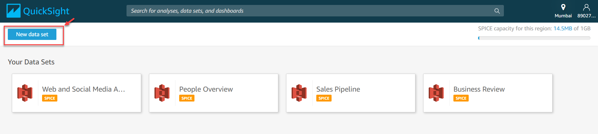
Figure 8 – Choosing a new data set
图8 –选择一个新的数据集
On the next page, choose Upload a file to upload the CSV file from the local machine.
在下一页上,选择“上载文件”以从本地计算机上载CSV文件。
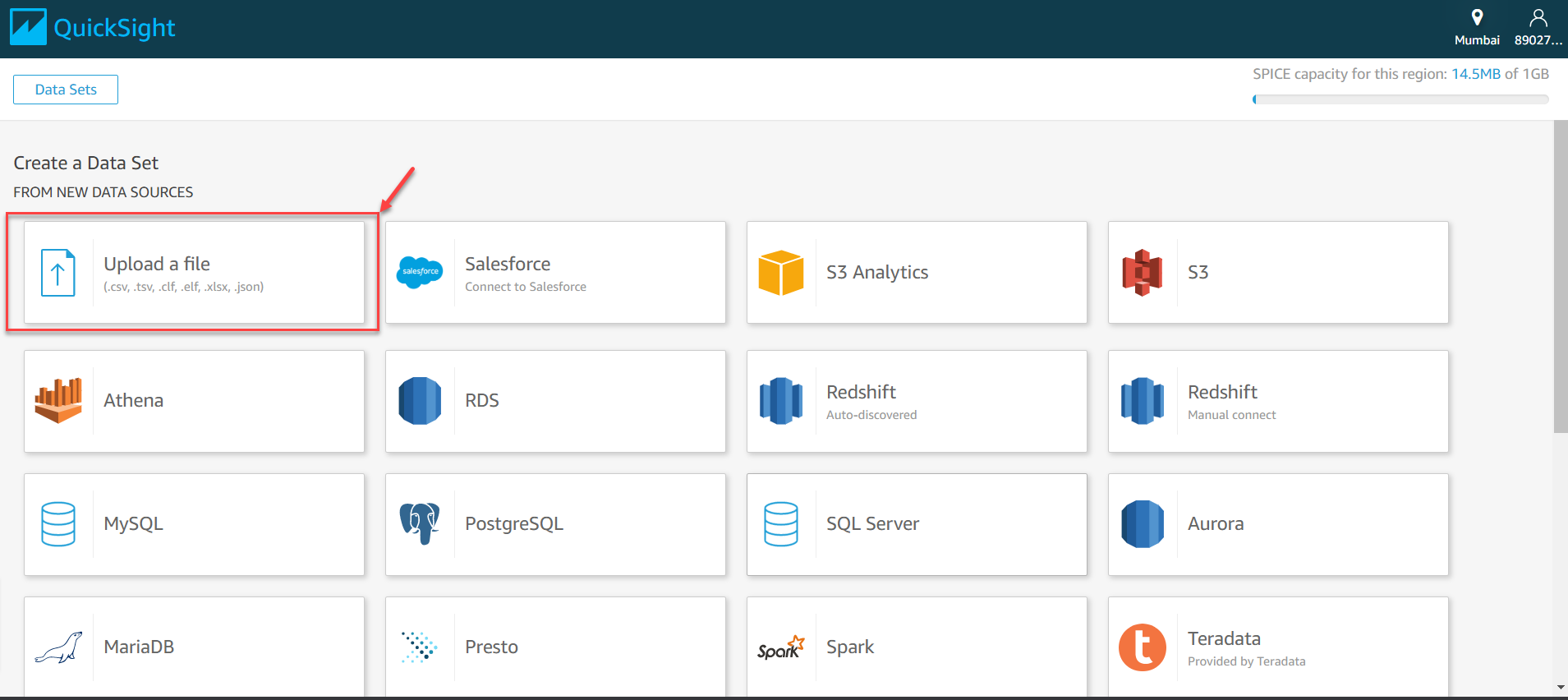
Figure 9 – Upload a file
图9 –上传文件
Choose the path on which the CSV is downloaded and select the file for upload. Once the file is uploaded, you can verify it by the following message on the screen.
选择下载CSV的路径,然后选择要上传的文件。 文件上传后,您可以通过屏幕上的以下消息进行验证。
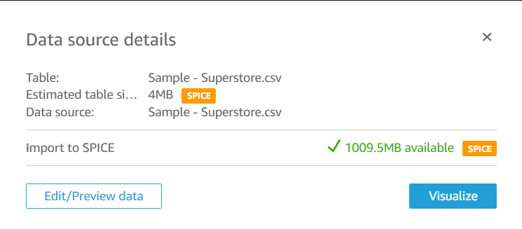
Figure 10 – Data source uploaded successfully
图10 –数据源成功上传
Click on Visualize to create an analysis from this dataset. You will see that a new analysis opens up without any visuals on it. Rename the analysis as required and proceed forward to create the visuals.
单击“ 可视化”以从该数据集创建分析。 您将看到一个新的分析打开,没有任何视觉效果。 根据需要重命名分析,然后继续创建视觉效果。
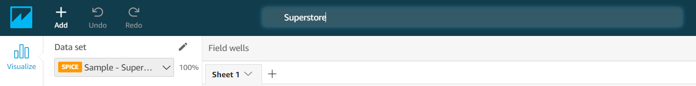
Figure 11 – Rename the Analysis
图11 –重命名分析
Let us now go ahead and create our first visual. Let us try to see the sales made by each state in the United States on a bar chart. Select the visual type as bar from the pane and drag and drop the State and Sales from the Field List pane to the Y-axis and the Value boxes, respectively.
现在让我们继续创建我们的第一个视觉效果。 让我们尝试在条形图上查看美国各州的销售额。 从窗格中选择可视类型为条形 ,然后将“ 状态”和“ 销售”从“ 字段列表”窗格中分别拖放到Y轴和“ 值”框中。
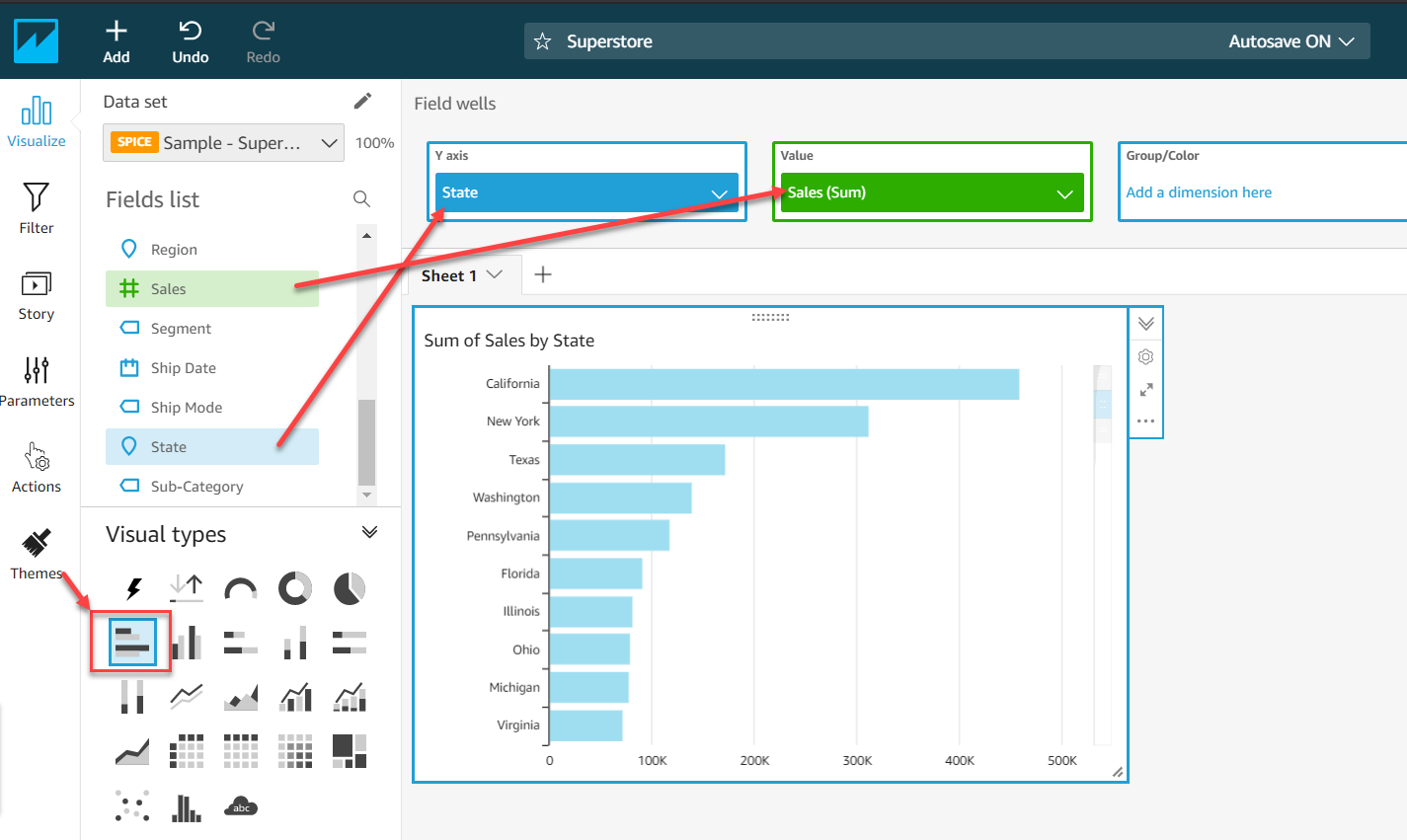
Figure 12 – Sales by State visual
图12 –按州销售
Likewise, let us try to make another visual, a line chart that displays the sales over a period of time. Click on the Add icon on the top and select Add visual. Select the visual type as Line and drag and drop the Order Date and Sales to the X-axis and the Value boxes, respectively.
同样,让我们尝试制作另一个可视化的折线图,以显示一段时间内的销售额。 点击顶部的添加图标,然后选择添加视觉效果 。 选择视觉类型作为“ 行” ,然后将“ 订单日期”和“ 销售”分别拖放到X轴和“ 值”框中。
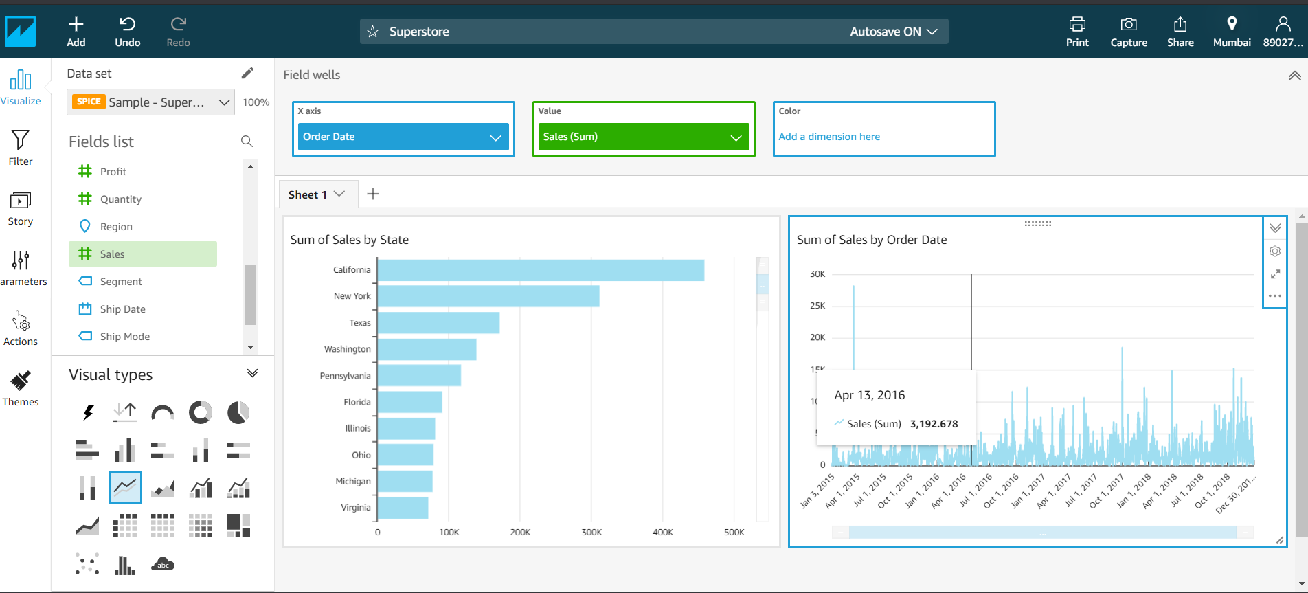
Figure 13 – Sales over Period
图13 –期间销售额
By default, these analyses are automatically saved, which means you do not need to save them explicitly. You can toggle this feature by selecting Autosave on or off as required.
默认情况下,这些分析会自动保存,这意味着您无需显式保存它们。 您可以根据需要选择“自动保存”打开或关闭来切换此功能。
分享分析 (Sharing the analyses)
Now that the analysis is done, we are ready to publish it and share it with other users. There are two ways to share analysis. The first way is to share the analysis by creating a read-only version, also known as a dashboard and the second option is to share the same analysis with someone.
既然分析已经完成,我们准备发布它并与其他用户共享。 共享分析有两种方法。 第一种方法是通过创建只读版本(也称为仪表板)共享分析,第二种方法是与某人共享同一分析。
Let us go ahead and publish the analysis as a dashboard first. Click on the Share icon on the menu bar and select Publish dashboard.
让我们继续并首先将分析结果发布为仪表板。 单击菜单栏上的共享图标,然后选择发布仪表板 。
Figure 14 – Publish Dashboard
图14 –发布仪表板
Give the dashboard a relevant name and click on Publish dashboard.
为仪表板指定一个相关名称,然后单击“ 发布仪表板” 。
Figure 15 – Dashboard Name
图15 –仪表板名称
You can choose which uses should have access to the dashboard by providing individual email addresses or selecting all users under the account. Once the dashboard is ready it will be visible to all the users under the account used.
您可以通过提供单独的电子邮件地址或选择该帐户下的所有用户来选择哪些用户可以访问仪表板。 仪表板准备就绪后,使用该帐户的所有用户都可以看到它。
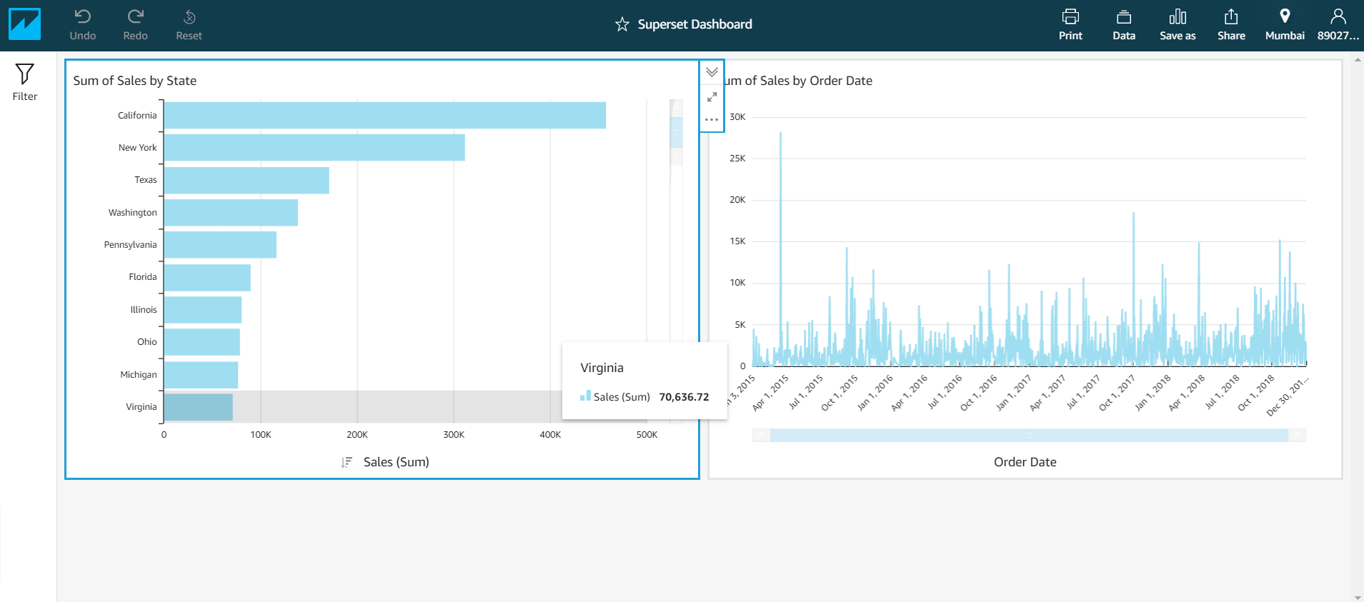
Figure 16 – Superstore Dashboard
图16 –超市仪表板
结论 (Conclusion)
In this article, we have seen an introduction to Amazon QuickSight service and how it can be used to visualize data. As explained previously, Amazon QuickSight is a fully managed cloud data visualization tool that can be compared to Power BI service. This tool is available to be used in multiple regions across the globe.
在本文中,我们介绍了Amazon QuickSight服务及其如何用于可视化数据。 如前所述,Amazon QuickSight是一个完全托管的云数据可视化工具,可以与Power BI服务进行比较。 该工具可在全球多个地区使用。
翻译自: https://www.sqlshack.com/getting-started-with-amazon-quicksight/
亚马逊技能开发入门


 1451
1451

 被折叠的 条评论
为什么被折叠?
被折叠的 条评论
为什么被折叠?
 到【灌水乐园】发言


