


flexbox
What if you could build complex CSS layouts in minutes? Flexbox is a new CSS layout spec that makes it easy to construct dynamic layouts. With flexbox, vertical centering, same-height columns, reordering, and direction agnosticism are a piece of cake.
如果您可以在几分钟内构建复杂CSS布局怎么办? Flexbox是一个新CSS布局规范,可轻松构造动态布局。 使用flexbox,垂直居中,等高列,重新排序和方向不可知论是小菜一碟。

There's a popular myth floating around that flexbox isn't ready for prime time. Wrong! 93% of people are now running a browser that supports flexbox. That's better than the support for the HTML5 <video> element.
有一个流行的神话认为,flexbox还没有准备好迎接黄金时段。 错误! 现在,有93%的人正在运行支持flexbox的浏览器。 这比对HTML5 <video>元素的支持要好。
In this article, I'll walk you through the basics of flexbox by showing you how to build the faces of a die. For now, we'll skip some of the trickier parts of flexbox such as vendor prefixes, old versions of the syntax and browser quirks. I'll cover those in upcoming lessons.
在本文中,我将通过向您展示如何构建模具的面,向您介绍flexbox的基础知识。 现在,我们将跳过flexbox的一些比较棘手的部分,例如供应商前缀,语法的旧版本和浏览器怪癖。 我将在以后的课程中介绍这些内容。
This is the first lesson in a seven-part series on flexbox. If you like this article, be sure to subscribe to the entire course over at Free Flexbox Starter Course.
这是关于Flexbox的由七个部分组成的系列的第一节课。 如果您喜欢本文,请确保通过Free Flexbox Starter Course订阅了整个课程 。
第一张脸 (The First Face)
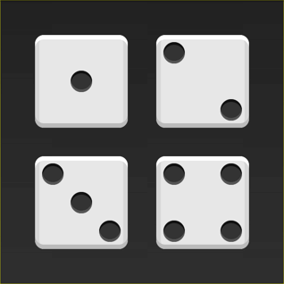
A die consists of six faces (sides). Each face has a number of pips (dots) which determine the value of the side. The first side consists of a single pip in the center of the face.
模具由六个面(侧面)组成。 每个面都有许多确定点值的点(点)。 第一面由脸中央的一个点组成。
Let's start with the HTML.
让我们从HTML开始。
<div class="first-face">
  <span class="pip"></span>
</div>
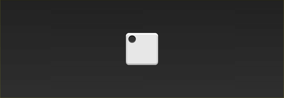
To make life a little easier, I've added the basic styles for the faces and the pips. Here's what this face looks like:
为了使生活更轻松,我添加了脸部和小提示的基本样式。 这是这张脸的样子:
The first step is to tell the browser to make the face a flexbox container.
第一步是告诉浏览器使该面Kong成为Flexbox容器。
.first-face {
  display: flex;
}
That doesn't look any different, but there's a lot going on under the hood.
看起来没有什么不同,但是引擎盖下有很多事情要做。
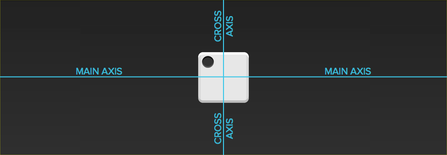
The first-face container now has a horizontal main axis. The main axis of a flexbox container can be either horizontal or vertical, but the default is horizontal. If we added another pip to the face, it would show up to the right of the first one. The container also has a vertical cross axis. The cross axis is always perpendicular to the main axis.
first-face容器现在具有水平主轴。 flexbox容器的主轴可以是水平或垂直的,但默认值为水平。 如果我们在脸上添加另一个点,它将显示在第一个点的右侧。 容器还具有垂直的横轴。 横轴始终垂直于主轴。
The justify-content property defines the alignment along the main axis. Since we want to center the pip along the main axis, we'll use the center value.
justify-content属性定义沿主轴的对齐方式。 由于我们希望沿主轴使点居中,因此我们将使用center值。
.first-face {
  display: flex;
  justify-content: center;
}
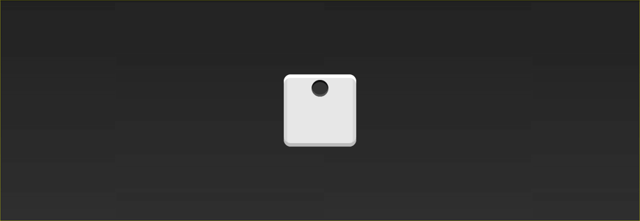
Hey, cool! Since the main axis is horizontal, the pip is now centered in the parent element.
嘿,酷! 由于主轴是水平的,因此pip现在位于父元素的中心。
The align-items property dictates how the items are laid out along the cross axis. Because we want the pip to center along this axis, we'll use the center value here too.
align-items属性指示如何沿交叉轴布置项目。 因为我们希望点沿此轴居中,所以我们也将在此处使用center值。
.first-face {
  display: flex;
  justify-content: center;
  align-items: center;
}
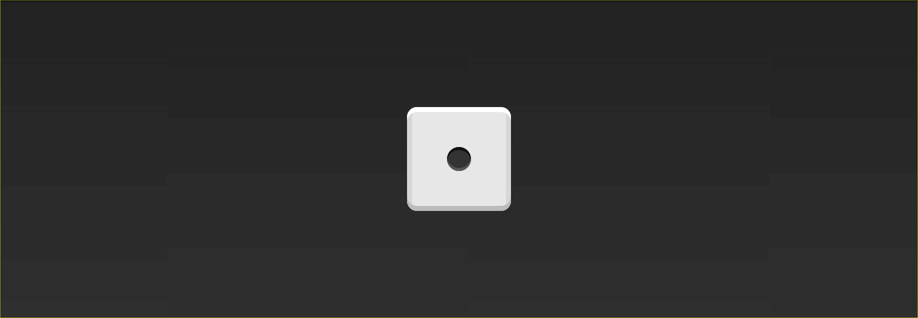
And just like that, the pip is centered!
就像那样,点居中!
越来越棘手 (Getting Trickier)
On the second face of a die, the first pip is in the top left corner and the second is in the bottom right. This is also pretty easy to do with flexbox!
在骰子的第二面上,第一个点位于左上角,第二个点位于右下角。 使用flexbox也很容易做到这一点!
Again, let's start with the markup and the basic CSS.
同样,让我们从标记和基本CSS开始。
<div class="second-face">
  <span class="pip"></span>
  <span class="pip"></span>
</div>
.second-face {
  display: flex;
}

Now we have two pips right next to each other. This time around, we want the pips on opposite sides of the die. There's a value for justify-content that will let us do just that: space-between.
现在我们彼此相邻有两个点。 这次,我们希望点子位于模具的相对两侧。 justify-content有一个价值,可以让我们做到这一点: space-between 。
The space-between property evenly fills the space between flex items. Since there are only two pips, this pushes them away from each other.
space-between属性均匀地填充弹性项目之间的空间。 由于只有两个点,这使它们彼此远离。
.second-face {
  display: flex;
  justify-content: space-between;
}
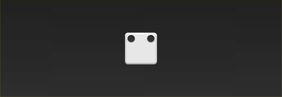
Here's where we run into a problem. Unlike before, we can't set align-items because it will affect both pips. Luckily, flexbox includes align-self. This property lets us align individual items in a flex container along the cross axis however we'd like! The value we want for this property is flex-end.
这是我们遇到问题的地方。 与以前不同,我们无法设置align-items因为它将影响两个点。 幸运的是,flexbox包含align-self 。 此属性使我们能够沿交叉轴将弹性容器中的各个项目对齐,但是我们希望如此! 我们想要此属性的值是flex-end 。
.second-face {
  display: flex;
  justify-content: space-between;
}

.second-face .pip:nth-of-type(2) {
  align-self: flex-end;
}
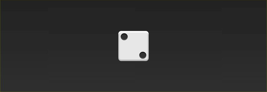
Looks good!
看起来挺好的!
水平和垂直嵌套 (Horizontal and Vertical Nesting)
Let's skip the third face and tackle the fourth. This one is a little trickier than the others because we need to support two columns, each with two pips.
让我们跳过第三张面Kong,处理第四张面Kong。 这一点比其他技巧有些棘手,因为我们需要支持两列,每列有两个点。
There are two things about flexbox that will save us here: flex containers can have vertical or horizontal content, and flex containers can be nested.
flexbox有两件事可以为我们省钱:flex容器可以具有垂直或水平内容,而flex容器可以嵌套。
Unlike before, our markup will now include columns.
与以前不同,我们的标记现在将包括列。
<div class="fourth-face">
  <div class="column">
    <span class="pip"></span>
    <span class="pip"></span>
  </div>
  <div class="column">
    <span class="pip"></span>
    <span class="pip"></span>
  </div>
</div>
Since we want the two columns to be on opposite sides, let's go ahead and use justify-content: space-between like we did before.
由于我们希望这两列在相反的一侧,所以让我们继续使用justify-content: space-between像以前一样在它们justify-content: space-between使用justify-content: space-between 。
.fourth-face {
  display: flex;
  justify-content: space-between;
}
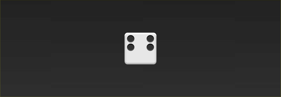
Next, we need to make the columns flex containers. It might seem like they already are, but remember that we haven't set display: flex yet. We can use the flex-direction property to set the direction of the main axis to column.
接下来,我们需要使列成为弹性容器。 看起来好像已经存在了,但是请记住我们还没有设置display: flex 。 我们可以使用flex-direction属性将主轴的方向设置为列。
.fourth-face {
  display: flex;
  justify-content: space-between;
}

.fourth-face .column {
  display: flex;
  flex-direction: column;
}
It doesn't look any different, but the columns are now flex containers. Notice how we stuck a flex container directly inside another flex container? That's okay! Flexbox doesn't care if the containers are nested.
看起来没有什么不同,但是列现在是flex容器。 注意我们如何将一个flex容器直接插入另一个flex容器中? 没关系! Flexbox不在乎容器是否嵌套。
The final step is to space the the pips inside the columns apart from each other. Since the main axis is vertical, we can use justify-content again.
最后一步是将列内的点彼此隔开。 由于主轴是垂直的,因此我们可以再次使用justify-content 。
.fourth-face {
  display: flex;
  justify-content: space-between;
}

.fourth-face .column {
  display: flex;
  flex-direction: column;
  justify-content: space-between;
}

Note: This face could have been built without columns by using wrapping. I'll cover wrapping in more detail in a future lesson.
注意:可以通过使用包装来构建没有柱子的此面。 我将在以后的课程中详细介绍包装。
结语 (Wrapping up)
Woohoo! Three faces down and three to go. At this point, you should have everything you need to build the other three. Your homework is to write the CSS for the missing faces. When you're done, you can look at the CodePen below for the answers. Let me know how it went in the comments!
hoo! 三个面朝下,三个要走。 此时,您应该拥有构建其他三个组件所需的一切。 您的作业是为缺少的面Kong编写CSS。 完成后,您可以查看下面的CodePen以获取答案。 让我知道评论中的情况!
See the Pen Flexbox Dice by Landon Schropp (@LandonSchropp) on CodePen.
见笔Flexbox的骰子由兰登Schropp( @LandonSchropp上) CodePen 。
My next lesson will cover how to write flexbox without vendor prefixes or old syntax. To make sure you get it, head over to Free Flexbox Starter Course and sign up.
我的下一课将介绍如何在没有供应商前缀或旧语法的情况下编写flexbox。 为了确保您能得到它,请前往“ 免费Flexbox入门课程”并注册。
flexbox


 7668
7668

 被折叠的 条评论
为什么被折叠?
被折叠的 条评论
为什么被折叠?
 到【灌水乐园】发言


