


视差滚动
Scrolling animations are fun. They are fun to create and fun to use. If you are tired of bootstrapping you might find playing with scrolling animations as a nice juicy refreshment in your dry front-end development career. Let's have a look how to create animating sound wave using Skroll.js.
滚动动画很有趣。 它们创建起来很有趣,使用起来也很有趣。 如果您厌倦了自举,则可能会在干燥的前端开发事业中将滚动动画作为一种多汁的休闲方式来玩。 让我们看看如何使用Skroll.js创建动画声波。
HTML (The HTML)
Firstly we'll create a container with all our parts.
首先,我们将创建一个包含所有零件的容器。
<div id="soundWave">
    <div class="part p1"></div>
    <div class="part p2"></div>
    <div class="part p3"></div>
    <div class="part p4"></div>
    <div class="part p5"></div>
    <div class="part p6"></div>
    <div class="part p7"></div>
    <div class="part p8"></div>
    <div class="part p9"></div>
    <div class="part p10"></div>
    <div class="part p11"></div>
    <div class="part p12"></div>
    <div class="part p13"></div>
</div>
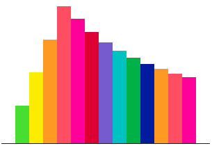
Each part represents a block in the wave.
每个部分代表波浪中的一个块。
CSS (The CSS)
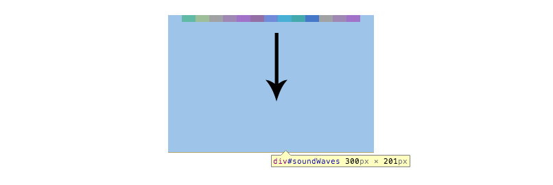
Add CSS to position our sound wave in the middle of the page and give each part a different background color.
添加CSS将声波定位在页面中间,并为每个部分提供不同的背景色。
.soundWaves {
    border-bottom: 1px #222222 solid;
    width: 300px;
    height: 200px;
    position: fixed;
    top: 50%;
    left: 50%;
    margin: -200px 0 0 -150px;
}
.partsContainer {
    position: relative;
    width: 240px;
    height: 200px;
    left: 30px;
}
.part {
    width: 20px;
    height: 1px;
    float: left;
}
.p1 {background-color: #4fdc3f;}
.p2 {background-color: #fbe91b;}
.p3 {background-color: #fe9836;}
.p4 {background-color: #fd5064;}
.p5 {background-color: #ff159b;}
.p6 {background-color: #da0638;}
.p7 {background-color: #755eca;}
.p8 {background-color: #0dc2c0;}
.p9 {background-color: #00ae4c;}
.p10 {background-color: #00239b;}
.p11 {background-color: #fe9836;}
.p12 {background-color: #fd5064;}
.p13 {background-color: #ff159b;}
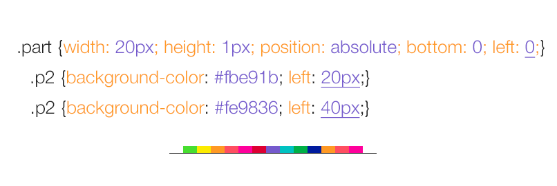
Using float to position our parts won't create a good base for us -- we need to tweak the CSS to align everything with the bottom edge of the parent container. Let's change it from float: left to position: absolute.
使用float来定位零件不会为我们创造良好的基础-我们需要调整CSS以使所有内容与父容器的底部边缘对齐。 让我们将其从float: left更改为position: absolute 。
.part {
    width: 20px;
    height: 1px;
    position: absolute;
    bottom: 0;
    left: 0;
    transform-origin:50% 100%;
    -ms-transform-origin:50% 100%; /* IE 9 */
    -webkit-transform-origin:50% 100%; /* Chrome, Safari, Opera */
}
.p1 {background-color: #4fdc3f;}
.p2 {background-color: #fbe91b; left: 20px;}
.p3 {background-color: #fe9836; left: 40px}
.p4 {background-color: #fd5064; left: 60px}
.p5 {background-color: #ff159b; left: 80px}
.p6 {background-color: #da0638; left: 100px}
.p7 {background-color: #755eca; left: 120px}
.p8 {background-color: #0dc2c0; left: 140px}
.p9 {background-color: #00ae4c; left: 160px}
.p10 {background-color: #00239b; left: 180px}
.p11 {background-color: #fe9836; left: 200px}
.p12 {background-color: #fd5064; left: 220px}
.p13 {background-color: #ff159b; left: 240px}
We have changed the position of all the parts to position:absolute and bottom: 0, which means that we also need to define left offset, otherwise all parts would be sitting on top of each other.
我们已经将所有零件的位置更改为position:absolute和bottom:0,这意味着我们还需要定义左偏移,否则所有零件都将位于彼此的顶部。
Now when we have them aligned to the bottom edge, changing their scaleY will make them animate up instead of down.
现在,当我们将它们与底部边缘对齐时,更改它们的scaleY将使它们向上而不是向下设置动画。
Notice that we have also included transform-origin: 50% 100%. This moves the point from which the scaleY is calculated to the bottom of the element instead of the default center point.
请注意,我们还包括了转换原点:50%100%。 这会将计算scaleY的点移动到元素的底部,而不是默认的中心点。
第3步-初始化Skrollr并添加一些爵士乐 (Step 3 - Init Skrollr and Add Some Jazz)
We'll initiate Skrollr below the reference to Skrollr.min.js just before the end of the body.
在主体结尾之前,我们将在对Skrollr.min.js的引用下面启动Skrollr。
<script src="js/skrollr.min.js"></script>
<script type="text/javascript">
var s = skrollr.init();
</script>
And add our first data attributes. We'll use absolute values in this demo.
并添加我们的第一个数据属性。 在此演示中,我们将使用绝对值。
<div class="part p1"
    data-start="transform: scaleY(1)"
    data-1000-start="transform: scaleY(200)"
    data-2000-start="transform: scaleY(1)"
    anchor-target="body"
></div>
By setting these data attributes we are creating an animation keyframes.
通过设置这些数据属性,我们可以创建动画关键帧。
data-start contains our initial value, that is similar to our value in the stylesheet.
data-start包含我们的初始值,该初始值类似于样式表中的值。
data-1000-start is the scale of the part when the user scrolls 1000 pixels down the page and data-2000-start is the scale at 2000 pixels scroll top position.
data-1000-start是用户在页面上向下滚动1000像素时零件的比例,而data-2000-start是用户在页面顶部滚动2000像素时的比例。
We want to create a wave, which means that we will need to add the same increment to each of the following parts.
我们要创建一个wave,这意味着我们需要为以下每个部分添加相同的增量。
<div class="part p2" data-start="transform: scaleY(1)" data-1250-start="transform: scaleY(200)" data-2250-start="transform: scaleY(1)" anchor-target="body"></div>
We are increasing the second and third offset value, which creates the desired wave effect. We are also repeating the same increment for all other 13 parts.
我们正在增加第二和第三偏移值,从而创建所需的波效果。 我们还将对所有其他13个部分重复相同的增量。
Also notice that we don't need to set the height of out page, Skrollr is smart enough and calculates it for us automatically.
还要注意,我们不需要设置页面高度,Skrollr足够聪明,可以自动为我们计算出来。
There you have it: a nice simple sound wave created using Skroll.js. Learn more about Skrollr, parallax and scrolling animations in Petr's Parallax Scrolling Master Class, enter our giveaway below.
在那里,您就会找到它:使用Skroll.js创建的漂亮的简单声波。 在Petr的视差滚动大师班中了解有关Skrollr,视差和滚动动画的更多信息,请在下面输入我们的赠品。
送 (Giveaway)
Enter to WIN a Parallax Scrolling Master Class by Petr Tichy. An online course teaching you how to create a parallax scrolling website from start to finish using Skrollr.js! How do you throw your hat in the ring? In the comments below, post a link to your favorite use of the parallax effect. There are many great ones out there so to win you better bring an A-quality effect!
输入以赢得Petr Tichy的视差滚动大师课程 。 在线课程教您如何使用Skrollr.js从头到尾创建视差滚动网站! 您如何将帽子戴在戒指上? 在下面的评论中,发布指向您最喜欢的视差效果使用的链接。 有很多很棒的东西,所以要赢得您更好地带来A品质的效果!
视差滚动


 1027
1027

 被折叠的 条评论
为什么被折叠?
被折叠的 条评论
为什么被折叠?
 到【灌水乐园】发言


