


 本文介绍了如何在Excel中创建组合图,包括单轴组合图和双轴组合图。组合图能在一个图表上同时展示柱状图和折线图,方便对比不同数据类型。文章通过实例详细展示了创建和修改组合图的步骤。

A combo chart in Excel displays two chart types (such as column and line) on the same chart. They are used to show different types of information on a single chart, such as actuals against a target.
Excel中的组合图表在同一图表上显示两种图表类型(如柱形图和折线图)。 它们用于在单个图表上显示不同类型的信息,例如针对目标的实际值。
In this article, we’ll demonstrate how to make a combo chart that follows the same axis and one that displays mixed types of data in a single chart on a different axis.
在本文中,我们将演示如何制作一个沿同一轴的组合图表,以及一个在不同轴上的单个图表中显示混合数据类型的组合图表。
插入单轴组合图 (Insert a Combo Chart with a Single Axis)
In the first example, we will create a combo chart to show monthly revenue against a target using the sample data below.
在第一个示例中,我们将使用下面的示例数据创建一个组合图,以显示针对目标的每月收入。
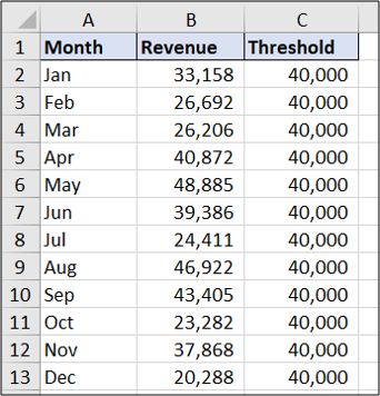
You can see that the target value is the same each month. The result will show the data as a straight
 最低0.47元/天 解锁文章


 被折叠的 条评论
为什么被折叠?
被折叠的 条评论
为什么被折叠?
 到【灌水乐园】发言


