


If you read data science articles, you may have already stumbled upon FiveThirtyEight’s content. Naturally, you were impressed by their awesome visualizations. You wanted to make your own awesome visualizations and so asked Quora and Reddit how to do it. You received some answers, but they were rather vague. You still can’t get the graphs done yourself.
如果您阅读数据科学文章,则可能已经迷失了FiveThirtyEight的内容。 当然,他们的出色可视化效果给您留下了深刻的印象。 您想制作自己的出色可视化文件,所以问Quora和Reddit如何做到这一点。 您收到了一些答案,但是它们相当模糊。 您仍然无法自己完成图表。
In this post, we’ll help you. Using Python’s matplotlib and pandas, we’ll see that it’s rather easy to replicate the core parts of any FiveThirtyEight (FTE) visualization.
在这篇文章中,我们将为您提供帮助。 使用Python的matplotlib和pandas ,我们将看到复制任何FiveThirtyEight(FTE)可视化的核心部分都相当容易。
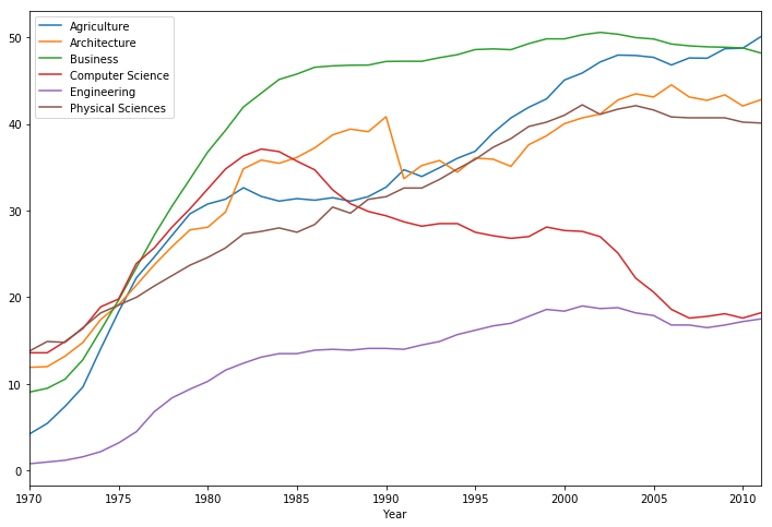
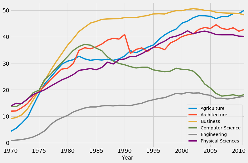
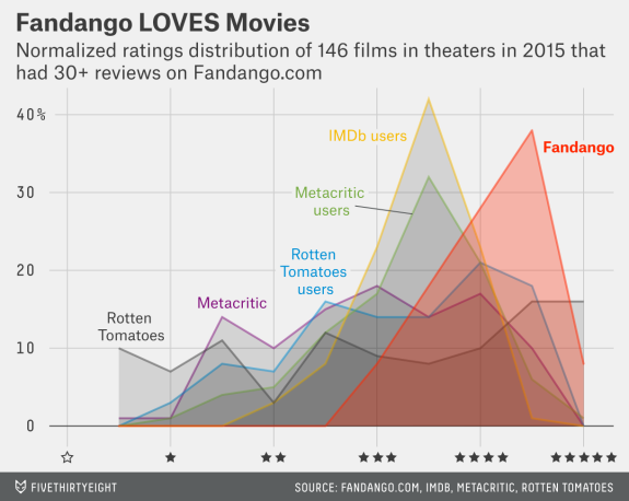
We’ll start here:
我们将从这里开始:
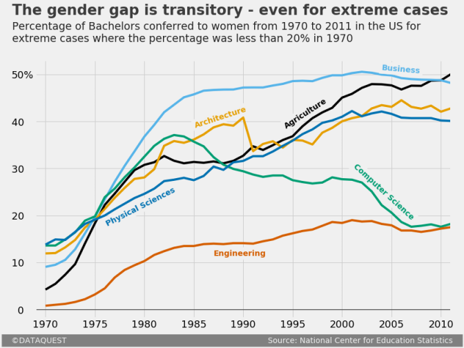
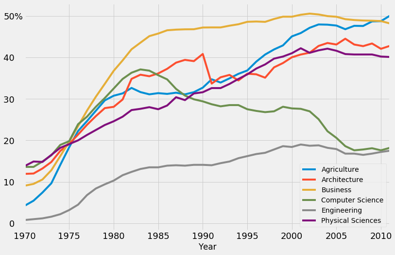
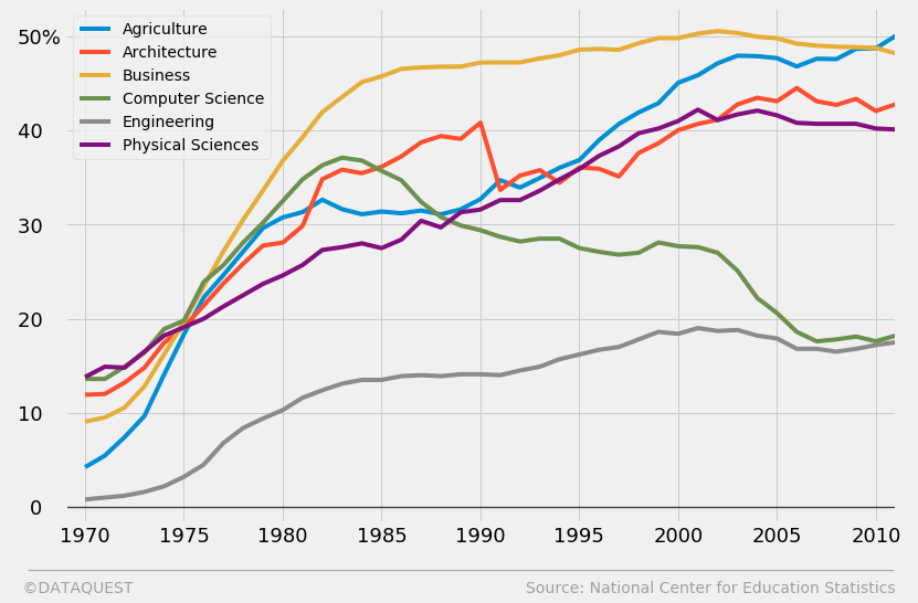
And, at the end of the tutorial, arrive here:
并且,在本教程的结尾,到达此处:
To follow along, you’ll need at least some basic knowledge of Python. If you know what’s the difference between methods and attributes, then you’re good to go.
要继续学习,您至少需要一些Python的基础知识。 如果您知道方法和属性之间有什么区别,那么您就很好了。
引入数据集 (Introducing the dataset)
We’ll work with data describing the percentages of Bachelors conferred to women in the US from 1970 to 2011. We’ll use a dataset compiled by data scientist Randal Olson, who collected the data from the National Center for Education Statistics.
我们将使用描述1970年至2011年美国授予女性学士学位的百分比的数据进行处理。我们将使用由数据科学家Randal Olson收集的数据集,该数据收集者是美国国家教育统计中心的数据 。
If you want to follow along by writing code yourself, you can download the data from Randal’s blog. To save yourself some time, you can skip downloading the file, and just pass in the direct link to pandas’ read_csv() function. In the following code cell, we:
如果您想自己编写代码,请从Randal的博客下载数据。 为了节省时间,您可以跳过下载文件的过程,而直接将直接链接传递给pandas的read_csv() 函数 。 在以下代码单元中,我们:
- Import the pandas module.
- Assign the direct link toward the dataset as a
stringto a variable nameddirect_link. - Read in the data by using
read_csv(), and assign the content towomen_majors. - Print information about the dataset by using the
info()method. We’re looking for the number of rows and columns, and checking for null values at the same time. - Show the first five rows to understand better the structure of the dataset by using the
head()method.
- 导入pandas模块。
- 将指向数据集的直接链接作为
string分配给名为direct_link的变量。 - 使用
read_csv()读入数据,并将内容分配给women_majors。 - 使用
info()方法打印有关数据集的info()。 我们正在寻找行和列的数量,并同时检查null值。 - 显示前五行,以使用
head()方法更好地理解数据集的结构。
import import pandas pandas as as pd

pd

direct_link direct_link = = 'http://www.randalolson.com/wp-content/uploads/percent-bachelors-degrees-women-usa.csv'
'http://www.randalolson.com/wp-content/uploads/percent-bachelors-degrees-women-usa.csv'
women_majors women_majors = = pdpd .. read_csvread_csv (( direct_linkdirect_link )

)

printprint (( women_majorswomen_majors .. infoinfo ())
())
women_majorswomen_majors .. headhead ()
()
<class 'pandas.core.frame.DataFrame'>
RangeIndex: 42 entries, 0 to 41
Data columns (total 18 columns):
Year                             42 non-null int64
Agriculture                      42 non-null float64
Architecture                     42 non-null float64
Art and Performance              42 non-null float64
Biology                          42 non-null float64
Business                         42 non-null float64
Communications and Journalism    42 non-null float64
Computer Science                 42 non-null float64
Education                        42 non-null float64
Engineering                      42 non-null float64
English                          42 non-null float64
Foreign Languages                42 non-null float64
Health Professions               42 non-null float64
Math and Statistics              42 non-null float64
Physical Sciences                42 non-null float64
Psychology                       42 non-null float64
Public Administration            42 non-null float64
Social Sciences and History      42 non-null float64
dtypes: float64(17), int64(1)
memory usage: 6.0 KB
None
| Year | 年 | Agriculture | 农业 | Architecture | 建筑 | Art and Performance | 艺术与表演 | Biology | 生物学 | Business | 商业 | Communications and Journalism | 传播与新闻 | Computer Science | 计算机科学 | Education | 教育 | Engineering | 工程 | English | 英语 | Foreign Languages | 外语 | Health Professions | 卫生专业 | Math and Statistics | 数学与统计学 | Physical Sciences | 物理科学 | Psychology | 心理学 | Public Administration | 公共行政 | Social Sciences and History | 社会科学与历史 | ||
|---|---|---|---|---|---|---|---|---|---|---|---|---|---|---|---|---|---|---|---|---|---|---|---|---|---|---|---|---|---|---|---|---|---|---|---|---|---|
| 0 | 0 | 1970 | 1970年 | 4.229798 | 4.229798 | 11.921005 | 11.921005 | 59.7 | 59.7 | 29.088363 | 29.088363 | 9.064439 | 9.064439 | 35.3 | 35.3 | 13.6 | 13.6 | 74.535328 | 74.535328 | 0.8 | 0.8 | 65.570923 | 65.570923 | 73.8 | 73.8 | 77.1 | 77.1 | 38.0 | 38.0 | 13.8 | 13.8 | 44.4 | 44.4 | 68.4 | 68.4 | 36.8 | 36.8 |
| 1 | 1个 | 1971 | 1971年 | 5.452797 | 5.452797 | 12.003106 | 12.003106 | 59.9 | 59.9 | 29.394403 | 29.394403 | 9.503187 | 9.503187 | 35.5 | 35.5 | 13.6 | 13.6 | 74.149204 | 74.149204 | 1.0 | 1.0 | 64.556485 | 64.556485 | 73.9 | 73.9 | 75.5 | 75.5 | 39.0 | 39.0 | 14.9 | 14.9 | 46.2 | 46.2 | 65.5 | 65.5 | 36.2 | 36.2 |
| 2 | 2 | 1972 | 1972年 | 7.420710 | 7.420710 | 13.214594 | 13.214594 | 60.4 | 60.4 | 29.810221 | 29.810221 | 10.558962 | 10.558962 | 36.6 | 36.6 | 14.9 | 14.9 | 73.554520 | 73.554520 | 1.2 | 1.2 | 63.664263 | 63.664263 | 74.6 | 74.6 | 76.9 | 76.9 | 40.2 | 40.2 | 14.8 | 14.8 | 47.6 | 47.6 | 62.6 | 62.6 | 36.1 | 36.1 |
| 3 | 3 | 1973 | 1973年 | 9.653602 | 9.653602 | 14.791613 | 14.791613 | 60.2 | 60.2 | 31.147915 | 31.147915 | 12.804602 | 12.804602 | 38.4 | 38.4 | 16.4 | 16.4 | 73.501814 | 73.501814 | 1.6 | 1.6 | 62.941502 | 62.941502 | 74.9 | 74.9 | 77.4 | 77.4 | 40.9 | 40.9 | 16.5 | 16.5 | 50.4 | 50.4 | 64.3 | 64.3 | 36.4 | 36.4 |
| 4 | 4 | 1974 | 1974年 | 14.074623 | 14.074623 | 17.444688 | 17.444688 | 61.9 | 61.9 | 32.996183 | 32.996183 | 16.204850 | 16.204850 | 40.5 | 40.5 | 18.9 | 18.9 | 73.336811 | 73.336811 | 2.2 | 2.2 | 62.413412 | 62.413412 | 75.3 | 75.3 | 77.9 | 77.9 | 41.8 | 41.8 | 18.2 | 18.2 | 52.6 | 52.6 | 66.1 | 66.1 | 37.3 | 37.3 |
Besides the Year column, every other column name indicates the subject of a Bachelor degree. Every datapoint in the Bachelor columns represents the percentage of Bachelor degrees conferred to women. Thus, every row describes the percentage for various Bachelors conferred to women in a given year.
除“ Year列外,其他所有列名称均指示本科学历。 “学士学位”列中的每个数据点都代表授予女性学士学位的百分比。 因此,每一行都描述了给定年份中授予女性的各种学士学位的百分比。
As mentioned before, we have data from 1970 to 2011. To confirm the latter limit, let’s print the last five rows of the dataset by using the tail() method:
如前所述,我们拥有1970年至2011年的数据。为确认后一个限制,让我们使用tail() 方法打印数据集的最后五行:
| Year | 年 | Agriculture | 农业 | Architecture | 建筑 | Art and Performance | 艺术与表演 | Biology | 生物学 | Business | 商业 | Communications and Journalism | 传播与新闻 | Computer Science | 计算机科学 | Education | 教育 | Engineering | 工程 | English | 英语 | Foreign Languages | 外语 | Health Professions | 卫生专业 | Math and Statistics | 数学与统计学 | Physical Sciences | 物理科学 | Psychology | 心理学 | Public Administration | 公共行政 | Social Sciences and History | 社会科学与历史 | ||
|---|---|---|---|---|---|---|---|---|---|---|---|---|---|---|---|---|---|---|---|---|---|---|---|---|---|---|---|---|---|---|---|---|---|---|---|---|---|
| 37 | 37 | 2007 | 2007年 | 47.605026 | 47.605026 | 43.100459 | 43.100459 | 61.4 | 61.4 | 59.411993 | 59.411993 | 49.000459 | 49.000459 | 62.5 | 62.5 | 17.6 | 17.6 | 78.721413 | 78.721413 | 16.8 | 16.8 | 67.874923 | 67.874923 | 70.2 | 70.2 | 85.4 | 85.4 | 44.1 | 44.1 | 40.7 | 40.7 | 77.1 | 77.1 | 82.1 | 82.1 | 49.3 | 49.3 |
| 38 | 38 | 2008 | 2008年 | 47.570834 | 47.570834 | 42.711730 | 42.711730 | 60.7 | 60.7 | 59.305765 | 59.305765 | 48.888027 | 48.888027 | 62.4 | 62.4 | 17.8 | 17.8 | 79.196327 | 79.196327 | 16.5 | 16.5 | 67.594028 | 67.594028 | 70.2 | 70.2 | 85.2 | 85.2 | 43.3 | 43.3 | 40.7 | 40.7 | 77.2 | 77.2 | 81.7 | 81.7 | 49.4 | 49.4 |
| 39 | 39 | 2009 | 2009年 | 48.667224 | 48.667224 | 43.348921 | 43.348921 | 61.0 | 61.0 | 58.489583 | 58.489583 | 48.840474 | 48.840474 | 62.8 | 62.8 | 18.1 | 18.1 | 79.532909 | 79.532909 | 16.8 | 16.8 | 67.969792 | 67.969792 | 69.3 | 69.3 | 85.1 | 85.1 | 43.3 | 43.3 | 40.7 | 40.7 | 77.1 | 77.1 | 82.0 | 82.0 | 49.4 | 49.4 |
| 40 | 40 | 2010 | 2010 | 48.730042 | 48.730042 | 42.066721 | 42.066721 | 61.3 | 61.3 | 59.010255 | 59.010255 | 48.757988 | 48.757988 | 62.5 | 62.5 | 17.6 | 17.6 | 79.618625 | 79.618625 | 17.2 | 17.2 | 67.928106 | 67.928106 | 69.0 | 69.0 | 85.0 | 85.0 | 43.1 | 43.1 | 40.2 | 40.2 | 77.0 | 77.0 | 81.7 | 81.7 | 49.3 | 49.3 |
| 41 | 41 | 2011 | 2011年 | 50.037182 | 50.037182 | 42.773438 | 42.773438 | 61.2 | 61.2 | 58.742397 | 58.742397 | 48.180418 | 48.180418 | 62.2 | 62.2 | 18.2 | 18.2 | 79.432812 | 79.432812 | 17.5 | 17.5 | 68.426730 | 68.426730 | 69.5 | 69.5 | 84.8 | 84.8 | 43.1 | 43.1 | 40.1 | 40.1 | 76.7 | 76.7 | 81.9 | 81.9 | 49.2 | 49.2 |
我们的FiveThirtyEight图的上下文 (The context of our FiveThirtyEight graph)
Almost every FTE graph is part of an article. The graphs complement the text by illustrating a little story, or an interesting idea. We’ll need to be mindful of this while replicating our FTE graph.
几乎每个FTE图都是文章的一部分。 这些图形通过说明一个小故事或一个有趣的想法来补充文本。 在复制FTE图时,我们需要注意这一点。
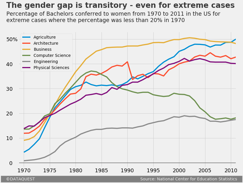
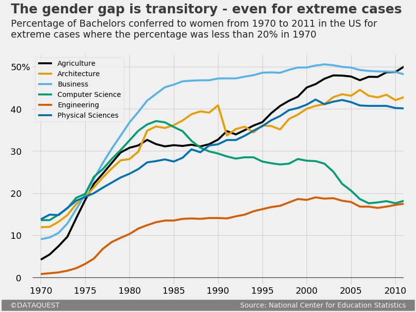
To avoid digressing from our main task in this tutorial, let’s just pretend we’ve already written most of an article about the evolution of gender disparity in US education. We now need to create a graph to help readers visualize the evolution of gender disparity for Bachelors where the situation was really bad for women in 1970. We’ve already set a threshold of 20%, and now we want to graph the evolution for every Bachelor where the percentage of women graduates was less than 20% in 1970.
为了避免偏离本教程的主要任务,我们仅假装我们已经撰写了一篇有关美国教育中性别差距的演变的文章。 现在,我们需要创建一个图表,以帮助读者形象地了解1970年对女性而言真的很糟糕的单身汉性别差异的演变情况。我们已经设定了20%的阈值,现在我们想要绘制每个人的变化趋势图1970年,女性毕业生的学士学位不足20%。
Let’s first identify those specific Bachelors. In the following code cell, we will:
首先让我们确定那些特定的学士学位。 在以下代码单元中,我们将:
- Use
.loc, a label-based indexer, to:- select the first row (the one that corresponds to 1970);
- select the items in the first row only where the values are less than 20; the
Yearfield will be checked as well, but will obviously not be included because 1970 is much greater than 20.
- Assign the resulting content to
under_20.
- 使用
.loc(基于标签的索引器 )进行以下操作:- 选择第一行(对应于1970年);
- 仅在值小于20的情况下选择第一行中的项目; 也将选中“
Year字段,但显然不会包括在内,因为1970年大于20。
- 将结果内容分配给
under_20。
under_20 under_20 = = women_majorswomen_majors .. locloc [[ 00 , , women_majorswomen_majors .. locloc [[ 00 ] ] < < 2020 ]
]
under_20
under_20
Agriculture           4.229798
Architecture         11.921005
Business              9.064439
Computer Science     13.600000
Engineering           0.800000
Physical Sciences    13.800000
Name: 0, dtype: float64
使用matplotlib的默认样式 (Using matplotlib’s default style)
Let’s begin working on our graph. We’ll first take a peek at what we can build by default. In the following code block, we will:
让我们开始研究图表。 我们首先来看看默认情况下可以构建的内容。 在下面的代码块中,我们将:
- Run the Jupyter magic
%matplotlibto enable Jupyter and matplotlib work together effectively, and addinlineto have our graphs displayed inside the notebook. - Plot the graph by using the
plot()method onwomen_majors. We pass in toplot()the following parameters:x– specifies the column fromwomen_majorsto use for the x-axis;y– specifies the columns fromwomen_majorsto use for the y-axis; we’ll use the index labels ofunder_20which are stored in the.indexattribute of this object;figsize– sets the size of the figure as atuplewith the format(width, height)in inches.
- Assign the plot object to a variable named
under_20_graph, and print its type to show that pandas usesmatplotlibobjects under the hood.
- 运行Jupyter magic
%matplotlib以使Jupyter和matplotlib有效地协同工作 ,并添加inline以在笔记本中显示我们的图形。 - 通过在
women_majors上使用plot()方法绘制图形。 我们将以下参数传递给plot():-
x–指定women_majors中用于x轴的列; -
y–指定来自women_majors的列用于y轴; 我们将使用under_20的索引标签,这些标签存储在此对象的.index属性中; -
figsize–将图的大小设置为tuple,格式(width, height)以英寸为单位。
-
- 将绘图对象分配给一个名为
under_20_graph的变量,并打印其类型以显示熊猫在under_20_graph使用matplotlib对象。
使用matplotlib的第五十八样式 (Using matplotlib’s fivethirtyeight style)
The graph above has certain characteristics, like the width and color of the spines, the font size of the y-axis label, the absence of a grid, etc. All of these characteristics make up matplotlib’s default style.
上面的图形具有某些特征,例如,脊的宽度和颜色,y轴标签的字体大小,不存在网格等。所有这些特征构成了matplotlib的默认样式。
As a short parenthesis, it’s worth mentioning that we’ll use a few technical terms about the parts of a graph throughout this post. If you feel lost at any point, you can refer to the legend below.
作为简短的括号,值得一提的是,在本文中,我们将使用一些技术术语来表示图形的各个部分。 如果您感到迷茫,可以参考以下图例。
Besides the default style, matplotlib comes with several built-in styles that we can use readily. To see a list of the available styles, we will:
除了默认样式外,matplotlib还带有一些内置样式,我们可以随时使用它们。 要查看可用样式的列表,我们将:
- Import the
matplotlib.stylemodule under the namestyle. - Explore the content of
matplotlib.style.available(a predefined variable of this module), which contains a list of all the available in-built styles.
- 以名称
style导入matplotlib.style模块 。 - 探索
matplotlib.style.available(此模块的预定义变量)的内容,其中包含所有可用的内置样式的列表。
import import matplotlib.style matplotlib.style as as style
style
stylestyle .. available
available
['seaborn-deep',
 'seaborn-muted',
 'bmh',
 'seaborn-white',
 'dark_background',
 'seaborn-notebook',
 'seaborn-darkgrid',
 'grayscale',
 'seaborn-paper',
 'seaborn-talk',
 'seaborn-bright',
 'classic',
 'seaborn-colorblind',
 'seaborn-ticks',
 'ggplot',
 'seaborn',
 '_classic_test',
 'fivethirtyeight',
 'seaborn-dark-palette',
 'seaborn-dark',
 'seaborn-whitegrid',
 'seaborn-pastel',
 'seaborn-poster']
You might have already observed that there’s a built-in style called fivethirtyeight. Let’s use this style, and see where that leads. For that, we’ll use the aptly named use() function from the same matplotlib.style module (which we imported under the name style). Then we’ll generate our graph using the same code as earlier.
您可能已经观察到,有一种内置样式称为fivethirtyeight 。 让我们使用这种样式,并查看结果。 为此,我们将从同一个matplotlib.style模块(我们以名称style导入use()使用恰当命名的use() 函数 。 然后,我们将使用与之前相同的代码来生成图形。
Wow, that’s a major change! With respect to our first graph, we can see that this one has a different background color, it has grid lines, there are no spines whatsoever, the weight and the font size of the major tick labels are different, etc.
哇,那是一个重大变化! 关于我们的第一个图,我们可以看到该图具有不同的背景色,具有网格线,没有任何刺,主要刻度标签的粗细和字体大小均不同,等等。
You can read a technical description of the fivethirtyeight style here – it should also give you a good idea about what code runs under the hood when we use this style. The author of the style sheet, Cameron David-Pilon, discusses some of the characteristics here.
您可以在此处阅读有关fivethirtyeight样式的技术说明-它也应该使您对当我们使用这种样式时fivethirtyeight运行的代码有一个很好的了解。 样式表的作者Cameron David-Pilon在这里讨论了一些特征。
matplotlib第五十八样式的局限性 (The limitations of matplotlib’s fivethirtyeight style)
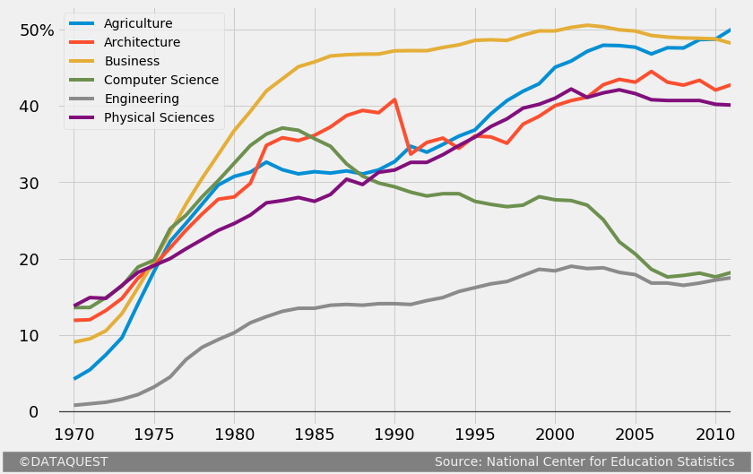
All in all, using the fivethirtyeight style clearly brings us much closer to our goal. Nonetheless, there’s still a lot left to do. Let’s examine a simple FTE graph, and see what else we need to add to our graph.
总而言之,使用fivethirtyeight风格显然使我们更接近我们的目标。 尽管如此,还有很多事情要做。 让我们检查一个简单的FTE图,并查看我们还需要添加到图中的内容。
By comparing the above graph with what we’ve made so far, we can see that we still need to:
通过将上面的图表与到目前为止所做的比较,我们可以看到我们仍然需要:
- Add a title and a subtitle.
- Remove the block-style legend, and add labels near the relevant plot lines. We’ll also have to make the grid lines transparent around these labels.
- Add a signature bottom bar which mentions the author of the graph and the source of the data.
- Add a couple of other small adjustments:
- increase the font size of the tick labels;
- add a “%” symbol to one of the major tick labels of the y-axis;
- remove the x-axis label;
- bold the horizontal grid line at y = 0;
- add an extra grid line next to the tick labels of the y-axis;
- increase the lateral margins of the figure.
- 添加标题和副标题。
- 删除块样式图例,并在相关绘图线附近添加标签。 我们还必须使这些标签周围的网格线透明。
- 添加一个签名底部栏,其中提到图形的作者和数据源。
- 添加一些其他小的调整:
- 增加刻度线标签的字体大小;
- 在y轴的主要刻度标签之一上添加“%”符号;
- 移除x轴标签;
- 在y = 0处加粗水平网格线;
- 在y轴的刻度标签旁边添加一条额外的网格线;
- 增加图形的侧边距。
To minimize the time spent with generating the graph, it’s important to avoid beginning adding the title, the subtitle, or any other text snippet. In matplotlib, a text snippet is positioned by specifying the x and y coordinates, as we’ll see in some of the sections below. To replicate in detail the FTE graph above, notice that we’ll have to align vertically the tick labels of the y-axis with the title and the subtitle. We want to avoid a situation where we have the vertical alignment we want, lost it by increasing the font size of the tick labels, and then have to change the position of the title and subtitle again.
为了最大限度地减少生成图形所花费的时间,请务必避免开始添加标题,副标题或任何其他文本片段,这一点很重要。 在matplotlib中,通过指定x和y坐标来定位文本片段,如我们在以下某些部分中所见。 要详细复制上面的FTE图,请注意,我们必须将y轴的刻度标签与标题和副标题垂直对齐。 我们想要避免出现我们想要的垂直对齐方式,通过增加刻度线标签的字体大小而丢失它,然后必须再次更改标题和副标题的位置的情况。
For teaching purposes, we’re now going to proceed incrementally with adjusting our FTE graph. Consequently, our code will span over multiple code cells. In practice, however, no more than one code cell will be required.
出于教学目的,我们现在将逐步调整FTE图。 因此,我们的代码将跨越多个代码单元。 但是,实际上,只需要一个以上的代码单元。
喜欢这篇文章吗? 使用Dataquest学习数据科学! (Enjoying this post? Learn data science with Dataquest!)
- Learn from the comfort of your browser.
- Work with real-life data sets.
- Build a portfolio of projects.
- 从舒适的浏览器中学习。
- 处理实际数据集。
- 建立项目组合。
自定义刻度标签 (Customizing the tick labels)
We’ll start by increasing the font size of the tick labels. In the following code cell, we:
我们将从增加刻度标签的字体大小开始。 在以下代码单元中,我们:
- Plot the graph using the same code as earlier, and assign the resulting object to
fte_graph. Assigning to a variable allows us to repeatedly and easily apply methods on the object, or access its attributes. - Increase the font size of all the major tick labels using the
tick_params()method with the following parameters:axis– specifies the axis that the tick labels we want to modify belong to; here we want to modify the tick labels of both axes;which– indicates what tick labels to be affected (the major or the minor ones; see the legend shown earlier if you don’t know the difference);labelsize– sets the font size of the tick labels.
- 使用与先前相同的代码绘制图形,然后将结果对象分配给
fte_graph。 分配变量使我们能够重复轻松地在对象上应用方法或访问其属性。 - 使用带有以下参数的
tick_params()方法 ,增加所有主要刻度标签的字体大小:-
axis–指定我们要修改的刻度标签所属的轴; 这里我们要修改两个轴的刻度标签; -
which–指示将影响哪些刻度标签(主要或次要标签;如果您不知道区别,请参见前面显示的图例); -
labelsize-设置刻度标记标签的字体大小。
-
fte_graph fte_graph = = women_majorswomen_majors .. plotplot (( x x = = 'Year''Year' , , y y = = under_20under_20 .. indexindex , , figsize figsize = = (( 1212 ,, 88 ))
))
fte_graphfte_graph .. tick_paramstick_params (( axis axis = = 'both''both' , , which which = = 'major''major' , , labelsize labelsize = = 1818 )
)
You may have noticed that we didn’t use style.use('fivethirtyeight') this time. That’s because the preference for any matplotlib style becomes global once it’s first declared in our code. We’ve set the style earlier as fivethirtyeight, and from there on all subsequent graphs inherit this style. If for some reason you want to return to the default state, just run style.use('default').
您可能已经注意到我们style.use('fivethirtyeight')没有使用style.use('fivethirtyeight') 。 这是因为任何matplotlib样式的首选项在我们的代码中首次声明后都会变为全局首选项。 我们之前将样式设置为fivethirtyeight ,从那里开始,所有后续图形都继承了该样式。 如果出于某种原因要返回默认状态,只需运行style.use('default') 。
We’ll now build upon our previous changes by making a few adjustments to the tick labels of the y-axis:
现在,我们将通过对y轴的刻度标签进行一些调整来建立以前的更改:
- We add a “%” symbol to 50, the highest visible tick label of the y-axis.
- We also add a few whitespace characters after the other visible labels to align them elegantly with the new “50%” label.
- 我们在50(y轴的最高可见刻度)上添加一个“%”符号。
- 我们还在其他可见标签之后添加了一些空白字符,以使它们与新的“ 50%”标签优雅地对齐。
To make these changes to the tick labels of the y-axis, we’ll use the set_yticklabels() method along with the label parameter. As you can deduce from the code below, this parameter can take in a list of mixed data types, and doesn’t require any fixed number of labels to be passed in.
为了对y轴的刻度标签进行这些更改,我们将使用set_yticklabels() 方法和label参数。 从下面的代码可以推断出,此参数可以采用混合数据类型的列表,并且不需要传入任何固定数量的标签。
The tick labels of the y-axis: [-10. 0. 10. 20. 30. 40. 50. 60.]
在y = 0处加粗水平线 (Bolding the horizontal line at y = 0)
We will now bold the horizontal line where the y-coordinate is 0. For that, we’ll use the axhline() method to add a new horizontal grid line, and cover the existing one. The parameters we use for axhline() are:
现在,我们将在y坐标为0的水平线上加粗。为此,我们将使用axhline() 方法添加一条新的水平网格线,并覆盖现有的水平网格线。 我们用于axhline()的参数是:
y– specifies the y-coordinate of the horizontal line;color– indicates the color of the line;linewidth– sets the width of the line;alpha– regulates the transparency of the line, but we use it here to regulate the intensity of the black color; the values foralpharange from 0 (completely transparent) to 1 (completely opaque).
-
y–指定水平线的y坐标; -
color–指示线条的颜色; -
linewidth–设置线的宽度; -
alpha–调节线条的透明度,但是我们在这里使用它来调节黑色的强度;alpha值的范围从0(完全透明)到1(完全不透明)。
# The previous code
# The previous code
fte_graph fte_graph = = women_majorswomen_majors .. plotplot (( x x = = 'Year''Year' , , y y = = under_20under_20 .. indexindex , , figsize figsize = = (( 1212 ,, 88 ))
))
fte_graphfte_graph .. tick_paramstick_params (( axis axis = = 'both''both' , , which which = = 'major''major' , , labelsize labelsize = = 1818 )
)
fte_graphfte_graph .. set_yticklabelsset_yticklabels (( labels labels = = [[ -- 1010 , , '0   ''0   ' , , '10   ''10   ' , , '20   ''20   ' , , '30   ''30   ' , , '40   ''40   ' , , '50%''50%' ])

])

# Generate a bolded horizontal line at y = 0
# Generate a bolded horizontal line at y = 0
fte_graphfte_graph .. axhlineaxhline (( y y = = 00 , , color color = = 'black''black' , , linewidth linewidth = = 1.31.3 , , alpha alpha = = .. 77 )
)
As we mentioned earlier, we have to add another vertical grid line in the immediate vicinity of the tick labels of the y-axis. For that, we simply tweak the range of the values of the x-axis. Increasing the range’s left limit will result in the extra vertical grid line we want.
如前所述,我们必须在y轴的刻度标签附近添加另一条垂直网格线。 为此,我们只需调整x轴值的范围即可。 增大范围的左限将导致我们需要额外的垂直网格线。
Below, we use the set_xlim() method with the self-explanatory parameters left and right.
在下面,我们将set_xlim() 方法与不言自明的参数left和right 。
生成签名栏 (Generating a signature bar)
The signature bar of the example FTE graph presented above has a few obvious characteristics:
上面显示的示例FTE图的签名栏具有一些明显的特征:
- It’s positioned at the bottom of the graph.
- The author’s name is located on the left side of the signature bar.
- The source of the data is mentioned on the right side of the signature bar.
- The text has a light grey color (the same as the background color of the graph), and a dark grey background.
- The area in-between the author’s name and the source name has a dark grey background as well.
- 它位于图的底部。
- 作者的姓名位于签名栏的左侧。
- 数据源在签名栏的右侧提到。
- 文本具有浅灰色(与图形的背景颜色相同)和深灰色背景。
- 作者姓名和来源姓名之间的区域也具有深灰色背景。
The image is posted again so you don’t have to scroll back. Source: FiveThirtyEight
该图像再次发布,因此您无需向后滚动。 资料来源: FiveThirtyEight
It may seem difficult to add such a signature bar, but with a little ingenuity we can get it done quite easily.
添加这样的签名栏似乎很困难,但是通过一点点巧思,我们就可以轻松完成它。
We’ll add a single snippet of text, give it a light grey color, and a background color of dark grey. We’ll write both the author’s name and the source in a single text snippet, but we’ll space out these two such that one ends up on the far left side, and the other on the far right. The nice thing is that the whitespace characters will get a dark grey background as well, which will create the effect of a signature bar.
我们将添加一个文本片段,为其提供浅灰色,并为深灰色的背景色。 我们将在单个文本片段中写上作者的姓名和来源,但是我们将两者隔开,使得它们的结尾在最左边,另一个在最右边。 令人高兴的是,空白字符也将获得深灰色背景,这将产生签名栏的效果。
We’ll also use some white space characters to align the author’s name and the name of the source, as you’ll be able to see in the next code block.
我们还将使用一些空格字符来对齐作者的姓名和源名称,正如您将在下一个代码块中看到的那样。
This is also a good moment to remove the label of the x-axis. This way, we can get a better visual sense of how the signature bar fits in the overall scheme of the graph. In the next code cell, we’ll build up on what we’ve done so far, and we will:
这也是移除x轴标签的好时机。 这样,我们可以更好地看到签名栏如何适合图形的整体方案。 在下一个代码单元中,我们将基于到目前为止所做的工作,我们将:
- Remove the label of the x-axis by passing in a
Falsevalue to theset_visible()method we apply to the objectfte_graph.xaxis.label. Think of it this way: we access thexaxisattribute offte_graph, and then we access thelabelattribute offte_graph.xaxis. Then we finally applyset_visible()tofte_graph.xaxis.label. - Add a snippet of text on the graph in the way discussed above. We’ll use the
text()method with the following parameters:x– specifies the x-coordinate of the text;y– specifies the y-coordinate of the text;s– indicates the text to be added;fontsize– sets the size of the text;color– specifies the color of the text; the format of the value we use below is hexadecimal; we use this format to match exactly the background color of the entire graph (as specified in the code of thefivethirtyeightstyle);backgroundcolor– sets the background color of the text snippet.
- 通过将
False值传递给我们应用于对象fte_graph.xaxis.label的set_visible()方法,删除x轴的标签。 想想这样说:我们访问xaxis的属性fte_graph,然后我们访问label的属性fte_graph.xaxis。 然后,我们最终将set_visible()应用于fte_graph.xaxis.label。 - 以上述方式在图表上添加一小段文本。 我们将使用带有以下参数的
text()方法 :-
x–指定文本的x坐标; -
y–指定文本的y坐标; -
s–表示要添加的文本; -
fontsize–设置文本的大小; -
color–指定文本的颜色; 我们下面使用的值的格式是十六进制 ; 我们使用这种格式来完全匹配整个图形的背景颜色(如fivethirtyeight样式的代码中所指定); -
backgroundcolor–设置文本片段的背景色。
-
# The previous code
# The previous code
fte_graph fte_graph = = women_majorswomen_majors .. plotplot (( x x = = 'Year''Year' , , y y = = under_20under_20 .. indexindex , , figsize figsize = = (( 1212 ,, 88 ))
))
fte_graphfte_graph .. tick_paramstick_params (( axis axis = = 'both''both' , , which which = = 'major''major' , , labelsize labelsize = = 1818 )
)
fte_graphfte_graph .. set_yticklabelsset_yticklabels (( labels labels = = [[ -- 1010 , , '0   ''0   ' , , '10   ''10   ' , , '20   ''20   ' , , '30   ''30   ' , , '40   ''40   ' , , '50%''50%' ])
])
fte_graphfte_graph .. axhlineaxhline (( y y = = 00 , , color color = = 'black''black' , , linewidth linewidth = = 1.31.3 , , alpha alpha = = .. 77 )
)
fte_graphfte_graph .. set_xlimset_xlim (( left left = = 19691969 , , right right = = 20112011 )

)

# Remove the label of the x-axis
# Remove the label of the x-axis
fte_graphfte_graph .. xaxisxaxis .. labellabel .. set_visibleset_visible (( FalseFalse )

)

# The signature bar
# The signature bar
fte_graphfte_graph .. texttext (( x x = = 1965.81965.8 , , y y = = -- 77 ,
    ,
    s s = = '   ©DATAQUEST                                                                                 Source: National Center for Education Statistics   ''   ©DATAQUEST                                                                                 Source: National Center for Education Statistics   ' ,
    ,
    fontsize fontsize = = 1414 , , color color = = '#f0f0f0''#f0f0f0' , , backgroundcolor backgroundcolor = = 'grey''grey' )
)
The x and y coordinates of the text snippet added were found through a process of trial and error. You can pass in floats to the x and y parameters, so you’ll be able to control the position of the text with a high level of precision.
通过反复试验的过程找到了添加的文本片段的x和y坐标。 您可以将floats传递给x和y参数,这样便可以高精度地控制文本的位置。
It’s also worth mentioning that we tweaked the positioning of the signature bar in such a way that we added some visually refreshing lateral margins (we discussed this adjustment earlier). To increase the left margin, we simply lowered the value of the x-coordinate. To increase the right one, we added more whitespace characters between the author’s name and the source’s name – this pushes the source’s name to the right, which results in adding the desired margin.
还值得一提的是,我们通过以下方式调整了签名栏的位置:添加了一些视觉上令人耳目一新的横向边距(我们在前面讨论了此调整)。 为了增加左边距,我们只是降低了x坐标的值。 为了增加右边的字符,我们在作者的名字和源的名字之间添加了更多的空格字符–这将源的名字推到右边,从而增加了所需的边距。
另一种签名栏 (A different kind of signature bar)
You’ll also meet a slightly different kind of signature bar:
您还将遇到一种稍微不同的签名栏:
This kind of signature bar can be replicated quite easily as well. We’ll just add some grey colored text, and a line right above it.
这种签名栏也可以很容易地复制。 我们将只添加一些灰色文本,并在其上方添加一行。
We’ll create the visual effect of a line by adding a snippet of text of multiple underscore characters (“_”). You might wonder why we’re not using axhline() to simply draw a horizontal line at the y-coordinate we want. We don’t do that because the new line will drag down the entire grid of the graph, and this won’t create the desired effect.
我们将通过添加多个下划线字符(“ _”)的文本片段来创建线条的视觉效果。 您可能想知道为什么我们不使用axhline()在所需的y坐标上简单地绘制一条水平线。 我们不这样做,因为新行将向下拖动图形的整个网格,并且不会产生所需的效果。
We could also try adding an arrow, and then remove the pointer so we end up with a line. However, the “underscore” solution is much simpler.
我们还可以尝试添加箭头,然后删除指针,以便最终得到一条线。 但是,“下划线”解决方案要简单得多。
## Adding a title and subtitle If you examine [a couple of FTE graphs](https://fivethirtyeight.com/features/the-52-best-and-weirdest-charts-we-made-in-2016/), you may notice these patterns with regard to the title and the subtitle: * The title is almost invariably complemented by a subtitle. * The title gives a contextual angle to look from at a particular graph. The title is almost never technical, and it usually expresses a single, simple idea. It’s also almost never emotionally-neutral. In the Fandango graph above, we can see a simple, “emotionally-active” title (“Fandango LOVES Movies”), and not a bland “The distribution of various movie rating types”. * The subtitle offers technical information about the graph. This information is what makes axis labels redundant oftentimes. We should be careful to customize our subtitle accordingly since we’ve already dropped the x-axis label. * Visually, the title and the subtitle have different font weights, and they are left-aligned (unlike most titles, which are centered). Also, they are aligned vertically with the major tick labels of the y-axis, as we showed earlier. Let’s now add a title and a subtitle to our graph while being mindful of the above observations. In the code block below, we’ll build upon what we’ve coded so far, and we will: * Add a title and a subtitle by using the same `text()` method we used to add text in the signature bar. If you already have some experience with matplotlib, you might wonder why we don’t use the `title()` and `suptitle()` methods. This is because these two methods have an awful functionality with regard to moving text with precision. The only new parameter for `text()` is `weight`. We use it to bold the title.
##添加标题和副标题如果您查看[几个FTE图](https://fivethirtyeight.com/features/the-52-best-and-weirdest-charts-we-made-in-2016/),您可能会注意到标题和副标题的这些模式:*标题几乎总是由副标题补充。 *标题提供了从特定图形看的上下文角度。 标题几乎从来都不是技术性的,它通常只表示一个简单的想法。 它也几乎从来没有情绪中立。 在上方的Fandango图表中,我们可以看到一个简单的“具有情感动感”的标题(“ Fandango喜欢电影”),而没有一个平淡的“各种电影分级类型的分布”。 *字幕提供了有关图形的技术信息。 该信息经常使轴标签变得多余。 由于我们已经删除了x轴标签,因此应谨慎定制相应的字幕。 *视觉上,标题和副标题具有不同的字体粗细,并且它们是左对齐的(与大多数居中的标题不同)。 而且,如我们先前所示,它们与y轴的主要刻度标签垂直对齐。 现在,请注意上面的观察,在图中添加标题和副标题。 在下面的代码块中,我们将基于到目前为止已编码的内容,并且将:*通过使用与在签名栏中添加文本相同的`text()`方法,添加标题和副标题。 如果您已经对matplotlib有一定的经验,您可能想知道为什么我们不使用`title()`和`suptitle()`方法。 这是因为这两种方法在精确移动文本方面都具有可怕的功能。 “ text()”的唯一新参数是“ weight”。 我们用它来加粗标题。
# The previous code
# The previous code
fte_graph fte_graph = = women_majorswomen_majors .. plotplot (( x x = = 'Year''Year' , , y y = = under_20under_20 .. indexindex , , figsize figsize = = (( 1212 ,, 88 ))
))
fte_graphfte_graph .. tick_paramstick_params (( axis axis = = 'both''both' , , which which = = 'major''major' , , labelsize labelsize = = 1818 )
)
fte_graphfte_graph .. set_yticklabelsset_yticklabels (( labels labels = = [[ -- 1010 , , '0   ''0   ' , , '10   ''10   ' , , '20   ''20   ' , , '30   ''30   ' , , '40   ''40   ' , , '50%''50%' ])
])
fte_graphfte_graph .. axhlineaxhline (( y y = = 00 , , color color = = 'black''black' , , linewidth linewidth = = 1.31.3 , , alpha alpha = = .. 77 )
)
fte_graphfte_graph .. xaxisxaxis .. labellabel .. set_visibleset_visible (( FalseFalse )
)
fte_graphfte_graph .. set_xlimset_xlim (( left left = = 19691969 , , right right = = 20112011 )
)
fte_graphfte_graph .. texttext (( x x = = 1965.81965.8 , , y y = = -- 77 ,
    ,
    s s = = '   ©DATAQUEST                                                                                 Source: National Center for Education Statistics   ''   ©DATAQUEST                                                                                 Source: National Center for Education Statistics   ' ,
    ,
    fontsize fontsize = = 1414 , , color color = = '#f0f0f0''#f0f0f0' , , backgroundcolor backgroundcolor = = 'grey''grey' )


)


# Adding a title and a subtitle
# Adding a title and a subtitle
fte_graphfte_graph .. texttext (( x x = = 1966.651966.65 , , y y = = 62.762.7 , , s s = = "The gender gap is transitory - even for extreme cases""The gender gap is transitory - even for extreme cases" ,
               ,
               fontsize fontsize = = 2626 , , weight weight = = 'bold''bold' , , alpha alpha = = .. 7575 )
)
fte_graphfte_graph .. texttext (( x x = = 1966.651966.65 , , y y = = 5757 ,
               ,
               s s = = 'Percentage of Bachelors conferred to women from 1970 to 2011 in the US for'Percentage of Bachelors conferred to women from 1970 to 2011 in the US for nn extreme cases where the percentage was less than 20extreme cases where the percentage was less than 20 % i% i n 1970'n 1970' ,
              ,
              fontsize fontsize = = 1919 , , alpha alpha = = .. 8585 )
)
In case you were wondering, the font used in the original FTE graphs is Decima Mono, a paywalled font. For this reason, we’ll stick with Matplotlib’s default font, which looks pretty similar anyway. ## Adding colorblind-friendly colors Right now, we have that clunky, rectangular legend. We’ll get rid of it, and add colored labels near each plot line. Each line will have a certain color, and a word of an identical color will name the Bachelor which that line corresponds to. First, however, we’ll modify the default colors of the plot lines, and add [colorblind-friendly](https://en.wikipedia.org/wiki/Color_blindness) colors:
如果您想知道,原始FTE图形中使用的字体是Decima Mono(付费墙字体)。 因此,我们将坚持使用Matplotlib的默认字体,无论如何它看起来都非常相似。 ##添加色盲友好的颜色现在,我们有了笨拙的矩形图例。 我们将摆脱它,并在每条绘图线附近添加彩色标签。 每行将具有特定的颜色,并且相同颜色的单词将命名该行所对应的学士学位。 但是,首先,我们将修改绘图线的默认颜色,并添加[colorblind-friendly](https://en.wikipedia.org/wiki/Color_blindness)颜色:
We’ll compile a list of [RGB](https://en.wikipedia.org/wiki/RGB_color_model) parameters for colorblind-friendly colors by using values from the above image. As a side note, we avoid using yellow because text snippets with that color are not easily readable on the graph’s dark grey background color. After compiling this list of RGB parameters, we’ll then pass it to the `color` parameter of the `plot()` method we used in our previous code. Note that matplotlib will require the RGB parameters to be within a 0-1 range, so we’ll divide every value by 255, the maximum RGB value. We won’t bother dividing the zeros because 0/255 = 0.
我们将使用上一张图片中的值来编译用于色盲友好颜色的[RGB](https://en.wikipedia.org/wiki/RGB_color_model)参数列表。 附带说明一下,我们避免使用黄色,因为带有该颜色的文本片段在图形的深灰色背景颜色上不容易阅读。 编译完此RGB参数列表后,我们将其传递给我们先前代码中使用的`plot()`方法的`color`参数。 请注意,matplotlib将要求RGB参数在0-1范围内,因此我们将每个值除以最大RGB值255。 我们不会费心将零除,因为0/255 = 0。
## Changing the legend style by adding colored labels Finally, we add colored labels to each plot line by using the `text()` method used earlier. The only new parameter is `rotation`, which we use to rotate each label so that it fits elegantly on the graph. We’ll also do a little trick here, and make the grid lines transparent around labels by simply modifying their background color to match that of the graph. In our previous code we only modify the `plot()` method by setting the `legend` parameter to `False`. This will get us rid of the default legend. We also skip redeclaring the `colors` list since it’s already stored in memory from the previous cell.
##通过添加彩色标签来更改图例样式最后,我们使用先前使用的`text()`方法向每条绘图线添加彩色标签。 唯一的新参数是“ rotation”,我们使用它旋转每个标签,以使其优雅地适合图形。 我们还将在此处做一些技巧,通过简单地修改标签的背景颜色以使其与图形相匹配,使标签周围的网格线透明。 在我们之前的代码中,我们仅通过将legend参数设置为False来修改plot()方法。 这将使我们摆脱默认的图例。 我们也跳过了重新声明“颜色”列表,因为它已经存储在上一个单元格的内存中。
# The previous code we modify
# The previous code we modify
fte_graph fte_graph = = women_majorswomen_majors .. plotplot (( x x = = 'Year''Year' , , y y = = under_20under_20 .. indexindex , , figsize figsize = = (( 1212 ,, 88 ), ), color color = = colorscolors , , legend legend = = FalseFalse )

)

# The previous code that remains unchanged
# The previous code that remains unchanged
fte_graphfte_graph .. tick_paramstick_params (( axis axis = = 'both''both' , , which which = = 'major''major' , , labelsize labelsize = = 1818 )
)
fte_graphfte_graph .. set_yticklabelsset_yticklabels (( labels labels = = [[ -- 1010 , , '0   ''0   ' , , '10   ''10   ' , , '20   ''20   ' , , '30   ''30   ' , , '40   ''40   ' , , '50%''50%' ])
])
fte_graphfte_graph .. axhlineaxhline (( y y = = 00 , , color color = = 'black''black' , , linewidth linewidth = = 1.31.3 , , alpha alpha = = .. 77 )
)
fte_graphfte_graph .. xaxisxaxis .. labellabel .. set_visibleset_visible (( FalseFalse )
)
fte_graphfte_graph .. set_xlimset_xlim (( left left = = 19691969 , , right right = = 20112011 )
)
fte_graphfte_graph .. texttext (( x x = = 1965.81965.8 , , y y = = -- 77 ,
    ,
    s s = = '   ©DATAQUEST                                                                                 Source: National Center for Education Statistics   ''   ©DATAQUEST                                                                                 Source: National Center for Education Statistics   ' ,
    ,
    fontsize fontsize = = 1414 , , color color = = '#f0f0f0''#f0f0f0' , , backgroundcolor backgroundcolor = = 'grey''grey' )
)
fte_graphfte_graph .. texttext (( x x = = 1966.651966.65 , , y y = = 62.762.7 , , s s = = "The gender gap is transitory - even for extreme cases""The gender gap is transitory - even for extreme cases" ,
               ,
               fontsize fontsize = = 2626 , , weight weight = = 'bold''bold' , , alpha alpha = = .. 7575 )
)
fte_graphfte_graph .. texttext (( x x = = 1966.651966.65 , , y y = = 5757 ,
               ,
               s s = = 'Percentage of Bachelors conferred to women from 1970 to 2011 in the US for'Percentage of Bachelors conferred to women from 1970 to 2011 in the US for nn extreme cases where the percentage was less than 20extreme cases where the percentage was less than 20 % i% i n 1970'n 1970' ,
              ,
              fontsize fontsize = = 1919 , , alpha alpha = = .. 8585 )

)

# Add colored labels
# Add colored labels
fte_graphfte_graph .. texttext (( x x = = 19941994 , , y y = = 4444 , , s s = = 'Agriculture''Agriculture' , , color color = = colorscolors [[ 00 ], ], weight weight = = 'bold''bold' , , rotation rotation = = 3333 ,
              ,
              backgroundcolor backgroundcolor = = '#f0f0f0''#f0f0f0' )
)
fte_graphfte_graph .. texttext (( x x = = 19851985 , , y y = = 42.242.2 , , s s = = 'Architecture''Architecture' , , color color = = colorscolors [[ 11 ], ], weight weight = = 'bold''bold' , , rotation rotation = = 1818 ,
              ,
              backgroundcolor backgroundcolor = = '#f0f0f0''#f0f0f0' )
)
fte_graphfte_graph .. texttext (( x x = = 20042004 , , y y = = 5151 , , s s = = 'Business''Business' , , color color = = colorscolors [[ 22 ], ], weight weight = = 'bold''bold' , , rotation rotation = = -- 55 ,
               ,
               backgroundcolor backgroundcolor = = '#f0f0f0''#f0f0f0' )
)
fte_graphfte_graph .. texttext (( x x = = 20012001 , , y y = = 3030 , , s s = = 'Computer Science''Computer Science' , , color color = = colorscolors [[ 33 ], ], weight weight = = 'bold''bold' , , rotation rotation = = -- 42.542.5 ,
              ,
              backgroundcolor backgroundcolor = = '#f0f0f0''#f0f0f0' )
)
fte_graphfte_graph .. texttext (( x x = = 19871987 , , y y = = 11.511.5 , , s s = = 'Engineering''Engineering' , , color color = = colorscolors [[ 44 ], ], weight weight = = 'bold''bold' ,
              ,
              backgroundcolor backgroundcolor = = '#f0f0f0''#f0f0f0' )
)
fte_graphfte_graph .. texttext (( x x = = 19761976 , , y y = = 2525 , , s s = = 'Physical Sciences''Physical Sciences' , , color color = = colorscolors [[ 55 ], ], weight weight = = 'bold''bold' , , rotation rotation = = 2727 ,
              ,
              backgroundcolor backgroundcolor = = '#f0f0f0''#f0f0f0' )
)

## Next steps That’s it, our graph is now ready for publication! To do a short recap, we’ve started with generating a graph with matplotlib’s default style. We then brought that graph to “FTE-level” through a series of steps: * We used matplotlib’s in-built `fivethirtyeight` style. * We added a title and a subtitle, and customized each. * We added a signature bar. * We removed the default legend, and added colored labels. * We made a series of other small adjustments: customizing the tick labels, bolding the horizontal line at y = 0, adding a vertical grid line near the tick labels, removing the label of the x-axis, and increasing the lateral margins of the y-axis. To build upon what you’ve learned, here are a few next steps to consider: * Generate a similar graph for other Bachelors. * Generate different kinds of FTE graphs: a histogram, a scatter plot etc. * Explore [matplotlib’s gallery](https://matplotlib.org/gallery.html) to search for potential elements to enrich your FTE graphs (like inserting images, or adding arrows etc.). Adding images can take your FTE graphs to a whole new level:
##下一步就这样,我们的图形现在可以发布了! 为了简短地回顾一下,我们从生成具有matplotlib默认样式的图形开始。 然后,我们通过一系列步骤将该图移至“ FTE级”:*我们使用了matplotlib的内置“ fivethirtyeight”样式。 *我们添加了标题和副标题,并分别对其进行了自定义。 *我们添加了签名栏。 *我们删除了默认图例,并添加了彩色标签。 *我们进行了一系列其他小的调整:自定义刻度线标签,在y = 0处加粗水平线,在刻度线标签附近添加垂直网格线,移除x轴的标签,以及增加刻度线的横向边距。 y轴。 要基于您所学的知识,请考虑以下几个步骤:*为其他学士学位生成类似的图表。 *生成不同类型的FTE图:直方图,散点图等。*浏览[matplotlib的图库](https://matplotlib.org/gallery.html)搜索可能的元素,以丰富您的FTE图(例如插入图像,或添加箭头等)。 添加图像可以使您的FTE图达到一个全新的水平:
翻译自: https://www.pybloggers.com/2017/09/how-to-generate-fivethirtyeight-graphs-in-python/


 782
782

 被折叠的 条评论
为什么被折叠?
被折叠的 条评论
为什么被折叠?
 到【灌水乐园】发言


