


Problem statement: Using matplotlib.pyplot library in python draw a bar graph with two values for comparison, using different colors.
问题陈述:在python中使用matplotlib.pyplot库使用不同的颜色绘制带有两个值的条形图以进行比较。
Program:
程序:
import matplotlib.pyplot as plt
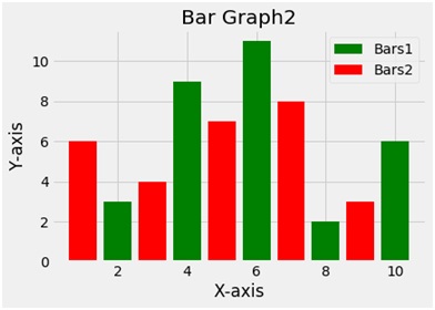
x1 = [2,4,6,8,10]
y1=[3,9,11,2,6]
x2=[1,3,5,7,9]
y2=[6,4,7,8,3]
plt.bar(x1,y1,label ='Bars1', color='g')
plt.bar(x2,y2,label = 'Bars2', color='r')
plt.xlabel('X-axis')
plt.ylabel('Y-axis')
plt.title('Bar Graph2')
plt.legend()
plt.show()
Output
输出量
Explanation:
说明:
Python library matplotlib.pyplot is used to draw the above chart. Four random variables x1 y1 and x2 y2 are taken with random values. The bar function plots a bar plot. The second bar function used draws another bar plot in the same frame. The bar function takes 2 arguments i.e. x and y and a label variable gives the label to the plot. To give the title to the plot the title function is used. To show the legend the legend function is used and finally to show the plot the show function.
Python库matplotlib.pyplot用于绘制以上图表。 四个随机变量x1 y1和x2 y2带有随机值。 条形函数绘制条形图。 使用的第二个条形图函数在同一帧中绘制另一个条形图。 bar函数采用2个参数,即x和y,以及一个label变量为该图提供标签。 为了给绘图赋予标题,使用了标题功能。 为了显示图例,使用了图例功能,最后使用show函数显示了情节。
翻译自: https://www.includehelp.com/python/create-a-bar-graph-with-using-matplotlib-pyplot.aspx


 7170
7170


 被折叠的 条评论
为什么被折叠?
被折叠的 条评论
为什么被折叠?
 到【灌水乐园】发言


