


 本文介绍如何利用Python的matplotlib.pyplot库创建条形图。程序中使用了两个随机变量x和y,通过bar函数绘制条形图,并通过xlabel、ylabel、title和legend函数进行轴标签、标题和图例的设定,最后使用show函数展示图表。
Problem statement: Write a python program using matplotlib.pyplot library to create a bar chart.
问题陈述:使用matplotlib.pyplot库编写python程序以创建条形图。
A bar chart or bar graph is a chart or graph that presents categorical data with rectangular bars.
条形图或条形图是用矩形条形显示分类数据的图或图。
Program:
程序:
import matplotlib.pyplot as plt
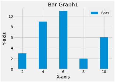
x = [2,4,6,8,10]
y=[3,9,11,2,6]
plt.bar(x,y,label ='Bars')
plt.xlabel('X-axis')
plt.ylabel('Y-axis')
plt.title('Bar Graph1')
plt.legend()
plt.show()
Output
输出量
Explanation:
说明:
Python library matplotlib.pyplot is used to draw the above chart. Two random variables x and y are taken with random values. The bar function plots a bar plot. The bar function takes 2 arguments i.e. x and y and a label variable gives the label to the plot. To name the axes xlabel and ylabel functions are used and to give the title to the plot the title function is used. To show the legend the legend function is used and finally to show the plot the show function.
Python库matplotlib.pyplot用于绘制以上图表。 两个随机变量x和y带有随机值。 条形函数绘制条形图。 bar函数采用2个参数,即x和y,以及一个label变量为该图提供标签。 为了命名轴,使用了xlabel和ylabel函数,并且使用了title函数为绘图赋予标题。 为了显示图例,使用了图例功能,最后使用show函数显示了情节。
翻译自: https://www.includehelp.com/python/create-a-bar-chart-using-matplotlib-pyplot.aspx


 668
668

 被折叠的 条评论
为什么被折叠?
被折叠的 条评论
为什么被折叠?
 到【灌水乐园】发言


