


 本文介绍了如何使用Matplotlib的pyplot包在Python中绘制两个信号之间的连贯性。通过生成随机信号并进行垂直子图绘制,实现更好的可视化效果。
python 轮廓 不连贯
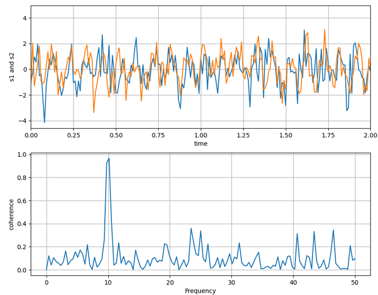
With many applications, coherence is an important part of Physics and other subjects too. Therefore, Matplotlib allows us to plot the coherence between two signals using the pyplot package. In this example, we are going to generate two random signals using a NumPy random package and then plot them. For coherence between two signals, the plotting is done by vertical sub plotting for better visualization.
在许多应用中, 连贯性也是物理学和其他学科的重要组成部分。 因此,Matplotlib允许我们使用pyplot软件包绘制两个信号之间的相干性。 在此示例中,我们将使用NumPy随机包生成两个随机信号,然后绘制它们。 对于两个信号之间的相干性,可以通过垂直子图进行绘制,以获得更好的可视化效果。
用于绘制一致性的Python代码 (Python code for plotting coherence)
import numpy as np
import matplotlib.pyplot as plt

dt = 0.01
t = np.arange(0, 30, dt)
nse1 = np.random.randn(len(t)) # white noise 1
nse2 = np.random.randn(len(t)) # white noise 2

# Two signals with a coherent part
# at 10Hz and a random part
s1 = np.sin(2 * np.pi * 10 * t) + nse1
s2 = np.sin(2 * np.pi * 10 * t) + nse2

plt.figure(figsize=(10,8))
plt.subplot(211)
plt.plot(t, s1, t, s2)
plt.xlim(0, 2)
plt.xlabel('time')
plt.ylabel('s1 and s2')
plt.grid(True)

plt.subplot(212)
plt.cohere(s1, s2, 256, 1. / dt)
plt.ylabel('coherence')
plt.show()
Output:
输出:
Output is as figure
翻译自: https://www.includehelp.com/python/plotting-coherence.aspx
python 轮廓 不连贯


 1414
1414

 被折叠的 条评论
为什么被折叠?
被折叠的 条评论
为什么被折叠?
 到【灌水乐园】发言


