


 本文介绍了Python的Seaborn模块在数据可视化中的应用,包括使用Seaborn进行线图、散点图、箱形图、小提琴图等统计数据可视化的方法,以及如何与Pandas结合展示分类数据。Seaborn基于Matplotlib,提供了更高效和丰富的图表功能,帮助提升数据可视化的效果和理解。
Hey, folks! Today we will be unveiling a very interesting module of Python — Seaborn Module and will be understanding its contribution to Data Visualizations.
嘿伙计! 今天,我们将推出一个非常有趣的Python模块-Seaborn Module ,并将了解它对数据可视化的贡献。
需要Seaborn模块 (Need of Seaborn module)
Data visualization is the representation of the data values in a pictorial format. Visualization of data helps in attaining a better understanding and helps draw out perfect conclusions from the data.
数据可视化是以图形格式表示数据值。 数据的可视化有助于获得更好的理解,并有助于从数据中得出完美的结论。
Python Matplotlib library provides a base for all the data visualization modules present in Python. Python Seaborn module is built over the Matplotlib module and provides functions with better efficiency and plot features inculcated in it.
Python Matplotlib库为Python中存在的所有数据可视化模块提供了基础。 Python Seaborn模块建立在Matplotlib模块之上,并提供效率更高的功能和其中包含的绘图功能。
With Seaborn, data can be presented with different visualizations and different features can be added to it to enhance the pictorial representation.
使用Seaborn,可以使用不同的可视化效果呈现数据,并且可以向其中添加不同的功能来增强图形表示。
使用Python Seaborn可视化数据 (Visualizing Data with Python Seaborn)
In order to get started with data visualization with Seaborn, the following modules need to be installed and imported in the Python environment.
为了开始使用Seaborn进行数据可视化,需要在Python环境中安装和导入以下模块。
Note: I have linked the above modules(in the bullets) with the article links for reference.
注意:我已将以上模块(在项目符号中)与文章链接链接起来,以供参考。
Further, we need to install and load the Python Seaborn module into the environment.
此外,我们需要将Python Seaborn模块安装并加载到环境中。
pip install seaborn
import seaborn
Now that we have installed and imported the Seaborn module in our working environment, Let us get started with Data visualizations in Seaborn.
现在我们已经在工作环境中安装并导入了Seaborn模块,让我们开始使用Seaborn中的数据可视化。
Seaborn统计数据可视化 (Statistical Data Visualization with Seaborn)
Python Seaborn module helps us visualize and depict the data in statistical terms i.e. understanding of the relationship between data values with the help of the following plots:
Python Seaborn模块帮助我们以统计术语可视化和描绘数据,即借助以下图表了解数据值之间的关系:
- Line Plot 线图
- Scatter Plot 散点图
Let us understand each of them in detail in the upcoming sections.
让我们在接下来的部分中详细了解它们。
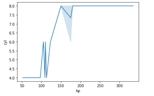
Seaborn线图 (Seaborn Line Plot)
Seaborn Line Plot depicts the relationship between the data values amongst a set of data points. Line Plot helps in depicting the dependence of a data variable/value over the other data value.
Seaborn线图描述了一组数据点之间的数据值之间的关系。 线图有助于描述数据变量/值对其他数据值的依赖性。
The seaborn.lineplot() function plots a line out of the data points to visualize the dependence of a data variable over the other parametric data variable.
seaborn.lineplot() function在数据点外绘制一条线,以可视化数据变量对其他参数数据变量的依赖性。
Syntax:
句法:
seaborn.lineplot(x,y)
Example 1:
范例1:
import seaborn as sn
import matplotlib.pyplot as plt
import numpy as np
import pandas
data = pandas.read_csv("C:/mtcars.csv")
res = sn.lineplot(data['hp'],data['cyl'])
plt.show()
Output:
输出:
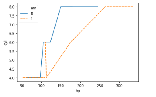
Example 2:
范例2:
import seaborn as sn
import matplotlib.pyplot as plt
import numpy as np
import pandas
data = pandas.read_csv("C:/mtcars.csv")
res = sn.lineplot(data['hp'],data['cyl'],hue=data['am'],style=data['am'])
plt.show()
In the above example, we have depicted the relationship between various data values using the parameter hue and style to depict the relationship between them using different plotting styles.
在上面的示例中,我们使用参数hue和style描述了各种数据值之间的关系,以使用不同的绘图样式描述了它们之间的关系。
Output:
输出:
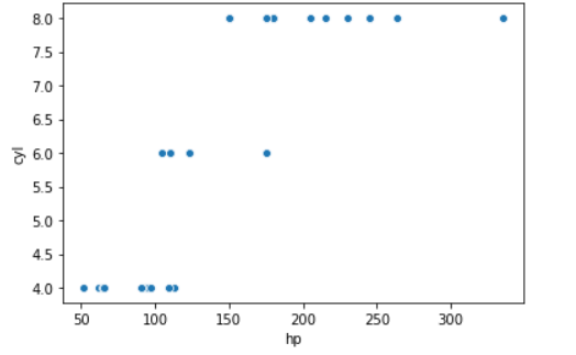
Seaborn散点图 (Seaborn Scatter Plot)
Seaborn Scatter plot too helps depicts the relationship between various data values against a continuous/categorical data value(parameter).
Seaborn散点图也有助于描述各种数据值与连续/分类数据值(参数)之间的关系。
Scatter plot is extensively used to detect outliers in the field of data visualization and data cleansing. The outliers is the data values that lie away from the normal range of all the data values. Scatter plot helps in visualizing the data points and highlight the outliers out of it.
散点图广泛用于检测数据可视化和数据清理领域中的异常值。 离群值是偏离所有数据值正常范围的数据值。 散点图有助于可视化数据点并突出显示其离群值。
Syntax:
句法:
seaborn.scatterplot()
The seaborn.scatterplot()function plots the data points in the clusters of data points to depict and visualize the relationship between the data variables. While visualizing the data model, we need to place the dependent or the response variable values against the y-axis and independent variable values against the x-axis.
seaborn.scatterplot()函数在数据点群集中绘制数据点,以描绘和可视化数据变量之间的关系。 在可视化数据模型时,我们需要将因变量或响应变量值放在y轴上,将自变量值放在x轴上。
Example 1:
范例1:
import seaborn as sn
import matplotlib.pyplot as plt
import numpy as np
import pandas
data = pandas.read_csv("C:/mtcars.csv")
res = sn.scatterplot(data['hp'],data['cyl'])
plt.show()
Output:
输出:
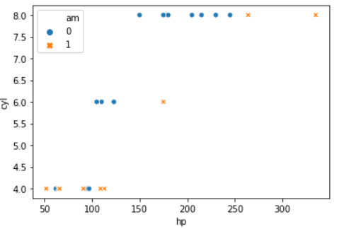
Example 2:
范例2:
import seaborn as sn
import matplotlib.pyplot as plt
import numpy as np
import pandas
data = pandas.read_csv("C:/mtcars.csv")
res = sn.scatterplot(data['hp'],data['cyl'],hue=data['am'],style=data['am'])
plt.show()
With the parameters ‘hue‘ and ‘style‘, we can visualize multiple data variables with different plotting styles.
使用参数“ hue ”和“ style ”,我们可以可视化具有不同绘图样式的多个数据变量。
Output:
输出:
使用Seaborn和Pandas进行分类数据可视化 (Categorical Data visualization with Seaborn and Pandas)
Before getting started with the categorical data distribution, it is necessary for us to understand certain terms related to data analysis and visualization.
在开始分类数据分发之前,我们有必要了解与数据分析和可视化有关的某些术语。
- Continuous variable: It is a data variable that contains continuous and numeric values. For example: Age is a continuous variable whose value can lie between 1 – 100 连续变量 :这是一个包含连续值和数值的数据变量。 例如:Age是一个连续变量,其值可以介于1到100之间
- Categorical variable: It is a data variable containing discrete values i.e. in the form of groups or categories. For example: Gender can be categorized into two groups– ‘Male’, ‘Female’ and ‘Others’. 分类变量 :它是一个数据变量,包含离散值,即以组或类别的形式。 例如:性别可分为两类:“男性”,“女性”和“其他”。
Having understood the basic terminologies, let us dive into the visualization of categorical data variables.
了解了基本术语后,让我们深入研究分类数据变量的可视化。
箱形图 (Box Plot)
Seaborn Boxplot is used to visualize the categorical/numeric data variable and is extensively used to detect outliers in the data cleansing process.
Seaborn Boxplot用于可视化分类/数值数据变量,并广泛用于检测数据清除过程中的异常值 。
The seaborn.boxplot() method is used create a boxplot for a particular data variable. The box structure represents the main quartile of the plot.
seaborn.boxplot() method用于为特定数据变量创建箱线图。 箱形结构代表情节的主要四分位数。
Syntax:
句法:
seaborn.boxplot()
The two lines represent the lower and the upper range. Any data point that lies below the lower range or above the upper range is considered as an outlier.
两条线代表上下限。 低于下限范围或高于上限范围的任何数据点均被视为异常值。
Example:
例:
import seaborn as sn
import matplotlib.pyplot as plt
import numpy as np
import pandas
data = pandas.read_csv("C:/mtcars.csv")
res = sn.boxplot(data['mpg'])
plt.show()
Output:
输出:
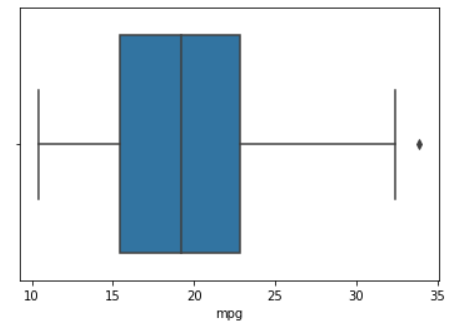
In the above boxplot, the data point lying above the upper range is marked as a data point and considered as an outlier to the dataset.
在上面的箱线图中,位于上限范围上方的数据点被标记为数据点,并被视为数据集的异常值。
箱形图 (Boxen Plot)
Seaborn Boxenplot resembles the boxplot but has a slight difference in the presentation of the plot.
Seaborn Boxenplot与Boxplot类似,但在情节显示方面略有不同。
The seaborn.boxenplot() function plots the data variable with enlarged inter quartile blocks depicting a detailed representation of the data values.
seaborn.boxenplot() function使用扩大的四分位数块来绘制数据变量,这些块描述了数据值的详细表示。
Syntax:
句法:
seaborn.boxenplot()
Example:
例:
import seaborn as sn
import matplotlib.pyplot as plt
import numpy as np
import pandas
data = pandas.read_csv("C:/mtcars.csv")
res = sn.boxenplot(data['hp'])
plt.show()
Output:
输出:
小提琴图 (Violin Plot)
Seaborn Violin Plot is used to represent the underlying data distribution of a data variable across its data values.
Seaborn小提琴图用于表示数据变量跨其数据值的基础数据分布。
Syntax:
句法:
seaborn.violinplot()
Example:
例:
import seaborn as sn
import matplotlib.pyplot as plt
import numpy as np
import pandas
data = pandas.read_csv("C:/mtcars.csv")
res = sn.violinplot(data['hp'])
plt.show()
Output:
输出:

群图 (SwarmPlot)
Seaborn Swarmplot gives a better picture in terms of the description of the relationship amongst categorical data variables.
Seaborn Swarmplot就分类数据变量之间的关系描述提供了更好的描述。
The seaborn.swarmplot() function creates a swarm of data points around the data values that happen to represent a relationship between the two categorical data variables/columns.
seaborn.swarmplot() function在数据值周围创建了一大堆数据点 ,这些数据点恰好表示两个分类数据变量/列之间的关系。
Syntax:
句法:
seaborn.swarmplot()
Example:
例:
import seaborn as sn
import matplotlib.pyplot as plt
import numpy as np
import pandas
data = pandas.read_csv("C:/mtcars.csv")
res = sn.swarmplot(data['am'],data['cyl'])
plt.show()
Output:
输出:

使用Seaborn估算类别数据 (Estimation of categorical data using Seaborn)
In the field of data analysis and visualization, we often require data plots that help us estimate the frequency or count of certain survey/re-searches, etc. The following plots are useful to serve the same purpose:
在数据分析和可视化领域,我们经常需要数据图来帮助我们估计某些调查/重新研究的频率或计数等。以下图可用于实现相同目的:
- Barplot 条形图
- Pointplot 点图
- Countplot 计数图
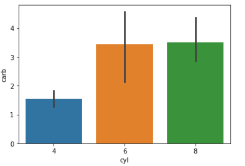
1.小节 (1. Barplot)
Seaborn Barplot represents the data distribution among the data variables as a frequency distribution of the central tendency values.
Seaborn Barplot将数据变量之间的数据分布表示为中心趋势值的频率分布 。
Syntax:
句法:
seaborn.barplot()
Example:
例:
import seaborn as sn
import matplotlib.pyplot as plt
import numpy as np
import pandas
data = pandas.read_csv("C:/mtcars.csv")
res = sn.barplot(data['cyl'],data['carb'])
plt.show()
Output:
输出:
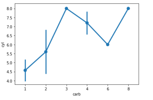
2.点图 (2. Pointplot)
Seaborn Pointplot is a combination of Statistical Seaborn Line and Scatter Plots. The seaborn.pointplot() function represents the relationship between the data variables in the form of scatter points and lines joining them.
Seaborn点图是统计Seaborn线图和散点图的组合。 seaborn.pointplot() function以散点和连接它们的线的形式表示数据变量之间的关系。
Syntax:
句法:
seaborn.pointplot()
Example:
例:
import seaborn as sn
import matplotlib.pyplot as plt
import numpy as np
import pandas
data = pandas.read_csv("C:/mtcars.csv")
res = sn.pointplot(data['carb'],data['cyl'])
plt.show()
Output:
输出:
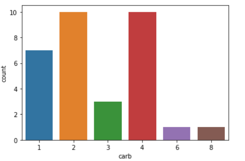
3.计数图 (3. Countplot)
Seaborn Countplot represents the count or the frequency of the data variable passed to it. Thus it can be considered as a Univariate Data distribution plot.
Seaborn Countplot表示传递给它的数据变量的计数或频率。 因此,可以将其视为单变量数据分布图。
Syntax:
句法:
seaborn.countplot()
Example:
例:
import seaborn as sn
import matplotlib.pyplot as plt
import numpy as np
import pandas
data = pandas.read_csv("C:/mtcars.csv")
res = sn.countplot(data['carb'])
plt.show()
Output:
输出:
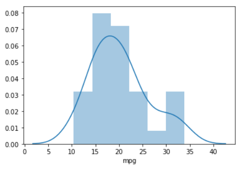
使用Seaborn Distplot进行单变量分布 (Univariate distribution using Seaborn Distplot)
The Seaborn Distplot is extensively used for univariate data distribution and visualization i.e. visualizing the data values of a single data variable.
Seaborn Distplot广泛用于单变量数据分发和可视化,即可视化单个数据变量的数据值。
The seaborn.distplot() function depicts the data distribution of a continuous variable. It is represented as histogram along with a line.
seaborn.distplot() function描述了连续变量的数据分布。 它用一条线表示为直方图。
Syntax:
句法:
seaborn.distplot()
Example:
例:
import seaborn as sn
import matplotlib.pyplot as plt
import numpy as np
import pandas
data = pandas.read_csv("C:/mtcars.csv")
res = sn.distplot(data['mpg'])
plt.show()
Output:
输出:
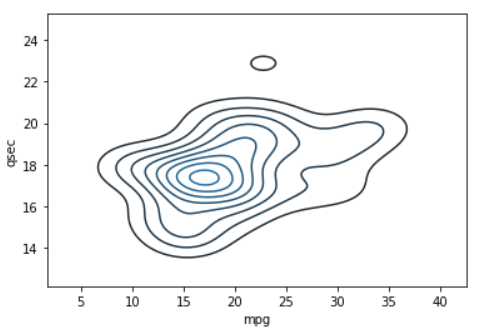
使用Seaborn Kdeplot进行双变量分布 (Bivariate distribution using Seaborn Kdeplot)
Seaborn Kdeplot depicts the statistical probability distribution representation of multiple continuous variables altogether.
Seaborn Kdeplot描绘了多个连续变量的统计概率分布表示。
Syntax:
句法:
seaborn.kdeplot()
Example:
例:
import seaborn as sn
import matplotlib.pyplot as plt
import numpy as np
import pandas
data = pandas.read_csv("C:/mtcars.csv")
res = sn.kdeplot(data['mpg'],data['qsec'])
plt.show()
Output:
输出:
使用Seaborn设置不同的背景 (Setting different backgrounds using Seaborn)
The seaborn.set() function can be used to set different background to the plots such as ‘dark‘, ‘whitegrid‘, ‘darkgrid‘, etc.
seaborn.set() function可用于为绘图设置不同的背景,例如“ dark ”,“ whitegrid ”,“ darkgrid ”等。
Syntax:
语法 :
seaborn.set(style)
Example:
例:
import seaborn as sn
import matplotlib.pyplot as plt
import numpy as np
import pandas
data = pandas.read_csv("C:/mtcars.csv")
sn.set(style='darkgrid',)
res = sn.lineplot(data['mpg'],data['qsec'])
plt.show()
Output:
输出:

结论 (Conclusion)
Thus, Seaborn module helps in visualizing the data using different plots according to the purpose of visualization.
因此,Seaborn模块有助于根据可视化的目的使用不同的绘图来可视化数据。
参考资料 (References)
- Python Seaborn Module — JournalDev Python Seaborn模块— JournalDev
- Data visualization with Seaborn — AskPython Seaborn进行数据可视化— AskPython
翻译自: https://www.journaldev.com/40374/data-visualization-seaborn-pandas


 2055
2055

 被折叠的 条评论
为什么被折叠?
被折叠的 条评论
为什么被折叠?
 到【灌水乐园】发言


