


flexbox布局
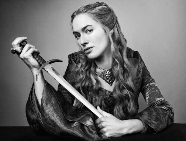
To celebrate the season 4 debut of HBO's Game of Thrones, and to help out my 1st year students with their fairly complex designs, I decided that today’s tutorial would be a grid layout.
为了庆祝本赛季首次亮相4 HBO的的权力的游戏 ,并帮助了我1年的学生与他们的相当复杂的设计,我决定,今天的教程将是一个网格布局。
The overall design could be achieved using many methods, including display: table-cell, inline-block, or even float. But perhaps the best and easiest method, at least for modern browsers, is flexbox.
可以使用许多方法来实现总体设计,包括display: table-cell , inline-block甚至float 。 但是,至少对于现代浏览器而言,最好和最简单的方法可能是flexbox 。
Flexbox标记 (Markup For Flexbox)
One of the advantages of using this system is that the markup remains very simple, with no hacks. For the sake of illustration, I’ll show just the first two <figure> elements inside the containing <div>, using photographs taken of the GOT cast by Gavin Bond:
使用该系统的优点之一是标记保持非常简单,没有黑客攻击。 为了说明起见,我将使用Gavin Bond投射的GOT拍摄的照片,仅显示包含的<div>的前两个<figure>元素:
<div id="got-gridbox">
	<figure>
		<img src="daenerys-targaryen.png" alt="Black and white photograph of Emilia Clarke as Daenerys Targaryen">
		<figcaption>Daenerys Targaryen</figcaption>
	</figure>
	<figure>
		<img src="tyrion-lannister.png" alt="Black and white photograph of Peter Dinklage as Tyrion Lannister">
		<figcaption>Tyrion Lannister</figcaption>
	</figure>
…
</div>
Flexbox网格CSS (CSS For Flexbox Grids)
To start the layout, set the outer <div> to display: flex, and separate the items inside it by using justify-content. The row layout is created using flex-flow: row-wrap. (By way of contrast, I recently demonstrated a “masonry” layout with flexbox using flex-flow: column-wrap). A universal box-sizing reset is used to avoid any layout weirdness when I add borders to the <figure> elements a little later .
要开始布局,请将外部<div>为display: flex ,并使用justify-content分隔其中的项目。 使用flex-flow: row-wrap创建行布局。 (通过对比,我最近展示了使用flex-flow: column-wrap flexbox的“砌体”布局 )。 稍后,当我向<figure>元素添加边框时,可以使用通用的 box-sizing 重置来避免任何布局怪异。
* {
	box-sizing: border-box;
}
#got-gridbox {
	display: flex;
	flex-flow: row wrap;
	justify-content: space-between;
}(Vendor prefixes are not shown to keep things simple; the most recent browser versions don’t require them for flexbox anyway, with the significant exception of Safari)
(未显示供应商前缀来简化操作;最新的浏览器版本无论如何都不需要将其用于flexbox,但Safari除外)
Next, I’ll set up the <figure> elements:
接下来,我将设置<figure>元素:
#got-gridbox figure {
	border: 1px solid #333;
	position: relative;
	font-size: 0;
	margin: 2% 0;
	flex: 0 0 48%;
}
position: relative is used so that I can absolutely position the caption text inside each element. font-size: 0 “sucks all the air” out of the <figure> elements, leaving no gaps inside them.
position: relative是用来使标题文本绝对位于每个元素内的位置 。 font-size: 0从<figure>元素中“吸尽所有”,它们之间没有任何缝隙。
The key to the layout is the flex property, which I will discuss in depth in a future article. For now, it’s enough to understand that this declaration, combined with the CSS used so far, ensures that each <figure> element will be 48% of the width of its container, leaving a 4% horizontal gap between each element .This spacing is also used in the margin setting: a 2% top and bottom on each <figure> will combine to create a total 4% vertical space between elements on different rows. Other possibilities include flex: 0 0 50% and no margin, which would produce a two-column grid with no spacing at all.
布局的关键是flex属性,我将在以后的文章中对其进行深入讨论。 到目前为止,足以理解此声明以及迄今为止使用CSS,可以确保每个<figure>元素将占其容器宽度的48%,每个元素之间留有4%的水平间距。也用于margin设置:顶部和底部2% 每个<figure>组合将在不同行上的元素之间创建总计4%的垂直空间。 其他可能性包括flex: 0 0 50%和没有margin ,这将产生一个两列的网格,根本没有间距。
Next, the images inside each <figure> are made responsive:
#got-gridbox figure img {
	width: 60%;
	height: auto;
	margin-top: -2rem;
}
As every image is the same size, and an alpha-masked PNG, they fill the <figure> elements in exactly the same way. I’ve used a negative margin-top on the images to draw them up and out of the <figure> elements, so that each PNG penetrates the top of its container.
由于每个图像的大小均相同,并且带有Alpha蒙版的PNG ,因此它们以完全相同的方式填充<figure>元素。 我在图像上使用了负的页margin-top将其向上绘制并从<figure>元素中绘制出来,以便每个PNG都可以穿透其容器的顶部。
The only difference is that images in the right-hand column are floated right:
唯一的区别是右侧列中的图像向右浮动:
#got-gridbox figure:nth-child(even) img {
	float: right;
}
In the left-hand column, <figcaption> elements are on the right of each <figure>. so I’ll make that the default:
在左侧列中, <figcaption>元素位于每个<figure>的右侧。 所以我将其设为默认值:
#got-gridbox figure figcaption {
	position: absolute;
	right: 4%;
	top: 5%;
	font-family: Deseret, Trajan Pro, Trajan, Requiem, serif;
	text-transform: uppercase;
	font-size: 1.6rem;
	text-align: right;
}
As Deseret is an all-caps titling font that is not in all browsers, I’ve used a general serif font displayed in uppercase as a fallback.
由于Deseret是并非所有浏览器都支持的全大写标题字体,因此我使用了大写的通用serif字体作为后备字体。
The <figcaption> elements in the right column are on the other side:
右列中的<figcaption>元素在另一侧:
#got-gridbox figure:nth-child(even) figcaption {
	left: 4%;
	right: auto;
	text-align: left;
}
That takes care of the main presentation rules. As I’ve used it here, flexbox is automatically responsive; the only CSS I’ll have to add there is to change font size at smaller screen sizes.
这照顾了主要的展示规则。 正如我在这里使用的一样,flexbox是自动响应的; 我唯一要添加CSS是在较小的屏幕尺寸下更改字体大小。
整理起来 (Finishing Up)
The last two images presented an interesting challenge: both photographs included a horizontal table. Removing or cropping the tables wasn’t an option. As the images aren’t the full width of their containing <figure> elements, extending the table with some PhotoShop work wasn’t an option either. Finally, reaching the last two elements in the series was a little tricky: most developers would add classes to the markup, but I wanted to avoid that.
最后两张图片提出了一个有趣的挑战:两张照片都包含一张水平桌子。 删除或裁剪表不是一种选择。 由于图像不是其包含的<figure>元素的全部宽度,因此也不可以使用某些PhotoShop来扩展表格。 最后,到达系列的最后两个元素有些棘手:大多数开发人员都会在标记中添加类 ,但是我想避免这种情况。
Instead, I chose to create the visual impression of the table by using a CSS linear gradient, selecting the last two elements with an unusual variation of nth-last-child:
相反,我选择通过使用CSS线性渐变来创建表格的视觉效果,选择最后两个元素,它们具有nth-last-child的不同变化:
#got-gridbox figure:nth-last-child(-n+2) {
	background-image: linear-gradient(transparent, transparent 80%, #111 81%);
}
Finally, making adjustments as appropriate breakpoints:
最后,进行适当的断点调整:
@media screen and (max-width: 900px) {
	#got-gridbox figure figcaption {
		font-size: 1.4rem;
	}
}
@media screen and (max-width: 800px) {
	#got-gridbox figure figcaption {
		font-size: 1.25rem;
	}
}
Alternatively, the text could be measured in vw units, with @media queries setting upper and lower limits on font-size.
可替代地,文本可在被测量vw单元 ,与@media查询上设置和上下限font-size 。
At 750 pixels wide, the layout converts to a single column, with each <figure> element taking 100% of the horizontal space:
在750像素宽的情况下,版式转换为单列,每个<figure>元素占用100%的水平空间:
@media screen and (max-width: 750px) {
	#got-gridbox figure {
		flex: 0 0 100%;
		margin-bottom: 7%;
	}
	#got-gridbox figure figcaption {
		font-size: 1.6rem;
	}
}
@media screen and (max-width: 450px) {
	#got-gridbox figure figcaption {
		font-size: 1.2rem; width: 50%;
	}
}
That’s it! As you can see, flexbox makes it much easier to create grid-based layouts on pages, compared to the trickery and hackery of previous solutions.
而已! 如您所见,与以前解决方案的棘手和骇客行为相比 , flexbox使得在页面上创建基于网格的布局要容易得多。
翻译自: https://thenewcode.com/854/Easy-Responsive-Grid-Layout-With-Flexbox
flexbox布局


 被折叠的 条评论
为什么被折叠?
被折叠的 条评论
为什么被折叠?
 到【灌水乐园】发言


