


css3 变形
现在是时候添加一些CSS3和Photoshop了,在这种情况下,我们将深入研究转换 。 更改对象的形状是任何图形编辑器工具集的重要组成部分。 如今,借助CSS3,我们可以在不需要Photoshop的情况下旋转,缩放和倾斜元素的形状。 试试吧!
注意:以下所有示例均已在Mozilla Firefox,Safari和Chrome上进行了测试。 如果您想在IE或任何其他浏览器中获得类似的信息,请留下评论,我们将很乐意为您提供帮助。
开始之前
在本教程中,我们将使用“渐变背景”,“盒子阴影”和“多图像背景”以及“过渡效果”,“不透明度和透明度”样式,这些主题将在本系列的前三篇教程中介绍:
步骤1:旋转
旋转元素是任何图形编辑器的更基本功能之一。 旋转效果使用径向坐标值,角度范围为0到180(正向和负向)。 正角为顺时针旋转,负角为逆时针旋转。
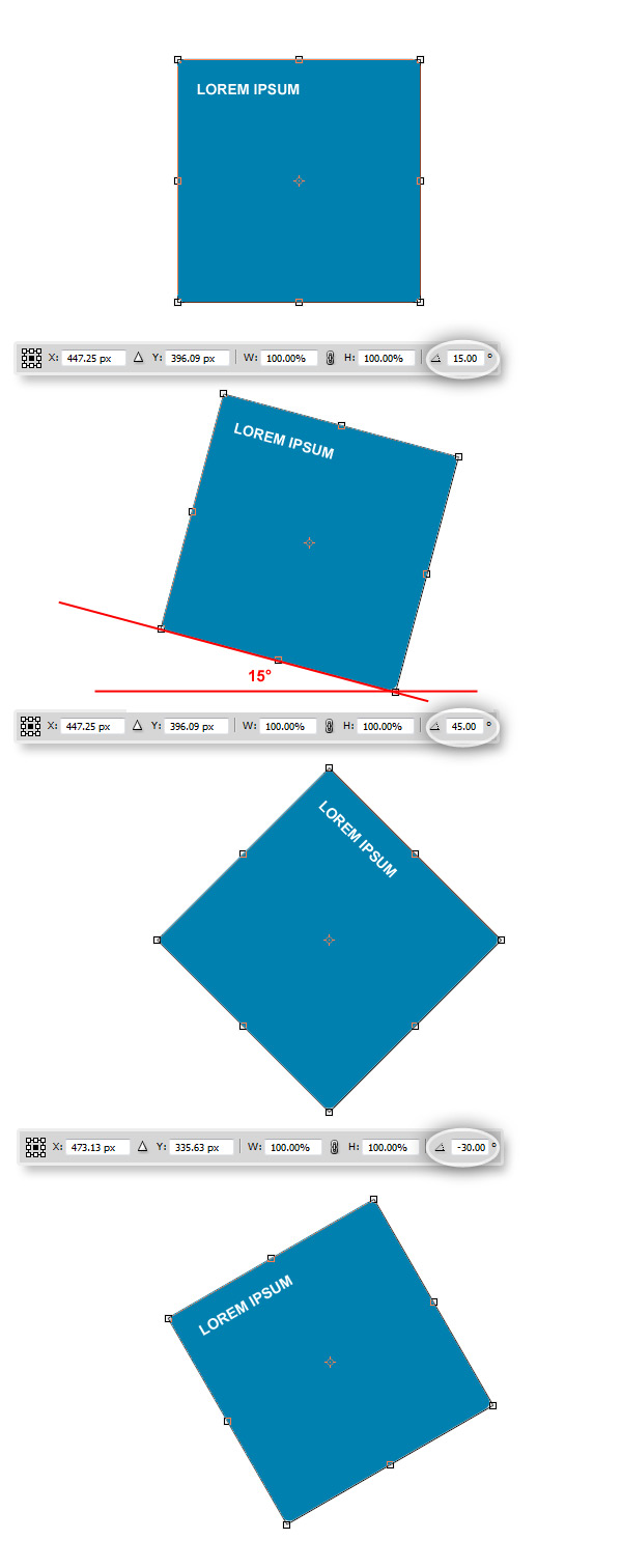
过去,旋转HTML中的元素通常非常复杂,而现在使用CSS3,一切都非常简单:
以下是旋转变换的语法:
transform: rotate( <number> deg);
现在为HTML部分设置一系列不同的角度旋转:
/*Transforms*/
/*Rotate 15 degrees*/
.rotate15{
	-moz-transform: rotate(15deg);
	-webkit-transform: rotate(15deg);
}

/*Rotate 45 degrees*/
.rotate45{
	-moz-transform: rotate(45deg);
	-webkit-transform: rotate(45deg);
}

/*Rotate -30 degrees*/
.rotate-30{
	-moz-transform: rotate(-30deg);
	-webkit-transform: rotate(-30deg);
}

/*Rotate 180 degrees (Inverted text)*/
.rotate180{
	-moz-transform: rotate(180deg);
	-webkit-transform: rotate(180deg);
}

/*Rotate 270 degrees (Vertical text)*/
.rotate270{
	-moz-transform: rotate(270deg);
	-webkit-transform: rotate(270deg);
}
如您所见,我们确定转换的方式与在Photoshop中完全一样。
观看演示
步骤2:缩放
您可以使用任何图形编辑器获得的另一个基本转换选项是Scale。 缩放非常简单,它可以增加或减少任何元素或元素组的宽度和高度。
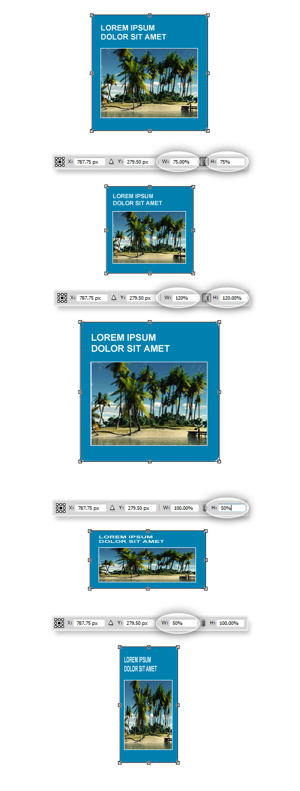
使用CSS3,您可以像在Photoshop中一样缩放元素,沿两个轴缩放的语法为:
transform: scale(<value>); //Both width and height
 transform: scalex(<value>) //Width
 transform: scaley(<value>) //Height
让我们看一些例子:
/*Scale 50%*/
.scale50{
	-moz-transform:scale(.50);
	-webkit-transform:scale(.50);
}

/*Scale 120%*/
.scale120{
	-moz-transform:scale(1.2);
	-webkit-transform:scale(1.2);
}

/*Scale from 25% to 75% on :hover*/
.scale25-75{
	-moz-transform:scale(.25);
	-webkit-transform:scale(.25);

	-webkit-transition: all 1s ease-in-out;
	-moz-transition: all 1s ease-in-out;
}

	.scale25-75:hover{
		-moz-transform:scale(.75);
		-webkit-transform:scale(.75);
	}

/*Scale 50% width*/
.scale50x{
	-moz-transform:scalex(.50);
	-webkit-transform:scalex(.50);
}

/*Scale 50% height*/
.scale50y{
	-moz-transform:scaley(.50);
	-webkit-transform:scaley(.50);
}
现在看到它正在运行:
观看演示
步骤3:倾斜
进行另一个非常基本但功能强大的转换:Skew。 通过更改角度,您可以移动形状的平行线以创建可以用作3D效果的透视幻觉。
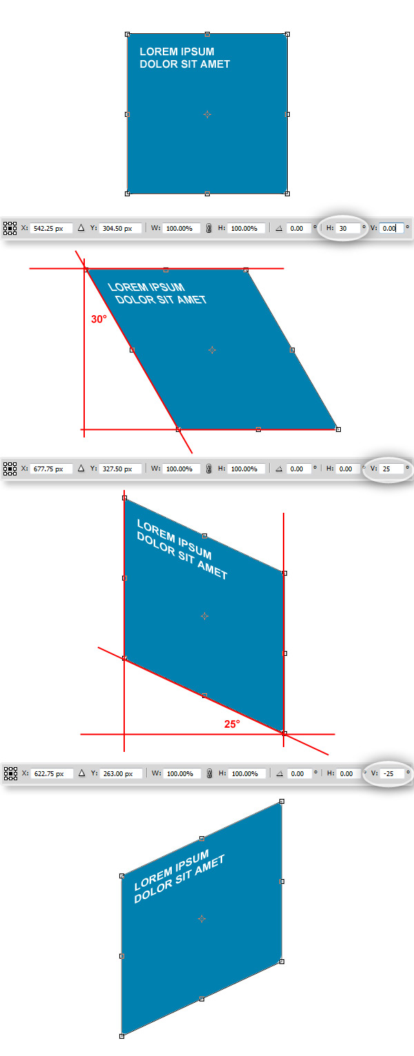
使用CSS3,可以像在Photoshop中一样倾斜形状,让我们看一些示例:
/*Skew*/
/*Skew 30 degrees X on hover*/
.skew30x{
	-webkit-transition: all 1s ease-in-out;
	-moz-transition: all 1s ease-in-out;
}

	.skew30x:hover{
		-moz-transform: skewx(30deg);
		-webkit-transform: skewx(30deg);
	}

/*Skew 15 degrees X*/
.skew15x{
	-moz-transform: skewx(15deg);
    -webkit-transform: skewx(15deg);
}

/*Skew -15 degrees X*/
.skew-15x{
	-moz-transform: skewx(-15deg);
    -webkit-transform: skewx(-15deg);
}

/*Skew 25 degrees Y*/
.skew25y{
	-moz-transform: skewy(25deg);
    -webkit-transform: skewy(25deg);
}

/*Skew -25 degrees Y*/
.skew-25y{
	-moz-transform: skewy(-25deg);
    -webkit-transform: skewy(-25deg);
}
观看演示
步骤4:合并转换
让我们尝试结合变换样式以创建一些基本效果:
/*Combining Transforms*/
.transformed{
	-moz-transform:		rotate(10deg)
						scale(1.3)
						skewy(15deg)
						skewx(-30deg);
	-webkit-transform:	rotate(10deg)
						scale(1.3)
						skewy(15deg)
						skewx(-30deg;
}
观看演示
步骤5:一些有趣的例子
以下是一些有趣的示例,这些示例可以使用转换来实现。 我们将从设计的Photoshop渲染开始,然后看看是否可以使用CSS3获得相同的结果(您可以在教程文件中下载PSD源代码)。

首先,建立一些通用CSS:
/* Reset */
html, body, div, h1, h2, h3, h4, h5, h6, ul, ol, dl, li, dt, dd, p, blockquote, pre, form, fieldset, table, th, td, img{
    margin: 0;
    padding: 0;
	border:0px;
}

header, section, footer, aside, nav, article, figure {
    display: block;
}
/* End of Reset */

/*Set up some basic styles*/
body{
	font-family:Arial, Helvetica, sans-serif;
	color:#333;
}

html{
	height:100%; /* To add a full page body CSS3 gradient you need to set this height to 100% */
}

.wrapper{ margin:0px auto; width:960px; padding:60px 0px 60px 0px;}

.left{ text-align:left;}
.right{ text-align:right;}
.center{ text-align:center;}

/* Body background */
body{
	height:100%;/* To add a full page body CSS3 gradient you need to set this height to 100% */

	background-repeat:no-repeat;

	background-image:-moz-linear-gradient(top, #0096f5, #00416a);
	background-image: -webkit-gradient(linear, 0% 0%, 0% 100%, from(#0096f5), to(#00416a), color-stop(1,#FFF));
	filter: progid:DXImageTransform.Microsoft.gradient(GradientType=0, startColorstr=#0096f5, endColorstr=#00416a);
    -ms-filter: "progid:DXImageTransform.Microsoft.gradient (GradientType=0, startColorstr=#0096f5, endColorstr=#00416a)";

	/*To avoid have a blank stripe at the bottom, there are a couple of fixes */
	/*background-attachment:fixed;*/ /*Works ok except on IE*/
	background-color:#00416a; /*The background will look nice when scroll, adding the bottom color all across the page*/
}


/* a basic style for a column */
.row{
	width:50%;
	float:left;
	margin-bottom:10px;
	height:340px;
	border-bottom:1px dotted #FFF;
}
半透明风扇和垂直标题
首先,我们拥有三个div的风扇和一个标题标签。 这里的技巧是使用z-index属性正确安排内容。
HTML结构:
<section class="row">
	<h2 class="title">Lorem Ipsum</h2>
		<div class="box">
			<p>Lorem ipsum dolor sit amet, consectetur adipisicing elit, sed do eiusmod tempor incididunt ut labore et dolore magna aliqua. Ut enim ad minim veniam, quis nostrud exercitation ullamco laboris nisi ut aliquip ex ea commodo consequat. Duis aute irure dolor in reprehenderit in voluptate velit esse cillum dolore eu fugiat nulla pariatur. </p>
		</div>
	<div class="box box2"></div>
	<div class="box box3"></div>
</section>
现在设置div和标题的样式:
/*Main Box*/
.box{
	width:190px;
	height:190px;

	background-color:rgba(255,255,255,.85);

	/*Rounded corners*/
	-moz-border-radius: 10px;
	-webkit-border-radius: 10px;
	border-radius: 10px;

	/*Get rid of Bleed*/
    -moz-background-clip: padding;
    -webkit-background-clip: padding-box;
    background-clip: padding-box;

	/*Set the position*/
	position:relative;
	left:0px;
	top:0px;

	/*Show it on top*/
	z-index:3;
}

/*A basic Paragraph style*/
.box p{
	color:#02263D;
	padding:10px;
	font-size:11px;
	line-height:140%;
	/*Show it on top as well*/
	z-index:3;
}

/*First translucent layer*/
.box2{
	/*Set the background color with RGBA*/
	background-color:rgba(255,255,255,.5);

	/*Set the position*/
	left:20px;
	top:-165px;

	/*Show it one level behind the main box*/
	z-index:2;

	/*Rotate Trabsform*/
	-moz-transform: rotate(15deg);
	-webkit-transform: rotate(15deg);
}

/*Second translucent layer*/
.box3{
	/*Set the background color with RGBA*/
	background-color:rgba(255,255,255,.25);
	/*Set the position*/
	left:30px;
	top:-325px;

	/*Show it two levels behind the main box*/
	z-index:1;

	/*Rotate Trabsform*/
	-moz-transform: rotate(30deg);
	-webkit-transform: rotate(30deg);
}

/*Vertical Title*/
.title{
	/*Text Styles*/
	color:#FFF;
	text-transform:uppercase;
	font-size:14px;

	/*Set the position*/
	position:relative;
	left:-255px;
	top:-45px;

	/*Rotate Transform*/
	-moz-transform: rotate(-90deg);
	-webkit-transform: rotate(-90deg);
}
悬停旋转
您可以独立旋转html元素内的所有元素。 结合过渡效果,这可能是将焦点添加到设计的某些区域的好方法。 以下面HTML样机为例:
<section class="row">
	<div class="box4">
	<img src="images/pic.jpg" alt="Picture"></div>
</section> 现在,在:hover伪类中以不同角度(顺时针和逆时针)旋转图像和容器框。
/*Box Style*/
.box4{
	/*Width and padding*/
	width:220px;
	height:220px;
	padding:10px;

	/*Translucent background color with RGBA*/
	background-color:rgba(255,255,255,.85);

	/*Rounded Corners*/
	-moz-border-radius: 10px;
	-webkit-border-radius: 10px;
	-khtml-border-radius: 10px;
	border-radius: 10px;

	/*Get rid of Bleed*/
    -moz-background-clip: padding;
    -webkit-background-clip: padding-box;
    background-clip: padding-box;

	/*Enable transition effects*/
	-webkit-transition: all 1s ease-in-out;
	-moz-transition: all 1s ease-in-out;
	transition: all 1s ease-in-out;
}

/*Set the styles of the image inside the section*/
.box4 img{
	/*A nice border*/
	border:1px solid #FFF;

	/*A box shadow to add a bit of deep sensation*/
	box-shadow: 5px 5px 5px rgba(0,0,0,0.25);
	-moz-box-shadow: 5px 5px 5px rgba(0,0,0,0.25);
	-webkit-box-shadow: 5px 5px 5px rgba(0,0,0,0.25);

	/*Enable transition effects*/
	-webkit-transition: all 1s ease-in-out;
	-moz-transition: all 1s ease-in-out;
	-o-transition: all 1s ease-in-out;
	-ms-transition: all 1s ease-in-out;
	transition: all 1s ease-in-out;
}

/*Rotate on hover*/
.box4:hover{
	/*Rotate -15deg CCW*/
	-moz-transform: rotate(-15deg);
	-webkit-transform: rotate(-15deg);
}
复杂的倾斜以创建反射的框布局
让我们进一步前进。 使用偏斜变换,您可以为截面提供某种3D深度。 让我们尝试使用标题,描述和HTML5视频标签,构建一种显示媒体库中项目的替代方法!
让我们从HTML模型开始:
<section class="row2">
	<video class="front" src="http://edusol.info/sites/edusol.info/files/CINT_Nik_H264_720.ogv" controls="" poster="./poster.jpg" tabindex="0"></video>
    <div class="side"><p>Lorem ipsum dolor sit amet, consectetur adipisicing elit, sed do eiusmod.</p></div>
    <div class="top"><h2>Sample Video</h2></div>
    <div class="frontreflection"></div>
    <div class="sidereflection"></div>
</section>
由于<video>标记可以像其他任何HTML元素一样处理,因此我们可以将几乎所有已知的样式应用于该标记。
首先,设置容器部分的背景。 下面的代码生成一个光滑的渐变,从而创建某种“水平”来模拟下一个元素。
/*Set the container*/
.row2{
	/*Adjust the size and position*/
	width:100%;
	height:650px;
	float:left;
	padding-top:10px;

	/*You know that you can scale the whole section*/
	-moz-transform:scale(.90);
	-webkit-transform:scale(.90);

	/*Apply a gradient background*/
	background: -moz-linear-gradient(top, rgba(0,105,175,0) 0%, rgba(0,105,175,0.85) 35%, rgba(0,80,130,0.95) 35%, rgba(0,80,130,0) 100%);
	background:	-webkit-gradient(linear, left top, left bottom, from(rgba(0,105,175,0)), color-stop(0.35, rgba(0,105,175,0.85)), color-stop(0.35, 	rgba(0,80,130,0.95)), to(rgba(0,80,130,0)));
}
设置文本的通用样式。
/*Common Styles (Nothing really difficult here)*/
.top h2{
	font-size:20px;
	color:#FFF;
	text-transform:uppercase;
	padding:25px;
}

.side p{
	font-size:20px;
	color:#FFF;
	font-weight:normal;
	padding:10px;
}
现在对前端容器进行样式设置, <video>标签可以处理我们所知道的几乎所有CSS样式,并且可以像其他任何HTML块级元素一样工作。
/*Let's set the front container*/
.front{
	/*Set the position*/
	position:relative;
	left:220px;
	top:132px;
	/*Dimensions*/
	width:355px;
	height:200px;

	background-color:#FFF;

	/*Skew Y Transform*/
	-moz-transform: skewy(20deg);
    -webkit-transform: skewy(20deg);
}
现在,侧面部分(可以是视频摘要或介绍性文字。
/*Set the Side Container*/
.side{
	/*Position (Next to the front container)*/
	position:relative;
	left:575px;
	top:-45px;
	width:130px;
	height:200px;

	/*Set a gradient background*/
	background-image: -moz-linear-gradient(left, #000000, #313131);
	background-image: -webkit-gradient(linear, 0% 0%, 100% 0%, from(#000000), to(#313131), color-stop(1,#313131));

	/*Skew it*/
	-moz-transform: skewy(-30deg);
    -webkit-transform: skewy(-30deg);

	/*Just in case the text is bigger than the container*/
	overflow:hidden;
}
让我们设置标题的样式。
/*The title*/
.top{
	/*Set the Position*/
	position:relative;
	left:220px;
	top:-360px;
	width:355px;
	height:75px;

	/*A gradient background*/
	background-image: -moz-linear-gradient(left, #000000, #313131);
	background-image: -webkit-gradient(linear, 0% 0%, 100% 0%, from(#000000), to(#313131), color-stop(1,#313131));

	/*Skew it to match the Front section*/
	-moz-transform: skewy(20deg);
    -webkit-transform: skewy(20deg);
}
现在,我们已经将主要div放置在适当的位置,我们将添加几个“地板反射”(具有RGBA渐变背景的div),以使该部分更具光泽感。
.frontreflection{
	/*Set the position just below the Front section*/
	position:relative;
	top:-147px;
	left:220px;
	width:355px;
	height:200px;

	/*Skew it to match the perspective angle*/
	-moz-transform: skewy(20deg);
    -webkit-transform: skewy(20deg);

	/*Set the gradient background (with the bottom stop color transparent)*/
	background: -moz-linear-gradient(top, rgba(182,182,182,1) 0%, rgba(182,182,182,0) 100%);
	background:	-webkit-gradient(linear, left top, left bottom, from(rgba(182,182,182,1)), to(rgba(182,182,182,0)));

	/*Set the opacity as you want*/
	opacity:0.25;
}

.sidereflection{
	/*Set the position just below the Side section*/
	position:relative;
	left:575px;
	top:-320px;
	width:130px;
	height:200px;

	/*Match the skew angle*/
	-moz-transform: skewy(-30deg);
    -webkit-transform: skewy(-30deg);

	/*Set the background gradient*/
	background: -moz-linear-gradient(top, rgba(73,73,73,1) 0%, rgba(73,73,73,0) 100%);
	background:	-webkit-gradient(linear, left top, left bottom, from(rgba(10,10,10,1)), to(rgba(10,10,10,0)));

	/*Set the opacity*/
	opacity:0.35;
}
查看在浏览器中运行的以下示例集:
观看演示
结论
自己去看看,用CSS3转换选项可以创建什么。 谢谢阅读!
翻译自: https://webdesign.tutsplus.com/articles/css3-vs-photoshop-transforms--webdesign-4145
css3 变形


 扫一扫
扫一扫
 990
990

 被折叠的 条评论
为什么被折叠?
被折叠的 条评论
为什么被折叠?
 到【灌水乐园】发言


