


css3过渡使用
转换和转换(作为CSS3规范的一部分引入)使我们能够创建以前仅与JavaScript或Flash相关联的交互和体验。 您可能已经阅读了很多有关这些属性的讨论和教程,但是它们本质上是实验性质的。
在本教程中,我们将通过创建更有用的内容来探索CSS转换和过渡。 我们将构建一个静态HTML页面,该页面将利用滑块中的变换和过渡以及一些有趣的悬停效果。
在继续之前,需要注意浏览器的兼容性。 本教程演示了现代技术,这些技术将很普遍,但暂时在较旧的浏览器中不兼容。 请访问caniuse.com,以更详细地分析哪些浏览器支持此处讨论的各种方法。
制备
好了,到此我们已经知道我们要去的地方了,因此我们可以决定需要做些什么。
首先,准备是成功的关键。 〜亚历山大·贝尔
基本技能
首先,我们需要对HTML和CSS有基本的了解。 假设您有,我们就可以开始了。
但是,如果您真的是这个领域的新手,我建议您花一些时间来了解该主题。 幸运的是,Envato提供了一个为期30天的课程 ,该课程将免费教您所有需要了解的有关HTML和CSS的基本知识。
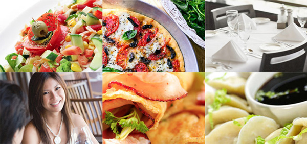
查找图片
显然,我们需要一些图像来制作图像滑块,以及网站的图像标题。 PhotoDune将很好地满足我们的目的。 以下是我们将在本教程中使用的图像。
我们还将需要背景纹理。 目前,我最喜欢的查找纹理的地方是“ 微妙的图案” ,浏览完所有页面之后,我最终决定使用此示例 。
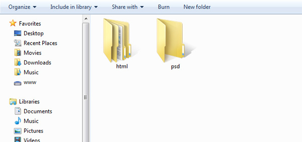
管理资料夹
尽管这是可选的,但我个人还是想在第一步中管理我的项目文件夹,这样可以确保我们一开始就保持井井有条。 因此,对于该网站,我已经创建了两个主文件夹psd和html ,其中html文件夹还包含两个用于字体和图像的文件夹。
该设计
接下来,我们在用HTML构建网站时在Photoshop中模拟一个网站以供参考。 在这一步中,我将不做进一步的介绍,因为实际的设计超出了本文的范围。 您已经可以在Webdesigntuts +上找到大量的布局教程,例如本教程。
好吧,下面的图片是我想到的。 让我们将文件保留在psd文件夹中。
HTML
在进行任何编码之前,我已经对布局中要使用的一些必需图形进行了切片。 首先是导航背景,顶部为黑色,图像缩略图的定制图案。
如果您按照HTML和CSS的整个30天课程进行了学习,那么Jeffrey在第27天介绍了如何对PSD文件进行切片。
HTML5
我们还将利用HTML5规范中的新标签,因此希望找到<nav> , <header> , <footer>以及我(诚实地)很少使用的其他一些新标签,例如<figure>和<figcaption> 。
但是,在这里我们不会过多地讨论HTML5,这超出了本教程的范围。 相反,您可以在Nettuts +上找到大量HTML5教程 。
页眉和导航
好吧,现在让我们打开一个文本编辑器并开始编写一些标记。
如您在最终设计中所见,我们不会将菜单和标题部分分开,因此主导航本身将包装在header标记内。
<header>
	<div>
		<h1 class="home"><a href="/">the resto.</a></h1>
		<nav id="site-nav">
			<ul class="menu">
				<li><a href="#">About</a></li>
				<li><a href="#">Contact</a></li>
				<li><a href="#">Restaurant</a></li>
				<li><a href="#">Store</a></li>
			</ul>
		</nav>
	</div>
</header>
图像滑块部分
“图像”滑块将被包装在section标签内。 section是一个新元素,也包含在新HTML5规范中以定义HTML文档中的部分或段。
<section id="image-slider">
	<div class="hidden">
	<span class="shine"></span>
	<ul>
		<li id="slide-1" class="slide">
		<figure>
			<img src="images/slide/grilled-chicken.jpg" />
			<figcaption>
				<p>Faworki cotton candy apple pie lollipop. Jelly beans apple pie sweet roll pie cheesecake.</p>
			</figcaption>
		</figure>
		</li>
		<li id="slide-2" class="slide">
		<figure>
			<img src="images/slide/pasta.jpg" />
			<figcaption>
				<p>Sesame snaps caramels powder muffin applicake chocolate cake.</p>
			</figcaption>
		</figure>
		</li>
		<li id="slide-3" class="slide">
			<figure>
				<img src="images/slide/steak.jpg" />
				<figcaption>
					<p>Pie danish applicake sugar plum sweet roll faworki cookie lollipop carrot cake. Chupa chups jujubes cupcake tart. </p>
				</figcaption>
			</figure>
		</li>
		<li id="slide-4" class="slide">
			<figure>
				<img src="images/slide/cappuccino.jpg" />
				<figcaption>
					<p>Lollipop dessert toffee apple pie liquorice chocolate marzipan.</p>
				</figcaption>
			</figure>
		</li>
	</ul>
	</div>

	<!-- image slider navigation -->
	<nav class="nav-slider">
		<ul>
			<li><a href="#slide-1">1</a></li>
			<li><a href="#slide-2">2</a></li>
			<li><a href="#slide-3">3</a></li>
			<li><a href="#slide-4">4</a></li>
		</ul>
	</nav>
	</section>
这就是形成图像滑块所需的所有HTML。 现在,让我们仔细看一下标记的每个部分。
从<div class="hidden"> ,我们将使用该类隐藏从指定尺寸溢出的幻灯片。 在这种情况下,它将是960 x 380像素。
幻灯片使用无序列表进行结构化。 每张幻灯片都包裹在<li>标记内,并带有唯一的ID <li id="slide-3" class="slide">这样我们以后就可以通过片段标识符选择特定的幻灯片。
请注意,我们使用figure来包装幻灯片图像和figcaption的幻灯片标题。 这些元素完美地(象征性地)描述了它们所具有的角色和关系。
<figure>
	<img src="images/slide/cappuccino.jpg" />
	<figcaption>
	<p>Lollipop dessert toffee apple pie liquorice chocolate marzipan.</p>
	</figcaption>
</figure> 该figure是HTML5规范中的新标签。 此标签用于标记图形,照片,图表等。 根据w3c的figcaption表示图形的标题或图例。 因此,这些标签有效地相互关联。
图片说明部分
图像标题也将包裹在section标签中。
<section id="image-caption">
<ul>
<li class="thumbnail thumbnail-1">
<figure>
<span class="pattern-overlay"></span>
<img src="images/thumbnail/women-at-dinnner.jpg"/>
<figcaption>
<p>Lemon drops dessert</p>
</figcaption>
</figure>
</li>
<li class="thumbnail thumbnail-2">
<figure>
<span class="pattern-overlay"></span>
<img src="images/thumbnail/cooked-breakfast.jpg"/>
<figcaption>
<hr /><h3>Apple pie chupa</h3>
<p>Apple pie chupa chups pudding cheesecake pie cake topping jelly-o.
Icing sweet roll toffee.</p>
<p>Lemon drops toffee pastry cookie marzipan carrot cake tart sweet roll tiramisu.</p>
</figcaption>
</figure>
</li>
<li class="thumbnail thumbnail-3">
<figure>
<span class="pattern-overlay"></span>
<img src="images/thumbnail/steamed-dumplings.jpg"/>
<figcaption>
<hr /><h3>Jelly beans</h3>
<p>Jelly beans icing macaroon pudding carrot cake.
Sweet roll halvah pudding cookie candy canes cake jelly marshmallow.</p>
<p>Chupa chups halvah tiramisu sugar plum.</p>
</figcaption>
</figure>
</li>
<li class="thumbnail thumbnail-4">
<figure>
<span class="pattern-overlay"></span>
<img src="images/thumbnail/salad.jpg"/>
<figcaption>
<p>Gummies chocolate bar tootsie roll oat cake gummies. Sesame snaps faworki ice cream tootsie roll pastry.</p>
</figcaption>
</figure>
</li>
<li class="thumbnail thumbnail-5">
<figure>
<span class="pattern-overlay"></span>
<img src="images/thumbnail/table-in-restaurant.jpg"/>
<figcaption>
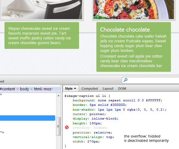
<p>Wypas cheesecake sweet ice cream faworki macaroon sweet pie.
Tart sweet muffin pastry cotton candy ice cream chocolate gummi bears.</p>
</figcaption>
</figure>
</li>
<li class="thumbnail thumbnail-6">
<figure>
<span class="pattern-overlay"></span>
<img src="images/thumbnail/pizza.jpg"/>
<figcaption>
<hr /><h3>Chocolate chocolate</h3>
<p>Chocolate chocolate cake wafer halvah jelly ice cream fruitcake wypas.
Sweet topping candy sugar plum bear claw sugar plum bonbon. </p>
<p>Croissant sweet roll apple pie cotton candy bear claw marshmallow cheesecake ice cream chocolate bar</p>
</figcaption>
</figure>
</li>
</ul>
</section>这就是我们在“图像标题”部分中所需要的,标记非常不言自明,因为它与“图像滑块”中的标记相似。
页脚
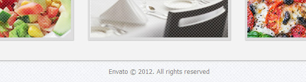
我们仅在页脚中添加版权文本。
<footer>
<p>Envato © 2012. All rights reserved</p>
</footer>造型
在本节中,我们将开始所有样式设计工作。 我假设您已经知道如何将样式与HTML文档分开,并使用CSS文件将其链接。
<link href="style.css" rel="stylesheet" type="text/css" />
无前缀
这些样式将利用许多新CSS3规范,不幸的是,每种浏览器都需要使用供应商前缀才能正常工作。 例如-o-表示Opera, -moz-表示Mozilla Firefox, -webkit-表示Safari和Chrome。 用这种方式编写肿CSS可能效率很低。
因此,我决定在文档中添加Lea Verou的无前缀 。 一个JavaScript库来自动处理所有这些供应商前缀,因此我们只需要添加官方属性格式。 例如,通常我们需要编写以下CSS规则来缩放元素:
div {
	transform: scale(2,4);
	-ms-transform: scale(2,4); /* IE 9 */
	-webkit-transform: scale(2,4); /* Safari and Chrome */
	-o-transform: scale(2,4); /* Opera */
	-moz-transform: scale(2,4); /* Firefox */
}
在使用无前缀脚本时,我们可以删除所有供应商前缀。
div {
	transform: scale(2,4);
}下载无前缀文件,并将其放在文档的底部,位于结束body标签之前。
<script src="prefixfree.js">
CSS重置
我们将在浏览器中遇到的另一个问题是不一致。 实际上,每个浏览器都会将HTML元素呈现为其自己的默认样式,而这些默认样式通常会略有不同。
为了覆盖默认样式并确保我们在每个浏览器中都从同一起始块开始工作,我们将使用CSS重置。 有几种选择。 例如埃里克·梅耶(Eric Mayer)的这款产品 ,雅虎(Yahoo)的YUI和理查德·克拉克(Richard Clark)的HTML5 Reset 。 但是这次我有兴趣尝试Nicolas Gallagher的Normalize.css 。 下载文件,然后将链接放在head标记内,然后再引用其他任何CSS文件。
<head>
	<link href="normalize.css" rel="stylesheet" type="text/css" />
</head>
好吧,现在我们已经准备就绪。 让我们开始造型。 从body标签开始。
该网站将具有带纹理的背景; 我们将在主体上应用背景,并指定默认字体系列和大小。
body {
	background:url('images/grid-noise.png') repeat;
	font: 12pt Tahoma, Geneva, sans-serif;
}
@字体脸
说到字体,我们计划为HTML应用一些非系统字体,因此我们将使用@font-face规则解决该问题。 好吧, @font-face在CSS中并不是什么新鲜事物,它实际上已包含在CSS2规范中,但是不幸的是,当时该方法并未被Web设计人员广泛采用。
使用@font-face包含我们自己的字体非常简单。 实际上, 字体松鼠的好人创建了这个方便的工具来生成您需要的代码。
在我们的设计中,我们将ChunkFive用于resto徽标,并将Titillium用于菜单导航。 让我们下载所有这些字体,然后将@font-face规则应用于样式表:

@font-face {
	font-family: 'ChunkFiveRegular';
	src: url('fonts/Chunkfive-webfont.eot');
	src: url('fonts/Chunkfive-webfont.eot?#iefix') format('embedded-opentype'),
		 url('fonts/Chunkfive-webfont.woff') format('woff'),
		 url('fonts/Chunkfive-webfont.ttf') format('truetype'),
		 url('fonts/Chunkfive-webfont.svg#ChunkFiveRegular') format('svg');
	font-weight: normal;
	font-style: normal;
}
@font-face {
	font-family: 'TitilliumText22LRegular';
	src: url('fonts/TitilliumText22L003-webfont.eot');
	src: url('fonts/TitilliumText22L003-webfont.eot?#iefix') format('embedded-opentype'),
		 url('fonts/TitilliumText22L003-webfont.woff') format('woff'),
		 url('fonts/TitilliumText22L003-webfont.ttf') format('truetype'),
		 url('fonts/TitilliumText22L003-webfont.svg#TitilliumText22LRegular') format('svg');
	font-weight: normal;
	font-style: normal;
}
样式设置标题和导航
标题将具有我们在本教程前面部分所介绍的背景,我们还将新的字体系列应用于home类和nav li.
header {
	background: url('images/nav-bg.png') repeat-x;
	padding: 0;
	height: 70px;
	border-bottom: 2px solid #000;
	box-shadow: 0px 1px 5px 0px rgba(0, 0, 0, .5);
	width: 100%;
}
header > div {
	width: 960px;
	margin: 0 auto;
}
header .home {
	margin: 0;
	font: 36pt/60pt 'ChunkFiveRegular', Arial, sans-serif;
	text-shadow: 0px 2px 0px #000;
	float: left;
}
header a {
	text-decoration: none;
	color: #fff;
	text-shadow: 1px 1px 0 #000;
	transition: all 300ms ease-out;
}
header nav {
	float: right;
}
header nav ul {
	padding: 0;
	margin-right: 6px;
}
header nav li {
	display: inline;
	font: 12pt/35pt 'TitilliumText22LRegular', Arial, sans-serif;
	margin-left: 25px;
	text-transform: uppercase;
}
请注意,我们没有包括供应商前缀来声明盒影规则。 我必须感谢Lea Verou创建了无前缀脚本-这样可以省去很多麻烦。
内容样式
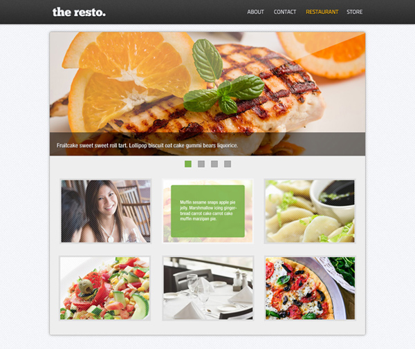
#content样式是标准的。 它将具有略带白色的背景色,固定宽度960px(位于屏幕中心)和阴影。
#content {
width: 960px;
height: auto;
margin: 25px auto 0;
background: #f3f3f3;
border: 1px solid #bbb;
box-shadow: 0px 0px 3px 0px rgba(0, 0, 0, .3);
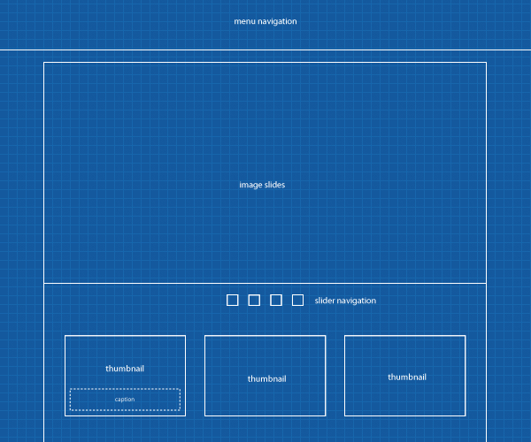
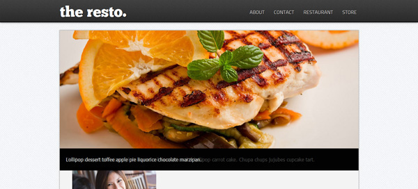
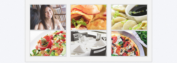
}到目前为止,应用了以上所有样式后,您应该会看到类似以下内容:
样式化图像滑块
现在,让我们将一些样式应用于“图像滑块”。 包含导航的滑块的尺寸为960 x 425像素,而如上所述的图像幻灯片本身只有960 x 360像素。
#image-slider {
	height: 425px;
	width: 960px;
}
#image-slider ul {
	list-style: none;
	margin: 0;
	padding: 0;
}
图像标题将具有稍微透明的背景。 为了实现这种透明效果,我们将不使用不透明度规则,因为它也会影响标题内的文本。 相反,我们将使用RGBA色彩模式中的Alpha通道来实现它。
#image-slider figcaption {
	background-color: rgba(0,0,0,.7);
	color: #fff;
	padding: 10px 20px;
	position: relative;
	text-shadow: 1px 1px 0px #000;
	width: 920px;
	bottom: 0;
}
如果您注意幻灯片中的图像; 图像和标题之间有空白。 要删除它,我们添加display: block; 图片。
#image-slider img {
	display: block;
}
滑动位置
在本节中,我们将处理幻灯片。 幻灯片将使用绝对位置,以便它们可以堆叠。
#image-slider .slide {
	position: absolute;
}
虽然幻灯片中的图片应该是不可见的,但我们可以通过将不透明度值更改为零来实现。
#image-slider .slide img {
	position: relative;
	opacity: 0;
}
但是,第一张幻灯片中的图像应该是可见的。 因此,我们将使用:first-child选择器专门选择它,并将不透明度设置为1。
#image-slider .slide:first-child img {
	opacity: 1;
}
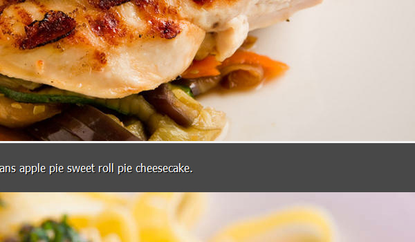
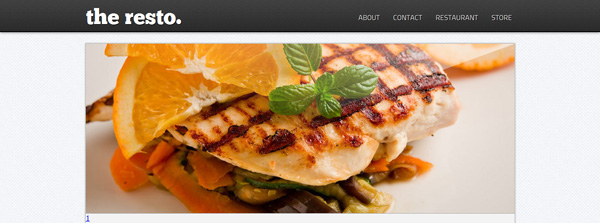
好吧,结果仍然不是我们最终设计所期望的。 从上图可以看到,应该隐藏的幻灯片标题仍然可见。 因此,我们需要隐藏它们。
#image-slider .hidden {
	height: 380px;
	overflow: hidden;
	position: relative;
	width: 960px;
	border-bottom: 1px solid #aaa;
}
创造光彩效果
我们要感谢CSS3的新规范,因为我们现在可以创建闪亮效果而无需合并任何图像。 我们将使用CSS3 Background Gradient实现效果。
我不会详细介绍如何应用它,因为您可以在此处全面阅读此技巧 。
现在,让我们添加以下样式;
#image-slider .shine {
	height: 300px;
	margin: 0 auto;
	position: absolute;
	right: -60px;
	top: -58px;
	transform: rotate(-20deg);
	background: linear-gradient(45deg, rgba(255,255,255,0) 50%,rgba(255,255,255,1) 100%);
	width: 1500px;
	z-index: 5;
}
如果您已阅读技巧,那么我认为渐变规则对于您来说应该是显而易见的。 但是,让我们看另一条规则来弄清楚CSS的实际作用。
首先, <span class="shine"> absolute: position为z-index: 5 ,将其置于幻灯片中其他元素的最上方。 闪光效果未正确显示,因此仍需要将元素旋转大约-20度( transform: rotate(-20deg); )。
滑块导航
滑块样式非常简单。 默认情况下,导航中的菜单将具有嵌入式位置,以便每个菜单并排出现。
.nav-slider {
	text-align: center;
	padding-top: 15px;
	border-top: 1px solid #fff;
}
.nav-slider li {
	display: inline;
	margin: 0 5px;
}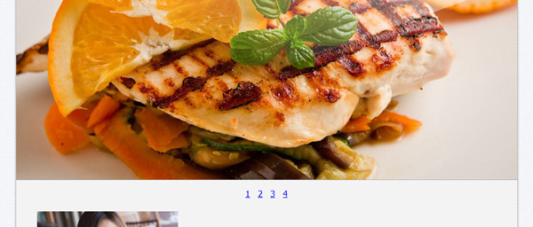
注意,导航仍然显示数字文本。 我们应该将其删除并提供一些样式。
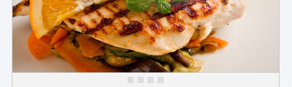
首先,我们添加inline-block ,以便可以为锚添加宽度和高度值,然后添加text-indent: -9999px以可视方式删除其中的文本。
.nav-slider li a {
	background: #ddd;
	border: 1px solid #ccc;
	display: inline-block;
	height: 19px;
	text-indent: -9999px;
	width: 19px;
}
图像缩略图
现在,我们将样式添加到“图像标题”部分。
#image-caption {
	padding: 32px 32px 40px;
}
#image-caption ul {
	list-style: none;
	padding: 0;
	margin: 0;
}
#image-caption ul li {
	display: inline-block;
	width: 270px;
	vertical-align: top;
	height: 190px;
	background: #fff;
	border: 5px solid #ddd;
	cursor: pointer;
	box-shadow: 1px 1px 1px 0px rgba(0, 0, 0, .2);
	position: relative;
	overflow: hidden;
}
我们还删除了图像和标题之间的空白。
#image-caption img {
	display: block;
}
缩略图将具有我们之前切过的图案叠加层。
.pattern-overlay {
	background: url('images/thumbnail-pattern.png') repeat;
	height: 190px;
	width: 270px;
	position: absolute;
	z-index: 1;
}
正如我们在上图中所看到的,缩略图像是混杂在一起的。 我们需要一定的余量,以在两者之间保持一定的差距。 而不是为每个缩略图定义此页边距,我们将规定只有中间图像使用nth-child图像。
nth-child是一个css伪类,用于使用公式选择特定的子元素。 要获得对该伪类的更多了解,可以阅读此综合说明 。
好吧,首先我们将选择中间图像,在这种情况下,选择图像缩略图编号2、5及其相乘。
.thumbnail:nth-child(3n+2) {
	margin: 0 23px;
}
之后,我们仅选择前三个图像的底边空白。 因此,第一行和第二行之间也将有间隙。
.thumbnail:nth-child(-n+3) {
	margin-bottom: 33px;
}
缩略图标题
参考我们的设计,标题通常为绿色,透明度略微,边框呈圆形。
.thumbnail figcaption {
	background: rgba(136,184,88,0.9);
	margin: 10px;
	border-radius: 3px;
	padding: 10px;
	width: 230px;
	color: #fff;
	font-size: 10pt;
}
一些标题的标题级别为3(H3),在此我们指定h3样式。
.thumbnail figcaption h3 {
	font-size: 14pt;
	font-weight: normal;
}
标题内的文本包装在段落标签(p)内。 因此我们也使用边距指定标题和段落之间的空格。
.thumbnail figcaption p, .thumbnail figcaption h3 {
	margin: 3px;
	padding: 0;
}
对于页脚样式,我们仅将文本居中。
footer {
width: 960px;
text-align: center;
margin: 0 auto;
color: #777;
text-shadow: 1px 1px 0px #fff;
font-size: 10pt;
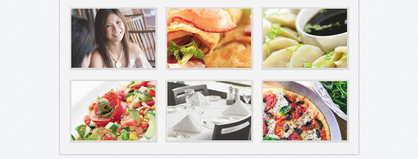
}好了,我们已经完成了所有必要的样式,到目前为止,您可以期望结果看起来像这样:
效果
在本节中,我们将开始使用转换和过渡属性将某些效果应用于网站。
这些属性如何工作?
我想您会遇到一些已经讨论过这些属性(转换和转换)的帖子,尤其是如果您是Tuts +博客网络的常规读者。 让我只解释一下这些属性,以便快速回顾一下。
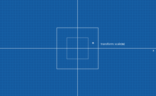
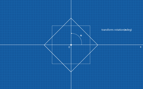
Transform是CSS3规范中包含的新CSS属性。 使用此属性,我们可以对元素应用各种变换,例如平移(移动),旋转,倾斜和缩放。
可以使用以下css函数来实现转换; transform: transform-method(value) 。 对于变换方法,我们可以使用平移,缩放,旋转和倾斜。 出于说明目的,我们将把这些方法中的每一个应用于我们的图像标题。
虽然过渡也是CSS3规范的一部分,但此属性将使我们能够为动画创建渐变效果,而不是即时更改。 在简写形式中,可以使用以下功能来应用效果:
transition: <property> <duration> <timing-function> <delay>
让我们将它们应用于我们的图像标题以更好地理解。
颜色过渡
在导航部分,我们将演示过渡效果的简单示例。 当我们将鼠标悬停在菜单上时,通过指定transition-property ,可以将菜单颜色从白色( #FFFFFF )平滑更改为橙色( #FFB400 )。
让我们看一下下面CSS规则;
#site-nav li a {
	transition: color 500ms;
}
#site-nav li a:hover {
	color: #ffb400;
}
上面CSS规则将仅指定将以500毫秒作为持续时间过渡的color属性。 并且请注意,我没有添加特定的timing-function 。 如果未指定,默认情况下浏览器将使用ease 。
现在,我们将进入下一个更具挑战性的部分。
图片字幕效果
在本节中,我们将对图像标题应用各种变换和过渡效果。 首先,我们为图像缩略图过渡指定通用规则。
.thumbnail img {
	transition: all 350ms;
}
我们没有在规则中添加特定的属性,相反,我们为其使用了“全部”。 这意味着过渡效果将应用于图像周围的所有属性。
在这种情况下,当我们将鼠标悬停在图像上时,图像将具有30%的透明度。
.thumbnail:hover img {
	opacity: 0.3;
}
在下一步中,我们将定义每个字幕转换行为。
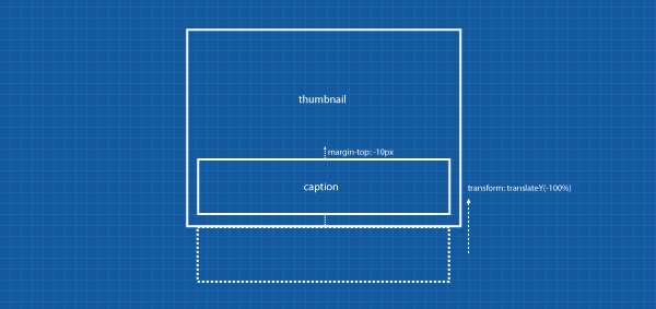
标题1:向上移动
第一个图像标题将具有线性timing-function ,因此从开始到结束的移动都是稳定的。
.thumbnail-1 figcaption {
	transition: all 350ms linear;
	margin: 0 10px 0 10px;
}
然后,当我们将鼠标悬停在缩略图上时,标题将移至顶部。 我们可以使用translate方法来实现移动。 translate方法将使元素从translate值中指定的一个点移动到另一点。
.thumbnail-1:hover figcaption {
	transform: translateY(-100%);
	margin-top: -10px;
}
我们使用百分比进行翻译,而不是以像素为单位给出特定值。 这样,字幕将相对于图像高度移动,而与高度的实际值无关。 另外,请注意,我们添加了margin-top 。
标题2:向下移动和过渡延迟
第二个标题将具有完整的高度和宽度,以使其覆盖图像缩略图。 我们将在字幕中使用ease-in因此希望字幕开始缓慢。 我们还添加了约350ms的transition-delay ,这意味着效果将在图像过渡完成后立即开始。
.thumbnail-2 figcaption {
	transition: all 350ms ease-in 350ms;
	height: 150px;
	position: absolute;
	top: -190px;
}
然后,当我们将鼠标悬停在缩略图上时,字幕最终将向下移动。
.thumbnail-2:hover figcaption {
	transform: translateY(190px);
}
标题3:放大效果
对于第三个标题,我们将使用ease-out 。 使用此选项可使字幕过渡缓慢结束。 当我们将鼠标悬停在相应的缩略图上时,我们计划进行标题放大,因此我们将标题缩放比例的起始点指定为零。
.thumbnail-3 figcaption {
	transition: all 350ms ease-out;
	transform: scale(0);
	height: 150px;
	opacity: 0;
	position: absolute;
	top: 0;
}
下面是悬停状态CSS规则集。 当我们将鼠标悬停在第三个缩略图上时,标题将放大,回到其原始尺寸。
.thumbnail-3:hover figcaption {
	transform: scale(1);
	opacity: 1;
}
标题4:多重转换
第四个字幕将进行旋转变换,为了不使文本反转,我们将首先将字幕旋转-180度。
标题和内部的文本都将具有过渡属性,这一次我们将使用ease-in-out 。 从函数名称来看,您可以猜到,它将使过渡效果开始和结束缓慢。
.thumbnail-4 figcaption {
	transition: all 500ms ease-in-out;
	transform: rotate(-180deg);
	overflow: hidden;
	max-height: 150px;
	position: relative;
}
由于我们计划对文本进行缩小效果,因此我们首先将文本转换为300%的比例,然后通过降低不透明度将其视觉上隐藏。
.thumbnail-4 figcaption p {
	transition: all 350ms ease-in-out 500ms;
	transform: scale(3);
	opacity: 0;
}
然后,当我们将鼠标悬停在缩略图上时,字幕最终将从其初始位置移到顶部并同时旋转。 这是一个简单实用的示例,说明了如何在一个元素中应用多个转换。
.thumbnail-4:hover figcaption {
	transform: rotate(0deg) translateY(-100%);
	margin-top: -10px;
}
对于文本转换,将像我们前面提到的那样进行缩小。
.thumbnail-4:hover figcaption p {
	transform: scale(1);
	opacity: 1;
}
标题5:玩立方贝塞尔曲线
说到过渡时序功能,我们已经使用过ease , linear , ease-in , ease-out和ease-in-out 。 这些关键字实际上是贝塞尔曲线的特定值的表示。 如:
- 线性等于
cubic-bezier(0,0,1,1) - 安逸度等于
cubic-bezier(0.25,0.1,0.25,1) - 缓入等于
cubic-bezier(0.42,0,1,1) - 缓和等于
cubic-bezier(0,0,0.58,1) - 缓入等于
cubic-bezier(0.42,0,0.58,1)
这次,对于此标题,我们将尝试使用具有自定义值的三次贝塞尔曲线。 如果我们没有看到实际的行为,实际上很难预测更改的工作方式。 幸运的是,有一个方便且非常有用的工具可用于立方贝塞尔曲线,因此我们可以看到更改的即时结果。
访问cubic-bezier.com ,在这里您可以玩由Lea Verou(无前缀后面的那个人)创建的bezier曲线。
在下面CSS中,我设置了三次贝塞尔曲线值,以便在开始时相当快地运行过渡,而在结束时则要慢得多。
.thumbnail-5 figcaption, .thumbnail-5 img {
	transition: all 350ms cubic-bezier(.1,.72,.68,.68);
}
然后,当缩略图悬停在上方时,我们希望图像和标题相应地向上移动。
.thumbnail-5:hover figcaption, .thumbnail-5:hover img {
	transform: translateY(-90px);
}
标题6:转换原点。
我们对前面的字幕应用了缩放和旋转方法。 您可能已经注意到旋转和比例尺从元素的中心点开始。 这是因为默认情况下transform-origin是50%50%。
transform-origin是允许我们在元素中指定转换起点的属性。 可以使用以下语法transform-origin: xy 。
在第六个标题中,我们将原点更改为0 0(xy) 。
.thumbnail-6 figcaption {
	top:0;
	position: absolute;
	height: 150px;
	transform: scale(0);
	transform-origin: 0 0;
	opacity: 0;
}
字幕和图像都将具有过渡效果。
.thumbnail-6 figcaption, .thumbnail-6 img {
	transition: all 500ms;
}
然后,当我们将鼠标悬停在缩略图上时,图像和标题将同时转换。
.thumbnail-6:hover img {
	transform: scale(0);
	transform-origin: 0 0;
	opacity: 0;
}
.thumbnail-6:hover figcaption {
	transform: scale(1);
	transform-origin: 0 0;
	opacity: 1;
}
图像滑块效果
我们在转换和过渡属性上玩了很多次。 在这一步中,我们将它们应用到图像滑块中。
首先,我们设置图像和标题。 在这里,我们将图像设置为具有淡入过渡效果。
#image-slider li img {
	transition: all 1s linear;
}

#image-slider li figcaption {
	transition: all 500ms ease-in-out 300ms;
}
以及指定滑块的导航过渡。
.nav-slider li a {
	transition: all 1s ease-out;
}:target伪类简介
单击将驱动“图像滑块”。 当我们单击滑块菜单时,最终将显示相应的幻灯片/图像,通常具有滑入或淡入效果。 这些类型的导航和滑块效果通常基于JavaScript或Flash技术构建。
但是,在本教程中,我们将尝试仅使用CSS来实现它,即使用:target伪类。
:target是CSS3中独特的功能之一,它使我们能够在HTML文档中选择具有与URI中的片段标识符匹配的特定ID的元素。
例如,URI; http://www.somedomain.com/page/#section-1将在页面上选择id="section-1"的元素。 因此,类似于:hover ,将应用:target周围的所有样式。
好吧,让我们看一下以下CSS规则:
当各自的li充当:target时,下面CSS规则会将图像不透明度变为1。 请记住,我们使用无序列表标记标记了幻灯片/图像。
#image-slider li:target img {
	opacity: 1;
}
其中的标题应向上滑动100%的宽度; 请不要忽略!important声明。 这个很重要。
#image-slider li:target figcaption {
	transform: translateY(-100%) !important;
}
好的,在浏览器中尝试一下结果。
滑块导航效果
transition属性可以专门应用于选择器,例如:hover和:active 。
我们已经在上面为.nav-slider li a定义了过渡,但是我们还将在用户行为的某些条件下指定不同的计时功能。
当我们将鼠标悬停在滑块导航上时,菜单将通过300ms缓入时间将颜色更改为绿色。
.nav-slider li a:hover {
	background: #89c53f;
	border: 1px solid #467536;
	transition: all 300ms ease-in;
}
当我们单击它时,菜单会以大约50ms的速度快速变为深绿色。
.nav-slider li a:active {
	background: #467536;
	border: 1px solid #20411d;
	transition: all 50ms;
} 而且,当菜单没有用户活动时,菜单将非常缓慢地恢复到其原始状态,如上面在.nav-slider li a所指定的那样,恢复时间约为1 .nav-slider li a 。
极限
就像使用任何其他技术一样,CSS也不例外。 它仍然有一些限制。
如果刷新浏览器(我假设您仍在本教程的练习页上),则会注意到第一张幻灯片中的标题未在第一页加载时显示。 好吧,因为这是因为我们仅在CSS中声明过,一旦li成为目标,就会显示标题。 因此,在这里我们需要为标题添加特定的翻译。
我们使用:first-child选择器选择第一张幻灯片,并将标题平移以向上移动其高度的100%。
#image-slider li:first-child figcaption {
	transform: translateY(-100%);
}
刷新浏览器,现在第一个标题应显示在第一次加载中。 请记住,我们在上一步中添加了300ms的延迟过渡,因此字幕将在指定的时间后开始显示。
尽管有一个问题,尽管我们已经导航到另一张幻灯片,但是上面CSS语句将使标题保持不变。 因此,我们需要为其创建反作用规则。
我们将为标题添加一个.hide类(在第一张幻灯片中),并将其定义为返回其初始位置。
#image-slider li:first-child figcaption.hide {
	transform: translateY(0);
}
等一下,我们不是在标题中添加了隐藏类吗?
我们没有。
我们将(有条件地)从jQuery中有条件地添加它。 如果用户导航到其他幻灯片,则将应用hide类。
将以下来自Google库的jQuery链接放在页面底部的body关闭标签之前。 当前的jQuery版本是1.7.1。
<script src="https://ajax.googleapis.com/ajax/libs/jquery/1.7.1/jquery.min.js"></script>
我们首先为所选元素创建变量。
var firstcaption = $('.slide:first-child figcaption'),
otherslides = $('.nav-slider li:nth-child(n+2)'); 然后创建一个函数,当用户单击菜单以导航到其他幻灯片时,添加hide类。
otherslides.click(function(){
		firstcaption.addClass("hide");
}); 不要忘记将上面的所有代码包装在<script>标记内。
<script>
$(function() {
  	var 	firstcaption = $('.slide:first-child figcaption'),
		otherslides	= $('.nav-slider li:nth-child(n+2)');

		otherslides.click(function(){
		firstcaption.addClass("hide");
	});
 });
</script>
结语
好了,我们在本教程中编写了很多代码,让我们回顾一下。
HTML标记
<!doctype html>
<html lang="en">
<head>
<meta charset="utf-8">
<title>Practical Use of CSS3: Transforms and Transitions - Webdesigntuts+</title>
<link href="normalize.css" rel="stylesheet" type="text/css" />
<link href="style.css" rel="stylesheet" type="text/css" />
<link href="effects.css" rel="stylesheet" type="text/css" />
</head>
<body>
<!-- site navigation -->
<header>
<div>
<h1 class="home"><a href="/">the resto.</a></h1>
<nav id="site-nav">
<ul class="menu">
<li><a href="#">About</a></li>
<li><a href="#">Contact</a></li>
<li><a href="#">Restaurant</a></li>
<li><a href="#">Store</a></li>
</ul>
</nav>
</div>
</header>
<!-- content section -->
<div id="content">
<!-- image slider -->
<section id="image-slider">
<div class="hidden">
<span class="shine"></span>
<ul>
<li id="slide-1" class="slide">
<figure>
<img src="images/slide/grilled-chicken.jpg" />
<figcaption>
<p>Faworki cotton candy apple pie lollipop. Jelly beans apple pie sweet roll pie cheesecake.</p>
</figcaption>
</figure>
</li>
<li id="slide-2" class="slide">
<figure>
<img src="images/slide/pasta.jpg" />
<figcaption>
<p>Sesame snaps caramels powder muffin applicake chocolate cake.</p>
</figcaption>
</figure>
</li>
<li id="slide-3" class="slide">
<figure>
<img src="images/slide/steak.jpg" />
<figcaption>
<p>Pie danish applicake sugar plum sweet roll faworki cookie lollipop carrot cake.
Chupa chups jujubes cupcake tart. </p>
</figcaption>
</figure>
</li>
<li id="slide-4" class="slide">
<figure>
<img src="images/slide/cappuccino.jpg" />
<figcaption>
<p>Lollipop dessert toffee apple pie liquorice chocolate marzipan.</p>
</figcaption>
</figure>
</li>
</ul>
</div>
<!-- image slider navigation -->
<nav class="nav-slider">
<ul>
<li><a href="#slide-1">1</a></li>
<li><a href="#slide-2">2</a></li>
<li><a href="#slide-3">3</a></li>
<li><a href="#slide-4">4</a></li>
</ul>
</nav>
</section>
<!-- image caption -->
<section id="image-caption">
<ul>
<li class="thumbnail thumbnail-1">
<figure>
<span class="pattern-overlay"></span>
<img src="images/thumbnail/women-at-dinnner.jpg"/>
<figcaption>
<p>Lemon drops dessert</p>
</figcaption>
</figure>
</li>
<li class="thumbnail thumbnail-2">
<figure>
<span class="pattern-overlay"></span>
<img src="images/thumbnail/cooked-breakfast.jpg"/>
<figcaption>
<hr /><h3>Apple pie chupa</h3>
<p>Apple pie chupa chups pudding cheesecake pie cake topping jelly-o.
Icing sweet roll toffee.</p>
<p>Lemon drops toffee pastry cookie marzipan carrot cake tart sweet roll tiramisu.</p>
</figcaption>
</figure>
</li>
<li class="thumbnail thumbnail-3">
<figure>
<span class="pattern-overlay"></span>
<img src="images/thumbnail/steamed-dumplings.jpg"/>
<figcaption>
<hr /><h3>Jelly beans</h3>
<p>Jelly beans icing macaroon pudding carrot cake.
Sweet roll halvah pudding cookie candy canes cake jelly marshmallow.</p>
<p>Chupa chups halvah tiramisu sugar plum.</p>
</figcaption>
</figure>
</li>
<li class="thumbnail thumbnail-4">
<figure>
<span class="pattern-overlay"></span>
<img src="images/thumbnail/salad.jpg"/>
<figcaption>
<p>Gummies chocolate bar tootsie roll oat cake gummies. Sesame snaps faworki ice cream tootsie roll pastry.</p>
</figcaption>
</figure>
</li>
<li class="thumbnail thumbnail-5">
<figure>
<span class="pattern-overlay"></span>
<img src="images/thumbnail/table-in-restaurant.jpg"/>
<figcaption>
<p>Wypas cheesecake sweet ice cream faworki macaroon sweet pie.
Tart sweet muffin pastry cotton candy ice cream chocolate gummi bears.</p>
</figcaption>
</figure>
</li>
<li class="thumbnail thumbnail-6">
<figure>
<span class="pattern-overlay"></span>
<img src="images/thumbnail/pizza.jpg"/>
<figcaption>
<hr /><h3>Chocolate chocolate</h3>
<p>Chocolate chocolate cake wafer halvah jelly ice cream fruitcake wypas.
Sweet topping candy sugar plum bear claw sugar plum bonbon. </p>
<p>Croissant sweet roll apple pie cotton candy bear claw marshmallow cheesecake ice cream chocolate bar</p>
</figcaption>
</figure>
</li>
</ul>
</section>
</div>
<!-- site footer -->
<footer>
<p>Envato © 2012. All rights reserved</p>
</footer>
<script src="https://ajax.googleapis.com/ajax/libs/jquery/1.7.1/jquery.min.js"></script>
<script src="prefixfree.js"></script>
<script>
$(function() {
//Define variables
var firstcaption = $('.slide:first-child figcaption'),
otherslides = $('.nav-slider li:nth-child(n+2)');
//Add class "hide" when the other slides are clicked
otherslides.click(function(){
firstcaption.addClass("hide");
});
});
</script>
</body>
</html>CSS
我们将样式分成两个文件。 首先, style.css文件将存储所有影响网站外观CSS规则。
/* Apply a background in the body tag */
body {
	background:url('images/grid-noise.png') repeat;
	font: 12pt Tahoma, Geneva, sans-serif;
}
/* @font-face */
@font-face {
	font-family: 'ChunkFiveRegular';
	src: url('fonts/Chunkfive-webfont.eot');
	src: url('fonts/Chunkfive-webfont.eot?#iefix') format('embedded-opentype'),
		 url('fonts/Chunkfive-webfont.woff') format('woff'),
		 url('fonts/Chunkfive-webfont.ttf') format('truetype'),
		 url('fonts/Chunkfive-webfont.svg#ChunkFiveRegular') format('svg');
	font-weight: normal;
	font-style: normal;
}
@font-face {
	font-family: 'TitilliumText22LRegular';
	src: url('fonts/TitilliumText22L003-webfont.eot');
	src: url('fonts/TitilliumText22L003-webfont.eot?#iefix') format('embedded-opentype'),
		 url('fonts/TitilliumText22L003-webfont.woff') format('woff'),
		 url('fonts/TitilliumText22L003-webfont.ttf') format('truetype'),
		 url('fonts/TitilliumText22L003-webfont.svg#TitilliumText22LRegular') format('svg');
	font-weight: normal;
	font-style: normal;
}
/* Header */
header {
	background: url('images/nav-bg.png') repeat-x;
	padding: 0;
	height: 70px;
	border-bottom: 2px solid #000;
	box-shadow: 0px 1px 5px 0px rgba(0, 0, 0, .5);
	width: 100%;
}
header > div {
	width: 960px;
	margin: 0 auto;
}
header .home {
	margin: 0;
	font: 36pt/60pt 'ChunkFiveRegular', Arial, sans-serif;
	text-shadow: 0px 2px 0px #000;
	float: left;
}
header a {
	text-decoration: none;
	color: #fff;
	text-shadow: 1px 1px 0 #000;
	transition: all 300ms ease-out;
}
header nav {
	float: right;
}
header nav ul {
	padding: 0;
	margin-right: 6px;
}
header nav li {
	display: inline;
	font: 12pt/35pt 'TitilliumText22LRegular', Arial, sans-serif;
	margin-left: 25px;
	text-transform: uppercase;
}
/* Content */
#content {
	width: 960px;
	height: auto;
	margin: 25px auto 0;
	background: #f3f3f3;
	border: 1px solid #bbb;
	box-shadow: 0px 0px 3px 0px rgba(0, 0, 0, .3);
}
/* Image Slider Section */
#image-slider {
	height: 425px;
	width: 960px;
}
#image-slider ul {
	list-style: none;
	margin: 0;
	padding: 0;
}
#image-slider img {
	display: block; /** For removing white space **/
}
#image-slider figcaption {
	background-color: rgba(0,0,0,.7);
	color: #fff;
	padding: 10px 20px;
	position: relative;
	text-shadow: 1px 1px 0px #000;
	width: 920px;
	bottom: 0;
}
#image-slider .slide {
	position: absolute;
}
#image-slider .slide img {
	position: relative;
	opacity: 0;
}
#image-slider .slide:first-child img {
	opacity: 1;
}
#image-slider .hidden {
	height: 380px;
	overflow: hidden;
	position: relative;
	width: 960px;
	border-bottom: 1px solid #aaa;
}
#image-slider .shine {
	height: 300px;
	margin: 0 auto;
	position: absolute;
	right: -60px;
	top: -58px;
	transform: rotate(-20deg);
	background: linear-gradient(45deg, rgba(255,255,255,0) 50%,rgba(255,255,255,1) 100%);
	width: 1500px;
	z-index: 5;
}
/* Slide Navigation Section */
.nav-slider {
	text-align: center;
	padding-top: 15px;
	border-top: 1px solid #fff;
}
.nav-slider li {
	display: inline;
	margin: 0 5px;
}
.nav-slider li a {
	background: #ddd;
	border: 1px solid #ccc;
	display: inline-block;
	height: 19px;
	text-indent: -9999px;
	width: 19px;
}
/* Image Caption Section */
#image-caption {
	padding: 32px 32px 40px;
}
#image-caption ul {
	list-style: none;
	padding: 0;
	margin: 0;
}
#image-caption ul li {
	display: inline-block;
	width: 270px;
	vertical-align: top;
	height: 190px;
	background: #fff;
	border: 5px solid #ddd;
	cursor: pointer;
	box-shadow: 1px 1px 1px 0px rgba(0, 0, 0, .2);
	position: relative;
	overflow: hidden;
}
#image-caption img {
	display: block; /** Remove white space **/
}
.pattern-overlay {
	background: url('images/thumbnail-pattern.png') repeat;
	height: 190px;
	width: 270px;
	position: absolute;
	z-index: 1;
}
.thumbnail:nth-child(3n+2) /** Select only the the middle images (2,5,...etc)**/ {
	margin: 0 23px;
}
.thumbnail:nth-child(-n+3) /** Select only the first 3 images **/ {
	margin-bottom: 33px;
}
.thumbnail figcaption {
	background: rgba(136,184,88,0.9);
	margin: 10px;
	border-radius: 3px;
	padding: 10px;
	width: 230px;
	color: #fff;
	font-size: 10pt;
}
.thumbnail figcaption h3 {
	font-size: 14pt;
	font-weight: normal;
}
.thumbnail figcaption p, .thumbnail figcaption h3 {
	margin: 3px;
	padding: 0;
}
.thumbnail-1 figcaption {
	margin: 0 10px 0 10px;
}
.thumbnail-2 figcaption {
	height: 150px;
	position: absolute;
	top: -190px;
}
.thumbnail-3 figcaption {
	transform: scale(0);
	height: 150px;
	opacity: 0;
	position: absolute;
	top: 0;
}
.thumbnail-4 figcaption {
	transform: rotate(-180deg);
	overflow: hidden;
	max-height: 150px;
	position: relative;
}
.thumbnail-4 figcaption p {
	transform: scale(3);
	opacity: 0;
}
.thumbnail-5 img {
	box-shadow: 1px 1px 1px 0px rgba(0, 0, 1, .5);
	position: relative;
	z-index: 1;
}
.thumbnail-5 figcaption {
	margin: 0;
	border-radius: 0;
	width: 250px;
}
.thumbnail-6 figcaption {
	top:0;
	position: absolute;
	height: 150px;
	transform: scale(0);
	transform-origin: 0 0;
	opacity: 0;
}
.thumbnail-6, .thumbnail-6 img {
	box-shadow: 1px 1px 1px 0px rgba(0, 0, 1, .5);
}
/* Footer */
footer {
	width: 960px;
	text-align: center;
	margin: 0 auto;
	color: #777;
	text-shadow: 1px 1px 0px #fff;
	font-size: 10pt;
}
然后是在网站上执行过渡和转换效果的所有CSS规则的effects.css。
/* Site Navigation */
#site-nav li a {
	transition: all 500ms;
}
#site-nav li a:hover {
	color: #ffb400;
}

/* Image Slider Effects */
#image-slider li img {
	transition: all 1s linear;
}
#image-slider li figcaption {
	transition: all 500ms ease-in-out 300ms;
}
#image-slider li:target img {
	opacity: 1;
}
#image-slider li:target figcaption {
	transform: translateY(-100%) !important;
}
#image-slider li:first-child figcaption {
	transform: translateY(-100%);
}
#image-slider li:first-child figcaption.hide {
	transform: translateY(0);
}

/* Nav Slider */
.nav-slider li a {
	transition: all 1s ease-out;
}
.nav-slider li a:hover {
	background: #89c53f;
	border: 1px solid #467536;
	transition: all 300ms ease-in;
}
.nav-slider li a:active {
	background: #467536;
	border: 1px solid #20411d;
	transition: all 50ms;
}

/* Image Caption */
.thumbnail img {
	transition: all 350ms;
}
.thumbnail-1 figcaption {
	transition: all 350ms linear;
}
.thumbnail-2 figcaption {
	transition: all 350ms ease-in 350ms;
}
.thumbnail-3 figcaption {
	transition: all 350ms ease-out;
}
.thumbnail-4 figcaption {
	transition: all 500ms ease-in-out;
}
.thumbnail-4 figcaption p {
	transition: all 350ms ease-in-out 500ms;
}
.thumbnail-5 figcaption, .thumbnail-5 img {
	transition: all 350ms cubic-bezier(.1,.72,.68,.68);
}
.thumbnail-6 figcaption, .thumbnail-6 img {
	transition: all 500ms;
}
.thumbnail:hover img {
	opacity: 0.3;
}
.thumbnail-1:hover figcaption {
	transform: translateY(-100%);
	margin-top: -10px;
}
.thumbnail-2:hover figcaption {
	transform: translateY(190px);
}
.thumbnail-3:hover figcaption {
	transform: scale(1);
	opacity: 1;
}
.thumbnail-4:hover figcaption {
	transform: rotate(0deg) translateY(-100%);
	margin-top: -10px;
}
.thumbnail-4:hover figcaption p {
	transform: scale(1);
	opacity: 1;
}
.thumbnail-5:hover figcaption, .thumbnail-5:hover img {
	transform: translateY(-90px);
}
.thumbnail-6:hover img {
	transform: scale(0);
	transform-origin: 0 0;
	opacity: 0;
}
.thumbnail-6:hover figcaption {
	transform: scale(1);
	transform-origin: 0 0;
	opacity: 1;
}
最后的想法
大功告成! 看到今天我们如何仅使用带有最少JavaScriptCSS规则就能完成如此多的效果,这很有用。
不要忘记较旧的浏览器(尤其是IE)缺乏支持。 但是保守地使用这些效果可以优雅地降低网站质量。
感谢您阅读本教程; 我希望你学到了一些东西!
翻译自: https://webdesign.tutsplus.com/tutorials/practical-use-of-css3-transforms-and-transitions--pre-33170
css3过渡使用


 442
442

 被折叠的 条评论
为什么被折叠?
被折叠的 条评论
为什么被折叠?
 到【灌水乐园】发言


