APIs
Segmented
| 参数 | 说明 | 类型 | 默认值 |
|---|
| block | 是否将宽度调整为父元素宽度,同时所有选项占据相同的宽度 | boolean | false |
| disabled | 是否禁用 | boolean | false |
| options | 选项数据 | string[] | number[] | SegmentedOption[] | [] |
| size | 控件尺寸 | ‘small’ | ‘middle’ | ‘large’ | ‘middle’ |
| value v-model | 当前选中的值 | string | number | undefined |
SegmentedOption Type
| 名称 | 说明 | 类型 | 默认值 |
|---|
| label? | 选项名 | string | undefined |
| value | 选项值 | string | number | undefined |
| disabled? | 是否禁用选项 | boolean | false |
| payload? | 自定义数据载体 | any | undefined |
Events
| 名称 | 说明 | 类型 |
|---|
| change | 选项变化时的回调函数 | (value: string | number) => void |
创建分段控制器组件Segmented.vue
<script setup lang="ts">
interface SegmentedOption {
label?: string
value: string | number
disabled?: boolean
payload?: any
}
interface Props {
block?: boolean
disabled?: boolean
options?: string[] | number[] | SegmentedOption[]
size?: 'small' | 'middle' | 'large'
value?: string | number
}
const props = withDefaults(defineProps<Props>(), {
block: false,
disabled: false,
options: () => [],
size: 'middle',
value: undefined
})
const emits = defineEmits(['update:value', 'change'])
function onSelected(value: string | number) {
if (value !== props.value) {
emits('update:value', value)
emits('change', value)
}
}
function getOptionDisabled(option: string | number | SegmentedOption) {
if (typeof option == 'object') {
return option?.disabled || false
}
return false
}
function getOptionValue(option: string | number | SegmentedOption) {
if (typeof option == 'object') {
return option.value
}
return option
}
function getOptionLabel(option: string | number | SegmentedOption) {
if (typeof option == 'object') {
return option.label
}
return option
}
</script>
<template>
<div
class="m-segmented"
:class="{
'segmented-small': size == 'small',
'segmented-large': size == 'large',
'segmented-block': block
}"
>
<div class="m-segmented-group">
<div
class="m-segmented-item"
:class="{
'segmented-item-selected': value === getOptionValue(option),
'segmented-item-disabled': disabled || getOptionDisabled(option),
'segmented-item-block': block
}"
v-for="(option, index) in options"
:key="index"
@click="disabled || getOptionDisabled(option) ? () => false : onSelected(getOptionValue(option))"
>
<input
type="radio"
class="segmented-item-input"
:checked="value === getOptionValue(option)"
:disabled="disabled || getOptionDisabled(option)"
/>
<div
class="segmented-item-label"
:title="typeof option === 'object' && option.payload ? undefined : String(getOptionLabel(option))"
>
<slot
name="label"
:label="getOptionLabel(option)"
:payload="typeof option === 'object' ? option.payload : {}"
>
{{ getOptionLabel(option) }}
</slot>
</div>
</div>
</div>
</div>
</template>
<style lang="less" scoped>
.m-segmented {
display: inline-block;
padding: 2px;
color: rgba(0, 0, 0, 0.65);
font-size: 14px;
line-height: 1.5714285714285714;
background-color: #f5f5f5;
border-radius: 6px;
transition: all 0.2s cubic-bezier(0.645, 0.045, 0.355, 1);
.m-segmented-group {
position: relative;
display: flex;
align-items: stretch;
justify-items: flex-start;
width: 100%;
.m-segmented-item {
position: relative;
text-align: center;
cursor: pointer;
transition:
color 0.2s cubic-bezier(0.645, 0.045, 0.355, 1),
background-color 0.2s;
border-radius: 4px;
&:hover:not(.segmented-item-selected):not(.segmented-item-disabled) {
color: rgba(0, 0, 0, 0.88);
&::after {
background-color: rgba(0, 0, 0, 0.06);
}
}
&::after {
position: absolute;
width: 100%;
height: 100%;
top: 0;
inset-inline-start: 0;
border-radius: inherit;
transition: background-color 0.2s;
pointer-events: none;
content: '';
}
.segmented-item-input {
position: absolute;
inset-block-start: 0;
inset-inline-start: 0;
width: 0;
height: 0;
opacity: 0;
pointer-events: none;
}
.segmented-item-label {
min-height: 28px;
line-height: 28px;
padding: 0 11px;
overflow: hidden;
white-space: nowrap;
text-overflow: ellipsis;
}
}
.segmented-item-selected {
background-color: #ffffff;
box-shadow:
0 1px 2px 0 rgba(0, 0, 0, 0.03),
0 1px 6px -1px rgba(0, 0, 0, 0.02),
0 2px 4px 0 rgba(0, 0, 0, 0.02);
color: rgba(0, 0, 0, 0.88);
}
.segmented-item-disabled {
color: rgba(0, 0, 0, 0.25);
cursor: not-allowed;
}
}
}
.segmented-small {
border-radius: 4px;
.m-segmented-group .m-segmented-item {
border-radius: 2px;
.segmented-item-label {
min-height: 20px;
line-height: 20px;
padding: 0 7px;
}
}
}
.segmented-large {
border-radius: 8px;
.m-segmented-group .m-segmented-item {
border-radius: 6px;
.segmented-item-label {
min-height: 36px;
line-height: 36px;
padding: 0 11px;
font-size: 16px;
}
}
}
.segmented-block {
display: flex;
width: 100%;
.m-segmented-group .m-segmented-item {
flex: 1;
min-width: 0;
}
}
</style>
在要使用的页面引入
<script setup lang="ts">
import Segmented from './Segmented.vue'
import { reactive, ref } from 'vue'
const options = reactive(['Daily', 'Weekly', 'Monthly', 'Quarterly', 'Yearly'])
const optionsDisabled = reactive([
'Daily',
{ label: 'Weekly', value: 'Weekly', disabled: true },
'Monthly',
{ label: 'Quarterly', value: 'Quarterly', disabled: true },
'Yearly'
])
const value = ref(options[0])
const value2 = ref('Daily')
const onChange = (value: string | number) => {
console.log('change', value)
}
const dynamicOptions = reactive(['Daily', 'Weekly', 'Monthly'])
const dynamicValue = ref(dynamicOptions[0])
const loading = ref(false)
const disabled = ref(false)
const loadMore = () => {
loading.value = true
setTimeout(() => {
dynamicOptions.push(...['Quarterly', 'Yearly'])
loading.value = false
disabled.value = true
}, 1000)
}
const customOptions1 = reactive([
{
label: 'user1',
value: 'user1',
payload: {
src: 'https://cdn.jsdelivr.net/gh/themusecatcher/resources@0.0.5/1.jpg',
style: { backgroundColor: '#f56a00' }
}
},
{
label: 'user2',
value: 'user2',
payload: {
style: { backgroundColor: '#f56a00' },
content: 'K'
}
},
{
label: 'user3',
value: 'user3',
payload: {
icon: 'User',
style: { backgroundColor: '#f56a00' }
}
}
])
const customValue = ref(customOptions1[0].value)
const customOptions2 = reactive([
{
value: 'spring',
payload: {
title: 'Spring',
subTitle: 'Jan-Mar'
}
},
{
value: 'summer',
payload: {
title: 'Summer',
subTitle: 'Apr-Jun'
}
},
{
value: 'autumn',
payload: {
title: 'Autumn',
subTitle: 'Jul-Sept'
}
},
{
value: 'winter',
payload: {
title: 'Winter',
subTitle: 'Oct-Dec'
}
}
])
const customValue2 = ref(customOptions2[0].value)
</script>
<template>
<div>
<h1>{{ $route.name }} {{ $route.meta.title }}</h1>
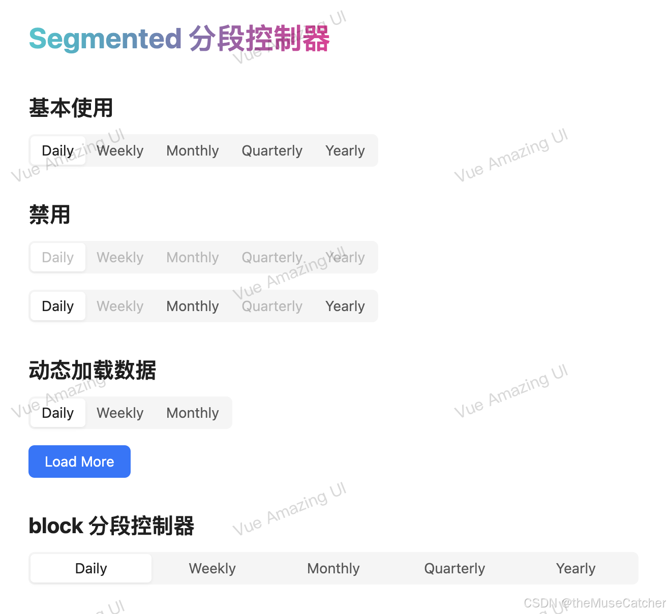
<h2 class="mt30 mb10">基本使用</h2>
<Segmented v-model:value="value" :options="options" @change="onChange" />
<h2 class="mt30 mb10">禁用</h2>
<Space vertical>
<Segmented v-model:value="value" disabled :options="options" />
<Segmented v-model:value="value2" :options="optionsDisabled" />
</Space>
<h2 class="mt30 mb10">动态加载数据</h2>
<Space vertical>
<Segmented v-model:value="dynamicValue" :options="dynamicOptions" />
<Button type="primary" :loading="loading" :disabled="disabled" @click="loadMore">Load More</Button>
</Space>
<h2 class="mt30 mb10">block 分段控制器</h2>
<Space :width="600">
<Segmented v-model:value="value" block :options="options" />
</Space>
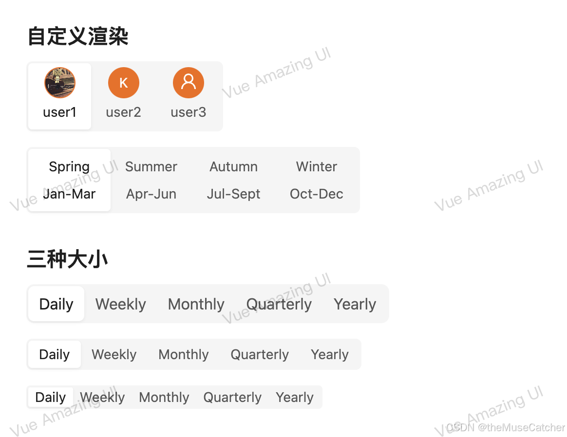
<h2 class="mt30 mb10">自定义渲染</h2>
<Space vertical>
<Segmented v-model:value="customValue" :options="customOptions1">
<template #label="{ label, payload = {} }">
<div style="padding: 4px">
<template v-if="payload.icon">
<Avatar :style="payload.style">
<template #icon>
<svg
focusable="false"
class="u-icon"
data-icon="user"
width="1em"
height="1em"
fill="currentColor"
aria-hidden="true"
viewBox="64 64 896 896"
>
<path
d="M858.5 763.6a374 374 0 00-80.6-119.5 375.63 375.63 0 00-119.5-80.6c-.4-.2-.8-.3-1.2-.5C719.5 518 760 444.7 760 362c0-137-111-248-248-248S264 225 264 362c0 82.7 40.5 156 102.8 201.1-.4.2-.8.3-1.2.5-44.8 18.9-85 46-119.5 80.6a375.63 375.63 0 00-80.6 119.5A371.7 371.7 0 00136 901.8a8 8 0 008 8.2h60c4.4 0 7.9-3.5 8-7.8 2-77.2 33-149.5 87.8-204.3 56.7-56.7 132-87.9 212.2-87.9s155.5 31.2 212.2 87.9C779 752.7 810 825 812 902.2c.1 4.4 3.6 7.8 8 7.8h60a8 8 0 008-8.2c-1-47.8-10.9-94.3-29.5-138.2zM512 534c-45.9 0-89.1-17.9-121.6-50.4S340 407.9 340 362c0-45.9 17.9-89.1 50.4-121.6S466.1 190 512 190s89.1 17.9 121.6 50.4S684 316.1 684 362c0 45.9-17.9 89.1-50.4 121.6S557.9 534 512 534z"
></path>
</svg>
</template>
{{ payload.content }}
</Avatar>
</template>
<template v-else>
<Avatar :src="payload.src" :style="payload.style">
{{ payload.content }}
</Avatar>
</template>
<div>{{ label }}</div>
</div>
</template>
</Segmented>
<Segmented v-model:value="customValue2" :options="customOptions2">
<template #label="{ payload }">
<div style="padding: 4px 4px">
<div>{{ payload.title }}</div>
<div>{{ payload.subTitle }}</div>
</div>
</template>
</Segmented>
</Space>
<h2 class="mt30 mb10">三种大小</h2>
<Space vertical>
<Segmented v-model:value="value" :options="options" size="large" />
<Segmented v-model:value="value" :options="options" />
<Segmented v-model:value="value" :options="options" size="small" />
</Space>
</div>
</template>
<style lang="less" scoped>
.u-icon {
display: inline-block;
fill: #fff;
}
</style>


 390
390

 被折叠的 条评论
为什么被折叠?
被折叠的 条评论
为什么被折叠?
 到【灌水乐园】发言


