


 本文介绍了一个基于 @vuepic/vue-datepicker 的 Vue3 日期选择器组件,支持多种日期选择模式,并提供丰富的自定义选项。
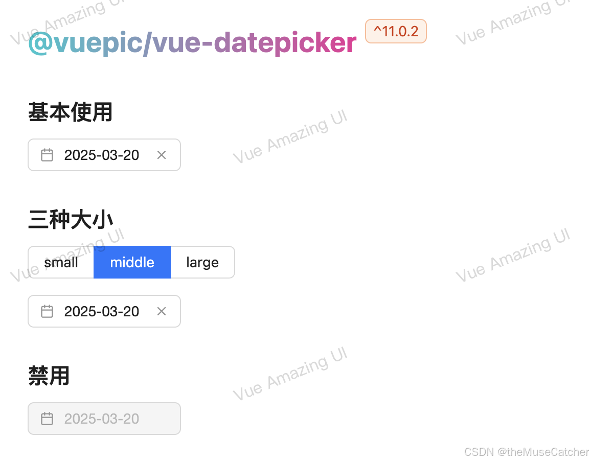
本组件基于 @vuepic/vue-datepicker@11.0.2 进行二次封装,以便更适合日常使用!
官方文档:https://vue3datepicker.com/installation/
除了范围选择器、年选择器以外,其余选择的日期(v-model)均默认返回字符串指定格式日期!
可自定义设置以下二次封装属性(也可根据官方文档设定相应属性,组件已设置继承所有属性):
-
日期选择器宽度(width),类型:string | number,单位 px,默认 150
-
日期选择器大小(size),类型:'small' | 'middle' | 'large',默认 'middle'
-
选择器模式(mode),类型:'time' | 'date' | 'week' | 'month' | 'year',默认 'date'
-
日期展示格式(format),类型:string | ((date: Date) => string) | ((dates: Date[]) => string),默认 DefaultFormat
-
是否增加时间选择(showTime),类型:boolean,默认 false
-
是否展示”今天“按钮(showToday),类型:boolean,默认 false
-
是否使用范围选择器(range),类型:boolean,默认 false
-
范围选择器最长日期可选择范围(maxRange),单位天,类型:number,默认 undefined;仅当 range: true 时生效
-
v-model 值的类型(modelType),类型:'timestamp' | 'format',默认 'format',可选 timestamp:时间戳、format:字符串,mode 为 week 或 year 时,该配置不生效
-
双向绑定值(v-model:modelValue),类型:number | string | object | array,默认 null
更多使用方式还请查阅官方文档,功能设计非常全面,各部分主题颜色也均可自定义修改!
常用官方属性举例:
-
日期展示格式(format),类型:string | ((date: Date) => string) | ((dates: Date[]) => string),默认 DefaultFormat
format 支持的格式化占位符为:
yy: 年, M: 月, d: 天, H: 时, m: 分, s: 秒, w: 周
其中 DefaultFormat 取值如下:
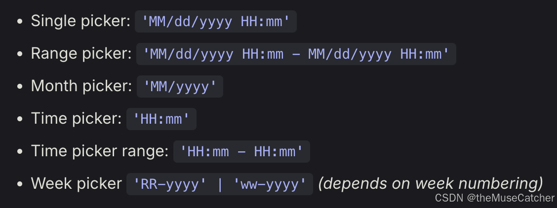
-
范围选择器是否使用双日期面板(multiCalendars),类型:boolean,默认 false
-
定义选择顺序(flow),类型:array,默认 [],可选 ("calendar" | "time" | "month" | "year" | "minutes" | "hours" | "seconds")[]
-
样式主题是否使用黑色(dark),类型:boolean,默认 false
-
是否展示秒选择(enable-seconds),类型:boolean,默认 false
效果如下图:

在线预览
①创建日期选择器组件DatePicker.vue:
其中引入使用了以下工具函数:
<script setup lang="ts">
import VueDatePicker from '@vuepic/vue-datepicker'
import '@vuepic/vue-datepicker/dist/main.css'
import { computed, ref, watch } from 'vue'
import { useInject } from 'components/utils'
export interface Props {
  width?: string | number // 日期选择器宽度,单位 px
  size?: 'small' | 'middle' | 'large' // 日期选择器大小
  mode?: 'time' | 'date' | 'week' | 'month' | 'year' // 选择器模式,可选:时间 time,日期 date,周 week,月 month,年 year
  // format?: string | ((date: Date) => string) | ((dates: Date[]) => string) // 日期展示格式,(yy: 年, M: 月, d: 天, H: 时, m: 分, s: 秒, w: 周)
  showTime?: boolean // 是否增加时间选择
  showToday?: boolean // 是否展示”今天“按钮
  range?: boolean // 是否使用范围选择器
  maxRange?: number // 范围选择器最长日期可选择范围,单位天,仅当 range: true 时生效
  // multiCalendars?: boolean // 范围选择器是否使用双日期面板
  // flow?: any[] // 定义选择顺序 ("calendar" | "time" | "month" | "year" | "minutes" | "hours" | "seconds")[]
  // dark?: boolean // 样式主题是否使用黑色
  modelType?: 'timestamp' | 'format' // v-model 值类型,可选 timestamp: 时间戳、format: 字符串,mode 为 week 或 year 时,该配置不生效
}
const props = withDefaults(defineProps<Props>(), {
  width: 150,
  size: 'middle',
  mode: 'date',
  /* format default
    Single picker: 'MM/dd/yyyy HH:mm'
    Range picker: 'MM/dd/yyyy HH:mm - MM/dd/yyyy HH:mm'
    Month picker: 'MM/yyyy'
    Time picker: 'HH:mm'
    Time picker range: 'HH:mm - HH:mm'
    Week picker: 'ww-yyyy'
  */
  showTime: false,
  showToday: false,
  range: false,
  maxRange: undefined,
  // multiCalendars: false,
  // flow: () => [],
  // dark: false,
  modelType: 'format'
})
const { colorPalettes, shadowColor } = useInject('DatePicker') // 主题色注入
const datepickerWidth = computed(() => {
  if (typeof props.width === 'number') {
    return `${props.width}px`
  }
  return props.width
})
const time = computed(() => {
  return props.mode === 'time'
})
const week = computed(() => {
  return props.mode === 'week'
})
const month = computed(() => {
  return props.mode === 'month'
})
const year = computed(() => {
  return props.mode === 'year'
})
// const format = (date: Date) => {
//   const day = date.getDate()
//   const month = date.getMonth() + 1
//   const year = date.getFullYear()
//   return `${year}-${month}-${day}`
// }
const startTs = ref<number | null>(null) // 范围选择器的开始时间戳
const rangeTs = computed(() => {
  return (props.maxRange ?? 0) * 24 * 60 * 60 * 1000
})
watch(
  () => props.maxRange,
  () => {
    startTs.value = null
  }
)
function onClosed() {
  startTs.value = null
}
function rangeStart(date: Date) {
  startTs.value = date.getTime()
}
function maxRangeDisabledDates(date: Date): boolean {
  const current = date.getTime()
  if (startTs.value && Math.abs(current - startTs.value) >= rangeTs.value) return true
  return false
}
</script>
<template>
  <VueDatePicker
    class="m-datepicker"
    :class="{
      'datepicker-small': size === 'small',
      'datepicker-large': size === 'large'
    }"
    :style="`
      --datepicker-width: ${datepickerWidth};
      --datepicker-primary-color: ${colorPalettes[5]};
      --datepicker-primary-color-hover: ${colorPalettes[4]};
      --datepicker-primary-color-focus: ${colorPalettes[4]};
      --datepicker-primary-shadow-color: ${shadowColor};
    `"
    locale="zh-CN"
    position="left"
    :month-change-on-scroll="false"
    :enable-time-picker="showTime"
    :time-picker="time"
    :week-picker="week"
    :month-picker="month"
    :year-picker="year"
    :range="range"
    now-button-label="今天"
    :show-now-button="showToday"
    auto-apply
    text-input
    :model-type="modelType"
    :day-names="['一', '二', '三', '四', '五', '六', '七']"
    :disabled-dates="range && maxRange ? maxRangeDisabledDates : []"
    @range-start="rangeStart"
    @closed="onClosed"
  />
</template>
<style lang="less" scoped>
.m-datepicker {
  display: inline-block;
  width: var(--datepicker-width);
  :deep(.dp__input_wrap) {
    svg {
      fill: currentColor;
    }
    .dp__input {
      line-height: 1.5714285714285714;
    }
    :deep(.dp__input:hover:not(.dp__disabled)) {
      border-color: var(--dp-border-color-hover);
    }
    .dp__disabled {
      color: rgba(0, 0, 0, 0.25);
      cursor: not-allowed;
      &:hover {
        border-color: var(--dp-border-color);
      }
    }
    .dp__input_focus {
      box-shadow: 0 0 0 2px var(--datepicker-primary-shadow-color);
    }
  }
  :deep(.dp__outer_menu_wrap) {
    .dp__menu {
      overflow: hidden;
      border: none;
      border-radius: 8px;
      box-shadow:
        0 6px 16px 0 rgba(0, 0, 0, 0.08),
        0 3px 6px -4px rgba(0, 0, 0, 0.12),
        0 9px 28px 8px rgba(0, 0, 0, 0.05);
      .dp__arrow_top,
      .dp__arrow_bottom {
        display: none;
      }
      .dp__overlay {
        padding-top: 8px;
        .dp__overlay_container::-webkit-scrollbar-thumb {
          border-radius: 5px;
          cursor: pointer;
          background-color: var(--dp-scroll-bar-color);
          transition: background-color 0.2s cubic-bezier(0.4, 0, 0.2, 1);
          &:hover {
            background-color: rgba(0, 0, 0, 0.4);
          }
        }
      }
      .dp__cell_offset.dp__range_start {
        color: var(--dp-primary-text-color);
      }
      .dp__cell_disabled.dp__date_hover {
        &:hover {
          background: transparent;
          color: var(--dp-secondary-color);
        }
      }
      .dp__cell_disabled.dp__today {
        background: transparent;
        border: 1px solid var(--dp-secondary-color);
      }
      .dp__cell_disabled.dp__active_date {
        color: rgba(0, 0, 0, 0.45);
        border-color: var(--dp-secondary-color);
      }
      .dp__range_between {
        &:not(.dp__today) {
          border-color: transparent;
        }
        &.dp__cell_disabled {
          background: transparent;
          color: var(--dp-secondary-color);
        }
      }
    }
  }
}
// CSS variables
.m-datepicker {
  /*General*/
  --dp-font-family:
    -apple-system, blinkmacsystemfont, 'Segoe UI', roboto, oxygen, ubuntu, cantarell, 'Open Sans', 'Helvetica Neue',
    sans-serif;
  --dp-border-radius: 6px; /*Configurable border-radius*/
  --dp-cell-border-radius: 4px; /*Specific border radius for the calendar cell*/
  // --dp-common-transition: all 0.1s ease-in; /*Generic transition applied on buttons and calendar cells*/
  --dp-common-transition: all 0.2s ease; /*Generic transition applied on buttons and calendar cells*/
  /*Sizing*/
  --dp-button-height: 35px; /*Size for buttons in overlays*/
  --dp-month-year-row-height: 35px; /*Height of the month-year select row*/
  --dp-month-year-row-button-size: 35px; /*Specific height for the next/previous buttons*/
  --dp-button-icon-height: 20px; /*Icon sizing in buttons*/
  --dp-cell-size: 35px; /*Width and height of calendar cell*/
  --dp-cell-padding: 5px; /*Padding in the cell*/
  --dp-common-padding: 10px; /*Common padding used*/
  --dp-input-icon-padding: 35px; /*Padding on the left side of the input if icon is present*/
  --dp-input-padding: 4px 30px 4px 12px; /*Padding in the input*/
  --dp-menu-min-width: 260px; /*Adjust the min width of the menu*/
  --dp-action-buttons-padding: 2px 5px; /*Adjust padding for the action buttons in action row*/
  --dp-row-margin: 5px 0; /*Adjust the spacing between rows in the calendar*/
  --dp-calendar-header-cell-padding: 0.5rem; /*Adjust padding in calendar header cells*/
  --dp-two-calendars-spacing: 10px; /*Space between multiple calendars*/
  --dp-overlay-col-padding: 3px; /*Padding in the overlay column*/
  --dp-time-inc-dec-button-size: 32px; /*Sizing for arrow buttons in the time picker*/
  --dp-menu-padding: 6px 8px; /*Menu padding*/
  /*Font sizes*/
  --dp-font-size: 14px; /*Default font-size*/
  --dp-preview-font-size: 12px; /*Font size of the date preview in the action row*/
  --dp-time-font-size: 28px; /*Font size in the time picker*/
  /*Transitions*/
  --dp-animation-duration: 0.2s; /*Transition duration*/
  --dp-menu-appear-transition-timing: cubic-bezier(0.4, 0, 0.2, 1); /*Timing on menu appear animation*/
  --dp-transition-timing: ease-in-out; /*Timing on slide animations*/
  // 向下弹出时的过渡效果
  .slide-down-enter {
    transform: scale(0);
    transform-origin: 0% 0%;
    opacity: 0;
    animation-timing-function: cubic-bezier(0.23, 1, 0.32, 1);
    animation-duration: 0.2s;
    animation-fill-mode: both;
    animation-play-state: paused;
  }
  .slide-down-enter-active {
    animation-name: slideDownIn;
    animation-play-state: running;
    @keyframes slideDownIn {
      0% {
        transform: scaleY(0.8);
        transform-origin: 0% 0%;
        opacity: 0;
      }
      100% {
        transform: scaleY(1);
        transform-origin: 0% 0%;
        opacity: 1;
      }
    }
  }
  .slide-down-leave {
    animation-timing-function: cubic-bezier(0.755, 0.05, 0.855, 0.06);
    animation-duration: 0.2s;
    animation-fill-mode: both;
    animation-play-state: paused;
  }
  .slide-down-leave-active {
    animation-name: slideDownOut;
    animation-play-state: running;
    @keyframes slideDownOut {
      0% {
        transform: scaleY(1);
        transform-origin: 0% 0%;
        opacity: 1;
      }
      100% {
        transform: scaleY(0.8);
        transform-origin: 0% 0%;
        opacity: 0;
      }
    }
  }
  :deep(.dp-menu-appear-bottom-enter-active, .dp-slide-down-enter-active) {
    .slide-down-enter();
  }
  :deep(.dp-menu-appear-bottom-leave-active, .dp-slide-down-leave-active) {
    .slide-down-leave();
    .slide-down-leave-active();
  }
  :deep(.dp-menu-appear-bottom-enter-from, .dp-slide-down-enter-from) {
    .slide-down-enter();
  }
  :deep(.dp-menu-appear-bottom-enter-to, .dp-slide-down-enter-to) {
    .slide-down-enter();
    .slide-down-enter-active();
  }
  :deep(.dp-menu-appear-bottom-leave-from, .dp-slide-down-leave-from) {
    .slide-down-leave();
  }
  :deep(.dp-menu-appear-bottom-leave-to, .dp-slide-down-leave-to) {
    .slide-down-leave();
    .slide-down-leave-active();
  }
  // 向上弹出时的过渡效果
  .slide-up-enter {
    transform: scale(0);
    transform-origin: bottom left;
    opacity: 0;
    animation-timing-function: cubic-bezier(0.23, 1, 0.32, 1);
    animation-duration: 0.2s;
    animation-fill-mode: both;
    animation-play-state: paused;
  }
  .slide-up-enter-active {
    animation-name: slideUpIn;
    animation-play-state: running;
    @keyframes slideUpIn {
      0% {
        transform: scaleY(0.8);
        transform-origin: bottom left;
        opacity: 0;
      }
      100% {
        transform: scaleY(1);
        transform-origin: bottom left;
        opacity: 1;
      }
    }
  }
  .slide-up-leave {
    animation-timing-function: cubic-bezier(0.755, 0.05, 0.855, 0.06);
    animation-duration: 0.2s;
    animation-fill-mode: both;
    animation-play-state: paused;
  }
  .slide-up-leave-active {
    animation-name: slideUpOut;
    animation-play-state: running;
    @keyframes slideUpOut {
      0% {
        transform: scaleY(1);
        transform-origin: bottom left;
        opacity: 1;
      }
      100% {
        transform: scaleY(0.8);
        transform-origin: bottom left;
        opacity: 0;
      }
    }
  }
  :deep(.dp-menu-appear-top-enter-active, .dp-slide-up-enter-active) {
    .slide-up-enter();
  }
  :deep(.dp-menu-appear-top-leave-active, .dp-slide-up-leave-active) {
    .slide-up-leave();
    .slide-up-leave-active();
  }
  :deep(.dp-menu-appear-top-enter-from, .dp-slide-up-enter-from) {
    .slide-up-enter();
  }
  :deep(.dp-menu-appear-top-enter-to, .dp-slide-up-enter-to) {
    .slide-up-enter();
    .slide-up-enter-active();
  }
  :deep(.dp-menu-appear-top-leave-from, .dp-slide-up-leave-from) {
    .slide-up-leave();
  }
  :deep(.dp-menu-appear-top-leave-to, .dp-slide-up-leave-to) {
    .slide-up-leave();
    .slide-up-leave-active();
  }
}
.datepicker-small {
  --dp-input-padding: 0px 30px 0px 12px;
}
.datepicker-large {
  --dp-font-size: 16px;
  :deep(.dp__input_wrap) {
    .dp__input {
      height: 40px;
    }
  }
}
// dark theme configuration
.dp__theme_dark,
:deep(.dp__theme_dark) {
  --dp-background-color: #212121;
  --dp-text-color: #fff;
  --dp-hover-color: #484848;
  --dp-hover-text-color: #fff;
  --dp-hover-icon-color: #959595;
  // --dp-primary-color: #005cb2;
  --dp-primary-color: #1668dc;
  --dp-primary-disabled-color: #61a8ea;
  --dp-primary-text-color: #fff;
  --dp-secondary-color: #a9a9a9;
  --dp-border-color: #2d2d2d;
  --dp-menu-border-color: #2d2d2d;
  --dp-border-color-hover: #aaaeb7;
  --dp-border-color-focus: #aaaeb7;
  --dp-disabled-color: #737373;
  --dp-disabled-color-text: #d0d0d0;
  --dp-scroll-bar-background: #212121;
  --dp-scroll-bar-color: #484848;
  --dp-success-color: #00701a;
  --dp-success-color-disabled: #428f59;
  --dp-icon-color: #959595;
  --dp-danger-color: #e53935;
  --dp-marker-color: #e53935;
  --dp-tooltip-color: #3e3e3e;
  --dp-highlight-color: rgb(0 92 178 / 20%);
  --dp-range-between-dates-background-color: var(--dp-hover-color, #484848);
  --dp-range-between-dates-text-color: var(--dp-hover-text-color, #fff);
  --dp-range-between-border-color: var(--dp-hover-color, #fff);
}
// light theme configuration
.dp__theme_light,
:deep(.dp__theme_light) {
  --dp-background-color: #fff;
  // --dp-text-color: #212121;
  --dp-text-color: rgba(0, 0, 0, 0.88);
  // --dp-hover-color: #f3f3f3;
  --dp-hover-color: rgba(0, 0, 0, 0.04);
  // --dp-hover-text-color: #212121;
  --dp-hover-text-color: rgba(0, 0, 0, 0.88);
  --dp-hover-icon-color: #959595;
  // --dp-primary-color: #1976d2;
  --dp-primary-color: var(--datepicker-primary-color);
  --dp-primary-disabled-color: #6bacea;
  // --dp-primary-text-color: #f8f5f5;
  --dp-primary-text-color: #fff;
  // --dp-secondary-color: #c0c4cc;
  --dp-secondary-color: rgba(0, 0, 0, 0.25);
  // --dp-border-color: #ddd;
  --dp-border-color: #d9d9d9;
  // --dp-menu-border-color: #ddd;
  --dp-menu-border-color: #d9d9d9;
  // --dp-border-color-hover: #aaaeb7;
  --dp-border-color-hover: var(--datepicker-primary-color-hover);
  // --dp-border-color-focus: #aaaeb7;
  --dp-border-color-focus: var(--datepicker-primary-color-focus);
  // --dp-disabled-color: #f6f6f6;
  --dp-disabled-color: rgba(0, 0, 0, 0.04);
  // --dp-scroll-bar-background: #f3f3f3;
  --dp-scroll-bar-background: transparent;
  // --dp-scroll-bar-color: #959595;
  --dp-scroll-bar-color: rgba(0, 0, 0, 0.25);
  --dp-success-color: #76d275;
  --dp-success-color-disabled: #a3d9b1;
  --dp-icon-color: #959595;
  --dp-danger-color: #ff6f60;
  --dp-marker-color: #ff6f60;
  --dp-tooltip-color: #fafafa;
  --dp-disabled-color-text: #8e8e8e;
  --dp-highlight-color: rgb(25 118 210 / 10%);
  // --dp-range-between-dates-background-color: var(--dp-hover-color, #f3f3f3);
  --dp-range-between-dates-background-color: rgba(0, 0, 0, 0.04);
  // --dp-range-between-dates-text-color: var(--dp-hover-text-color, #212121);
  --dp-range-between-dates-text-color: rgba(0, 0, 0, 0.88);
  // --dp-range-between-border-color: var(--dp-hover-color, #f3f3f3);
  --dp-range-between-border-color: rgba(0, 0, 0, 0.04);
}
</style>
②在要使用的页面引入:
其中引入使用了以下组件:
<script setup lang="ts">
import DatePicker from './DatePicker.vue'
import pkg from '/package.json'
import { ref, watchEffect, computed } from 'vue'
import {
format,
endOfDay,
endOfMonth,
endOfYear,
startOfMonth,
startOfYear,
subMonths,
addDays,
startOfWeek,
endOfWeek,
addHours,
addMinutes,
addSeconds,
getMonth,
addMonths
} from 'date-fns'
const dateValue = ref(format(new Date(), 'yyyy-MM-dd'))
const dateTimeValue = ref(format(new Date(), 'yyyy-MM-dd HH:mm:ss'))
const rangeValue = ref<string[]>([format(new Date(), 'yyyy-MM-dd'), format(addDays(new Date(), 3), 'yyyy-MM-dd')])
const rangeTimeValue = ref<string[]>([
format(new Date(), 'yyyy-MM-dd HH:mm:ss'),
format(addDays(new Date(), 3), 'yyyy-MM-dd HH:mm:ss')
])
const maxRangeValue = ref<string[]>([format(new Date(), 'yyyy-MM-dd'), format(addDays(new Date(), 6), 'yyyy-MM-dd')])
const timeRangeValue = ref([
{
hours: new Date().getHours(),
minutes: new Date().getMinutes(),
seconds: new Date().getSeconds()
},
{
hours: addHours(Date.now(), 1).getHours(),
minutes: addMinutes(Date.now(), 10).getMinutes(),
seconds: addSeconds(Date.now(), 30).getSeconds()
}
])
const presetDates = ref([
{ label: 'Today', value: [new Date(), new Date()] },
{ label: 'This month', value: [startOfMonth(new Date()), endOfMonth(new Date())] },
{
label: 'Last month',
value: [startOfMonth(subMonths(new Date(), 1)), endOfMonth(subMonths(new Date(), 1))]
},
{ label: 'This year', value: [startOfYear(new Date()).getTime(), endOfYear(new Date()).getTime()] }
])
const timeValue = ref({
hours: new Date().getHours(),
minutes: new Date().getMinutes()
})
const secondsValue = ref({
hours: new Date().getHours(),
minutes: new Date().getMinutes(),
seconds: new Date().getSeconds()
})
// startOfWeek & endOfWeek 默认以周日作为一周的开始,可以传递一个选项对象,以周一作为一周的开始:{ weekStartsOn: 1 }
const options: any = { weekStartsOn: 1 }
const weekValue = ref([startOfWeek(new Date(), options), endOfWeek(new Date(), options)])
const monthValue = ref({
year: new Date().getFullYear(),
month: new Date().getMonth()
})
const yearValue = ref(new Date().getFullYear())
const sizeOptions = [
{
label: 'small',
value: 'small'
},
{
label: 'middle',
value: 'middle'
},
{
label: 'large',
value: 'large'
}
]
const size = ref('middle')
watchEffect(() => {
console.log('dateValue', dateValue.value)
})
watchEffect(() => {
console.log('dateTimeValue', dateTimeValue.value)
})
watchEffect(() => {
console.log('rangeValue', rangeValue.value)
})
watchEffect(() => {
console.log('rangeTimeValue', rangeTimeValue.value)
})
watchEffect(() => {
console.log('maxRangeValue', maxRangeValue.value)
})
watchEffect(() => {
console.log('timeRangeValue', timeRangeValue.value)
})
watchEffect(() => {
console.log('timeValue', timeValue.value)
})
watchEffect(() => {
console.log('secondsValue', secondsValue.value)
})
watchEffect(() => {
console.log('weekValue', weekValue.value)
})
watchEffect(() => {
console.log('monthValue', monthValue.value)
})
watchEffect(() => {
console.log('yearValue', yearValue.value)
})
function disabledDates(date: Date): boolean {
const current = date.getTime()
if (endOfDay(new Date()).getTime() < current && current <= endOfDay(addDays(new Date(), 7)).getTime()) {
return false
}
return true
}
function disabledDatesNextWeek(date: Date): boolean {
const current = date.getTime()
if (endOfDay(new Date()).getTime() < current && current <= endOfDay(addDays(new Date(), 7)).getTime()) {
return true
}
return false
}
interface Filters {
months?: number[] // 0 = Jan, 11 - Dec
years?: number[] // Array of years to disable
times?: {
hours?: number[] // disable specific hours
minutes?: number[] // disable sepcific minutes
seconds?: number[] // disable specific seconds
}
}
const filters = computed<Filters>(() => {
return {
months: [0, 1, 2].map((index: number) => getMonth(addMonths(new Date(), index + 1)))
}
})
</script>
<template>
<div>
<h1>{{ $route.name }} {{ $route.meta.title }}</h1>
<ul class="m-list">
<li>
<a class="u-file" href="https://vue3datepicker.com/" target="_blank">Vue Datepicker</a>
</li>
<li>
<a class="u-file" href="https://vue3datepicker.com/installation/" target="_blank">Vue Datepicker Documents</a>
</li>
<li>
<a class="u-file" href="https://date-fns.org/" target="_blank">date-fns</a>
</li>
</ul>
<Space class="mt30" gap="small">
<h1>@vuepic/vue-datepicker</h1>
<Tag color="volcano">{{ pkg.dependencies['@vuepic/vue-datepicker'] }}</Tag>
</Space>
<h2 class="mt30 mb10">基本使用</h2>
<DatePicker v-model="dateValue" format="yyyy-MM-dd" placeholder="请选择日期" />
<h2 class="mt30 mb10">三种大小</h2>
<Space vertical>
<Radio :options="sizeOptions" v-model:value="size" button button-style="solid" />
<DatePicker :size="size" v-model="dateValue" format="yyyy-MM-dd" placeholder="请选择日期" />
</Space>
<h2 class="mt30 mb10">禁用</h2>
<DatePicker disabled v-model="dateValue" format="yyyy-MM-dd" placeholder="请选择日期" />
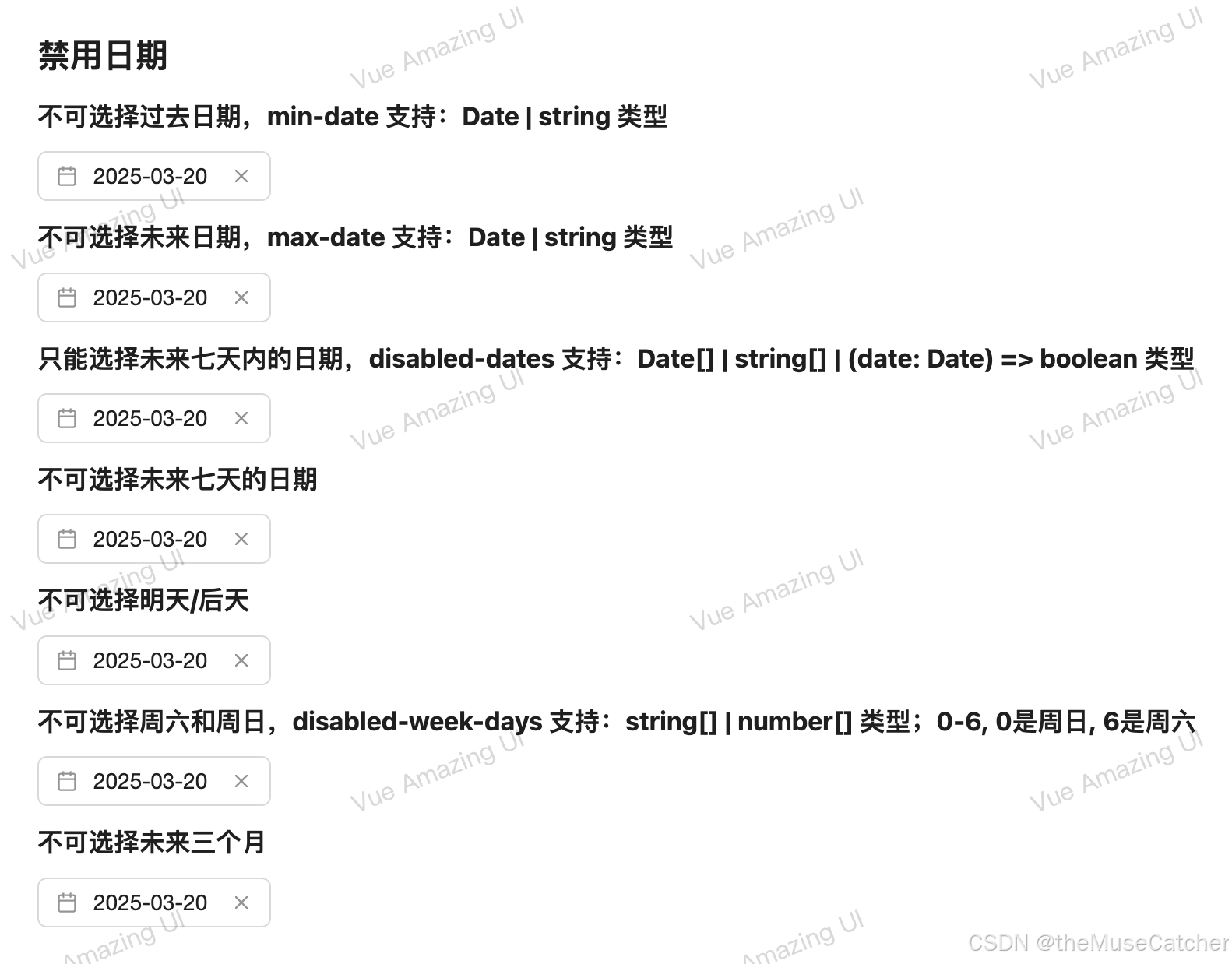
<h2 class="mt30 mb10">禁用日期</h2>
<h3 class="mb10">不可选择过去日期,min-date 支持:Date | string 类型</h3>
<DatePicker v-model="dateValue" :min-date="new Date()" format="yyyy-MM-dd" placeholder="请选择日期" />
<h3 class="mt10 mb10">不可选择未来日期,max-date 支持:Date | string 类型</h3>
<DatePicker
v-model="dateValue"
:max-date="format(new Date(), 'yyyy-MM-dd')"
format="yyyy-MM-dd"
placeholder="请选择日期"
/>
<h3 class="mt10 mb10"
>只能选择未来七天内的日期,disabled-dates 支持:Date[] | string[] | (date: Date) => boolean 类型</h3
>
<DatePicker v-model="dateValue" :disabled-dates="disabledDates" format="yyyy-MM-dd" placeholder="请选择日期" />
<h3 class="mt10 mb10">不可选择未来七天的日期</h3>
<DatePicker
v-model="dateValue"
:disabled-dates="disabledDatesNextWeek"
format="yyyy-MM-dd"
placeholder="请选择日期"
/>
<h3 class="mt10 mb10">不可选择明天/后天</h3>
<DatePicker
v-model="dateValue"
:disabled-dates="[addDays(new Date(), 1), addDays(new Date(), 2)]"
format="yyyy-MM-dd"
placeholder="请选择日期"
/>
<h3 class="mt10 mb10"
>不可选择周六和周日,disabled-week-days 支持:string[] | number[] 类型;0-6, 0是周日, 6是周六</h3
>
<DatePicker v-model="dateValue" :disabled-week-days="[0, 6]" format="yyyy-MM-dd" placeholder="请选择日期" />
<h3 class="mt10 mb10">不可选择未来三个月,filters 支持:Filters 类型</h3>
<DatePicker v-model="dateValue" :filters="filters" format="yyyy-MM-dd" placeholder="请选择日期" />
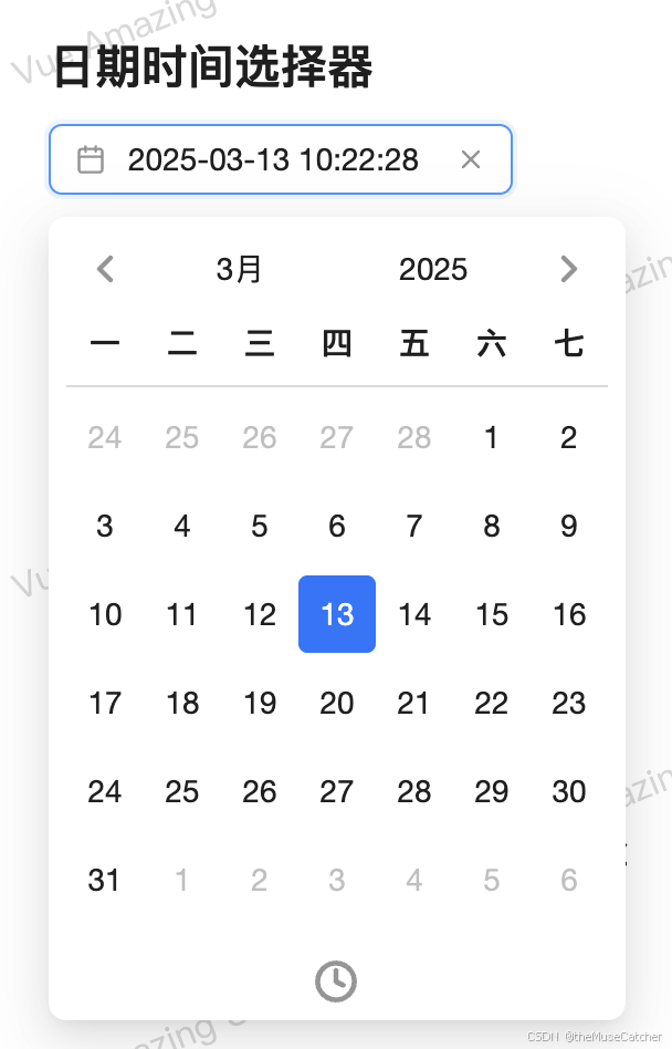
<h2 class="mt30 mb10">日期时间选择器</h2>
<DatePicker
:width="210"
v-model="dateTimeValue"
format="yyyy-MM-dd HH:mm:ss"
show-time
enable-seconds
placeholder="请选择日期时间"
/>
<h2 class="mt30 mb10">日期范围选择器</h2>
<DatePicker :width="240" v-model="rangeValue" range format="yyyy-MM-dd" placeholder="请选择日期范围" />
<h2 class="mt30 mb10">双日期面板</h2>
<DatePicker
:width="240"
v-model="rangeValue"
format="yyyy-MM-dd"
range
multi-calendars
placeholder="请选择日期范围"
/>
<h2 class="mt30 mb10">日期时间范围选择器</h2>
<DatePicker
:width="350"
v-model="rangeTimeValue"
range
show-time
enable-seconds
multi-calendars
format="yyyy-MM-dd HH:mm:ss"
placeholder="请选择日期时间范围"
/>
<h2 class="mt30 mb10">预设范围</h2>
<h3 class="mb10">预设常用的日期范围以提高用户体验</h3>
<DatePicker
:width="240"
v-model="rangeValue"
format="yyyy-MM-dd"
range
:preset-dates="presetDates"
multi-calendars
placeholder="请选择日期范围"
/>
<h2 class="mt30 mb10">自定义最长日期可选择范围</h2>
<h3 class="mb10">最长日期可选范围不超过7天</h3>
<DatePicker
:width="240"
v-model="maxRangeValue"
format="yyyy-MM-dd"
range
:max-range="7"
placeholder="请选择日期范围"
/>
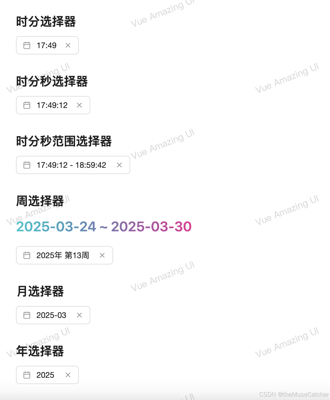
<h2 class="mt30 mb10">时分选择器</h2>
<DatePicker
:width="110"
v-model="timeValue"
mode="time"
show-time
mode-height="120"
format="HH:mm"
placeholder="请选择时间"
/>
<h2 class="mt30 mb10">时分秒选择器</h2>
<DatePicker
:width="130"
v-model="secondsValue"
mode="time"
format="HH:mm:ss"
show-time
enable-seconds
mode-height="120"
placeholder="请选择时间"
/>
<h2 class="mt30 mb10">时分秒范围选择器</h2>
<DatePicker
:width="200"
v-model="timeRangeValue"
mode="time"
format="HH:mm:ss"
show-time
range
enable-seconds
mode-height="120"
placeholder="请选择时间"
/>
<h2 class="mt30 mb10">周选择器</h2>
<Space vertical>
<GradientText
:size="24"
:weight="600"
:gradient="{
deg: '90deg',
from: '#09c8ce',
to: '#eb2f96'
}"
>
{{ format(weekValue[0], 'yyyy-MM-dd') + ' ~ ' + format(weekValue[1], 'yyyy-MM-dd') }}
</GradientText>
<DatePicker :width="170" v-model="weekValue" mode="week" format="yyyy年 第ww周" placeholder="请选择周" />
</Space>
<h2 class="mt30 mb10">月选择器</h2>
<DatePicker :width="130" v-model="monthValue" mode="month" format="yyyy-MM" placeholder="请选择月" />
<h2 class="mt30 mb10">年选择器</h2>
<DatePicker :width="110" v-model="yearValue" mode="year" format="yyyy" placeholder="请选择年" />
</div>
</template>


 扫一扫
扫一扫


 259
259

 被折叠的 条评论
为什么被折叠?
被折叠的 条评论
为什么被折叠?
 到【灌水乐园】发言


