


第七章 css3特性
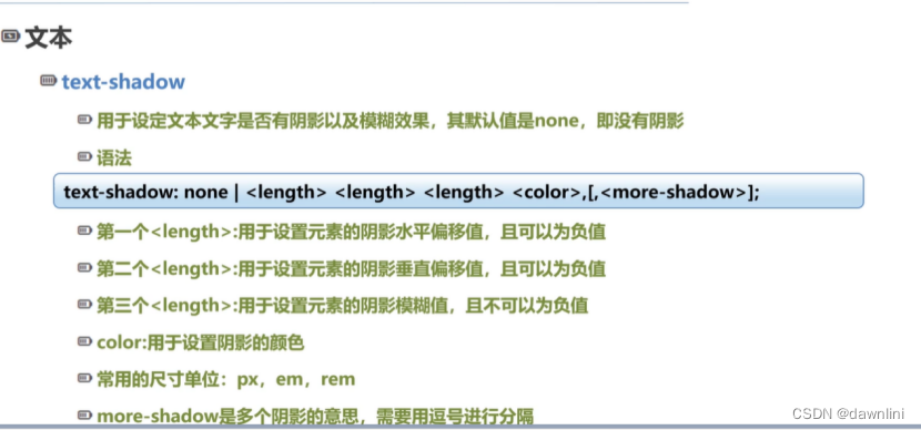
7.1文本text-shadow
<style type="text/css">
.shadow-1{
color: wheat;
/*x轴的偏移量、y轴的偏移量、阴影的模糊半径、 阴影的颜色*/
/*x、y正负设置偏移方向*/
/*只用来修饰文字,不用来修饰盒子模型*/
text-shadow: 2px 2px 5px crimson;
}
.shadow-2/*盒子的阴影*/
{
width: 200px;
height: 200px;
border: wheat;
box-shadow:2px 2px 5px crimson;
}
.shadow-3{
color: pink;
text-shadow:0 0 5px green,0 0 10px blue,0 0 red;
}
.container{
width: 450px;
height: 150px;
text-align: center;
font-size: 16px;
line-height: 150px;
background-color:black;
font-family: "黑体";
}
.shadow-4{
text-shadow: 0 0 5px white,0 -5px 5px #f5ff8b,
0 -10px 10px #ffdd33,0 -15px 10px #cc9900,
0 -20px 10px #ff2200,0 -20px 10px #cc3300;
}
.shadow-5{
color: white;
text-shadow: 0px 1px 1px #999999,
2px 2px 2px #888888,
3px 3px 3px #777777,
4px 4px 4px #666666,
5px 5px 5px #555555,
6px 6px 6px #444444
;
}
</style>
</head>
<body>
<!--文本阴影:IE9以及之前的浏览器不支持此属性-->
<h1 class="shadow-1">普通的文本阴影效果:text-shadow(好处是可以减少图片的使用)</h1>
<div class="shadow-2"></div>
<h1 class="shadow-3">多阴影显示</h1>
<div class="container">
<p class="shadow-4">火焰效果的文字阴影</p>
</div>
<div class="container">
<p class="shadow-5">3D文字效果</p>
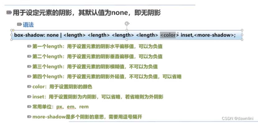
</div>7.2边框 box-shadow
<title>盒子阴影</title>
<style type="text/css">
body{
height: 350vh;/*view height 视口的高度 2.5倍的页面框高度*/
}
div{
width: 200px;
height: 200px;
margin: 0 auto;
border:#cc3300 dotted 1px;
}
.box-shadow-1{
/*offset-x(x轴的偏移量)、 offset-y、 阴影颜色color*/
box-shadow: 60px -20px chartreuse;
}
/*offset-x(x轴的偏移量)、 offset-y、阴影模糊半径(blur-radius)、 阴影颜色 */
.box-shadow-2{
box-shadow: 10px -5px 25px #e87a90;
}
/*offset-x(x轴的偏移量)、 offset-y、阴影模糊半径(blur-radius)、阴影的扩散半径、 阴影颜色 */
/*模糊半径:blur-radius 值越大,阴影就越大且淡*/
/*扩散半径:spread-radius 取正值是阴影扩大,取负值是阴影缩小*/
.box-shadow-3{
box-shadow: 10px -5px 25px 20px rgba(247,92,47,0.6);
}
/*5em表示5倍当前的字号*/
.box-shadow-4{
box-shadow: inset 5em 1em gold;/*inset可以写在开头或者最后*/
}
.box-shadow-5 {
margin-top: 100px;
box-shadow: -20px 0 20px 20px red,
20px 0 20px 20px blue,
0 -20px 20px orange;;
}
.box-shadow-6{
position: relative;
width: 350px;
background-color: #cccccc;
text-align: center;
line-height: 36px;
border: none;
border-radius: 20px;/*圆角效果*/
box-shadow: 0 1px 5px rgba(0 0 0 0.3),
inset 0 0 20px rgba(0 0 0 0.1)
;
}
.box-shadow-6:before,.box-shadow-6:after{
content: "";
position: absolute;
width: 175px;
height: 100px;
left: 10px;
bottom: 15px;
box-shadow: 0 15px 10px rgba(0 0 0 0.7);
transform: rotate(-3deg);/*旋转-3度*/
z-index: -1;/*Z轴坐标越小,离用户越远*/
}
.box-shadow-6:after{
right: 10px;
left:auto;
transform: rotate(3deg);/*旋转3度*/
}
</style>
</head>
<body>
<div class="box-shadow-1"></div>
<div class="box-shadow-2"></div>
<div class="box-shadow-3"></div>
<div class="box-shadow-4">向内扩散的阴影</div>
<div class="box-shadow-5">多重阴影</div>
<h1>下面是阴影的实例</h1>
<div class="box-shadow-6">逼真的阴影效果</div>
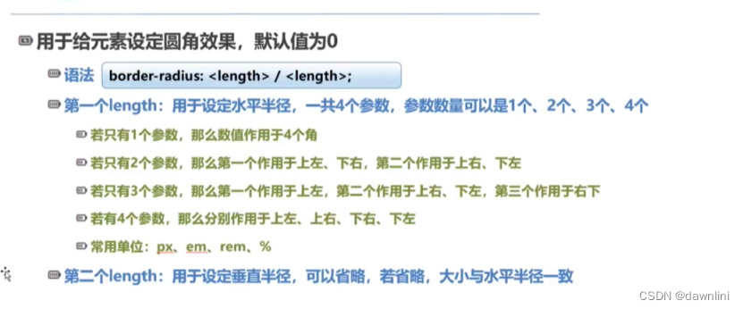
</body>7.3 border-radius
<title>边框半径属性</title>

  <style type="text/css">

    body{

      height: 350vh;

    }

    div{

      width: 350px;

      height: 200px;

      text-align: center;

      line-height: 32px;

      border: #ff2200 solid 1px;

    }

    /*50px/25px 垂直半径/水平半径*/

    .border-radius-1{

      border-radius: 50px/25px;

    }

    .border-radius-2{

      border-radius: 25px 50px;

    }

    .border-radius-3{

      border-radius: 25px 50px 125px;

    }

    .border-radius-4{

      border-radius: 25px 50px 75px 100px;

    }

    .border-radius-5{

      width: 350px;

      height: 350px;

      border-radius:50%;

    }

    /*可重用的按钮样式*/

    .button{

      display: inline-block;

      padding: 6px 12px;

      background-color: #ebebeb;

      border: transparent solid 1px;

      border-radius: 4px;


    }

    .button:hover{

      background-color: #999999;

      cursor: pointer;/*手*/

    }

    .btn-primary{/*普通按钮*/

      color: white;

      background-color: #428bca;

    }

    .btn-primary:hover{

      background-color: #428bca;

      box-shadow: inset 2px 2px cornflowerblue;

    }

    .btn-success{

      color: white;

      background-color: #47a447;

    }

    .btn-lg{

      padding: 10px 16px;

        font-size: 18px;

        /*1.5倍行高 与150%的区别*/

        /*150%:是根据父元素的字体大小计算出的行高=1.5em*/

        /*1.5:根据子元素自己的字体大小乘以1.5来计算行高*/

        line-height: 1.33;/*按钮变大的设置*/

    }

    .btn-sm{

        padding: 5px 10px;

        font-size: 12px;

        line-height: 1.5;

    }

  </style>

</head>

<body>

<div class="border-radius-1">一个参数:数值默认作用于四个角</div>

<div class="border-radius-2">两个参数:上左下右|上右下左 设置对角线</div>

<div class="border-radius-3">三个参数:上左|上右下左 |右下</div>

<div class="border-radius-4">四个参数:分别设置四个角的半径 顺时针方向</div>

<h1>仿Bootstrap的按钮样:着重体会可重用样式技巧</h1>

<button class="button">默认按钮</button>

<button class="button btn-primary ">普通按钮</button>

<button class="button btn-success ">成功按钮</button>

<button class="button btn-primary btn-lg">大按钮</button>

<button class="button btn-primary btn-sm">小按钮</button>

</body>
7.4背景
<title>设定背景图片的大小</title>

  <style type="text/css">

    .background-size-1,.background-size-2,.background-size-3,.background-size-4{

      width: 1902px;

      min-height: 1080px;

      background-image: url("images/夏威夷.jpg");

      background-size: auto;

      text-align: center;

      color: black;

      font-weight: bolder;

      line-height: 36px;

      margin:100px;

    }

    .background-size-2{

      /*为了观察包含的效果,要修改宽和高*/

      /*容器的宽度缩小,容器的宽度增加图片会随着更小的属性等比例缩放*/

      /*如果设置的边框大于图片本身边框按照小的那个等比例放大*/

      background-size: contain;

      width:500px;

      height: 1000px;

      background-repeat: no-repeat;

      border:crimson solid 1px;

      background-position: center center;/*可以让背景图片居中*/

    }

    .background-size-3{

      /*图片会随着更大的属性进行等比例缩放,

      如果小于图片原来的大小变宽设置,则按照原来的图片比例填充,不会等比例缩小*/

      width: 500px;

      height: 200px;

      background-repeat: no-repeat;

      background-size: cover;

      border:crimson solid 1px;

    }

    .background-size-4{

      width: 150px;

      height: 500px;

      background-repeat: no-repeat;

      background-size: contain;

    }

  </style>

</head>

<body>

<!--

  background-size:

  auto是默认值

  Contain:缩小图片来适应元素的尺寸(可以保持图像的宽高比)

Cover:图片会随着更大的属性进行等比例缩放,

     如果小于图片原来的大小变宽设置,则按照原来的图片比例填充,不会等比例缩小

<div class="background-size-1"></div>

<div class="background-size-2">

  contain;缩小图片来适应元素的尺寸(可以保持图像的宽高比)

</div>

<div class="background-size-3"></div>

<div class="background-size-4"></div>
7.5腾讯PVP首页练习
 <style type="text/css">

    body{

      padding: 0;

      margin: 0;

    }

    .page-content{

      position: relative;

      width: 100%;

      min-height: 2100px;

    }

    .page-background{/*背景图片层*/

        position: absolute;

        left: 0; top:0;

        z-index: -1;/*设置z轴坐标为负数,以便显示其他的组件*/

        width: 100%;

        height: 1100px;

        background-size: cover;

        background-image: url("images/王者荣耀首页背景图片.jpg");

        background-repeat: no-repeat;

        background-position: center top;

    }

    .b1{

      border: #ff2200 dotted 1px;

    }

    .abs-link{

        position: absolute;

        width: 1200px;

        min-height: 455px;/*自己测量得出*/

        top:90px;

        left:50%;/*50%宽,x坐标为当前页面的中间点*/

        margin-left: -600px;/*因为自己的宽是1200px,往左边移动600px就一定是当前页面的终点*/

        text-indent: -9999px;/*缩进一个不可能的值,用来隐藏文字*/

    }

    /*以下是正常布局元素*/

    .page-main{

        width: 1200px;

        min-height: 800px;

        margin: 550px auto auto auto;

        /*background-color: #f5ff8b;*/

    }

    .page-main-top{

        width: 100%;

        min-height: 340px;

        background-image: url("images/img.png");

        background-position: left top;

        background-repeat:no-repeat;

        color: white;

    }


  </style>

</head>

<body>

<div class="page-content b1">

  <!--设置成为绝对定位,专门用来设置大背景图片-->

  <div class="page-background"></div>

  <a  class="abs-link b1" href="#" title="进入爆料站">写啥都可以,最后看不到</a>

  <!-- 下面是网页的正常布局-->

  <div class="page-main">

    <div class="page-main-top">

        添加左中右的布局

    </div>

  </div>

</div>
7.6背景图片固定属性补充
<title>固定的背景图片</title>
<style type="text/css">
body{
background-image: url("images/夏威夷.jpg");
background-repeat: no-repeat;
background-position: center;
/*设置背景图像是否固定或者随着页面的其余部分滚动*/
background-attachment: fixed;
}
</style>
</head>
<body>
<div class="content" style="min-height: 2000px">
全局布局层
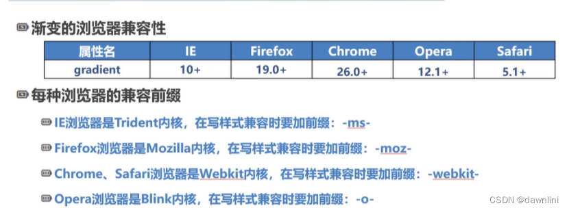
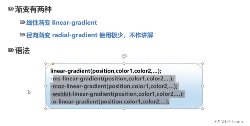
</div>7.7背景 渐变
background:-webkit-gradient(linear,left top, left bottom,from(pink),to(black));//谷歌
background:-o-linear-gradient(top,pink,black);
background:linear-gradient(to bottom,pink,black);
//利用工具网站 https://autoprefixer.github.io/ 补充前缀
<title>线性渐变示例</title>

  <style type="text/css">

    div{

      width: 900px;

      height: 500px;

      border:orange dotted 1px ;

    }

    /*从上到下的渐变、从白色到黑色*/

    .linear-gradient-1{

      background:linear-gradient(to bottom,pink,black);

    }

    /*对角线渐变*/

    .linear-gradient-2{

      background:linear-gradient(to top left,black,pink);


    }

    .linear-gradient-3{

        background: linear-gradient(to right,#ff0000 121px, #ff7f00 242px,

                                             #ffff00 363px,#00ff00 484px,

                                             #00ffff 605px, #0000ff 762px,

                                             #8b00ff 847px);

    }//这个地方是彩虹色渐变,这里的像素距离是指到原点(起点)像素的距离

    .linear-gradient-4{

        background: linear-gradient(90deg,black 0%,black 25%,

                                          white 25%, white 50%

                                  );

    }


  </style>

</head>

<body>

<!--

    linear-gradient(angle| to size-or-corner,color length,color length)

    to left:设置方向从右向左,相当于270deg

    to right: 设置方向从左向右,相当于90deg

    to top: 设置方向从下到上,相当于0deg

    to bottom:设置方向从上到下,默认值,相当于180deg//竖直为0deg


-->

<div class="linear-gradient-1"></div>

<div class="linear-gradient-2">对角线渐变</div>

<div class="linear-gradient-3">不同颜色的渐变</div>

<div class="linear-gradient-4">

    特殊的渐变效果:颜色之间直接变换,不再有中间的过渡色<br/>

实现思路:下一个颜色在上一个颜色开始的位置,浏览器不再填充颜色

实现了分色块

</div>

</body>
7.8三个属性与盒模型的关系
背景裁切:
主要是填充和边框的关系,背景的裁剪区域
<style type="text/css">

        body{

            margin: 0;

        }

        div{

            width: 100%;

            min-height: 150px;

            border: #ff2200 dotted 20px;

            font-size: 36px;

            line-height: 100px;

            color: #99999999;

            margin:10px 0;

            padding: 20px;

            background: linear-gradient(90deg,red,orange,yellow,green,indigo,blue,violet);

        }

        .Background-Clip-1{

            background-clip: border-box;

        }

        .Background-Clip-2{

            background-clip: padding-box;

        }

        .Background-Clip-3{

            background-clip: content-box;

        }

    </style>

</head>

<body>

<div class="Background-Clip-1">

    默认属性Border-box:裁切的起点从border的外延开始

</div>

<div class="Background-Clip-2">

   padding-box:背景从padding的区域向外裁剪,超过padding的区域背景将会被裁剪掉

</div>

<div class="Background-Clip-2">

    content-box:背景从content的区域向外裁剪,超过content的区域背景将会被裁剪掉

</div>
7.9盒模型 box-size
<title>盒模型的尺寸</title>

  <style type="text/css">

    .container-1{

      width: 350px;

      height: 350px;

      margin: 50px;

      padding: 100px;

      border: orange dotted 1px;

    }

    .container-2{

      width: 350px;

      height: 350px;

      margin: 50px;

      border: orange dotted 1px;

    }

    .border-box{

      width: 350px;

      height: 350px;

      margin: 50px;

      padding: 10px;

      border: orange dotted 1px;

    }

  </style>


</head>

<body>

<!--

  box-sizing:用来告诉浏览器如何计算一个元素的总宽度和总高度

  css的盒模型有两种,一种是w3c标准模型,另一种是IE盒模型

  content-box:默认值,W3C的标准盒模型

              element的总高度(内盒)=content height +padding-top/bottom +border(如果是外盒尺寸,还要算margin的高度)

              element的总高度(内盒)=content width +padding-top/bottom +border(如果是外盒尺寸,还要算margin的高度)

   border-box:IE传统的盒模型

              element的总高度=content height(如果是外盒,加上margin)

                             content height(包含了元素的content height,padding,border)

                element的总宽度=content width(如果是外盒,加上margin)

                             content width(包含了元素的content height,padding,border)

-->

<div class="container-1"></div>

<div class="container-2">

  宽高为350像素的,padding为0

</div>

<div class="border-box">

  这里设置的padding直接向内延展

  border-box:IE传统的盒模型

  element的总高度=content height(如果是外盒,加上margin)

  content height(包含了元素的content height,padding,border)

  element的总宽度=content width(如果是外盒,加上margin)

  content width(包含了元素的content height,padding,border)

</div>

</body>
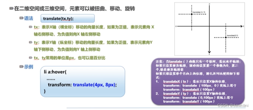
7.10 2D变换-位移
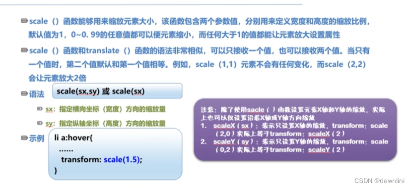
//这个也需要在网站上根据不同浏览器补充前缀,现在写的格式是谷歌
<title>2D变换效果</title>
<style type="text/css">
*{
margin: 0;
padding: 0;
}
ul li{
width: 80px;
min-height: 40px;
line-height: 40px;
list-style: none;
text-align: center;
float: left;
margin-left: 15px;
background-color: #47a447;
}
ul li a{
font-size: 16px;
color: white;
font-weight: bolder;
text-decoration: none;
}
ul:after{
display: block;
content: "";
clear: both;
}
.transform-1 li:hover{
/*X轴不变,Y轴向下位移10px*/
transform: translateX(0);
transform: translateY(10px);
/*如果只有一个参数,默认x轴,
两个参数就是X,Y轴多个参数记得写逗号*/
}
.transform-2 li:hover{
transform: scale(1.25);
}
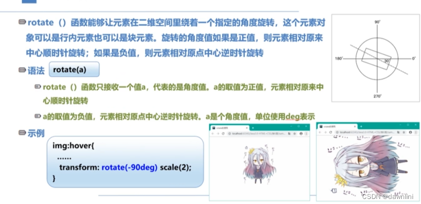
.transform-3 li:hover{
transform: rotate(90deg) scale(3);
}
.transform-4 li:hover{
transform:skew(45deg,0deg);//倾斜效果
}
</style>
</head>
<body>
<h1>2D的位移效果</h1>
<ul class="transform-1">
<li ><a href="#">动画</a></li>
<li ><a href="#">番剧</a></li>
<li ><a href="#">鬼畜</a></li>
<li ><a href="#">剪辑</a></li>
<li ><a href="#">生活区</a></li>
<li ><a href="#">学术区</a></li>
</ul>
<h1>2D的缩放效果</h1>
<ul class="transform-2">
<li ><a href="#">动画</a></li>
<li ><a href="#">番剧</a></li>
<li ><a href="#">鬼畜</a></li>
<li ><a href="#">剪辑</a></li>
<li ><a href="#">生活区</a></li>
<li ><a href="#">学术区</a></li>
</ul>
<h1>2D的旋转效果</h1>
<ul class="transform-3">
<li ><a href="#">动画</a></li>
<li ><a href="#">番剧</a></li>
<li ><a href="#">鬼畜</a></li>
<li ><a href="#">剪辑</a></li>
<li ><a href="#">生活区</a></li>
<li ><a href="#">学术区</a></li>
</ul>
<h1>2D的倾斜效果</h1>
<ul class="transform-4">
<li ><a href="#">动画</a></li>
<li ><a href="#">番剧</a></li>
<li ><a href="#">鬼畜</a></li>
<li ><a href="#">剪辑</a></li>
<li ><a href="#">生活区</a></li>
<li ><a href="#">学术区</a></li>
</ul>
</body>7.11 3D变换
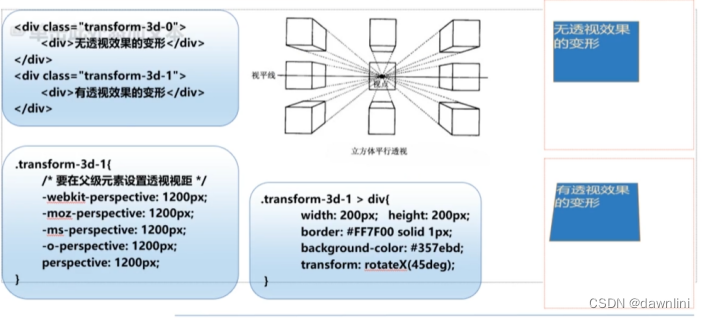
<title>3D效果</title>
<style type="text/css">
div{
width: 350px;
min-height: 350px;
font-size: 36px;
background-color: white;
}
.transform-3D-0{
border: #ff2200 1px solid;
}
.transform-3D-0 div{
width: 200px;
min-height: 200px;
transform: rotateX(45deg);
background-color: yellow;
}
.transform-3D-1{
/*如果不在父元素设置透视的视距,那么3D效果不会呈现*/
perspective: 1200px;
-webkit-perspective: 1200px;/*浏览器前缀*/
border: #ff2200 1px solid;
}
.transform-3D-1 div{
width: 200px;
min-height: 200px;
transform: rotateX(45deg);
background-color: cornflowerblue;
}
</style>
</head>
<body>
<!--
3D变换关键术语:透视、观察者、视点、视距
一般来说,物体离我们越远越小:反映在perspective(视距)
-->
<div class="transform-3D-0">
<div>无透视效果的变形,主要用来观察视距</div>
</div>
<div class="transform-3D-1">
<div>无透视效果的变形,主要用来观察视距</div>
</div>
<style type="text/css">
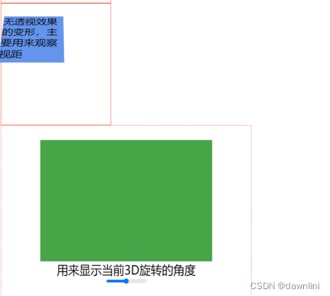
.transform-3D-2{
width: 800px;
height: 500px;
perspective: 1200px;
-webkit-perspective: 1200px;
border: #ff2200 1px dotted;
/*使用一种新的布局flex*/
display: flex;
flex-direction: column;
justify-content: center;
align-items: center;
}
.transform-3D-2 div{
width: 550px;
height: 300px;
background-color: #47a447;
}
.transform-3D-2 div.box{
/*rotatex(N deg)->rotate(1,0,0,N deg)*/
/*rotateY(N deg)->rotate(0,1,0,N deg)*/
/*rotateZ(N deg)->rotate(0,0,1,N deg)*/
transform: rotate3d(1, 0, 0,0deg);
}
</style>
<div class="transform-3D-2">
<div class="box" id="box"></div>
<span id="message">用来显示当前3D旋转的角度</span>
<!--当控件的滑块滑动时,调用函数changeAngle()-->
<input oninput="changeAngle(this.value)" type="range" min="0" max="360"/><!--滑块360度旋转-->
</div>
<script type="text/javascript">
function changeAngle (value){
let box=document.getElementById("box");
let message=document.getElementById("message")
message.textContent=value;
box.style.transform="rotate3d(0, 0, 1,"+ value +"deg)"
}
</script>
</body>
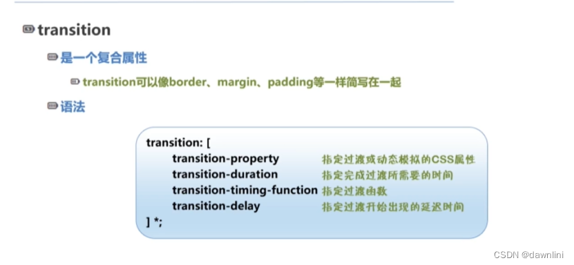
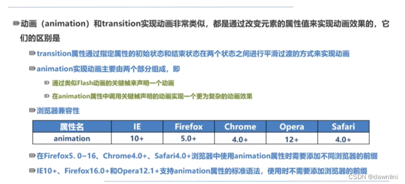
7.12 过渡效果
<title>过渡效果</title>
<style type="text/css">
.transition-1,.transition-2{
width: 300px;
height: 300px;
border: #ff2200 dotted 1px;
background-color: white;
/*transition: background-color 2s ease-in-out 0s;*/
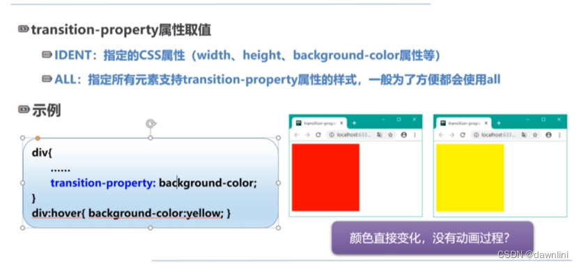
transition-property: background-color;//一般直接写all
transition-duration: 2s;
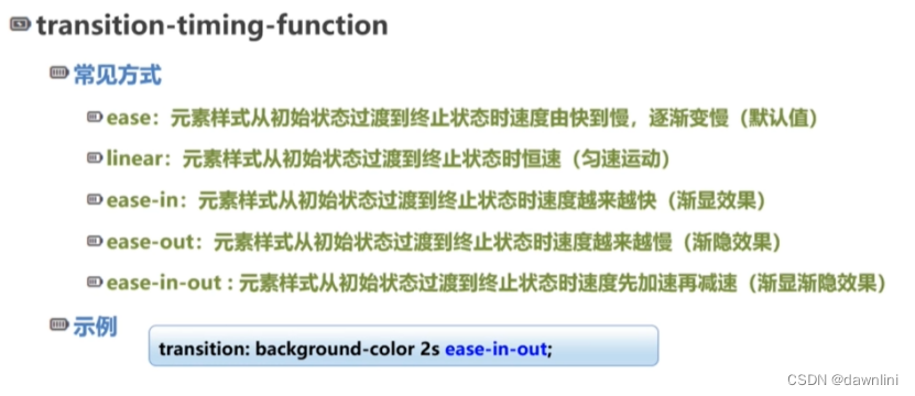
transition-timing-function: ease-out;
/*transition-delay:3s;*/
}
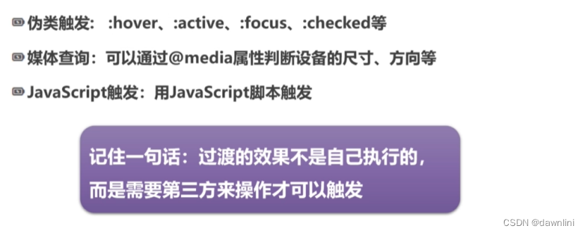
.transition-1:hover{
background-color: #47a447;
}
.transition-2:hover{
background-color: #ff2200;
width: 500px;
height: 500px;
font-size: 30px;
}
@keyframes bezier-test {
from{background-color: white}
to{background-color: yellow}
}
.transition-3{
width: 300px;
height: 300px;
border: #ff2200 dotted 1px;
background-color: white;
/*animation-timing-function: cubic-bezier(0,0,1,1);对应linear*/
animation-timing-function: cubic-bezier(0.25,0.1,0.25,1.0);/*对应ease效果*/
animation:bezier-test 5s infinite;
}
</style>
</head>
<body>
<div class="transition-1"></div>
<div class="transition-2">多个属性一起改变</div>
<div class="transition-3">
直接调用贝塞尔曲线实现的效果
</div>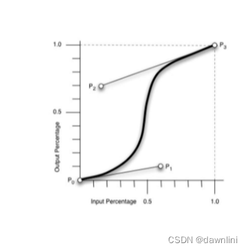
7.13动画
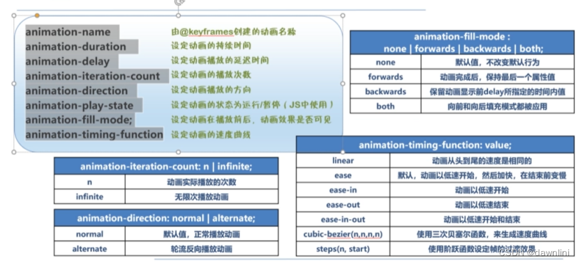
先定义关键帧,再定义动画
 <title>关键帧动画</title>

  <style type="text/css">

    div{

      width: 240px;

      height: 240px;

      background-color: yellow;

    }

    /*第一步,设置关键帧*/

    @keyframes animation-1 {

      0% {background-color: #ff2200;}

      50%{background-color: #47a447;}

      100%{background-color: blue;}

    }

    .animation-1:hover{

      /*infinite 表示无限播放*/

      animation: animation-1 2s infinite;

    }

    @keyframes spread {

      from{background-color: pink;/*transform:none;*/}

      to{background-color:deeppink;transform:scale(1.5);}

      0%{width:0%}

      33%{width: 33%}

      66%{width: 66%}

      100%{width: 100%}


    }

    .animation-2{

      animation-name:spread;

      animation-duration: 4S;

      animation-iteration-count: infinite;

      animation-direction: alternate-reverse;


    }

    .animation-3{

      animation-name:spread;

      animation-duration: 4S;

      animation-iteration-count: infinite;

      animation-direction: alternate;/*动画播放方向,加上reverse就是相反方向播放 */

      animation-fill-mode:forwards;


    }

    @keyframes direction-test {

      from{background-color: white;}

      to{background-color: red;}

    }

    .animation-4-1{

      animation: direction-test 3s normal 4;/*4是播放次数*/

      /*animation-iteration-count: 4;*/

      animation-fill-mode:forwards;

    }

    .animation-4-2{

      animation: direction-test 3s reverse 4;/*4是播放次数*/

      /*animation-iteration-count: 4;*/

      animation-fill-mode:forwards;

    }

    .animation-4-3{

      /*alternate 交替的意思 从from 到to 再从to 到from,和默认设置from一直到to有区别*/

      animation: direction-test 3s alternate 4;/*4是播放次数*/

      /*animation-iteration-count: 4;*/

      animation-fill-mode:forwards;

    }

    .animation-4-4{

      animation: direction-test 3s alternate-reverse 4;/*4是播放次数*/

      /*animation-iteration-count: 4;*/

      animation-fill-mode:forwards;

    }


    .animation-5{

      animation: direction-test 3s infinite steps(5);/*从白到红分5步走*/

    }


  </style>

</head>

<body>

<div class="animation-1"></div>

<div class="animation-2"></div>

<div class="animation-3"></div>

<div class="animation-4-1">animation-direction:normal</div>

<div class="animation-4-2">animation-direction:reverse</div>

<div class="animation-4-3">animation-direction:alternate</div>

<div class="animation-4-4">animation-direction:alternate-reverse</div>

<div class="animation-5">体会steps函数的作用</div>

<style type="text/css">

  /*精灵向下移动的关键帧*/

  @keyframes sprite-down {

    from{background-position: 0px 0px;}

    12.5%{background-position: -80px 0px;}

    25%{background-position: -160px 0px;}

    37.5%{background-position: -240px 0px;}

    50%{background-position: -320px 0px;}

    62.5%{background-position: -400px 0px;}

    75%{background-position: -480px 0px;}

    87.5%{background-position: -560px 0px;}

    /*to{background-position: -80px 0px;}*/

  }

  .sprite-1{

    height: 80px;

    width: 91px;

    background: url("images/精灵动画2.png")no-repeat;

    /*浏览器中,从一个状态过渡到另一个状态,默认是平滑过渡,steps函数可以实现分步过渡*/

    animation:sprite-down 0.8s infinite steps(1);

  }

</style>

<h1>使用STEPS函数实现精灵动画</h1>

<div class="sprite-1"></div>

<div style=" width:100%;min-height: 300px; background-color:snow"></div>


 1664
1664


 被折叠的 条评论
为什么被折叠?
被折叠的 条评论
为什么被折叠?
 到【灌水乐园】发言


