


代码仓库:https://gitee.com/DerekAndroid/miniProgramAgen.git
微信小程序实现图片文字二维码组合拼接成一张图片,下载到手机相册
思路:1下载网络图片,2使用canvas画图片,文字,3下载图片,保存到相册
注意点:1正式环境的图片地址必须https,否则下载失败,2保存相册,如果用户拒绝过权限,需要通过点击事件的形式去引导用户打开设置界面,然后打开保存相册开关
效果:

核心代码:
        //图片下载到微信本地临时文件目录,开始画图
        handleSaveImg() {
            let self = this;
            return new Promise((resolve, reject) => {
                let systemInfo = wx.getSystemInfoSync();
                let windowWidth = systemInfo.windowWidth;
                let windowHeight = systemInfo.windowHeight;
                //根据iphone6基准的宽度,进行px设备适配
                let unit = systemInfo.windowWidth / 375;
                // 创建画布对象
                const ctx = wx.createCanvasContext("myCanvas", self);
                ctx.setFillStyle('#fff')
                ctx.fillRect(0, 0, 375 * unit, 112 * unit); //画矩形
                ctx.drawImage(self.data.logoUrlTemp, 70 * unit, 26 * unit, 66 * unit, 66 * unit)    //  画头像icon
                ctx.font = 'normal bold 20px PingFang SC'
                ctx.setFillStyle('#333333')   //  颜色
                ctx.setTextAlign('center')
                var name = "阿根高级大酒店(五一店)";
                // var name = self.data.hotel.name;
                //根据括号进行换行
                if (name.indexOf('(') != -1 || name.indexOf('(') != -1) {
                    var index = name.indexOf('(') != -1 ? name.indexOf('(') : name.indexOf('(');
                    var line1 = name.substring(0, index);
                    var line2 = name.substring(index);
                    ctx.fillText(line1, windowWidth / 2 + unit * 20, unit * 50, unit * 220)    // 第一行
                    ctx.fillText(line2, windowWidth / 2 + unit * 20, unit * (50 + 30), unit * 220)    // 第二行
                }
                //换行居中适配
                else if (name.length > 9) {
                    var line1 = name.substring(0, 9);
                    var line2 = name.substring(9);
                    ctx.fillText(line1, windowWidth / 2 + unit * 20, unit * 50, unit * 220)    // 第一行
                    ctx.fillText(line2, windowWidth / 2 + unit * 20, unit * (50 + 30), unit * 220)    // 第二行
                } else {
                    ctx.fillText(name, windowWidth / 2 + unit * 20, unit * 50 + 16, unit * 220)    // 写昵称和位置
                }
                ctx.setFillStyle('#1B74FF')
                ctx.fillRect(0, 112 * unit, windowWidth, 451 * unit); //画下面的矩形,背景图代替资源图片显示
                // ctx.drawImage(self.data.roomCodeBaTemp, 0, 112 * unit, windowWidth, 451 * unit)    //  画背景图
                ctx.drawImage(self.data.appQrcodeTemp, 65 * unit, 166 * unit, 244 * unit, 244 * unit)    //  画二维码

                //把画板内容绘制成图片,并回调 画板图片路径
                ctx.draw(false, () => {
                    wx.canvasToTempFilePath({
                        x: 0,
                        y: 0,
                        width: windowWidth,
                        height: windowHeight,
                        destWidth: unit * 3750, // 设置大一点清晰度会高
                        destHeight: unit * 5600,
                        canvasId: 'myCanvas',
                        success(res) {
                            console.log('canvasToTempFilePathRes', res);
                            self.setData({
                                shareImgPath: res.tempFilePath,
                            })
                            resolve();
                        },
                        fail(res) {
                            console.log('canvasToTempFilePathResFail', res);
                            reject();
                        },
                    })
                })
            });
        },
具体位置:https://gitee.com/DerekAndroid/miniProgramAgen/tree/master/pages/roomCode
实现水平垂直居中transform:translate(-50%,-50%)
translate()函数是css3的新特性.在不知道自身宽高的情况下,可以利用它来进行水平垂直居中.。
当使用:top: 50%;left: 50%;, 是以左上角为原点,故不处于中心位置
translate(-50%,-50%) 作用是,往上(x轴),左(y轴)移动自身长宽的 50%,以使其居于中心位置。
与负margin-left和margin-top实现居中不同的是,margin-left必须知道自身的宽高,而translate可以在不知道宽高的情况下进行居中,tranlate()函数中的百分比是相对于自身宽高的百分比,所以能进行居中。
.content {
padding:10px;
background:green;
color:#fff;
position:absolute;
top:50%;
left:50%;
border-radius: 5px;
-webkit-transform: translate(-50%,-50%);
-moz-transform: translate(-50%,-50%);
transform:translate(-50%,-50%);
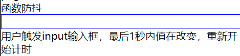
}函数节流和函数防抖
仓库位置:https://gitee.com/DerekAndroid/miniProgramAgen/tree/master/pages/noShake
函数防抖:input输入框的改变
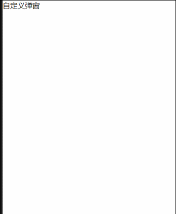
自定义组件-对话框

sc-modal.wxml
<view class="modal-content {{ modalSlide ? 'show': '' }}" wx:if="{{ modalStatus }}">
    <view class="modal-box" style="">
        <view class="close-modal" bindtap='onClose'>
            <icon type="cancel" color="#fff"></icon>
        </view>

        <slot name="con"></slot>

        <view class="modal-bot">
            <view wx:if="{{isShowCancel}}" class="btn-confirm btn-cancel" bindtap='onClose'>{{ cancelText }}</view>
            <view class="btn-confirm" bindtap='onConfirm'>{{ confirmText }}</view>
        </view>
    </view>
</view>
sc-modal.js
var app = getApp();

Component
({
    data:
    {
        images: '', // 静态图片地址
        modalStatus: false,
        modalSlide: false,
    },

    options:
    {
        multipleSlots: true // 使用多个slot插槽需要申明
    },

    properties:
    {
        show:
        {
            type: Boolean,
            value: false,

            // 监听父组件传入值变化
            observer(newVal)
            {
                if (newVal && newVal != this.data.modalStatus)
                {
                    this.setData({ modalStatus: true })

                    setTimeout(() =>
                    {
                        this.setData({ modalSlide: true })
                    }, 50)
                }
                else
                {
                    this.setData({ modalSlide: false });

                    setTimeout(() =>
                    {
                        this.setData({ modalStatus: false })
                    }, 100)
                }
            }
        },
        // 弹窗默认高度
        height:
        {
            type: String,
            value: 650
        },
        confirmText:
        {
            type: String,
            value: '确定'
        },
        cancelText:
        {
            type: String,
            value: '取消'
        },
        isShowCancel:{
            type: Boolean,
            value: false
        }
    },

    ready()
    {
        // console.log(this.properties.empty)
    },

    methods:
    {
        // 关闭
        onClose()
        {
            this.setData({ modalSlide: false });

            setTimeout(() =>
            {
                this.setData({ modalStatus: false })
            }, 100)

            let popup =
            {
                show: false,
                type: 0
            }

            this.triggerEvent('change', popup);
        },

        onConfirm()
        {
            this.setData({ modalSlide: false });

            setTimeout(() => {
                this.setData({ modalStatus: false })
            }, 100)

            let popup =
            {
                show: true,
                type: 1
            }

            this.triggerEvent('change', popup);
        }
    }
})
sc-modal.wxss
.modal-content {
    position: fixed;
    width: 100%;
    height: 100%;
    left: 0;
    top: 0;
    z-index: 999;
    background-color: rgba(0, 0, 0, 0.2);
}

.modal-box {
    position: absolute;
    left: 50%;
    opacity: 0;
    top: 200rpx;
    width: 650rpx;
    height: 590rpx;
    border-radius: 16rpx;
    margin-left: -325rpx;
    background-color: #fff;
    transition: opacity 0.2s ease-in;
}

.modal-content.show .modal-box {
    opacity: 1;
}

.modal-bot {
    position: absolute;
    display: flex;
    width:490rpx;
    bottom: 0;
    left: 50%;
    z-index: 99;
    height: 160rpx;
    line-height: 80rpx;
    margin-left: -245rpx;
}

.btn-confirm {
    flex: 1;
    height: 80rpx;
    color: #fff;
    font-size: 28rpx;
    line-height: 80rpx;
    text-align: center;
    border-radius: 8rpx;
    background-color: #f10215;
}

.btn-cancel {
    background-color: #ccc;
    margin: 0rpx 20rpx 0rpx 0rpx;
}

.close-modal {
    position: absolute;
    bottom: -140rpx;
    left: 50%;
    width: 64rpx;
    height: 64rpx;
    margin-left: -32rpx;
    z-index: 99;
}
sc-modal.json
{
  "component": true
}
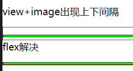
view+image出现上下间隔
<!--pages/image-test/image-test.wxml-->
<view>view+image出现上下间隔</view>
<view class="a">
<image class="b-image"></image>
</view>

<view>flex解决</view>
<view class="a">
<image class="b-image flex"></image>
</view>
/* pages/image-test/image-test.wxss */

.a {
    background-color: #fff;
    border: 1rpx solid #f00;
    margin-top: 30rpx;
}

.b-image {
    width: 750rpx;
    height: 6rpx;
    background: #0f0;
    border: 1rpx solid #00f;
}

.flex {
    display: flex;
}
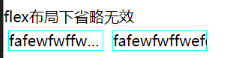
flex布局下省略无效
<view class="title">flex布局下省略无效</view>
<view class="flex_ellipsis">
    <view class="ellipsis">fafewfwffwefewf</view>
    <view class="ellipsis flex">fafewfwffwefewf</view>
</view>
.title {
margin-top: 28rpx;
}
.flex_ellipsis {
display: flex;
flex-direction: row;
}
.ellipsis {
width: 200rpx;
/* white-space: nowrap; */
overflow: hidden;
text-overflow: ellipsis;
border: 1rpx solid aqua;
margin: 10rpx;
}
.flex {
display: flex;
}
webkit-box实现一行省略+两行省略
设置display: -webkit-box;

<!--pages/ellipsis/ellipsis.wxml-->
<view class="title">有中文会出现换行</view>
<view class="a">普通省略-1231231123123123</view>
<view class="a">1231231123123123</view>
<view class="title">有中文,设置line-height后,省略号消失</view>
<view class="a line-height">-11231231123123</view>
<view class="a line-height">普通省略-11231231123123</view>
<view class="title">webkit-box实现一行省略+两行省略</view>
<view class="b">一行省略-1231231123123231123123</view>
<view class="b-two-line">两行省略-1231231123123231123123</view>
/* pages/ellipsis/ellipsis.wxss */
.title{
    margin-top: 28rpx;
}
.a {
    width: 200rpx;
    overflow: hidden;
    text-overflow: ellipsis;
    border: 1rpx solid purple;
}

.line-height {
    /* white-space: nowrap; */
    height: 30rpx;
    line-height: 30rpx;
    font-size: 30rpx;
}

.b {
    /* white-space: nowrap; */
    display: -webkit-box;
    width: 200rpx;
    overflow: hidden;
    text-overflow: ellipsis;
    -webkit-line-clamp: 1; /* 限制在一个块元素显示的文本的行数 */
    -webkit-box-orient: vertical; /* 垂直排列 */
    word-break: break-all; /* 内容自动换行 */
    border: 1rpx solid orange;
}

.b-two-line {
    display: -webkit-box;
    width: 200rpx;
    overflow: hidden;
    text-overflow: ellipsis;
    -webkit-line-clamp: 2; /* 限制在一个块元素显示的文本的行数 */
    -webkit-box-orient: vertical; /* 垂直排列 */
    word-break: break-all; /* 内容自动换行 */
    border: 1rpx solid orange;
}
相邻元素设置margin负值,引起覆盖层级问题解决方法:
哪里覆盖改哪里,设置position
左边是默认效果,右边是修改的效果
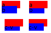
<!--pages/l/l.wxml-->
<!-- 相邻元素设置margin负值,引起覆盖层级问题解决方法:(谁被覆盖就设置谁的position) -->
<view class="ab">
    <!-- 默认b覆盖a -->
    <view class="a-view">
        <view class="a">a
        </view>
        <view class="b">b
        </view>
    </view>
    <!-- position: relative;改变覆盖层级,a被覆盖设置a -->
    <view>
        <view class="a position">a
        </view>
        <view class="b">b
        </view>
    </view>
</view>

<view class="ab">
    <view class="c">
        <!-- image默认c-image覆盖c-view -->
        <image class="c-image">c</image>
        <view class="c-view">c-v</view>
    </view>

    <!-- position: relative;改变覆盖层级,c-view被覆盖设置c-view -->
    <view class="c">
        <image class="c-image">c</image>
        <view class="c-view position">c-v</view>
    </view>
</view>
打勾图标-代码实现
思路:画两条边框线---》旋转45度---》合并
<!--pages/k/k.wxml-->
<view class="sc-checkbox {{ check ? 'check' : '' }}" catchtap="checkChange"></view>
/* pages/k/k.wxss */
.sc-checkbox {
position: relative;
display: inline-block;
vertical-align: top;
min-width: 48rpx;
height: 48rpx;
line-height: 48rpx;
padding-left: 0rpx;
/* border: 1rpx solid #0f0; */
}
.sc-checkbox:before {
position: absolute;
box-sizing: border-box;
display: block;
content: "";
width: 36rpx;
height: 36rpx;
left: 6rpx;
top: 50%;
margin-top: -18rpx;
z-index: 9;
border-radius: 50%;
border: 2rpx solid #ddd;
}
.sc-checkbox.check:before {
border-color: #de2810;
background-color: #de2810;
border-radius: 50%;
}
.sc-checkbox.check:after {
position: absolute;
display: block;
content: '';
width: 16rpx;
height: 8rpx;
z-index: 10;
left: 16rpx;
top: 50%;
margin-top: -8rpx;
transform: rotate(-45deg);
border-left: 2rpx solid #fff;
border-bottom: 2rpx solid #fff;
}
// pages/k/k.js
Page({

    /**
     * 页面的初始数据
     */
    data: {
        check: false,
    },

    /**
     * 生命周期函数--监听页面加载
     */
    onLoad: function(options) {

    },

    checkChange() {
        var self = this;
        var check = !self.data.check;
        self.setData({
            check: check,
        })
    },
})
左右排版布局,每行上下居中对齐
思路:左边的圆形,设置成绝对布局,然后进行行居中


    <view class="item-tip">
        <view class="item-tip-message">
            <view class="item-tip-circle">
                <!-- <image class="item-tip-icon" src="{{ images + '/pickup/circle-icon.png' }}"></image> -->
                <image class="item-tip-icon" ></image>
            </view>
            <view class="item-tip-words">门店老板信息会进行实名认证,所填写信息必须真实有效;</view>
        </view>
        <view class="item-tip-message">
            <view class="item-tip-circle">
                <!-- <image class="item-tip-icon" src="{{ images + '/pickup/circle-icon.png' }}"></image> -->
                <image class="item-tip-icon" ></image>
            </view>
            <view class="item-tip-words">一位门店老板只能在湘商优购开通一家门店,如需开通多家门店,请提供不同门店老板的信息;</view>
        </view>
        <view class="item-tip-message">
            <view class="item-tip-circle">
                <!-- <image class="item-tip-icon" src="{{ images + '/pickup/circle-icon.png' }}"></image> -->
                <image class="item-tip-icon" ></image>
            </view>
            <view class="item-tip-words">银行信息只支持普通储蓄卡(卡号为19位),信用卡/存折现不支持;</view>
        </view>
        <view class="item-tip-message">
            <view class="item-tip-circle">
                <!-- <image class="item-tip-icon" src="{{ images + '/pickup/circle-icon.png' }}"></image> -->
                <image class="item-tip-icon" ></image>
            </view>
            <view class="item-tip-words">门店信息提交认证审核通过后系统将会已短信方式下发通知。</view>
        </view>
    </view>
.item-tip {
    display: flex;
    flex-direction: column;
    width: 690rpx;
    padding: 0rpx 0rpx 0rpx 0rpx;
    margin: 60rpx 0rpx 0rpx 30rpx;
    /* border: 1rpx solid olivedrab;  */
}

.item-tip-message {
    display: flex;
    flex-direction: row;
    font-size:24rpx;
    color:rgba(222,40,16,1);
    /* border: 1rpx solid orange;  */
}

.item-tip-circle {
    position: relative;
    width:12rpx;
    height:60rpx;
    margin: 0rpx 17rpx 0rpx 0rpx;
    /* border: 1rpx solid #f00; */
}

.item-tip-icon {
    position: absolute;
    width:12rpx;
    height:12rpx;
    top: 50%;
    margin-top: -6rpx;
    vertical-align: top;
    border-radius:6rpx;
    background: rgba(222,40,16,1);
}

.item-tip-words {
    box-sizing: border-box;
    width: 658rpx;
    line-height:60rpx;
    /* border: 1rpx solid #00f; */
}
justify-content演示效果
http://www.runoob.com/try/playit.php?f=playcss_justify-content&preval=center
css三角形
我们的思路是使用border边框来实现三角形的样式,因为border的边框是由四个三角形组成的。
1.带边框的矩形
布局wxml:
<view class='original'>
</view>
样式wcss:
.original{
  width: 40rpx;
  height: 40rpx;
  border-width: 40rpx 40rpx 40rpx 40rpx;
  border-style:solid;
  border-color: red green blue orange;
}
2.矩形的宽高设置为0
.rect{
  width: 0rpx;
  height: 0rpx;
  border-width: 40rpx 40rpx 40rpx 40rpx;
  border-style:solid;
  border-color: red green blue orange;
}
3.向上的三角形
(思路:上边框的高度设置为0,上,右,左颜色为透明)
.triangle-top {
   width: 0rpx;
  height: 0rpx;
   border-width: 0rpx 40rpx 40rpx 40rpx;
  border-style: solid;
  border-color: transparent transparent blue transparent; /*透明 透明 蓝 透明*/
三角形-右
.triangle-right {
   width: 0rpx;
  height: 0rpx;
  border-width: 40rpx 0rpx 40rpx 40rpx;
  border-style: solid;
  border-color: transparent transparent transparent blue; /*透明 透明 蓝 透明*/
}
三角形-下
.triangle-bottom {
   width: 0rpx;
  height: 0rpx;
   border-width: 40rpx 40rpx 0rpx;
  border-style: solid;
  border-color: blue transparent transparent; /*透明 透明 蓝 透明*/
}
三角形-左
.triangle-left {
   width: 0rpx;
  height: 0rpx;
   border-width: 40rpx  40rpx 40rpx 0rpx;
  border-style: solid;
  border-color:  transparent blue transparent transparent ; /*透明 透明 蓝 透明*/
}
。。。


 1896
1896


 被折叠的 条评论
为什么被折叠?
被折叠的 条评论
为什么被折叠?
 到【灌水乐园】发言


