


介绍
本示例主要介绍了TabBar中间页面如何实现有一圈圆弧外轮廓以及TabBar页签被点击之后会改变图标显示,并有一小段动画效果。
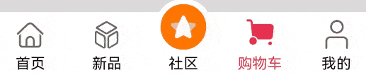
效果图预览
使用说明:
- 依次点击tabBar页面,除了社区图标之外,其它图标往上移动一小段距离。
实现思路
场景1:TabBar中间页面实现有一圈圆弧外轮廓
将Image组件外层包裹一层容器组件,通过设置borderRadius以及margin的top值实现圆弧外轮廓效果。 这里borderRadius的值设置为容器组件宽度的一半,margin的top值根据开发者的ux效果设置合适的值即可。
  Column() {
    Image(this.selectedIndex === this.tabBarIndex ? TABINFO[this.tabBarIndex].selectedIcon :
          TABINFO[this.tabBarIndex].defaultIcon)
      .size({
        width: $r('app.integer.custom_tab_community_image_size'),
        height: $r('app.integer.custom_tab_community_image_size')
      })
      .interpolation(ImageInterpolation.High) // TODO:知识点:使用interpolation属性对图片进行插值,使图片显示得更清晰
  }
  .width($r('app.integer.custom_tab_community_image_container_size'))
  .height($r('app.integer.custom_tab_community_image_container_size'))
    // TODO:知识点:通过设置borderRadius以及margin的top值实现圆弧外轮廓效果。
  .borderRadius($r('app.integer.custom_tab_community_image_container_border_radius_size'))
  .margin({ top: ARC_MARGIN_TOP })
  .backgroundColor(Color.White)
  .justifyContent(FlexAlign.Center)
场景2:TabBar页签点击之后会改变图标显示,并有一小段动画效果
改变图标显示功能可以先声明一个变量selectedIndex,此变量代表被选定的tabBar下标,点击的时候将当前tabBar的下标值进行赋值。 通过当前被选中的tabBar下标值和tabBar自己的下标值进行判断来达到点击之后改变图标显示的效果。 动画效果可以将Image添加一个offset属性和animation属性, offset属性可以控制组件的横向和纵向偏移量; animation在组件的某些通用 属性变化时,可以通过属性动画animation实现过 渡效果。 点击TabBar页签,改变offset的属性值,自动触发animation属性动画。
 Column() {
  // 通过被选中的tabBar下标值和tabBar的默认下标值来改变图片显示
   Image(this.selectedIndex === this.tabBarIndex ? TABINFO[this.tabBarIndex].selectedIcon :
         TABINFO[this.tabBarIndex].defaultIcon)
     // TODO:知识点:使用interpolation属性对图片进行插值,使图片显示得更清晰
     .interpolation(ImageInterpolation.High)
     .size(this.selectedIndex === HOME_TAB_BAR_INDEX && this.selectedIndex === this.tabBarIndex ?
       {
         width: $r('app.integer.custom_tab_community_image_size'),
         height: $r('app.integer.custom_tab_community_image_size')
       } :
       {
         width: $r('app.integer.custom_tab_image_size'),
         height: $r('app.integer.custom_tab_image_size')
       })
       // TODO:知识点:通过offset控制图片的纵向偏移。
     .offset({
       y: (this.selectedIndex === this.tabBarIndex && this.selectedIndex !== COMMUNITY_TAB_BAR_INDEX) ?
       this.iconOffset : $r('app.integer.custom_tab_common_size_0')
      })
      // TODO:知识点:组件的某些通用属性变化时,可以通过属性动画animation实现过渡效果。本示例的动画效果是tabBar的图片向上偏移一小段距离
     .animation({
       duration: 400,
       curve: Curve.Ease,
       iterations: 1,
       playMode: PlayMode.Normal
     })
  }
  .width(this.selectedIndex === HOME_TAB_BAR_INDEX && this.selectedIndex === this.tabBarIndex ?
         $r('app.integer.custom_tab_community_image_size') : $r('app.integer.custom_tab_image_container_size'))
  .height(this.selectedIndex === HOME_TAB_BAR_INDEX && this.selectedIndex === this.tabBarIndex ?
         $r('app.integer.custom_tab_community_image_size') : $r('app.integer.custom_tab_image_container_size'))
  .justifyContent(FlexAlign.Center)
高性能知识点
不涉及。
工程结构&模块类型
customtabbar                                    // har类型
|---model
|   |---DataType.ets                            // 模型层-Tabbar数据类型
|   |---TabBarData.ets                          // 数据模型层-TabBar数据
|---view
|   |---TabView.ets                             // 视图层-自定义TabBar页面
写在最后
- 如果你觉得这篇内容对你还蛮有帮助,我想邀请你帮我三个小忙:
- 点赞,转发,有你们的 『点赞和评论』,才是我创造的动力。
- 关注小编,同时可以期待后续文章ing ,不定期分享原创知识。
- 更多鸿蒙最新技术知识点,请关注作者


 8122
8122

 被折叠的 条评论
为什么被折叠?
被折叠的 条评论
为什么被折叠?
 到【灌水乐园】发言


