


引:若外层容器比其内的图片元素的更宽的话,只需要一个text-align即可实现图片的水平居中,要是外层容器比子元素还窄,里层子元素想居中肿么办???
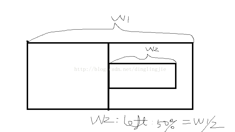
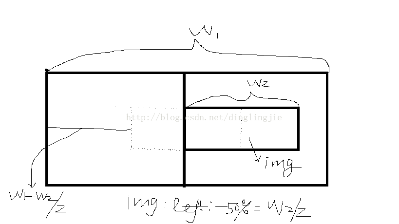
其实原理很简单,只需要一个万能计算公式:left=(width1-width2)/2 注:width1:外层容器的宽度,width2:内层元素的宽度
即设置内层元素距离外层容器左侧的值为二者的宽度之差的1/2;(ofcause 我们不会真的写js去计算宽度啦^-^)
先看下效果图:
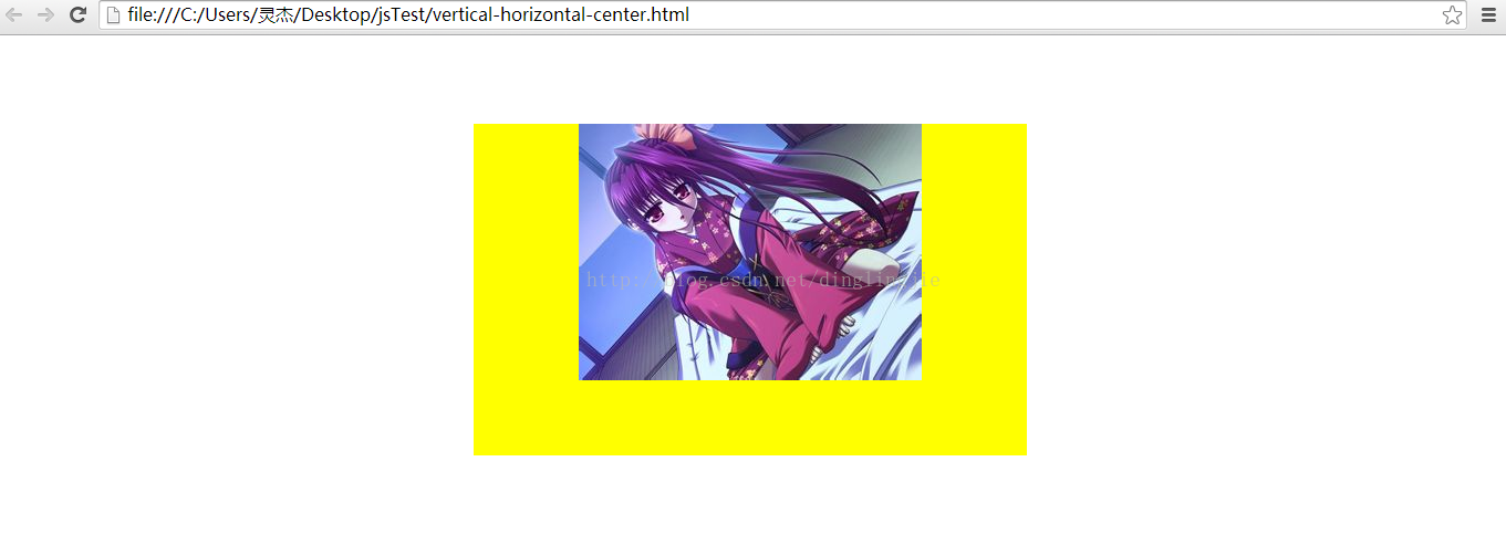
width1 > width2
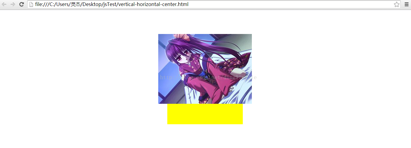
width1 < width2
上代码:
width1 > width2:
<html xmlns="http://www.w3.org/1999/xhtml">
 <head>
	<meta http-equiv="Content-Type" content="text/html;charset=UTF-8" />
    <title> New Document </title>
    <style>
	  div#content {
		position:absolute;
		top:0;right:0;bottom:0;left:0;
		margin:auto;
		width:500px;
		height:300px;
		background-color:yellow;
	  }

	  div#content1 {
		overflow:visible;
		position:relative;
		float:left;
		left:50%;
	  }

	  div img {
		  position:relative;
		  float:left;
		  left:-50%;
	  }
    </style>
 </head>
 <body>
	<div id="content">
		<div id="content1">
			<img src="5.jpg">
		</div>
	</div>
 </body>
</html>
<span style="font-weight: bold;"> width1 < width2:</span>
<html xmlns="http://www.w3.org/1999/xhtml">
 <head>
	<meta http-equiv="Content-Type" content="text/html;charset=UTF-8" />
    <title> New Document </title>
    <style>
	  div#content {
		position:absolute;
		top:0;right:0;bottom:0;left:0;
		margin:auto;
		width:250px;
		height:300px;
		overflow: visible;
		background-color:yellow;
	  }

	  div#content1 {
		overflow:visible;
		position:relative;
		float:left;
		left:50%;
	  }

	  div img {
		  position:relative;
		  float:left;
		  left:-50%;
	  }
    </style>
 </head>
 <body>
	<div id="content">
		<div id="content1">
			<img src="5.jpg">
		</div>
	</div>
 </body>
</html>
最后啰嗦一下:上边的万能公式:left=(width1-width2)/2 = width1/2 - width2/2, 用css表示就是:left:50% and left:-50%
再允许我上两张拙劣的图:
ok~


 扫一扫
扫一扫
 1250
1250

 被折叠的 条评论
为什么被折叠?
被折叠的 条评论
为什么被折叠?
 到【灌水乐园】发言


