


今天看了下Seaborn的countplot()函数,
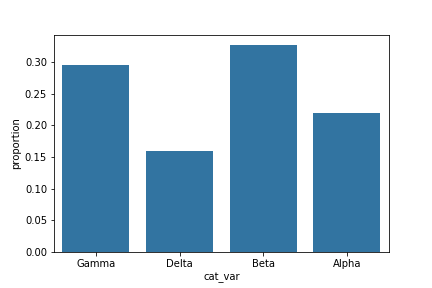
-画相对的统计值
# get proportion taken by most common group for derivation
# of tick marks
n_points = df.shape[0]
max_count = df['cat_var'].value_counts().max()
max_prop = max_count / n_points

# generate tick mark locations and names
tick_props = np.arange(0, max_prop, 0.05)
tick_names = ['{:0.2f}'.format(v) for v in tick_props]

# create the plot
base_color = sb.color_palette()[0]
sb.countplot(data = df, x = 'cat_var', color = base_color)
plt.yticks(tick_props * n_points, tick_names)
plt.ylabel('proportion')
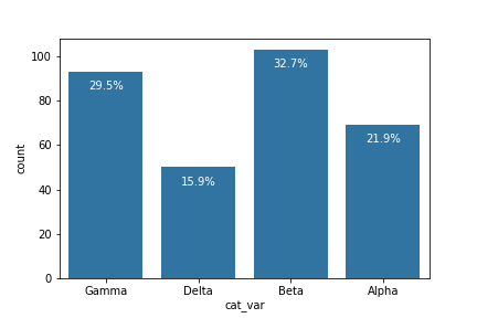
- 给每一列添加所占比例的值
# create the plot
base_color = sb.color_palette()[0]
sb.countplot(data = df, x = 'cat_var', color = base_color)

# add annotations
n_points = df.shape[0]
cat_counts = df['cat_var'].value_counts()
locs, labels = plt.xticks() # get the current tick locations and labels

# loop through each pair of locations and labels
for loc, label in zip(locs, labels):

    # get the text property for the label to get the correct count
    count = cat_counts[label.get_text()]
    pct_string = '{:0.1f}%'.format(100*count/n_points)

    # print the annotation just below the top of the bar
    plt.text(loc, count-8, pct_string, ha = 'center', color = 'w')
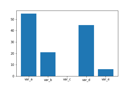
-统计缺失值
na_counts = df.isna().sum()
base_color = sb.color_palette()[0]
sb.barplot(na_counts.index.values, na_counts, color = base_color)
- 画双柱状图
 1 # -*- coding: utf-8 -*-
 2 import matplotlib.pyplot as plt
 3
 4 name_list = ['Monday','Tuesday','Friday','Sunday']
 5 num_list = [1.5,0.6,7.8,6]
 6 num_list1 = [1,2,3,1]
 7 x =list(range(len(num_list)))
 8 total_width, n = 0.8, 2
 9 width = total_width / n
10
11 plt.bar(x, num_list, width=width, label='boy',fc = 'y')
12 for i in range(len(x)):
13     x[i] = x[i] + width
14 plt.bar(x, num_list1, width=width, label='girl',tick_label = name_list,fc = 'r')
15 plt.legend()
16 plt.show()


 5333
5333


 被折叠的 条评论
为什么被折叠?
被折叠的 条评论
为什么被折叠?
 到【灌水乐园】发言


