


关于 flex-direction: column 之后宽度自动变为100%的解决办法
前提介绍:要实现这么个东西,想到了使用 flex
html:
<divclass="left cardp"slot="left">

<divclass="label":style="{color:'#cd329a','border-color':'#cd329a'}">净值理财</div>

<divclass="clearnum">1.1467</div>

<divclass="text">单位净值</div>

</div>
stylus:
.cardp
  display flex
  flex-directioncolumn
  justify-contentspace-between
.label
  display inline-block
  padding 0.266667rem/* 20/75 */
  height .56rem/* 42/75 */
  border .026667rem/* 2/75 */ solid#cd329a
  color #cd329a
  line-height .56rem
  text-align center
  border-radius .266667rem/* 20/75 */
  font-size 25px;/*px*/
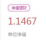
然后发现使用了 flex-directioncolumn之后,那个 净值理财 变成了宽度 100%、如下图
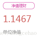
解决
这就很讨厌了,我不想设置死了这个宽度,想让他自动适应,但是结果宽度变成了 100%
然后不断地试,发现
在 .label加一句话
align-self: baseline
竟然成功了! 最后的 stylus:
.cardp
  display flex
  flex-directioncolumn
  justify-contentspace-between
.label
  display inline-block
  padding 0 .266667rem/* 20/75 */
  height .56rem/* 42/75 */
  border .026667rem/* 2/75 */ solid#cd329a
  color #cd329a
  line-height .56rem
  text-align center
  border-radius.266667rem/* 20/75 */
  font-size 25px;/*px*/
  align-self: baseline

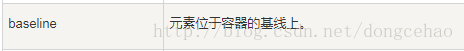
查了资料,发现 baseline 的解释为
然后继续试,发现只要给 align-self:设置一个值,就能实现这个目的,因为 默认值为
align-self: stretch
修改这个默认值,就能防止 100%


 661
661


 被折叠的 条评论
为什么被折叠?
被折叠的 条评论
为什么被折叠?
 到【灌水乐园】发言


