


【04】优雅草星云物联网AI智控系统从0开发鸿蒙端适配-deveco studio-自定义一个设置输入小部件组件-完成所有设置setting相关的页面-优雅草卓伊凡
项目背景
本项目渊源已久,优雅草2025年发布,PC端已经发布,将在4月完成成品发布,目前由于考虑到鸿蒙端用户使用,毕竟新一代纯血鸿蒙harmonyos next已经不再支持安卓android,因此优雅草团队必须考虑把鸿蒙端也开发上,以下实战过程完整记录了整个开发过程,优雅草卓伊凡审核代码,记录并更新,再次感谢优雅草团队所有同事们的努力,鸿蒙端为了加速鸿蒙生态已经开源地址供查看,关于优雅草星云物联网AI智控系统可以关注优雅草官网,在本文梳理的过程中发现在后面的页面中,只需要直接写出代码并且附上注释,卓伊凡相信大家应该看得懂,针对比较复杂的部分会单独做独立解释,每一个页面都可以对应查看,基本都会截图,如果没有截图的那就是真的没截图
项目开源代码地址
优雅草星云智控鸿蒙端harmonyos: 优雅草星云智控AI智能设备监控系统-移动端鸿蒙端-成都星云智控科技有限公司是成都市一颗优雅草科技有限公司的子公司
鸿蒙端运行环境
deveco 5.0.4版本
实战过程
接下来完成所有的设置相关页面,src/main/ets/components/settings/SettingInputWidget.ets
import { commonColor } from "@wcmzllx/common-const-library"
import { vp2 } from "../../common/NewVp"
// 定义一个设置输入小部件组件
@ComponentV2
export struct SettingInputWidget {
// 输入框标题,默认值为"系统语言"
@Param title: string = "系统语言"
// 是否为必填项,默认值为true
@Param isMust: boolean = true
// 输入框占位符,默认为空字符串
@Param placeholder: string = ""
// 当输入内容变化时触发的事件
@Event onContentChange: (value: string) => void;
// 是否为文本域,默认为false
@Param isTextArea: boolean = false;
// 文本域控制器
controller: TextAreaController = new TextAreaController()
// 构建组件界面
build() {
// 创建一个行容器,用于布局标题和输入框
Row({ space: vp2.vp2(5) }) {
// 创建标题文本
Text(undefined) {
// 如果是必填项,显示红色星号
if (this.isMust) {
Span("*").fontColor("#FFFD0808")
}
// 显示标题文本
Span(this.title + ":")
.fontColor(commonColor.FONT_3333_COLOR)
}
.fontSize(vp2.vp2(14))
.fontWeight(FontWeight.Regular)
.lineHeight(vp2.vp2(16.41))
// 创建一个行容器,用于布局输入框
Row() {
// 根据isTextArea参数决定使用TextArea还是TextInput
if (this.isTextArea){
TextArea({
placeholder: this.placeholder,
controller: this.controller
})
.backgroundColor(Color.Transparent)
.placeholderColor(commonColor.FONT_9999_COLOR)
.placeholderFont({ size: vp2.vp2(14) })
.margin(0)
.padding(0)
.borderRadius(0)
.height(vp2.vp2(160))
.fontSize(vp2.vp2(14))
.fontWeight(FontWeight.Regular)
.lineHeight(vp2.vp2(16.41))
}else {
TextInput({ placeholder: this.placeholder })
.backgroundColor(Color.Transparent)
.placeholderColor(commonColor.FONT_9999_COLOR)
.placeholderFont({ size: vp2.vp2(14) })
.margin(0)
.padding(0)
.borderRadius(0)
.fontSize(vp2.vp2(14))
.fontWeight(FontWeight.Regular)
.lineHeight(vp2.vp2(16.41))
.height(vp2.vp2(40))
.onChange(this.onContentChange)
}
}
.padding(vp2.vp2(10))
.height(this.isTextArea ? vp2.vp2(160) : vp2.vp2(40))
.borderRadius(5)
.layoutWeight(1)
.borderWidth(vp2.vp2(1))
.borderColor("#FFE6EBF0")
}
.alignItems(this.isTextArea ? VerticalAlign.Top : VerticalAlign.Center)
}
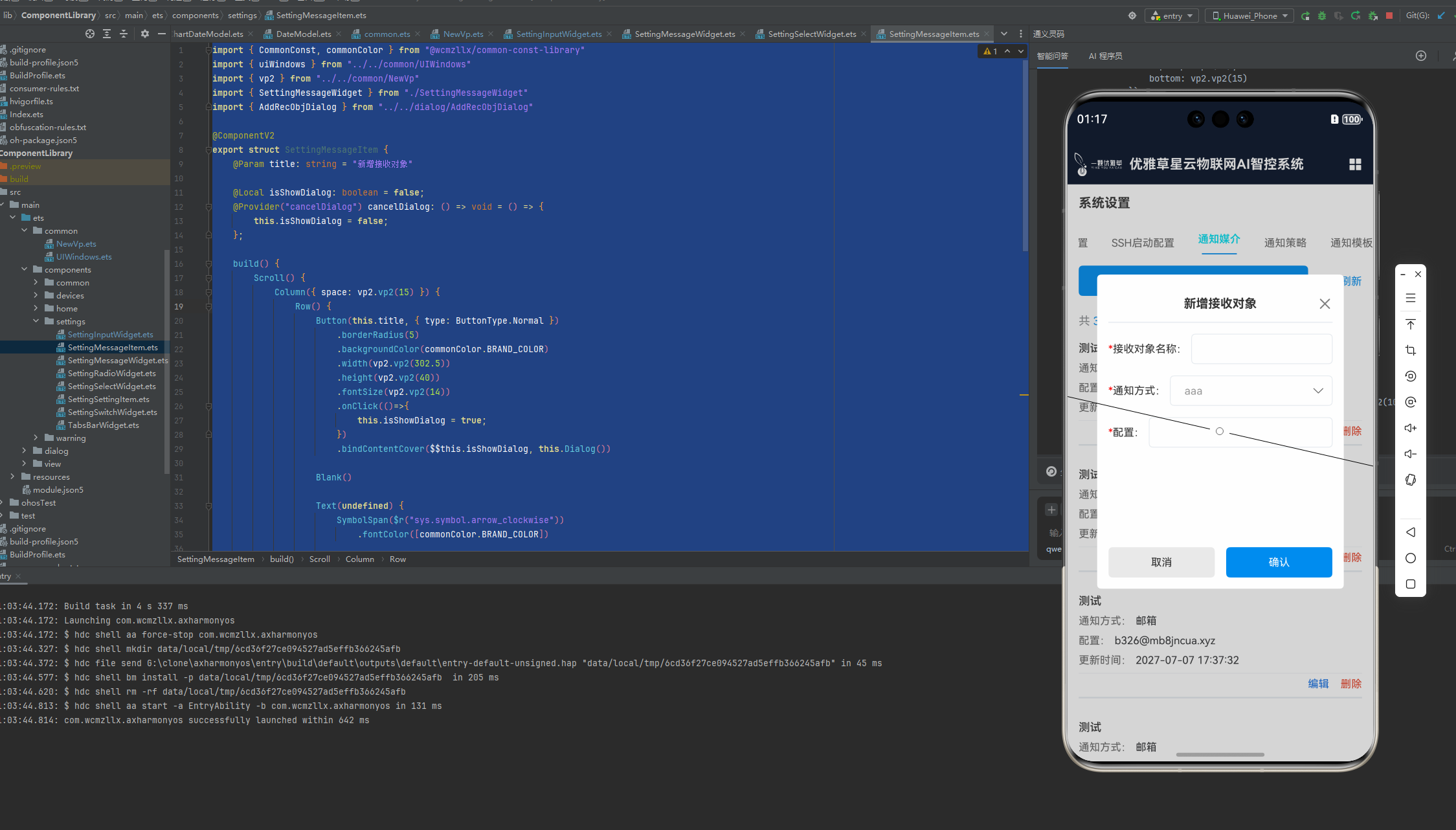
}新建接收对象页面,src/main/ets/components/settings/SettingMessageItem.ets
// 导入常用的常量和颜色库
import { CommonConst, commonColor } from "@wcmzllx/common-const-library"
// 导入UI窗口工具库,用于获取导航栏高度等信息
import { uiWindows } from "../../common/UIWindows"
// 导入新的视口处理库
import { vp2 } from "../../common/NewVp"
// 导入设置消息小部件,用于展示设置消息列表项
import { SettingMessageWidget } from "./SettingMessageWidget"
// 导入添加接收对象对话框组件
import { AddRecObjDialog } from "../../dialog/AddRecObjDialog"
// 定义设置消息项组件,使用ComponentV2进行结构优化
@ComponentV2
export struct SettingMessageItem {
// 设置消息项的标题,作为参数传入,默认为"新增接收对象"
@Param title: string = "新增接收对象"
// 本地状态,控制对话框的显示与隐藏
@Local isShowDialog: boolean = false;
// 提供一个关闭对话框的方法,通过Provider注解使其可在模板中直接调用
@Provider("cancelDialog") cancelDialog: () => void = () => {
this.isShowDialog = false;
};
// 构建方法,定义组件的UI结构
build() {
// 创建一个滚动视图,容纳设置消息项的内容
Scroll() {
// 列布局,用于垂直排列子元素,设置元素之间的间距
Column({ space: vp2.vp2(15) }) {
// 行布局,用于水平排列子元素
Row() {
// 创建一个按钮,设置其样式和事件处理程序
Button(this.title, { type: ButtonType.Normal })
.borderRadius(5)
.backgroundColor(commonColor.BRAND_COLOR)
.width(vp2.vp2(302.5))
.height(vp2.vp2(40))
.fontSize(vp2.vp2(14))
.onClick(()=>{
this.isShowDialog = true;
})
// 根据对话框的显示状态,条件渲染对话框内容
.bindContentCover($$this.isShowDialog, this.Dialog())
// 占位符,用于调整布局
Blank()
// 刷新按钮,包含图标和文本
Text(undefined) {
SymbolSpan($r("sys.symbol.arrow_clockwise"))
.fontColor([commonColor.BRAND_COLOR])
Span("刷新")
.fontColor(commonColor.BRAND_COLOR)
}
.fontWeight(FontWeight.Regular)
.fontSize(vp2.vp2(14))
.lineHeight(vp2.vp2(16.41))
}
// 设置行布局的内边距和宽度
.padding({
top: vp2.vp2(15),
bottom: vp2.vp2(15)
})
.width(CommonConst.GLOBAL_FULL_SCREEN)
// 显示数据统计信息
Text(undefined) {
Span("共 ")
Span("3045")
.fontColor(commonColor.BRAND_COLOR)
Span(" 条数据")
}
.fontColor("#FF8D9094")
.fontWeight(FontWeight.Regular)
.fontSize(vp2.vp2(15))
.lineHeight(vp2.vp2(11))
.width(CommonConst.GLOBAL_FULL_SCREEN)
.textAlign(TextAlign.Start)
// 使用ForEach循环生成设置消息小部件
ForEach([1, 2, 3, 4, 5], (item: number) => {
SettingMessageWidget()
})
}
// 设置列布局的下边距和宽度,考虑到底部导航栏的高度
.padding({
bottom: uiWindows.getNavigationHeight() + vp2.vp2(10)
})
.width(CommonConst.GLOBAL_FULL_SCREEN)
}
// 设置滚动视图的滚动条状态、对齐方式和高度
.scrollBar(BarState.Off)
.align(Alignment.Top)
.height(CommonConst.GLOBAL_FULL_SCREEN)
}
// 定义对话框内容构建方法
@Builder
Dialog(){
// 堆叠布局,用于放置对话框组件
Stack(){
AddRecObjDialog()
}
.width(CommonConst.GLOBAL_FULL_SCREEN)
.height(CommonConst.GLOBAL_FULL_SCREEN)
}
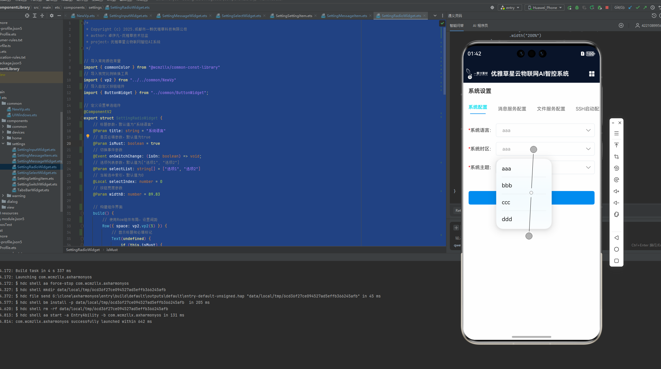
}系统配置页面src/main/ets/components/settings/SettingRadioWidget.ets
/*
 * Copyright (c) 2025.成都市一颗优雅草科技有限公司
 * author:卓伊凡-优雅草技术总监
 * project:优雅草星云物联网智控AI系统
 */

// 导入常用颜色常量
import { commonColor } from "@wcmzllx/common-const-library"
// 导入视觉比例转换工具
import { vp2 } from "../../common/NewVp"
// 导入自定义按钮组件
import { ButtonWidget } from "../common/ButtonWidget";

// 定义设置单选组件
@ComponentV2
export struct SettingRadioWidget {
    // 标题参数,默认值为"系统语言"
    @Param title: string = "系统语言"
    // 是否必填参数,默认值为true
    @Param isMust: boolean = true
    // 切换事件参数
    @Event onSwitchChange: (isOn: boolean) => void;
    // 选项列表参数,默认值为["选项1", "选项2"]
    @Param selectList: string[] = ["选项1", "选项2"]
    // 当前选中索引,默认值为0
    @Local selectIndex: number = 0
    // 按钮宽度参数
    @Param widthB: number = 89.83

    // 构建组件界面
    build() {
        // 使用Row组件布局,设置间距
        Row({ space: vp2.vp2(5) }) {
            // 显示标题和必填标记
            Text(undefined) {
                if (this.isMust) {
                    Span("*").fontColor("#FFFD0808")
                }
                Span(this.title + ":")
                    .fontColor(commonColor.FONT_3333_COLOR)
            }
            .fontSize(vp2.vp2(14))
            .fontWeight(FontWeight.Regular)
            .lineHeight(vp2.vp2(16.41))

            // 使用Row组件布局选项列表,设置间距
            Row({ space: vp2.vp2(4) }) {
                // 循环生成选项按钮
                ForEach(this.selectList, (item: string, index: number) => {
                    ButtonWidget({
                        title: item,
                        index: index,
                        fColor: this.selectIndex == index ? commonColor.WHITE_COLOR : commonColor.BRAND_COLOR,
                        bColor: this.selectIndex == index ? commonColor.BRAND_COLOR : Color.Transparent,
                        widthB: this.widthB,
                        onClickEvent: (selectIndex) => {
                            this.selectIndex = selectIndex;
                    } })
                        .borderRadius(vp2.vp2(5))
                        .borderWidth(vp2.vp2(1))
                        .borderColor(this.selectIndex == index ? Color.Transparent : "#FFE4E4E4")
                })
            }
            //.justifyContent(FlexAlign.End)
            // .padding(vp2.vp2(10))
            .height(vp2.vp2(40))
            .layoutWeight(1)
        }
    }
}

// 自定义单选按钮样式类
class MyRadioStyle implements ContentModifier<RadioConfiguration> {
    type: number = 0
    title: string = ""

    constructor(numberType: number, title: string) {
        this.type = numberType
        this.title = title
    }

    applyContent(): WrappedBuilder<[RadioConfiguration]> {
        return wrapBuilder(buildRadio)
    }
}

// 构建自定义单选按钮
@Builder
function buildRadio(config: RadioConfiguration) {
    Button((config.contentModifier as MyRadioStyle).title)
        .borderRadius(5)
        .borderWidth(vp2.vp2(1))
        .borderColor(config.checked ? Color.Transparent : "#FFE4E4E4")
        .fontColor(config.checked ? commonColor.WHITE_COLOR : commonColor.BRAND_COLOR)
        .padding(0)
        .fontWeight(FontWeight.Regular)
        .backgroundColor(config.checked ? commonColor.BRAND_COLOR : Color.Transparent)
        .height(vp2.vp2(40))
        .fontSize(vp2.vp2(14))
        .width(vp2.vp2(89.83))
        .type(ButtonType.Normal)
        .onClick(() => {
            if (config.checked) {
                config.triggerChange(false)
                return;
            }
            config.triggerChange(true)
        })
}
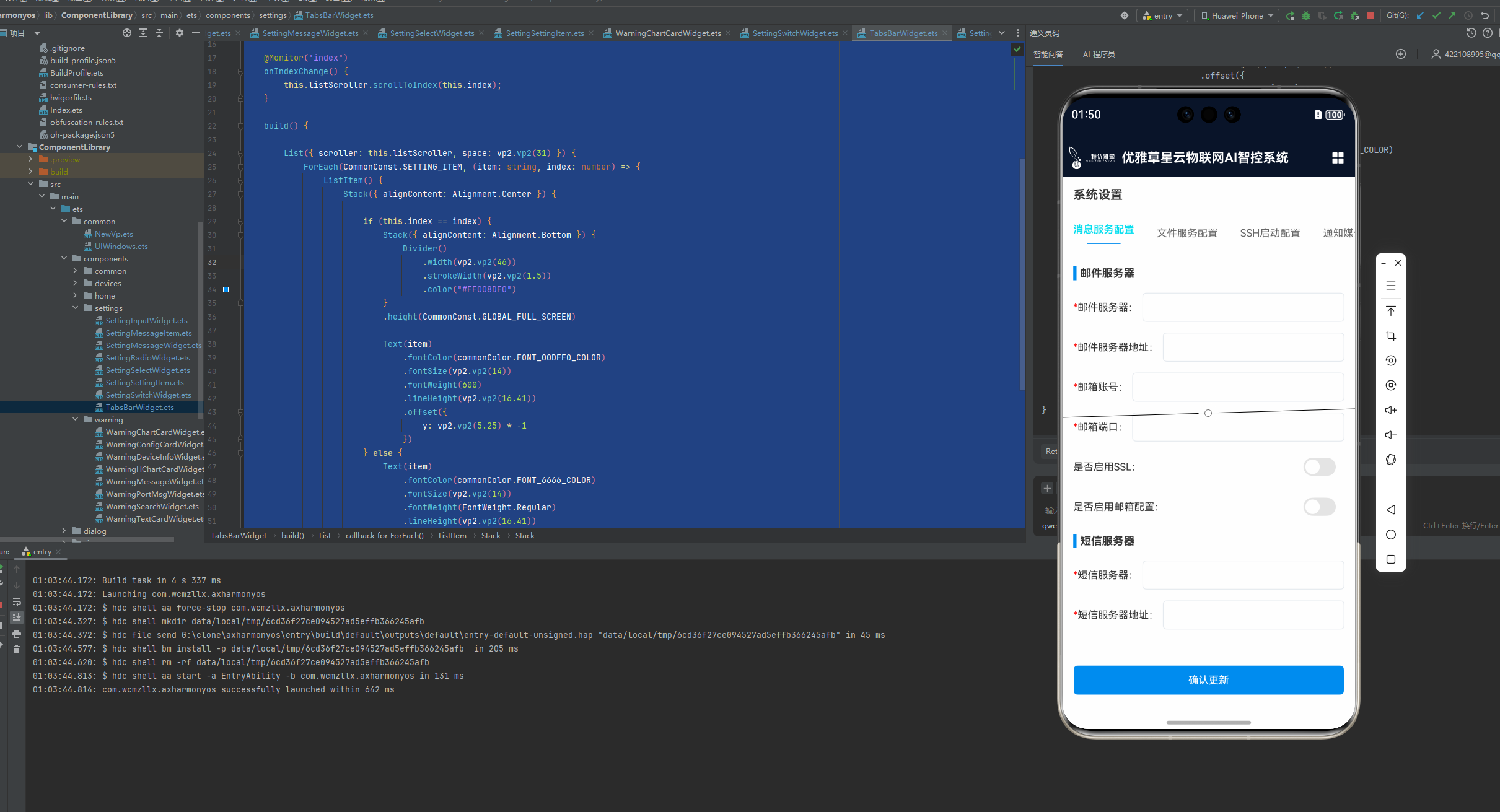
系统配置页面对应的选择src/main/ets/components/settings/SettingSelectWidget.ets
/*
 * Copyright (c) 2025.成都市一颗优雅草科技有限公司
 * author:卓伊凡-优雅草技术总监
 * project:优雅草星云物联网智控AI系统
 */

import { commonColor, CommonConst } from "@wcmzllx/common-const-library"
import { vp2 } from "../../common/NewVp"

@Extend(Select)
function selectOption(text: string) {
    .value(text)
    .font({ size: 14, weight: FontWeight.Regular })
    .fontColor(commonColor.FONT_9999_COLOR)
    .backgroundColor(Color.Transparent)
    .padding(vp2.vp2(10))
    .margin(0)
    .borderRadius(0)
}


@ComponentV2
export struct SettingSelectWidget {
    @Param title: string = "系统语言"
    @Param data: SelectOption[] = [
        { value: 'aaa' },
        { value: 'bbb' },
        { value: 'ccc' },
        { value: 'ddd' }]
    @Param isMust: boolean = true
    @Local index: number = 0;

    @Local text: string = "";

    aboutToAppear(): void {
        try{
            this.text = this.data[0].value as string
        }catch (e) {
            this.text = "请选择";
        }
    }

    build() {
        Row({ space: vp2.vp2(5) }) {
            Text(undefined) {
                if (this.isMust) {
                    Span("*").fontColor("#FFFD0808")
                }
                Span(this.title + ":")
                    .fontColor(commonColor.FONT_3333_COLOR)
            }
            .fontSize(vp2.vp2(14))
            .fontWeight(FontWeight.Regular)
            .lineHeight(vp2.vp2(16.41))

            Stack() {
                Row() {
                    Select(this.data)
                        .selectOption(this.text)
                        .onSelect((index: number, text?: string | undefined) => {

                        })
                        .height(CommonConst.GLOBAL_FULL_SCREEN)
                        .width("200%")
                }
                .height(CommonConst.GLOBAL_FULL_SCREEN)
                .width(CommonConst.GLOBAL_FULL_SCREEN)
                .zIndex(1)

                Row() {
                    Image($r("app.media.ic_input_select"))
                        .height(vp2.vp2(16))
                        .aspectRatio(1)
                }
                .justifyContent(FlexAlign.End)
                .padding(vp2.vp2(10))
                .hitTestBehavior(HitTestMode.Transparent)
                .zIndex(2)
                .height(CommonConst.GLOBAL_FULL_SCREEN)
                .width(CommonConst.GLOBAL_FULL_SCREEN)

            }
            .clip(true)
            .height(vp2.vp2(40))
            .borderRadius(5)
            .layoutWeight(1)
            .borderWidth(vp2.vp2(1))
            .borderColor("#FFE6EBF0")
        }
    }
}
系统设置 选择组件src/main/ets/components/settings/SettingSettingItem.ets
/*
 * Copyright (c) 2025.成都市一颗优雅草科技有限公司
 * author:卓伊凡-优雅草技术总监
 * project:优雅草星云物联网智控AI系统
 */

// 导入常用的常量、颜色、设置项模型和数组模型
import { CommonConst, commonColor, SettingsItemModel, SettingsArrayModel } from "@wcmzllx/common-const-library"
// 导入统一的UI窗口工具
import { uiWindows } from "../../common/UIWindows"
// 导入可视区域计算工具
import { vp2 } from "../../common/NewVp"
// 导入设置输入组件
import { SettingInputWidget } from "./SettingInputWidget"
// 导入设置选择组件
import { SettingSelectWidget } from "./SettingSelectWidget"
// 导入设置开关组件
import { SettingSwitchWidget } from "./SettingSwitchWidget"

// 定义一个设置项组件,用于展示和编辑设置
@ComponentV2
export struct SettingSettingItem {
    // 接受一个设置数组模型的参数
    @Param item: SettingsArrayModel[] = []

    // 构建UI界面
    build() {
        // 创建一个滚动视图,用于容纳可能超出屏幕的设置项
        Scroll() {
            // 创建一个垂直布局,用于排列设置项
            Column({ space: vp2.vp2(15) }) {
                // 添加一个空白视图,用于调整布局间距
                Blank().height(vp2.vp2(13))

                // 遍历设置数组,动态生成设置项
                ForEach(this.item, (item: SettingsArrayModel) => {
                    // 如果设置项有标题,则显示标题
                    if (item.title) {
                        // 创建一个水平布局,用于显示设置项的标题
                        Row({ space: vp2.vp2(5) }) {
                            // 添加一个彩色条,用于装饰标题
                            Column().width(vp2.vp2(4.5)).height(vp2.vp2(19.5)).backgroundColor(commonColor.BRAND_COLOR)

                            // 显示设置项的标题
                            Text(item.title)
                                .fontColor(commonColor.FONT_3333_COLOR)
                                .fontSize(vp2.vp2(15))
                                .fontWeight(FontWeight.Bold)
                                .lineHeight(vp2.vp2(17.58))
                        }
                        //.margin({ top: vp2.vp2(10) })
                        .justifyContent(FlexAlign.Start)
                        .width(CommonConst.GLOBAL_FULL_SCREEN)
                        .height(vp2.vp2(24))
                    }
                    // 遍历设置项,根据类型显示不同的设置组件
                    ForEach(item.item, (item: SettingsItemModel) => {
                        // 如果是开关类型设置项
                        if (item.type == "switch") {
                            // 显示开关组件
                            SettingSwitchWidget({
                                title: item.title,
                                isMust: item.isMust,
                                isOn: item.isOn,
                                onSwitchChange: item.onSwitchChange
                            })
                        } else if (item.type == "select") {
                            // 如果是选择类型设置项,显示选择组件
                            SettingSelectWidget({ title: item.title, isMust: item.isMust })// , data: item.data
                            // SettingSelectWidget()
                        } else if (item.type == "input") {
                            // 如果是输入类型设置项,显示输入组件
                            SettingInputWidget({
                                title: item.title,
                                isMust: item.isMust,
                                onContentChange: item.onInputChange
                            })
                        }
                    })
                })

                // 添加一个确认更新按钮
                Button("确认更新", { type: ButtonType.Normal })
                    .borderRadius(5)
                    .backgroundColor(commonColor.BRAND_COLOR)
                    .width(vp2.vp2(372))
                    .height(vp2.vp2(40))
                    .fontSize(vp2.vp2(14))
                    .margin({ top: vp2.vp2(35) })
            }
            // 设置滚动视图的底部填充,以适应不同设备的导航栏高度
            .padding({
                bottom: uiWindows.getNavigationHeight() + vp2.vp2(10)
            })
            .width(CommonConst.GLOBAL_FULL_SCREEN)
        }
        // 关闭滚动条,提升用户体验
        .scrollBar(BarState.Off)
        .align(Alignment.Top)
        .height(CommonConst.GLOBAL_FULL_SCREEN)
    }
}
定义开关 src/main/ets/components/settings/SettingSwitchWidget.ets 这块主要是针对颜色变化
/*
 * Copyright (c) 2025.成都市一颗优雅草科技有限公司
 * author:卓伊凡-优雅草技术总监
 * project:优雅草星云物联网智控AI系统
 */

// 导入常用颜色常量库
import { commonColor } from "@wcmzllx/common-const-library"
// 导入统一的视觉和布局参数库
import { vp2 } from "../../common/NewVp"

// 定义一个设置开关组件,用于在界面上展示一个带开关的设置项
@ComponentV2
export struct SettingSwitchWidget {
    // 设置项的标题,默认值为"系统语言"
    @Param title: string = "系统语言"
    // 是否为必填项,用于标记设置项的重要性
    @Param isMust: boolean = true
    // 开关的初始状态,true表示开启,false表示关闭
    @Param isOn: boolean = true;
    // 当开关状态改变时触发的事件,接收一个布尔值参数,表示新的开关状态
    @Event onSwitchChange: (isOn: boolean) => void;

    // 组件的构建方法,用于定义组件的UI结构
    build() {
        // 使用Row组件来布局设置项的标题和开关,设置它们之间的间距
        Row({ space: vp2.vp2(5) }) {
            // 使用Text组件来显示设置项的标题,如果设置项为必填,则在标题前加一个红色的星号
            Text(undefined) {
                if (this.isMust) {
                    Span("*").fontColor("#FFFD0808")
                }
                Span(this.title + ":")
                    .fontColor(commonColor.FONT_3333_COLOR)
            }
            .fontSize(vp2.vp2(14))
            .fontWeight(FontWeight.Regular)
            .lineHeight(vp2.vp2(16.41))

            // 使用Row组件来布局开关,并设置其对齐方式和样式
            Row() {
                // 使用Toggle组件来显示一个开关按钮,并设置其类型、初始状态、大小、选中颜色以及状态改变时的事件处理函数
                Toggle({ type: ToggleType.Switch, isOn: this.isOn })
                    .size({ width: vp2.vp2(44.44), height: vp2.vp2(25) })
                    .selectedColor(commonColor.BRAND_COLOR)
                    .onChange(this.onSwitchChange)
                    .borderRadius(vp2.vp2(12.5))
            }
            .justifyContent(FlexAlign.End)
            .padding(vp2.vp2(10))
            .height(vp2.vp2(40))
            //.borderRadius(5)
            .layoutWeight(1)
           // .borderWidth(vp2.vp2(1))

            // .borderColor("#FFE6EBF0")
        }
    }
}
src/main/ets/components/settings/TabsBarWidget.ets
/*
 * Copyright (c) 2025.成都市一颗优雅草科技有限公司
 * author:卓伊凡-优雅草技术总监
 * project:优雅草星云物联网智控AI系统
 */

// 导入常用常量和颜色配置
import { CommonConst, commonColor } from "@wcmzllx/common-const-library"
// 导入自定义的vp2工具函数
import { vp2 } from "../../common/NewVp"

// 定义一个组件,使用ComponentV2装饰器标记
@ComponentV2
export struct TabsBarWidget {
    // 定义一个参数,表示当前选中的标签页索引
    @Param index: number = 0
    // 定义一个事件,当标签页索引发生变化时触发
    @Event $index: (index: number) => void;
    // 定义一个依赖项,需要一个TabsController实例
    @Require @Param controller: TabsController;
    // 定义一个私有成员,用于滚动列表
    private listScroller: ListScroller = new ListScroller()

    // 监视index属性变化,当index变化时,滚动列表到对应的项
    @Monitor("index")
    onIndexChange() {
        this.listScroller.scrollToIndex(this.index);
    }

    // 构建组件UI
    build() {
        // 创建一个列表,使用listScroller进行滚动,设置项之间的间距
        List({ scroller: this.listScroller, space: vp2.vp2(31) }) {
            // 遍历设置项,生成每个标签页项
            ForEach(CommonConst.SETTING_ITEM, (item: string, index: number) => {
                ListItem() {
                    Stack({ alignContent: Alignment.Center }) {
                        // 根据当前索引是否与项索引一致,决定是否显示选中状态
                        if (this.index == index) {
                            // 显示选中状态,包括下划线和文本颜色变化
                            Stack({ alignContent: Alignment.Bottom }) {
                                Divider()
                                    .width(vp2.vp2(46))
                                    .strokeWidth(vp2.vp2(1.5))
                                    .color("#FF008DF0")
                            }
                            .height(CommonConst.GLOBAL_FULL_SCREEN)

                            Text(item)
                                .fontColor(commonColor.FONT_00DFF0_COLOR)
                                .fontSize(vp2.vp2(14))
                                .fontWeight(600)
                                .lineHeight(vp2.vp2(16.41))
                                .offset({
                                    y: vp2.vp2(5.25) * -1
                                })
                        } else {
                            // 未选中状态,文本颜色不同
                            Text(item)
                                .fontColor(commonColor.FONT_6666_COLOR)
                                .fontSize(vp2.vp2(14))
                                .fontWeight(FontWeight.Regular)
                                .lineHeight(vp2.vp2(16.41))
                        }
                    }
                    .height(CommonConst.GLOBAL_FULL_SCREEN)
                    // 点击事件,改变当前索引并触发事件
                    .onClick(() => {
                        this.controller.changeIndex(index);
                        this.$index(index)
                    })
                }
            })
        }
        // 设置列表滚动方向,关闭滚动条,设置宽度和高度
        .listDirection(Axis.Horizontal)
        .scrollBar(BarState.Off)
        .width(CommonConst.GLOBAL_FULL_SCREEN)
        .height(vp2.vp2(30))
    }
}
ok 基本上 设置相关页面基本就完成了,


 扫一扫
扫一扫


 被折叠的 条评论
为什么被折叠?
被折叠的 条评论
为什么被折叠?
 到【灌水乐园】发言


