


1、概述
ArkTs提供了应用内主题切换功能,支持全局主题切换,也支持局部主题切换,效果如下。本文针对主题切换做简单介绍

2、主题色
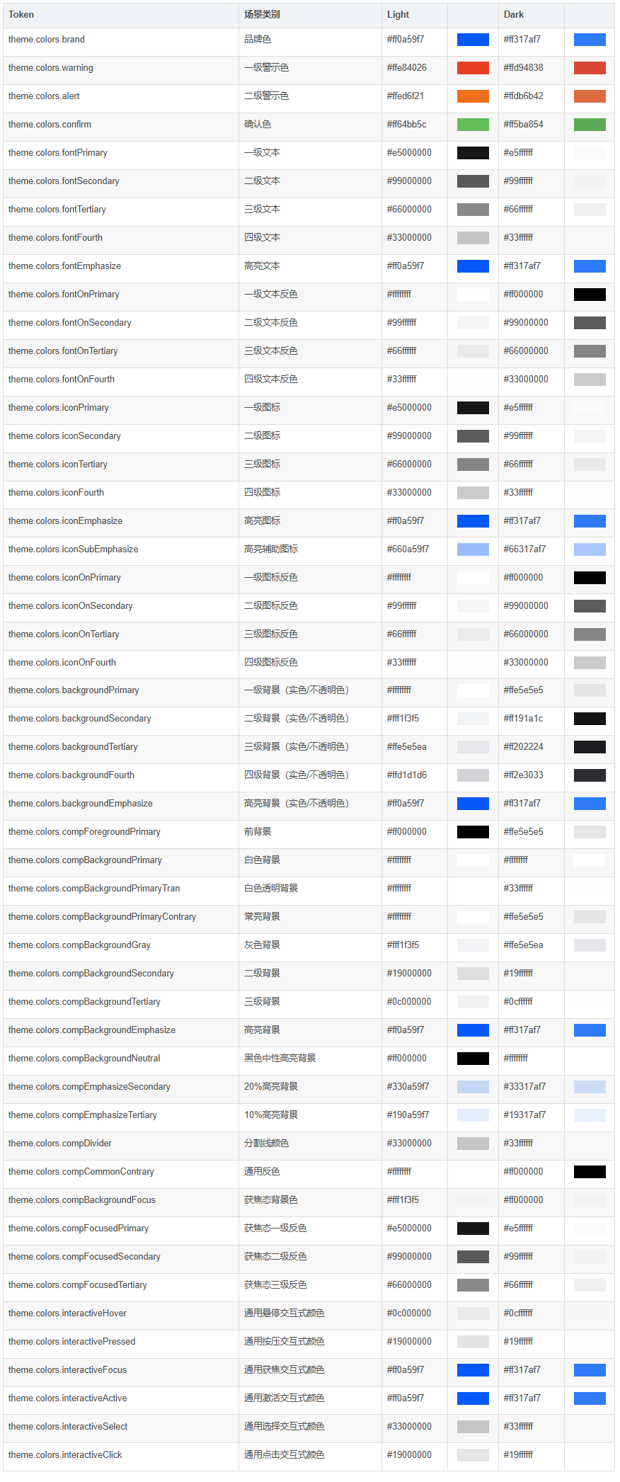
ArkTs提供了一套内置主题配色,有Colors对象持有,它包含了默认情况下,关于主题的基本资源枚举,枚举的key与说明如下:
brand  品牌色。
warning  一级警示色。
alert  二级提示色。
confirm  确认色。
fontPrimary  一级文本字体颜色。
fontSecondary  二级文本字体颜色。
fontTertiary  三级文本字体颜色。
fontFourth  四级文本字体颜色。
fontEmphasize  高亮字体颜色。
fontOnPrimary  一级文本反转颜色,用于彩色背景。
fontOnSecondary  二级文本反转颜色,用于彩色背景。
fontOnTertiary  三级文本反转颜色,用于彩色背景。
fontOnFourth  四级文本反转颜色,用于彩色背景。
iconPrimary  一级图标颜色。
iconSecondary  二级图标颜色。
iconTertiary  三级图标颜色。
iconFourth  四级图标颜色。
iconEmphasize  高亮图标颜色。
iconSubEmphasize  高亮辅助图标颜色。
iconOnPrimary  一级图标反转颜色,用于彩色背景。
iconOnSecondary  二级图标反转颜色,用于彩色背景。
iconOnTertiary  三级图标反转颜色,用于彩色背景。
iconOnFourth  四级图标反转颜色,用于彩色背景。
backgroundPrimary  一级背景颜色(实色,不透明)。
backgroundSecondary  二级背景颜色(实色,不透明)。
backgroundTertiary  三级背景颜色(实色,不透明)。
backgroundFourth  四级背景颜色(实色,不透明)。
backgroundEmphasize  高亮背景颜色(实色,不透明)。
compForegroundPrimary  前背景。
compBackgroundPrimary  白色背景。
compBackgroundPrimaryTran  白色透明背景。
compBackgroundPrimaryContrary  常亮背景。
compBackgroundGray  灰色背景。
compBackgroundSecondary  二级背景。
compBackgroundTertiary  三级背景。
compBackgroundEmphasize  高亮背景。
compBackgroundNeutral  黑色中性高亮背景颜色。
compEmphasizeSecondary  20%高亮背景颜色。
compEmphasizeTertiary  10%高亮背景颜色。
compDivider  通用分割线颜色。
compCommonContrary  通用反转颜色。
compBackgroundFocus  获焦态背景颜色。
compFocusedPrimary  获焦态一级反转颜色。
compFocusedSecondary  获焦态二级反转颜色。
compFocusedTertiary  获焦态三级反转颜色。
interactiveHover  通用悬停交互式颜色。
interactivePressed  通用按压交互式颜色。
interactiveFocus  通用获焦交互式颜色。
interactiveActive  通用激活交互式颜色。
interactiveSelect  通用选择交互式颜色。
interactiveClick  通用点击交互式颜色。
对应的颜色罗列如下:
我们可以在默认值的基础上对指定的颜色值做复写,其余部分将会使用默认值。假设我们需要修改几个颜色:brand、fontPrimary、iconOnPrimary、iconFourth,修改方法示意如下:
 // AppTheme.ets
import { CustomColors, CustomTheme } from '@kit.ArkUI'
export class AppColors implements CustomColors {
  //自定义主题色
  brand = 0xFF75D9;
  fontPrimary = 0xFFD53032
  iconOnPrimary = 0xFFD53032
  iconFourth = 0xFFD53032
}
export class AppTheme implements CustomTheme {
  public colors: AppColors = new AppColors()
}
export let gAppTheme: CustomTheme = new AppTheme()
2.1、设置自定义全局主题
我们可以在UIAbility中设置ThemeControl,在onWindowStageCreate()方法中setDefaultTheme,设置应用内组件的自定义主题色。
代码如下(26行):
// EntryAbility.ets
import {AbilityConstant, UIAbility, Want } from '@kit.AbilityKit';
import { hilog } from '@kit.PerformanceAnalysisKit';
import { window, CustomColors, ThemeControl } from '@kit.ArkUI';
import { gAppTheme } from './AppTheme'
export default class EntryAbility extends UIAbility {
  onCreate(want: Want, launchParam: AbilityConstant.LaunchParam) {
    hilog.info(0x0000, 'testTag', '%{public}s', 'Ability onCreate');
  }
  onDestroy() {
    hilog.info(0x0000, 'testTag', '%{public}s', 'Ability onDestroy');
  }
  onWindowStageCreate(windowStage: window.WindowStage) {
    // Main window is created, set main page for this ability
    hilog.info(0x0000, 'testTag', '%{public}s', 'Ability onWindowStageCreate');

    windowStage.loadContent('pages/Index', (err, data) => {
      if (err.code) {
        hilog.error(0x0000, 'testTag', 'Failed to load the content. Cause: %{public}s', JSON.stringify(err) ?? '');
        return;
      }
      hilog.info(0x0000, 'testTag', 'Succeeded in loading the content. Data: %{public}s', JSON.stringify(data) ?? '');
      // 在onWindowStageCreate()方法中setDefaultTheme
      ThemeControl.setDefaultTheme(gAppTheme)
      hilog.info(0x0000, 'testTag', '%{public}s', 'ThemeControl.setDefaultTheme done');
    });
  }
}
设置好后,我们写一个Page,代码如下:
@Entry
@Component
struct DisplayPage {
  build() {
    Column() {
      List({ space: 10 }) {
        ListItem() {
          Column({ space: '5vp' }) {
            Text('Color mode')
              .margin({ top: '5vp', left: '14fp' })
              .width('100%')
            Row() {
              Column() {
                Text('Light')
                  .fontSize('16fp')
                  .textAlign(TextAlign.Start)
                  .alignSelf(ItemAlign.Center)
                Radio({ group: 'light or dark', value: 'light' })
                  .checked(true)
              }
              .width('50%')
              Column() {
                Text('Dark')
                  .fontSize('16fp')
                  .textAlign(TextAlign.Start)
                  .alignSelf(ItemAlign.Center)
                Radio({ group: 'light or dark', value: 'dark' })
              }
              .width('50%')
            }
          }
          .width('100%')
          .height('90vp')
          .borderRadius('10vp')
        }
        ListItem() {
          Column() {
            Text('Brightness')
              .width('100%')
              .margin({ top: '5vp', left: '14fp' })
            Slider({ value: 40, max: 100 })
          }
          .width('100%')
          .height('70vp')
          .borderRadius('10vp')
        }
        ListItem() {
          Column() {
            Row() {
              Column({ space: '5vp' }) {
                Text('Touch sensitivity')
                  .fontSize('16fp')
                  .textAlign(TextAlign.Start)
                  .width('100%')
                Text('Increase the touch sensitivity of your screen' +
                  ' for use with screen protectors')
                  .fontSize('12fp')
                  .fontColor(Color.Blue)
                  .textAlign(TextAlign.Start)
                  .width('100%')
              }
              .alignSelf(ItemAlign.Center)
              .margin({ left: '14fp' })
              .width('75%')
              Toggle({ type: ToggleType.Switch, isOn: true })
                .margin({ right: '14fp' })
                .alignSelf(ItemAlign.Center)
            }
            .width('100%')
            .height('80vp')
          }
          .width('100%')
          .borderRadius('10vp')
        }
      }
    }
    .padding('10vp')
    .backgroundColor('#dcdcdc')
    .width('100%')
    .height('100%')
  }
}
效果如下(注意,在预览器里面看到的效果是默认主题效果,需要真机或模拟器才可以看到真实效果):
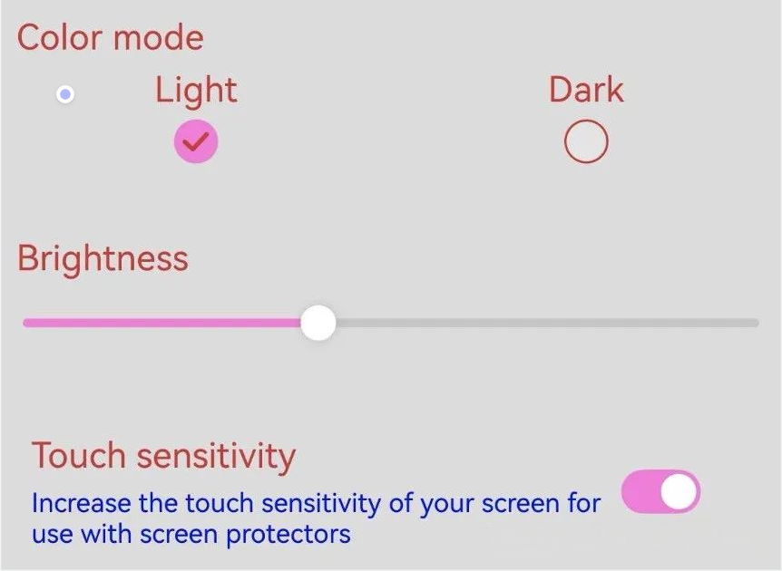
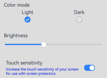
默认情况下,效果如下:
2.3、Page中获取自定义主题
我们可以在onWillApplyTheme回调函数获取用于使自定义组件获取当前生效的Theme对象。我们可以获取自定义的主题对象,读取指定的主题色值,代码示例如下(9 ~ 10行):
import { Theme, ThemeControl } from '@kit.ArkUI'
  @Entry
  @Component
  struct DisplayPage {
    @State menuItemColor: ResourceColor = $r('sys.color.background_primary')

    onWillApplyTheme(theme: Theme) {
      // theme是当前生效的主题对象
      this.menuItemColor = theme.colors.backgroundPrimary;
    }

    build() {
    // ...
    }
  }
2.4、局部应用主题色
我们可以通过设置WithTheme,将自定义主题Theme的配色应用于内部组件的默认样式。在WithTheme的作用范围内,组件的配色会根据Theme的配色进行调整。代码如下(29行):
import { CustomColors, CustomTheme, Theme } from '@kit.ArkUI'
class AppColors implements CustomColors {
  fontPrimary: Color = Color.Pink;
  backgroundEmphasize: Color = Color.Pink;
}
class AppColorsSec implements CustomColors {
  fontPrimary: Color = Color.Orange;
  backgroundEmphasize: Color = Color.Orange;
}
class AppTheme implements CustomTheme {
  public colors: AppColors = new AppColors()
}
class AppThemeSec implements CustomTheme {
  public colors: AppColors = new AppColorsSec()
}
@Entry
@Component
struct DisplayPage {
  @State customTheme: CustomTheme = new AppTheme()
  @State message: string = '切换自定义主题风格'
  count = 0;
  build() {
    WithTheme({ theme: this.customTheme }) {
      Row(){
        Column() {
          Text('WithTheme')
            .fontSize(30)
            .margin({bottom: 10})
          Text(this.message)
            .margin({bottom: 10})
          Button('切换主题').onClick(() => {
            this.count++;
            if (this.count > 1) {
              this.count = 0;
            }
            switch (this.count) {
              case 0:
                this.customTheme = new AppTheme();
                break;
              case 1:
                this.customTheme = new AppThemeSec();
                break;
            }
          })
        }
        .width('100%')
      }
      .height('100%')
      .width('100%')
    }
  }
}
如示例代码所示,使用WithTheme({ theme: this.myTheme })可将作用域内组件的配色设置为自定义主题风格。后续可以通过更新this.myTheme来更换主题风格。onWillApplyTheme回调函数用于使自定义组件能够获取当前生效的Theme对象。效果如下:


 扫一扫
扫一扫


 1252
1252

 被折叠的 条评论
为什么被折叠?
被折叠的 条评论
为什么被折叠?
 到【灌水乐园】发言


