


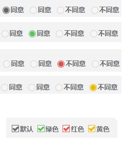
效果:
不使用js实现效果,纯css实现,操作“选中/禁用”等请使用原生js的dom操作方法.
html:
<!--radio-->
<label class="ms-radio ms-radio-default">
    <input type="radio"  value="1" name="a">默认
</label>
<label class="ms-radio ms-radio-success ">
    <input type="radio"   value="2" name="a">绿色
</label>
<label class="ms-radio ms-radio-danger">
    <input type="radio"  value="3" name="a"  >红色
</label>
<label class="ms-radio ms-radio-warning ">
    <input type="radio"  value="4" name="a" checked="">黄色
</label>

<!--checkbox-->
<label class="ms-checkbox ms-checkbox-default">
    <input type="checkbox" name="a" value="1" />默认
</label>
<label class="ms-checkbox ms-checkbox-success">
    <input type="checkbox" name="a" value="2" />绿色
</label>
<label class="ms-checkbox ms-checkbox-danger">
    <input type="checkbox" name="a" value="3" />红色
</label>
<label class="ms-checkbox ms-checkbox-warning">
    <input type="checkbox" name="a" value="4" />黄色
</label>
css(less):
.ms-radio, .ms-checkbox {
    box-sizing: border-box;
    cursor: pointer;
    position: relative;
    margin-right: 20px;

    input {
        width: 0;
        height: 0;
        outline: none;
    }
    input:before {
        outline: none;
        border: 1px solid #d4d4d4;
        content: "";
        display: inline-block;
        background-color: rgba(255, 255, 255, 0.26);
        width: 14px;
        height: 14px;
        position: absolute;
        top: 0px;
        left: -16px;
        -webkit-transition: border 0.15s ease-in-out;
        -o-transition: border 0.15s ease-in-out;
        transition: border 0.15s ease-in-out;
    }
    input[type="radio"]:before {
        border-radius: 50%;
    }
    input[type="radio"]:after {
        outline: none;
        content: "";
        width: 14px;
        height: 14px;
        position: absolute;
        top: 0px;
        left: -16px;
        border-radius: 50%;
        content: "";
        display: inline-block;
    }
    input[type="radio"]:checked:before {
        border: none;
        width: 10px;
        height: 10px;
        top: 2px;
        left: -14px;
    }

    input[type="checkbox"]:checked:before {
        font-family: "FontAwesome";
        content: "\f00c";
    }
}
.ms-radio-default {
    input[type="radio"]:checked:before {
        background-color: #666;
    }
    input[type="radio"]:checked:after, input[type="radio"]:hover:not(:disabled):after {
        border: 1px solid #666;
    }
}
.ms-radio-warning {
    input[type="radio"]:checked:before {
        background-color: #e5bb00;
    }
    input[type="radio"]:checked:after, input[type="radio"]:hover:not(:disabled):after {
        border: 1px solid #e5bb00;
    }
}
.ms-radio-danger {
    input[type="radio"]:checked:before {
        background-color: #d9534f;
    }

    input[type="radio"]:checked:after, input[type="radio"]:hover:not(:disabled):after {
        border: 1px solid #d9534f;
    }
}
.ms-radio-success {
    input:checked:before {
        background-color: #63bf63;
    }
    input[type="radio"]:checked:after, input[type="radio"]:hover:not(:disabled):after {
        border: 1px solid #63bf63;
    }
}

.ms-checkbox-default {
    input[type="checkbox"]:checked:before {
        color: #666;
    }
    input[type="checkbox"]:checked:before, input[type="checkbox"]:hover:not(:disabled):before {
        border: 1px solid #666;
    }
}
.ms-checkbox-success {
    input[type="checkbox"]:checked:before {
        color: #63bf63;
    }
    input[type="checkbox"]:checked:before, input[type="checkbox"]:hover:not(:disabled):before {
        border: 1px solid #63bf63;
    }
}
.ms-checkbox-danger {
    input[type="checkbox"]:checked:before {
        color: #d9534f;
    }
    input[type="checkbox"]:checked:before, input[type="checkbox"]:hover:not(:disabled):before {
        border: 1px solid #d9534f;
    }
}
.ms-checkbox-warning {
    input[type="checkbox"]:checked:before {
        color: #e5bb00;
    }

    input[type="checkbox"]:checked:before, input[type="checkbox"]:hover:not(:disabled):before {
        border: 1px solid #e5bb00;
    }
}


 3338
3338


 被折叠的 条评论
为什么被折叠?
被折叠的 条评论
为什么被折叠?
 到【灌水乐园】发言


