


前言
这段时间对逆水寒很是着迷,这不我又打开了它的官网,不得不说网易前端官网做的是真炫酷!!!
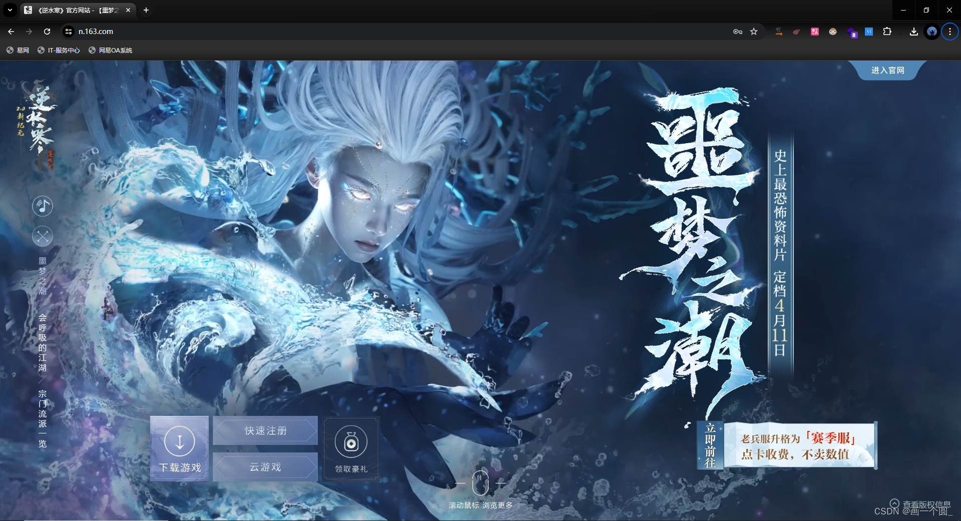
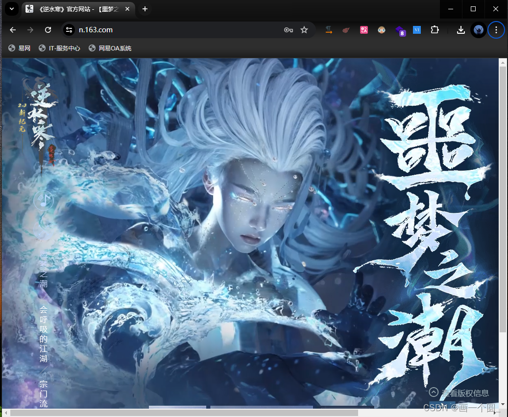
同样是前端的开发者(自己还是小菜鸡罢了),就不得不想扣扣官方的细节了,拿出我们老生常谈的问题—适配,官方做的很漂亮,窗口缩小不会影响页面内容位置的偏移,当我将窗口缩小的时候还会出现滚动条让我可以滚动滚动条来看到完整的页面内容。
有兴趣的同学可以去打开官网尝试一下。这种页面其实在很多地方都可以看到,如:产品官网,可视化大屏看板等等。所以这个怎么实现呢?接下来让我们来尝试复现一下。
实现
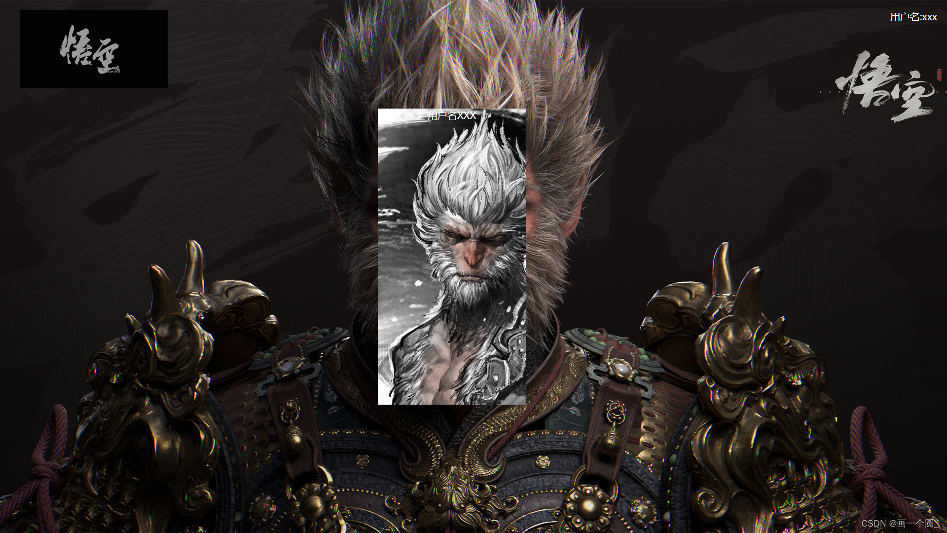
既然全屏是背景图片,那页面肯定就直接使用背景图片了,这里用了最近大火的《黑神话*悟空》游戏的素材了(素材都是网上搜的,不是爬的哈😜)。
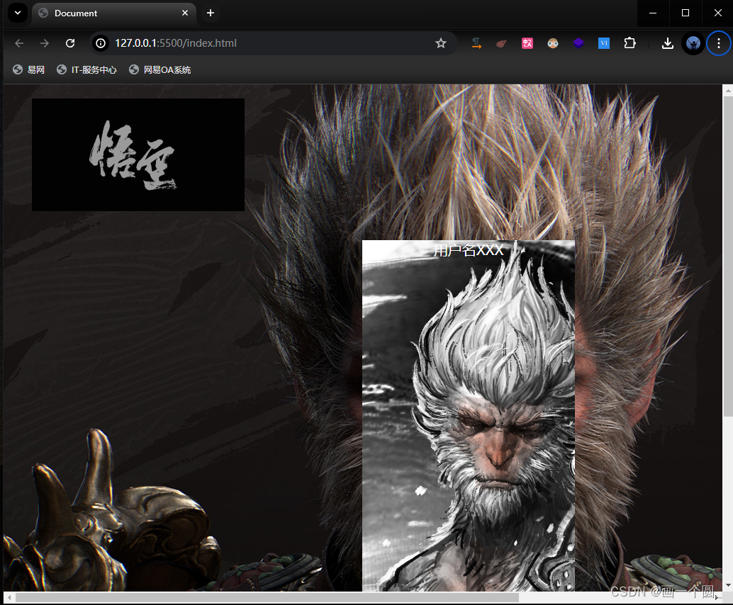
既然缩小会有滚动条,就说明设置了最小宽度值,这里我设置了最小宽度值为 1400px,其它的都是比较常规的操作了~。
有一个细节,就是在做悟空遮脸图的时候,由于是使用absolute绝对定位(center 并没有完全遮住悟空的脸🤣),为了避免窗口在缩小到一定成都后(小于遮脸图的高宽度)导致挤压出现白边的情况,所以要先在父元素中设置一个可以容纳所有子元素(使用定位的元素)的宽高。
另外,在使用定位元素的过程中,我们能使用相对定位情况就用相对定位,如遮脸图就使用的是relative,这样可以避免布局错乱等问题。
<template>
   <header>
     <div class="logo"></div>
     <div class="username">用户名:xxx</div>
   </header>
   <main>
     <section>
       <div class="backImg">
         <div class="username">用户名XXX</div>
       </div>
     </section>
   </main>
</template>

<style>
* {
  margin: 0;
  padding: 0;
}
html {
  min-width: 1400px;
}
body {
  max-width: 1920px;
  min-height: 1080px;
  background: url("demo.jpg") top no-repeat;
  background-size: cover;
  font-size: 16px;
  display: flex;
  flex-direction: column;
}
header {
  width: 100%;
  display: flex;
  flex-direction: row;
  justify-content: space-between;
}
.logo {
  width: 300px;
  height: 200px;
  background: url("logo.png") no-repeat;
  background-size: contain;
  margin-left: 40px;
  margin-top: 20px;
}
.username {
  color: #fff;
  font-size: 20px;
  margin-top: 20px;
  margin-right: 20px;
}
main {
  width: 100%;
  flex: 1;
}
section {
  width: 800px;
  height: 600px;
  margin: 0 auto;
  position: relative;
}
.backImg {
  width: 300px;
  height: 600px;
  position: relative;
  /* margin: 0 auto; */
  left: 206px;
  background: url("center.png") no-repeat;
}
.centerUsername {
  position: absolute;
  left: 50%;
  color: #fff;
  font-size: 20px;
  transform: translateX(-50%);
}
</style>
文章涉及源码链接
实现效果
只是简单实现了下类官网的效果~
全屏效果:
缩小效果:


 扫一扫
扫一扫


 4168
4168

 被折叠的 条评论
为什么被折叠?
被折叠的 条评论
为什么被折叠?
 到【灌水乐园】发言


