


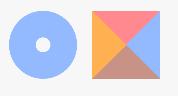
练习一:
<!DOCTYPE html>
<html lang="en">
<head>
	<meta charset="UTF-8">
	<title>CSS3 圆角边框</title>
	<style>
		body {
			padding: 0;
			background-color: #F7F7F7;
		}
		div{
			margin:20px;
			float: left;
		}
		/*饼环*/
		.border-radius {
			width: 40px;
			height: 40px;
			border: 70px solid #93baff;
			border-radius: 90px;
		}
		/*四边不同色*/
		.border-radius1 {
			width: 0px;
			height: 0px;
			border-width: 90px;
			border-style: solid;
			border-color: #ff898e #93baff #c89386 #ffb151;
		}
	</style>
</head>
<body>
	<div class="border-radius"></div>
	<div class="border-radius1"></div>
</body>
</html>
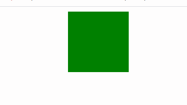
练习二:
<!DOCTYPE html>
<html lang="en">
<head>
	<meta charset="UTF-8">
	<title>Document</title>
	<style type="text/css">
		div{
			width: 100px;
			height: 100px;
			margin: 0 auto;
			background: green;
			transition: all 3s ease;
		}
		div:hover{
			background-color: hotpink;
		}
	</style>
</head>
<body>
	<div></div>
</body>
</html>
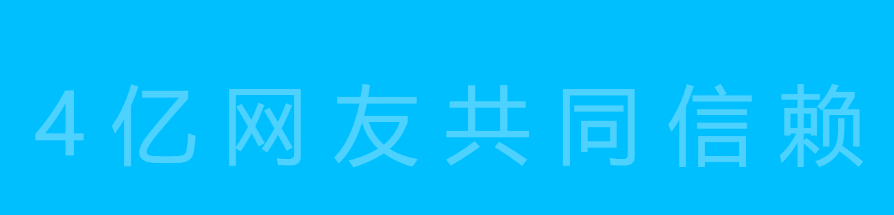
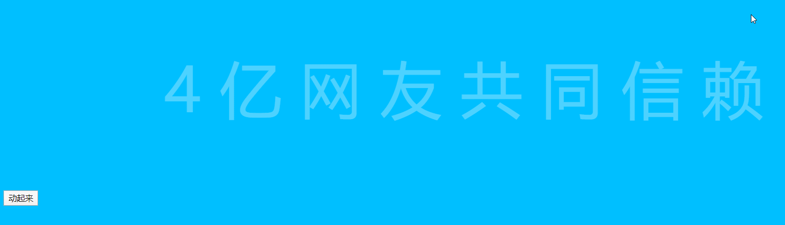
练习三:
<!DOCTYPE html>
<html lang="en">
<head>
	<meta charset="UTF-8">
	<title>Document</title>
	<style type="text/css">
		body{
			background-color: deepskyblue;
		}
		p{
			text-align: center;
			font-size: 100px;
			color: rgba(255,255,255,0.3);
			letter-spacing: 30px;
			transition: all 2s ease-in-out;
		}
		p:hover{
			color: rgba(255,255,255,1);
			letter-spacing: 0;
		}
		.dong{
			color: rgba(255,255,255,1);
			letter-spacing: 0;
		}
	</style>
</head>
<body>
	<p>4亿网友共同信赖</p>
	<button>动起来</button>
	<script type="text/javascript">
		var btn=document.querySelector('button');
		var p= document.querySelector('p');
		btn.onclick=function(){
			p.classList.add('dong');
		}
	</script>
</body>
</html>
练习四:
<!DOCTYPE html>
<html lang="en">
<head>
	<meta charset="UTF-8">
	<title>Document</title>
	<style type="text/css">
		*{
			border: 0;
			margin: 0;
			padding: 0;
		}
		.juxing_one,.juxing_two{
			width: 120px;
			height: 120px;
		}
		.juxing_one{
			position: relative;
			top: 120px;
			left: 120px;
		}
		.juxing_two{
			position: absolute;
			left: 550px;
		}
		.juxing_one div,.juxing_two div{
			float: left;
		}

		.juxing_one .tl{
			width: 0;
			height: 0;
			border-top: 30px solid #92D14F;
			border-left: 30px solid #92D14F;
			border-right: 30px solid #FFFF00;
			border-bottom: 30px solid #FFFF00;
		}
		.juxing_one .tr{
			width: 0;
			height: 0;
			border-top: 30px solid #FE0000;
			border-left: 30px solid #0071C1;
			border-right: 30px solid #FE0000;
			border-bottom: 30px solid #0071C1;

		}
		.juxing_one .bl{
			width: 0;
			height: 0;
			border-top: 30px solid #000000;
			border-left: 30px solid #6F30A2;
			border-right: 30px solid #000000;
			border-bottom: 30px solid #6F30A2;
		}
		.juxing_one .br{
			width: 0;
			height: 0;
			border-top: 30px solid #FFFFFF;
			border-left: 30px solid #FFFFFF;
			border-right: 30px solid #01B0F1;
			border-bottom: 30px solid #01B0F1;
		}
        .juxing_two .tl{
			width: 0;
			height: 0;
			border-top: 30px solid #F80302;
			border-left: 30px solid #70AD46;
			border-right: 30px solid #F80302;
			border-bottom: 30px solid #70AD46;
		}
		.juxing_two .tr{
			width: 0;
			height: 0;
			border-top: 30px solid #44546C;
			border-left: 30px solid #44546C;
			border-right: 30px solid #FFFF00;
			border-bottom: 30px solid #FFFF00;

		}
		.juxing_two .bl{
			width: 0;
			height: 0;
			border-top: 30px solid #6C31A3;
			border-left: 30px solid #6C31A3;
			border-right: 30px solid #012060;
			border-bottom: 30px solid #012060;
		}
		.juxing_two .br{
			width: 0;
			height: 0;
			border-top: 30px solid #FFBF05;
			border-left: 30px solid #01B0F1;
			border-right: 30px solid #FFBF05;
			border-bottom: 30px solid #01B0F1;
		}
		#wujiao {
			width: 0;
			height: 0;
			margin: 300px 300px;
			position: relative;
			border-right: 100px solid transparent;
			border-bottom: 70px solid #5A9BD5;
			border-left: 100px solid transparent;
			-moz-transform: rotate(35deg);
			-webkit-transform: rotate(35deg);
			-ms-transform: rotate(35deg);
			-o-transform: rotate(35deg);
		}
		#wujiao:before {
			width: 0;
			height: 0;
			position: absolute;
			display:block;
			top: -45px;
			left: -65px;
			border-bottom: 80px solid #5A9BD5;
			border-left: 30px solid transparent;
			border-right: 30px solid transparent;
			content: '';
			-webkit-transform: rotate(-35deg);
			-moz-transform: rotate(-35deg);
			-ms-transform: rotate(-35deg);
			-o-transform: rotate(-35deg);
			}
		#wujiao:after {
			width: 0;
			height: 0;
			position: absolute;
			display:block;
			top: 3px;
			left: -105px;
			border-right: 100px solid transparent;
			border-bottom: 70px solid #5A9BD5;
			border-left: 100px solid transparent;
			content: '';
			-webkit-transform: rotate(-70deg);
			-moz-transform: rotate(-70deg);
			-ms-transform: rotate(-70deg);
			-o-transform: rotate(-70deg);
			}
	</style>
</head>
<body>
	<div class="juxing_one">
		<div class="tl"></div>
	    <div class="tr"></div>
	    <div class="bl"></div>
	    <div class="br"></div>
	</div>
	<div class="juxing_two">
		<div class="tl"></div>
	    <div class="tr"></div>
	    <div class="bl"></div>
	    <div class="br"></div>
	</div>
	<div id="wujiao"></div>
</body>
</html>

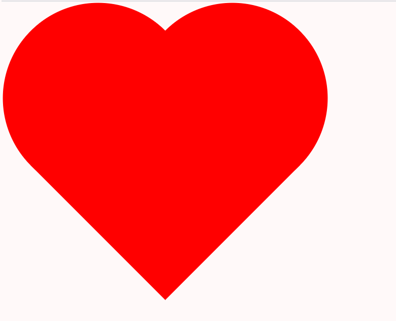
练习五:
<!DOCTYPE html>
<html lang="en">
<head>
	<meta charset="UTF-8">
	<title>Document</title>
	<style type="text/css">
		.heart{
			position: relative;
			left: 100px;
			top: 100px;
			width: 300px;
			height:300px;
			transform: rotate(45deg);
			background: red;
		}
		.heart:before,.heart:after{
			position: absolute;
			display: block;
			content: '';
			width: 300px;
			height: 300px;
			border-radius: 100%;
			background: red;
		}
		.heart:before{
			left: -50%;
			top:0;
		}
		.heart:after{
			right: 0;
			top:-50%;
		}
	</style>
</head>
<body>
	<div class="heart"></div>
</body>
</html>


 2460
2460


 被折叠的 条评论
为什么被折叠?
被折叠的 条评论
为什么被折叠?
 到【灌水乐园】发言


