


这是一个简单方便的Android自定义View库,我一直有一个想法弄一个开源库,现在这个想法付诸实现了,如果有什么需要自定义的View可以提出来,不一定都会采纳,合理的会采纳,时间周期不保证,咱要量力而行呀,踏实一点。
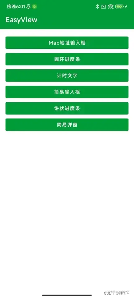
配置EasyView
1. 工程build.gradle 或 settings.gradle配置
代码已经推送到MavenCentral(),在Android Studio 4.2以后的版本中默认在创建工程的时候使用MavenCentral(),而不是jcenter()。
如果是之前的版本则需要在repositories{}闭包中添加mavenCentral(),不同的是,老版本的Android Studio是在工程的build.gradle中添加,而新版本是工程的settings.gradle中添加,如果已经添加,则不要重复添加。
repositories {
    ...
    mavenCentral()
}
2. 使用模块的build.gradle配置
例如在app模块中使用,则打开app模块下的build.gradle,在dependencies{}闭包下添加即可,之后记得要Sync Now。
dependencies {
    implementation 'io.github.lilongweidev:easyview:1.0.5'
}
使用EasyView
这是一个自定义View的库,会慢慢丰富里面的自定义View,我先画个饼再说,源码地址:EasyView
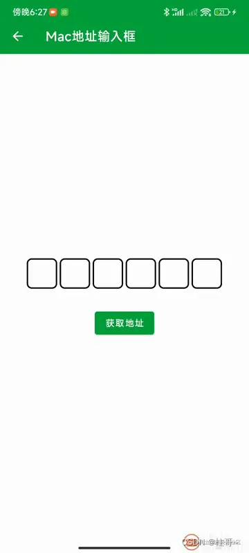
一、MacAddressEditText
MacAddressEditText是一个蓝牙Mac地址输入控件,点击之后出现一个定制的Hex键盘,用于输入值。
1. xml中使用
首先是在xml中添加如下代码,具体参考app模块中的activity_mac_address.xml。
    <com.easy.view.MacAddressEditText
        android:id="@+id/mac_et"
        android:layout_width="wrap_content"
        android:layout_height="wrap_content"
        app:boxBackgroundColor="@color/white"
        app:boxStrokeColor="@color/black"
        app:boxStrokeWidth="2dp"
        app:boxWidth="48dp"
        app:separator=":"
        app:textColor="@color/black"
        app:textSize="14sp" />
2. 属性介绍
这里使用了MacAddressEditText的所有属性,可以自行进行设置,使用说明参考下表。
| 属性 | 说明 |
|---|---|
| app:boxBackgroundColor | 设置输入框的背景颜色 |
| app:boxStrokeColor | 设置输入框的边框颜色 |
| app:boxStrokeWidth | 设置输入框的边框大小 |
| app:boxWidth | 设置输入框大小 |
| app:separator | Mac地址的分隔符,例如分号: |
| app:textColor | 设置输入框文字颜色 |
| app:textSize | 设置输入框文字大小 |
3. 代码中使用
    MacAddressEditText macEt = findViewById(R.id.mac_et);
    String macAddress = macEt.getMacAddress();
macAddress可能会是空字符串,使用之前请判断一下,参考app模块中的MacAddressActivity中的使用方式。
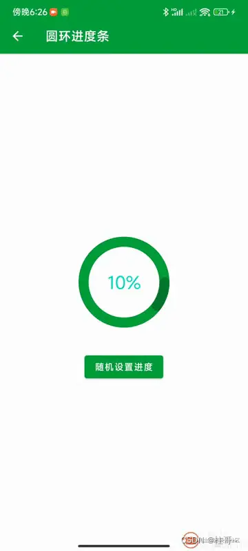
二、CircularProgressBar
CircularProgressBar是圆环进度条控件。
1. xml中使用
首先是在xml中添加如下代码,具体参考app模块中的activity_progress_bar.xml。
    <com.easy.view.CircularProgressBar
        android:id="@+id/cpb_test"
        android:layout_width="wrap_content"
        android:layout_height="wrap_content"
        android:layout_marginTop="30dp"
        app:maxProgress="100"
        app:progress="10"
        app:progressbarBackgroundColor="@color/purple_500"
        app:progressbarColor="@color/purple_200"
        app:radius="80dp"
        app:strokeWidth="16dp"
        app:text="10%"
        app:textColor="@color/teal_200"
        app:textSize="28sp" />
2. 属性介绍
这里使用了MacAddressEditText的所有属性,可以自行进行设置,使用说明参考下表。
| 属性 | 说明 |
|---|---|
| app:maxProgress | 最大进度 |
| app:progress | 当前进度 |
| app:progressbarBackgroundColor | 进度条背景颜色 |
| app:progressbarColor | 进度颜色 |
| app:radius | 半径,用于设置圆环的大小 |
| app:strokeWidth | 进度条大小 |
| app:text | 进度条中心文字 |
| app:textColor | 进度条中心文字颜色 |
| app:textSize | 进度条中心文字大小 |
3. 代码中使用
    CircularProgressBar cpbTest = findViewById(R.id.cpb_test);
    int progress = 10;
    cpbTest.setText(progress + "%");
    cpbTest.setProgress(progress);
参考app模块中的ProgressBarActivity中的使用方式。
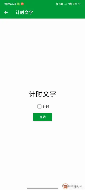
三、TimingTextView
TimingTextView是计时文字控件。
1. xml中使用
首先是在xml中添加如下代码,具体参考app模块中的activity_timing_text.xml。
    <com.easy.view.TimingTextView
        android:id="@+id/tv_timing"
        android:layout_width="wrap_content"
        android:layout_height="wrap_content"
        android:layout_marginTop="30dp"
        android:text="计时文字"
        android:textColor="@color/black"
        android:textSize="32sp"
        app:countdown="false"
        app:max="60"
        app:unit="s" />
2. 属性介绍
这里使用了TimingTextView的自定义属性不多,只有3个,TextView的属性就不列举说明,使用说明参考下表。
| 属性 | 说明 |
|---|---|
| app:countdown | 是否倒计时 |
| app:max | 最大时间长度 |
| app:unit | 时间单位:s(秒)、m(分)、h(时) |
3. 代码中使用
    TimingTextView tvTiming = findViewById(R.id.tv_timing);
    tvTiming.setMax(6);//最大时间
    tvTiming.setCountDown(false);//是否倒计时
    tvTiming.setUnit(3);//单位 秒
    tvTiming.setListener(new TimingListener() {
        @Override
        public void onEnd() {
            //定时结束
        }
    });
    //开始计时
    tvTiming.start();
    //停止计时
    //tvTiming.end();
参考app模块中的TimingActivity中的使用方式。
四、EasyEditText
EasyEditText是一个简易输入控件,可用于密码框、验证码输入框进行使用。
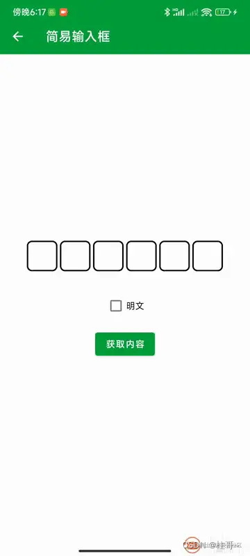
1. xml中使用
首先是在xml中添加如下代码,具体参考app模块中的activity_easy_edittext.xml。
    <com.easy.view.EasyEditText
        android:id="@+id/et_content"
        android:layout_width="wrap_content"
        android:layout_height="wrap_content"
        app:boxBackgroundColor="@color/white"
        app:boxFocusStrokeColor="@color/green"
        app:boxNum="6"
        app:boxStrokeColor="@color/black"
        app:boxStrokeWidth="2dp"
        app:boxWidth="48dp"
        app:ciphertext="false"
        app:textColor="@color/black"
        app:textSize="16sp" />
2. 属性介绍
这里使用了EasyEditText的所有属性,可以自行进行设置,使用说明参考下表。
| 属性 | 说明 |
|---|---|
| app:boxBackgroundColor | 设置输入框的背景颜色 |
| app:boxFocusStrokeColor | 设置输入框获取焦点时的颜色 |
| app:boxNum | 设置输入框的个数,4~6个 |
| app:boxStrokeColor | 设置输入框的边框颜色 |
| app:boxStrokeWidth | 设置输入框的边框大小 |
| app:boxWidth | 设置输入框大小 |
| app:ciphertext | 是否密文,用于密码框 |
| app:textColor | 设置输入框文字颜色 |
| app:textSize | 设置输入框文字大小 |
3. 代码中使用
        binding.cbFlag.setOnCheckedChangeListener((buttonView, isChecked) -> {
        binding.etContent.setCiphertext(isChecked);
        binding.cbFlag.setText(isChecked ? "密文" : "明文");
        });
        //输入框
        binding.btnGetContent.setOnClickListener(v -> {
        String content = binding.etContent.getText();
        if (content.isEmpty()) {
        showMsg("请输入内容");
        return;
        }
        if (content.length() < binding.etContent.getBoxNum()) {
        showMsg("请输入完整内容");
        return;
        }
        showMsg("输入内容为:" + content);
        });
参考app模块中的EasyEditTextActivity中的使用方式。
五、PieProgressBar
PieProgressBar是一个饼状进度条。
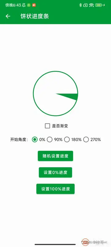
1. xml中使用
首先是在xml中添加如下代码,具体参考app模块中的activity_pie_progress_bar.xml。
    <com.easy.view.PieProgressBar
        android:id="@+id/progress"
        android:layout_width="wrap_content"
        android:layout_height="wrap_content"
        app:layout_constraintBottom_toBottomOf="parent"
        app:layout_constraintEnd_toEndOf="parent"
        app:layout_constraintStart_toStartOf="parent"
        app:layout_constraintTop_toTopOf="parent"
        app:customAngle="right"
        app:gradient="false"
        app:gradientColorArray="@array/color"
        app:maxProgress="100"
        app:progress="5"
        app:progressbarColor="@color/green"
        app:radius="80dp" />
2. 属性介绍
这里使用了PieProgressBar的所有属性,可以自行进行设置,使用说明参考下表。
| 属性 | 说明 |
|---|---|
| app:maxProgress | 最大进度 |
| app:progress | 当前进度 |
| app:progressbarColor | 进度颜色 |
| app:radius | 半径,用于设置圆环的大小 |
| app:strokeWidth | 描边大小 |
| app:gradient | 是否开启进度颜色渐变 |
| app:gradientColorArray | 渐变颜色数组 |
| app:customAngle | 开始角度,可设置:right、bottom、left、top |
3. 代码中使用
        //设置渐变
        binding.progress.setGradient(isChecked);
        //设置开始角度
        binding.progress.setCustomAngle(angle);
        //设置进度
        binding.progress.setProgress(0);
参考app模块中的PieProgressBarActivity中的使用方式。
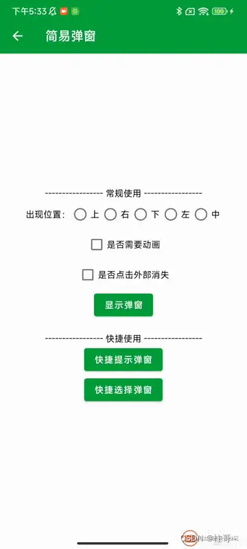
六、EasyDialog
EasyDialog是一个简易弹窗,你可以选择自定义xml使用或者快捷使用两种方式。
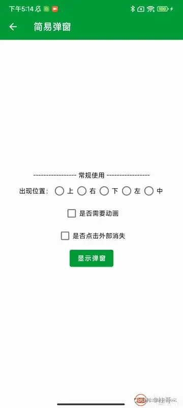
1. 自定义XML使用
在layout下创建一个dialog_warm_tip.xml,作为弹窗的布局,代码如下所示:
<?xml version="1.0" encoding="utf-8"?>
<androidx.constraintlayout.widget.ConstraintLayout xmlns:android="http://schemas.android.com/apk/res/android"
    xmlns:app="http://schemas.android.com/apk/res-auto"
    android:layout_width="300dp"
    android:layout_height="wrap_content"
    android:background="@drawable/shape_dialog_bg">

    <TextView
        android:id="@+id/tv_title"
        android:layout_width="0dp"
        android:layout_height="?attr/actionBarSize"
        android:gravity="center"
        android:text="弹窗标题"
        android:textColor="@color/black"
        android:textSize="16sp"
        android:textStyle="bold"
        app:layout_constraintEnd_toEndOf="parent"
        app:layout_constraintStart_toStartOf="parent"
        app:layout_constraintTop_toTopOf="parent" />

    <View
        android:id="@+id/view"
        android:layout_width="match_parent"
        android:layout_height="1dp"
        android:background="@color/line"
        app:layout_constraintTop_toBottomOf="@+id/tv_title" />

    <TextView
        android:id="@+id/tv_content"
        android:layout_width="0dp"
        android:layout_height="?attr/actionBarSize"
        android:gravity="center"
        android:text="你想要写什么内容呢?"
        android:textColor="@color/black"
        android:textSize="14sp"
        app:layout_constraintEnd_toEndOf="parent"
        app:layout_constraintStart_toStartOf="parent"
        app:layout_constraintTop_toBottomOf="@+id/view" />

    <View
        android:id="@+id/view_1"
        android:layout_width="match_parent"
        android:layout_height="1dp"
        android:background="@color/line"
        app:layout_constraintTop_toBottomOf="@+id/tv_content" />

    <TextView
        android:id="@+id/tv_cancel"
        android:layout_width="0dp"
        android:layout_height="?attr/actionBarSize"
        android:gravity="center"
        android:text="取消"
        android:textColor="@color/black"
        android:textSize="14sp"
        app:layout_constraintBottom_toBottomOf="parent"
        app:layout_constraintEnd_toEndOf="parent"
        app:layout_constraintEnd_toStartOf="@+id/view_2"
        app:layout_constraintHorizontal_bias="0.5"
        app:layout_constraintStart_toStartOf="parent"
        app:layout_constraintTop_toBottomOf="@+id/view_1" />

    <View
        android:id="@+id/view_2"
        android:layout_width="1dp"
        android:layout_height="?attr/actionBarSize"
        android:background="@color/line"
        app:layout_constraintBottom_toBottomOf="parent"
        app:layout_constraintEnd_toStartOf="@+id/tv_confirm"
        app:layout_constraintHorizontal_bias="0.5"
        app:layout_constraintStart_toEndOf="@+id/tv_cancel"
        app:layout_constraintTop_toBottomOf="@+id/view_1" />

    <TextView
        android:id="@+id/tv_confirm"
        android:layout_width="0dp"
        android:layout_height="?attr/actionBarSize"
        android:gravity="center"
        android:text="确定"
        android:textColor="@color/black"
        android:textSize="14sp"
        app:layout_constraintBottom_toBottomOf="parent"
        app:layout_constraintEnd_toEndOf="parent"
        app:layout_constraintHorizontal_bias="0.5"
        app:layout_constraintStart_toEndOf="@+id/view_2"
        app:layout_constraintTop_toBottomOf="@+id/view_1" />
</androidx.constraintlayout.widget.ConstraintLayout>
使用示例代码如下所示:
private EasyDialog easyDialog;

private void showDialog() {
        EasyDialog.Builder builder = new EasyDialog.Builder(EasyDialogActivity.this)
        .setContentView(R.layout.dialog_warm_tip)
        //添加自定义动画
        .addCustomAnimation(Gravity.CENTER, true)
        //设置对话框可取消
        .setCancelable(true)
        //设置标题
        .setText(R.id.tv_title, "温馨提示")
        //设置内容
        .setText(R.id.tv_content, "您今天还没有搞钱,请记得搞钱!")
        //设置文字颜色
        .setTextColor(R.id.tv_confirm, ContextCompat.getColor(EasyDialogActivity.this, R.color.white))
        //设置背景资源
        .setBackground(R.id.tv_confirm, ContextCompat.getDrawable(EasyDialogActivity.this, R.drawable.shape_confirm_bg))
        //设置弹窗宽高
        .setWidthAndHeight(EasyUtils.dp2px(EasyDialogActivity.this, 320), LinearLayout.LayoutParams.WRAP_CONTENT)
        //添加点击事件  取消
        .setOnClickListener(R.id.tv_cancel, v1 -> {
            easyDialog.dismiss();
        })
        //添加点击事件  确定
        .setOnClickListener(R.id.tv_confirm, v2 -> {
            showMsg("我知道了!");
            easyDialog.dismiss();
        })
        //添加取消监听
        .setOnCancelListener(dialog -> {
            showMsg("弹窗取消了");
        })
        //弹窗消失监听
        .setOnDismissListener(dialog -> {
            showMsg("弹窗消失了");
        });
        //创建弹窗
        easyDialog = builder.create();
        //显示弹窗
        easyDialog.show();
}
2. 快捷使用
内置了一些XML和功能弹窗,一行代码调用即可,简单方便。
显示提示弹窗:
EasyDialogUtils.showTipDialog(EasyDialogActivity.this, "温馨提示", "端午又要调休!",
                        () -> showMsg("取消"), () -> showMsg("确定"));
显示选择弹窗:
final String[] stringArr = {"富强", "民主", "文明", "和谐", "自由", "平等", "公正", "法治", "爱国", "敬业", "诚信", "友善"};
List<String> stringList = new ArrayList<>(Arrays.asList(stringArr));
EasyDialogUtils.showSelectDialog(EasyDialogActivity.this, "社会主义核心价值观",
        stringList, this::showMsg);
参考app模块中的EasyDialogActivity中的使用方式。
原文链接 https://juejin.cn/post/7225407341633175613Github库链接https://github.com/lilongweidev/EasyView


 扫一扫
扫一扫


 415
415

 被折叠的 条评论
为什么被折叠?
被折叠的 条评论
为什么被折叠?
 到【灌水乐园】发言


