


CSS又叫层叠样式表,用于网页样式的修饰。
CSS语法
每个CSS语法包括选择符和声明。
声明:{属性:属性值;属性:属性值;}。(每条声明以分号结束)
当一个属性有多个属性值时,属性值间不分前后顺序,用空格隔开,{属性:属性值1 属性值2;}
书写样式过程中,空、换行等操作不影响属性显示。
CSS插入样式
CSS代码插入样式分为三种:内部样式、外部样式、行内样式。
内部样式
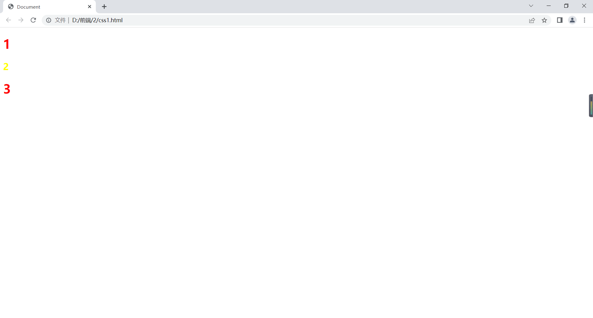
例如:
<!DOCTYPE html>
<html lang="en">
<head>
    <meta charset="UTF-8">
    <title>Document</title>
</head>
<body>
    <style>
        h1{
            color:red;
        }
        h2{
            color: yellow;
        }
    </style>
    <h1>1</h1>
    <h2>2</h2>
    <h1>3</h1>
</body>
</html>
在浏览器中显示如下:
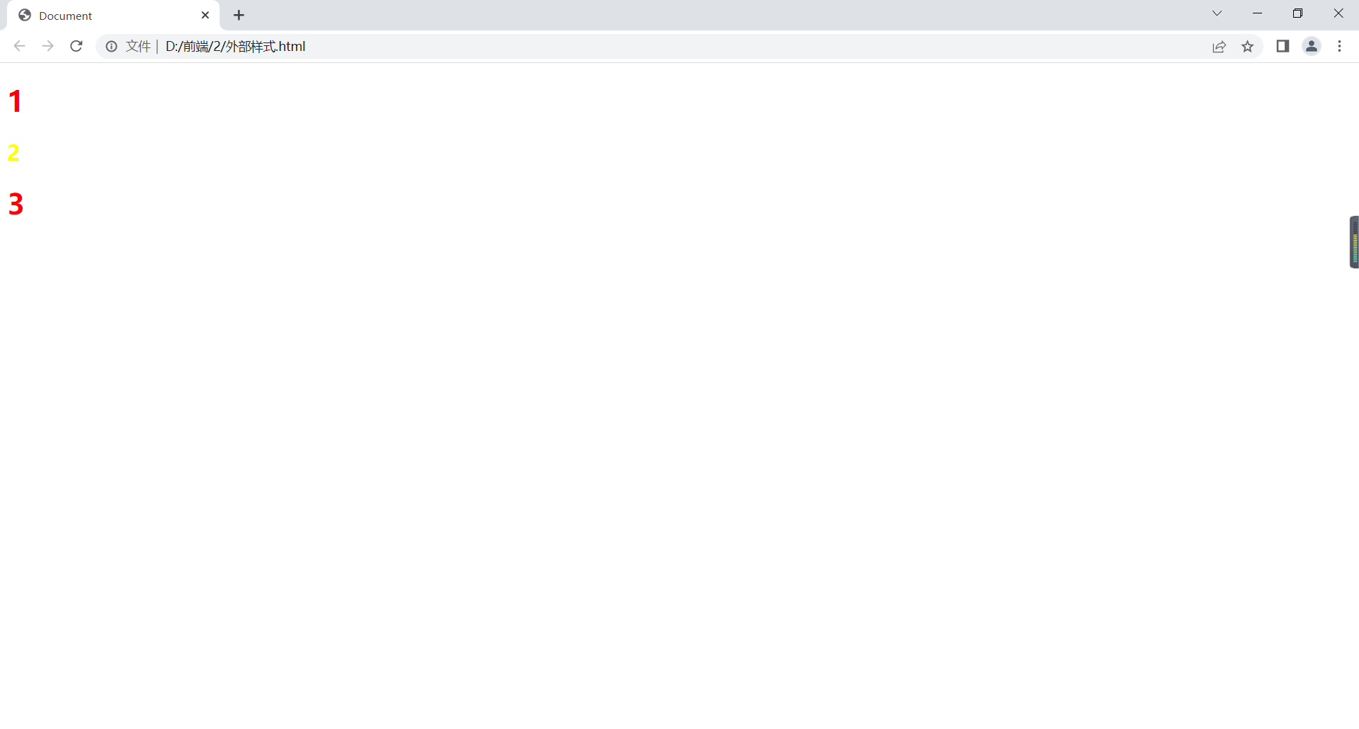
外部样式
CSS外部引入方式:
在HTML的<head> </head>中加入<link rel="stylesheet" type="text/css" href="css文件路径"/>;
在HTML的<head> </head>中加入
<style type="text/css">
@import url("css文件的路径");
</style>
例如:
html代码:
<!DOCTYPE html>
<html lang="en">
<head>
    <meta charset="UTF-8">
    <title>Document</title>
    <link rel="stylesheet" type="text/css" href="1.css">
</head>
<body>
    <h1>1</h1>
    <h2>2</h2>
    <h1>3</h1>
</body>
</html>
css中代码:
h1{
    color:red;
}
h2{
    color: yellow;
}
在浏览器显示如下:
行内样式
style作为属性直接写在标签后边。
例如:
<!DOCTYPE html>
<html lang="en">
<head>
    <meta charset="UTF-8">
    <title>Document</title>
</head>
<body>
    <h1 style="color: red;">1</h1>
    <h2 style="color: yellow;">2</h2>
    <h1 style="color: red;">3</h1>
</body>
</html>
在浏览器显示如下:

注意:优先级:行内>内部>外部,但如果加了!important,则优先级最高。
选择器
用来对html页面元素实现一对一、一对多或多对一的控制。
元素选择器
语法:元素名称{属性:属性值;}如:div、p、h1、img等。
例如:
<!DOCTYPE html>
<html lang="en">
<head>
    <meta charset="UTF-8">
    <title>Document</title>
    <style>
        h1{
            color:aqua;
        }
        h2{
            color:blue;
        }
        div{
            color:red;
        }
    </style>
</head>
<body>
    <h1>1</h1>
    <h2>2</h2>
    <div>3</div>
</body>
</html>
在浏览器显示如下:

类选择器
.class名{属性:属性值;}
例如:
<!DOCTYPE html>
<html lang="en">
<head>
    <meta charset="UTF-8">
    <title>Document</title>
    <style>
        .a{
            color:red;
        }
        .b{
            color:green;
        }
        .c{
            color:blue;
        }
        .d{
            background-color: black;
        }
    </style>

</head>
<body>
    <h1 class="a">1111</h1>
    <h1 class="b d">222</h1>
    <h2 class="c">22</h2>
    <div class="b">333</div>
</body>
</html>
在浏览器显示如下:
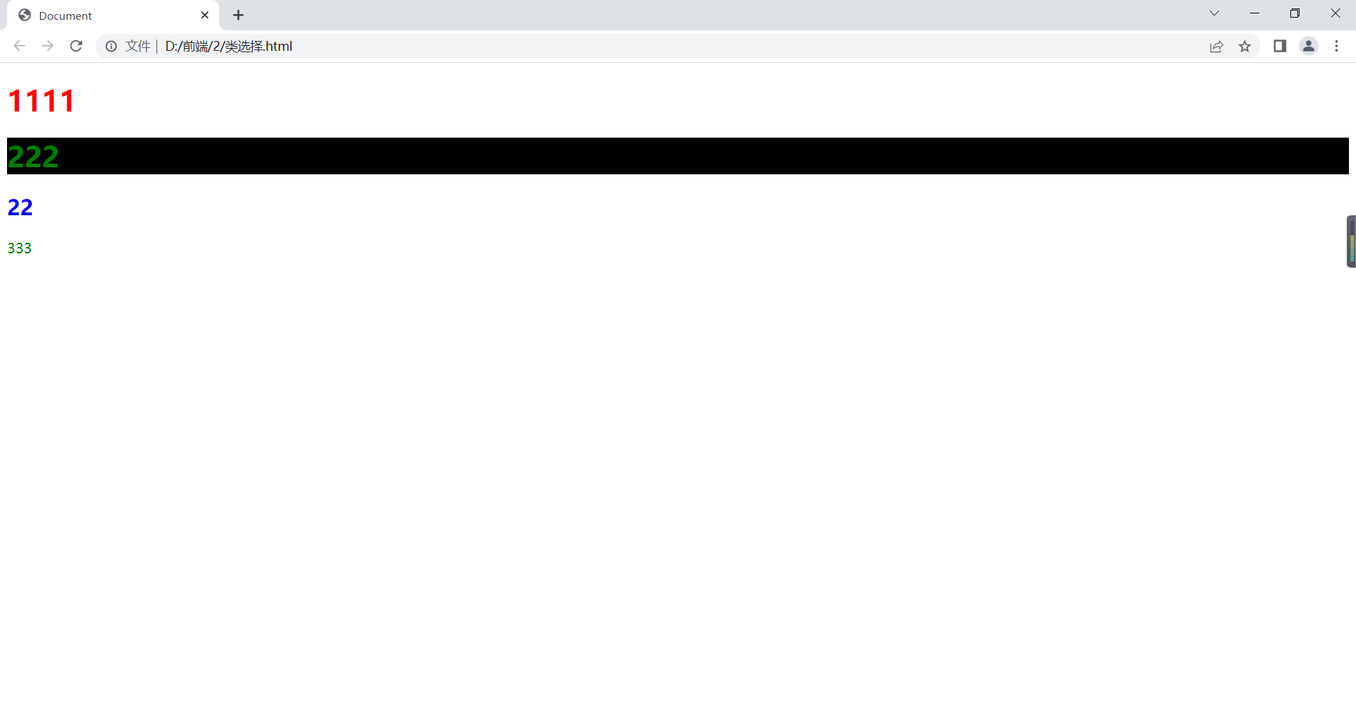
当该元素有不同类选择器,恰好不同选择器对同一属性有不同属性值,则采用就近原则,即在<style> </style>中离该元素最近的优先。
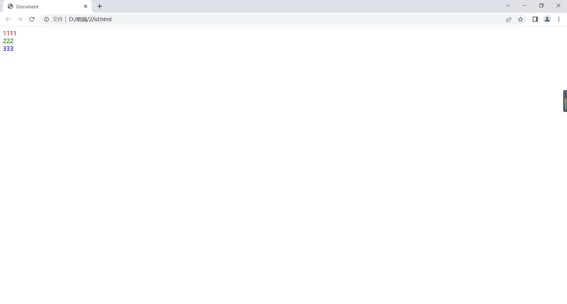
id选择器
#id名{属性:属性值;}
不能一个标签几个id,应该唯一。
<!DOCTYPE html>
<html lang="en">
<head>
    <meta charset="UTF-8">
    <title>Document</title>
    <style>
        #a{
            color:red;
        }
        #b{
            color:green;
        }
        #c{
            color:blue;
        }
    </style>

</head>
<body>
    <div id="a">1111</div>
    <div id="b">222</div>
    <div id="c">333</div>
</body>
</html>
在浏览器显示如下:
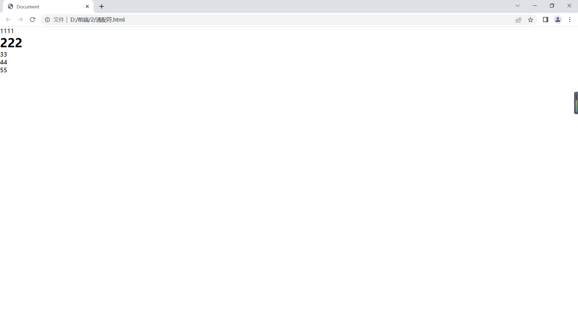
通配符选择器
*{属性:属性值;}
对所有元素。
<!DOCTYPE html>
<html lang="en">
<head>
    <meta charset="UTF-8">
    <title>Document</title>
    <style>
        *{
            margin:0;/*外边距*/
            padding:0;/*内边距*/
        }
    </style>

</head>
<body>
    <div>1111</div>
    <h1>222</h1>
    <ul>
        <li>33</li>
        <li>44</li>
        <li>55</li>
    </ul>
</body>
</html>
在浏览器显示如下:
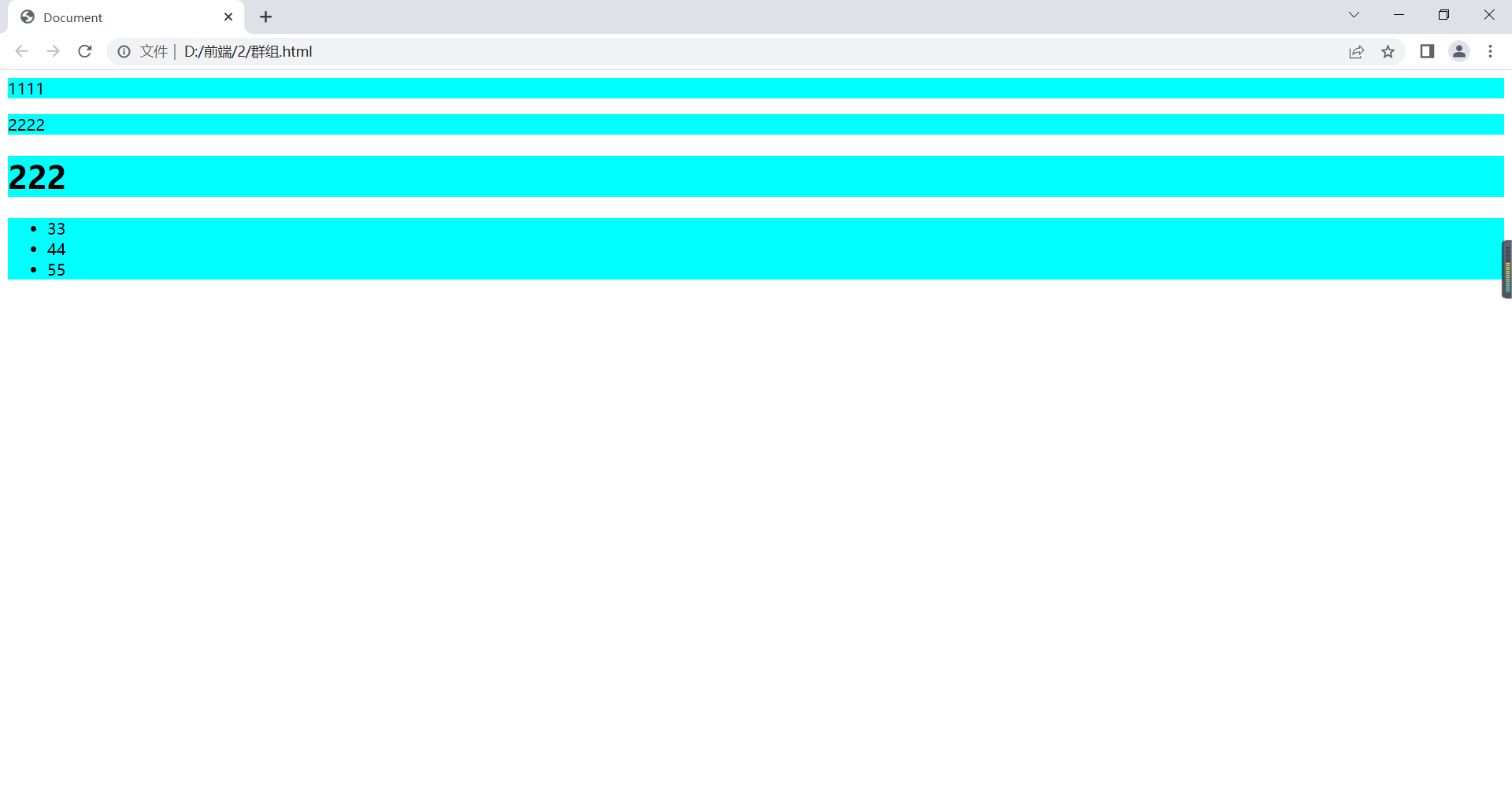
群组选择器
例如:
<!DOCTYPE html>
<html lang="en">
<head>
    <meta charset="UTF-8">
    <title>Document</title>
    <style>
        div,.a,h1,ul{
            background-color: aqua;
        }
    </style>
</head>
<body>
    <div>1111</div>
    <p class="a">2222</p>
    <h1>222</h1>
    <ul>
        <li>33</li>
        <li>44</li>
        <li>55</li>
    </ul>
</body>
</html>
在浏览器显示如下:
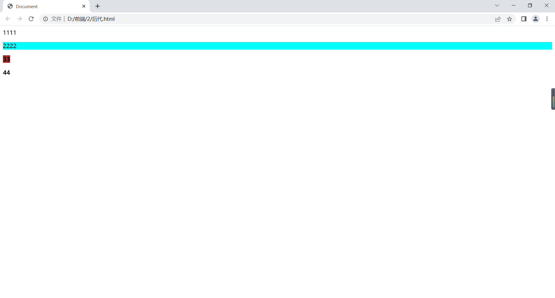
包含/后代选择器
为从右到左选择,先找到被包含的,再找包含的,
例如:
<!DOCTYPE html>
<html lang="en">
<head>
    <meta charset="UTF-8">
    <title>Document</title>
    <style>
        div p{
            background-color: aqua;
        }
        p b{
            background-color: brown;
        }
    </style>
</head>
<body>
    <div>1111</div>
    <div>
        <p>2222</p>
    </div>
    <p>
        <b>33</b>
    </p>
    <div>
        <b>44</b>
    </div>
</body>
</html>
在浏览器显示如下:
伪类选择器
a:link{属性:属性值;}超链接初始状态;
a:visited{属性:属性值;}超链接被访问后的状态;
a:hover{属性:属性值;}鼠标悬停超链接的状态;
a:active{属性:属性值;}鼠标点下超链接的状态。
注意:
顺序为:link-visited-hover-active
可把相同声明提出来放在a选择符中。
例如:
<!DOCTYPE html>
<html lang="en">
<head>
    <meta charset="UTF-8">
    <title>Document</title>
    <style>
        a:link{
            color:yellow;
        }
        a:visited{
            color:red;
        }
        a:hover{
            color:green;
        }
        a:active{
            color:orange;
        }
    </style>

</head>
<body>
    <a href="https://www.baidu.com">百度</a>
</body>
</html>
在浏览器显示如下:
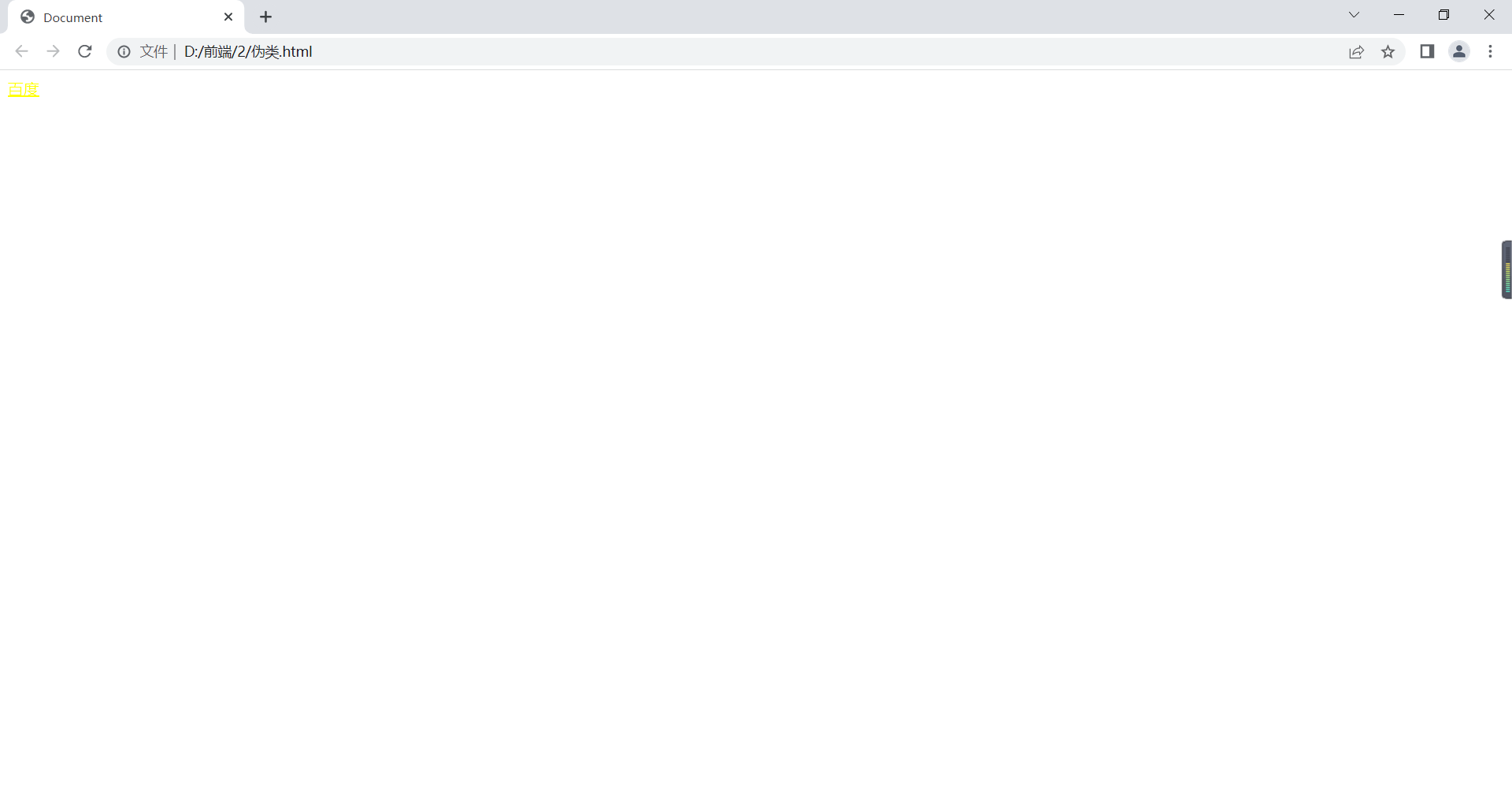
在进行其他操作后,颜色也随之改变。
注意:优先级:!important>内联>id>class>元素
包含选择器为选择符权重和。
相同权重,就近,哪个选择符最后定义,采用哪个。
文本属性
font-size:字体大小;
font-family:字体;
color:颜色;blue/#0000ff/rgb(0,0,255)
font-weight:加粗。lighter更细的、bolder更粗的、bold加粗、normal常规/100-500不加粗、600-900加粗;
font-style:倾斜。italic斜体字、oblique倾斜的文字、normal常规;
text-align:文字水平对齐。left、center、right、justify水平2端对齐,只对多行起作用。
line-height:行间距。与height一样时,可实现垂直居中(多行文本不可,可适当调整)。
letter-spacing:字符间距;
word-spacing:词间距;
text-indent:首行缩进(2em当前字体两倍);
text-decoration:文本修饰(none没有/underline下划线/overline上划线/line-through删除线;
font:font-style、font-weight、font-size、line-height、font-family简写(顺序不能变,且当font-size和font-family同时存在时才起作用;
text-transform:大小写。capitalize首字母大写/lowercase小写/uppercase大写/none;
<!DOCTYPE html>
<html lang="en">
<head>
<meta charset="UTF-8">
<meta http-equiv="X-UA-Compatible" content="IE=edge">
<meta name="viewport" content="width=device-width, initial-scale=1.0">
<title>Document</title>
<style>
.p1{
font-size: 20px;
color:#0000ff;
}
.p2{
font-family: 草书,宋体;
font-weight: bolder;
font-style: italic;
}
.box1{
text-align: justify;
width: 500px;
background-color: yellow;
}
.box2{
width: 500px;
height: 100px;
background-color: yellow;
line-height: 100px;
/* 多行文本不能和weight一样 */
text-align: center;
}
.p3{
letter-spacing: 10px;
}
.p4{
word-spacing: 10px;
}
.p{
/* text-indent: 32px; */
text-indent: 2em;
}
.p5{
text-decoration: underline;
/* text-transform: capitalize; */
text-transform: lowercase;
}
.p6{
font:italic bold 20px/1em 楷体
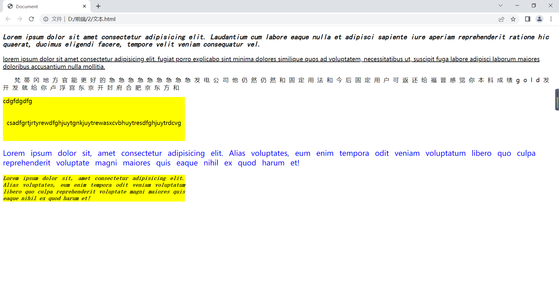
}
</style>
</head>
<body>
<p class="p6">Lorem ipsum dolor sit amet consectetur adipisicing elit. Laudantium cum labore eaque nulla et adipisci sapiente iure aperiam reprehenderit ratione hic quaerat, ducimus eligendi facere, tempore velit veniam consequatur vel.</p>
<p class="p5">Lorem ipsum dolor sit amet consectetur adipisicing elit. Fugiat porro explicabo sint minima dolores similique quos ad voluptatem, necessitatibus ut, suscipit fuga labore adipisci laborum maiores doloribus accusantium nulla mollitia.</p>
<p class="p3 p">梵蒂冈地方官能更好的急急急急急急急急急发电公司他仍然仍然和固定用法和今后固定用户可返还给福晋感觉你本科成绩gold发开发就给你卢浮宫东京开封府合肥京东方和</p>
<div class="box1">cdgfdgdfg</div>
<div class="box2">csadfgrtjrtyrewdfghjuytgnkjuytrewasxcvbhuytresdfghjuytrdcvg</div>
<p class="p1 p4">Lorem ipsum dolor sit, amet consectetur adipisicing elit. Alias voluptates, eum enim tempora odit veniam voluptatum libero quo culpa reprehenderit voluptate magni maiores quis eaque nihil ex quod harum et!</p>
<p class="p2 box1">Lorem ipsum dolor sit, amet consectetur adipisicing elit. Alias voluptates, eum enim tempora odit veniam voluptatum libero quo culpa reprehenderit voluptate magni maiores quis eaque nihil ex quod harum et!</p>
</body>
</html>在浏览器显示如下:
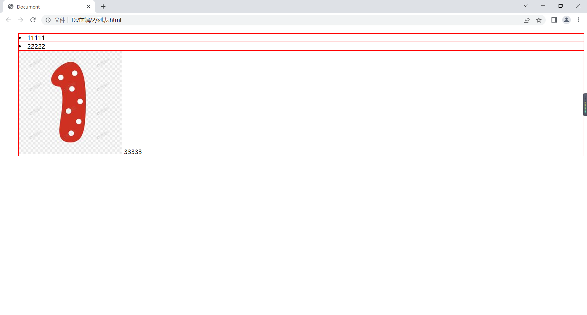
列表属性
list-style-type:列表符号样式;disc实心圆/circle空心圆/square实心方块/none去掉符号;
list-style-image:图片设置为列表符号;url();
list-style-position:设置列表项标记位置;outside列表外面(默认)/inside列表里面;
list-style:简写;none去除列表符号;
<!DOCTYPE html>
<html lang="en">
<head>
    <meta charset="UTF-8">
    <meta http-equiv="X-UA-Compatible" content="IE=edge">
    <meta name="viewport" content="width=device-width, initial-scale=1.0">
    <title>Document</title>
    <style>
        ul{
            list-style-type: disc;
            /* circle square none */
            /* list-style-image: url(); */
            /* url()里写图片路径 */
        }
        li{
            border: 1px solid red;
            list-style-position: inside;
        }
        .box{
            list-style: none url(1.jpg) inside;
        }
    </style>
</head>
<body>
   <ul>
    <li>11111</li>
    <li>22222</li>
    <li class="box">33333</li>
   </ul>
</body>
</html>
在浏览器显示如下:
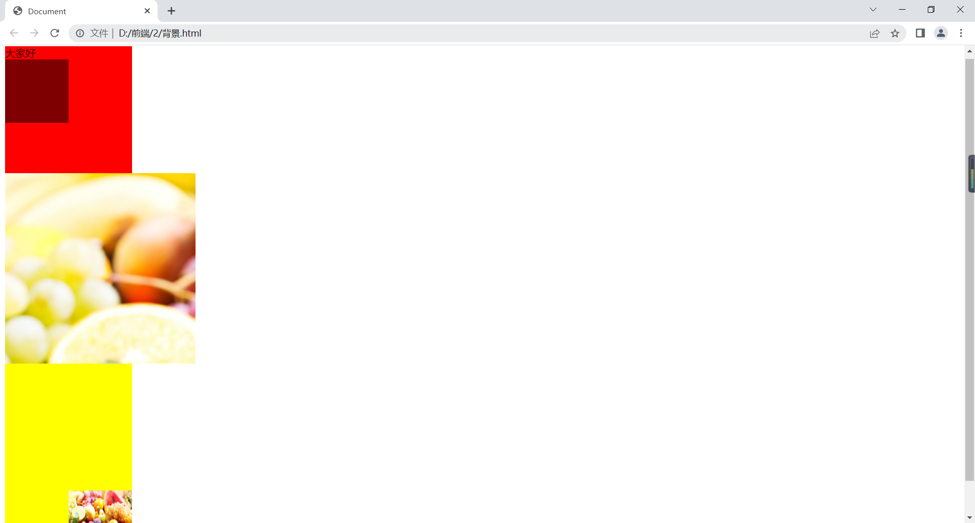
背景属性
background-color:背景颜色;
backgrounf-image:背景图片;
background-repeat:背景图片的平铺;no-repeat/repeat/repeat-x/repeat-y;
background-position:背景图片的定位;水平、垂直;
background-attachment:背景图片的固定;scroll滚动/fixed固定;
background-size:背景图片大小;
可简写成background,background-size不行。
<!DOCTYPE html>
<html lang="en">
<head>
    <meta charset="UTF-8">
    <meta http-equiv="X-UA-Compatible" content="IE=edge">
    <meta name="viewport" content="width=device-width, initial-scale=1.0">
    <title>Document</title>
    <style>
        .box1{
            width: 200px;
            height: 200px;
            background-color: rgb(255,0,0);
        }
        .box2{
            width: 100px;
            height: 100px;
            background-color: rgba(0,0,0,0.5);/*a代表透明度*/
        }
        .box3{
            width: 300px;
            height: 300px;
            background-color: yellow;
            background-image: url(../1/img/1.jpg);
            background-repeat: repeat-x;
            /* background-repeat: repeat-x; */
            /* background-position: 20px 20px; */
            /*
            1.px px
            2.% %
            3.left center right
            top center bottom
            */
        }
        .box4{
            width: 200px;
            height: 300px;
            background: yellow url(../1/img/1.jpg) no-repeat bottom right scroll;
            background-size: 100px 100px;
            /*
            1.px px
            2.% %
            3.cover(可能会裁图)
            4.contain(可能会留白)
            */
        }
    </style>
</head>
<body>
    <div class="box1">
        大家好
        <div class="box2"></div>
    </div>
    <div class="box3"></div>
    <div class="box4"></div>
</body>
</html>
在浏览器显示如下:
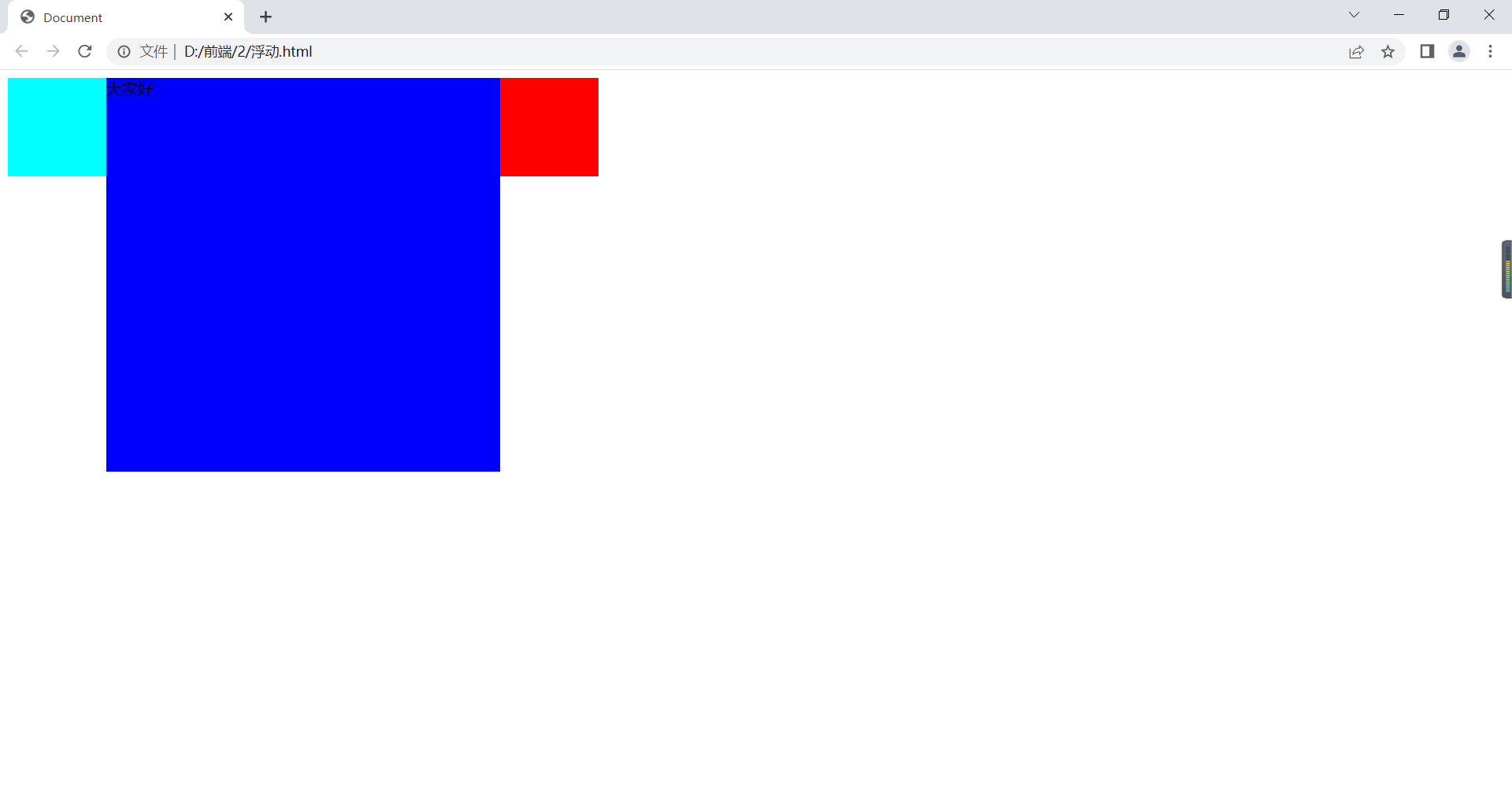
浮动属性
浮动
用来定义网页中其它文本如何环绕该元素显示以及让竖着的东西横着来。
float:left元素靠左边浮动/right元素靠右边浮动/none元素不浮动;
<!DOCTYPE html>
<html lang="en">
<head>
    <meta charset="UTF-8">
    <title>Document</title>
    <style>
        div{
            width: 100px;
            height: 100px;
        }
        .a{
            background:aqua;
            float:left;
        }
        .b{
            width: 400px;
            height: 400px;
            background:blue;
            float: left;
        }
        .c{
            background:red;
            float: left;
        }
    </style>
</head>
<body>
    <div class="a"></div>
    <div class="b">大家好</div>
    <div class="c"></div>
</body>
</html>
在浏览器显示如下:
清浮动
clear:none允许有浮动/right不允许右边有浮动/left不允许左边有浮动/both不允许有浮动;
应对高度塌陷:
高度写死;
清浮动,被遮挡的不允许有对应浮动;
当前浮动元素后补一个盒子,不设宽高,clear:both;
overflow:hidden。
<!DOCTYPE html>
<html lang="en">
<head>
    <meta charset="UTF-8">
    <title>Document</title>
    <style>
        .a,.b{
            width: 200px;
            height: 200px;
            float: left;
        }
        .a{
            background:aqua;
        }
        .b{
            background:blue;
        }
        .c{
            width: 300px;
            height: 300px;
            background:red;
           /* clear: left;2.不允许有左浮动*/
        }
        .container{
            /*1.写死高度height: 200px;*/
            overflow: hidden;/*4.*/
        }
    </style>
</head>
<body>
    <div class="container">
        <div class="a"></div>
        <div class="b"></div>
        <!-- <div style="clear:both"></div>3.当前浮动元素后clear:both -->
    </div>
    <div class="c"></div>
</body>
</html>
在浏览器显示如下:

盒子模型
padding:内边距;1个值代表四个方向一样;2个值代表上下、左右;3个值代表上、左右、下;4个值代表上右左下;
padding-top、padding-bottom、padding-left、padding-right:四个内边距;
border:边框;**px;solid实线/double双实线/dashed线段线/dotted点状线;color;
border-top、border-bottom、border-left、border-right:四个内边距;
border-width:边框宽度;
border-style:边框样式;
border-color:边框颜色;
margin:外边距;margin-top、margin-bottom、margin-left、margin-right;(背景色没有蔓延,可设负值);
margin:0 auto盒子水平居中;
特性问题:
兄弟关系,两个盒子垂直外边距不取两个相邻外边距的和,反而取最大值;水平外间距取和。
父子关系,给子盒子加外边距,但作用于父身上:
给父盒子加内边距,但要注意父盒子高度减去内边距;
给父盒子设置透明边框,但注意高度和宽度要减去2倍边框;
给子盒子或父盒子浮动;
给父盒子加overflow: hidden。
例如:
<!DOCTYPE html>
<html lang="en">
<head>
<meta charset="UTF-8">
<title>Document</title>
<style>
.a{
width:500px;
height: 100px;
background: yellow;
text-align: justify;
padding: 10px 20px 30px 40px;
}
.b{
width:300px;
height: 200px;
background: blue;
text-align: justify;
padding-left: 10px;
}
.c{
width: 100px;
height: 100px;
background: red;
border: 10px solid green;
}
.d{
width: 50px;
height: 50px;
background: gray;
border-top: 5px solid aqua;
border-left: 10 dotted yellow;
margin-right: 10px;
float: left;
}
.d1{
width: 50px;
height: 50px;
background: rebeccapurple;
border-top: 5px solid teal;
border-left: 10 dotted yellow;
margin-left: 10px;
float: left;
}
.e{
width: 50px;
height: 50px;
background: blue;
border-width: 5px 10px;
border-color: yellow green blue;
border-style: double;
clear: left;
margin: 0 auto;
}
.f{
width: 100px;
height: 100px;
/* height: 90px; */
background: yellowgreen;
/*padding-top=10px 1.给父盒子加内边距,但要注意父盒子高度减去内边距*/
/* border: 1px solid transparent;2. 给父盒子设置透明边框,但注意高度和宽度要减去2倍边框 */
/* float: left; 3.给子盒子或父盒子浮动*/
overflow: hidden;/*4.给父盒子加overflow: hidden;*/
}
.g{
width: 50px;
height: 50px;
background: red;
margin-top: 10px;
/* float: left; 3.给子盒子或父盒子浮动*/
}
</style>
</head>
<body>
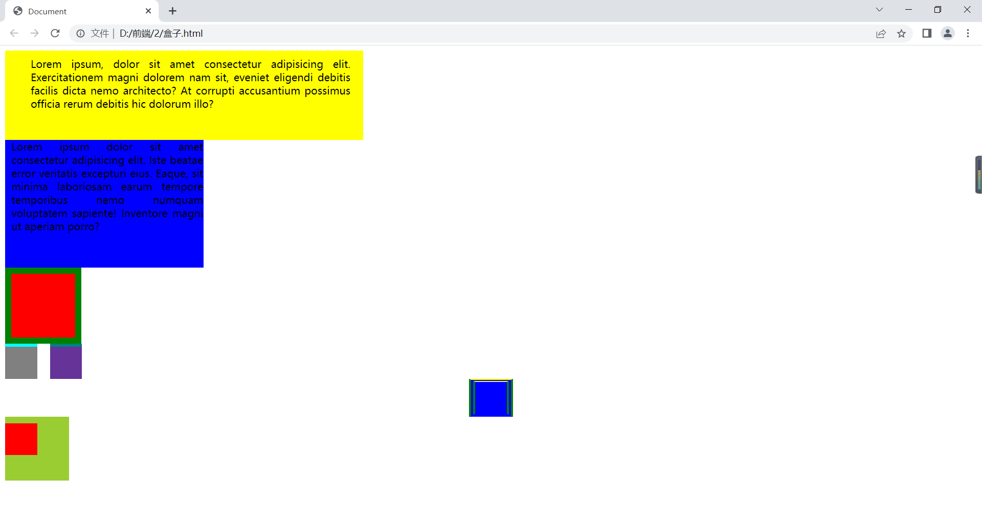
<div class="a">
Lorem ipsum, dolor sit amet consectetur adipisicing elit. Exercitationem magni dolorem nam sit, eveniet eligendi debitis facilis dicta nemo architecto? At corrupti accusantium possimus officia rerum debitis hic dolorum illo?
</div>
<div class="b">Lorem ipsum dolor sit amet consectetur adipisicing elit. Iste beatae error veritatis excepturi eius. Eaque, sit minima laboriosam earum tempore temporibus nemo numquam voluptatem sapiente! Inventore magni ut aperiam porro?</div>
<div class="c"></div>
<div class="d"></div>
<div class="d1"></div>
<div class="e"></div>
<div class="f">
<div class="g"></div>
</div>
</body>
</html>在浏览器显示如下:
溢出属性
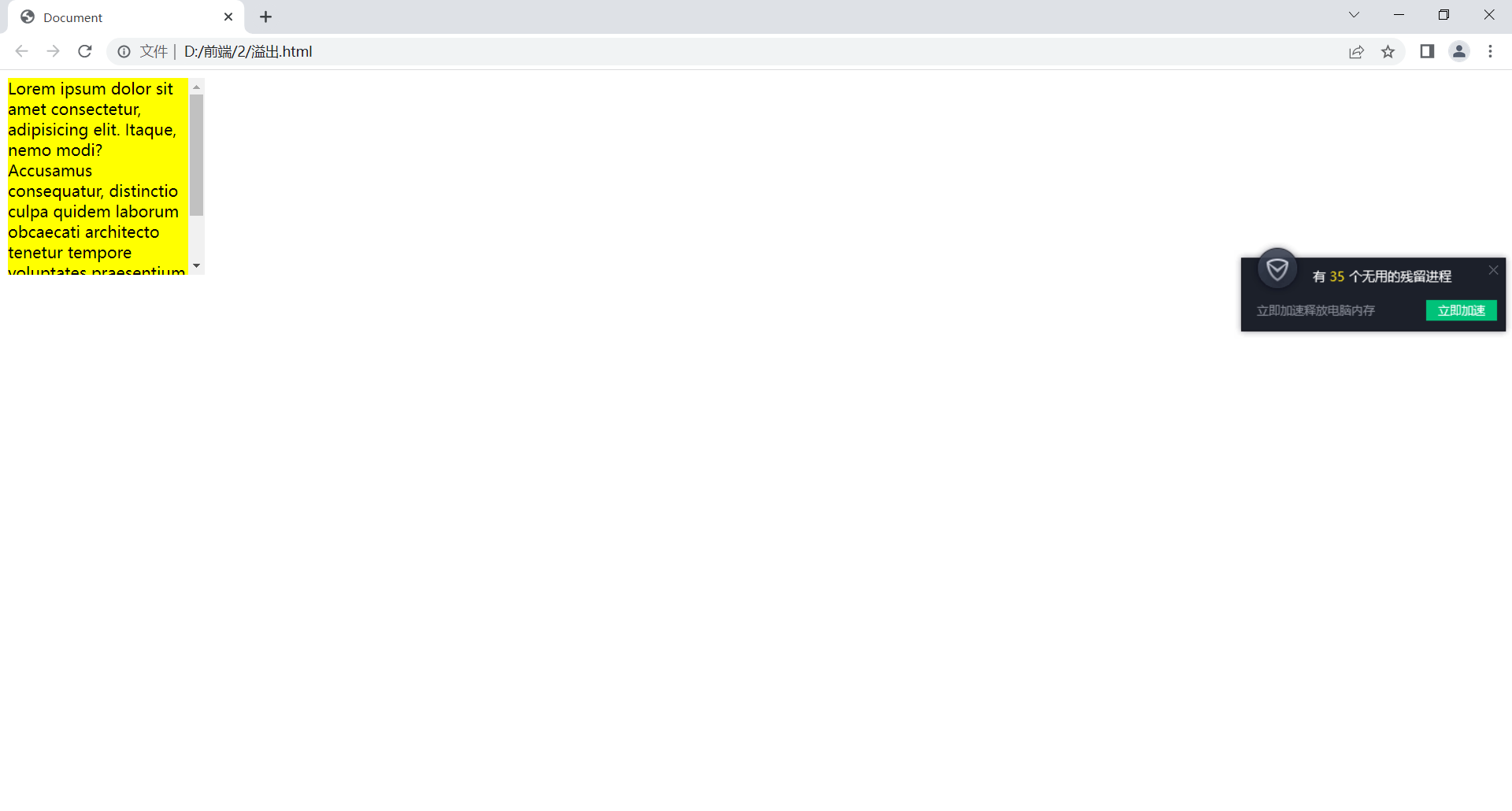
overflow:visible(默认,溢出内容显示元素外)/hidden(溢出内容隐藏)/scroll(溢出内容以滚动方式显示)/auto(有溢出加滚动条,无溢出正常显示)/inherit(遵从父元素继承overflow的值)
overflow-x:x轴溢出;
overflow-y:y轴溢出;
例如:
<!DOCTYPE html>
<html lang="en">
<head>
    <meta charset="UTF-8">
    <title>Document</title>
    <style>
        div{
            width: 200px;
            height: 200px;
            background: yellow;
            /*overflow:visible 显示溢出*/
            /*overflow:hidden 溢出隐藏,文本裁切*/
            /* overflow: scroll; 滚动条*/
            /* overflow: auto; */
            overflow-x: hidden;
            overflow-y: auto;
        }
    </style>
</head>
<body>
    <div>
        Lorem ipsum dolor sit amet consectetur, adipisicing elit. Itaque, nemo modi? Accusamus consequatur, distinctio culpa quidem laborum obcaecati architecto tenetur tempore voluptates praesentium laboriosam blanditiis quam minima magnam vel aliquam!
    </div>
</body>
</html>
在浏览器显示如下:
空余空间
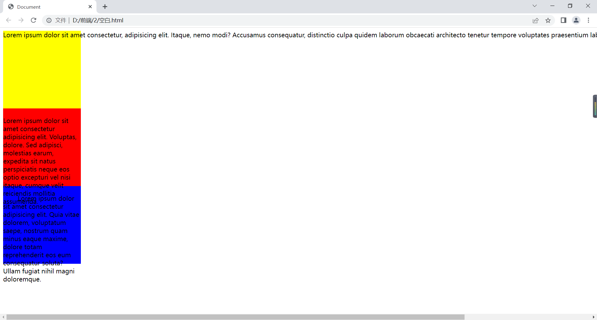
white-space:normal(默认,空白被浏览器忽略)/nowrap(文本不换行,在同一行上继续,直到遇到<br>/pre(显示空格、回车,不换行)/pre-wrap(显示空格、回车,换行)/pre-line(显示回车,不显示空格、换行)/inherit
<!DOCTYPE html>
<html lang="en">
<head>
    <meta charset="UTF-8">
    <title>Document</title>
    <style>
        div{
            width: 200px;
            height: 200px;
        }
        .a{
            background: yellow;
            white-space: nowrap;
        }
        .b{
            background: red;
            white-space: pre-line;
        }
        .c{
            background: blue;
            white-space: pre-wrap;
        }
    </style>
</head>
<body>
    <div class="a">
        Lorem ipsum dolor sit amet consectetur, adipisicing elit. Itaque, nemo modi? Accusamus consequatur, distinctio culpa quidem laborum obcaecati architecto tenetur tempore voluptates praesentium laboriosam blanditiis quam minima magnam vel aliquam!
    </div>
    <div class="b">
        Lorem ipsum dolor sit amet consectetur adipisicing elit. Voluptas, dolore. Sed adipisci, molestias earum, expedita sit natus perspiciatis neque eos optio excepturi vel nisi itaque, cumque velit reiciendis mollitia assumenda.
    </div>
    <div class="c">
        Lorem ipsum dolor sit amet consectetur adipisicing elit. Quia vitae dolorem, voluptatum saepe, nostrum quam minus eaque maxime, dolore totam reprehenderit eos eum consequatur soluta? Ullam fugiat nihil magni doloremque.
    </div>
</body>
</html>
在浏览器显示如下:
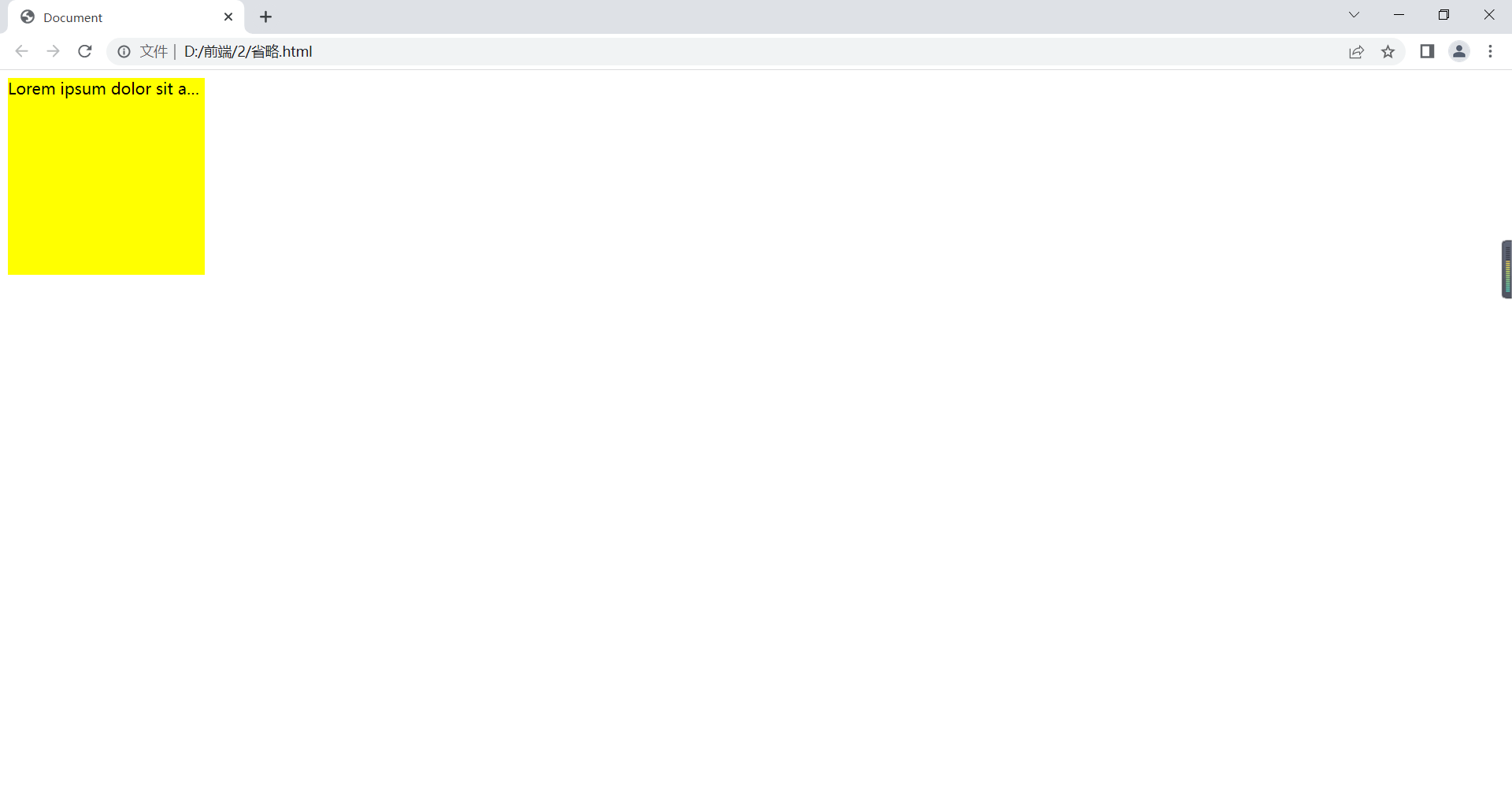
溢出省略号
必须要有容器宽度
强制文本在一行内显示,white-space:no-wrap;
溢出内容为隐藏,overflow:hidden;
溢出文本显示省略号,text-overflow:ellipsis;
<!DOCTYPE html>
<html lang="en">
<head>
    <meta charset="UTF-8">
    <title>Document</title>
    <style>
        div{
            width: 200px;
            height: 200px;
            background: yellow;
            white-space: nowrap;
            overflow: hidden;
            text-overflow: ellipsis;
        }
    </style>
</head>
<body>
    <div>
        Lorem ipsum dolor sit amet consectetur, adipisicing elit. Itaque, nemo modi? Accusamus consequatur, distinctio culpa quidem laborum obcaecati architecto tenetur tempore voluptates praesentium laboriosam blanditiis quam minima magnam vel aliquam!
    </div>
</body>
</html>
在浏览器显示如下:
元素显示类型
块元素
显示为矩形区域;
默认占一行,自上而下排列;
可定义宽度和高度;
一般作为其他元素容器。
如:div、p、ul、ol、li、dl、dd、dt、h1-h6等。
有display:block/list-item;。
行内元素
横着排;
没有形状,不能定义宽和高;
遵循盒模型基本规则,但对margin、padding无效,只能左右,不能上下。
如:a、b、em、i、span、strong。
有display:inline;。
<!DOCTYPE html>
<html lang="en">
<head>
<meta charset="UTF-8">
<title>Document</title>
<style>
/* div{
width: 100px;
height: 100px;
padding: 10px;
margin: 10px;
border: 1px solid red;
} */
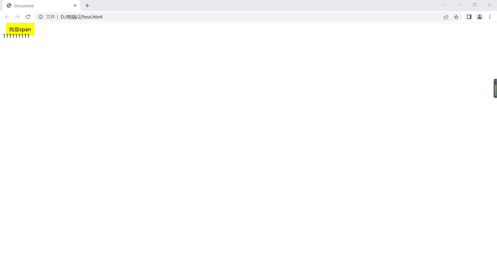
span{
background: yellow;
padding: 10px;
margin: 10px;
}
</style>
</head>
<body>
<div>
</div>
<span>
我是span
</span>
<div>111111111</div>
</body>
</html>在浏览器显示如下:
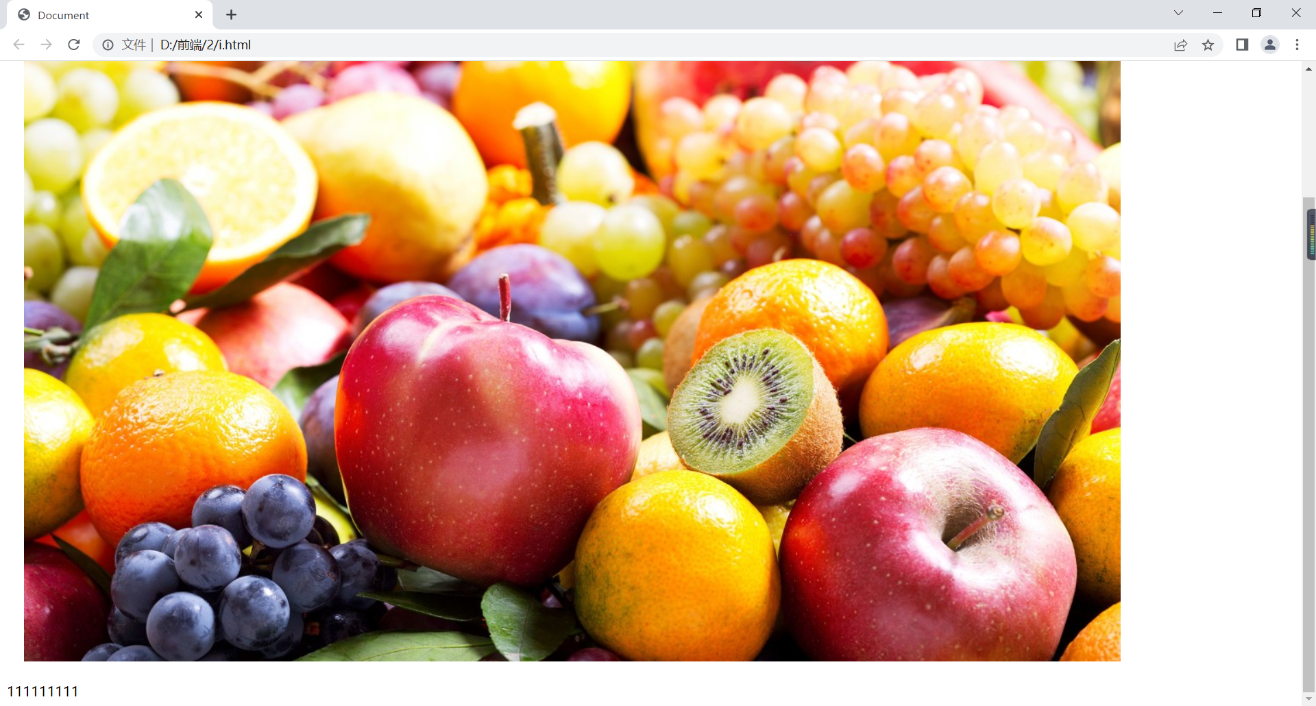
行内块元素
同时具备块元素及行内元素特点。
如:img、input等。
有display:inline-block;。
支持上下左右边距。
<!DOCTYPE html>
<html lang="en">
<head>
    <meta charset="UTF-8">
    <title>Document</title>
    <style>
        img{
            padding: 10px;
            margin: 10px;
        }
    </style>
</head>
<body>
    <img src="../1/img/1.jpg">
    <div>111111111</div>
</body>
</html>
在浏览器显示如下:
元素类型强制转换
<!DOCTYPE html>
<html lang="en">
<head>
    <meta charset="UTF-8">
    <title>Document</title>
    <style>
        img{
            display: block;
        }
        div{
            width: 100px;
            height: 100px;
            background: yellow;
            display: inline;
        }
    </style>
</head>
<body>
    <img src="../1/img/1.jpg">
    <div>111111111</div>
</body>
</html>
在浏览器显示如下:
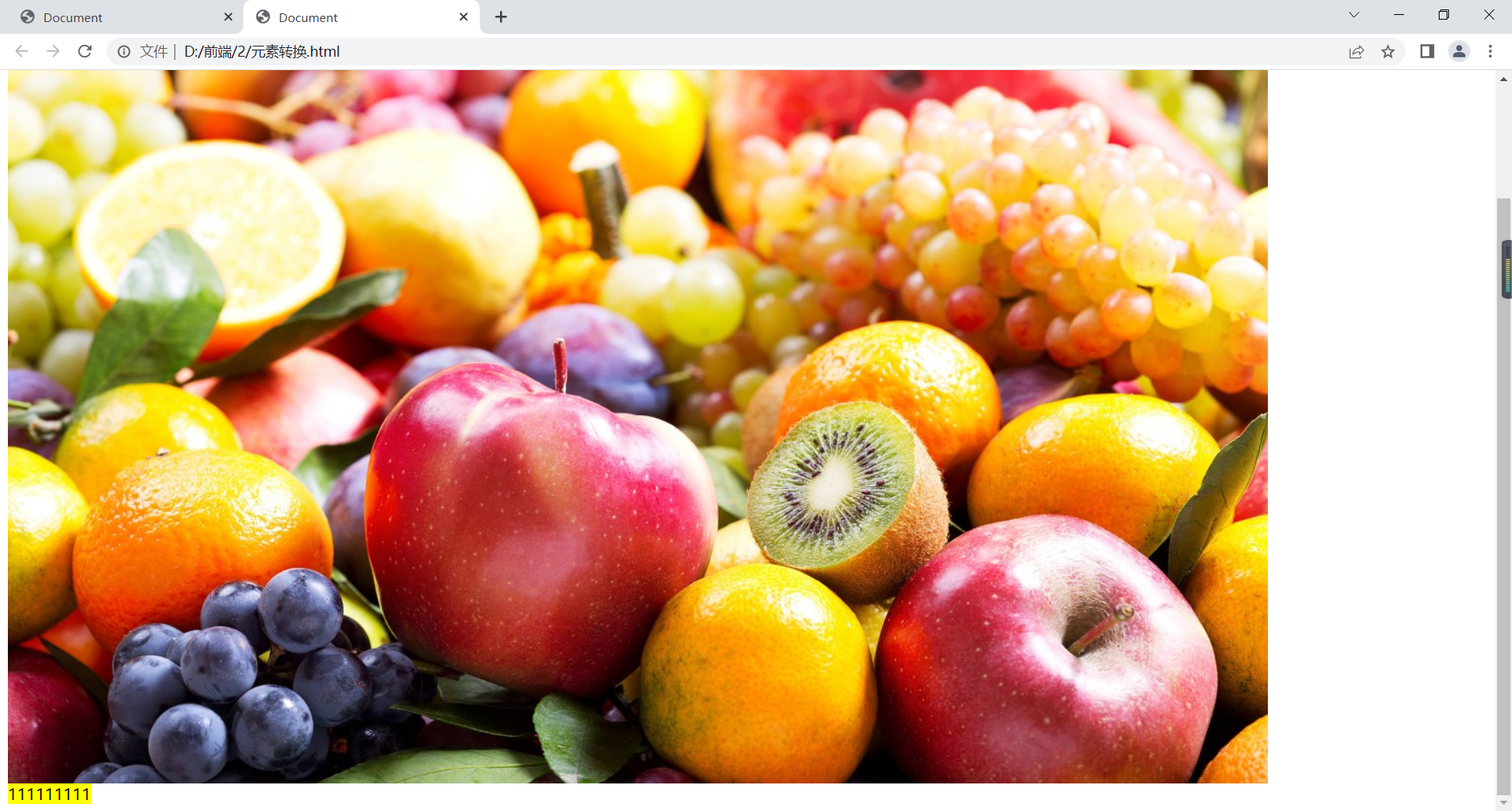
可见,div成了行内元素。
例如:
<!DOCTYPE html>
<html lang="en">
<head>
<meta charset="UTF-8">
<title>Document</title>
<style>
.home{
background-color: red;
}
a{
background-color: black;
color:white;
padding:10px;
display: inline-block;
}
a:hover{
background-color: red;
}
</style>
</head>
<body>
<a href="" class="home">首页</a>
<a href="">国内</a>
<a href="">国际</a>
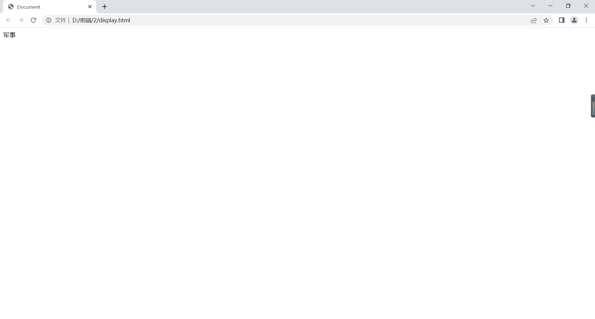
<a href="">军事</a>
<a href="">财经</a>
<div>11111111111111111</div>
</body>
</html>在浏览器显示如下:
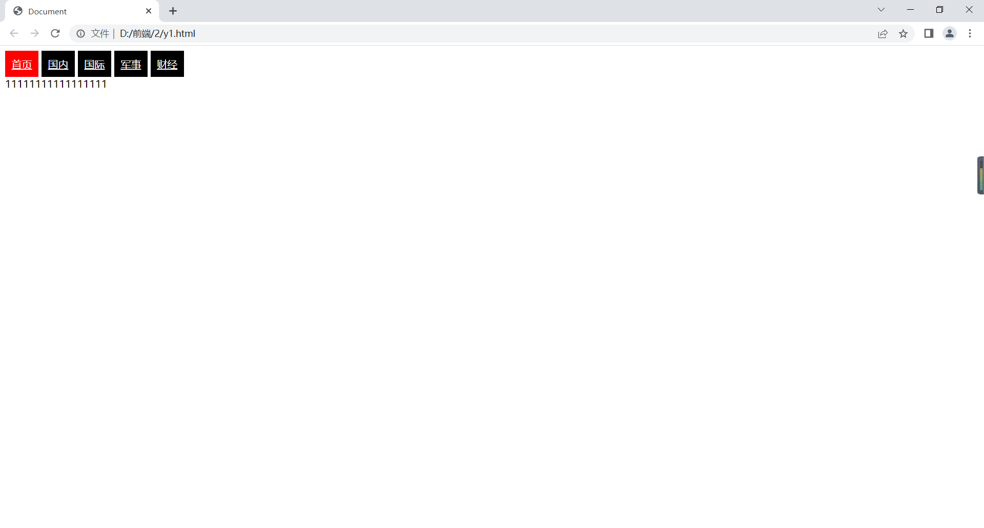
可见几个链接成了行内块元素。
display
display:none 不显示
<!DOCTYPE html>
<html lang="en">
<head>
    <meta charset="UTF-8">
    <title>Document</title>
    <style>
        .hide{
            display:none;
        }
        .box:hover ul{
            background: yellow;
            display: block;
        }
    </style>
</head>
<body>
    <div class="hide">111111</div>
    <div class="box">
        军事
        <ul class="hide">
            <li>111</li>
            <li>222</li>
            <li>333</li>
        </ul>
    </div>
</body>
</html>
在浏览器显示如下:
只有当鼠标移到上面才会显示黄色背景的列表。
表单属性
文本域
textarea:
通过width、height给定宽高,通过resize重新设置大小,当resize值为vertical表示只可以垂直方向改变表单大小,horizontal则水平改大小,both都可以改变,none都不可以改变。
<!DOCTYPE html>
<html lang="en">
<head>
    <meta charset="UTF-8">
    <title>Document</title>
    <style>
        textarea{
            width: 100px;
            height: 100px;
        }
        .a{
            resize: both;
        }
        .b{
            resize: none;
        }
    </style>
</head>
<body>
    <div>
        <textarea cols="10" rows="10" placeholder="请输入你的意见" class="a"></textarea>
    </div>
    <div>
        <textarea cols="10" rows="10" placeholder="请输入你的意见" class="b">意见是:</textarea>
    </div>
</body>
</html>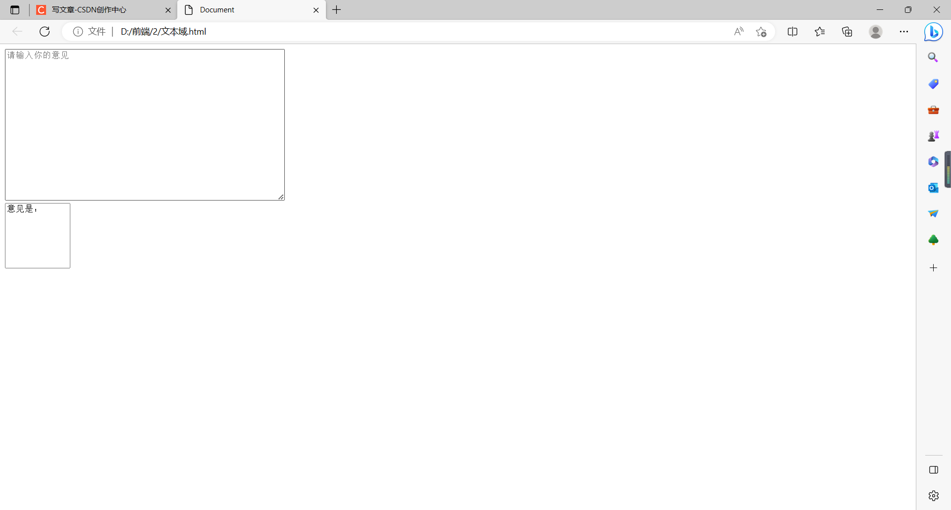
字段集
<!DOCTYPE html>
<html lang="en">
<head>
    <meta charset="UTF-8">
    <title>Document</title>
    <style>
        fieldset{
            border: 1px solid blue;
            width: 400px;
            height: 100px;
        }
        legend{
            border: 1px solid red;
            text-align: center;
            padding:10px;
        }
    </style>
</head>
<body>
    <fieldset>
        <legend>性别</legend>
        <input type="radio" name="a">男
        <br>
        <input type="radio" name="a">女
    </fieldset>
    <fieldset>
        <legend>爱好</legend>
        <input type="checkbox" name="b">抽烟
        <br>
        <input type="checkbox" name="b">喝酒
    </fieldset>
</body>
</html>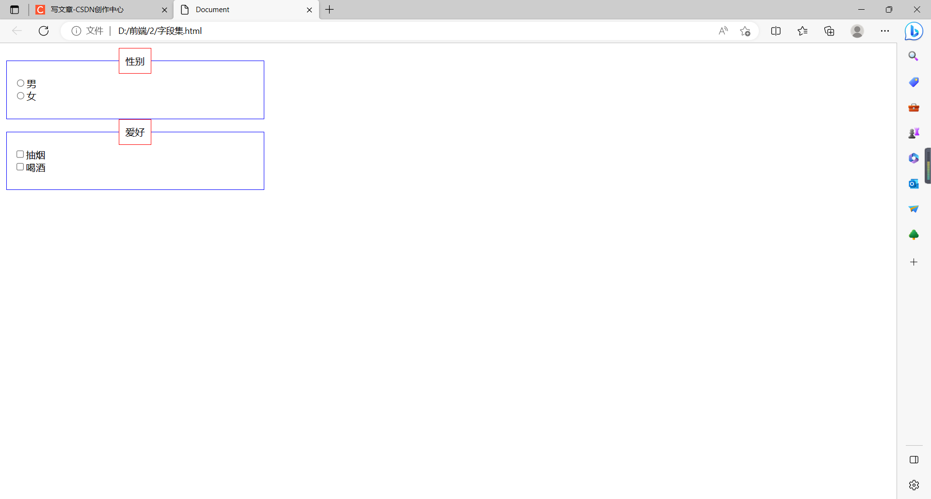
定位属性
静态定位和相对定位
position:static;(默认)即按照文档流顺序,从左到右从上到下占满页面
position:relative;相对定位,不脱离文档流,参照自己初始位置
举例如下:
<!DOCTYPE html>
<html lang="en">
<head>
    <meta charset="UTF-8">
    <title>Document</title>
    <style>
        div{
            width: 200px;
            height: 200px;
        }
        .box1{
            background: red;
            position: static;
            top: 100px;
        }
        .box2{
            background: blue;
            position: relative;
            top: 100px;
            left: 100px;
        }
        .box3{
            background: yellow;
        }
    </style>
</head>
<body>
    <div class="box1"></div>
    <div class="box2"></div>
    <div class="box3"></div>
</body>
</html>
在浏览器显示如下:
可见,第一个位置采用默认值后,top不奏效,第二个采用相对定位后,会根据原来所在位置移动。
绝对定位
position:absolute;绝对定位,脱离文档流
当没有父元素或父元素没有定位,参照物为浏览器窗口第一屏;
有父元素且父元素有定位,参照父元素。
举例如下:
<!DOCTYPE html>
<html lang="en">
<head>
    <meta charset="UTF-8">
    <title>Document</title>
    <style>
        *{
            margin: 0;
            padding: 0;
        }
        .box{
            width: 200px;
            height: 200px;
            background: yellow;
            position: absolute;
            top: 100px;
            left: 100px;
        }
        .b1{
            width: 500px;
            height: 500px;
            background: yellow;
            margin: 0 auto;
            position: relative;
        }
        .child{
            width: 200px;
            height: 200px;
            background: red;
            left: 100px;
            top: 100px;
            position: absolute;
        }
    </style>
</head>
<body>
    <div>Lorem ipsum dolor sit amet consectetur adipisicing elit. Pariatur recusandae fugiat non nesciunt. Doloribus illum temporibus illo? Nesciunt quidem quasi doloribus. Vitae id, sapiente consectetur quisquam soluta veritatis eligendi consequuntur!Lorem</div>
    <div class="box"></div>
    <div class="b1">
        <div class="child"></div>
    </div>
</body>
</html>
在浏览器显示如下:
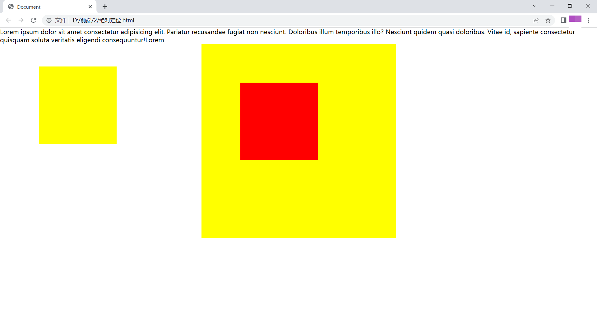
第一个盒子为没有父元素,故相对于浏览器移动;第二个盒子有父元素且父元素有定位,故相对于父元素移动。
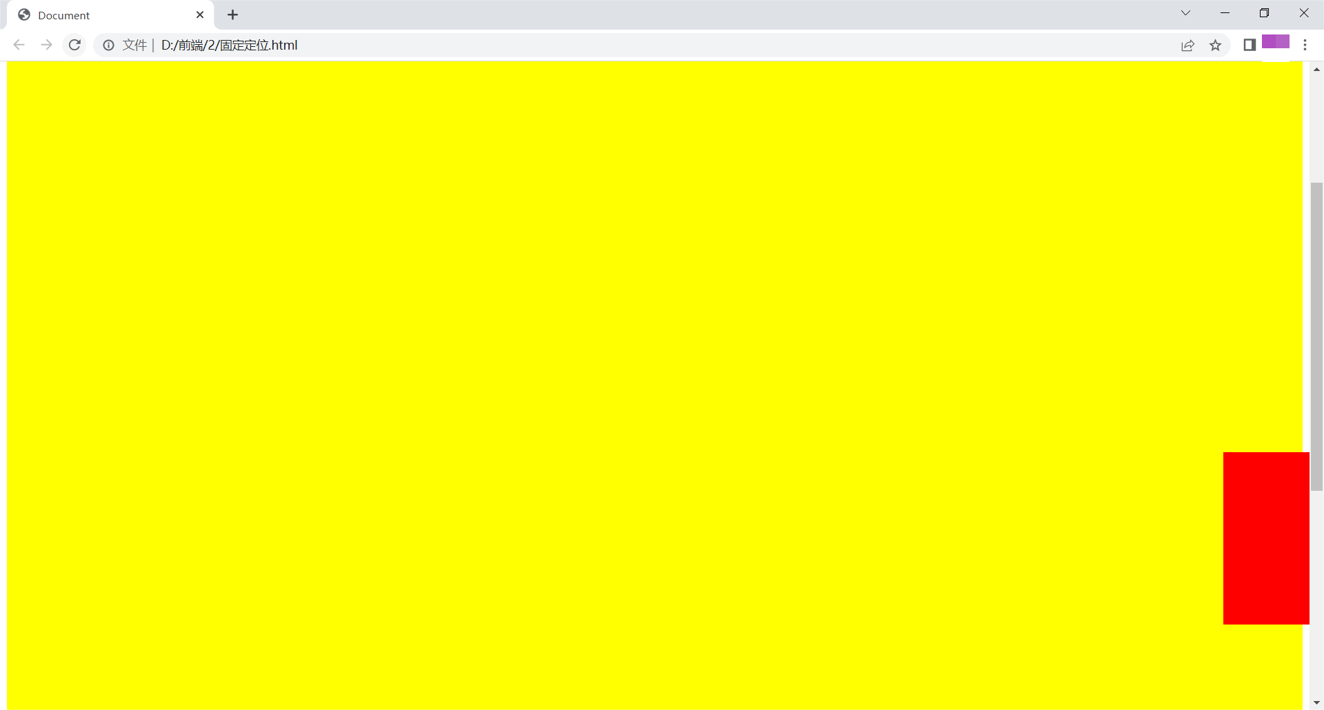
固定定位
position:fixed;固定定位,脱离文档流,参照浏览器当前窗口
举例如下:
<!DOCTYPE html>
<html lang="en">
<head>
    <meta charset="UTF-8">
    <title>Document</title>
    <style>
        .box{
            width: 100%;
            height: 1500px;
            background: yellow;
        }
        .ad{
            width: 100px;
            height: 200px;
            background: red;
            position: fixed;
            right: 0;
            bottom: 100px;
        }
    </style>
</head>
<body>
    <div class="box">

    </div>
    <div class="ad">

    </div>
</body>
</html>
在浏览器显示如下:
可见,无论如何滚动,小盒子都固定在右下角。
粘性定位
position:sticky;粘性定位,可以做吸顶效果,CSS3.0内容
举例如下:
<!DOCTYPE html>
<html lang="en">
<head>
    <meta charset="UTF-8">
    <title>Document</title>
    <style>
        *{
            margin: 0;
            padding: 0;
        }
        .header{
            background: yellow;
            width: 100%;
            height: 100px;
        }
        .nav{
            background: red;
            width: 500px;
            height: 50px;
            margin: 0 auto;
            position:sticky;
            top:0px;
        }
        .body{
            height: 1000px;
            background: green;
        }
    </style>
</head>
<body>
    <div class="header"></div>
    <div class="nav"></div>
    <div class="body"></div>
</body>
</html>
在浏览器显示如下:
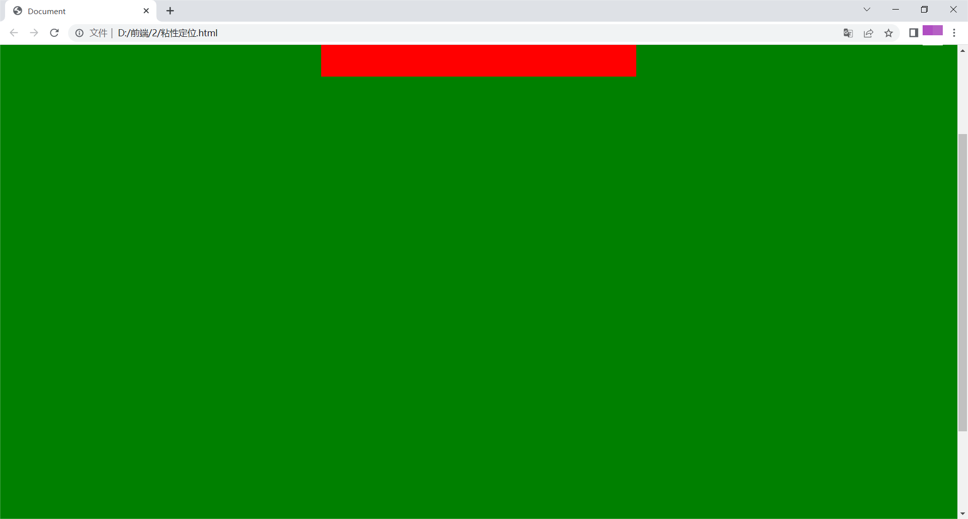
可见,形成吸顶效果。
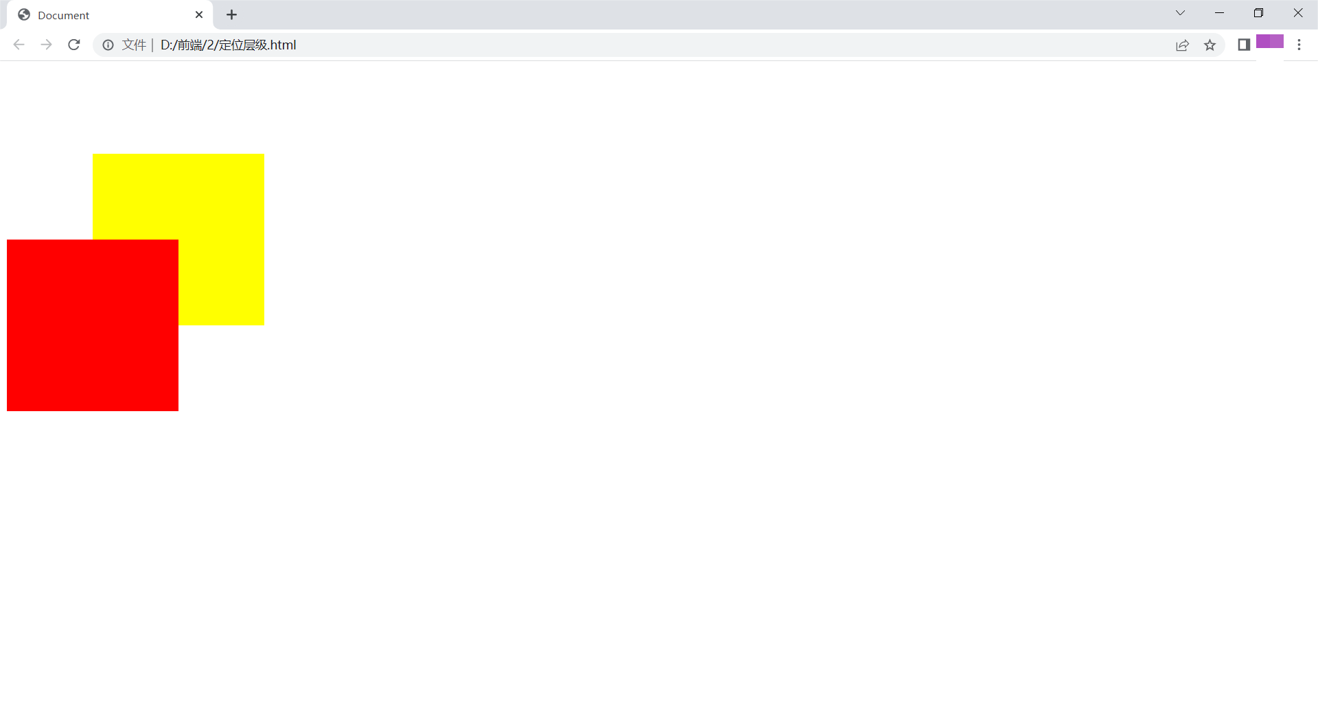
定位的层级
z-index值越大,层级越高,显示在上面
举例如下:
<!DOCTYPE html>
<html lang="en">
<head>
    <meta charset="UTF-8">
    <title>Document</title>
    <style>
        div{
            width: 200px;
            height: 200px;
        }
        .box1{
            background: yellow;
            position: relative;
            top: 100px;
            left: 100px;
            z-index: 100;
        }
        .box2{
            background: red;
            position: relative;
            z-index: 200;
        }
    </style>
</head>
<body>
    <div class="box1"></div>
    <div class="box2"></div>
</body>
</html>
在浏览器显示如下:
绝对定位的层级及延伸
父子关系的层级
举例如下:
<!DOCTYPE html>
<html lang="en">
<head>
    <meta charset="UTF-8">
    <title>Document</title>
    <style>
        .box{
            width: 200px;
            height: 200px;
            background: yellow;
            position: relative;
        }
        .child{
            width: 100px;
            height: 100px;
            background: red;
            position: absolute;
            top: 10px;
            left: 10px;
            z-index: -1;
        }
    </style>
</head>
<body>
    <div class="box">
        <div class="child"></div>
    </div>
</body>
</html>
在浏览器显示如下:
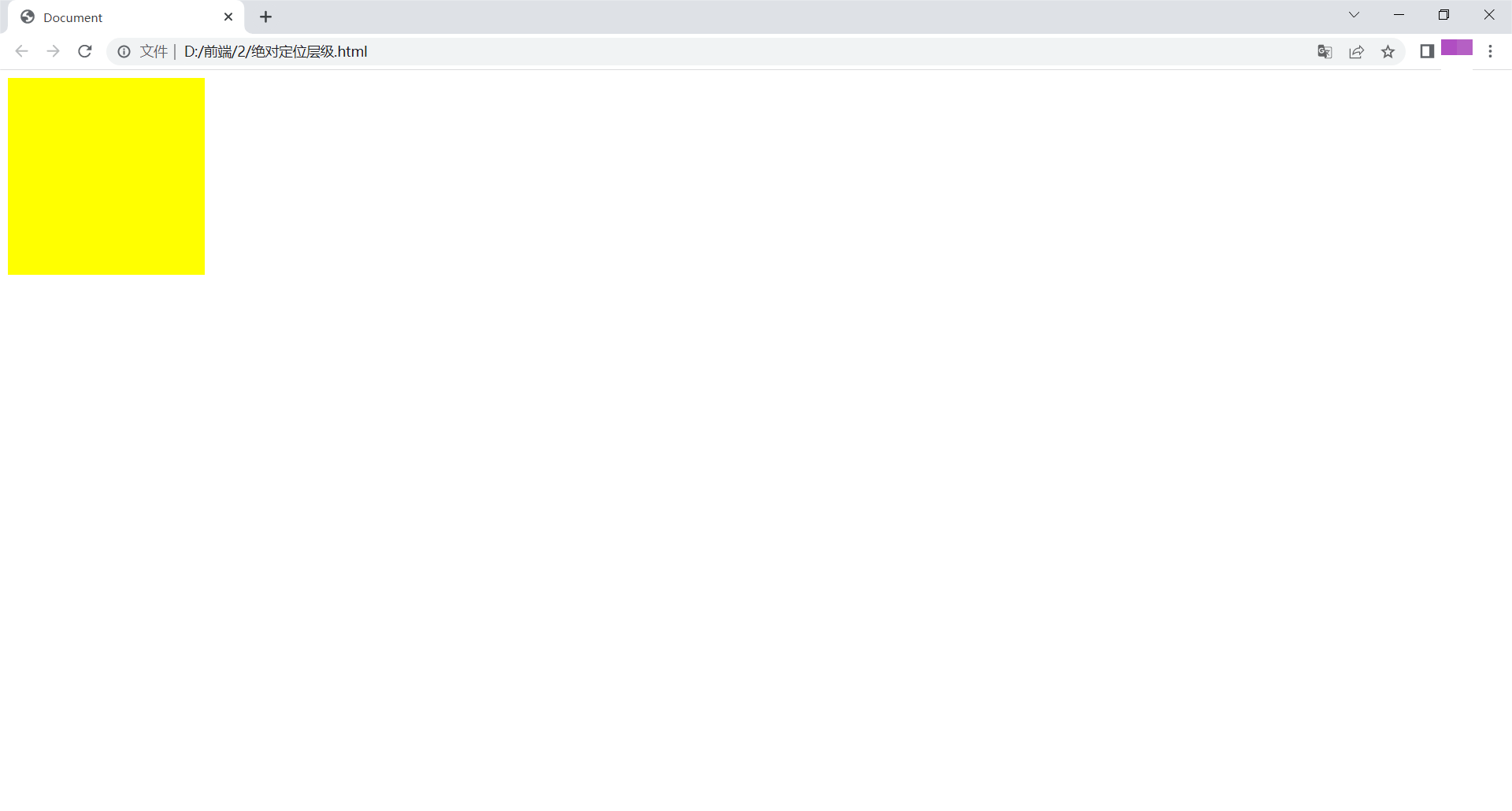
如图所示,父盒子显示在子盒子上。
兄弟关系的层级
举例如下:
<!DOCTYPE html>
<html lang="en">
<head>
    <meta charset="UTF-8">
    <title>Document</title>
    <style>
        .box1{
            width: 200px;
            height: 200px;
            background: yellow;
            position: absolute;
            top: 50px;
            left: 50px;
            z-index: 100;
        }
        .box2{
            width: 100px;
            height: 100px;
            background: red;
            position: absolute;
            top: 0;
            left: 0;
            z-index: 200;
        }
    </style>
</head>
<body>
    <div class="box1">

    </div>
    <div class="box2"></div>
</body>
</html>
在浏览器显示如下:
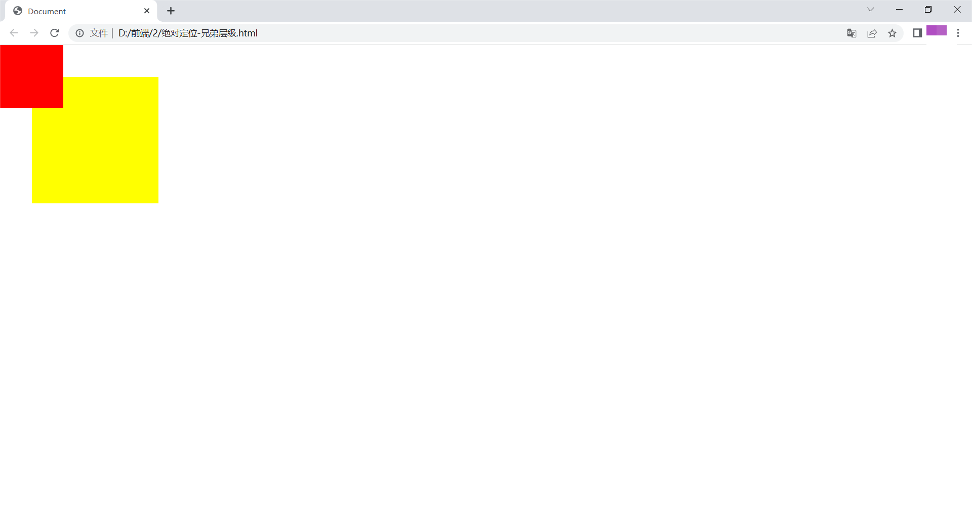
同样,z-index值越大,层级越高,显示在上面。
行内元素转变为块元素
将行内元素通过绝对定位转变为块元素
<!DOCTYPE html>
<html lang="en">
<head>
    <meta charset="UTF-8">
    <title>Document</title>
    <style>
        span{
            width: 100px;
            height: 100px;
            background: yellow;
            position: absolute;
        }
    </style>
</head>
<body>
    <span></span>
</body>
</html>
浏览器显示如下:

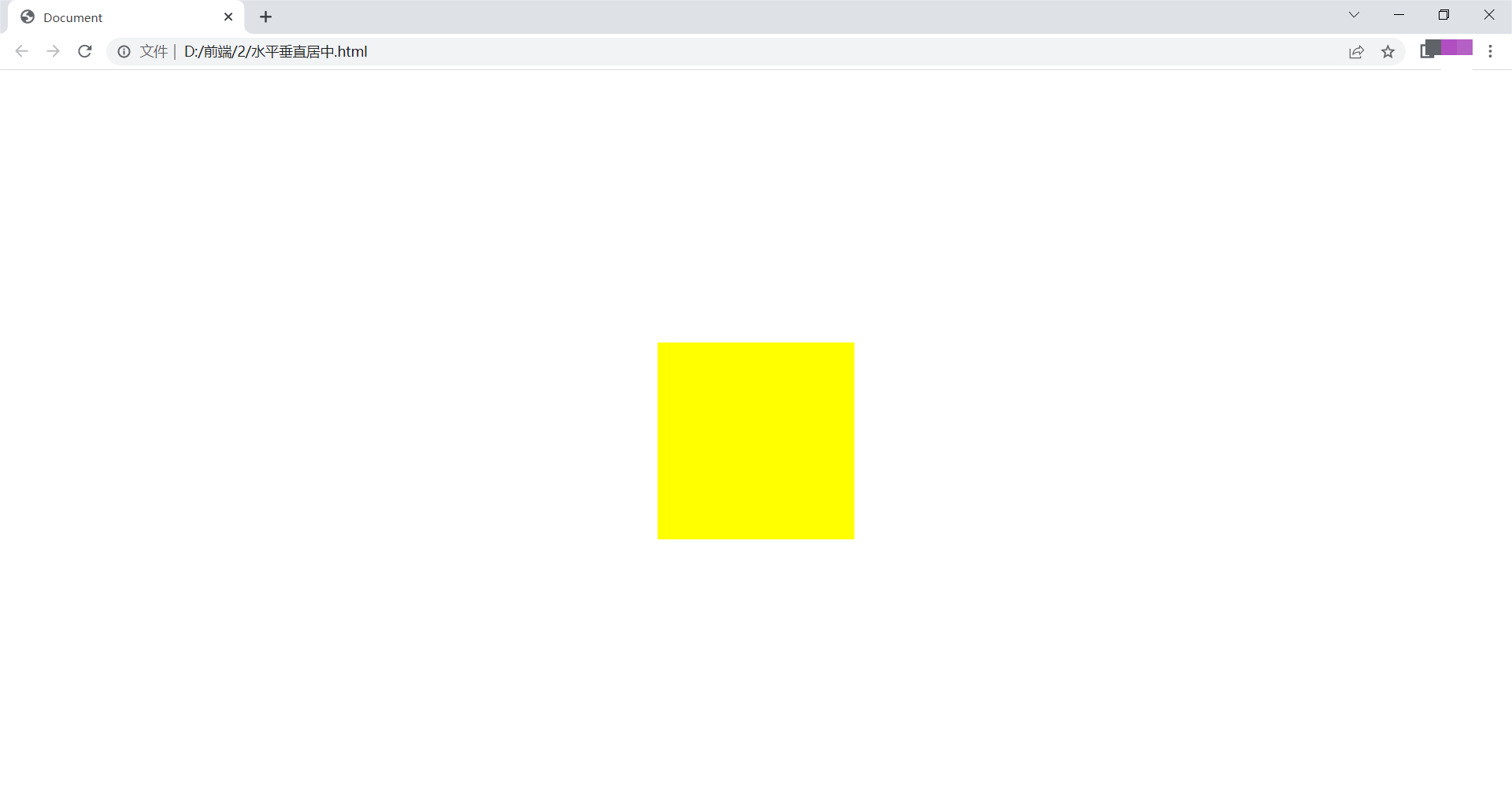
定位控制元素水平垂直居中
屏幕水平居中
<!DOCTYPE html>
<html lang="en">
<head>
    <meta charset="UTF-8">
    <title>Document</title>
    <style>
        *{
            margin: 0;
            padding: 0;
        }
        div{
            width: 200px;
            height: 200px;
            background: yellow;
            position: absolute;
            top: 50%;
            left: 50%;
            margin-left: -100px;
            margin-top: -100px;
        }
    </style>
</head>
<body>
    <div>

    </div>
</body>
</html>
在浏览器显示如下:
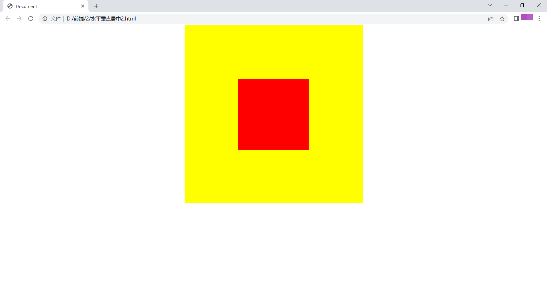
子盒子在父盒子中水平垂直居中
<!DOCTYPE html>
<html lang="en">
<head>
    <meta charset="UTF-8">
    <title>Document</title>
    <style>
        *{
            margin: 0;
            padding: 0;
        }
        .box{
            width: 500px;
            height: 500px;
            background: yellow;
            margin: 0 auto;
            position: relative;
        }
        .child{
            width: 200px;
            height: 200px;
            background: red;
            position: absolute;
            top:50%;
            left: 50%;
            margin-left: -100px;
            margin-top: -100px;
        }
    </style>
</head>
<body>
    <div class="box">
        <div class="child"></div>
    </div>
</body>
</html>
浏览器显示如下:
浮动与定位区别
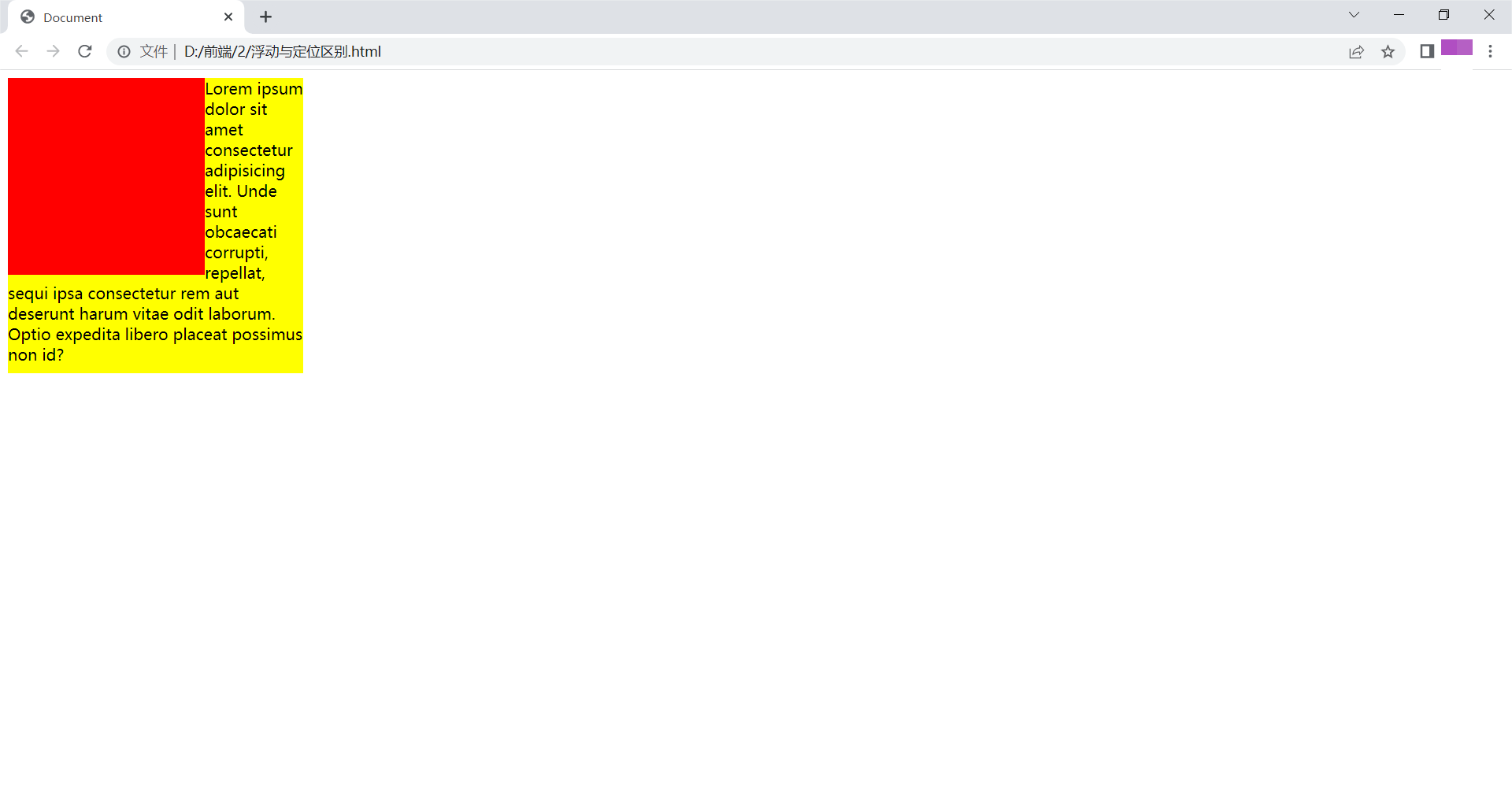
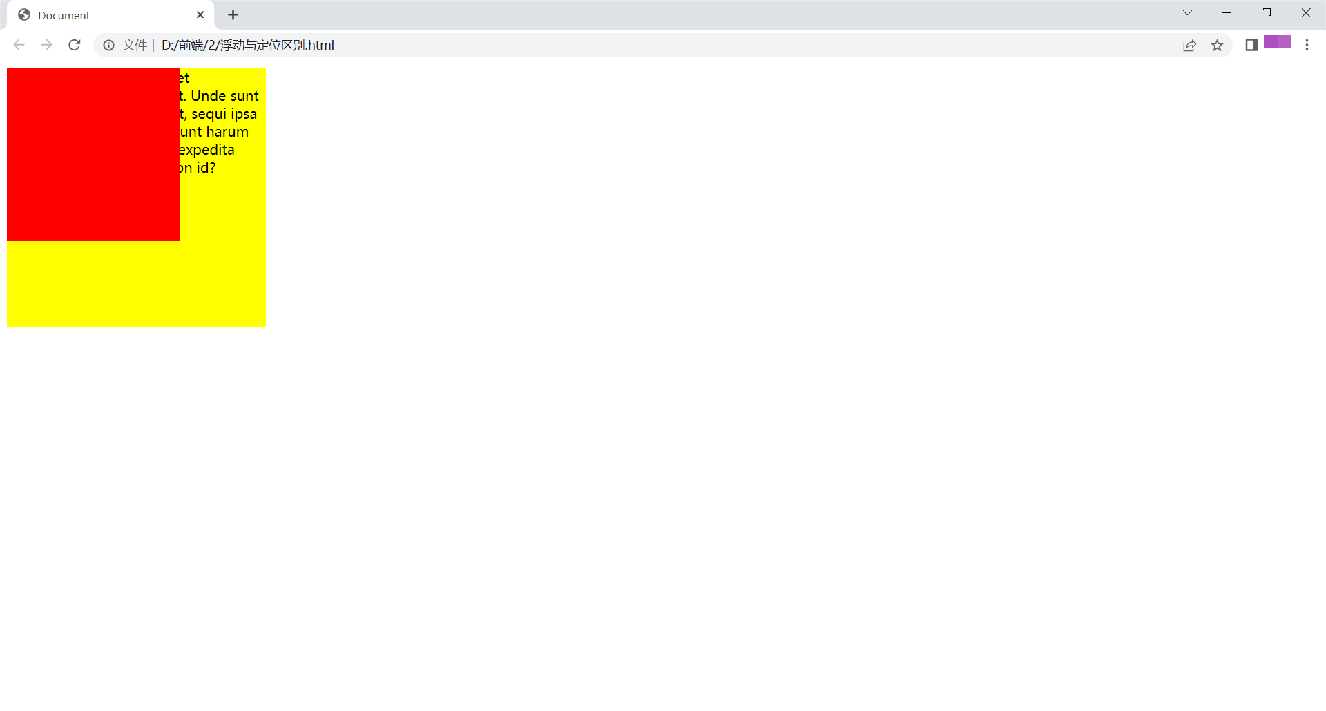
float:半脱离文档流,会形成文字环绕效果
绝对定位:全脱离文档流,不会出现文字环绕
浮动
<!DOCTYPE html>
<html lang="en">
<head>
    <meta charset="UTF-8">
    <title>Document</title>
    <style>
        .box1{
            width: 200px;
            height: 200px;
            background: red;
            float: left;
        }
        .box2{
            width: 300px;
            height: 300px;
            background: yellow;
        }
    </style>
</head>
<body>
    <div class="box1"></div>
    <div class="box2">Lorem ipsum dolor sit amet consectetur adipisicing elit. Unde sunt obcaecati corrupti, repellat, sequi ipsa consectetur rem aut deserunt harum vitae odit laborum. Optio expedita libero placeat possimus non id?</div>
</body>
</html>
浏览器显示如下:
绝对定位
<!DOCTYPE html>
<html lang="en">
<head>
    <meta charset="UTF-8">
    <title>Document</title>
    <style>
        .box1{
            width: 200px;
            height: 200px;
            background: red;
            position: absolute;
        }
        .box2{
            width: 300px;
            height: 300px;
            background: yellow;
        }
    </style>
</head>
<body>
    <div class="box1"></div>
    <div class="box2">Lorem ipsum dolor sit amet consectetur adipisicing elit. Unde sunt obcaecati corrupti, repellat, sequi ipsa consectetur rem aut deserunt harum vitae odit laborum. Optio expedita libero placeat possimus non id?</div>
</body>
</html>
浏览器显示如下:
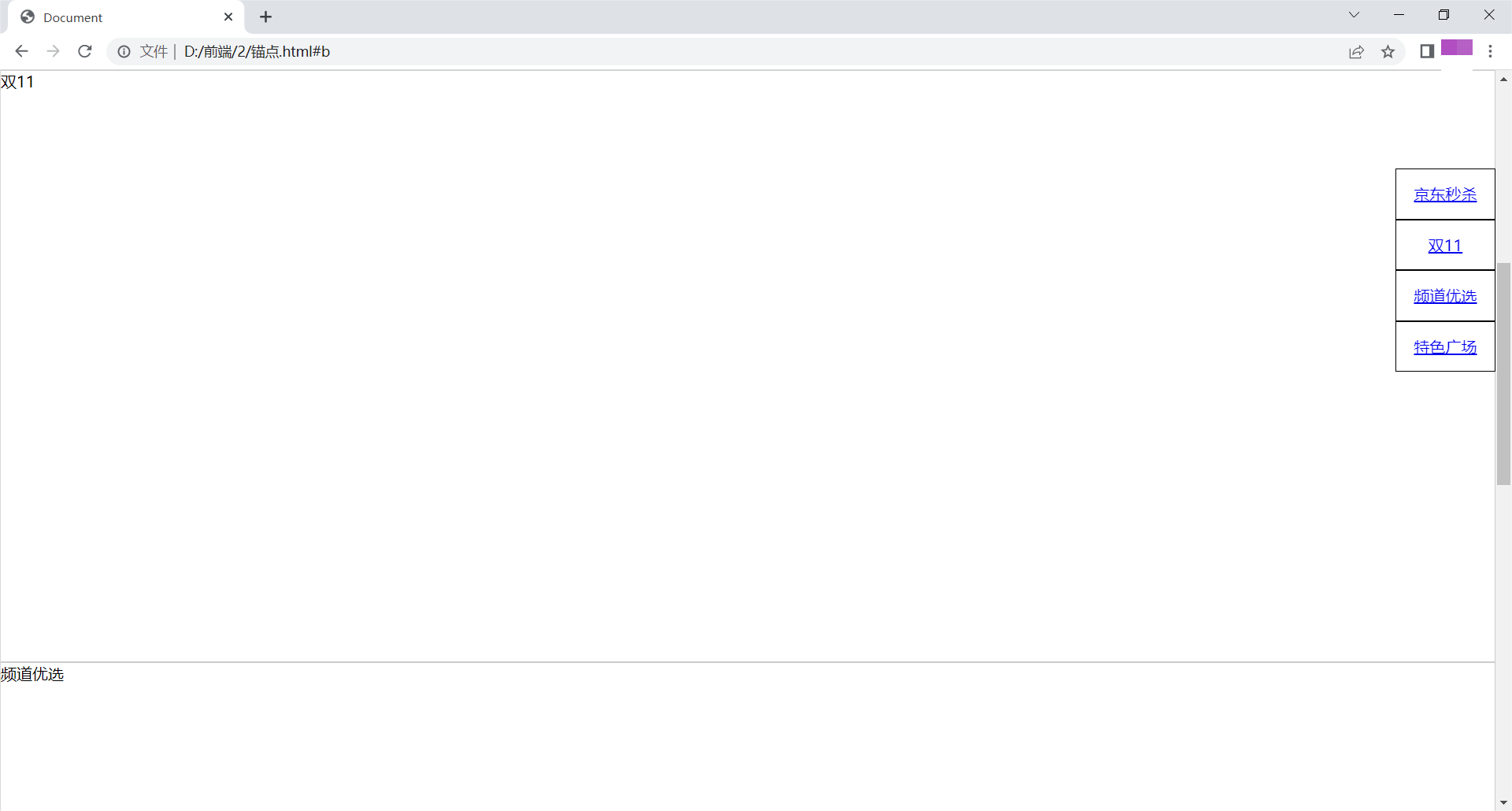
锚点
可以实现页内跳转
<!DOCTYPE html>
<html lang="en">
<head>
    <meta charset="UTF-8">
    <title>Document</title>
    <style>
        *{
            margin: 0;
            padding: 0;
        }
        ul{
            list-style: none;
            position: fixed;
            right: 0px;
            top: 100px;
        }
        li{
            width: 100px;
            height: 50px;
            line-height: 50px;
            text-align: center;
            border: 1px solid black;

        }
        div{
            height: 600px;
            border: 1px solid #ccc;
        }
    </style>
</head>
<body>
    <ul>
        <li>
            <a href="#a">京东秒杀</a>
        </li>
        <li>
            <a href="#b">双11</a>
        </li>
        <li><a href="#c">频道优选</a></li>
        <li><a href="#d">特色广场</a></li>
    </ul>
    <div id="a">京东秒杀</div>
    <div id="b">双11</div>
    <div id="c">频道优选</div>
    <div id="d">特色广场</div>
</body>
</html>
浏览器显示如下:
精灵图
图片整合技术
将导航背景图片,按钮背景图片等有规则的合并成一张图片,用background-position实现图片定位。
图片整合优势:
减少对服务器请求次数,提高页面加载速度;
减小图片体积。
<!DOCTYPE html>
<html lang="en">
<head>
    <meta charset="UTF-8">
    <title>Document</title>
    <style>
        div{
            width: 103px;
            height: 32px;
            float: left;
            margin: 10px;
            background: yellow url(./1.png);
        }
        .box1{
            background-position: -205px -111px;
        }
        .box2{
            background-position: -205px -74px;
        }
        .box3{
            background-position: -205px -37px;
        }
    </style>
</head>
<body>
    <div class="box1"></div>
    <div class="box2"></div>
    <div class="box3"></div>
</body>
</html>
浏览器显示如下:
宽高自适应
即元素大小可根据窗口或子元素自动调整。
宽度自适应
宽度默认值为auto;
<!DOCTYPE html>
<html lang="en">
<head>
    <meta charset="UTF-8">
    <title>Document</title>
    <style>
        *{
            margin: 0;
            padding: 0;
        }
        div{
            width: auto;
            height: 100px;
            padding-left: 100px;
            background: yellow;
        }
    </style>
</head>
<body>
    <div></div>
</body>
</html>
浏览器显示如下:
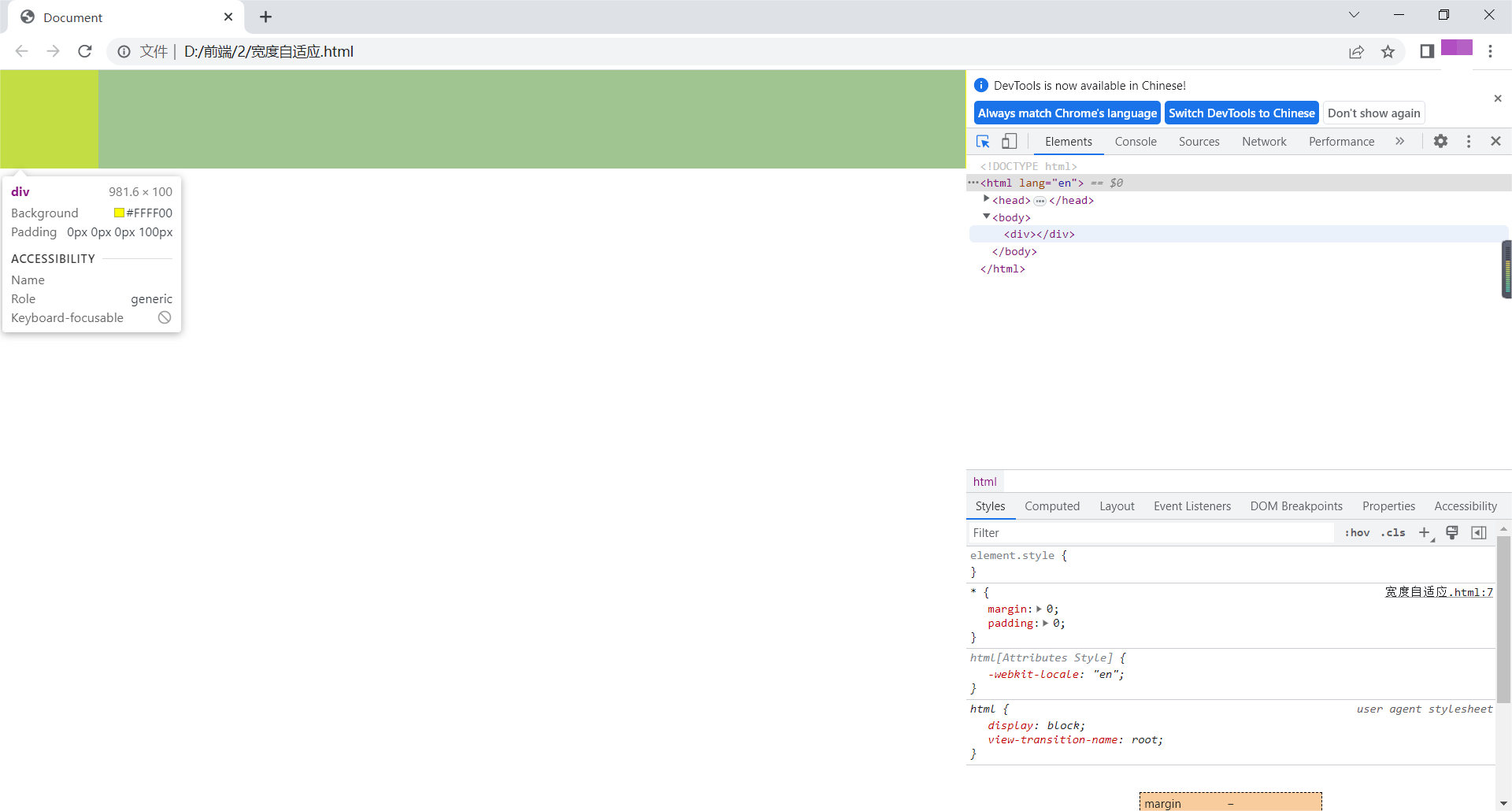
可见,即使有padding,宽度会自适应。
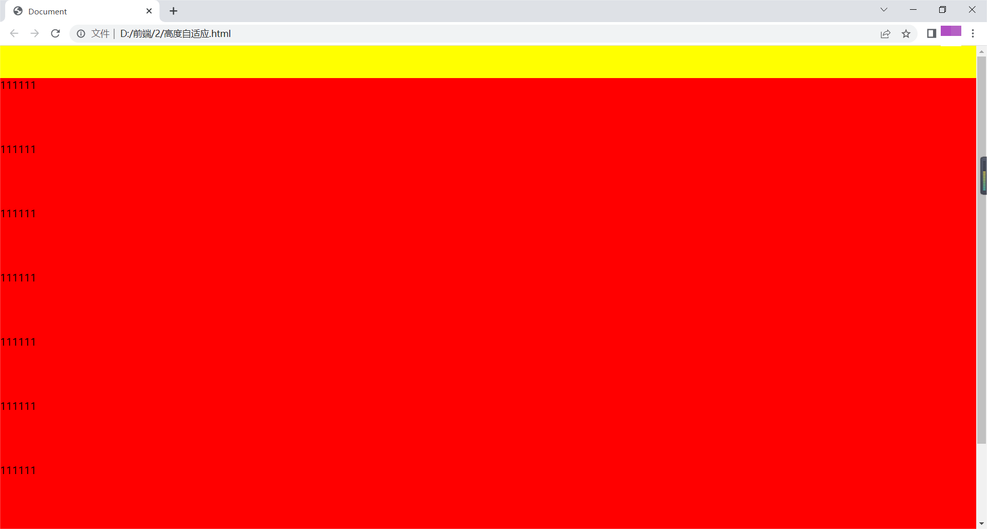
高度自适应
高度默认值为height:auto。
<!DOCTYPE html>
<html lang="en">
<head>
    <meta charset="UTF-8">
    <title>Document</title>
    <style>
        *{
            margin: 0;
            padding: 0;
        }
        .header,.footer{
            width: 100%;
            height: 50px;
            background: yellow;
        }
        .body{
            height: auto;
            background: red;
        }
        li{
            height: 100px;
        }
    </style>
</head>
<body>
    <div class="header"></div>
    <div class="body">
        <ul>
            <li>111111</li>
            <li>111111</li>
            <li>111111</li>
            <li>111111</li>
            <li>111111</li>
            <li>111111</li>
            <li>111111</li>
            <li>111111</li>
        </ul>
    </div>
    <div class="footer"></div>
</body>
</html>
浏览器显示如下:
最小高度/最小宽度
设置min-height/min-width,即使内容很少,盒子高度和宽度也会是最小高度值和最小宽度值。
最大高度/最大宽度
设置max-height/max-width,即使内容很多,盒子高度和宽度也只能是设定的最大值。
浮动元素父元素高度自适应
解决高度塌陷的几种方法及问题:
给父元素添加高度
只适用于固定页面布局,不能自适应;
例如:
<!DOCTYPE html>
<html lang="en">
<head>
    <meta charset="UTF-8">
    <title>Document</title>
    <style>
        .left,.right{
            width: 100px;
            height: 100px;
            float: left;
        }
        .left{
            background: yellow;
        }
        .right{
            background: red;
        }
        .content{
            width: 200px;
            height: 200px;
            background: green;
        }
       .box{
            height: 100px;
        }
    </style>
</head>
<body>
    <div class="box">
        <div class="left"></div>
        <div class="right"></div>
        <div class="left"></div>
        <div class="right"></div>
        <div class="left"></div>
        <div class="right"></div>
        <div class="left"></div>
        <div class="right"></div>
        <div class="left"></div>
        <div class="right"></div>
        <div class="left"></div>
        <div class="right"></div>
        <div class="left"></div>
        <div class="right"></div>
        <div class="left"></div>
        <div class="right"></div>
    </div>
    <div class="content"></div>
</body>
</html>
浏览器显示如下:
如图所示:当盒子过多出现换行时出现覆盖。
在高度塌陷父元素后添加<div style="clear:both;"></div>
会添加多余结构,不利于可读性。
例如:
<!DOCTYPE html>
<html lang="en">
<head>
    <meta charset="UTF-8">
    <title>Document</title>
    <style>
        .left,.right{
            width: 100px;
            height: 100px;
            float: left;
        }
        .left{
            background: yellow;
        }
        .right{
            background: red;
        }
        .content{
            width: 200px;
            height: 200px;
            background: green;
        }
    </style>
</head>
<body>
    <div class="box">
        <div class="left"></div>
        <div class="right"></div>
        <div style="clear:both;"></div>
    </div>
    <div class="content"></div>
</body>
</html>
给塌陷的元素添加overflow:hidden;
会隐藏定位在元素外面的元素。
例如:
<!DOCTYPE html>
<html lang="en">
<head>
    <meta charset="UTF-8">
    <title>Document</title>
    <style>
        .left,.right{
            width: 100px;
            height: 100px;
            float: left;
        }
        .left{
            background: yellow;
        }
        .right{
            background: red;
        }
        .content{
            width: 200px;
            height: 200px;
            background: green;
        }
        .box{
            overflow: hidden;
        }
    </style>
</head>
<body>
    <div class="box">
        <div class="left"></div>
        <div class="right">Lorem ipsum dolor sit, amet consectetur adipisicing elit. Quos inventore nesciunt nam pariatur nobis exercitationem at. Aliquam asperiores voluptatem libero atque itaque eos, assumenda officiis facilis iure necessitatibus hic tempore.</div>
    </div>
    <div class="content"></div>
</body>
</html>
浏览器显示如下:
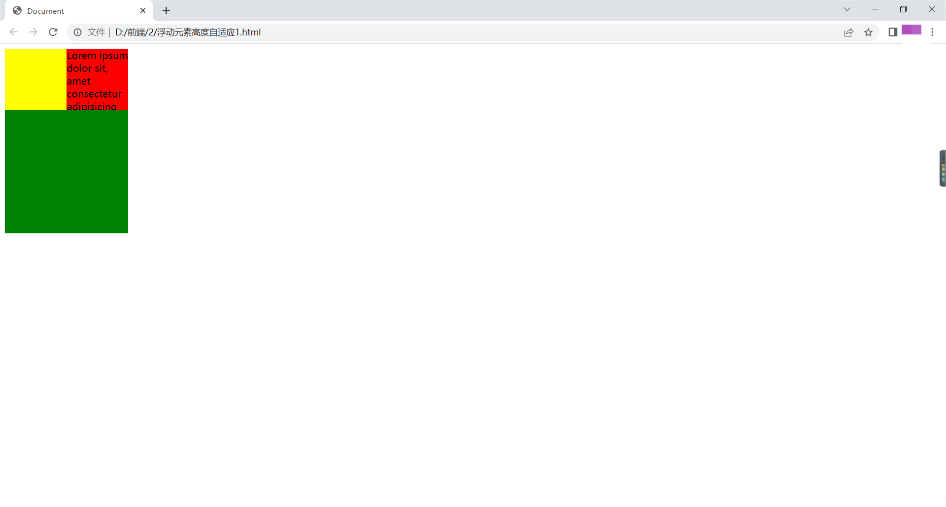
如图所示:溢出的文字被隐藏。
万能清除浮动法
父元素:after{content:".";clear:both;display:block;height:0;overflow:hidden;visibility:hidden;}
<!DOCTYPE html>
<html lang="en">
<head>
    <meta charset="UTF-8">
    <meta http-equiv="X-UA-Compatible" content="IE=edge">
    <meta name="viewport" content="width=device-width, initial-scale=1.0">
    <title>Document</title>
    <style>
        *{
            margin:0;
            padding: 0;
        }
        .a{
            width: 300px;
            margin: 0 auto;
        }
        ul{
            list-style: none;
        }
        .a .b{
            float:left;
            width: 148px;
            text-align: center;
            border: 1px solid blue;
            background: blue;
            color:white;
            line-height: 40px;
            position: relative;
        }
        .b:hover{
            background: lightblue;
        }
        .b ul{
            display:none;
            background: white;
            color: black;
            position: absolute;
            top: 40px;
            left: 0;
            width: 148px;
        }
        .b:hover ul{
            display: block;
        }
        .b>li li:hover{
            background: lightblue;

        }
        .content{
            height: 100px;
            background:yellow;
        }
        .a::after{
            content: "";
            clear: both;
            display: block;
            width: 0;
            height: 0;
            visibility: hidden;
        }
    </style>
</head>
<body>
    <ul class="a">
        <li class="b">视频教程
            <ul>
                <li>全部视频教程</li>
                <li>HTML</li>
                <li>JAVA</li>
            </ul>
        </li>
        <li class="b">认证考试
            <ul>
                <li>pmp</li>
                <li>红帽</li>
            </ul>
        </li>
    </ul>
    <div class="content">11111111</div>
</body>
</html>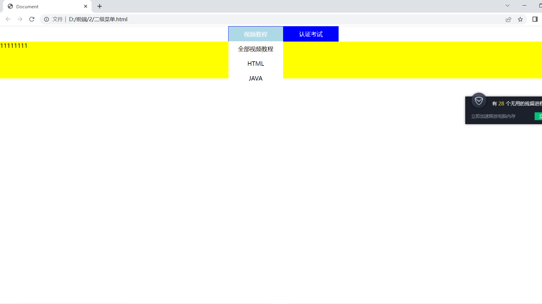
如图所示,在打开二级菜单后会对下边的进行覆盖。
伪元素
::after(与content属性一起用,定义在对象后的内容。)
::before:与content属性一起用,定义在对象前的内容。
::first-letter:定义对象内第一个字符的样式。
::first-line:定义对象内第一行文本的样式。
<!DOCTYPE html>
<html lang="en">
<head>
    <meta charset="UTF-8">
    <title>Document</title>
    <style>
        div::first-letter{
            font-size: 30px;
            color: red;
        }
        div::first-line{
            background: yellow;
        }
        div::before{
            content: "aaa";
        }
        div::after{
            content: "bbb";
        }
    </style>
</head>
<body>
    <div>Lorem ipsum dolor sit amet consectetur adipisicing elit. Culpa dicta laboriosam non? Voluptates sint, tempore sit eius necessitatibus, dolorum sunt earum modi praesentium corrupti quidem totam quo deserunt facilis impedit!</div>
</body>
</html>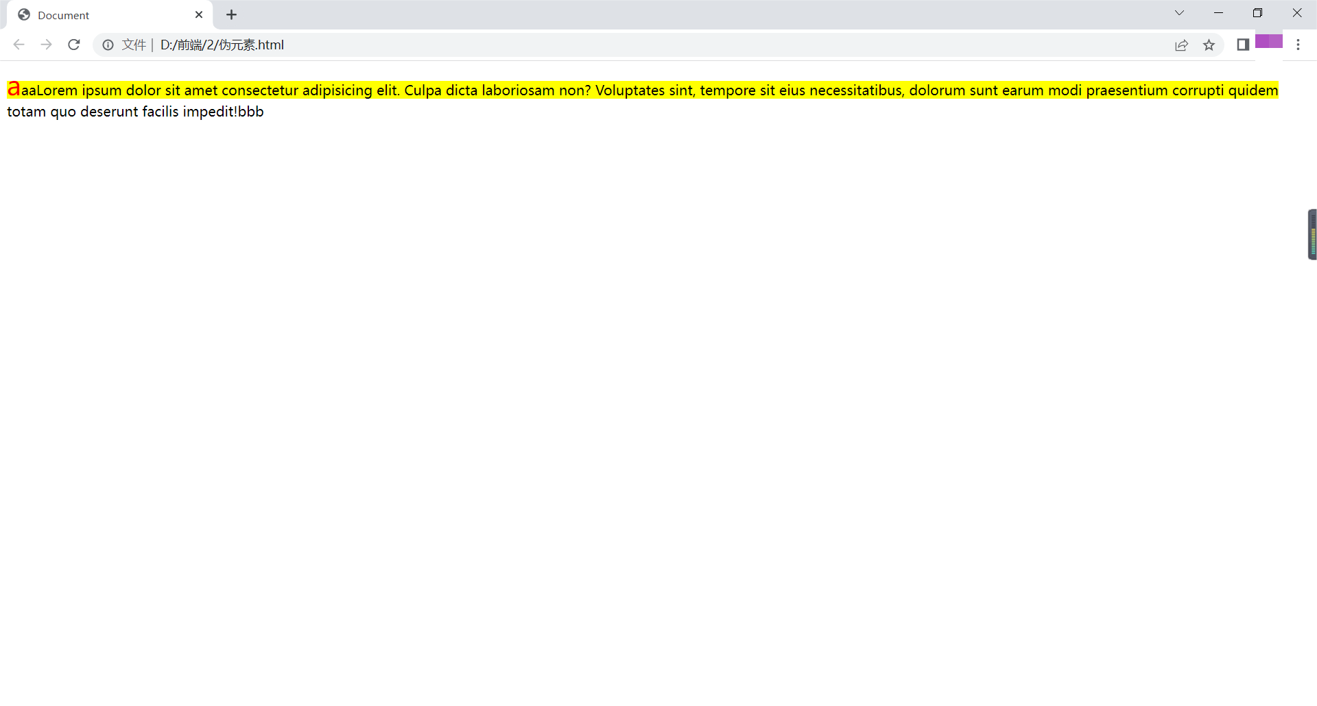
占位隐藏
visibility:hidden;为占位隐藏
<!DOCTYPE html>
<html lang="en">
<head>
    <meta charset="UTF-8">
    <title>Document</title>
    <style>
        .box1{
            width: 100px;
            height: 100px;
            background: yellow;
            /*display: none;不占位隐藏*/
            visibility: hidden;
        }
        .box2{
            width: 100px;
            height: 100px;
            background: red;
        }
    </style>
</head>
<body>
    <div class="box1"></div>
    <div class="box2"></div>
</body>
</html>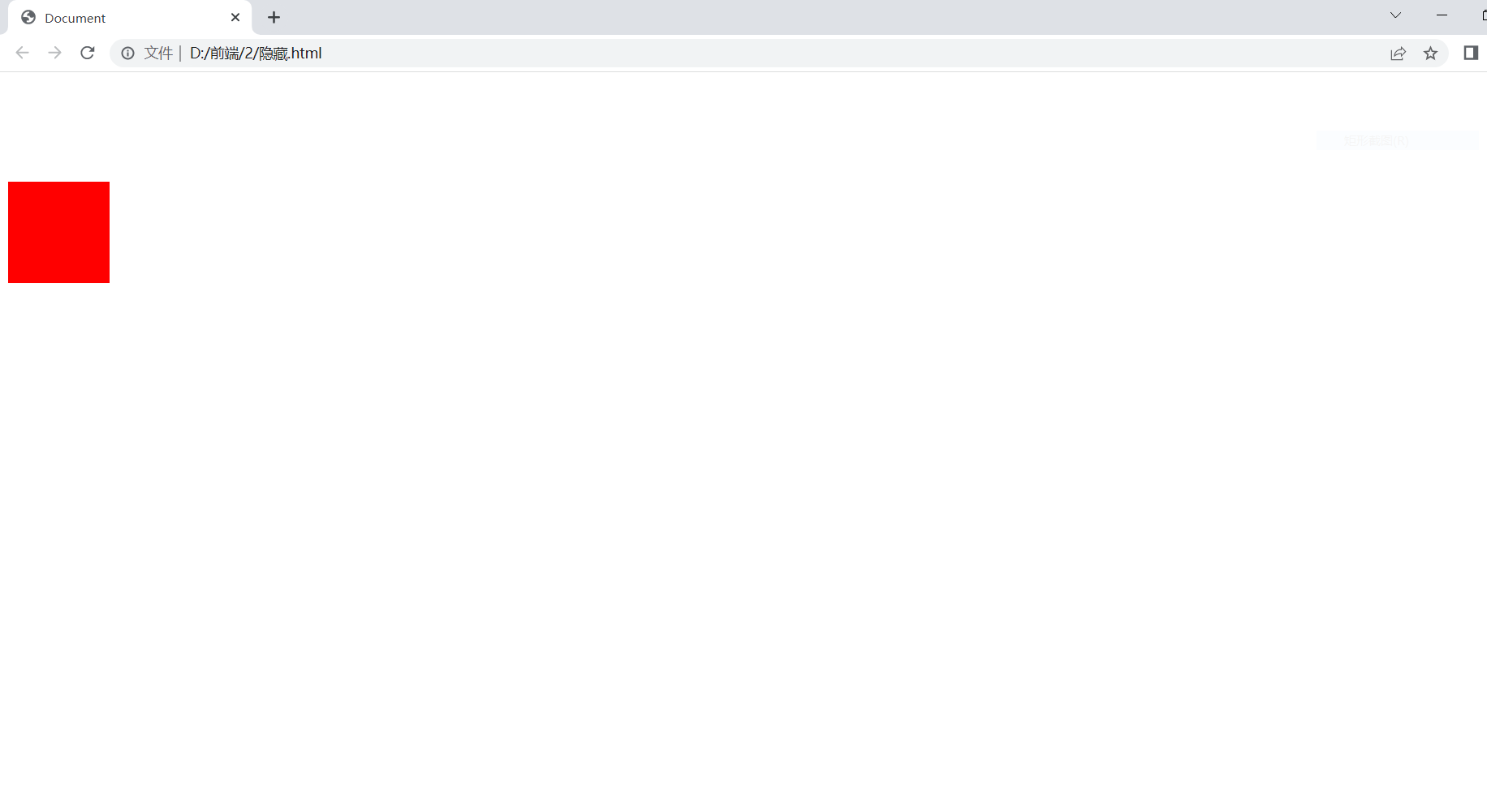
窗口自适应
盒子根据窗口大小改变
html,body{height:100%;}
<!DOCTYPE html>
<html lang="en">
<head>
    <meta charset="UTF-8">
    <title>Document</title>
    <style>
        *{
            margin: 0;
            padding: 0;
        }
        .box{
            width: 100%;
            height: 100%;
            background: yellow;
        }
        html,body{
            height: 100%;
        }
        .child1{
            background: blue;
            height: 50%;
        }
        .child2{
            background: red;
            height: 50%;
        }
    </style>
</head>
<body>
    <div class="box">
        <div class="child1"></div>
        <div class="child2"></div>
    </div>
</body>
</html>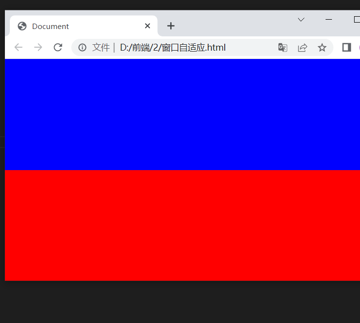
两栏布局
第一种
<!DOCTYPE html>
<html lang="en">
<head>
    <meta charset="UTF-8">
    <title>Document</title>
    <style>
        *{
            margin: 0;
            padding: 0;
        }
        html,body{
            height: 100%;
        }
        .box1{
            width: 200px;
            height: 100%;
            background: red;
            float: left;
        }
        .box2{
            height: 100%;
            background: yellow;
            margin-left: 200px;
            width: 100%;
        }
    </style>
</head>
<body>
    <div class="box1"></div>
    <div class="box2"></div>
</body>
</html>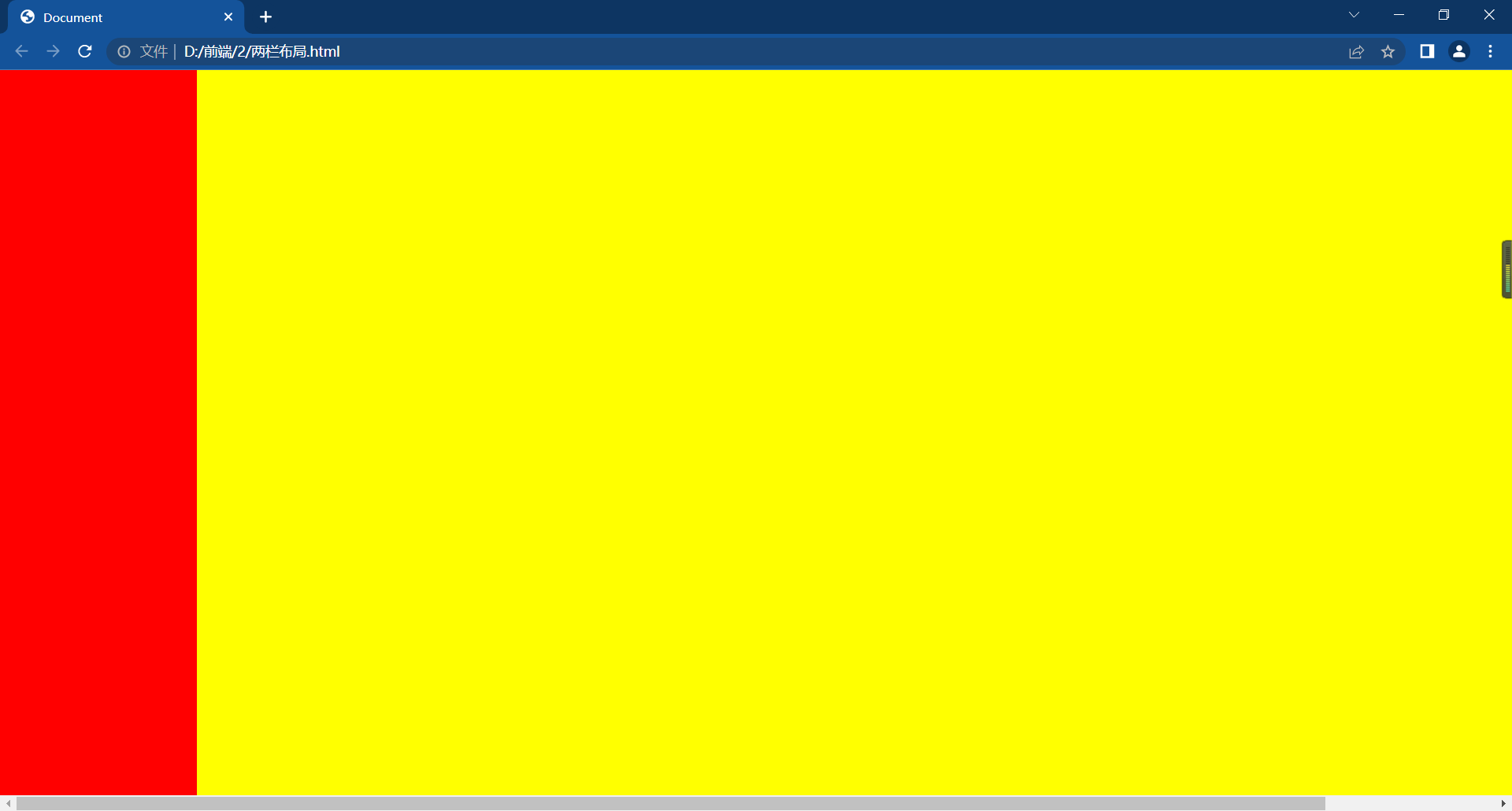
第二种方法
calc()函数:用于动态计算长度值
运算符前后需要保留一个空格,如:width: calc(100% - 200px);
支持"+""-""*""/"
使用标准数学运算优先级规则
<!DOCTYPE html>
<html lang="en">
<head>
    <meta charset="UTF-8">
    <title>Document</title>
    <style>
        *{
            margin: 0;
            padding: 0;
        }
        html,body{
            height: 100%;
        }
        .box1{
            width:200px;
            height: 100%;
            background: red;
            float: left;
        }
        .box2{
            width:calc(100% - 200px);
            height: 100%;
            background: yellow;
            float: left;
        }
    </style>
</head>
<body>
    <div class="box1"></div>
    <div class="box2"></div>
</body>
</html>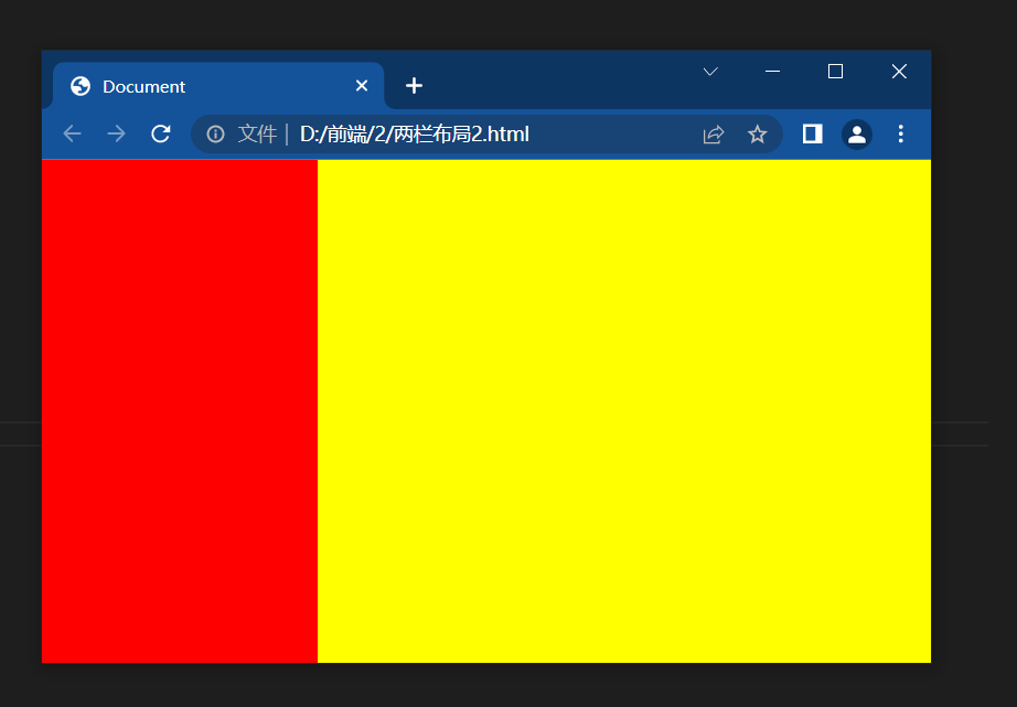
右边实现了自适应
三栏布局
第一种
<!DOCTYPE html>
<html lang="en">
<head>
    <meta charset="UTF-8">
    <title>Document</title>
    <style>
        *{
            margin: 0;
            padding: 0;
        }
        html,body{
            height: 100%;
        }
        .left,.right{
            width: 200px;
            height: 100%;
        }
        .left{
            background: yellow;
            float: left;
        }
        .right{
            background: red;
            float: right;
        }
        .center{
            height: 100%;
            background: green;
            margin-left:200px;
            margin-right: 200px;
        }
    </style>
</head>
<body>
    <div class="left"></div>
    <div class="right"></div>
    <div class="center"></div>

</body>
</html>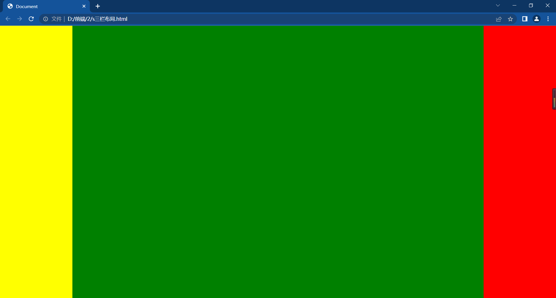
第二种
<!DOCTYPE html>
<html lang="en">
<head>
    <meta charset="UTF-8">
    <title>Document</title>
    <style>
        *{
            margin: 0;
            padding: 0;
        }
        html,body{
            height: 100%;
        }
        .left,.right{
            width: 200px;
            height: 100%;
        }
        .left{
            background: yellow;
            float: left;
        }
        .right{
            background: red;
            float: right;
        }
        .center{
            width: calc(100% - 400px);
            height: 100%;
            background: green;
            float: left;
        }
    </style>
</head>
<body>
    <div class="left"></div>
    <div class="right"></div>
    <div class="center"></div>

</body>
</html>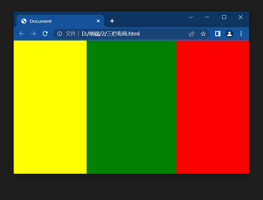
中间盒子宽度自适应。
综合例子
<!DOCTYPE html>
<html lang="en">
<head>
    <meta charset="UTF-8">
    <title>Document</title>
    <style>
        *{
            margin: 0;
            padding: 0;
        }
        html,body{
            height: 100%;
        }
        .top,.bottom{
            width: 100%;
            height: 50px;
            background: #ccc;
        }
        .middle{
            height: calc(100% - 100px);
            background: yellow;
        }
        .left,.right{
            width: 100px;
            height: 100%;
            background: red;
            float: left;
        }
        .center{
            width: calc(100% - 200px);
            height: 100%;
            background: blue;
            float: left;
        }
    </style>
</head>
<body>
    <div class="top"></div>
    <div class="middle">
        <div class="left"></div>
        <div class="center"></div>
        <div class="right"></div>

    </div>
    <div class="bottom"></div>
</body>
</html>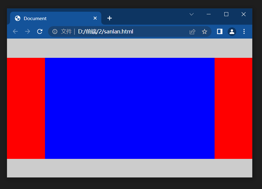


 扫一扫
扫一扫
 3980
3980

 被折叠的 条评论
为什么被折叠?
被折叠的 条评论
为什么被折叠?
 到【灌水乐园】发言


