


上节内容回顾
- 补充:默认img标签,有一个1px的边框
如果点击图片调转到连接,a标签下套img标签,在IE有的版本中,会有蓝色边框。
    <a href="http://blog.csdn.net/fgf00" target="_blank">
        <img src="1.png" style="width: 300px; height: 200px" />
    </a>
因为a标签默认字体颜色就是蓝色,img标签继承了父级标签,而IE浏览器默认给边框加了宽度。解决:
<head>
    <style>
        img {
            border: 0;
        }
    </style>
</head>
<body>
    <a href="http://blog.csdn.net/fgf00" target="_blank">
        <img src="作业--效果图.png" style="width: 300px; height: 200px" />
    </a>
</body>- 回顾
    1、块级和行内
    2、form标签 提交表单
            <form action='http://sssss' methed='GET' enctype="multipart/form-data">
                <div>asdfasdf</div>
                <input type='text' name='q' />
                # 上传文件
                <input type='file' name='f' />  <!--依赖form表单属性 enctype-->
                <input type='submit' />
            </form>

            GET: http://sssss?q=用户输入的值&b=用户输入的内容
            POST:
                请求头
                请求内容
    3、display: block;inline;inline-block
    4、float:
        <div>
            <div style='float:left;'>f</div>
            <div style='clear:both;'></div>
        </div>

    5、margin: 0 auto;  <!--整个页面居中-->
    6、padding, ---> 内边距。自身发生变化
一、css 之 position 分层
1、posttion:fixed 永远固定位置
返回顶部和上方的菜单,永远固定在一个位置
网页有好几屏,不管怎么拉,右下角都有个返回顶部,网页的菜单也一直固定在上方。
前边的内容,所有的页面都是在一层上的。实现返回顶部,就需要position:fixed分层了。
CSS全称:层叠样式表
- 返回顶部
position:fixed ==> 固定在页面某个位置
<div onclick="GoTop();" style="width: 40px; height: 40px; background-color: #0000cc; color: white;
    position: fixed;
    bottom: 20px;
    right: 20px;
    ">返回顶部</div>
<div style="height: 5000px; background-color: #dddddd;">FGFGF</div>
<script>
    function GoTop(){
        document.body.scrollTop = 0;
    }
</script>- 菜单永远在顶部
菜单position固定,内容margin设定外边距
<head>
    <meta charset="UTF-8">
    <title>Title</title>
    <style>
        .pg-header{
            height:48px;  background-color:#2459a2;  color: #dddddd;
            position:fixed;
            top:0;  right:10px;  left:10px;
        }
        .pg-body{
            background-color: #dddddd;  height: 5000px;
            margin-top: 50px;
        }
    </style>
</head>
<body>
    <div class="pg-header">头部</div>
    <div class="pg-body">内容</div>
</body>
2、posttion:relative + absolute 相对定位
posttion: absolute :一次性固定在网页某个位置,再移动滑轮跟着动
posttion: relative :单独使用没有任何变化。
组合(relative + absolute) :固定在父类标签的某个位置。
<div style="position: relative; width:500px;height:200px; background-color: #b3b3b3; margin:auto;">
    <div style="position: absolute; left: 0; bottom: 0; width: 50px; height: 50px; background-color: blue;"></div>
</div>
3、多层展示
- opcity: 0.5 透明度
- z-index: 层级顺序 ,值大在上面
<!--z-index:值大的在上面; display:none;-->
<div style="z-index:10; position:fixed;
top:50%; left:50%;margin-left:-250px; margin-top:-200px;  /*居中*/
background-color:white; height:400px; width:500px;">
    <input type="text" />
</div>

<!--opacity:0.5 透明度;上右下左:0:全遮住-->
<div style="z-index:9; position:fixed; opacity:0.5;
top:0; bottom:0; right:0; left:0; background-color:black;"></div>

<div style="height:5000px; background-color: greenyellow">FGFFGF</div>
二、css 之 overflow 图片显示方式
当图片大小超过了父级标签,就把父级标签撑开了。
- overflow: auto:图片滚动条显示
- overflow: hidden:图片只显示父级标签大小
<!--图片出现滚动条-->
<div style="height:200px; width:300px; overflow: auto">
    <img src="1.png" />
</div>
<!--图片只显示父级大小-->
<div style="height:200px; width:300px; overflow: hidden">
    <img src="1.png" />
    <!--<img src="1.png" style="height:200px; width:300px;"/>-->
</div>
三、css 之 hover 鼠标移过去样式
网站上,鼠标移动过去,变颜色
样式后加上hover :当鼠标移动到当前标签上时,才生效的css属性
<head>
    <meta charset="UTF-8">
    <title>Title</title>
    <style>
        .pg-header{
            position: fixed;
            right: 0;  left: 0;  top: 0;  height: 48px;
            background-color: #2459a2;  line-height: 48px;
        }
        .pg-body{
            margin-top: 50px;
        }
        .w{
            width: 980px;
            margin: 0 auto;
        }
        .pg-header .menu{
            display: inline-block;
            padding: 0 10px 0 10px;  /*上 右 下 左 加上内边距*/
            color: white;
        }
        /*当鼠标移动到当前标签上时,以下CSS属性才生效*/
        .pg-header .menu:hover{
            background-color: blue;
        }
    </style>
</head>
<body>
    <div class="pg-header">
        <div class="w">
            <a class="logo">LOGO</a>
            <a class="menu">全部</a>
            <a class="menu">42区</a>
            <a class="menu">段子</a>
            <a class="menu">1024</a>
        </div>
    </div>

    <div class="pg-body">
        <div class="w">a</div>
    </div>
</body>
四、css 之 background 背景
- background-color :背景颜色
- background-image:背景图片
设置了背景图片,当图片很小,父级div很大,图片会堆叠重复放。水平垂直方向都会帮你重复增加。
<div style="height:790px; width:980px; border: 1px solid red;">
    <div style="background-image: url(http://www.autohome.com.cn/images/error/bg.png); height: 100%; "></div>
</div>
background-repeat(no-repeat;repeat-x;repeat-y):指定方向堆叠
- no-repeat:不堆叠
<div style="background-image:url('4.gif'); height: 80px;background-repeat:no-repeat"></div>repeat-x:只水平堆叠
repeat-y:只垂直堆叠
background-position :指定背景显示位置
如图:icon.png

<div style="background-image: url(icon.png);
             background-repeat:no-repeat;
             height: 20px;width:20px;
             border: 1px solid red;
             background-position-x: 0;    <!--水平方向位置-->
             background-position-y: -78px;<!--垂直方向位置-->
             "></div>
这样指定位置有点麻烦,下面说下几种指定x、y值的方式
<!--第一种:直接x、y写-->
background-position-x:
background-position-y:
<!--第二种:background-position(直接跟x、y值)-->
background-position: 10px 10px
<!--第三种: 简写的方式:-->
<div style="background: #f8f8f8 url(icon.png) 0 -78px no-repeat;
        height: 20px;width:20px;
        border: 1px solid red;
        "></div>
五、小练习
实现用户名,密码登录框。要求登录框上有如下小图标
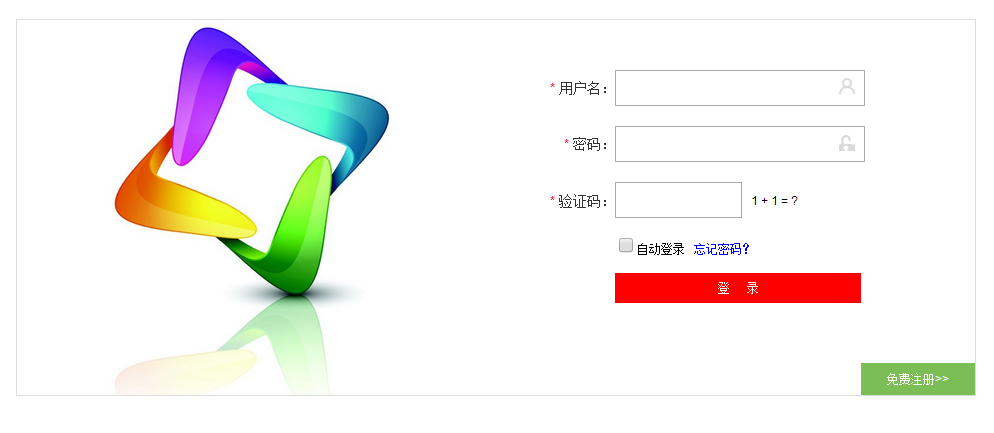
i_name.jpg

i_pwd.jpg

<div style="height: 35px; width: 400px; position: relative;">
    <!--输入框输满之后,会被图标挡住;为避免挡住,添加padding内边距(370+30=400px)-->
    <input type="text" style="height: 35px; width: 370px; padding-right: 30px;" />
    <!--放在父级标签的指定位置。-->
    <span style="position: absolute; right:6px; top:10px; background-image: url(i_name.jpg);
    height:16px; width: 16px; display: inline-block;"></span>
</div>

<!--以下功能重复,看一个练习即可-->
<div style="margin: 10px 0; height: 35px; width: 400px; position: relative;">
    <input type="password" style="height: 35px; width: 370px; padding-right: 30px;" />
    <span style="position: absolute; right:6px; top:10px; background-image: url(i_pwd.jpg);
    height:16px; width: 16px; display: inline-block;"></span>
</div>转载请务必保留此出处:http://blog.csdn.net/fgf00/article/details/53180724
六、总结
CSS补充
    position:
        a. fiexd => 固定在页面的某个位置

        b. relative + absolute

            <div style='position:relative;'>
                <div style='position:absolute;top:0;left:0;'></div>
            </div>

    opcity: 0.5 透明度
    z-index: 层级顺序
    overflow: hidden,auto
    hover

    background-image:url('image/4.gif'); # 默认,div大,图片重复访
    background-repeat: repeat-y;
    background-position-x:
    background-position-y:

    示例:输入框右边放置图标


 1356
1356

 被折叠的 条评论
为什么被折叠?
被折叠的 条评论
为什么被折叠?
 到【灌水乐园】发言


