


文字居中
一、文字水平居中
方法:给父级添加text-align:cener;
CSS代码:
.father{
            text-align: center;
        }
HTML代码:
<div class="father">文字居中</div>
效果:

二、文字垂直居中
方法:给父级添加line-height属性,取值为父盒子的高度
CSS代码:
.father{
            background-color: pink;
            height: 50px;
            text-align: center;
            line-height: 50px;
        }
HTML代码:
<div class="father">文字垂直居中</div>
效果:

图片居中
一、图片水平居中
方法:图片居中和文字居中一样,给父级添加text-align:cener;
注意:图片和文字居中的区别在于图片本身带有img标签,设置属性的时候不要给img设置而要给包裹图片的父盒子设置
CSS代码:
 .father{
            text-align: center;
        }
HTML代码:
<div class="father">
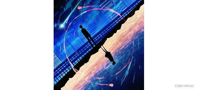
<img src="./images/1.jpg" alt="">
</div>
效果:
二、图片垂直居中
方法一:使用定位配合transform,可以连同水平居中一起实现,不需要再写text-align:center;
CSS代码:
.father{
            position: relative;
            height: 500px;
            background-color: pink;
        }
        img{
            position: absolute;
            left: 50%;
            top: 50%;
            transform: translate(-50%,-50%);
        }
HTML代码:
<div class="father">
        <img src="./images/1.jpg" alt="">
    </div>
效果:
方法二:将父类设置成弹性盒子布局,利用弹性盒子对齐属性实现居中对齐
CSS代码:
 .father{
            display: flex;
            height: 500px;
            justify-content: center;
            align-items: center;
            background-color: pink;
        }
HTML代码:
 <div class="father">
        <img src="./images/1.jpg" alt="">
    </div>
效果同上
方法三:使用margin或padding调整
CSS代码:
.father{
            height: 500px;
            text-align: center;
            padding-top: 100px;
            background-color: pink;
        }
 .father{
            height: 500px;
            text-align: center;
            background-color: pink;
        }
        img{
            margin-top: 100px;
        }
三、背景图片居中
方法:使用background-position
CSS代码:
.father{
            height: 500px;
            width: 500px;
            background-image: url(./images/1.jpg);
            background-repeat: no-repeat;
            background-position: center center;
            border: 1px solid #000;
        }
效果:
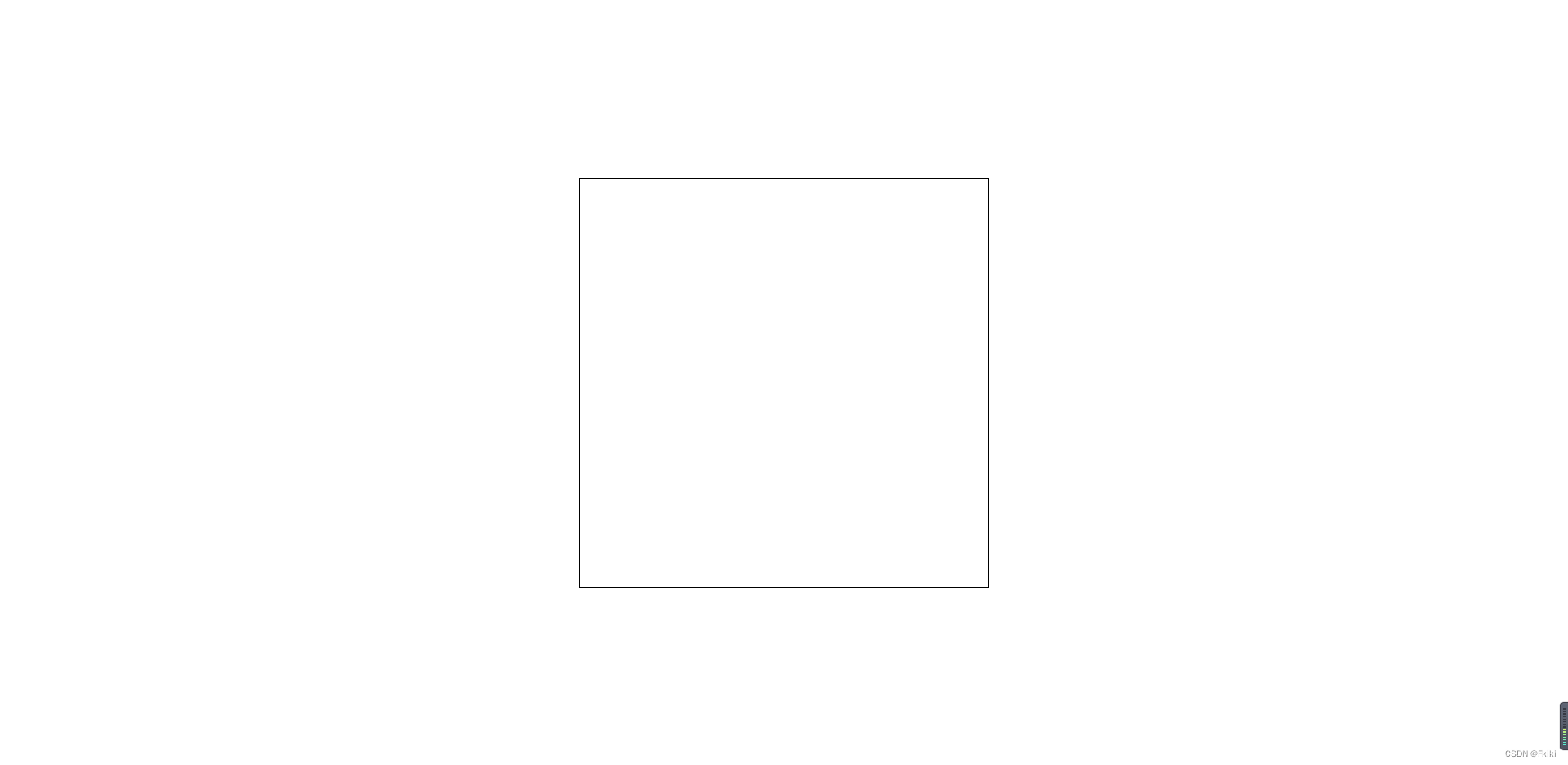
盒子居中
一、盒子水平居中
方法:使用margin:0 auto
CSS代码:
.father{
            margin: 0 auto;
            height: 500px;
            width: 500px;
            border: 1px solid #000;
        }
效果:
二、盒子垂直居中
方法一:position配合transform
注意:给body添加height:100%的同时也要给html添加height:100%否则无法生效
html{
            height: 100%;
        }
        body{
            position: relative;
            height: 100%;
        }
        .father{
            position: absolute;
            top: 50%;
            left: 50%;
            transform: translate(-50%,-50%);
            height: 500px;
            width: 500px;
            border: 1px solid #000;
        }
效果:
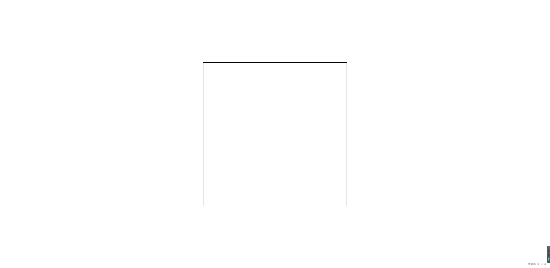
再多加一个盒子在居中盒子里居中
html{
            height: 100%;
        }
        body{
            position: relative;
            height: 100%;
        }
        .father{
            position: absolute;
            top: 50%;
            left: 50%;
            transform: translate(-50%,-50%);
            height: 500px;
            width: 500px;
            border: 1px solid #000;
        }
        .son{
            position: absolute;
            top: 50%;
            left: 50%;
            transform: translate(-50%,-50%);
            height: 300px;
            width: 300px;
            border: 1px solid #000;
        }
效果:
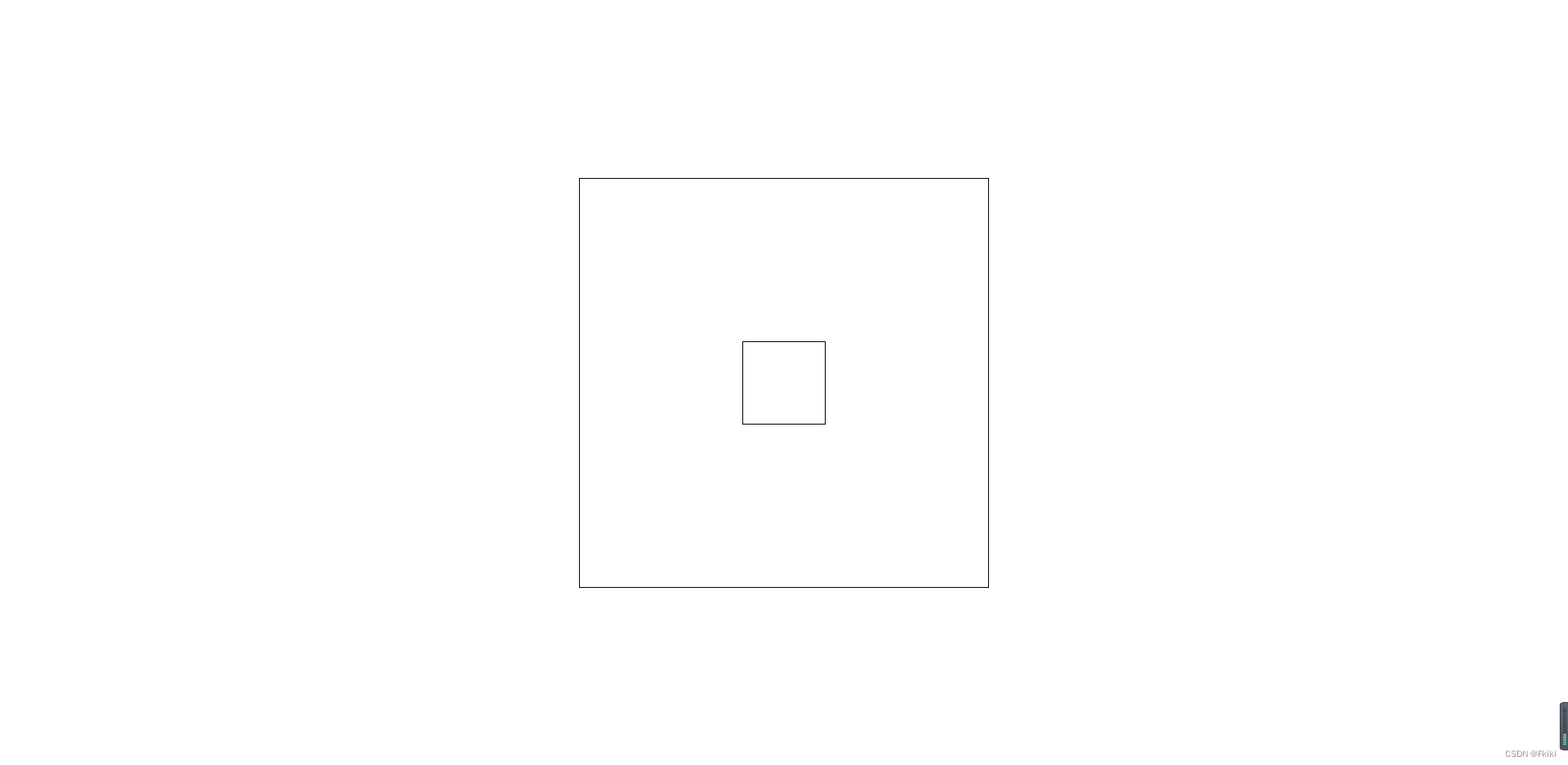
方法二:弹性盒子布局
CSS代码:
 html{
            height: 100%;
        }
        body{
            display: flex;
            justify-content: center;
            align-items: center;
            height: 100%;
        }
        .father{
            display: flex;
            justify-content: center;
            align-items: center;
            height: 500px;
            width: 500px;
            border: 1px solid #000;
        }
        .son{
            height: 100px;
            width: 100px;
            border: 1px solid #000;
        }
效果:
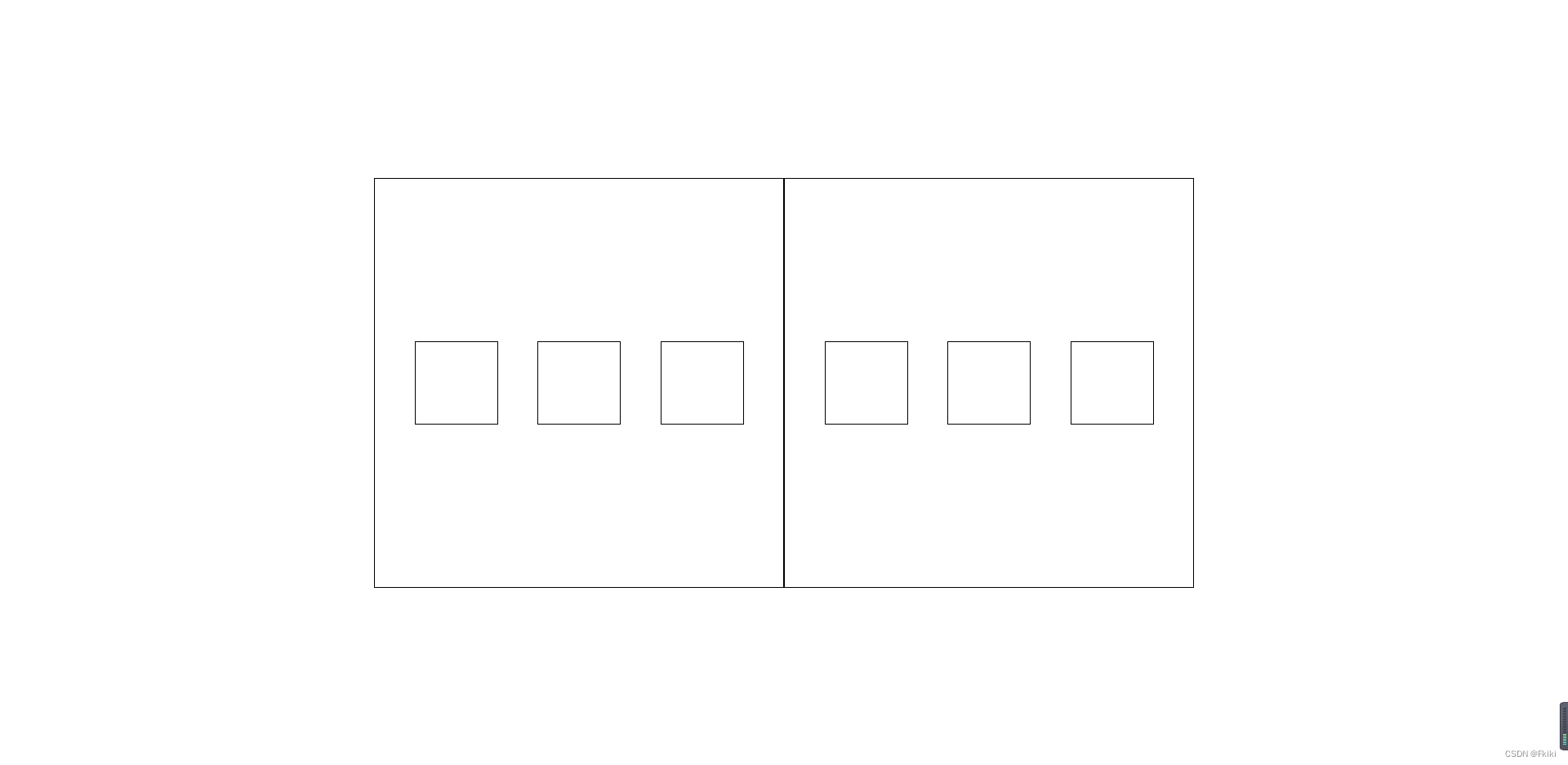
弹性盒子布局实现多个盒子居中
CSS代码:
html{
            height: 100%;
        }
        body{
            display: flex;
            justify-content: center;
            align-items: center;
            height: 100%;
        }
        .father{
            display: flex;
            justify-content: space-evenly;
            align-items: center;
            height: 500px;
            width: 500px;
            border: 1px solid #000;
        }
        .son{
            height: 100px;
            width: 100px;
            border: 1px solid #000;
        }
方法三:使用margin或padding调整
总结
以上就是我个人总结出的CSS中常用的居中对齐方式,希望对你有帮助


 1486
1486


 被折叠的 条评论
为什么被折叠?
被折叠的 条评论
为什么被折叠?
 到【灌水乐园】发言


