


小程序使用使用echarts的方法
小程序项目中有需要用到折线图,饼状图,柱状图等等的时候,引用echarts是非常方便的,不过在使用的一些细节方面可就要认真阅读官方文档了,这里记录我在小程序中使用echarts的过程,仅供借鉴
第一步:去github下载echarts对应的组件文件,它提供的是一个项目demo,可以参考自己所需要的 具体图表代码的,点击跳转github链接
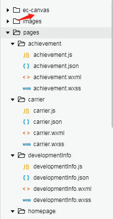
第二步:下好之后会有一个这样的目录

我之前已经建好了项目,所以只要把ec-canvas这个文件夹放到我的项目中即可如下:
这个是我放进去之后的截图,接下来就可以使用了。
使用方式,先引用组件:
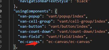
我的项目90%都是图表展示,所以我就在app.json中全局引入了,还可以页面引入,只要在你的对应文件的json文件加上上述代码即可,然后在页面的js文件申明:
我第一个做的 饼状图,示例如下:
js:
function initChart(canvas, width, height) {
  const chart = echarts.init(canvas, null, {
    width: width,
    height: height
  });
  canvas.setChart(chart);

  var option = {
    backgroundColor: "#ffffff",
    color: ["#AAE9FF", "#00B1ED"],
    tooltip: {
      trigger: 'item',
      formatter: '{a} <br/>{b}: {c} ({d}%)'
    },
    legend: {
      // orient: 'vertical',
      left: 10,
      data: ['全市企业', '当前企业类型']
    },
    title: {
      text: '12350家',
      x: 'center',
      y: 'center',
      top: '130',
      textStyle: {
        fontSize: 15,
        color: '#020202',
        fontWeight: '400'
      }
    },
    graphic: {       //图形中间文字
      type: "text",
      left: "center",
      top: "156rpx",
      style: {
        text: '占比26%',
        textAlign: "center",
        fill: "#0090C1",
        fontSize: 12
      }
    },
    series: [{
      label: {
        normal: {
          fontSize: 14
        }
      },
      type: 'pie',
      center: ['50%', '50%'],
      radius: ['40%', '70%'],
      data: [{
        value: 26,
        name: '当前企业类型'
      }, {
        value: 74,
          name: '全市企业'
      }
      ],
      itemStyle: {
        normal: {
          label: {
            show: false   //隐藏标示文字
          },
          labelLine: {
            show: false   //隐藏标示线
          }
        },
        emphasis: {
          shadowBlur: 10,
          shadowOffsetX: 0,
          shadowColor: 'rgba(0, 2, 2, 0.3)'
        }
      }
    }]
  };

  chart.setOption(option);
  return chart;
}
data: {
    ec: {}
  },

  echartInit(e) {
    initChart(e.detail.canvas, e.detail.width, e.detail.height);
  },
wxml:
<view class="echart_panel">
    <ec-canvas id="mychart-dom-pie" canvas-id="mychart-pie" ec="{{ ec }}" bind:init="echartInit">
    </ec-canvas>
</view>
效果如下:

到这里就差不多了,还有一些使用的细节,之后在分享吧!


 3997
3997


 被折叠的 条评论
为什么被折叠?
被折叠的 条评论
为什么被折叠?
 到【灌水乐园】发言


