


为什么要做这件事
借助封装table组件的过程来巩固一下vue3相关知识点。
组件有哪些配置项
- options:表格的配置项
- data: 表格数据源
- elementLoadingText:加载文案
- elementLoadingSpinner:加载图标
- elementLoadingBackground:背景遮罩的颜色
- elementLoadingSvg:加载图标(svg)
- elementLoadingSvgViewBox:加载图标是svg的话,配置项
- editIcon:编辑图标
- isEditRow:是否支持编辑
- editRowIndex:编辑行的标识符
- pagination:是否支持分页
- paginationAlign:分页对齐方式
- currentPage:当前页数
- pageSize:每页显示条目个数
- pageSizes:每页显示个数选择器的选项设置
- total:总条目数
实现过程
首先,将一个普通的element-plus中的table组件引入进来,表格数据源就是我们通过父组件传递进来的data,所以我们使用defineProps来定义,并且它的数据类型是一个数组;同时我们遵循单向数据流的原则,使用lodash中的深拷贝方法将data拷贝一份出来赋值给变量tableData,将tableData传递给element-plus中的table组件,用来渲染数据。
// 子组件 m-table-copy

<template>
  <el-table :data="tableData">
    <el-table-column prop="date" label="Date" width="180" />
    <el-table-column prop="name" label="Name" width="180" />
    <el-table-column prop="address" label="Address" />
  </el-table>
</template>

<script setup>
import { ref } from 'vue'
import cloneDeep from 'lodash/cloneDeep'
let props = defineProps({
  data: {
    type: Array,
    required: true
  }
})

// 拷贝一份儿数据
let tableData = ref(cloneDeep(props.data))
</script>
父组件在使用这个自定义组件的时候应该这么使用:
<!-- 父组件 -->
<template>
  <m-table-copy :data="tableData"></m-table-copy>
</template>

<script setup>
import { ref } from 'vue'

let tableData = ref([])

tableData.value = [
  {
    name: '张三',
    address: '杭州市',
    date: '1998-07-16'
  },
  {
    name: '李四',
    address: '石家庄市',
    date: '2013-09-02'
  }
]
</script>
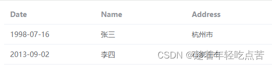
这样页面上就能够显示出来我们的数据了:
第一步完成了,我们接着再分析,还有什么是可以封装的呢?仔细看上面的代码,是不是有了想法?是的,label、width、prop这些也是可以放在一个配置项里面的,那我们继续来进行封装:
// 父组件准备好的数据结构
let options = [
  {
    prop: 'date',
    label: '日期',
    align: 'center',
    slot: 'date',
    editable: true,
    width: '230'
  },
  {
    prop: 'name',
    label: '姓名',
    align: 'center',
    slot: 'name'
  },
  {
    prop: 'address',
    label: '地址',
    align: 'center',
    editable: true
  },
  {
    label: '操作',
    align: 'center',
    action: true
  }
]
<template>
<el-table :data="tableData">
<template v-for="(item, index) in tableOption" :key="index">
<el-table-column
:label="item.label"
:prop="item.prop"
:align="item.align"
:width="item.width" />
</template>
</el-table>
</template>
<script setup>
import { ref, computed } from 'vue'
let props = defineProps({
// 表格配置项
options: {
type: Array,
required: true
}
})
// 过滤操作项之后的配置
let tableOption = computed(() => props.options.filter((item) => !item.action))
</script>一般来说,表格都会配置一下loading状态,所以我们继续封装,将loading相关的配置项也添加进来:
完整代码
<template>
  <el-table
    :data="tableData"
    v-loading="isLoading"
    :element-loading-text="elementLoadingText"
    :element-loading-spinner="elementLoadingSpinner"
    :element-loading-svg="elementLoadingSvg"
    :element-loading-svg-view-box="elementLoadingSvgViewBox"
    :element-loading-background="elementLoadingBackground"
    @row-click="rowClick"
    v-bind="$attrs">
    <template v-for="(item, index) in tableOption" :key="index">
      <el-table-column
        :label="item.label"
        :prop="item.prop"
        :align="item.align"
        :width="item.width">
        <template #default="scope">
          <!-- 编辑模式 -->
          <template v-if="scope.row.rowEdit">
            <el-input v-model="scope.row[item.prop]"></el-input>
          </template>
          <template v-else>
            <template v-if="scope.$index + scope.column.id === currentEdit">
              <div style="display: flex">
                <el-input v-model="scope.row[item.prop]"></el-input>
                <div>
                  <slot
                    v-if="$slots.cellEdit"
                    name="cellEdit"
                    :scope="scope"></slot>
                  <div class="action-icon" v-else>
                    <el-icon-check
                      class="check"
                      @click.stop="check(scope)"></el-icon-check>
                    <el-icon-close
                      class="close"
                      @click.stop="close(scope)"></el-icon-close>
                  </div>
                </div>
              </div>
            </template>
            <template v-else>
              <!-- slot是一个插槽出口,表示了父元素提供的插槽内容将在哪里被渲染 -->
              <slot v-if="item.slot" :name="item.slot" :scope="scope"></slot>
              <span v-else>{{ scope.row[item.prop] }}</span>
              <component
                v-if="item.editable"
                :is="`el-icon-${toLine(editIcon)}`"
                class="edit"
                @click.stop="clickEditIcon(scope)"></component>
            </template>
          </template>
        </template>
      </el-table-column>
    </template>
    <el-table-column
      :align="actionOption.align"
      :label="actionOption.label"
      :width="actionOption.width">
      <template #default="scope">
        <!-- 编辑模式下显示确认和取消 -->
        <slot name="editRow" :scope="scope" v-if="scope.row.rowEdit"></slot>
        <!-- 正常状态下显示 编辑和删除 -->
        <slot name="action" :scope="scope" v-else></slot>
      </template>
    </el-table-column>
  </el-table>
  <div
    v-if="pagination && !isLoading"
    class="pagination"
    :style="{ justifyContent }">
    <el-pagination
      v-model:currentPage="currentPage"
      :page-size="pageSize"
      :page-sizes="pageSizes"
      @size-change="handleSizeChange"
      @current-change="handleCurrentChange"
      layout="total, sizes, prev, pager, next, jumper"
      :total="total" />
  </div>
</template>
<script setup>
import cloneDeep from 'lodash/cloneDeep'
import { computed, onMounted, ref, watch } from 'vue'
import { toLine } from '../../../utils'
let props = defineProps({
// 表格配置项
options: {
type: Array,
required: true
},
// 表格数据
data: {
type: Array,
required: true
},
// 编辑图标
editIcon: {
type: String,
default: 'Edit'
},
// 显示在加载图标下方的加载文案
elementLoadingText: {
type: String
},
// 自定义加载图标
elementLoadingSpinner: {
type: String
},
// 自定义加载图标(svg)
elementLoadingSvg: {
type: String
},
// 自定义加载图标(svg)的配置
elementLoadingSvgViewBox: {
type: String
},
// 背景遮罩的颜色
elementLoadingBackground: {
type: String
},
// 是否可用编辑行
isEditRow: {
type: Boolean,
default: false
},
// 编辑行按钮的标识
editRowIndex: {
type: String,
default: ''
},
// 是否显示分页
pagination: {
type: Boolean,
default: false
},
// 分页的对齐方式
paginationAlign: {
type: String,
default: 'left'
},
// 当前第几页
currentPage: {
type: Number,
default: 1
},
// 显示分页数据多少条的选项
pageSizes: {
type: Array,
default: () => [10, 20, 30, 40]
},
// 数据总条数
total: {
type: Number,
default: 0
}
})
// 深拷贝一份表格的数据
let tableData = ref(cloneDeep(props.data))
let cloneEditRowIndex = ref(props.editRowIndex)
// 过滤操作项之后的配置
let tableOption = computed(() => props.options.filter((item) => !item.action))
let actionOption = computed(() => props.options.find((item) => item.action))
// 监听的标识
let watchData = ref<boolean>(false)
// 如果data的数据变了 要重新给tableData赋值
// 只需要监听一次就可以了
let stopWatchData = watch(
() => props.data,
(val) => {
watchData.value = true
tableData.value = val
tableData.value.map((item) => {
item.rowEdit = false
})
if (watchData.value) stopWatchData()
},
{ deep: true }
)
watch(
() => props.editRowIndex,
(val) => {
if (val) cloneEditRowIndex.value = val
}
)
// 当前被点击的单元格的标志
let currentEdit = ref('')
let currentPage = computed(() => props.currentPage)
let justifyContent = computed(() => {
if (props.paginationAlign === 'left') return 'flex-start'
else if (props.paginationAlign === 'right') return 'flex-end'
else return 'center'
})
let isLoading = computed(() => !props.data || !props.data.length)
let emits = defineEmits([
'confirm',
'cancel',
'update:editRowIndex',
'size-change',
'current-change'
])
onMounted(() => {
tableData.value.map((item) => {
item.rowEdit = false
})
})
let clickEditIcon = (scope) => {
currentEdit.value = scope.$index + scope.column.id
}
let handleSizeChange = (val) => {
emits('size-change', val)
}
let handleCurrentChange = (val) => {
emits('current-change', val)
}
let check = (scope) => {
emits('confirm', scope)
currentEdit.value = ''
}
let close = (scope) => {
emits('cancel', scope)
currentEdit.value = ''
}
let rowClick = (row, column) => {
if (column.label === actionOption.value.label) {
if (props.isEditRow && cloneEditRowIndex.value === props.editRowIndex) {
row.rowEdit = !row.rowEdit
tableData.value.map((item) => {
if (item !== row) item.rowEdit = false
})
if (!row.rowEdit) emits('update:editRowIndex', '')
}
}
}
</script>


 3291
3291


 被折叠的 条评论
为什么被折叠?
被折叠的 条评论
为什么被折叠?
 到【灌水乐园】发言


