


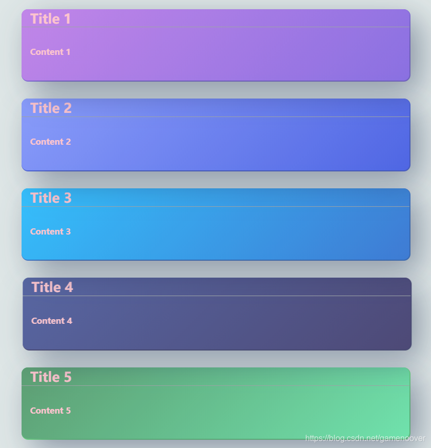
页面效果如下:
Html + Css代码如下:
<!DOCTYPE html>
<html lang="en">
<head>
    <meta charset="UTF-8">
    <meta http-equiv="X-UA-Compatible" content="IE=edge">
    <meta name="viewport" content="width=device-width, initial-scale=1.0">
    <title>Card List</title>
</head>
<body>
    <div class="warp">
        <div class="card one">
            <div class="title">Title 1</div>
            <div class="content">Content 1</div>
        </div>
        <div class="card two">
            <div class="title">Title 2</div>
            <div class="content">Content 2</div>
        </div>
        <div class="card three">
            <div class="title">Title 3</div>
            <div class="content">Content 3</div>
        </div>
        <div class="card four">
            <div class="title">Title 4</div>
            <div class="content">Content 4</div>
        </div>
        <div class="card five">
            <div class="title">Title 5</div>
            <div class="content">Content 5</div>
        </div>
    </div>
</body>
<style>
    body{
      margin: 0;
      padding: 0;
    }
    .warp{
        background-color: rgb(222, 230, 230);
        width: 100vw;
        height: 100vh;

        overflow: hidden;
        /* position: absolute; */
        /*避免子元素margin 影响外层元素 overflow和position都可以*/


        display: flex;
        justify-content: center;
		align-items: center;
        flex-direction: column;
        /* flex弹性布局 居中(水平、垂直) */
    }
    .card{
        width: 90vw;
        height: 16vh;
        background-color: darkcyan;
        border-radius: 2vh;
        margin: 2vh;

        /* 文本垂直居中 */
        /* text-align: center; */
        /* line-height: 20vh; */

        /*外层相对位置*/
        /* position: relative; */

        border-radius: 12px;
        color: #ffc0cb;
        cursor: pointer;
        transition: all 1s ease;
        display: block;
    }
    .one{
        background-color: #8063e1;
        background-image: linear-gradient(135deg, #bd7be8, #8063e1);
        box-shadow: 20px 20px 60px rgba(34,50,84,0.5), 1px 1px 0px 1px #8063e1;
        z-index: 5;
        opacity: 0.9;
    }
    .two{
        background-color: #3f58e3;
        background-image: linear-gradient(135deg, #7f94fc, #3f58e3);
        box-shadow: 20px 20px 60px rgba(34,50,84,0.5), 1px 1px 0px 1px #3f58e3;
        z-index: 4;
        opacity: 0.9;
    }
    .three{
        background-color: #2c6fd1;
        background-image: linear-gradient(135deg, #21bbfe, #2c6fd1);
        box-shadow: 20px 20px 60px rgba(34,50,84,0.5), 1px 1px 0px 1px #2c6fd1;
        z-index: 3;
        opacity: 0.9;
    }
    .four{
        background-color: #352f64;
        background-image: linear-gradient(135deg, #415197, #352f64);
        box-shadow: 20px 20px 60px rgba(34,50,84,0.5), 1px 1px 0px 1px #352f64;
        z-index: 2;
        opacity: 0.9;
    }
    .five{
        background-color: #63e1b7;
        background-image: linear-gradient(135deg, #4e9666, #63e1a6);
        box-shadow: 20px 20px 60px rgba(34,50,84,0.5), 1px 1px 0px 1px #63e178;
        z-index: 1;
        opacity: 0.9;
    }
    .card .title {
        /*内层绝对位置*/
        /* position: absolute; */
        border-bottom: rgb(149, 158, 158) 1px solid;
        width: calc(100% - 2vw);
        height: 25%;
        padding-left :2vw;
        font-size: 26px;
        font-weight: bold;
        }
    .card .content {
        /* position: absolute; */

        width: 100%;
        height: 74%;

        /* 文本垂直居中 */
        /* text-align: center; */
        line-height: 11vh;

        padding-left :2vw;
        font-weight: 700;
        font-size: 16px;
    }
    .card:hover {
        transform: rotateX(0deg) rotateY(0deg) rotate(0deg) translate(15px, 0px);
        opacity: 0.6;
    }
    .card:hover:after {
        transform: translateX(100%);
        transition: all 1.5s ease-in-out;
    }
    .card::after {
        content: '';
        position: absolute;
        top: 0px;
        left: 0;
        width: 100%;
        height: 100%;
        transform: translateX(-100%);
        background-image: linear-gradient(60deg, rgba(255,255,255,0) 20%, rgba(255,255,255,0.1), rgba(255,255,255,0) 80%);
    }
</style>
</html>
总结
1.页面的尺寸,建议使用vh,vw这样更好的适配页面;
2.利用transition实现动画特效,页面更有亲和度;
3.如果对页面的布局不清楚,可以在每个标签上使用 border: 1px red solid 可视化的看见要操作的标签,更好的去调整页面;
4.display:flex 内容很多,建议拿出点事件自己看看 display flex 菜鸟教程
5.由简单到高级,提升前台页面的设计能力。


 1万+
1万+


 被折叠的 条评论
为什么被折叠?
被折叠的 条评论
为什么被折叠?
 到【灌水乐园】发言


