


简述
讲了html的简易导航栏
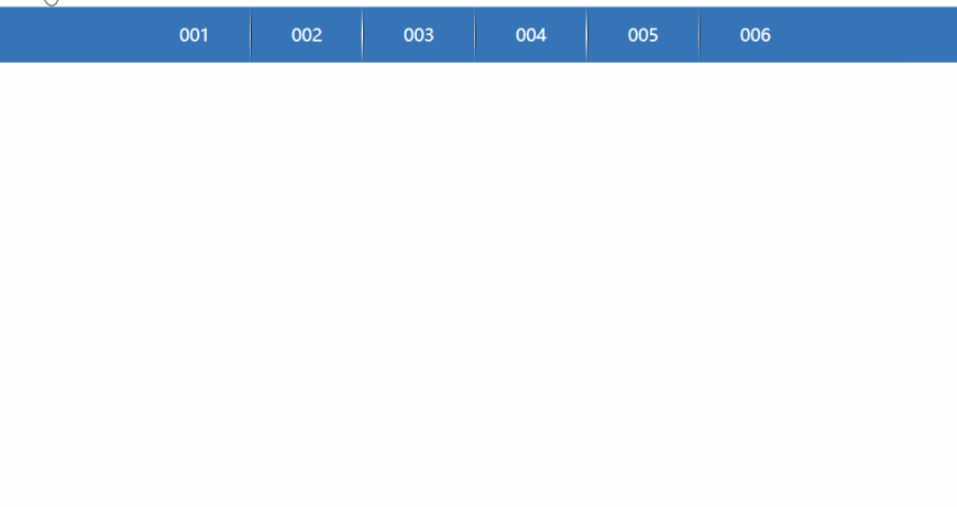
简易导航栏
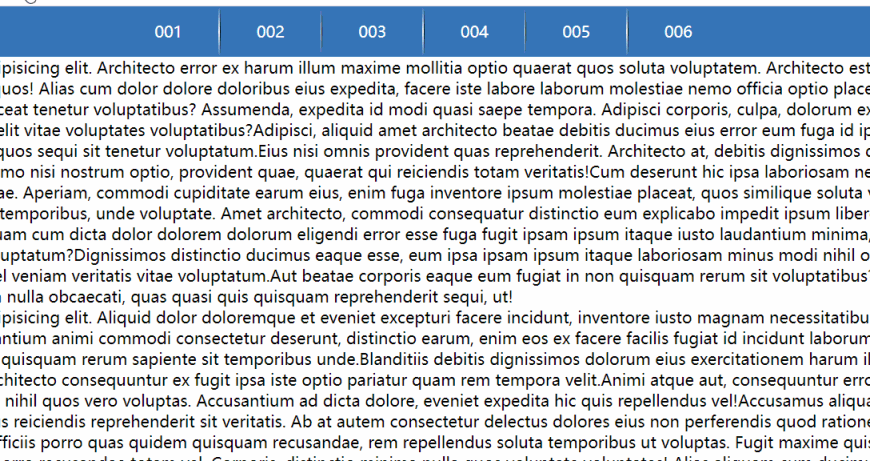
效果
代码
<!DOCTYPE html>
<html lang="zh">
<head>

    <meta charset="UTF-8">
    <title>Title</title>
    <style>
        *{
            padding: 0px;
            margin: 0px;
            border: 0px;
            box-sizing: border-box;
        }
        li{
            float: left;
            list-style: none;
        }
        ul:hover{
            display: block;
        }
        a{
            width: 100px;
            height: 50px;
            color: white;
            text-decoration: none;
            display: inline-block;
            background-color: #3675b8;
            text-align: center;
            line-height: 50px;
            transition: all .5s;
        }
        li:hover > a{
            background-color: #264979;
        }
        a + ul{
            width: 100px;
            display: none;
            position: absolute;
        }
        a:hover + ul{
            display: block;
        }
        .line{
            width: 1px;
            height: 50px;
        }
        .one{
            background-image: linear-gradient(transparent,white,transparent);
        }
        .two{
            background-image: linear-gradient(transparent,black,transparent);
        }
        nav{
            width: 100%;
            height: 50px;
            background-color: #3675b8;
        }
        nav>ul{
            display: block;
            width: max-content;
            margin: auto;
            height: 50px;
        }
        .md{
            width: 100px;
            height: 100px;
            background-color: black;
        }
    </style>
</head>
<body>
    <nav>
        <ul>
            <li><a href="">001</a>
                <ul>
                    <li><a href="">01</a></li>
                    <li><a href="">02</a></li>
                    <li><a href="">03</a></li>
                    <li><a href="">04</a></li>
                    <li><a href="">05</a></li>
                    <li><a href="">06</a></li>
                    <li><a href="">07</a></li>
                </ul>
            </li>
            <li class="line one"></li>
            <li class="line two"></li>
            <li><a href="">002</a>
                <ul>
                    <li><a href="">01</a></li>
                    <li><a href="">02</a></li>
                    <li><a href="">03</a></li>
                </ul>
            </li>
            <li class="line one"></li>
            <li class="line two"></li>
            <li><a href="">003</a>
                <ul>
                    <li><a href="">01</a></li>
                    <li><a href="">02</a></li>
                    <li><a href="">03</a></li>
                    <li><a href="">04</a></li>
                    <li><a href="">05</a></li>
                    <li><a href="">06</a></li>
                    <li><a href="">07</a></li>
                    <li><a href="">08</a></li>
                    <li><a href="">09</a></li>
                    <li><a href="">10</a></li>
                </ul>
            </li>
            <li class="line one"></li>
            <li class="line two"></li>
            <li><a href="">004</a></li>
            <li class="line one"></li>
            <li class="line two"></li>
            <li><a href="">005</a></li>
            <li class="line one"></li>
            <li class="line two"></li>
            <li><a href="">006</a></li>
        </ul>
    </nav>

</body>
</html>
遇到的问题
解决方案
对下拉菜单使用绝对定位
position: absolute;

特效变换
效果

代码
<!DOCTYPE html>
<html lang="zh">
<head>
    <meta charset="UTF-8">
    <title>Title</title>
    <style>
        div{
            width: 50px;
            height: 50px;
            background-color: #3675b8;
            position: absolute;
            top: 50%;
            left: 50%;
            transform: translate(-50%,-50%);
            transition: all .5s;
            /*transition: width .5s,height .5s,border-radius .5s;*/
        }
        div:hover{
            width: 100px;
            height: 100px;
            border-radius: 50%;
            background-color: #48ff00;
            box-shadow: 1px 1px 1px 1px #3675b8;
            cursor: pointer;
        }
    </style>
</head>
<body>
    <div>

    </div>
</body>
</html>
重点
特效变换速度(可单个,可全部)
transition: all .5s;
transition: width .5s,height .5s,border-radius .5s;
让元素在页面居中
position: absolute;
top: 50%;
left: 50%;
transform: translate(-50%,-50%);
背景颜色渐变 transparent是透明颜色
background-image: linear-gradient(transparent,black,transparent);
宽度包括内容
width: max-content;
取消A标签下划线
text-decoration: none;
使文字居中 使其行高等于容器
line-height: 50px;
标准去除css
*{
            padding: 0px;
            margin: 0px;
            border: 0px;
            box-sizing: border-box;
}
去除li前面的点
li{
       float: left;
       list-style: none;
}
有序列表更改编号
<ol type="1" start="3"></ol>
    padding: 0px;
        margin: 0px;
        border: 0px;
        box-sizing: border-box;
}
> 去除li前面的点

```html
li{
       float: left;
       list-style: none;
}
有序列表更改编号
<ol type="1" start="3"></ol>


 944
944


 被折叠的 条评论
为什么被折叠?
被折叠的 条评论
为什么被折叠?
 到【灌水乐园】发言


