


/**
* Sample React Native App
* https://github.com/facebook/react-native
* @flow
*/
import React, { Component } from 'react';
import {
AppRegistry,
StyleSheet,
Text,
View
} from 'react-native';
class FlexBoxDemo extends Component {
render() {
return (
<View style={styles.container}>
<Text style={{backgroundColor:'red'}}>第一个</Text>
<Text style={{backgroundColor:'green'}}>第二个</Text>
<Text style={{backgroundColor:'blue'}}>第三个</Text>
<Text style={{backgroundColor:'yellow'}}>第四个</Text>
</View>
);
}
}
const styles = StyleSheet.create({
container: {
backgroundColor: '#F5FCFF'
}
});
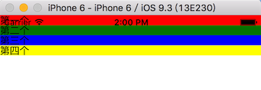
AppRegistry.registerComponent('FlexBoxDemo', () => FlexBoxDemo);1.改变主轴的方向
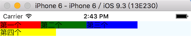
// 改变主轴的方向
flexDirection:'row'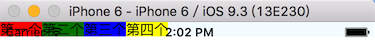
从上图我们可以看出,Text组件默认宽度和高度刚好包裹文字
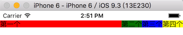
2.接下来我们改变主轴的对齐方式(这里主轴就是X方向)
justifyContent:'flex-end' //右对齐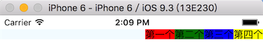
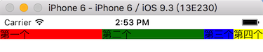
// 设置主轴对齐方式
justifyContent:'center' //居中对齐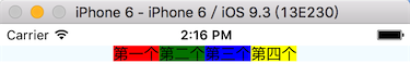
justifyContent:'space-between'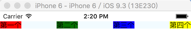
justifyContent:'space-around'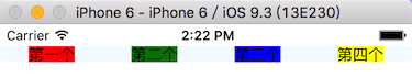
3.alignItems定义项目在交叉轴上如何对齐,可以把其想像成侧轴(垂直于主轴)的“对齐方式”
要进行这个实验,我们需要先给几个Text组件设置高度
<Text style={{backgroundColor:'red',height:30}}>第一个</Text>
<Text style={{backgroundColor:'green',height:40}}>第二个</Text>
<Text style={{backgroundColor:'blue',height:50}}>第三个</Text>
<Text style={{backgroundColor:'yellow',height:60}}>第四个</Text>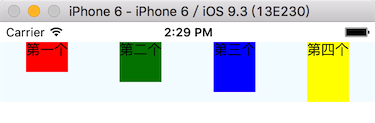
那么接下来我们设置alignItems看看
// 设置侧轴的对齐方式
alignItems:'flex-end'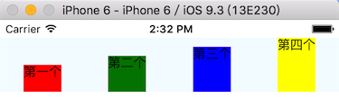
4个flexItem底部对齐了。
alignItems:'center'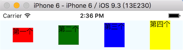
相对于父容器居中对齐了
另外还有:
baseline ,项目的第一行文字的基线对齐。
stretch(默认值),如果项目未设置高度或设为auto,将占满整个容器的高度。
就不一一赘述了。
4.flexWrap换行
第四个宽度超出了,第一行不够显示,我们来看一下代码:
/**
 * Sample React Native App
 * https://github.com/facebook/react-native
 * @flow
 */

import React, { Component } from 'react';
import {
  AppRegistry,
  StyleSheet,
  Text,
  View
} from 'react-native';

class FlexBoxDemo extends Component {
  render() {
    return (
      <View style={styles.container}>
        <Text style={{backgroundColor:'red',width:80}}>第一个</Text>
        <Text style={{backgroundColor:'green',width:90}}>第二个</Text>
        <Text style={{backgroundColor:'blue',width:100}}>第三个</Text>
        <Text style={{backgroundColor:'yellow',width:110}}>第四个</Text>
      </View>
    );
  }
}

const styles = StyleSheet.create({
  container: {
    backgroundColor: '#F5FCFF',
    // 上边距
    marginTop:20,
    // 改变主轴的方向
    flexDirection:'row',
    // 设置主轴对齐方式
    justifyContent:'flex-start',
    // 设置侧轴的对齐方式
    alignItems:'center',
    // 一行显示不下,换一行
    flexWrap:'wrap'
  }
});

AppRegistry.registerComponent('FlexBoxDemo', () => FlexBoxDemo);
元素属性
我们前面学的几个都是容器属性,下面我们来看看元素属性。
1.flex
<Text style={{backgroundColor:'red',flex:1}}>第一个</Text>
<Text style={{backgroundColor:'green'}}>第二个</Text>
<Text style={{backgroundColor:'blue'}}>第三个</Text>
<Text style={{backgroundColor:'yellow'}}>第四个</Text>分析:第一个设置了flex:1,最后的效果是第二三四个按照自己文字内容的宽度,剩下的宽度全部给了第一个。
那么我们给第一个,第二个都设置flex:1会怎么样呢?
第三四个根据自己的文字内容计算宽度后,剩下的屏幕宽度被第一个和第二个平分了。
我们修改成这样看看最后是什么效果:
<Text style={{backgroundColor:'red',flex:1}}>第一个</Text>
<Text style={{backgroundColor:'green',flex:2}}>第二个</Text>
<Text style={{backgroundColor:'blue',flex:2}}>第三个</Text>
<Text style={{backgroundColor:'yellow',flex:1}}>第四个</Text>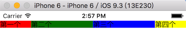
结果是不是和你想的一样?从代码我们也可以看出:宽度被分成了6份,第二和第三是另外的2倍。
2.alignSelf
align-self属性允许单个项目有与其他项目不一样的对齐方式,可覆盖align-items属性。默认值为auto,表示继承父元素的align-items属性,如果没有父元素,则等同于stretch。
/**
 * Sample React Native App
 * https://github.com/facebook/react-native
 * @flow
 */

import React, { Component } from 'react';
import {
  AppRegistry,
  StyleSheet,
  Text,
  View
} from 'react-native';

class FlexBoxDemo extends Component {
  render() {
    return (
      <View style={styles.container}>
        <Text style={{backgroundColor:'red',flex:1,height:60,alignSelf:'flex-end'}}>第一个</Text>
        <Text style={{backgroundColor:'green',flex:2,height:70}}>第二个</Text>
        <Text style={{backgroundColor:'blue',flex:2, height:80}}>第三个</Text>
        <Text style={{backgroundColor:'yellow',flex:1, height:90}}>第四个</Text>
      </View>
    );
  }
}

const styles = StyleSheet.create({
  container: {
    backgroundColor: '#F5FCFF',
    // 上边距
    marginTop:20,
    // 改变主轴的方向
    flexDirection:'row',
    // 设置主轴对齐方式
    justifyContent:'flex-start',
    // 设置侧轴的对齐方式
    alignItems:'center',
    // 一行显示不下,换一行
    flexWrap:'wrap'
  }
});

AppRegistry.registerComponent('FlexBoxDemo', () => FlexBoxDemo);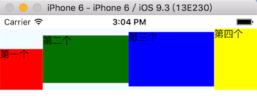
从上图我们可以看出:第一个Text遵守了它自己的alignSelf:'flex-end' 地对齐了,其他3个都是居中对齐。
alignSelf属性的值有如下几个:auto | flex-start | flex-end | center | baseline | stretch
四、获取当前屏幕的宽度、高度、分辨率
/**
 * Sample React Native App
 * https://github.com/facebook/react-native
 * @flow
 */

import React, { Component } from 'react';
import {
  AppRegistry,
  StyleSheet,
  Text,
  View
} from 'react-native';

// 引入系统的Dimensions类库
var Dimensions = require('Dimensions');

class FlexBoxDemo extends Component {
  render() {
    return (
      <View style={styles.container}>
        <Text>当前屏幕的width是:{Dimensions.get('window').width}</Text>
        <Text>当前屏幕的height是:{Dimensions.get('window').height}</Text>
        <Text>当前屏幕的scale是:{Dimensions.get('window').scale}</Text>
      </View>
    );
  }
}

const styles = StyleSheet.create({
  container: {
    backgroundColor: '#F5FCFF',
    // 上边距
    marginTop:20,
    // 设置主轴对齐方式
    justifyContent:'center',
    // 设置侧轴的对齐方式
    alignItems:'center'
  }
});

AppRegistry.registerComponent('FlexBoxDemo', () => FlexBoxDemo);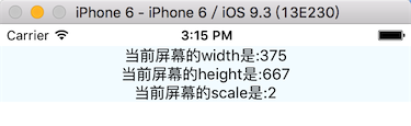
注意需要引入Dimensions类库
var Dimensions = require('Dimensions');


 扫一扫
扫一扫
 1万+
1万+

 被折叠的 条评论
为什么被折叠?
被折叠的 条评论
为什么被折叠?
 到【灌水乐园】发言


